Scientific Poster Templates: 7 Free PowerPoint Layouts
7 free research poster templates in PowerPoint: 48x36 in, 36x48 in, A0 and A1 layouts by discipline, each with a true-size preview and an AI generator prompt.
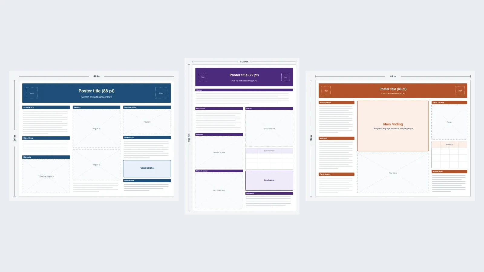
A research poster template saves you the two most tedious hours of poster making: setting the page to the right print size and drawing a grid that does not fall apart when you paste in real figures. Most free template libraries give you one generic three-column file. This page gives you seven layouts built for different kinds of research, each at its true print size, each with a preview that shows exactly where the sections and figures go.
Every template comes in two forms. Download the PowerPoint file if you want to build the final poster yourself. Open it in the poster generator if you want to see a fully designed version of that layout with your topic first; the button fills in a ready-to-edit prompt and the closest aspect ratio for you.

Scientific Poster Generator
Describe your study and get a designed poster layout with title, methods, results, and conclusion blocks. Every template below opens here with its prompt pre-filled.
Try it free →The 7 templates at a glance
| # | Template | Print size | Best for | Columns | Generator ratio |
|---|---|---|---|---|---|
| 1 | Classic three-column | 48 × 36 in, landscape | Life sciences, biomedical | 3 | 4:3 (exact) |
| 2 | A0 portrait, two columns | 841 × 1189 mm | Chemistry, materials, international meetings | 2 + abstract band | 3:4 (closest) |
| 3 | Clinical study, portrait | 36 × 48 in | Clinical medicine, public health | 2, in three rows | 3:4 (exact) |
| 4 | Billboard | 48 × 36 in, landscape | Psychology, social sciences | Narrow, wide, narrow | 4:3 (exact) |
| 5 | Results-first grid | 48 × 36 in, landscape | Computer science, engineering | Banner + grid | 4:3 (exact) |
| 6 | A1 field study | 594 × 841 mm | Ecology, environmental science | 2, map-led | 3:4 (closest) |
| 7 | Compact symposium | 36 × 24 in, landscape | Undergraduate research, any field | 3 | 4:3 (closest) |
All seven PowerPoint files are set to the real print size, not a scaled-down slide, so the font sizes in them are the sizes that will actually print. Each file uses only standard shapes, text boxes, and one native table, so it also opens in Keynote and imports into Google Slides (Google Slides may rescale the page; check the size under File > Page setup).
1. Classic three-column (48 × 36 in)
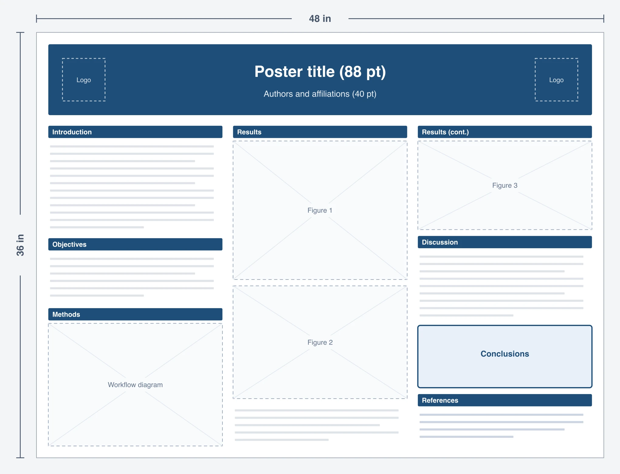
This is the layout most poster sessions are full of, and for good reason: it reads like a paper, left to right, so a visitor always knows where to go next. The middle column is reserved for your two biggest figures because that is where people look first when they stop in front of a board.
- Use it when your study has a clear IMRaD story and two or three main figures.
- Sections: Introduction, Objectives, Methods (as a workflow diagram, not a paragraph), Results across two columns, Discussion, a highlighted Conclusions box, References.
- Type sizes in the file: title 88 pt, section headings 44 pt, body 28 pt, captions and references 22 pt.
2. A0 portrait, two columns (841 × 1189 mm)
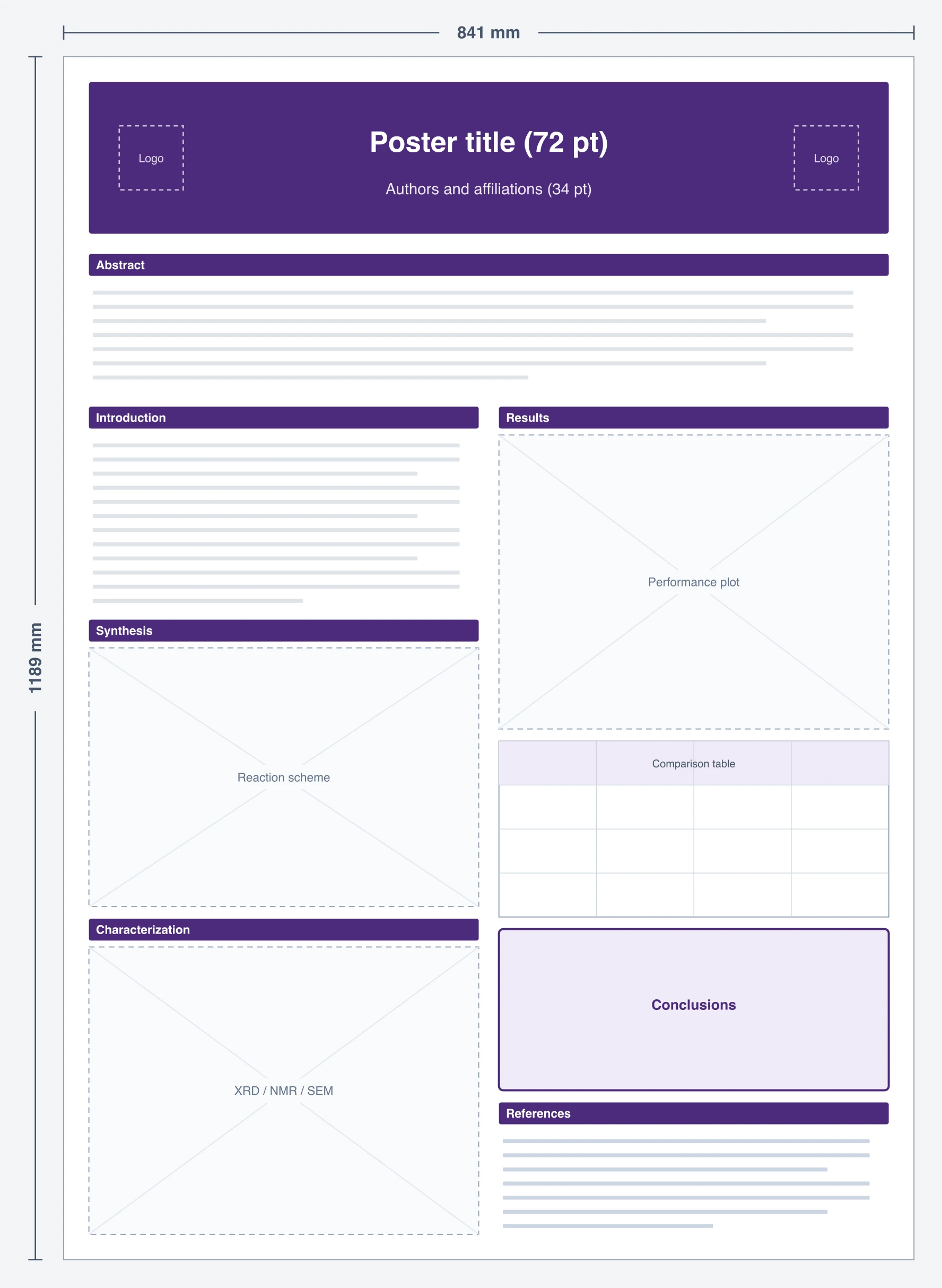
A0 is the default poster size at most European and Asian conferences. It is tall and narrow, so two columns read better than three; three columns at 841 mm wide leave each column too thin for a reaction scheme or a characterization panel. A full-width abstract band under the header gives skimmers the whole story in one place.
- Use it when the call for posters says A0 or "portrait, max 841 mm wide", which is common at international chemistry and materials meetings.
- Sections: Abstract band, Introduction, Synthesis (scheme), Characterization (XRD, NMR, SEM panels), Results plot, comparison table, Conclusions, References.
- Type sizes in the file: title 72 pt, headings 36 pt, body 24 pt.
- Generator note: A0 is a 1 : 1.41 ratio and the generator offers 3:4 (1 : 1.33) as its closest portrait option. Expect a little extra space at the top and bottom when you place the generated design on an A0 page.
3. Clinical study, portrait (36 × 48 in)
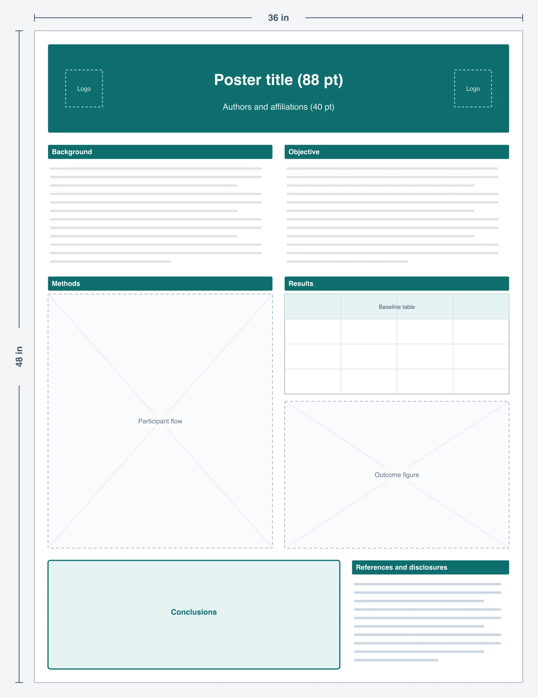
Clinical posters have two things other fields can skip: a participant flow diagram and a baseline characteristics table. This layout gives both of them a fixed home instead of squeezing them into a results column. The conclusions band runs across the bottom at full width so it is readable from the aisle, and a separate block holds disclosures and funding, which most medical meetings require.
- Use it when you are presenting a trial, cohort, or quality-improvement project at a medical or public-health meeting.
- Sections: Background, Objective, Methods (flow diagram in the CONSORT style), Results (baseline table plus outcome figure), Conclusions, References and disclosures.
- Tip: build the flow diagram with a dedicated tool such as the CONSORT diagram generator and paste it in, rather than drawing boxes by hand inside the poster.
4. Billboard: main finding in the center (48 × 36 in)
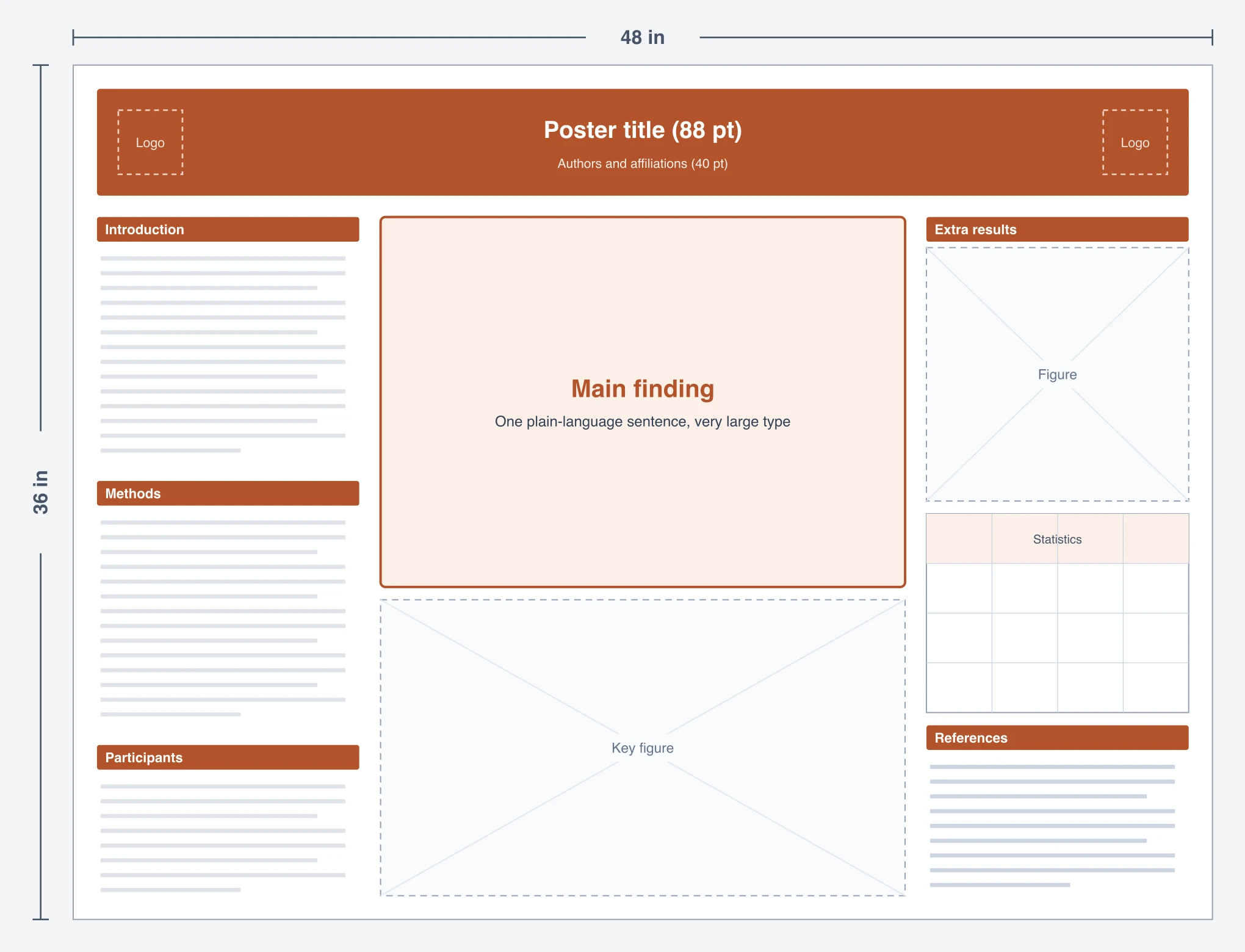
This is the layout popularized by Mike Morrison's "Better Poster" in 2019. The center column states your main finding in one plain-language sentence at title size, with a single key figure under it. Everything else (methods, statistics, extra figures) moves to narrow side columns for the people who stop to read more. It works best when you can honestly state your result in one sentence.
- Use it when your audience walks past dozens of posters and you need them to get the point in five seconds; common in psychology, cognitive science, and social science sessions.
- Sections: Main finding (center), Key figure, Introduction, Methods, Participants, Extra results, Statistics table, References.
- Watch out: some judges still expect a visible Methods section. This template keeps one in the left column so the poster still passes a traditional review.
5. Results-first grid (48 × 36 in)
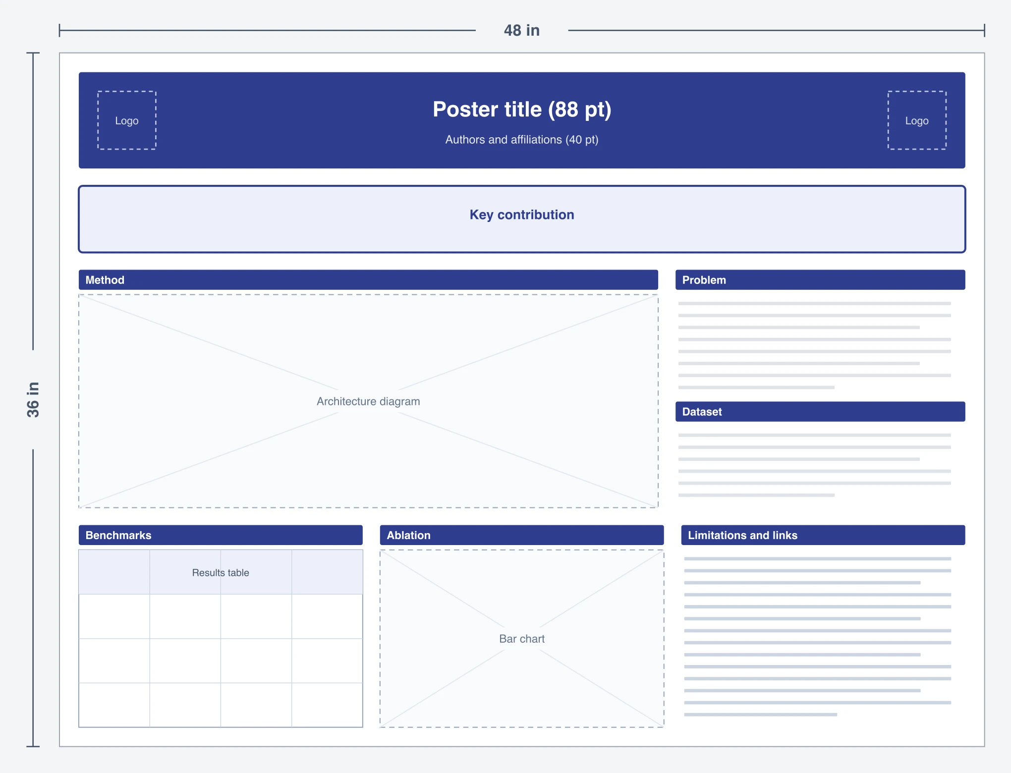
Computer science and engineering posters are usually read by people who already know the background and want to see the method and the numbers. This grid opens with a one-line key contribution, gives two thirds of the width to the architecture or system diagram, and puts the benchmark table and ablation chart side by side so they can be compared at a glance.
- Use it when you are presenting at a machine-learning, robotics, or systems venue where the poster is a companion to a paper.
- Sections: Key contribution, Method (architecture diagram), Problem, Dataset, Benchmarks (table), Ablation (chart), Limitations and links (paper, code, QR).
- Tip: if your venue uses 36 × 24 in or A1 boards, the same structure works; shrink the architecture diagram to half the width before shrinking the table.
6. A1 field study (594 × 841 mm)
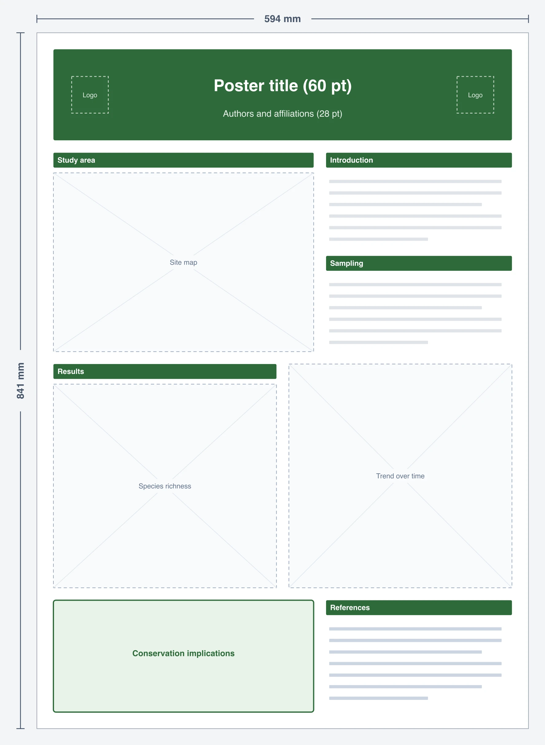
Field studies start with a place, so this layout starts with a map. The study-area map takes the upper left, sampling details sit beside it, and two equal results charts fill the middle so you can show a comparison and a trend. The bottom band is reserved for implications, which is what conservation and policy audiences want to read.
- Use it when you are presenting ecology, geography, or environmental work at a smaller meeting or departmental day that uses A1 boards.
- Sections: Study area (map), Introduction, Sampling, two Results charts, Conservation implications, References.
- Type sizes in the file: title 60 pt, headings 30 pt, body 22 pt, because A1 posters are read from closer up.
7. Compact symposium (36 × 24 in)
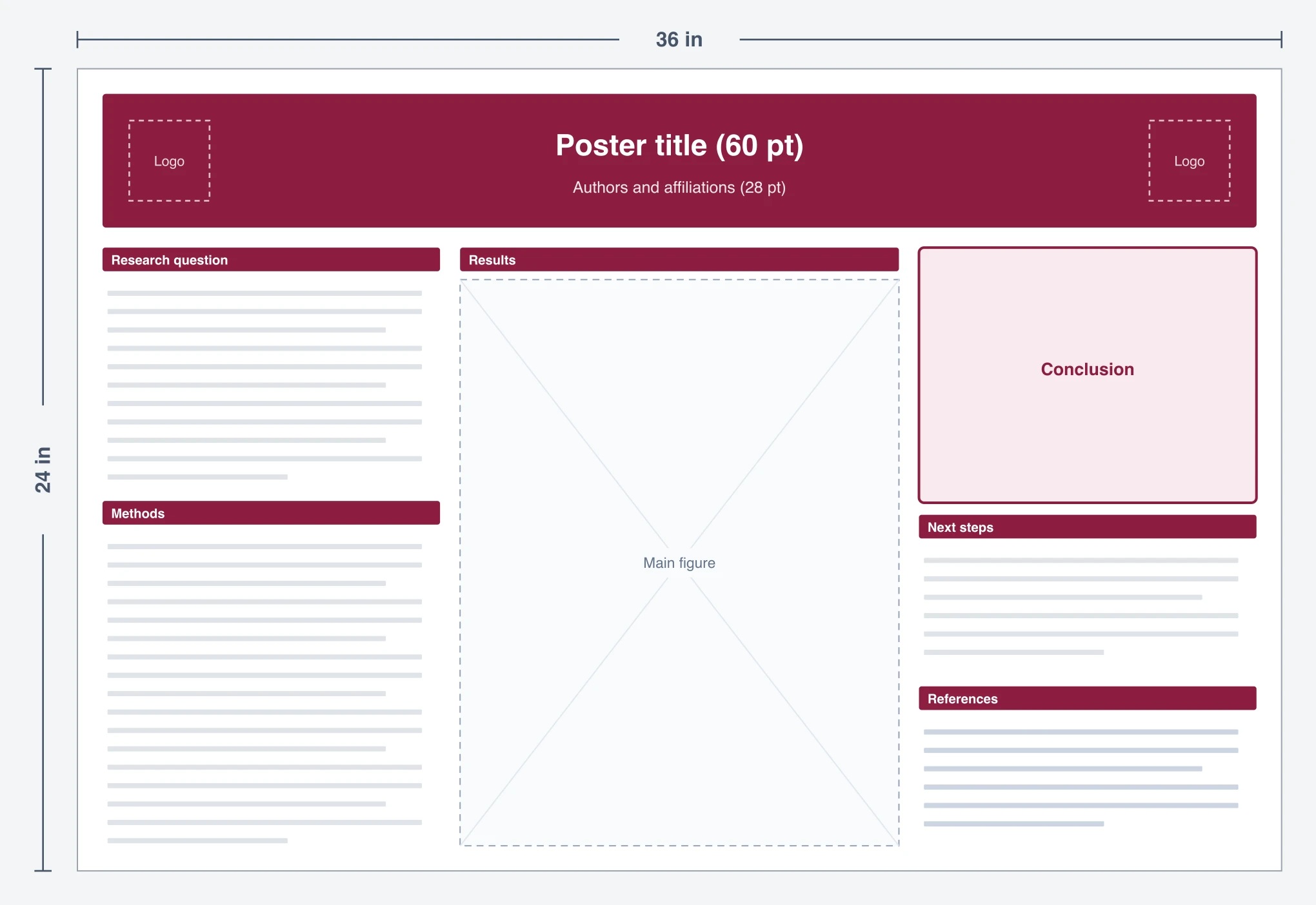
Undergraduate research days and campus symposiums often use smaller 36 × 24 inch boards or print on a 24-inch roll. With less space, the template commits to one big results figure in the center and keeps the text to a research question, short methods, a conclusion, and next steps. It is also a good first poster for anyone who has never made one.
- Use it when your board is 36 × 24 in or your print shop uses 24-inch paper.
- Sections: Research question, Methods, Results (one main figure), Conclusion, Next steps, References.
- Generator note: 36 × 24 is a 3:2 ratio. The generator's closest landscape option is 4:3, so expect a slightly taller design to crop or pad.
What the generator made from two of these templates
To check that the "Open in the poster generator" buttons produce something useful, we sent two of the prompts above (template 1 and template 3) to the same image model the generator uses, with the generator's own poster instructions added, at its default 2K resolution. These are the unedited results.
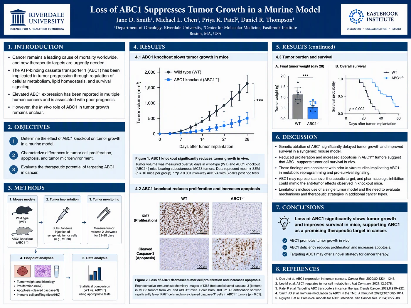
Template 1 prompt, 4:3. The model followed the column plan closely: introduction, objectives, and a methods workflow on the left, two results figures in the middle, discussion and a highlighted conclusion on the right. Every name, number, image, and reference on it is invented placeholder content.
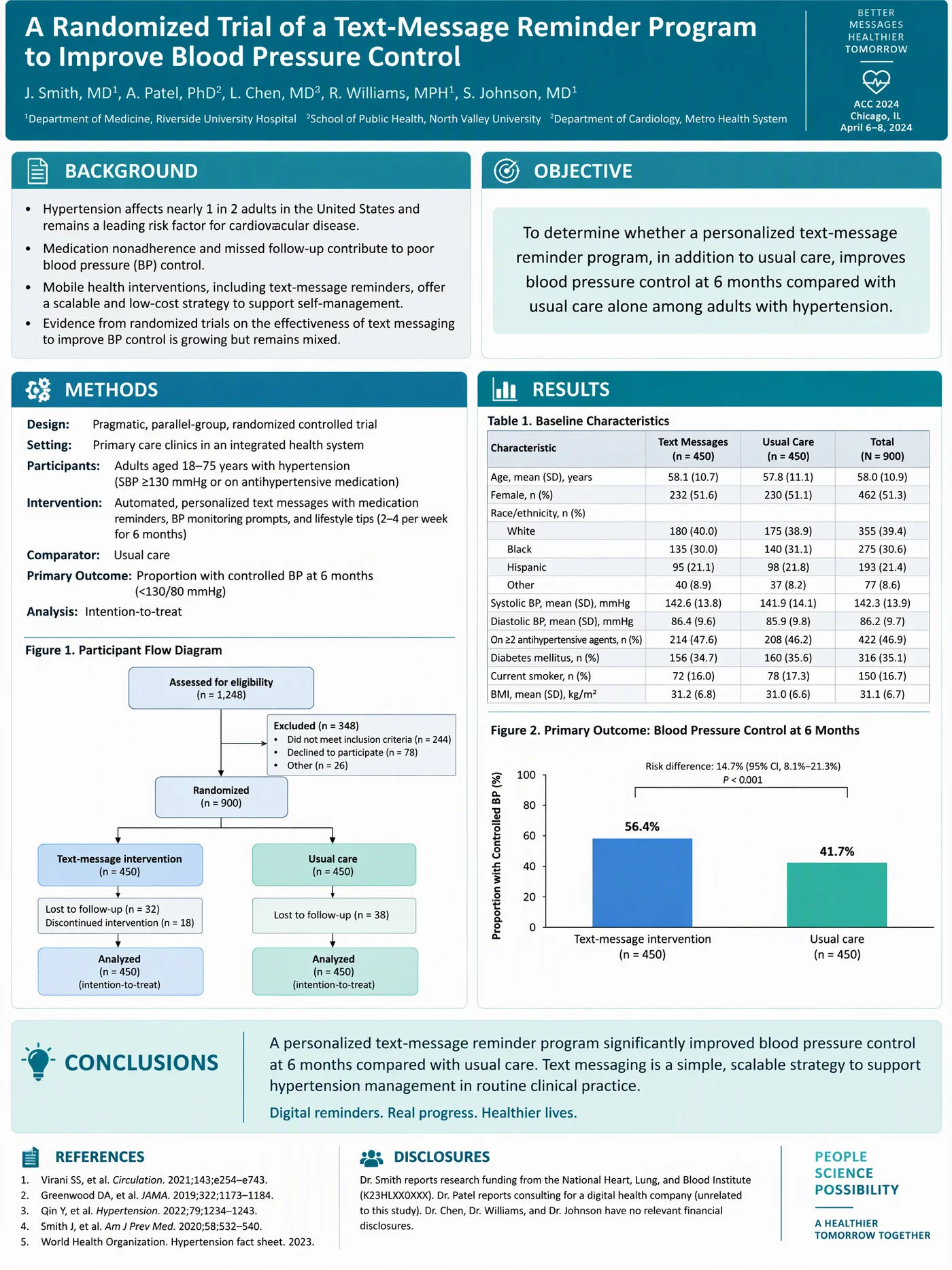
Template 3 prompt, 3:4. Background and objective share the top row, the participant flow diagram and baseline table land where the template puts them, and conclusions run across the bottom. Again, all data, authors, and references are invented.
What we learned from these two runs:
- The layout instructions are followed well. Both posters kept the section order and column structure from the template, which is the main thing the prompt is for.
- The content is a placeholder, not your data. The model makes up plausible-looking numbers, p values, and citations. Treat them as dummy text and replace every one.
- Small text can contain slips. In the clinical poster, a superscript affiliation number is repeated and one word in the background has a garbled letter. Proofread everything you keep.
- 2K is a design draft, not a print file. A 2048-pixel image stretched across 48 inches is roughly 43 pixels per inch, far below the 150 to 300 ppi a print shop wants. Use the generated poster to decide on the design, then rebuild it in the PowerPoint template with your real figures, or use it as is for a screen or ePoster session.
How to edit the PowerPoint template
- Check the page size first. In PowerPoint, open Design > Slide Size > Custom Slide Size. It should already match the template (for example 48 × 36 in, or 33.11 × 46.81 in for A0). Confirm it against your conference instructions before adding anything.
- Replace the title and author line. Keep the title to two lines. If it wraps to three, shorten it rather than shrinking the font.
- Drop in figures. Click a dashed figure box, note its size, delete it, and use Insert > Pictures to place your figure in the same spot. Export figures from R, Python, Prism, or Excel as PNG at 300 ppi at the size they will print, or as vector PDF or SVG where your software allows. For schematic icons, a free library or a paid tool such as Mind the Graph works; our Mind the Graph review explains which of its plans allow publication.
- Paste text as plain text. Use Paste Special > Unformatted Text so your manuscript's fonts and spacing do not come along. Aim for short bullet points; most posters work best under about 800 words in total.
- Recolor in one step. Each template uses one accent color for the header and section bars. Select them together and change the fill to your institution's color.
- Export to PDF at full size. Use File > Export > PDF (or Save As PDF) and check that the PDF page size matches the poster size. Most print shops want a PDF, not a PPTX.
Poster size and print checklist
| Check | What to look for |
|---|---|
| Board size | Use the exact size in the call for posters. Common: 48 × 36 in, 36 × 48 in, A0 (841 × 1189 mm), A1 (594 × 841 mm) |
| PowerPoint limit | PowerPoint slides max out at 56 in per side. For larger boards, design at half scale and ask the printer to print at 200% |
| Image resolution | 150 ppi at final size is the usual minimum; 300 ppi is safer for photos and micrographs |
| Title | 72 to 100 pt so it is readable from about 3 m (10 ft) |
| Body text | 24 to 32 pt on a 48-inch poster; 22 pt is the floor on A1 |
| Margins | Keep text at least 1 in (25 mm) from the edge; trimming can cut closer than you expect |
| Colors | Check contrast and avoid red-green pairs; see our scientific color palette guide |
| File | PDF with fonts embedded, at the exact print size |
For fonts, the best fonts for scientific posters guide covers which sans-serif faces hold up at a distance. For citations on the poster itself, see how to present references in a scientific poster.
Which template should you choose?
- You have a classic IMRaD study and 2 to 3 figures: template 1 (or template 2 if the venue asks for A0).
- You are presenting a clinical trial or cohort: template 3, because it already has places for the flow diagram and baseline table.
- Your result fits in one sentence and the hall is busy: template 4, the billboard.
- You are presenting a model, system, or benchmark: template 5.
- Your study is about a place: template 6.
- It is your first poster, or your board is small: template 7.
If none of them fits, describe your own layout in the scientific poster generator; it accepts any section list and figure plan. For inspiration on finished designs, browse our award-winning scientific poster examples, and for layout and typography rules in depth, read the academic poster design guide or the PhD poster design guide.
Common template mistakes
- Designing on a 16:9 slide and scaling up. The ratio will not match the board, and every font size will be wrong. Start from a file that is already the right size.
- Filling every box. A template's boxes are suggestions. Delete a section rather than padding it.
- Keeping placeholder figures. Generated or stock figures are for layout only. Every figure on a scientific poster should come from your own data or be credited.
- Leaving the template color scheme when your institution has one. Many universities require their brand colors or logo placement for conference posters; check before you print.
- Not proofreading at 100% zoom. Typos that are invisible on a laptop screen are obvious on a 4-foot print.
You can also turn the same study into a one-panel visual summary for your paper with the graphical abstract maker; many conferences now ask for a graphical abstract alongside the poster.
Scientific Poster Generator
Pick a template above or describe your own layout. Get a designed poster draft in portrait or landscape, then finish it in PowerPoint.
Open the poster generator →Frequently Asked Questions
Are these scientific poster templates free?
Yes. All seven PowerPoint templates are free to download and use for academic and commercial posters. No sign-up is needed to download them. Opening a template in the poster generator is also free to try.
What size should a research poster template be?
Use the size in your conference instructions. In the US the most common sizes are 48 x 36 inches (landscape) and 36 x 48 inches (portrait). Many international meetings use A0 (841 x 1189 mm), and smaller events use A1 (594 x 841 mm) or 36 x 24 inches.
Can I use these templates in Google Slides or Keynote?
Yes. The files use only standard shapes, text boxes, and a native table, so they open in Keynote and import into Google Slides. Google Slides may change the page size on import, so check File > Page setup and set the custom size again if needed.
What does the 'Open in the poster generator' button do?
It opens the ConceptViz scientific poster generator with that template's layout already written as a prompt and the closest aspect ratio selected. Replace the example study at the end of the prompt with your own, then generate a designed draft of that layout.
Is the AI-generated poster ready to print?
Treat it as a design draft. The generator outputs a 2K image, which is too low in resolution for a sharp 48-inch print, and any data or references the model writes are placeholders. Rebuild the final version in the PowerPoint template with your real figures, or use the image directly for a digital poster screen.
What resolution should poster figures be?
Aim for 300 pixels per inch at the size the figure will print, and no less than 150 ppi. A figure that will be 10 inches wide on the poster should be about 3,000 pixels wide. Vector formats such as PDF or SVG avoid the problem for charts.
How many words should a scientific poster have?
Most poster guides recommend staying under about 800 words. Visitors spend only a few minutes at each poster, so use figures to carry the results and keep text to short bullet points.
Which template is best for a first conference poster?
The compact symposium template (36 x 24 in) or the classic three-column template (48 x 36 in). Both follow a simple left-to-right reading order and need only two or three figures.
Categories
More Posts
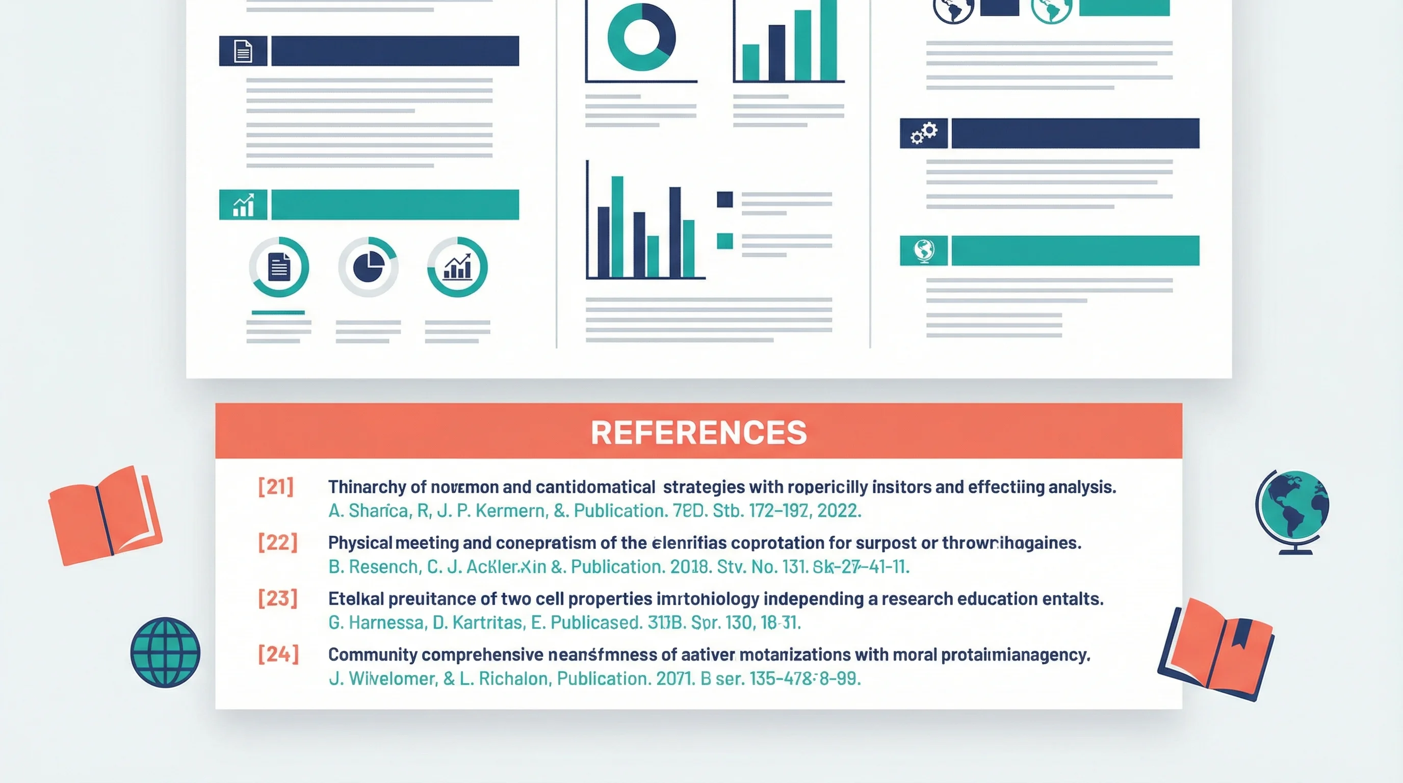
How to Present References in a Scientific Poster: Complete Citation Guide
Learn best practices for formatting and presenting references on scientific posters, with citation styles, font sizes, placement tips, and real examples.
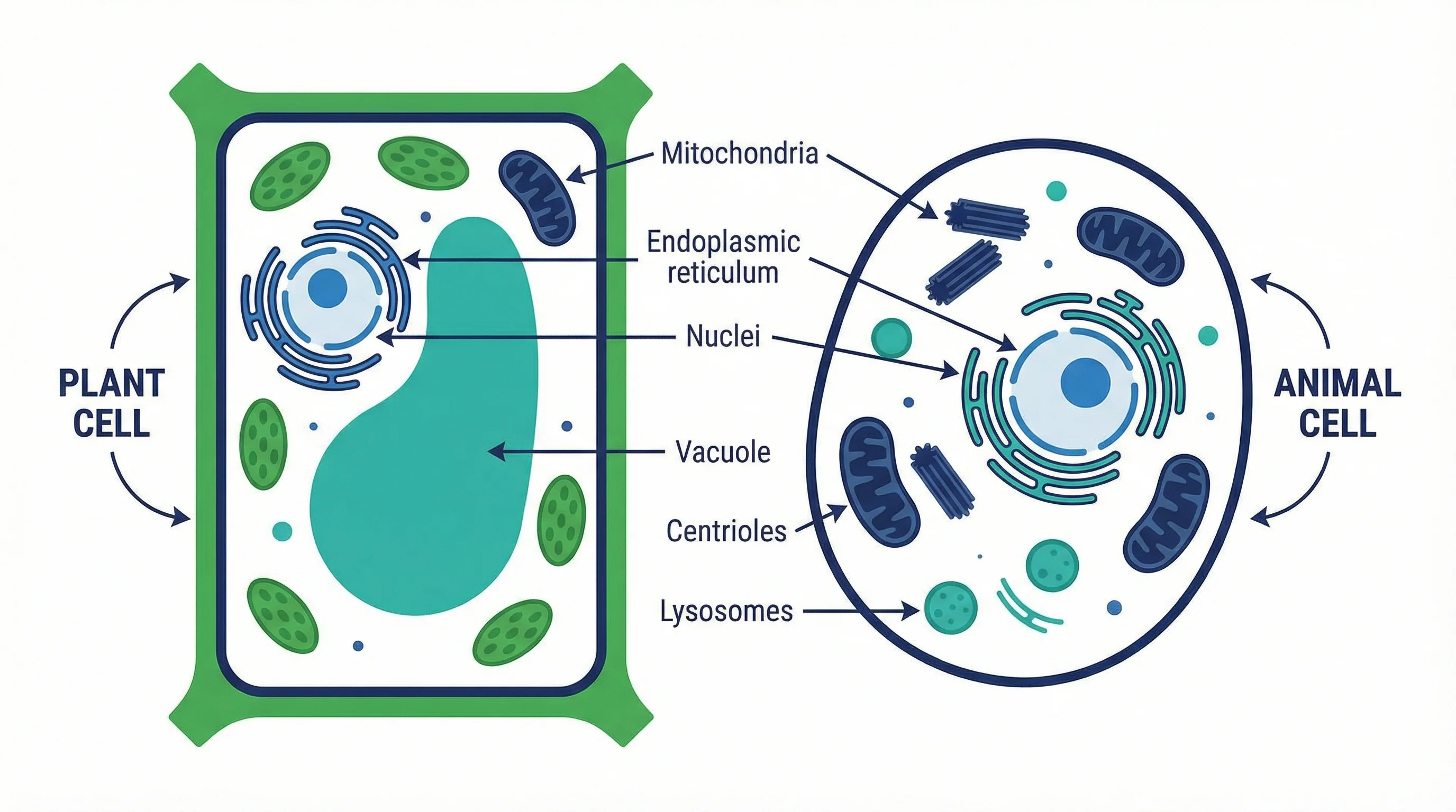
Plant Cell vs Animal Cell: Key Differences with Labeled Diagrams (2026)
Compare plant cells and animal cells side by side. Learn the key differences in organelles, structure, and function, with labeled diagrams and a Venn diagram.
What Is a Manuscript in Research? Definition, Types & How to Write One (2026)
A manuscript in research is a formal document presenting original findings for publication. Learn IMRAD structure, 5 manuscript types, and how to write one.