
Best Scientific Color Palettes: Hex Codes & Examples
Compare Okabe-Ito, Viridis, Paul Tol and other scientific color palettes for research figures. Includes colorblind-safe hex codes, use cases and code snippets.
Best Scientific Color Palettes: Quick Reference
Need a scientific color palette for a research paper, poster, or journal figure? Start with Okabe-Ito for categories, Viridis for continuous data, and Paul Tol palettes for publication-ready qualitative and diverging charts.
| Palette | Best For | Why Use It |
|---|---|---|
| Okabe-Ito | Categorical groups | Colorblind-safe, widely used in scientific figures |
| Viridis | Sequential data | Perceptually uniform and readable in grayscale |
| Paul Tol | Qualitative and diverging charts | Publication-friendly color sets with clear contrast |
| Scientific Colour Maps | Geoscience and continuous fields | Designed to avoid misleading visual gradients |
Below the quick reference, you'll find copy-ready hex codes, Python/R examples, and practical guidance on choosing the right palette for your data.
Scientific Color Palette Generator
Generate colorblind-safe palettes for your research figures. Export hex codes, RGB values, and more.
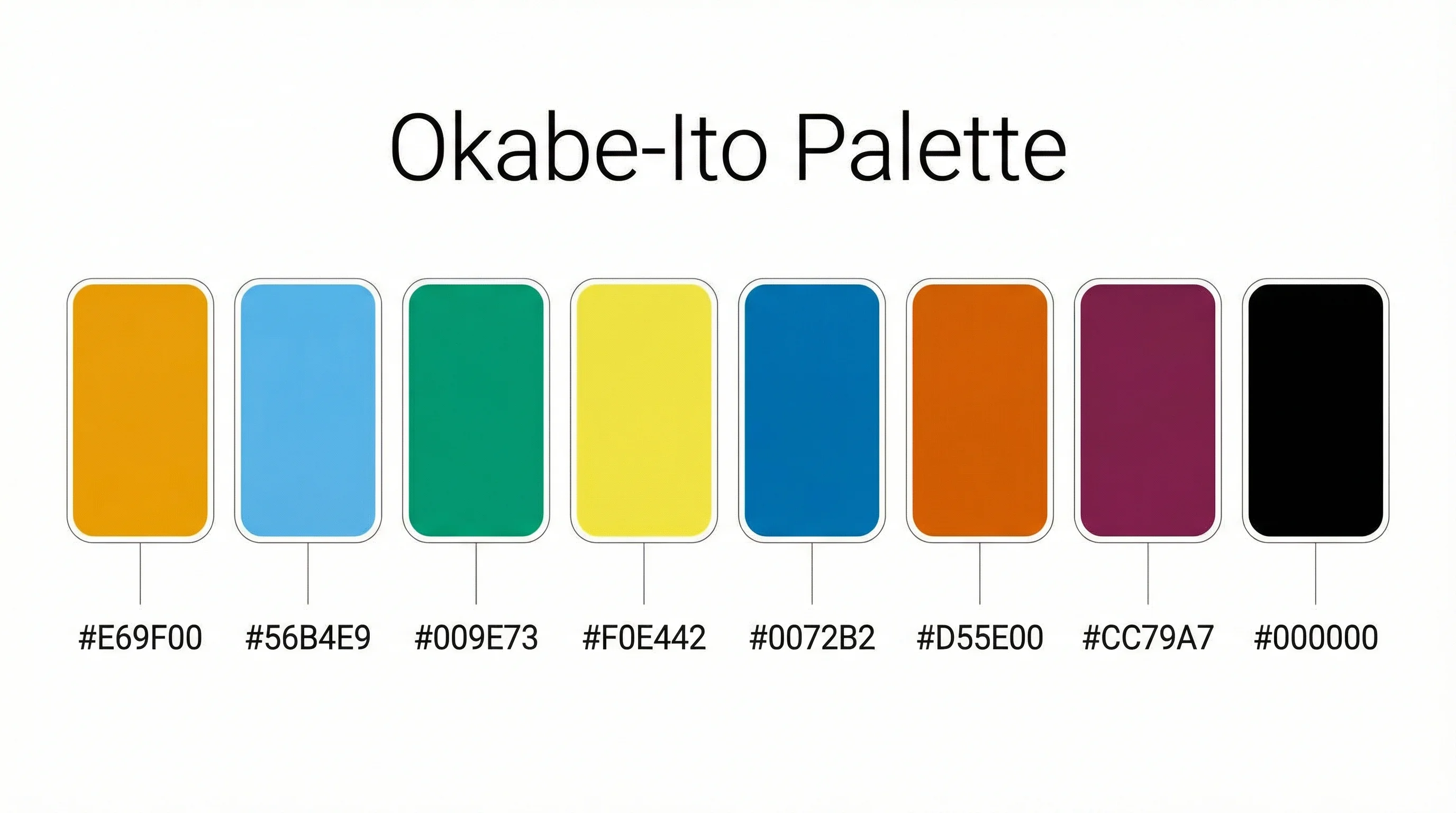
Try it free →Okabe-Ito Palette: Hex Codes & Usage
The Okabe-Ito palette is the gold standard colorblind-friendly categorical color palette for scientific figures. Developed by Masataka Okabe and Kei Ito, it is explicitly recommended by Nature Methods (also known as the Wong palette) and is the default in Claus Wilke's "Fundamentals of Data Visualization."
Okabe-Ito Complete Hex Code Reference
| Color | Hex Code | RGB | Usage |
|---|---|---|---|
| Orange | #E69F00 | rgb(230, 159, 0) | Primary category |
| Sky Blue | #56B4E9 | rgb(86, 180, 233) | Secondary category |
| Bluish Green | #009E73 | rgb(0, 158, 115) | Third category |
| Yellow | #F0E442 | rgb(240, 228, 66) | Fourth category |
| Blue | #0072B2 | rgb(0, 114, 178) | Fifth category |
| Vermillion | #D55E00 | rgb(213, 94, 0) | Sixth category |
| Reddish Purple | #CC79A7 | rgb(204, 121, 167) | Seventh category |
| Black | #000000 | rgb(0, 0, 0) | Eighth category / text |
Why the Okabe-Ito Palette Works
These 8 colors remain distinguishable for people with all common types of color vision deficiency (CVD), including protanopia, deuteranopia, and tritanopia. Approximately 8% of men have some form of color blindness, making this palette essential for accessible scientific communication.
Key advantages of the Okabe-Ito palette:
- Designed specifically for color vision deficiency -- not just "tested" after the fact
- Each color has distinct luminance, so the palette works in grayscale too
- Recommended by Nature, Science, and other top journals
- Works in Python (matplotlib), R (ggplot2), MATLAB, and all major visualization tools
How to Use the Okabe-Ito Palette
Python (matplotlib):
okabe_ito = ['#E69F00', '#56B4E9', '#009E73', '#F0E442',
             '#0072B2', '#D55E00', '#CC79A7', '#000000']
R (ggplot2):
okabe_ito <- c("#E69F00", "#56B4E9", "#009E73", "#F0E442",
               "#0072B2", "#D55E00", "#CC79A7", "#000000")
ggplot(data) + scale_color_manual(values = okabe_ito)
CSS / Web:
--okabe-orange: #E69F00;
--okabe-sky-blue: #56B4E9;
--okabe-green: #009E73;
--okabe-yellow: #F0E442;
--okabe-blue: #0072B2;
--okabe-vermillion: #D55E00;
--okabe-purple: #CC79A7;
--okabe-black: #000000;
Why Color Choice Matters in Science
Color choice in scientific figures isn't just about aesthetics -- it directly affects how your research is understood, interpreted, and even whether it gets published.
Research shows that figures are often the first thing readers look at when evaluating a paper. According to studies published in PLOS ONE and eLife, papers with clear, well-designed figures receive significantly more citations.
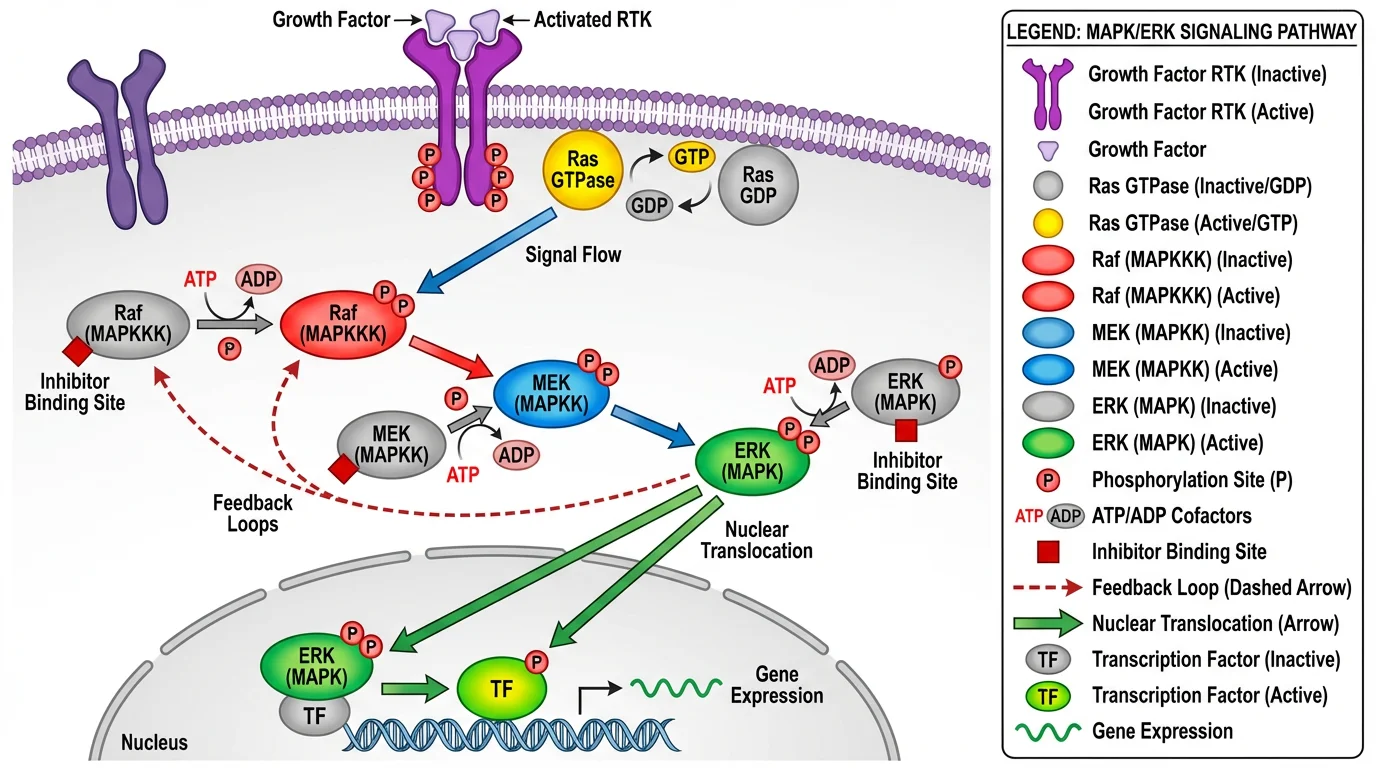 A well-designed signaling pathway diagram using a balanced, accessible color palette. Notice how distinct colors separate different elements while maintaining visual harmony.
The impact of color choice:
| Factor | Poor Color Choice | Good Color Choice |
|---|---|---|
| Readability | Confusing, hard to interpret | Clear, intuitive understanding |
| Accessibility | Excludes 8% of male readers (colorblind) | Inclusive for all viewers |
| Print Quality | Colors shift or disappear in grayscale | Maintains clarity in any format |
| Credibility | Appears amateur or misleading | Professional, trustworthy appearance |
| Publication | May be rejected or require revision | Meets journal standards |
The Three Types of Scientific Color Palettes
Before choosing specific colors, you need to understand which type of palette fits your data. There are three main categories:
1. Sequential Palettes
Best for: Data that goes from low to high values (temperature, concentration, intensity)
Sequential palettes use a gradient of colors ranging from light to dark (or low to high saturation). They're ideal for representing continuous data with a natural order.
Examples: Viridis, Magma, Inferno, Plasma, Blues, Greens
When to use:
- Heatmaps showing gene expression levels
- Maps showing population density
- Microscopy intensity data
- Any single-variable gradient
2. Diverging Palettes
Best for: Data with a meaningful center point (positive/negative, above/below average)
Diverging palettes have a neutral color in the middle and contrasting colors at both ends. They highlight how data deviates from a central value.
Examples: Red-Blue, Purple-Green, Brown-Teal
When to use:
- Showing data above/below a threshold
- Correlation matrices (positive vs. negative)
- Change from baseline measurements
- Temperature anomalies (warmer/cooler than average)
3. Qualitative (Categorical) Palettes
Best for: Distinguishing different categories or groups
Qualitative palettes use distinct colors that don't imply any order or relationship. Each color should be equally visually prominent.
Examples: Okabe-Ito, Paul Tol, Set1, Paired
When to use:
- Different experimental groups
- Multiple cell types or species
- Categorical variables in bar charts
- Legend items that need clear distinction
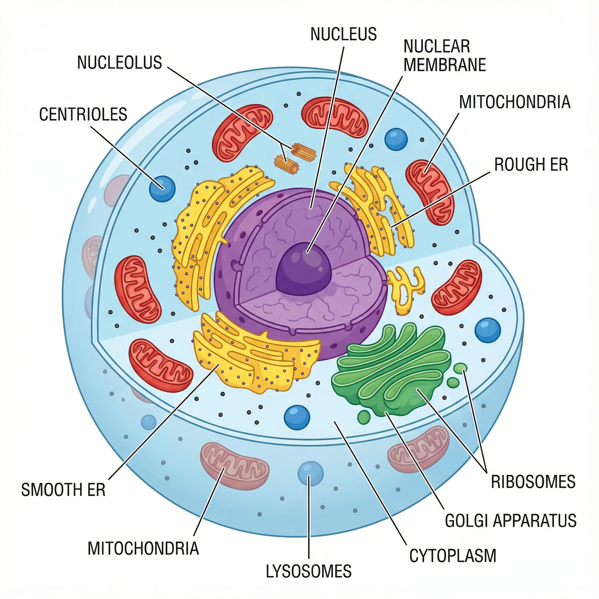 A cell diagram using categorical colors to distinguish different organelles. Each structure has a distinct color that's easy to identify and remember.
5 More Recommended Scientific Color Palettes
Beyond Okabe-Ito, here are the other most widely recommended color palettes for scientific visualization, with specific hex codes you can use immediately.
1. Viridis Family (Best for Sequential Data)
The Viridis color maps were designed by Stéfan van der Walt and Nathaniel Smith for Matplotlib. They are:
- Perceptually uniform — equal steps in data appear as equal steps in color
- Colorblind-friendly — readable by people with CVD
- Print-safe — maintain clarity when printed in grayscale
| Palette | Character | Best For |
|---|---|---|
| Viridis | Blue → Green → Yellow | General purpose, most versatile |
| Magma | Black → Purple → Orange → White | High contrast, dramatic effect |
| Inferno | Black → Purple → Orange → Yellow | Similar to Magma, warmer tones |
| Plasma | Purple → Pink → Orange → Yellow | No black, good for 3D surfaces |
| Cividis | Blue → Yellow | Optimized for CVD, very safe |
How to use: These are available in Python (matplotlib), R (viridis package), MATLAB, and most visualization tools.
2. Scientific Colour Maps by Fabio Crameri
Fabio Crameri's Scientific Colour Maps are specifically designed for scientific visualization. They include 50+ color maps that are:
- Perceptually uniform
- Colorblind-friendly
- Readable in grayscale
- Free to download for any software
Popular options:
- batlow — Blue → Yellow → Red (universal sequential)
- roma — Diverging, CVD-safe
- vik — Blue → White → Red diverging
These are available for MatLab, Python, R, GMT, QGIS, Paraview, Illustrator, and more.
3. Paul Tol's Color Schemes
Paul Tol's schemes provide comprehensive options for all three palette types. They're designed by a scientist for scientists and include:
- Bright — High contrast categorical (7 colors)
- Vibrant — Saturated categorical (7 colors)
- Muted — Softer categorical (9 colors)
- Light — Pastel categorical (9 colors)
- Sunset/BuRd — Diverging options
- YlOrBr/Iridescent — Sequential options
4. ColorBrewer Palettes
ColorBrewer was originally designed for cartography but is now widely used in science. Key features:
- Interactive web tool for choosing palettes
- Built-in colorblind-safe filter
- Print-friendly options
- Export to various formats
Recommended ColorBrewer palettes:
- Sequential: YlGnBu, PuBuGn, BuPu
- Diverging: RdBu, PiYG, PRGn
- Qualitative: Set2, Paired, Dark2
5. Nature-Recommended Wong Palette
Bang Wong's palette, published in Nature Methods, is the same set of colors as the Okabe-Ito palette described above. It is explicitly recommended by Nature journals for all scientific figures. See the complete Okabe-Ito hex code table at the top of this page for all 8 colors with hex codes and RGB values.
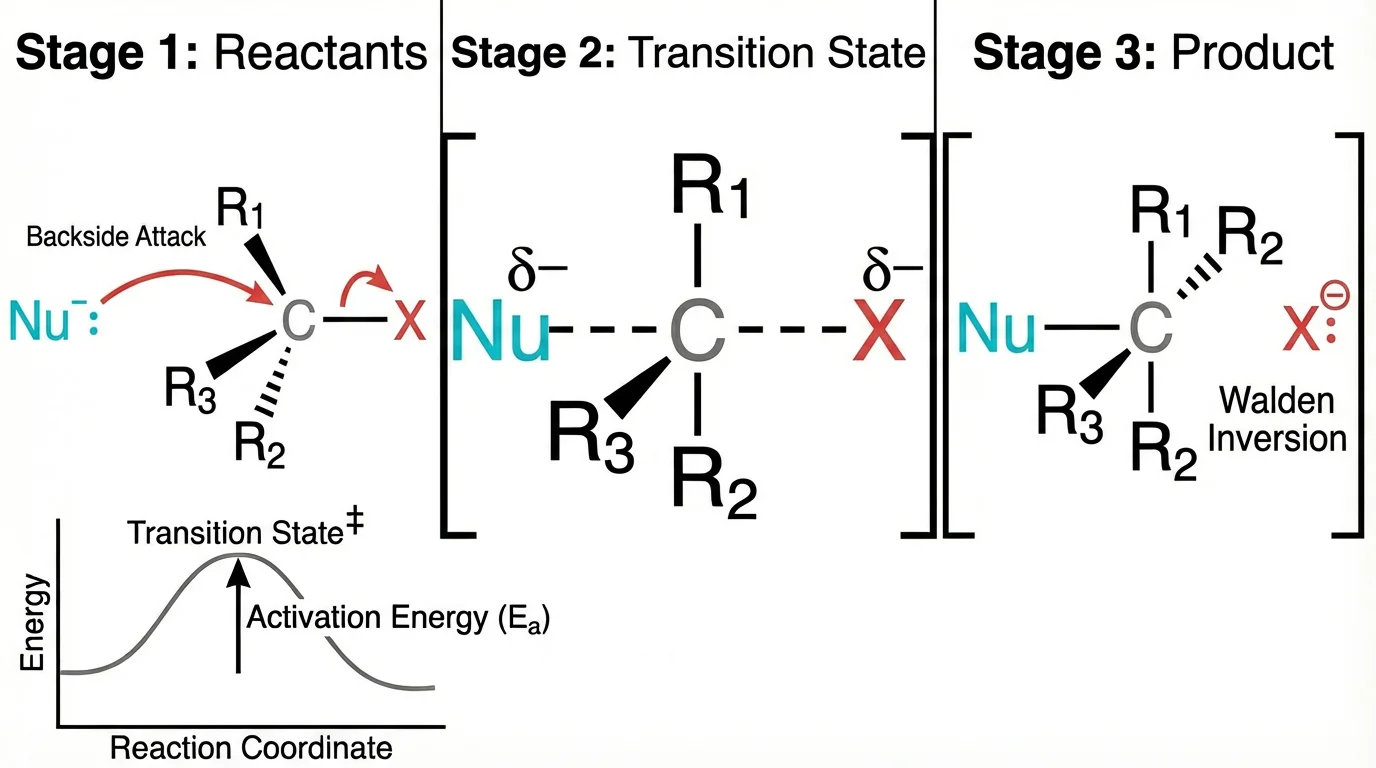 A chemistry reaction mechanism using clear, distinguishable colors. The color choices help readers follow the electron movement without confusion.
Designing for Colorblind Readers
Approximately 8% of men and 0.5% of women have some form of color vision deficiency. This means in a conference room of 50 scientists, 4 people likely can't see your red-green color scheme properly.
Colors to Avoid Together
| Problematic Combination | Why It Fails | Better Alternative |
|---|---|---|
| Red + Green | Most common CVD affects red-green distinction | Blue + Orange |
| Green + Brown | Can appear identical | Blue + Brown |
| Blue + Purple | Difficult for tritanopia | Blue + Orange |
| Light Green + Yellow | Low contrast | Dark Green + Yellow |
| Red + Orange | Too similar for protanopia | Blue + Orange |
Safe Color Combinations
These combinations work for virtually all types of color blindness:
- Blue + Orange — The safest combination, universally distinguishable
- Blue + Red — Good contrast, works for most CVD types
- Blue + Yellow — High contrast, CVD-safe
- Purple + Yellow — Distinctive and accessible
Beyond Color: Multiple Encoding
When you need more than 3-4 categories, use multiple encoding — combine color with other visual elements:
- Shapes: Circles, squares, triangles, diamonds
- Line styles: Solid, dashed, dotted
- Fill patterns: Solid, hatched, crossed
- Size variation: Different point sizes
This ensures your figure remains readable even in grayscale or for colorblind readers.
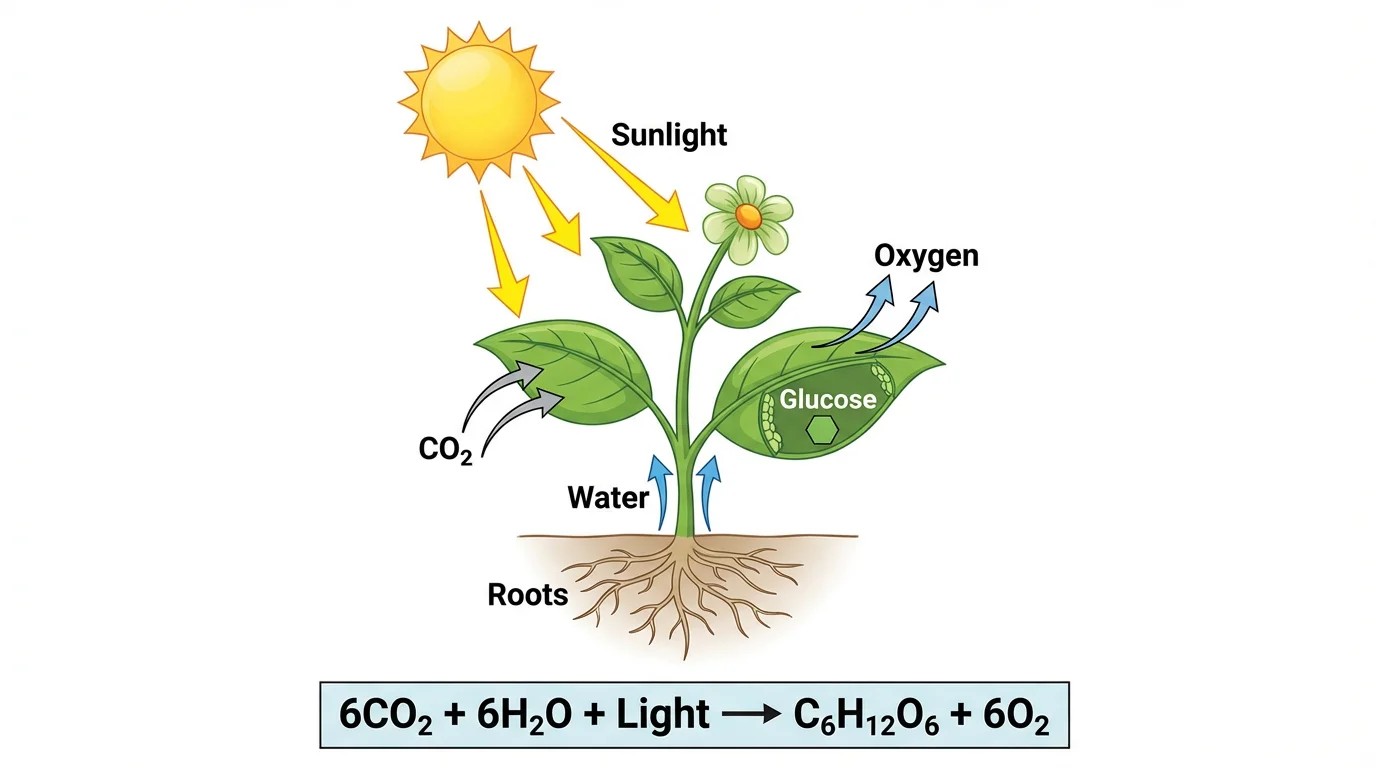 A photosynthesis diagram demonstrating effective use of color hierarchy — primary processes are highlighted while supporting elements use softer tones.
Journal Requirements: Nature, Science, and More
Nature Journals
According to Nature's figure guidelines:
Color Mode:
- Submit figures in RGB (not CMYK)
- RGB provides a wider color gamut for online viewing
- Colors are automatically converted to CMYK for print
Accessibility Requirements:
- Avoid red-green combinations
- Rainbow color scales are not recommended
- Use an accessible color palette (Wong 2011 is explicitly recommended)
- For fluorescence images, use green + magenta instead of red + green
Practical Specifications:
- Single column: 89mm wide
- Double column: 183mm wide
- Font size: 5-7pt at final size
- Resolution: 300 DPI for images
Science Magazine
Science follows similar guidelines:
- Colorblind-friendly palettes required
- Sequential data should use perceptually uniform color maps
- Avoid pure red/green for critical distinctions
Cell Press
Cell journals emphasize:
- High contrast between adjacent colors
- Consistent color coding across figures
- Clear legends with color swatches
Common Color Mistakes (and How to Fix Them)
Mistake 1: Using Rainbow/Jet Color Maps
The problem: Rainbow color maps (red → yellow → green → blue) are perceptually non-uniform. The yellow and cyan bands appear brighter, creating artificial "bands" in your data that don't exist.
The fix: Replace with Viridis, Magma, or any perceptually uniform alternative.
Mistake 2: Too Many Colors
The problem: Using 10+ distinct colors makes it impossible for readers to remember which is which.
The fix:
- Limit to 6 colors maximum for categories
- Group similar items under the same color
- Use shades of a single color when possible
Mistake 3: Inconsistent Colors Across Figures
The problem: Using blue for "Control" in Figure 1 but red for "Control" in Figure 2 confuses readers.
The fix: Create a color key at the start of your project and stick to it throughout the paper.
Mistake 4: Low Contrast
The problem: Light colors on white backgrounds, or similar colors adjacent to each other.
The fix:
- Test your figure in grayscale — if you can't distinguish elements, neither can some of your readers
- Ensure sufficient luminance contrast between elements
Mistake 5: Colored Text Labels
The problem: Colored text is harder to read and prints poorly.
The fix: Use black text with colored boxes or lines connecting to the relevant data.
Tools for Choosing and Testing Colors
Palette Selection Tools
| Tool | Best For | Link |
|---|---|---|
| ColorBrewer | Interactive palette selection with CVD filter | colorbrewer2.org |
| Viz Palette | Testing palettes for CVD and print | projects.susielu.com/viz-palette |
| Coolors | Generating custom palettes | coolors.co |
| Adobe Color | Advanced color theory tools | color.adobe.com |
Colorblind Simulation Tools
| Tool | Platform | Link |
|---|---|---|
| Color Oracle | Desktop (Win/Mac/Linux) | colororacle.org |
| Coblis | Web-based | color-blindness.com/coblis |
| Sim Daltonism | macOS/iOS | Mac App Store |
| NoCoffee | Chrome extension | Chrome Web Store |
Software-Specific Resources
Python:
import matplotlib.pyplot as plt
# Use viridis (default) or specify another
plt.imshow(data, cmap='viridis')  # or 'magma', 'plasma', 'inferno'
R:
library(viridis)
ggplot(data) + scale_color_viridis()

library(RColorBrewer)
display.brewer.all(colorblindFriendly = TRUE)
GraphPad Prism: Right-click on graph → Define color scheme → Colorblind safe
Quick Reference: Color Palette Decision Tree
Use this decision tree to choose the right palette type:
Is your data categorical (groups/types)?
├── YES → Use Qualitative palette (Okabe-Ito, Paul Tol)
│         └── More than 6 categories? Add shapes/patterns
│
└── NO → Is your data continuous?
         ├── Does it have a meaningful center point?
         │   ├── YES → Use Diverging palette (RdBu, vik)
         │   └── NO → Use Sequential palette (Viridis, Magma)
         │
         └── Does it need to print in grayscale?
             └── YES → Use high-contrast sequential (Viridis, Cividis)
Applying These Principles to Your Work
Whether you're creating figures for a research paper, designing a conference poster, or building educational materials, these color principles apply universally.
For researchers creating scientific diagrams, tools like ConceptViz generate figures using scientifically-informed color schemes by default, ensuring your diagrams are both visually appealing and accessible. You can explore examples of properly colored scientific diagrams in our diagram tools collection.
For more guidance on creating publication-ready figures, see our guide on How to Make Scientific Diagrams for Research Papers.
Conclusion
Choosing the right color palette for your scientific figures isn't complicated once you understand the principles:
- Match palette type to data type — Sequential, Diverging, or Qualitative
- Prioritize accessibility — Use colorblind-friendly schemes like Okabe-Ito or Viridis
- Test your choices — Simulate colorblindness and grayscale printing
- Follow journal guidelines — Especially avoiding red-green combinations
- Keep it simple — 2-3 main colors is usually enough
Recommended palettes to start with:
- For categories: Okabe-Ito / Wong palette
- For continuous data: Viridis family
- For diverging data: ColorBrewer RdBu or Crameri's roma
Your figures should communicate your science clearly to all readers. Good color choices make that possible.
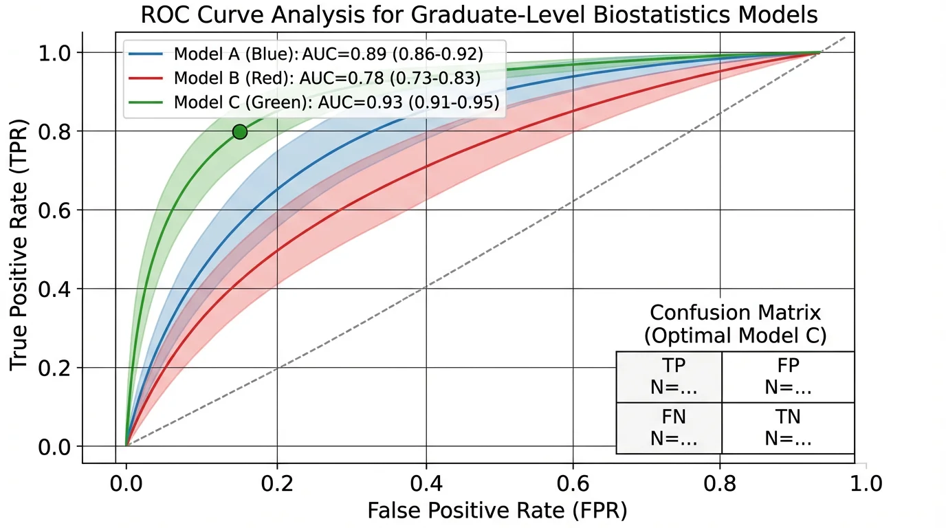 A ROC curve analysis using a clean, professional color scheme — demonstrating how even technical data visualizations benefit from thoughtful color choices.
Related Resources
- How to Make Scientific Diagrams for Research Papers
- Best Free BioRender Alternatives for Teachers
- Best Free Adobe Illustrator Alternatives for Teachers
- Science Diagram Tools
FAQ
Q: What is the best color palette for scientific figures? A: For categorical data, the Okabe-Ito palette is the gold standard — it's colorblind-friendly and recommended by Nature journals. For continuous/sequential data, the Viridis family (Viridis, Magma, Plasma, Inferno) is the most widely recommended choice due to perceptual uniformity and accessibility.
Q: Why should I avoid red and green together? A: Approximately 8% of men have red-green color blindness (protanopia or deuteranopia), making red-green combinations indistinguishable. Using blue-orange or blue-yellow instead ensures all readers can interpret your figures correctly.
Q: What color palette does Nature recommend? A: Nature journals explicitly recommend the Wong palette (published in Nature Methods, 2011), which is essentially the Okabe-Ito palette. They also recommend avoiding rainbow color scales and using green-magenta instead of red-green for fluorescence images.
Q: How many colors should I use in a scientific figure? A: Limit categorical colors to 6 or fewer when possible. Beyond 8 distinct colors, readers struggle to remember which color represents what. If you need more categories, combine color with shapes, patterns, or line styles.
Q: Should I use RGB or CMYK for my figures? A: Submit in RGB. Nature and most journals recommend RGB because it provides a wider color gamut for online viewing. Journals will convert to CMYK for print automatically. If you're concerned about print appearance, you can convert to CMYK yourself to preview the results.
Q: How do I test if my colors are colorblind-friendly? A: Use simulation tools like Color Oracle (desktop), Coblis (web), or Viz Palette. These show how your figure appears to people with different types of color vision deficiency. If your figure is still readable in simulation mode, it's accessible.
Q: What are the Okabe-Ito palette hex codes?
A: The 8 Okabe-Ito hex codes are: Orange #E69F00, Sky Blue #56B4E9, Bluish Green #009E73, Yellow #F0E442, Blue #0072B2, Vermillion #D55E00, Reddish Purple #CC79A7, and Black #000000. This palette was designed by Masataka Okabe and Kei Ito specifically for colorblind accessibility and is recommended by Nature journals.
Q: What's wrong with rainbow/jet color maps? A: Rainbow color maps are perceptually non-uniform — the yellow and cyan regions appear artificially bright, creating visual "bands" that don't correspond to your actual data. This can mislead readers about patterns in your data. Use Viridis or other perceptually uniform alternatives instead.
Categories
More Posts

What Is a Particulate Diagram? Particle Models Explained
A particulate diagram shows matter as individual particles. Learn how particle diagrams represent solids, liquids, gases, elements, compounds, and mixtures, with examples.
")
How to Create Circuit Diagrams Online: Free Tools & Step-by-Step Guide (2026)
Learn how to draw circuit diagrams online for free. Compare top circuit diagram makers and follow our step-by-step guide to create professional electrical diagrams.

How to Design an Award-Winning Scientific Poster: Complete Guide
Master the art of scientific poster design with proven strategies used by award winners. Learn layout principles, visual hierarchy, and presentation tips.