")
PhD Poster Design Guide: How to Create a Winning Conference Poster (2026)
Complete guide to designing PhD conference posters that stand out. Learn layout principles, typography, color schemes, and use free AI tools to create publication-quality research posters.
Presenting a poster at an academic conference is a milestone for most PhD students. It is often the first time your research faces a live audience beyond your supervisor and lab group. A well-designed conference poster can spark collaborations, attract feedback from senior researchers, and even lead to job offers. A poorly designed one gets walked past in seconds.
This guide covers everything you need to create a conference poster that communicates your research clearly and looks professional, from layout structure and typography to color choices and figure placement.
Scientific Poster Generator
Create professional conference posters with AI. PhD defense and research presentation ready.
Try it free →Poster Size Standards You Need to Know
Before you open any design tool, check your conference requirements. Poster dimensions vary by venue, discipline, and region. Submitting the wrong size means reprinting at the last minute or taping a shrunk-down version to a board that dwarfs it.
| Size | Dimensions | Typical Use |
|---|---|---|
| A0 | 841 x 1189 mm (33.1 x 46.8 in) | International standard, portrait |
| 48" x 36" | 122 x 91 cm | US standard, landscape |
| 36" x 48" | 91 x 122 cm | US standard, portrait |
| A1 | 594 x 841 mm (23.4 x 33.1 in) | Smaller conferences, workshops |
| 42" x 36" | 107 x 91 cm | Common US alternative |
Most US-based conferences default to 48 x 36 inches in landscape orientation. European and international conferences lean toward A0 in portrait. Some conferences now accept digital or e-poster formats at 16:9 aspect ratios, so always read the submission guidelines carefully.
Layout Principles: Guiding the Viewer's Eye
A conference poster is not a research paper reformatted onto a large sheet. It is a visual communication tool. The goal is to let a viewer understand your core finding within 30 seconds and decide whether to stop and talk to you.
The Standard Three-Column Layout
The most widely used poster layout divides content into three or four vertical columns read left to right, top to bottom:
┌──────────────────────────────────────────────────────┐
│                   TITLE & AUTHORS                    │
├──────────────┬──────────────┬────────────────────────┤
│ Introduction │   Results    │     Discussion         │
│              │              │                        │
│  Methods     │   Results    │     Conclusions        │
│              │   (cont.)   │                        │
│              │              │     References         │
└──────────────┴──────────────┴────────────────────────┘
This layout works because it matches the natural reading direction in Western languages. Viewers intuitively start at the top-left and scan rightward.
The #BetterPoster Approach
Developed by Mike Morrison, the #BetterPoster method puts your main finding front and center:
┌──────────────────────────────────────────────────────┐
│  Methods  │                                │ Results  │
│           │      MAIN FINDING              │          │
│           │   (Large, plain language)       │          │
│  Sidebar  │                                │  Sidebar │
│           │      Key Figure                │          │
│           │      QR Code → Full Paper      │          │
└───────────┴────────────────────────────────┴──────────┘
This format prioritizes speed. Passers-by can absorb your main result without stopping, and the QR code lets interested viewers access the full paper later. It is increasingly popular at STEM conferences.
Essential Sections
Regardless of layout, include these sections:
- Title block -- Title (under 15 words), all author names, institutional affiliations, contact email or QR code
- Introduction -- Research question, why it matters, brief literature context (100-150 words)
- Methods -- Study design, participants, analysis approach; use flowcharts where possible
- Results -- The core of your poster; figures, graphs, and key statistics should dominate (allocate 40-50% of poster space here)
- Discussion/Conclusions -- Interpretation, implications, limitations, future directions
- References -- Abbreviated format, 5-10 key citations
- Acknowledgments -- Funding sources (required by most grants), collaborators
For a deeper dive into poster structure and section requirements, see our academic poster design complete guide.
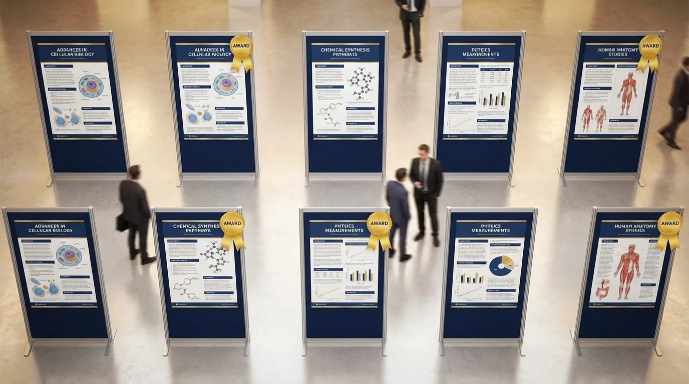
Conference poster examples demonstrating effective layout structures for PhD research presentations
Typography That Works at a Distance
Typography makes or breaks poster readability. Your poster will be viewed from several feet away by people scanning a hall full of competing visuals.
Recommended Font Sizes
| Element | Size | Viewing Distance |
|---|---|---|
| Title | 72-96 pt | 15+ feet (across the room) |
| Author names | 48-60 pt | 10 feet |
| Section headings | 36-48 pt | 6 feet |
| Body text | 24-32 pt | 3-4 feet |
| Figure captions | 20-24 pt | 3 feet |
| References | 16-20 pt | Close reading |
Choosing the Right Fonts
Stick to one or two typefaces for the entire poster. A common pairing is a sans-serif font for headings and a serif or the same sans-serif for body text.
Reliable sans-serif options: Helvetica, Arial, Open Sans, Lato, Source Sans Pro
Reliable serif options: Georgia, Palatino, Charter
Avoid decorative, handwritten, or novelty fonts entirely. They reduce readability and look unprofessional. Also avoid condensed or ultra-light weights -- they become difficult to read at poster scale.
For a comprehensive breakdown of font pairing strategies, see our best fonts for scientific posters and figures guide.
Font pairing examples and size hierarchy for research poster typography
Color Schemes for Research Posters
Color draws attention and organizes information, but too much color creates visual noise. The safest approach for a PhD poster is restraint.
Building a Color Palette
Start with these guidelines:
- Background: White or very light neutral. Dark backgrounds waste ink and reduce contrast.
- Primary accent: One strong color for headings, section dividers, and graph highlights. Many researchers use their university's brand color.
- Secondary accent: A complementary color for emphasis. Keep it subtle.
- Text: Black or very dark gray (#333) on light backgrounds.
A three-color palette (background, primary, secondary) plus black text covers most posters. If your university has brand guidelines, use those colors for instant polish and institutional recognition.
Color Accessibility
Approximately 8% of men have some form of color vision deficiency. Avoid relying on red-green distinctions alone in figures. Use colorblind-friendly palettes like ColorBrewer or viridis. Always supplement color with patterns, labels, or shapes so data points remain distinguishable without color.
Figure Placement and Quality
Figures are the single most important element on a research poster. Viewers look at figures first, then decide whether to read the surrounding text.
Figure Guidelines
- Resolution: Export at 300 DPI minimum. Figures that look fine on screen will pixelate badly when printed at A0 or 48x36 size.
- Format: Use vector formats (SVG, PDF) for graphs and charts whenever possible. Use high-resolution PNG or TIFF for photographs and microscopy images.
- Size: Make key figures large. A central results figure should occupy 20-30% of the poster area. Do not shrink figures to make room for more text.
- Labels: All axes, legends, and annotations should be legible at the poster's body text size (24+ pt).
- Consistency: Use the same color scheme across all figures. Match font styles to the poster's typography.
Where to Place Figures
Position your most important figure where the eye naturally lands: center or center-right of the poster in a landscape layout. Supporting figures go in the methods or supplementary results sections. Every figure should have a brief caption explaining what the viewer is looking at.
PowerPoint vs. LaTeX vs. AI: Choosing Your Tool
The tool you use matters less than the result, but each option has real trade-offs for PhD students.
| Criteria | PowerPoint / Google Slides | LaTeX (beamerposter, tikzposter) | AI Tools (ConceptViz) |
|---|---|---|---|
| Learning curve | Low | High | Low |
| Design flexibility | Moderate | Limited (template-dependent) | High |
| Typography control | Basic | Excellent | Automated |
| Figure handling | Drag and drop | Code-based placement | Automated layout |
| Collaboration | Easy (shared files) | Harder (requires LaTeX setup) | Browser-based |
| Output quality | Good with care | Excellent | Professional |
| Time to create | 4-8 hours | 6-12 hours | Under 1 hour |
| Cost | Free (Google Slides) / included | Free | Free tier available |
PowerPoint / Google Slides is the most common choice. Set a custom slide size to your poster dimensions, use gridlines for alignment, and export as PDF for printing. The main risk is inconsistent alignment and amateur-looking results if you do not use guides carefully.
LaTeX produces typographically superior output and handles equations beautifully, making it popular in mathematics, physics, and computer science. However, the learning curve is steep if you have not used LaTeX before, and precise visual adjustments require patience.
AI-powered tools like the ConceptViz scientific poster generator can produce a polished, print-ready poster from your research content in minutes. This is especially useful when you are short on time or want a professional layout without wrestling with design software.
Common Mistakes PhD Students Make
After reviewing hundreds of conference posters, these are the errors that come up most often:
1. Too Much Text
The single most common mistake. If your poster has more than 800 words of body text, you have too much. A poster is not a paper. Cut ruthlessly: every sentence should earn its place. Use bullet points instead of paragraphs where possible.
2. Tiny Figures with Huge Captions
Some students shrink their figures to leave room for text, then add long captions to explain what the shrunken figure shows. Flip this: make the figure large and self-explanatory, and keep the caption to one sentence.
3. No Visual Hierarchy
When everything looks the same size and weight, nothing stands out. Use font size, color, and spacing to create a clear hierarchy: title > section headings > body text > captions > references.
4. Wall of Methods
Unless your contribution is methodological, keep the methods section brief. Use a flowchart or diagram instead of paragraphs. Reviewers at a poster session care far more about what you found than exactly how you ran your Western blots.
5. Forgetting Contact Information
You will not stand next to your poster for the entire session. Include your email address, a QR code linking to the paper or preprint, and optionally your academic social media handle so interested viewers can reach you later.
6. Last-Minute Printing Disasters
Print a test copy at reduced size (A4 or letter) to check for cut-off text, low-resolution figures, and color shifts. Send the final file to the print shop at least one week before you need it. Express printing is expensive and stressful.
For more poster design best practices and award-winning examples, see our guide on scientific poster examples and award-winning designs.
Step-by-Step Poster Creation Workflow
Here is a practical workflow that keeps you on track:
- Read the conference guidelines -- Confirm poster size, orientation, and submission format.
- Draft your content -- Write all sections in a plain document first. Edit for clarity and brevity before touching any design tool.
- Select your figures -- Choose 3-5 high-quality figures that tell the story. Re-export at 300 DPI if needed.
- Pick a layout -- Three-column for traditional conferences, #BetterPoster for maximum impact.
- Design the poster -- Apply consistent fonts, colors, and spacing. Align everything to a grid.
- Get feedback -- Show it to your supervisor and at least one person outside your field. If the outsider cannot identify your main finding in 30 seconds, simplify further.
- Print and prepare -- Export as PDF, print a test copy, then print the final version. Practice your 2-minute elevator pitch.
If time is short, you can skip straight to the design phase using the scientific poster generator and iterate from the AI-generated draft.
Presenting Your Poster at the Conference
Design is only half the work. How you present matters just as much.
- Prepare a 2-minute summary that covers motivation, method, key result, and significance. Practice until it feels natural.
- Stand beside your poster, not in front of it. Let viewers read while you talk.
- Adapt to your audience. A fellow specialist wants technical depth. A department head wants the big picture. Read the badge and adjust.
- Bring a short stack of handouts or business cards with a QR code to the full paper.
- Take notes on questions you receive. They often reveal gaps in your argument or new directions worth exploring.
For advice on condensing your research into a compelling short presentation, see our 3-minute thesis presentation guide.
Frequently Asked Questions
What size should a PhD conference poster be?
The most common size in the US is 48 x 36 inches in landscape orientation. International conferences typically use A0 (841 x 1189 mm) in portrait orientation. Always check your specific conference guidelines before designing, as requirements vary by venue and discipline.
How many words should a research poster have?
Aim for 300-800 words of body text total. A conference poster is a visual summary, not a paper on a board. The majority of your poster space should be dedicated to figures, graphs, and white space. If you have more than 800 words, you need to cut.
What is the best software for making a PhD poster?
PowerPoint and Google Slides are the most accessible options. LaTeX (using beamerposter or tikzposter packages) produces excellent typography and is popular in math and physics. AI-powered tools like ConceptViz can generate a professional poster layout in minutes, which is ideal when you are short on time.
What font size should I use for a conference poster?
Title: 72-96pt (readable from across the room), section headings: 36-48pt, body text: 24-32pt, captions: 20-24pt, references: 16-20pt. The title should be legible from at least 15 feet away, and body text from 3-4 feet.
Should I use a landscape or portrait poster orientation?
Landscape (horizontal) is most common at US conferences and provides a natural left-to-right reading flow. Portrait (vertical) is standard at many European conferences and works well for timeline-based or flowchart-heavy research. Check your conference requirements before choosing.
How far in advance should I print my conference poster?
Send your poster to the print shop at least one week before you need it. Print a test copy at reduced size (A4 or letter paper) first to check for resolution issues, cut-off text, and color accuracy. Express printing is significantly more expensive and leaves no room to fix errors.
Related Reading
Categories
More Posts
Scientific Poster Examples: 50+ Award-Winning Designs & Best Practices
Explore award-winning scientific poster examples from biology, chemistry, physics, and medicine. Learn what makes a poster stand out at conferences with expert design tips and templates.

Bode Plot Generator Guide: Make Magnitude and Phase Plots from a Transfer Function
Learn how to use a Bode plot generator, enter transfer functions correctly, read magnitude and phase plots, and avoid common frequency-response mistakes.
")
How to Make a Histogram in Excel: Step-by-Step Guide (2026)
Learn how to create a histogram in Excel with the built-in Histogram chart, bin controls, and formatting tips. Includes Excel 365, 2024, 2021, 2019, and 2016 guidance.