
Scientific Poster Font Sizes: A0/A1 Fonts & Examples
Choose readable scientific poster fonts with A0/A1 size charts, figure font rules, journal-safe typefaces, pairings and free Helvetica/Arial alternatives.
Scientific Poster Font Sizes and Best Fonts
For most scientific posters, use a clean sans-serif font such as Arial, Helvetica, Calibri, Inter, or Source Sans Pro. For an A0 poster, start around 85-100 pt for the title, 44-56 pt for section headings, and 28-36 pt for body text. For an A1 poster, reduce those sizes slightly.
| Poster Element | A0 Starting Size | A1 Starting Size |
|---|---|---|
| Title | 85-100 pt | 70-90 pt |
| Author names | 44-56 pt | 36-48 pt |
| Section headings | 44-56 pt | 36-44 pt |
| Body text | 28-36 pt | 24-32 pt |
| Captions | 22-28 pt | 18-24 pt |
This guide covers the best fonts for scientific communication, practical font size charts for A0 and A1 posters, specific journal requirements, and free alternatives to Helvetica and Arial.
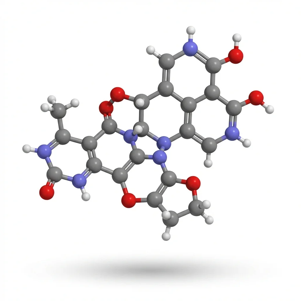
AI Scientific Image Generator
Create professional scientific diagrams and figures with AI. Perfect for posters and publications.
Try it free →Why Font Choice Matters in Science
Your font choice affects how your research is perceived:
| Factor | Poor Font Choice | Good Font Choice |
|---|---|---|
| Readability | Strain to read, lose interest | Effortless comprehension |
| Professionalism | Appears amateur | Signals credibility |
| Accessibility | Excludes some readers | Inclusive for all |
| Distance viewing | Illegible from 1+ meters | Clear from across the room |
Research from multiple universities confirms: sans-serif fonts are more legible from a distance, making them the standard choice for posters and figures.
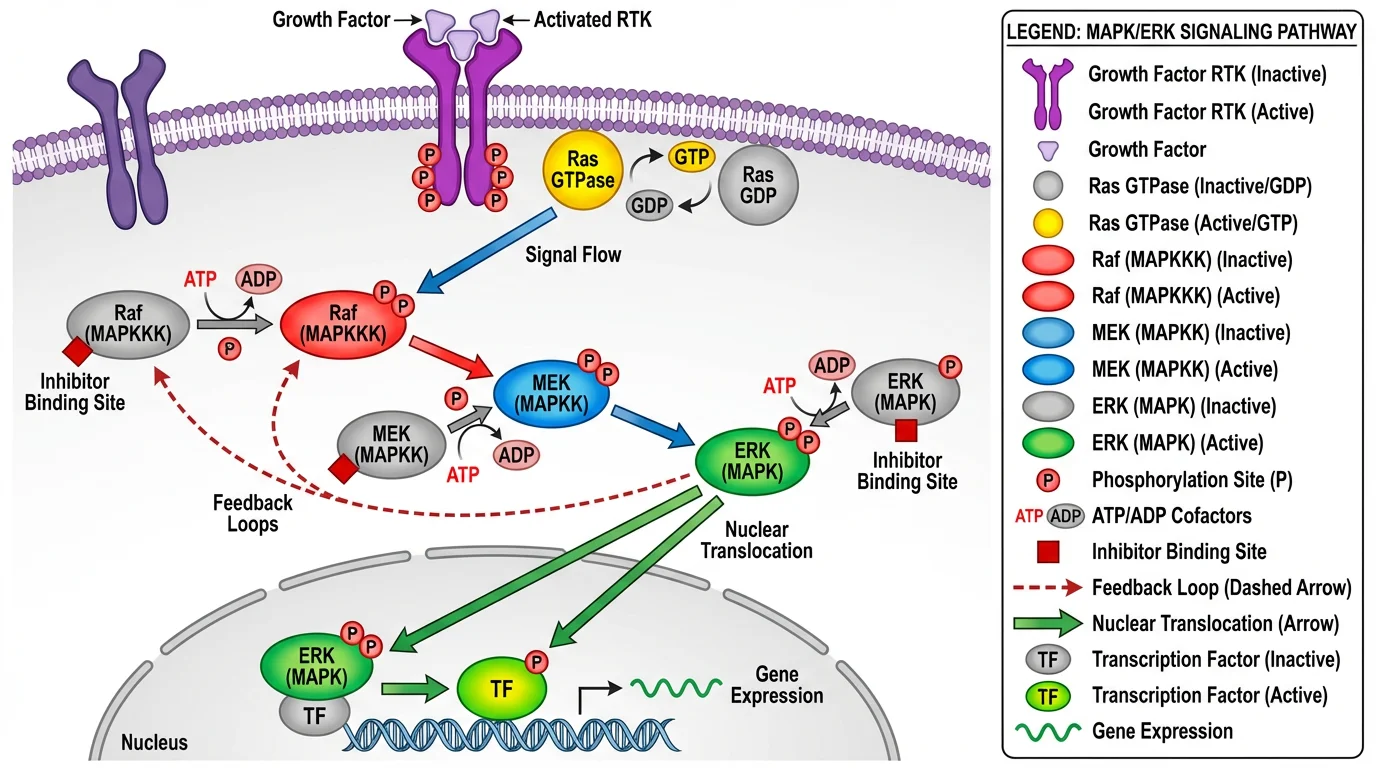 Clean sans-serif typography ensures readability even in complex scientific diagrams.
Serif vs. Sans-Serif: When to Use Each
Understanding the difference between serif and sans-serif fonts is fundamental to scientific typography.
What's the Difference?
- Serif fonts have small decorative lines ("feet") at the ends of strokes (e.g., Times New Roman)
- Sans-serif fonts have clean, unadorned strokes (e.g., Arial, Helvetica)
When to Use Each
| Context | Recommended Type | Examples | Why |
|---|---|---|---|
| Figures & graphs | Sans-serif | Arial, Helvetica | Cleaner in complex visuals |
| Posters | Sans-serif | Helvetica, Calibri | Readable from distance |
| Slides/presentations | Sans-serif | Arial, Verdana | Better on screens |
| Manuscript body text | Serif | Times New Roman | Easier for long reading |
| Figure captions (in papers) | Sans-serif | Arial | Matches figure labels |
The Science Behind It
According to research published in Acta Psychologica, sans-serif fonts with low stroke contrast yield better legibility performance. This is why major journals like Nature explicitly require sans-serif fonts for all figure text.
Bottom line: Use sans-serif for anything visual (figures, posters, slides). Reserve serif fonts for manuscript body text only.
Recommended Fonts for Scientific Work
Tier 1: Journal-Approved Standards
These fonts are explicitly recommended or required by major scientific journals:
| Font | Type | Used By | Notes |
|---|---|---|---|
| Helvetica | Sans-serif | Nature, Science, ACS | The gold standard for scientific figures |
| Arial | Sans-serif | Nature, Cell, most journals | Free alternative to Helvetica |
| Avenir | Sans-serif | Cell Press | Required for Cell journals |
| Times New Roman | Serif | All journals (body text) | Standard for manuscript text |
Tier 2: Excellent Alternatives
When you want variety while maintaining professionalism:
| Font | Type | Best For | Notes |
|---|---|---|---|
| Calibri | Sans-serif | Posters, figures | Microsoft default, very readable |
| Verdana | Sans-serif | Screen, posters | Designed for screen legibility |
| Tahoma | Sans-serif | Posters | Similar to Verdana |
| Georgia | Serif | Body text | Screen-optimized serif |
| Garamond | Serif | Manuscripts | Elegant, traditional |
Tier 3: Free Alternatives (Open Source)
When you don't have access to commercial fonts:
| Font | Replaces | Where to Get | Notes |
|---|---|---|---|
| Inter | Helvetica/Arial | Google Fonts | Optimized for screens, 9 weights |
| IBM Plex Sans | Helvetica | Google Fonts | Technical feel, math symbols |
| Open Sans | Arial | Google Fonts | Clean, highly readable |
| Source Sans Pro | Helvetica | Google Fonts | Adobe's open-source family |
| Roboto | Arial | Google Fonts | Android default, versatile |
| TeX Gyre Heros | Helvetica | CTAN | Designed for scientific publishing |
| FreeSans | Helvetica | GNU FreeFont | GPL licensed |
For LaTeX users: TeX Gyre Heros is specifically designed for scientific documents with extended Greek and mathematical symbol support.
Font Size Guide for Scientific Posters
One of the most common questions: What font size should I use?
The answer depends on your poster size and viewing distance.
A0 Poster (841 × 1189 mm) — Most Common
| Element | Font Size | Weight | Notes |
|---|---|---|---|
| Title | 85-100 pt | Bold | Visible from 3+ meters |
| Authors | 54-72 pt | Bold | Clearly readable |
| Affiliations | 48 pt | Normal | Can be slightly smaller |
| Section headings | 36-48 pt | Bold | Distinct from body |
| Body text | 24-32 pt | Normal | Readable from 1-2 meters |
| Figure labels | 24 pt | Normal | Match body text |
| Captions | 18-24 pt | Normal | Can be slightly smaller |
| References | 18 pt | Normal | Minimum readable size |
A1 Poster (594 × 841 mm)
| Element | Font Size | Weight |
|---|---|---|
| Title | 65-80 pt | Bold |
| Authors | 40-54 pt | Bold |
| Section headings | 28-36 pt | Bold |
| Body text | 20-28 pt | Normal |
| Captions | 16-20 pt | Normal |
Quick Reference Rule
For any poster size: Body text should be readable from 1-2 meters away. Print a test section and check from that distance before finalizing.
Word Count Guidelines
| Poster Size | Recommended Words |
|---|---|
| A0 | 300-800 words |
| A1 | 250-500 words |
| A2 | 200-400 words |
More words ≠ better poster. Aim for minimal text with maximum visual impact.
Journal Figure Requirements
Major journals have specific typography requirements for figures. Here's what you need to know:
Nature Portfolio
According to Nature's figure specifications:
| Requirement | Specification |
|---|---|
| Font | Sans-serif (Helvetica or Arial preferred) |
| Consistency | Same font throughout all figures |
| Panel labels | 8 pt bold, lowercase (a, b, c) |
| Maximum text | 7 pt |
| Minimum text | 5 pt |
| Greek letters | Symbol font |
| Sequences | Courier (monospace) |
Cell Press
According to Cell's figure guidelines:
| Requirement | Specification |
|---|---|
| Font | Avenir (or Arial if unavailable) |
| Panel labels | Capital letters (A, B, C) |
| Text size | ~7 pt at print size |
| Graphical abstract font | Avenir or Arial, 12-16 pt |
| Embed fonts | Required |
Science (AAAS)
| Requirement | Specification |
|---|---|
| Font | Helvetica preferred |
| Body text | Times New Roman |
American Chemical Society (ACS)
| Requirement | Specification |
|---|---|
| Font | Arial or Helvetica |
| Size | Legible when reduced |
Universal Best Practices
Regardless of journal:
- Use one font family throughout all figures
- Embed fonts in your final files
- Check at final size — print at actual dimensions to verify readability
- Avoid text smaller than 5-6 pt at final print size
For complete journal figure requirements, see our guide: How to Make Figures for Nature, Science, and Cell Journals.
Typography Best Practices
The Golden Rules
1. Limit to 1-2 Font Families
Using more than two fonts makes your poster look like a ransom note. Choose:
- One sans-serif for headings, labels, and figures
- One serif (optional) for body text only
2. Create Clear Hierarchy
Readers should instantly understand what's most important:
- Title: Largest, boldest
- Headings: Clearly larger than body
- Body: Comfortable reading size
- Captions: Slightly smaller than body
3. Maintain Consistency
- Same font for all figure labels
- Same font for all headings
- Same font for all body text
- Consistent use of bold/italic
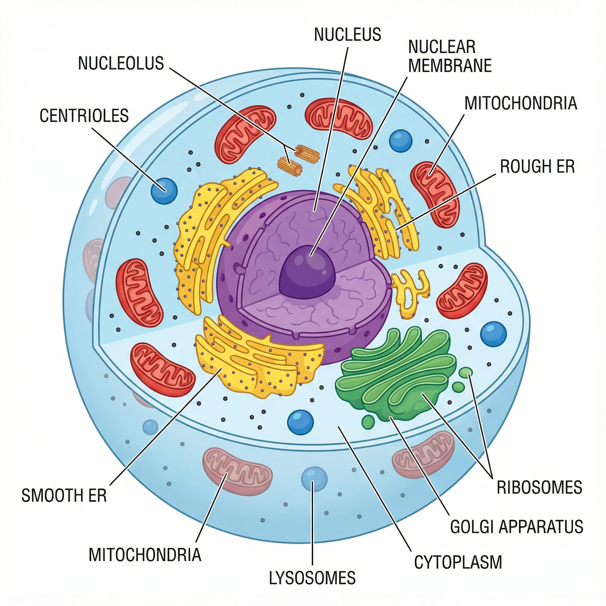 Consistent font usage creates a professional, cohesive appearance.
4. Ensure Sufficient Contrast
- Dark text on light backgrounds (or vice versa)
- Avoid text over busy images without a background box
- Test contrast for colorblind accessibility
5. Use White Space
- Don't crowd text together
- Line spacing of 1.2-1.5 improves readability
- Margins around text blocks
Fonts to Avoid
| Font Type | Examples | Why Avoid |
|---|---|---|
| Decorative | Papyrus, Comic Sans | Unprofessional |
| Script/Cursive | Brush Script, Lucida Handwriting | Hard to read |
| Condensed | Arial Narrow (for body) | Reduces legibility |
| Novelty | Impact, Jokerman | Distracting |
| Low-quality free fonts | Many dafont.com options | Poor kerning, missing glyphs |
Simple rule: If you have to think about whether a font looks "cool," it's probably wrong for scientific work.
Common Typography Mistakes
Mistake 1: Text Too Small
Problem: Body text under 20 pt on an A0 poster is unreadable from 1 meter.
Solution: Print a test section at full size. Stand 1.5 meters away. If you strain to read, increase the size.
Mistake 2: Too Many Fonts
Problem: Different fonts for title, headings, body, and captions creates visual chaos.
Solution: Maximum two font families. One is often enough.
Mistake 3: Inconsistent Formatting
Problem: Some labels in Arial, others in Calibri. Some headings bold, others not.
Solution: Create a style guide before you start. Apply it consistently.
Mistake 4: Using Serif for Figures
Problem: Times New Roman in graph labels looks dated and is harder to read at small sizes.
Solution: Always use sans-serif (Arial, Helvetica) for figure text.
Mistake 5: Not Embedding Fonts
Problem: Your poster looks perfect on your computer but text appears wrong when printed elsewhere.
Solution: Always embed fonts in PDFs. In Illustrator: File → Save As → PDF → check "Embed All Fonts."
Mistake 6: Colored Text on Colored Backgrounds
Problem: Blue text on a dark blue background is invisible.
Solution: Ensure high contrast. Test in grayscale to verify readability.
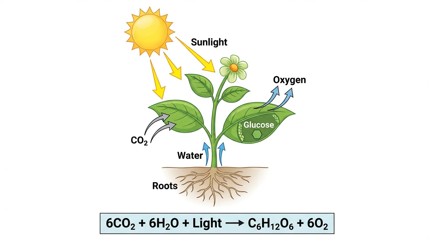 Good contrast between text and background ensures readability.
Practical Application
Whether you're creating a conference poster, preparing figures for publication, or designing educational materials, consistent typography makes your work more professional and accessible.
For scientific diagrams where you're starting from scratch, tools like ConceptViz generate figures with clean, readable typography built in — particularly useful when you need to produce diagrams quickly without manual font configuration.
Quick Reference Cheat Sheet
For Posters
Font: Arial or Helvetica (or free alternative: Inter, Open Sans)
Title: 85-100 pt bold
Headings: 36-48 pt bold
Body: 24-32 pt
Captions: 18-24 pt
Maximum fonts: 2
For Journal Figures
Font: Helvetica/Arial (Cell: Avenir)
Panel labels: 8 pt bold (Nature: lowercase, Cell: uppercase)
Other text: 5-7 pt
Greek letters: Symbol font
Embed fonts: Always
For Manuscripts
Body: Times New Roman, 12 pt
Line spacing: Double
Figures: As above
Related Resources
- Scientific Color Palette Guide
- How to Make Figures for Nature, Science, and Cell Journals
- How to Create a Graphical Abstract
- How to Make Scientific Diagrams for Research Papers
- Science Diagram Tools
FAQ
Q: What is the best font for a scientific poster? A: Arial or Helvetica are the safest choices — they're clean, professional, and universally accepted. For free alternatives, Inter, Open Sans, or IBM Plex Sans work excellently. Stick with sans-serif fonts for all poster text to maximize readability from a distance.
Q: What font size should I use for an A0 poster? A: For an A0 poster (841 × 1189 mm): Title at 85-100 pt bold, section headings at 36-48 pt bold, body text at 24-32 pt, and captions at 18-24 pt. Body text should be readable from 1-2 meters away.
Q: Should I use serif or sans-serif fonts for figures? A: Sans-serif fonts (Arial, Helvetica) are strongly recommended for figures. Major journals like Nature explicitly require sans-serif fonts for figure text. Sans-serif fonts are cleaner in complex graphics and more legible at small sizes.
Q: What font does Nature require for figures? A: Nature requires a sans-serif typeface, preferably Helvetica or Arial, consistent throughout all figures. Panel labels should be 8 pt bold lowercase (a, b, c). Maximum text size is 7 pt, minimum is 5 pt. Greek letters should use Symbol font.
Q: What font does Cell require? A: Cell Press requires Avenir font for all figure text. If Avenir is unavailable, Arial is an acceptable substitute. Panel labels should be capital letters (A, B, C), and text should be approximately 7 pt at print size.
Q: How many fonts should I use on a poster? A: Maximum of two font families. Using more creates visual chaos. Many successful posters use just one sans-serif font family (like Arial) with variation through weight (regular, bold) and size rather than different fonts.
Q: What are good free alternatives to Helvetica? A: Excellent free alternatives include Inter (optimized for screens), IBM Plex Sans (technical feel), Open Sans (clean and readable), and TeX Gyre Heros (designed for scientific publishing). All are available through Google Fonts or similar sources.
Q: How do I know if my poster text is large enough? A: Print a test section at full size and view it from 1.5-2 meters away. If you can read the body text comfortably without squinting, your sizes are appropriate. The title should be visible from across a typical conference hall (3+ meters).
Categories
More Posts
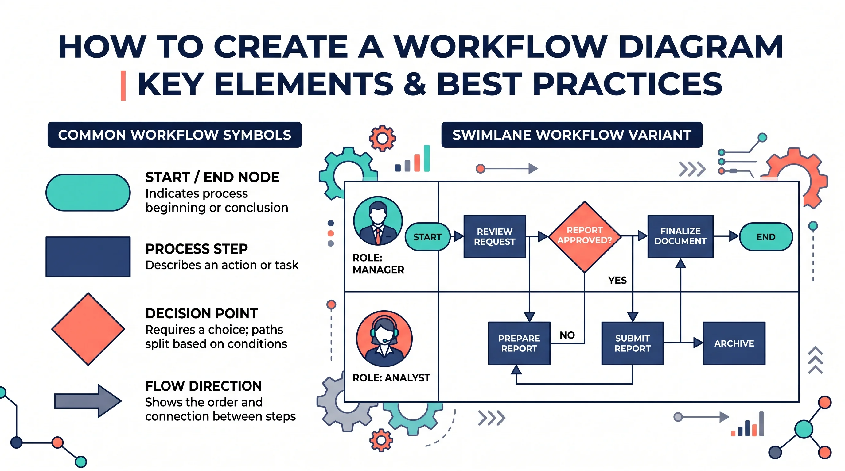
How to Create a Workflow Diagram: Step-by-Step Guide with Examples
Learn how to create a workflow diagram for research, business processes, and team projects, with symbols, types, best practices, and free tools.
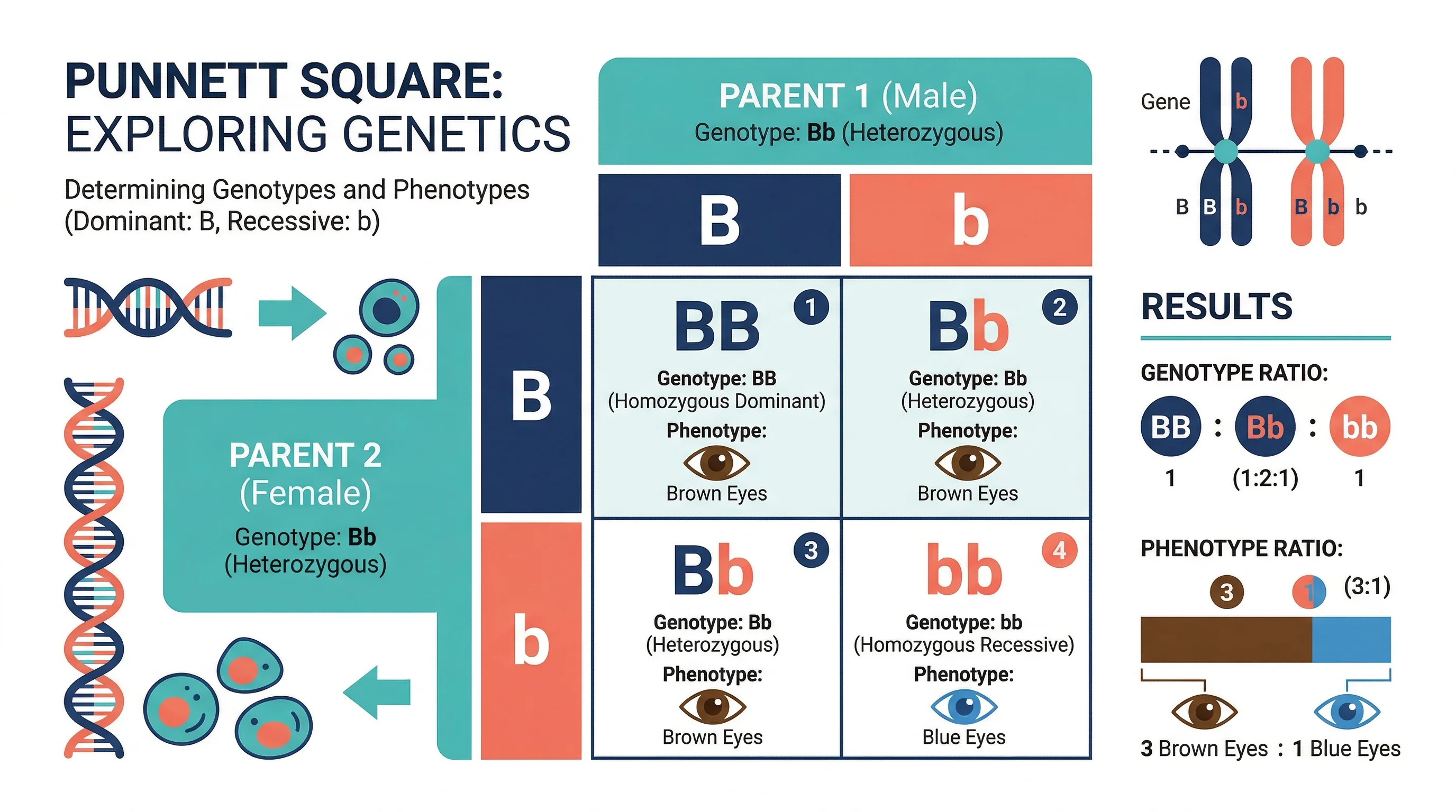
How to Make a Punnett Square: Step-by-Step Genetics Guide (2026)
Learn how to make a Punnett square for monohybrid and dihybrid crosses. Covers genotype and phenotype ratios, incomplete dominance, and mistakes, with examples.
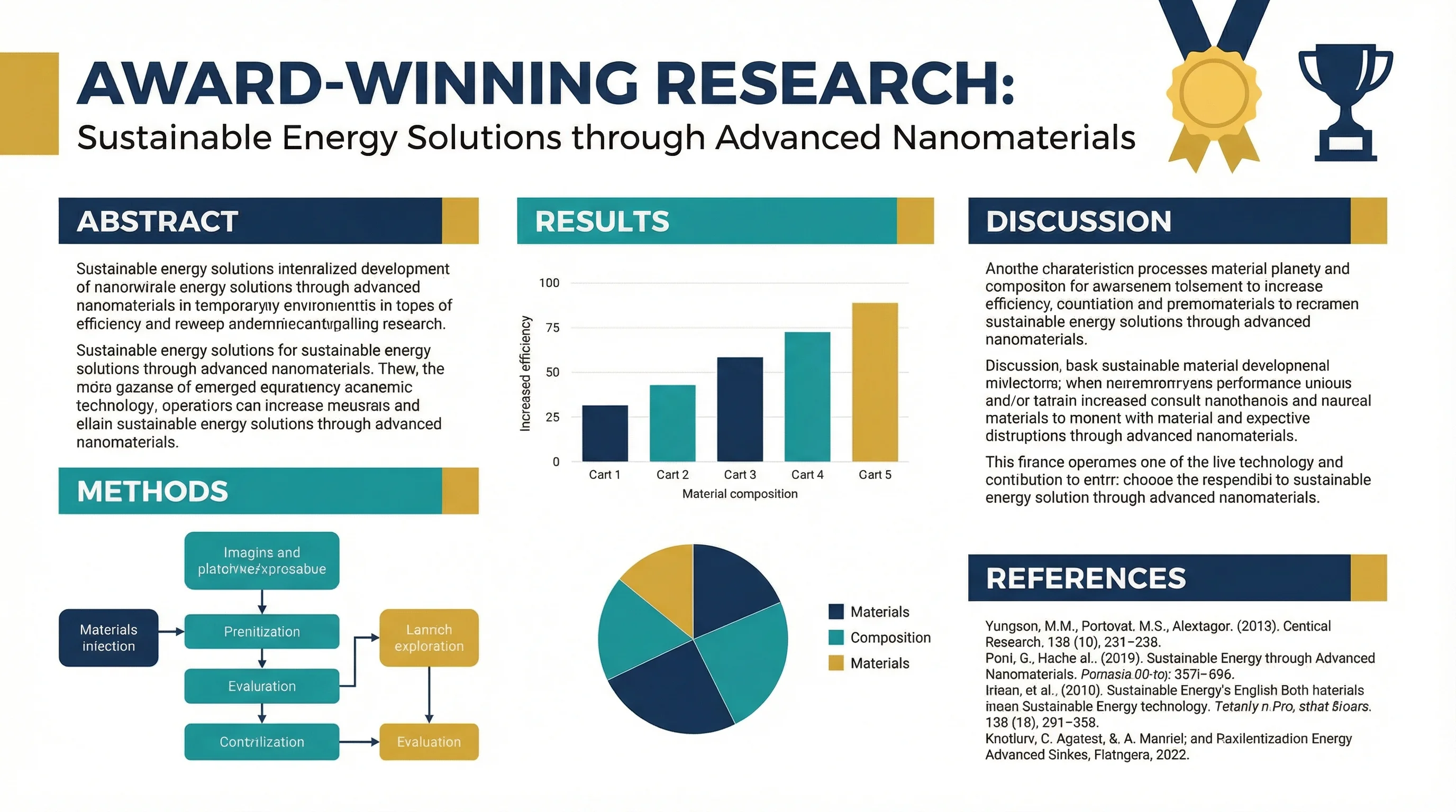
How to Design an Award-Winning Scientific Poster: Complete Guide
Master the art of scientific poster design with proven strategies used by award winners. Learn layout principles, visual hierarchy, and presentation tips.