
Nature, Science & Cell Figure Guidelines: Size, DPI, Fonts
Quick reference for Nature, Science and Cell figure requirements: dimensions, DPI, accepted file formats, fonts, panel labels, color mode and submission checks.
Nature, Science & Cell Figure Guidelines: Quick Reference
Preparing figures for Nature, Science, or Cell? The most important checks are final figure width, readable font size, 300 DPI or vector output, accepted file format, and consistent panel labels.
| Requirement | Safe Starting Point |
|---|---|
| Width | Single-column or full-width figure size from the target journal |
| Resolution | 300 DPI for color/grayscale figures; higher for line art where required |
| Text | Sans-serif labels, readable at final print size |
| Format | Prefer vector formats such as PDF, EPS, SVG or editable source files when allowed |
| Color | Avoid red-green combinations and rainbow/jet color scales |
| Panels | Use consistent panel labels and spacing across the full figure |
This guide then compares the exact technical specifications for Nature, Science, and Cell journals: figure dimensions, resolution requirements, accepted file formats, typography, color mode, and common mistakes that delay submission.
AI Scientific Image Generator
Create publication-quality scientific figures with AI. Export at 300 DPI for journal submission.
Try it free →Why Figure Quality Matters for Top Journals
According to research published in PLOS ONE and analysis from Elsevier, figures that are "not complete or not clear enough to read" are among the top reasons for manuscript rejection.
Top journals like Nature have rejection rates exceeding 90%. When editors have seconds to assess your paper, your figures are often the first thing they see. Poor figures signal poor research — even when that's not true.
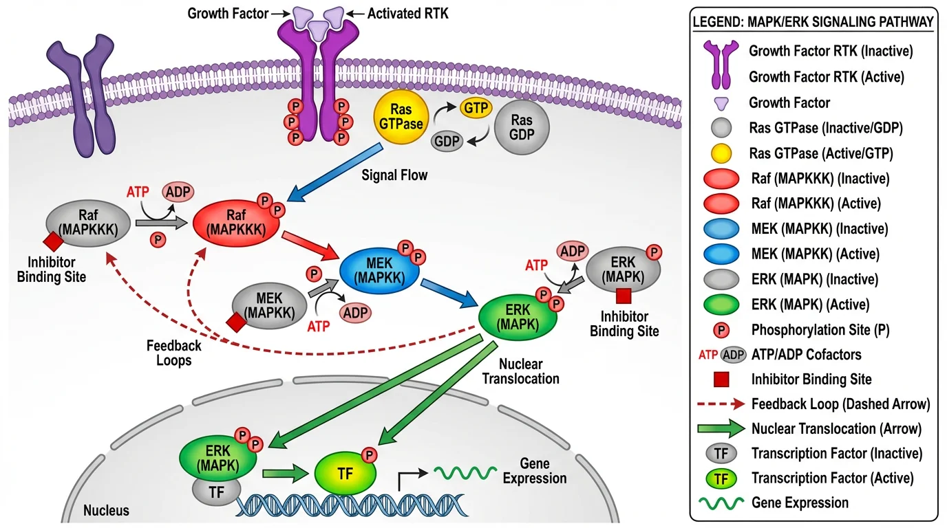 A publication-quality signaling pathway diagram. Notice the clear labeling, balanced colors, and professional layout that meets journal standards.
What top-tier figures communicate:
- Your research is rigorous and well-executed
- You understand your field's visual conventions
- You respect readers' time with clear, efficient communication
- You've taken care with every aspect of your work
Technical Requirements: Nature vs. Science vs. Cell
Each journal has specific technical specifications. Here's a comparison of the three most prestigious journals:
Figure Dimensions
| Journal | Single Column | 1.5 Column | Full Width | Max Height |
|---|---|---|---|---|
| Nature | 89 mm | 120-136 mm | 183 mm | 247 mm |
| Science | 8.5 cm | — | 17.5 cm | 24 cm |
| Cell | 8.5 cm | 11.4 cm | 17.4 cm | — |
Resolution Requirements
| Journal | Color/Grayscale | Line Art | Black & White |
|---|---|---|---|
| Nature | 300 DPI | 300 DPI | 300 DPI |
| Science | 150-300 DPI | 300 DPI | 300 DPI |
| Cell | 300 DPI | 1000 DPI | 500 DPI |
File Formats
| Journal | Preferred Formats | Not Accepted |
|---|---|---|
| Nature | AI, EPS, PDF, PSD (layered), SVG | JPEG, TIFF, PNG for main figures |
| Science | PDF, EPS, DOC embedded | — |
| Cell | TIFF, EPS, PDF, AI (for Leading Edge only) | — |
Typography
| Journal | Font | Panel Labels | Text Size |
|---|---|---|---|
| Nature | Helvetica, Arial (sans-serif) | 8pt bold lowercase (a, b, c) | 5-7pt |
| Science | Times New Roman | Capital letters (A, B, C) | 6-8pt |
| Cell | Avenir, Arial | Capital letters | 6-8pt |
Color Mode
All three journals recommend RGB for submission. Colors will be automatically converted to CMYK for print versions. For accurate print preview, you can convert to CMYK yourself before submission.
Critical accessibility requirements (all journals):
- Avoid red-green combinations (colorblind-unfriendly)
- Don't use rainbow/jet color scales
- Ensure text contrast ratio > 4.5
- Use distinct hues that work in grayscale
For detailed color guidance, see our Scientific Color Palette Guide.
Figure Types and Recommended Tools
Different figure types require different tools. Here's a breakdown of what to use for each:
1. Data Visualizations (Graphs, Charts, Plots)
Best tools: R (ggplot2), Python (matplotlib/seaborn), GraphPad Prism, Origin
These tools generate figures directly from your data, ensuring accuracy and reproducibility.
Best practices:
- Export as vector (PDF, EPS, SVG) when possible
- Use consistent styling across all figures
- Include error bars and statistical annotations
- Match journal's preferred font
Example workflow:
# R example with ggplot2
library(ggplot2)
ggplot(data, aes(x, y)) +
  geom_point() +
  theme_classic() +
  theme(text = element_text(family = "Arial", size = 7))
ggsave("figure1.pdf", width = 89, height = 60, units = "mm")
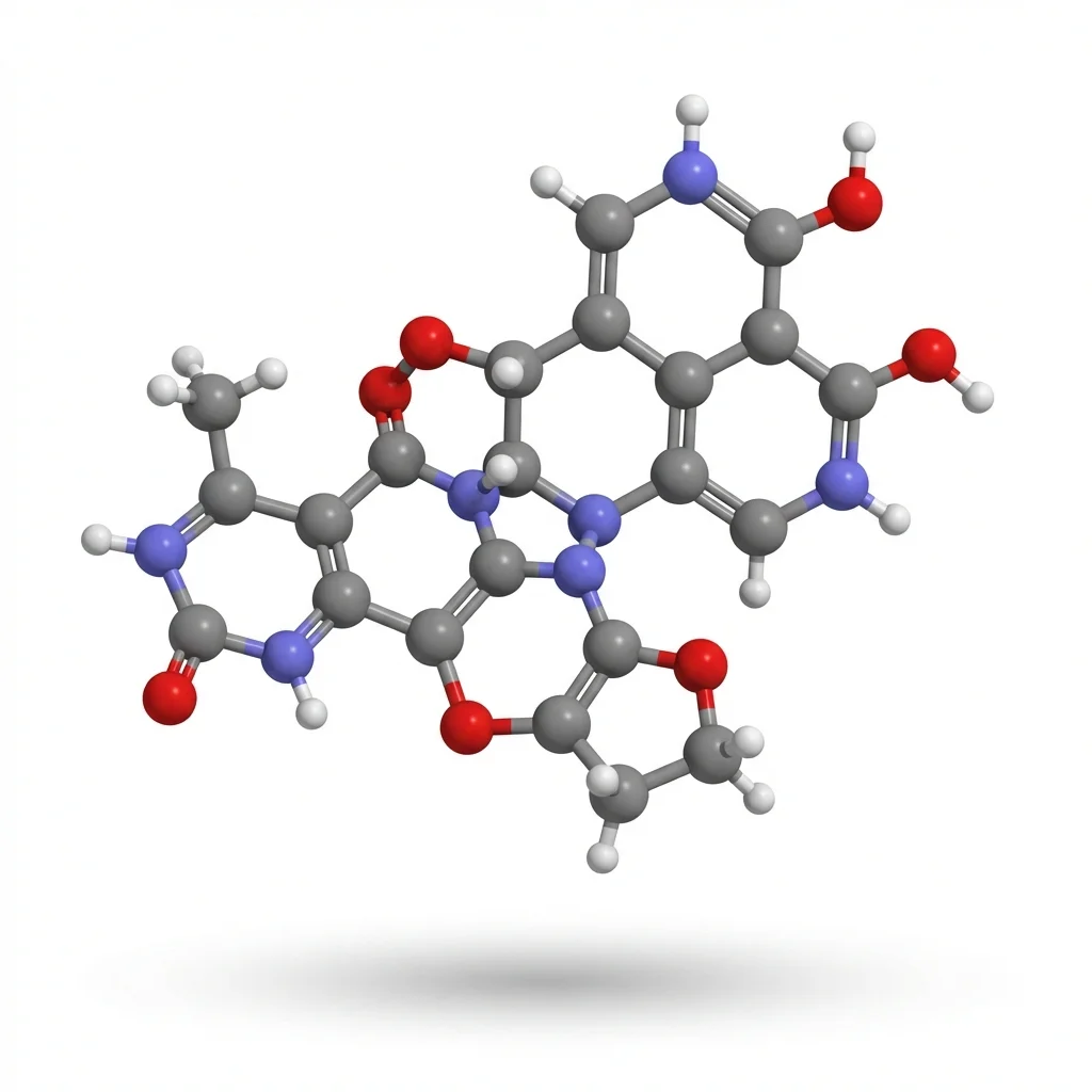
2. Molecular Structures and Chemical Diagrams
Best tools: ChemDraw, PyMOL, Chimera, UCSF ChimeraX
These specialized tools ensure chemical accuracy and follow IUPAC conventions.
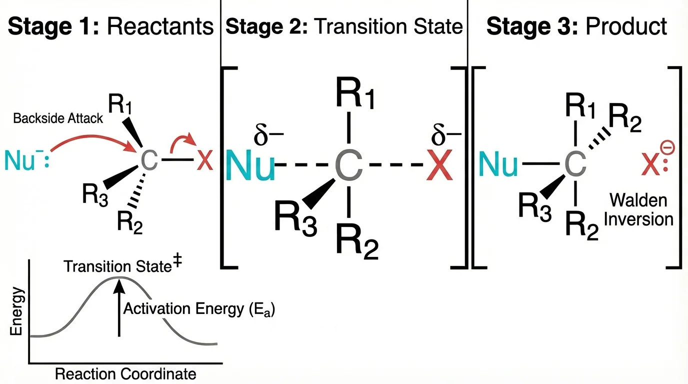 A chemistry reaction mechanism showing proper bond angles and electron movement — created with attention to chemical accuracy.
Best practices:
- Use standard bond lengths and angles
- Follow journal-specific chemistry style guides
- Export at high resolution (1000 DPI for line art)
- Include stereochemistry when relevant
3. Biological Schematics and Pathway Diagrams
Best tools: Adobe Illustrator, BioRender, Inkscape, ConceptViz
For conceptual diagrams, signaling pathways, and experimental workflows.
Best practices:
- Maintain consistent icon styles throughout
- Use color meaningfully (not decoratively)
- Include clear directional arrows
- Keep text minimal but informative
Quick concept generation: For rapidly exploring diagram concepts before final refinement, AI tools like ConceptViz can generate initial schematics in seconds. This is particularly useful during the ideation phase or for internal lab discussions before investing time in final production.
4. Microscopy and Imaging Data
Best tools: ImageJ/FIJI, Adobe Photoshop, Imaris
For processing and presenting experimental images.
Best practices:
- Apply identical adjustments to all comparable images
- Include scale bars (mandatory for most journals)
- Document all processing steps
- Never manipulate images to misrepresent data
- Use appropriate lookup tables (LUTs)
Cell Press specifically states: "Before you submit, check the original data and make sure you know how the figures were prepared from them."
5. Composite Figures and Multi-Panel Layouts
Best tools: Adobe Illustrator, Inkscape, PowerPoint
For assembling individual panels into complete figures.
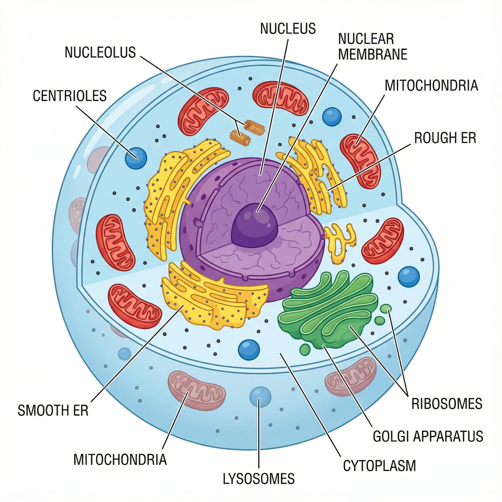 A well-organized diagram with consistent styling, clear labels, and efficient use of space.
Best practices:
- Align panels precisely using guides/grids
- Use consistent spacing between panels
- Label panels in reading order (a, b, c or A, B, C per journal style)
- Ensure all text is the same size
- Minimize white space without overcrowding
Step-by-Step Figure Creation Workflow
Here's a proven workflow for creating publication-quality figures:
Step 1: Plan Before You Create
Before opening any software:
- Check journal requirements — Download the specific guide for your target journal
- Sketch your figure — Plan layout, what each panel shows, and the narrative flow
- Identify figure type — Data plot? Schematic? Image? This determines your tools
- Gather all elements — Raw data, images, icons you'll need
Step 2: Create Individual Elements
Generate each component using the appropriate tool:
| Element Type | Tool | Output Format |
|---|---|---|
| Statistical graphs | R/Python/Prism | PDF or SVG |
| Chemical structures | ChemDraw | EPS or PDF |
| Protein structures | PyMOL | PNG (high-res) or PDF |
| Schematics/concepts | Illustrator/ConceptViz | SVG or PDF |
| Microscopy | ImageJ | TIFF |
Pro tip: For schematic diagrams and conceptual figures, you can use ConceptViz's AI diagram tools to quickly generate initial concepts, then refine them in vector software if needed for final submission.
Step 3: Assemble in Vector Software
Import all elements into Adobe Illustrator or Inkscape:
- Set up your artboard at the correct dimensions (e.g., 89 mm × 60 mm for single column)
- Import elements — Place PDFs/SVGs as linked or embedded objects
- Arrange panels — Use alignment tools for precision
- Add labels — Panel letters, annotations, scale bars
- Apply consistent styling — Same fonts, line weights, colors throughout
Step 4: Check Against Requirements
Before export, verify:
- Dimensions match journal specifications
- All text is 5-8pt at final size
- Fonts are embedded or converted to outlines
- Colors are colorblind-friendly
- No red-green combinations
- Panel labels match journal style (lowercase vs. uppercase)
- Scale bars included where needed
- Resolution meets requirements
Step 5: Export Correctly
For Nature:
File → Export → Export As → PDF
- Preserve Illustrator Editing Capabilities: ON
- Embed Page Thumbnails: OFF
- Optimize for Fast Web View: OFF
For Cell:
File → Export → Export As → TIFF
- Color Mode: RGB
- Resolution: 300 DPI (or 1000 for line art)
- LZW Compression: ON
Step 6: Final Quality Check
Open your exported file and check:
- Text is readable at 100% zoom
- No pixelation or artifacts
- Colors appear as intended
- File size is within limits (usually < 10-20 MB per figure)
Common Mistakes That Get Figures Rejected
Based on editor feedback and journal guidelines, here are the most common figure problems:
1. Wrong Resolution or Dimensions
Problem: Figures appear blurry when printed or don't fit the journal layout.
Solution: Always work at 300 DPI minimum. Set your artboard to exact journal dimensions before starting.
2. Rasterized Text or Line Art
Problem: Text looks fuzzy because it was saved as a bitmap instead of vector.
Solution: Keep text and line art as vector elements. In Illustrator, never rasterize text layers.
3. Unreadable Text at Print Size
Problem: Text that looks fine on screen becomes illegible when printed at journal size.
Solution: Preview your figure at actual print size (View → Actual Size in Illustrator). If you can't read it, neither can reviewers.
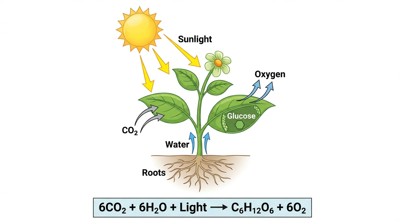 Labels are sized appropriately to remain readable at publication dimensions.
4. Red-Green Color Combinations
Problem: 8% of male readers cannot distinguish red from green.
Solution: Use blue-orange, blue-yellow, or purple-green combinations instead. Test with a colorblind simulator.
5. Inconsistent Styling Across Figures
Problem: Figure 1 uses Arial, Figure 2 uses Times New Roman. Figure 3 has different line weights.
Solution: Create a style guide before you start. Use the same fonts, colors, line weights, and labeling conventions throughout your paper.
6. Missing Scale Bars
Problem: Microscopy images without scale bars are meaningless.
Solution: Add scale bars to ALL images. Place them in a consistent location (usually bottom-right).
7. Overcrowded Panels
Problem: Too much information crammed into one figure makes it unreadable.
Solution: If a figure needs extensive explanation, consider splitting it. White space is not wasted space — it aids comprehension.
8. JPEG Compression Artifacts
Problem: Saving graphs or schematics as JPEG introduces visible compression artifacts.
Solution: Use PDF, EPS, or SVG for vector graphics. Use TIFF or PNG for images.
Tools Comparison for Publication Figures
Here's a practical comparison of tools for different needs:
| Tool | Best For | Skill Level | Cost | Output Quality |
|---|---|---|---|---|
| Adobe Illustrator | Final assembly, schematics | Advanced | $23/month | Excellent |
| Inkscape | Final assembly, schematics | Intermediate | Free | Excellent |
| R (ggplot2) | Statistical plots | Intermediate | Free | Excellent |
| Python (matplotlib) | Statistical plots | Intermediate | Free | Excellent |
| GraphPad Prism | Statistical plots | Beginner | $100+/year | Excellent |
| BioRender | Biological schematics | Beginner | $35/month | Very Good |
| ChemDraw | Chemical structures | Beginner | $200+/year | Excellent |
| ImageJ | Image processing | Intermediate | Free | Excellent |
| ConceptViz | Quick concept diagrams | Beginner | Free tier | Good-Very Good |
Recommended Workflows by Budget
Free workflow:
- R/Python for data plots
- ImageJ for image processing
- Inkscape for assembly
- ConceptViz for initial schematic concepts
Professional workflow:
- GraphPad Prism or R for data plots
- ChemDraw for structures
- BioRender or Illustrator for schematics
- Adobe Illustrator for final assembly
Journal-Specific Tips
Nature
- Use their Research Figure Guide — it's comprehensive
- Avoid JPEG, TIFF, PNG for main figures (use vector formats)
- Extended Data figures can be JPEG/TIFF
- 8pt bold lowercase for panel labels (a, b, c)
Science
- Initial submission can be lower resolution (150 DPI)
- Final submission requires high resolution
- Use Times New Roman for text
- Place panel labels at upper left of each panel
Cell
- Graphical abstract required (1200 × 1200 px at 300 DPI)
- Use Avenir or Arial fonts
- Line art needs 1000 DPI
- Consider Figure360 videos for complex figures
Applying These Principles
Creating figures for top-tier journals requires attention to detail, but the principles are straightforward:
- Know your journal's requirements before you start
- Use the right tool for each figure type
- Maintain consistency across all figures
- Check accessibility (colorblind-friendly, readable text)
- Export correctly in the required format
For educational materials, quick concept diagrams, or internal presentations, tools like ConceptViz can dramatically speed up the initial creation process. For final publication in Nature, Science, or Cell, you'll want to refine these concepts using professional vector software to meet exact specifications.
The investment in high-quality figures pays dividends: clearer communication, higher acceptance rates, and more citations for your work.
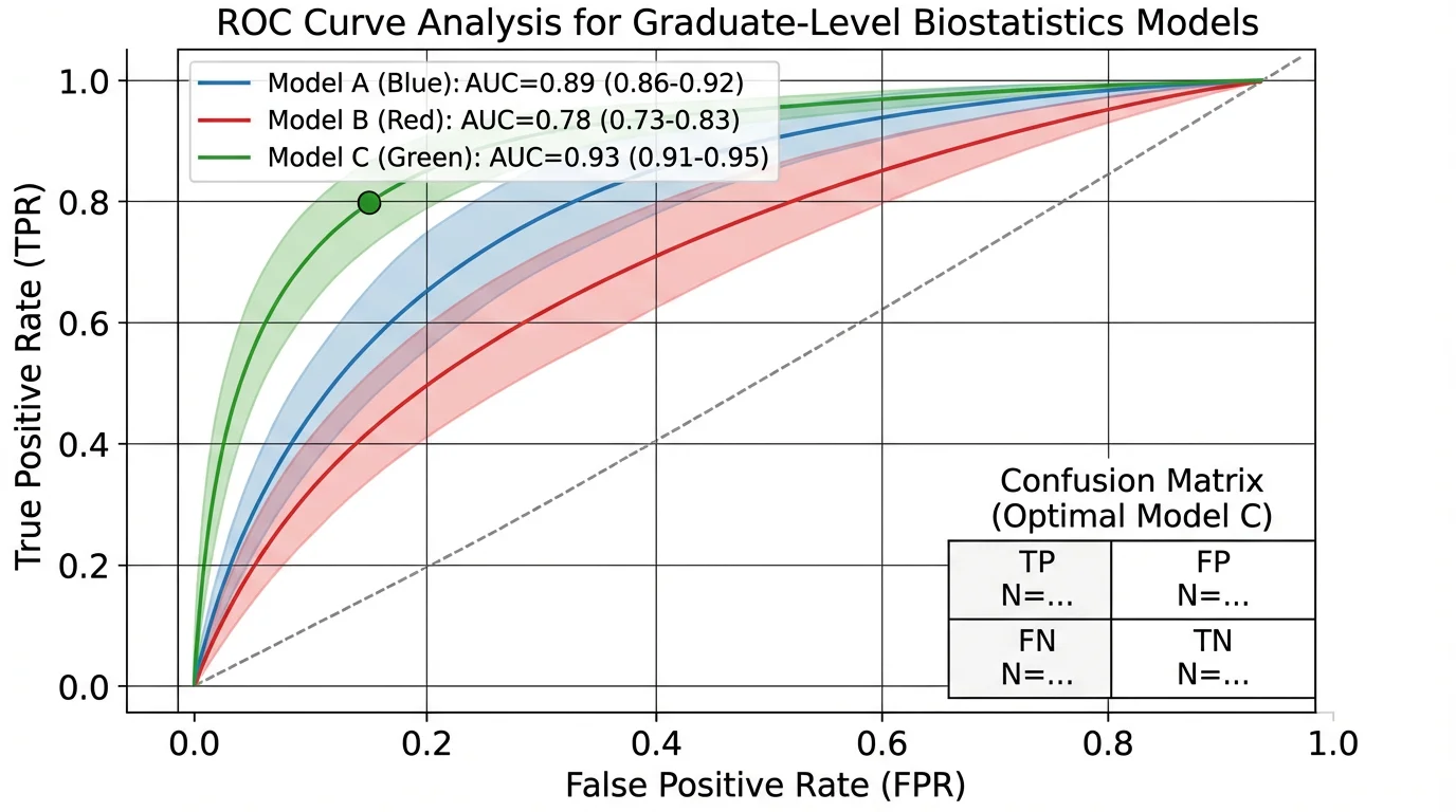 A clean data visualization that communicates results clearly — the hallmark of publication-quality figures.
Related Resources
- Scientific Color Palette Guide
- How to Make Scientific Diagrams for Research Papers
- Best Free BioRender Alternatives
- Best Free Adobe Illustrator Alternatives
- Science Diagram Tools
FAQ
Q: What resolution should figures be for Nature? A: Nature requires 300 DPI for all figures. Images should be supplied at maximum 300 DPI with file sizes under 10 MB. For vector graphics (graphs, schematics), use PDF, EPS, or SVG formats which are resolution-independent.
Q: Can I use PowerPoint to make figures for Science or Nature? A: Yes, but with caveats. PowerPoint can work for simple figures, but you'll need to export carefully to maintain quality. Nature accepts PowerPoint files saved as PDF. For best results, use dedicated vector software like Illustrator or Inkscape for final production.
Q: What's the difference between RGB and CMYK, and which should I use? A: RGB (Red-Green-Blue) is for screens and has a wider color range. CMYK (Cyan-Magenta-Yellow-Black) is for print. All major journals now recommend submitting in RGB — they'll convert to CMYK for print automatically. If you want to preview how colors will look in print, convert a copy to CMYK to check.
Q: How do I make figures colorblind-friendly? A: Avoid red-green combinations (affects 8% of men). Use blue-orange, blue-yellow, or purple-green instead. Test your figures with a colorblind simulator like Coblis or Color Oracle. For detailed guidance, see our Scientific Color Palette Guide.
Q: Should I include a graphical abstract? A: Cell Press journals require a graphical abstract (1200 × 1200 px at 300 DPI). Nature and Science don't require them but a well-designed graphical abstract can increase visibility and social media engagement for your paper.
Q: Can I use AI tools to generate figures for journal submission? A: AI tools can be helpful for generating initial concepts, schematics, and educational diagrams. For final submission to top journals, verify accuracy and consider refining in professional software to meet exact technical specifications. Always disclose AI usage per your journal's policy — see Nature's AI policy for guidance.
Q: What file format is best for figures with both photos and text? A: For composite figures with both raster images (photos, microscopy) and vector elements (text, labels, graphs), use layered formats like PSD or AI during editing. For submission, export to PDF (preserving vector elements) or TIFF (flattening but maintaining quality). Check your specific journal's preference.
Q: My figure has too much information. What should I do? A: Consider splitting into multiple figures or using supplementary figures for less critical details. Remove any elements that don't directly support your main message. Use white space strategically — crowded figures are harder to understand and less likely to impress reviewers.
Categories
More Posts
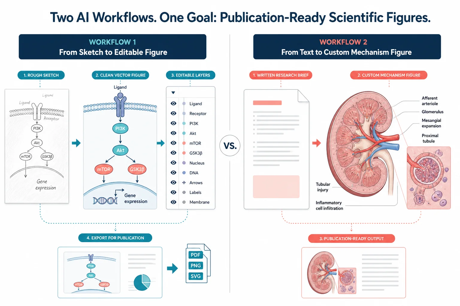
FigureLabs vs ConceptViz: AI Scientific Illustration Compared
Compare FigureLabs vs ConceptViz in 2026: credits, SVG and PPTX export, publication authorization, and when a custom brief beats an AI BioRender companion.
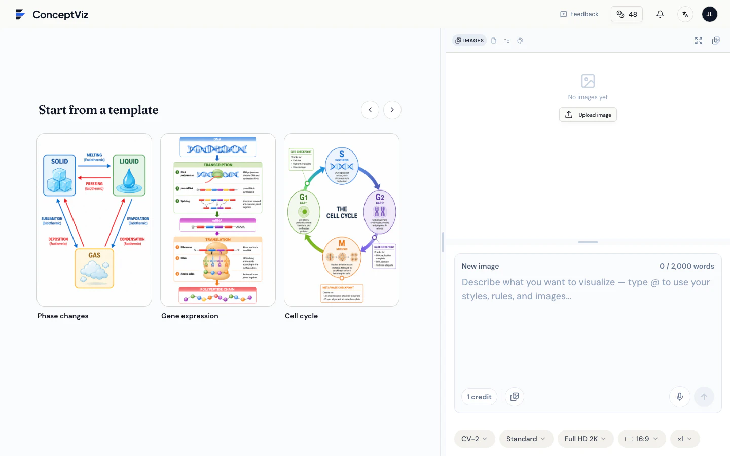
How to Use ConceptViz Studio: The Complete Guide
Master ConceptViz Studio: prompts, rules, styles, @ mentions, voice input, and output settings. A step-by-step guide to generating consistent visuals faster.
Free Printable Cell Diagram Worksheets: Unlabeled & Labeled (2026)
Download free printable cell diagram worksheets. Includes unlabeled plant cell, animal cell, and comparison diagrams for classroom quizzes and study guides.