")
How to Make Scientific Diagrams for Research Papers (2025 Guide)
Learn how to create professional scientific diagrams for research papers, theses, and publications. Includes best practices, tools comparison, and step-by-step tutorials for biology, chemistry, and physics diagrams.
Scientific diagrams are essential for communicating complex ideas in research papers, theses, and academic publications. A well-designed figure can explain concepts that would take paragraphs of text — and significantly increase your paper's impact and citation rate.
In this comprehensive guide, we'll cover everything you need to know about creating professional scientific diagrams, from choosing the right tools to meeting journal requirements.
Why Scientific Diagrams Matter in Research
Scientific figures aren't just decorative — they're a critical part of your research communication. According to a study published in PLOS ONE, papers with clear, high-quality figures receive significantly more citations than those with poor-quality visuals.
Research from eLife found that figures are often the first thing readers look at when evaluating a paper, making them crucial for first impressions.
Key benefits of effective scientific diagrams:
- Clarity: Complex processes become understandable at a glance
- Reproducibility: Other researchers can replicate your methods
- Engagement: Readers are more likely to read papers with good figures
- Citations: High-quality visuals increase paper visibility and citations
Types of Scientific Diagrams
Different research fields require different types of diagrams. Here's an overview of the most common categories:
1. Biological Diagrams
Biology papers frequently include:
- Cell diagrams — showing organelles, membrane structures, and cellular processes
- Molecular pathways — depicting signaling cascades and metabolic reactions
- Anatomical illustrations — organs, tissues, and body systems
- Phylogenetic trees — evolutionary relationships between species
- Experimental workflows — step-by-step protocol visualizations
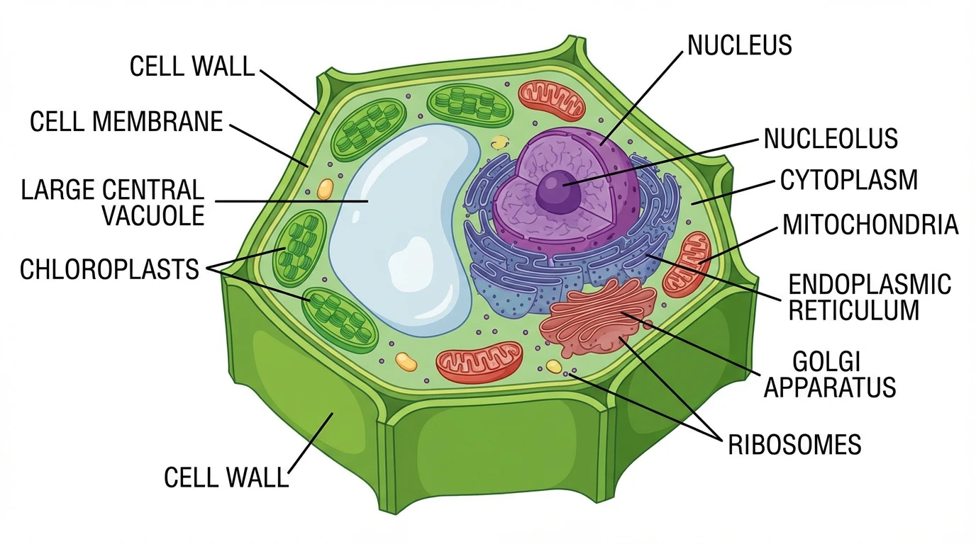
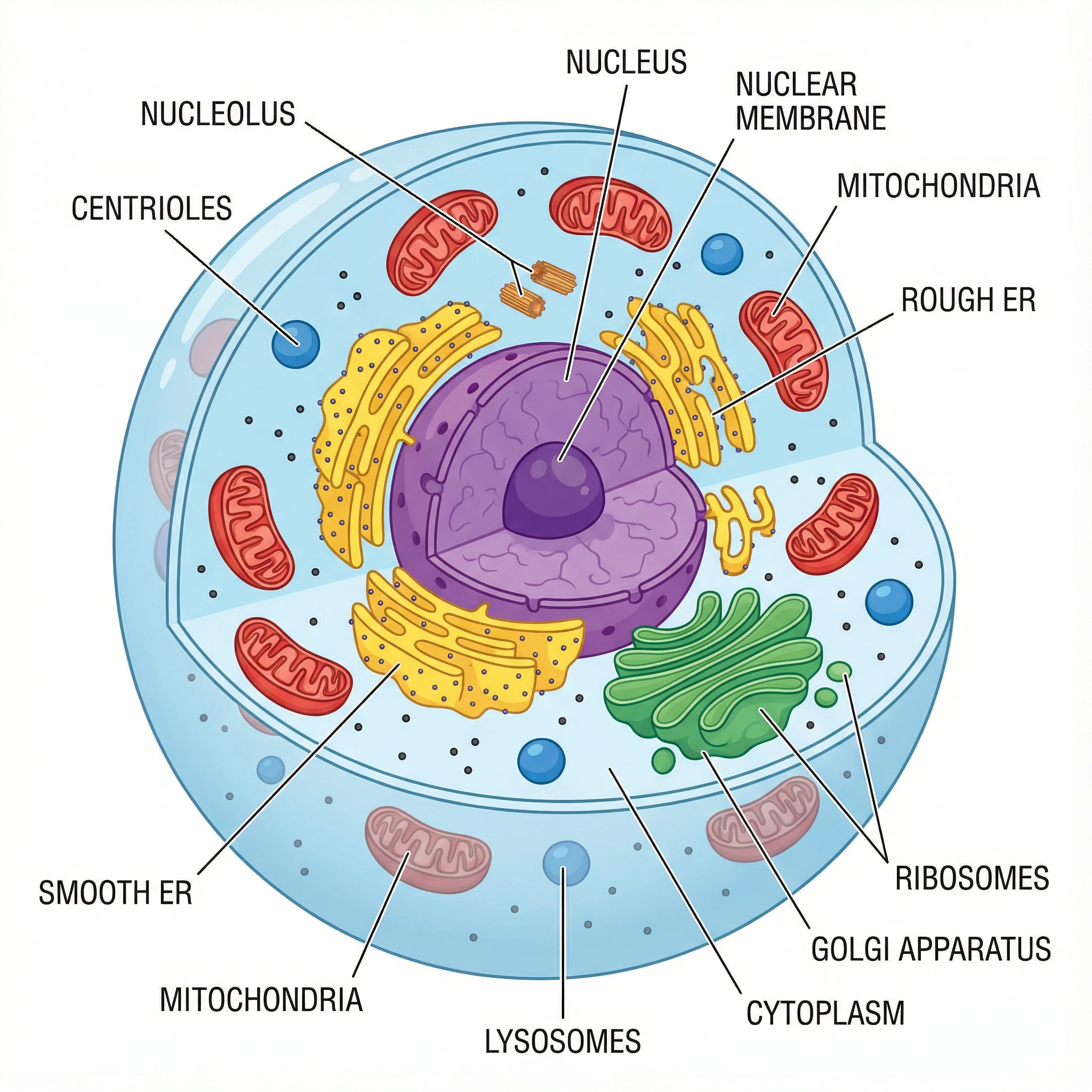 A labeled animal cell diagram showing key organelles — commonly used in biology research papers to illustrate cellular structures. Create your own with our Animal Cell Diagram Generator.
For cell biology research, accurate organelle representation is critical. The National Center for Biotechnology Information (NCBI) provides detailed references for cellular structures that can guide your diagram creation.
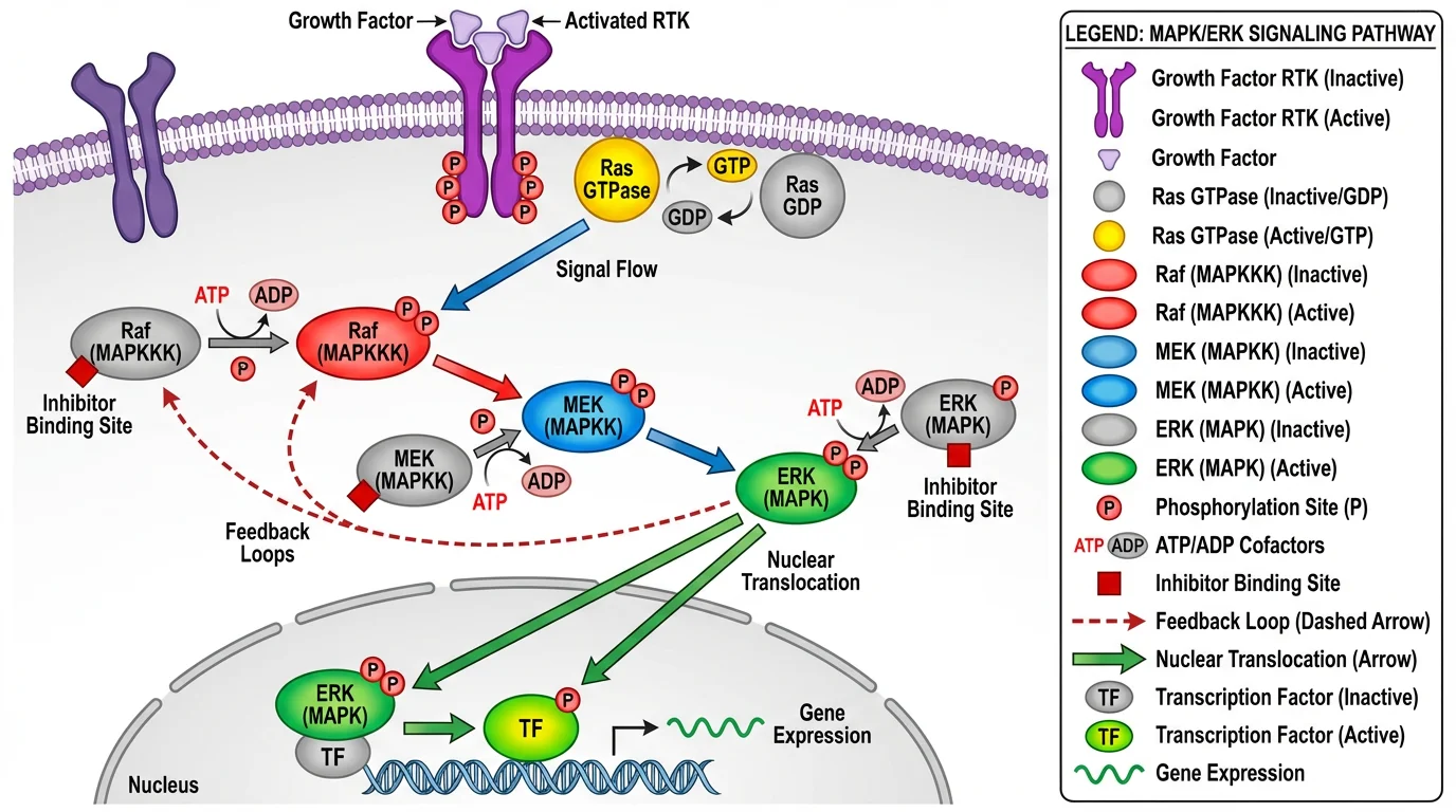 A graduate-level MAPK signaling pathway diagram showing molecular interactions — essential for cell signaling research papers.
2. Chemistry Diagrams
Chemistry publications typically need:
- Molecular structures — 2D and 3D representations of compounds
- Reaction mechanisms — electron movement and bond changes
- Synthesis pathways — multi-step chemical transformations
- Crystal structures — atomic arrangements in solid materials
- Spectroscopy data — NMR, IR, and mass spectrometry visualizations
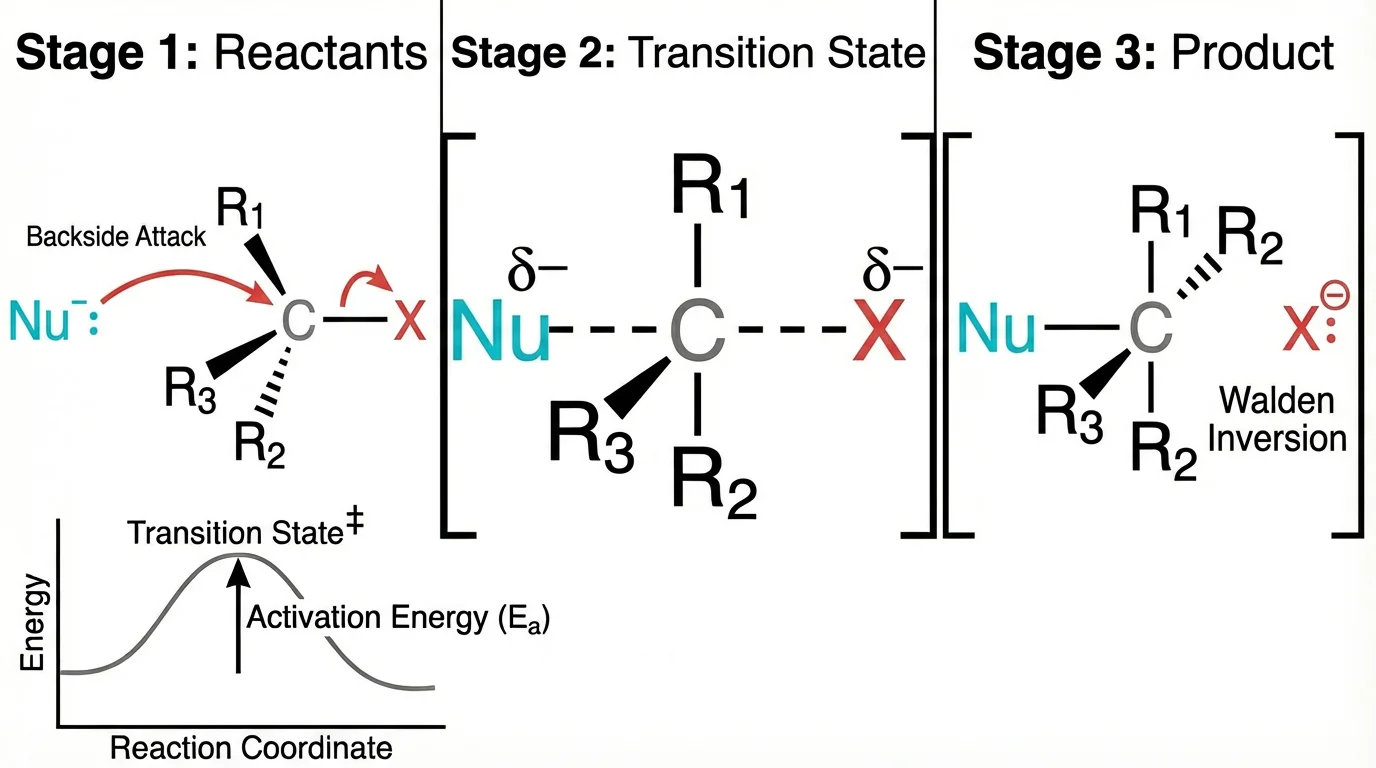 An SN2 reaction mechanism diagram showing electron movement and bond changes — standard in organic chemistry papers.
The American Chemical Society (ACS) provides comprehensive guidelines for chemical structure drawing, including bond lengths, angles, and stereochemistry representation.
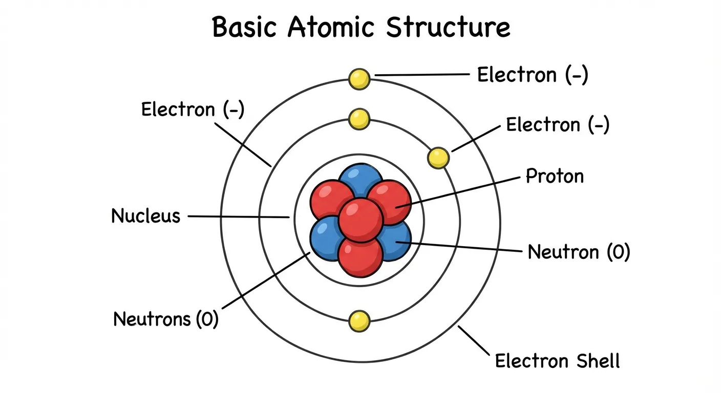 A clear atomic structure diagram showing protons, neutrons, and electrons — useful for introductory chemistry materials.
3. Physics and Engineering Diagrams
Physics papers often include:
- Circuit diagrams — electrical component layouts
- Force diagrams — vectors showing physical forces
- Experimental setups — apparatus and measurement configurations
- Data plots — graphs, charts, and statistical visualizations
- Flowcharts — process flows and decision trees
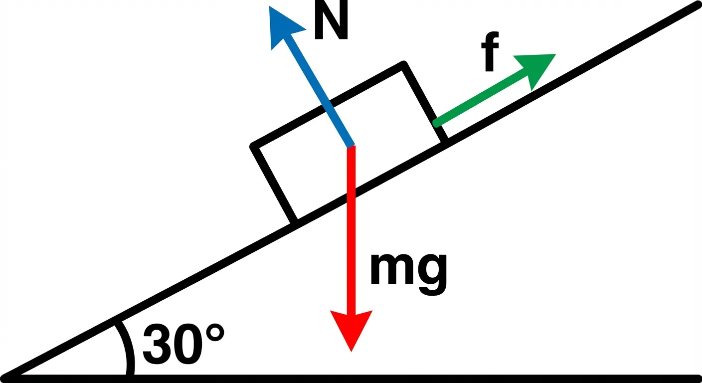 A free body diagram showing forces on a block on an inclined plane — standard physics illustration style.
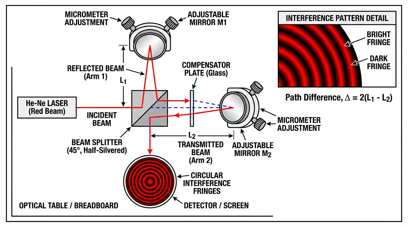 A Michelson interferometer setup diagram — commonly used in optics research papers to illustrate experimental configurations.
The American Physical Society (APS) offers detailed guidelines for physics figure preparation, including recommendations for line weights, font sizes, and color usage.
4. Earth and Environmental Science
Geoscience papers commonly feature:
- Water cycle diagrams — hydrological processes
- Geological cross-sections — rock layers and formations
- Climate models — atmospheric and oceanic systems
- Ecosystem diagrams — food webs and energy flows
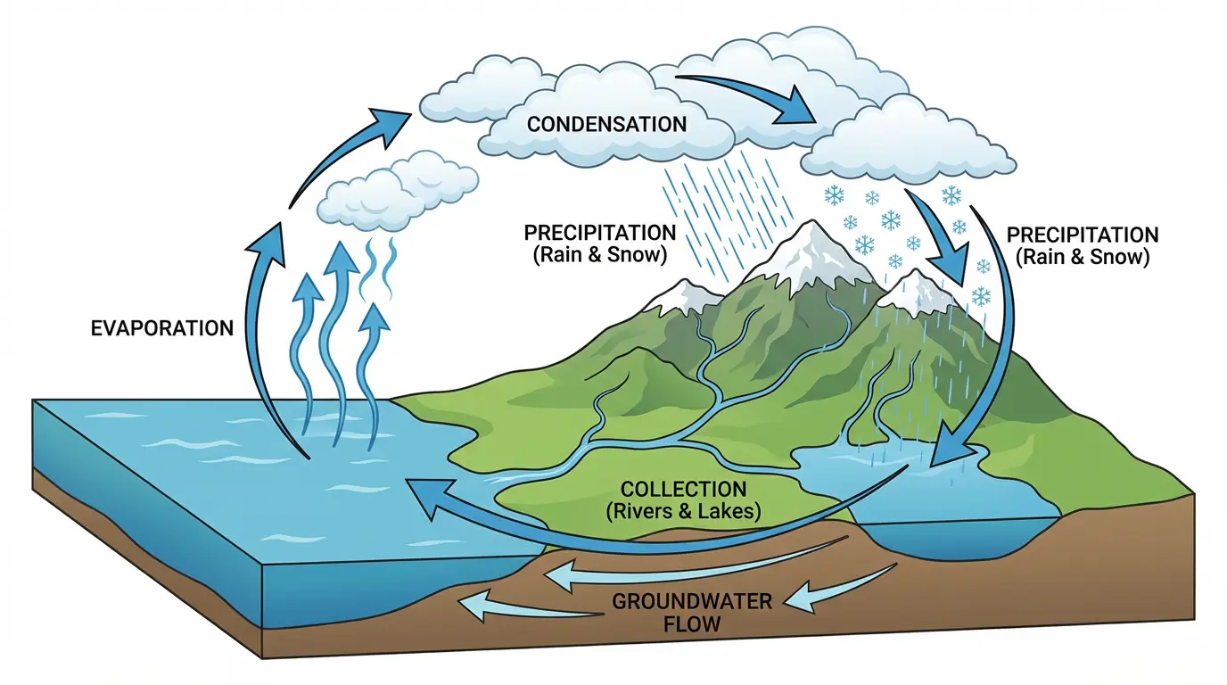 A complete water cycle diagram showing evaporation, condensation, precipitation, and collection. Create your own with our Water Cycle Diagram Generator.
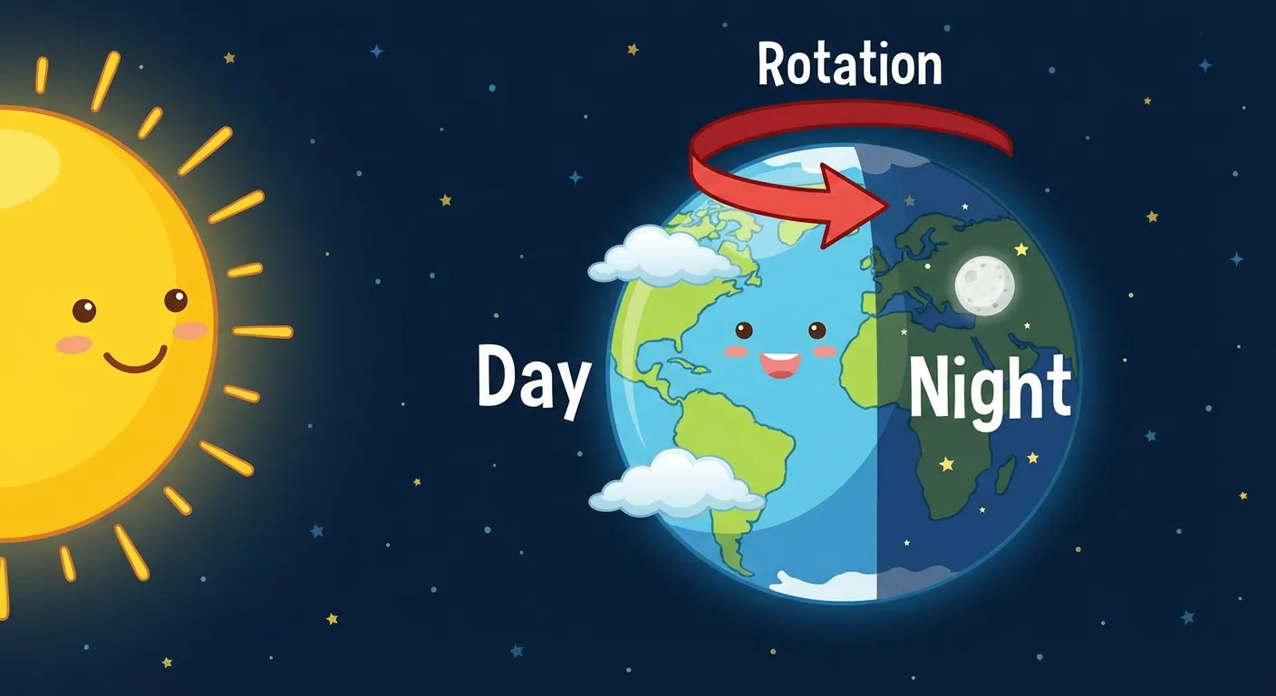 An Earth rotation diagram showing day and night cycles — useful for earth science publications.
5. Medical and Life Sciences
Medical research requires specialized diagrams:
- Anatomical illustrations — organ systems and structures
- Physiological processes — how body systems function
- Clinical pathways — diagnostic and treatment workflows
- Drug mechanisms — how medications work at the molecular level
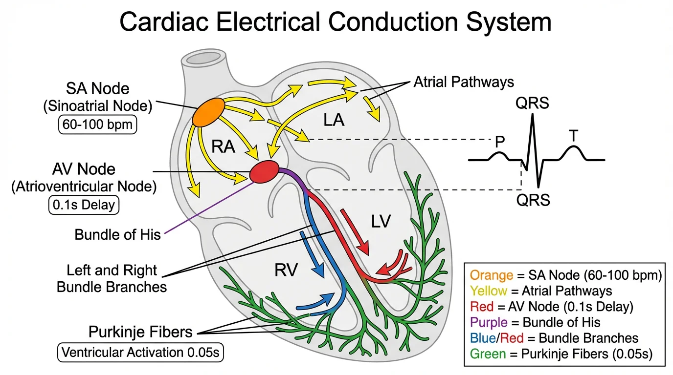 A cardiac conduction system diagram showing electrical pathways in the heart — essential for cardiology research.
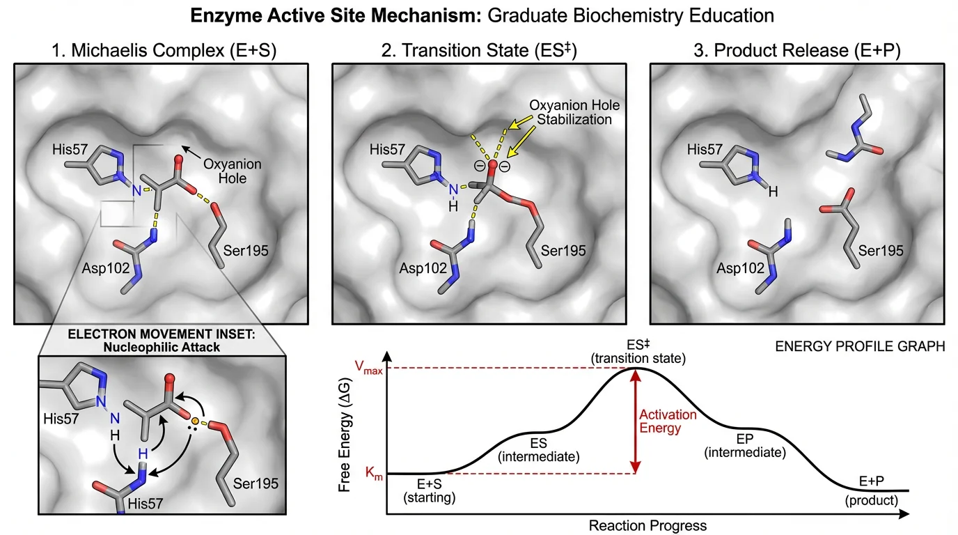 An enzyme active site mechanism diagram showing substrate binding and catalysis — commonly used in biochemistry papers.
Best Practices for Scientific Diagrams
Creating professional scientific diagrams requires attention to both scientific accuracy and visual design principles.
1. Follow Journal Guidelines
Every journal has specific requirements for figures. Before creating your diagrams, check:
- File format: Most journals accept EPS, PDF, TIFF, or high-resolution PNG
- Resolution: Typically 300 DPI minimum for print, 150 DPI for web
- Color mode: CMYK for print, RGB for online-only
- Size: Fit within column width (usually 8.5 cm) or page width (17.5 cm)
- Font: Usually sans-serif (Arial, Helvetica) at minimum 6-8 pt
Popular journals provide detailed figure preparation guides:
- Nature Figure Guidelines
- Science Figure Requirements
- Cell Press Figure Preparation
- Elsevier Artwork Guidelines
2. Maintain Scientific Accuracy
Your diagrams must be:
- Factually correct — double-check all labels and structures
- Proportional — relative sizes should be accurate (or clearly noted as not to scale)
- Consistent — use the same style throughout your paper
- Referenced — cite the source if adapting from other work
Resources for accuracy verification:
- PDB (Protein Data Bank) — for molecular structures
- KEGG Pathway Database — for metabolic pathways
- UniProt — for protein information
3. Design for Clarity
Visual hierarchy:
- Most important elements should be most prominent
- Use size, color, and position to guide the eye
- Remove unnecessary clutter and decorations
Color usage:
- Use colorblind-friendly palettes (avoid red-green combinations)
- Ensure figures work in grayscale (for print versions)
- Limit to 4-5 colors maximum
- Tools like ColorBrewer help select accessible palettes
Labels and annotations:
- Use clear, readable fonts (8-10 pt minimum)
- Place labels close to what they describe
- Use leader lines when necessary
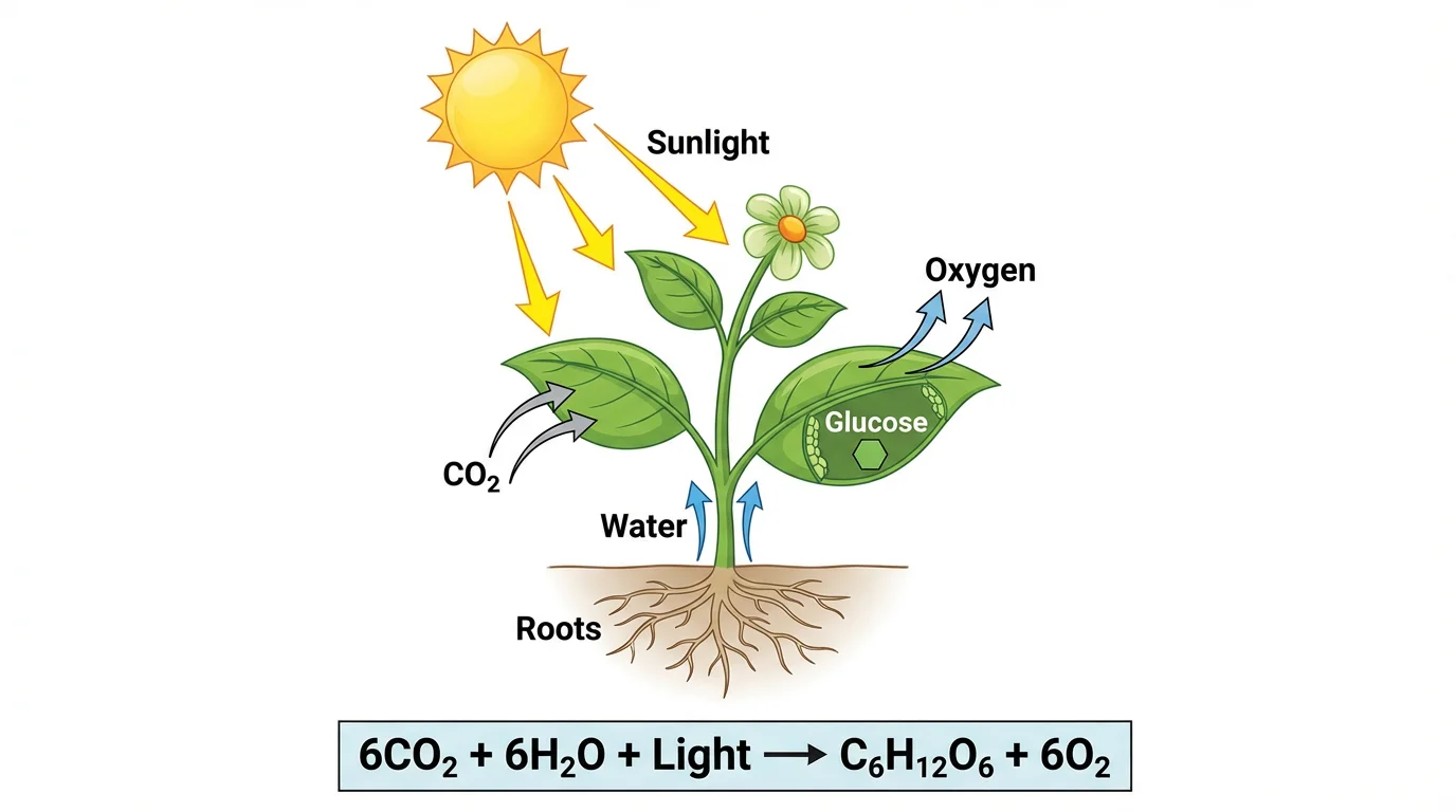 A well-labeled photosynthesis diagram with clear visual hierarchy — light reactions and Calvin cycle clearly distinguished. Create similar diagrams with our Photosynthesis Diagram Generator.
4. Export at Correct Resolution
For publication-quality figures:
| Format | Best Use | Resolution |
|---|---|---|
| EPS/PDF | Vector graphics (diagrams, charts) | Scalable |
| TIFF | Photographs, microscopy images | 300+ DPI |
| PNG | Web/screen display | 150-300 DPI |
| SVG | Web graphics, editable vectors | Scalable |
Tools for Creating Scientific Diagrams
Professional Software
Adobe Illustrator — Industry standard for vector graphics
- Pros: Extremely powerful, journal-standard output
- Cons: Expensive ($22/month), steep learning curve
- Adobe Illustrator
BioRender — Purpose-built for life science diagrams
- Pros: Huge icon library, drag-and-drop interface
- Cons: Expensive for individuals ($99/month)
- BioRender
ChemDraw — Chemistry structure drawing
- Pros: Industry standard for chemical structures
- Cons: Specialized for chemistry only
- ChemDraw
Free Alternatives
Inkscape — Open-source vector editor
- Pros: Free, powerful, cross-platform
- Cons: Less polished interface than Illustrator
- Download Inkscape
GIMP — Open-source image editor
- Pros: Free Photoshop alternative
- Cons: Not ideal for vector diagrams
- Download GIMP
draw.io (diagrams.net) — Free online diagramming
- Pros: Free, web-based, easy to use
- Cons: Limited scientific templates
- Use draw.io
For a comprehensive comparison, see our guide: Best Free BioRender Alternatives for Teachers
AI-Powered Tools
ConceptViz — AI diagram generator
- Pros: Generate diagrams from text descriptions, fast, affordable
- Best for: Educational diagrams, quick visualizations, initial concepts
- Try ConceptViz Free
AI tools are increasingly popular for creating initial drafts of scientific diagrams, which researchers then refine for publication.
Step-by-Step: Creating a Scientific Diagram
Let's walk through creating a professional biological pathway diagram:
Step 1: Plan Your Diagram
Before opening any software:
- Define the purpose — What concept are you explaining?
- Identify key elements — What must be included?
- Determine the flow — How do elements connect?
- Sketch on paper — Plan the layout roughly
Step 2: Gather Reference Materials
Collect:
- Published diagrams in your field (for style reference)
- Journal figure requirements
- Icon libraries or templates
- Source data for any quantitative elements
Useful reference databases:
- PubMed Central — open access figures from published papers
- Wikimedia Commons — free scientific illustrations
- Servier Medical Art — free medical illustrations
Step 3: Create the Base Structure
- Set up your canvas at the correct size and resolution
- Create the main shapes and elements
- Arrange them according to your layout plan
- Establish visual hierarchy (what's most important?)
Step 4: Add Details and Labels
- Add connecting lines and arrows
- Place labels and annotations
- Include a legend if needed
- Add scale bars for microscopy images
 A mitosis diagram showing all four phases with proper labeling — prophase, metaphase, anaphase, and telophase. Create your own with our Mitosis Diagram Generator.
Step 5: Refine and Export
- Check scientific accuracy
- Verify readability at publication size
- Test in grayscale
- Export in the required format
Common Mistakes to Avoid
1. Low Resolution
Problem: Figures look blurry when printed or zoomed Solution: Always work at 300+ DPI and export appropriately
2. Tiny Text
Problem: Labels become unreadable at publication size Solution: Preview at actual print size; use minimum 6-8 pt fonts
3. Cluttered Layouts
Problem: Too many elements competing for attention Solution: Remove everything that doesn't serve a purpose
 A clean, uncluttered plant cell diagram — notice how each organelle has clear space and readable labels. Create similar diagrams with our Plant Cell Diagram Generator.
4. Inconsistent Style
Problem: Different figures in the same paper look disconnected Solution: Create a style guide and template for your figures
5. Colorblind-Unfriendly Palettes
Problem: 8% of men cannot distinguish red from green Solution: Use colorblind-friendly palettes (blue-orange, purple-yellow)
Tools for checking colorblind accessibility:
- Color Oracle — desktop color blindness simulator
- Coblis — online image simulator
- Viz Palette — palette checker
Creating Diagrams with AI
AI-powered tools like ConceptViz can help researchers quickly create scientific diagrams:
When to Use AI Diagram Tools
AI tools work well for:
- Initial drafts — quickly visualize concepts
- Educational materials — teaching and presentation diagrams
- Simple illustrations — basic cell diagrams, cycles, processes
- Rapid iteration — testing different visual approaches
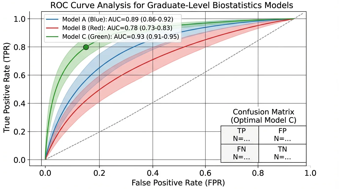 A ROC curve analysis diagram — while data visualizations like this are typically generated from actual data, AI can help create explanatory diagrams for methods sections.
When to Use Traditional Software
For publication, you may still need traditional tools for:
- Complex molecular structures — requiring chemical accuracy
- Data visualizations — generated from actual experimental data
- Highly detailed illustrations — anatomical or technical drawings
- Figures requiring precise scaling — microscopy with scale bars
A Hybrid Approach
Many researchers now use a hybrid workflow:
- Generate initial concept with AI — fast brainstorming
- Refine in vector software — adjust for publication standards
- Add data elements — integrate actual experimental results
- Final polish — ensure journal compliance
Try it: ConceptViz Diagram Generator — create your first diagram in seconds.
Diagram Checklist for Submission
Before submitting your paper, verify each figure:
- Resolution meets journal requirements (typically 300 DPI)
- File format is accepted (EPS, PDF, TIFF, or PNG)
- Text is readable at publication size (6-8 pt minimum)
- Colors work in grayscale
- Colorblind-friendly palette used
- All elements are labeled clearly
- Figure caption is complete and descriptive
- Source citations included where needed
- Scale bars added to microscopy images
- Figure numbers match manuscript text
Related Resources
Explore more diagram tools and guides:
- Free Printable Water Cycle Worksheets for Teachers
- Free Photosynthesis Diagram Worksheets
- Best Free BioRender Alternatives
- All Science Diagram Tools
Frequently Asked Questions
What software do scientists use to make diagrams?
The most common tools are Adobe Illustrator for vector graphics, BioRender for life science diagrams, and ChemDraw for chemical structures. Free alternatives include Inkscape and draw.io. AI tools like ConceptViz are increasingly used for quick diagram generation. See our comparison of BioRender alternatives for more options.
What resolution should scientific figures be?
Most journals require 300 DPI minimum for print publication. For online-only journals, 150-300 DPI is typically acceptable. Always check your target journal's specific requirements — Nature, Science, and Cell all have detailed guidelines.
How do I make my diagrams colorblind-friendly?
Avoid red-green color combinations. Use blue-orange or purple-yellow palettes instead. Tools like Color Oracle can simulate how your figures appear to colorblind viewers. ColorBrewer provides pre-made accessible palettes.
Can I use AI to create figures for my research paper?
Yes, AI tools can help create initial diagram drafts. However, you should always verify scientific accuracy and may need to refine the output in traditional software to meet publication standards. Always disclose AI usage per your journal's policy — see Nature's AI policy for guidance.
What file format is best for scientific figures?
EPS or PDF for vector graphics (diagrams, charts), TIFF for photographs and microscopy images at 300+ DPI. Avoid JPEG for diagrams due to compression artifacts. Most journals accept all these formats — check your target journal's guidelines.
How do I create figures that work in both color and grayscale?
Use patterns and line styles in addition to colors. Ensure there's sufficient contrast between elements. Preview your figures in grayscale before submission. Tools like Coblis can help you test your figures.
Ready to create professional scientific diagrams? Try ConceptViz to generate publication-ready diagrams in seconds, or explore our free biology diagram tools for specific use cases like cell diagrams, photosynthesis, and mitosis.
Categories
More Posts

Column Chart Maker Guide: When to Use Column Charts and How to Make One
Learn when to use a column chart, how it differs from a bar chart, and how to make clean grouped, stacked, and spreadsheet-ready column charts.

Motion Diagram Physics Guide: How to Draw and Read Motion Diagrams
Learn how to draw motion diagrams in physics, read dot spacing, velocity arrows, acceleration direction, and connect diagrams to graphs.

Scientific Poster Examples: 50+ Award-Winning Designs & Best Practices
Explore award-winning scientific poster examples from biology, chemistry, physics, and medicine. Learn what makes a poster stand out at conferences with expert design tips and templates.