Color Accessibility

Colorblind Friendly Palettes Hex Codes & Simulation Checker

Free colorblind friendly palettes with hex codes: Okabe-Ito, Paul Tol, viridis, cividis. Preview three types of color blindness and check your own colors.

7 palettes from official sources, with linksProtanopia, deuteranopia and tritanopia viewsPaste your own colors and find the closest pairCopy hex, R, Python and CSS. PNG, SVG and print

Type

Vision view (applies to every card)

Showing the original colors. Switch the vision view to see an approximation of how each palette may look with protanopia, deuteranopia or tritanopia.

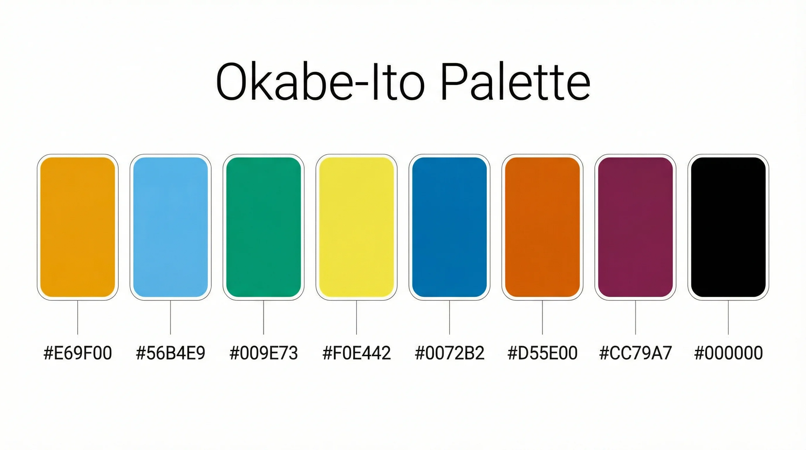
Okabe-Ito

Categorical, 8 colors

Normal vision

Closest pair: 2 (#E69F00) and 5 (#F0E442), ΔE00 21.7. Clearly different.

Paul Tol Bright

Categorical, 7 colors

Normal vision

Closest pair: 5 (#66CCEE) and 7 (#BBBBBB), ΔE00 20.5. Clearly different.

Paul Tol High-contrast

Categorical, 3 colors

Normal vision

Closest pair: 1 (#004488) and 3 (#BB5566), ΔE00 38.9. Clearly different.

Paul Tol Vibrant

Categorical, 7 colors

Normal vision

Closest pair: 1 (#EE7733) and 5 (#CC3311), ΔE00 18.3. Clearly different.

Paul Tol Muted

Categorical, 9 colors

Normal vision

Closest pair: 6 (#882255) and 9 (#AA4499), ΔE00 15.0. Clearly different.

Viridis (8 steps)

Sequential, 8 colors

Normal vision

Smallest step: 1 (#440154) and 2 (#46327E), ΔE00 12.2

Cividis (8 steps)

Sequential, 8 colors

Normal vision

Smallest step: 1 (#00224E) and 2 (#213B6E), ΔE00 8.2

Export the palettes shown, in the current vision view

Free Colorblind Palette Charts

Every chart below is drawn from the same data as the tool above. View, download and print them free, no sign-up.

All palettes

Colorblind Friendly Palettes Overview with Hex Codes

Every palette on this page in one sheet, with the hex code under each swatch.

1 / 6

Palette cards

Simulation

Counter-example

Quick reference

Which colorblind friendly palette should you use?

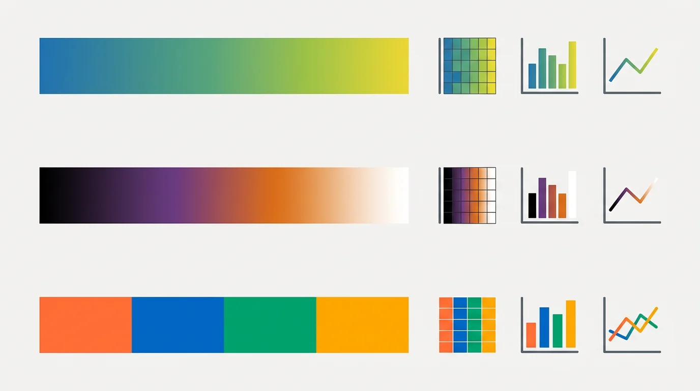
  • For categories such as groups, treatments or product lines, start with Okabe-Ito if you need up to eight colors, or one of Paul Tol’s qualitative schemes. Tol’s Bright scheme is his default for lines and labels, High-contrast has only three colors but stays readable in grayscale, Vibrant is more saturated, and Muted offers nine softer colors. For ordered data such as heatmaps and densities, use a sequential colormap that changes steadily in lightness. Viridis and cividis are the two on this page, and cividis was designed with red-green color vision deficiency in mind.
  • No palette works for every viewer and every chart. The point of a colorblind friendly palette is to keep your categories apart for the most common kinds of color vision deficiency, so a reader does not have to guess which line is which. Keep the number of colors small, and add direct labels, markers or line styles when you need more categories.

How the color blindness simulation works

  • Each card can be switched to protanopia (no working long-wavelength cones), deuteranopia (no working medium-wavelength cones) or tritanopia (no working short-wavelength cones). The page uses the model of Machado, Oliveira and Fernandes (2009) at severity 1.0. Each hex color is converted from sRGB to linear RGB, multiplied by the matrix for that deficiency, clipped to the displayable range, then converted back to sRGB.
  • This is an approximation of how a person with complete dichromacy may see a color. Many people have a milder, anomalous form that shifts colors less, screens and printers vary, and nobody sees exactly what a simulation shows. Use it to spot problems early, not to certify a palette.

How the closest pair check works

  • For every palette, the tool simulates each color, then measures the difference between every pair with CIEDE2000, a standard formula for perceived color difference. The pair with the smallest difference is marked with dark bars, and the result is flagged when it falls below 10. That threshold is a rule of thumb for the small marks in typical charts, not a standard: thin lines and small dots need a bigger difference than large filled areas.
  • The results are worth reading rather than trusting blindly. Under tritanopia the closest pair in Paul Tol Bright scores 8.7 and in Vibrant 8.6, below 10, while Okabe-Ito stays at 11.1 or above in every view. A red and green palette that looks fine in normal vision can fall to 3.5 under deuteranopia. For sequential colormaps the tool compares neighboring steps instead, because neighbors are meant to be close.

Check your own palette

Open the Check your palette tab and paste between two and twelve hex colors, separated by commas, spaces or new lines. Three-digit codes such as #0af are expanded, and anything that is not a valid hex code is reported instead of silently ignored. You get your colors in all four views, the closest pair in each, and a sample chart, and you can download the result as PNG or SVG or print it. Nothing is uploaded: the check runs in your browser.

Where the color values come from

Every hex value comes from the original source and is listed on the card with its link and the date it was checked. Okabe-Ito comes from the color universal design page of Okabe and Ito, which Wong (2011) also recommended in Nature Methods. The four Paul Tol schemes come from his color schemes page and the tol_colors.py file on the same site, where the current High-contrast scheme has three colors. Viridis and cividis are sampled at eight evenly spaced positions of the 256-entry tables in matplotlib, so an R function that interpolates may differ in the last digit. Copy the hex list, or the R, Python and CSS snippets, from the details panel of any card.
Frequently Asked Questions