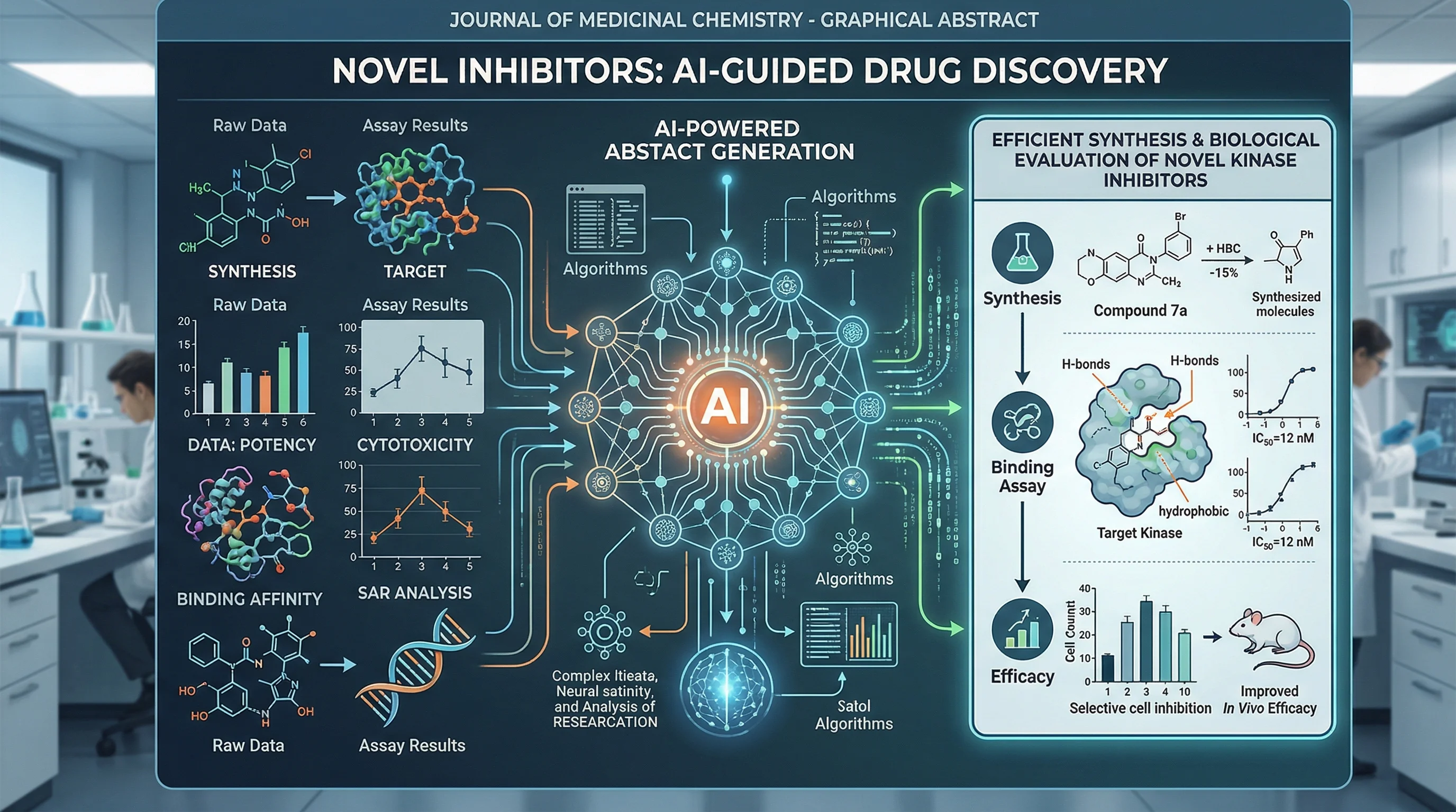
Graphical Abstract Examples by Discipline (2026)
Graphical abstract examples across 12 disciplines, with two new illustrated layouts, journal size checks, and practical ways to adapt each example.
Creating a graphical abstract from scratch can feel overwhelming. Where do you start? What layout works best for your research? How do other researchers in your field approach visual abstracts?
This guide groups graphical abstract examples and layout ideas across 12 disciplines. The illustrations are teaching examples, not figures reproduced from published studies. Two newly generated examples below show environmental science and plant research in specific journal-shaped canvases. Use them to plan a visual story; replace their hypothetical content with your own verified findings.
For step-by-step creation instructions, see our companion guide: How to Create a Graphical Abstract.
Graphical Abstract Maker
Describe your study and draft a visual summary. Choose a starting ratio, review the science, then crop or resize to your journal's exact requirements.
Draft a graphical abstract →Why Study Graphical Abstract Examples?
Before diving into examples, let's understand why studying existing graphical abstracts matters:
| Benefit | What You'll Learn |
|---|---|
| Pattern Recognition | Common layouts and visual conventions in your field |
| Quality Standards | What "good" looks like for journal submissions |
| Inspiration | Creative approaches you hadn't considered |
| Time Savings | Avoid reinventing the wheel |
| Confidence | Knowing your work matches field standards |
Research shows that articles with graphical abstracts receive approximately 2x more views than those without. By studying successful examples, you can ensure your visual abstract meets the standards that drive engagement.
The Four Universal Graphical Abstract Structures
Regardless of discipline, most effective graphical abstracts follow one of four structural patterns:
Structure 1: Linear Flow (Left → Right)
The most common pattern, showing progression from problem to solution:
[Context/Problem] → [Method/Approach] → [Key Finding] → [Implication]Best for:
- Process-based research
- Drug discovery pipelines
- Sequential experiments
- Cause-and-effect studies
Structure 2: Central Focus
Places the main finding at the center with supporting elements radiating outward:
        [Input 1]
            ↓
[Input 2] → [CENTRAL FINDING] ← [Input 3]
            ↓
        [Outcome]
Best for:
- Studies with multiple inputs leading to one outcome
- Mechanistic discoveries
- Integration studies
Structure 3: Before/After Comparison
Side-by-side layout showing transformation or contrast:
[Condition A]  |  [Condition B]
    ↓          |      ↓
[Result A]     |  [Result B]
Best for:
- Treatment studies
- Comparative analyses
- Control vs. experimental designs
Structure 4: Hierarchical/Layered
Top-to-bottom organization showing system levels:
[Macro Level / System]
        ↓
[Intermediate Level]
        ↓
[Molecular/Detailed Level]
Best for:
- Systems biology
- Ecological studies
- Multi-scale research
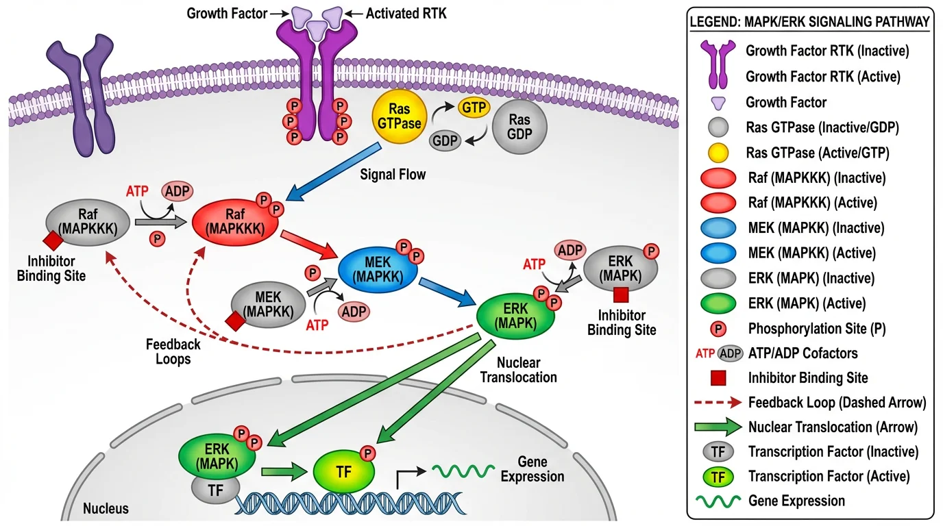
This pathway diagram demonstrates the linear flow structure, showing signal transduction from receptor to cellular response
Biology & Life Sciences Examples
Biology graphical abstracts often feature cellular structures, pathways, and organism-level representations.
Example Category 1: Molecular & Cellular Biology
Typical Elements:
- Cell membrane representations
- Protein structures and interactions
- Signaling pathway arrows
- Organelle diagrams
Effective Approaches:
| Study Type | Recommended Layout | Key Visual Elements |
|---|---|---|
| Signaling pathway | Linear flow | Arrows, protein icons, cell cross-section |
| Protein-protein interaction | Central focus | Molecular structures at center |
| Gene expression | Before/after | Control vs. treatment cells |
| Cellular mechanism | Hierarchical | System → cell → molecule |
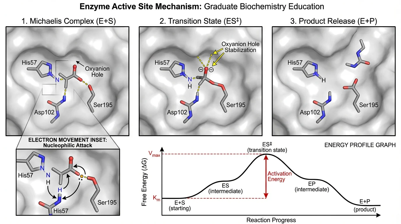
Enzyme mechanism diagrams use the central focus structure, highlighting the active site interaction
Biology-Specific Tips:
- Use established iconography: Stick to conventional representations for common structures (double helix for DNA, Y-shape for antibodies)
- Scale matters: Be consistent with relative sizes of structures
- Color coding: Use established color conventions (e.g., blue for cold/inhibition, red for activation)
- Avoid overcrowding: Focus on the key pathway relevant to your findings
Example Category 2: Ecology & Environmental Science
Typical Elements:
- Ecosystem representations
- Food web diagrams
- Geographic maps
- Species illustrations
- Environmental gradients
Recommended Layouts:
- Field studies: Geographic layout with sampling locations
- Community ecology: Network/web structure
- Climate research: Before/after or timeline comparison
- Conservation: Hierarchical (ecosystem → species → genetics)
Ecology-Specific Tips:
- Use simplified organism silhouettes rather than detailed illustrations
- Include scale bars for geographic representations
- Use intuitive color gradients (green for vegetation, blue for water)
- Consider seasonality or temporal aspects in your layout
Chemistry & Materials Science Examples
Chemistry graphical abstracts often combine molecular structures with reaction schemes and material properties.
Example Category 3: Organic & Synthetic Chemistry
Typical Elements:
- Molecular structures (2D or 3D)
- Reaction arrows and conditions
- Catalyst representations
- Yield/selectivity indicators
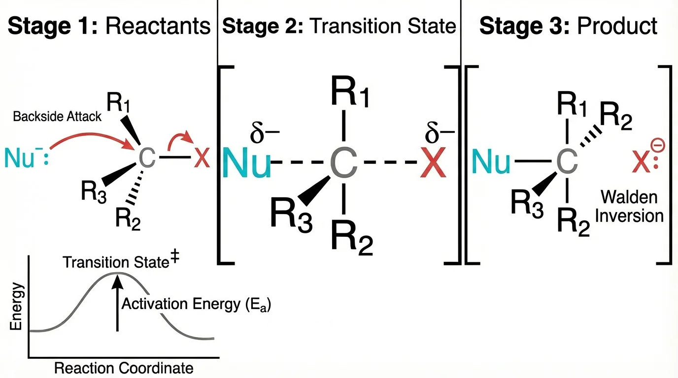
Reaction mechanism diagrams effectively use the linear flow structure to show substrate transformation
Chemistry-Specific Conventions:
| Element | Standard Representation |
|---|---|
| Reaction arrow | → or ⇌ (equilibrium) |
| Heat | Δ or temperature in °C |
| Light | hν |
| Catalyst | Above/below arrow |
| Yield | Percentage at arrow end |
Recommended Approaches:
- Synthesis route: Linear flow from starting material to product
- Mechanism study: Central focus on transition state
- Catalyst comparison: Before/after or side-by-side
- Structure-activity relationship: Grid or matrix layout
Example Category 4: Materials & Nanoscience
Typical Elements:
- Material structures (nanoparticles, films, crystals)
- Property measurements (conductivity, strength)
- Application demonstrations
- Scale comparisons (nano to macro)
Layout Recommendations:
[Raw Material] → [Synthesis] → [Structure] → [Property] → [Application]Tips for Materials Science:
- Include scale bars for microscopy images
- Use consistent color for same material across panels
- Show structure-property-function relationship
- Consider 3D representations for complex structures
Medicine & Clinical Research Examples
Medical graphical abstracts must balance scientific accuracy with accessibility for clinical readers.
Example Category 5: Clinical Trials & Treatment Studies
Typical Elements:
- Patient population icons
- Treatment arms/groups
- Outcome measures
- Statistical significance indicators
Recommended Structure:
[Patient Population] → [Randomization] → [Treatment A / Treatment B] → [Outcomes Comparison]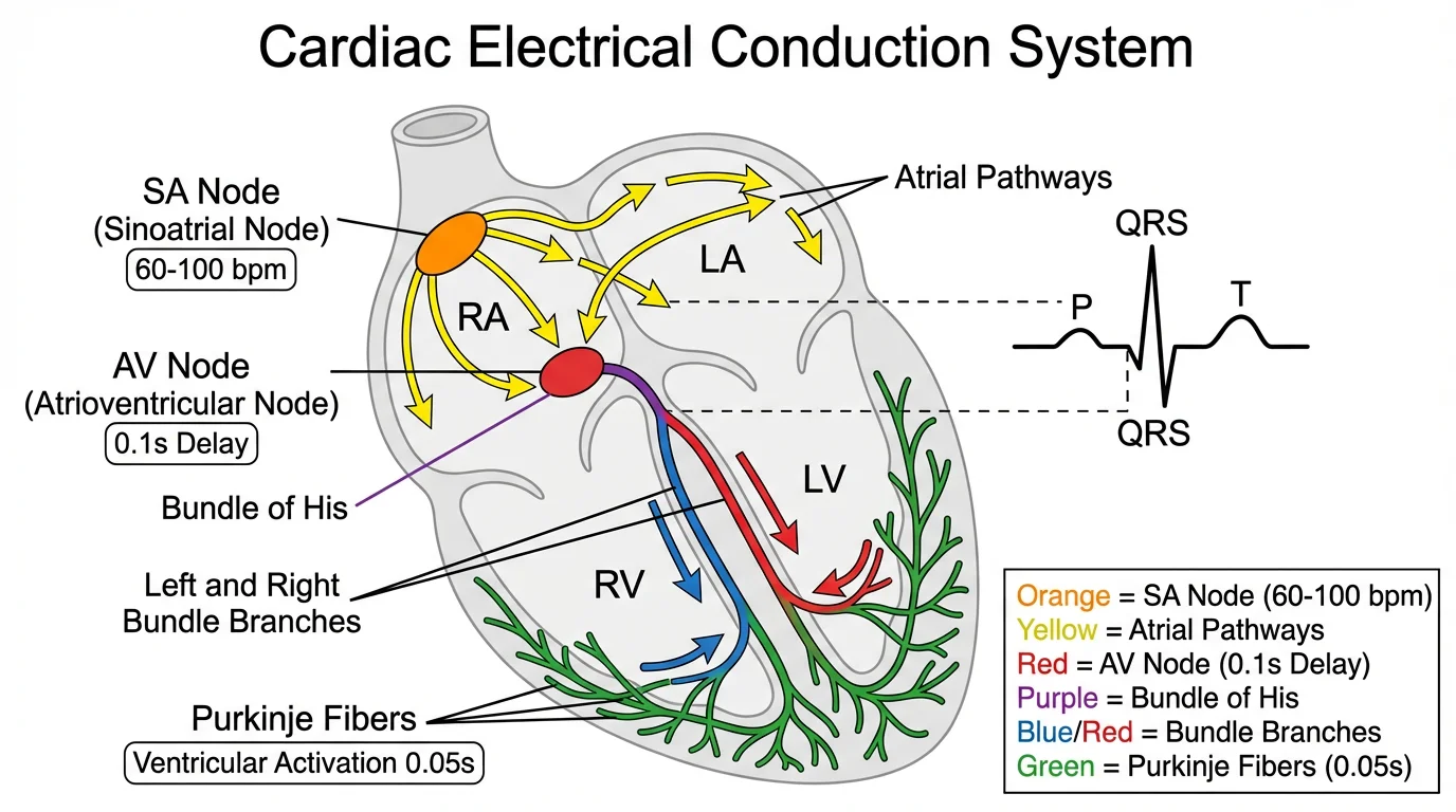
Medical diagrams combine anatomical accuracy with clear labeling for clinical comprehension
Medical Graphical Abstract Best Practices:
- Use simple patient icons: Avoid gendered or ethnically specific representations unless relevant
- Show sample sizes: n= values help readers assess study power
- Highlight primary endpoint: Make the main outcome visually dominant
- Include effect size: Not just p-values, but meaningful clinical differences
Example Category 6: Diagnostic & Biomarker Studies
Typical Elements:
- Diagnostic workflow
- Biomarker levels
- ROC curves (simplified)
- Sensitivity/specificity indicators
Recommended Layout:
[Sample Collection] → [Assay/Test] → [Biomarker Detection] → [Clinical Decision]Tips:
- Simplify complex assays to key steps
- Use intuitive positive/negative indicators
- Include clinical relevance (not just analytical performance)
Physics & Engineering Examples
Physics graphical abstracts often require representing abstract concepts visually.
Example Category 7: Physics & Optics
Typical Elements:
- Experimental setups
- Light paths and wave representations
- Energy level diagrams
- Mathematical relationships (simplified)
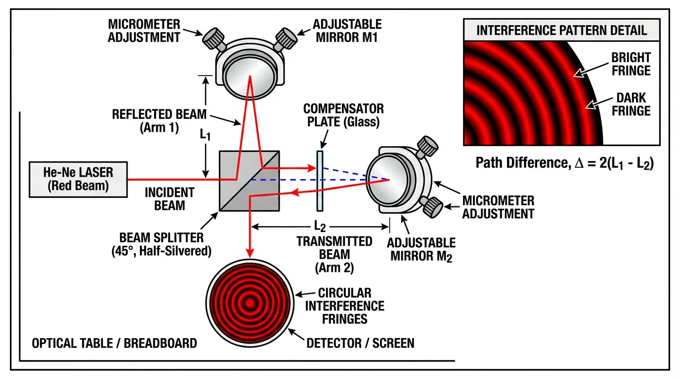
Physics diagrams clearly show experimental setups with labeled components and light paths
Physics-Specific Approaches:
| Study Type | Visual Strategy |
|---|---|
| Optical system | Ray diagrams with component labels |
| Quantum phenomena | Energy level diagrams |
| Mechanical system | Free body diagrams |
| Electromagnetic | Field line representations |
Example Category 8: Engineering & Applied Sciences
Typical Elements:
- System diagrams
- Performance metrics
- Input/output representations
- Process flow diagrams
Layout Strategy:
[Input Parameters] → [System/Device] → [Output/Performance] → [Application]Tips:
- Use standard engineering symbols where applicable
- Include quantitative improvements (e.g., "3× efficiency increase")
- Show real-world application context
- Balance technical detail with accessibility
Data Science & Computational Research Examples
Example Category 9: Machine Learning & AI
Typical Elements:
- Model architecture diagrams
- Data flow representations
- Performance metrics (accuracy, F1)
- Comparison charts
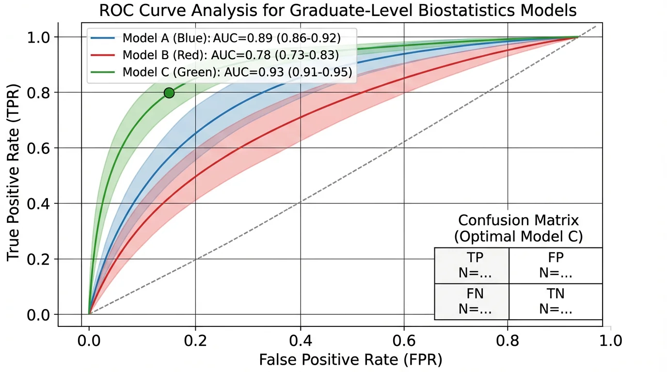
Data science graphical abstracts often include simplified performance visualizations
Recommended Structure:
[Data Input] → [Model Architecture] → [Training/Processing] → [Output/Prediction] → [Validation]ML/AI Specific Tips:
- Simplify neural networks: Don't show every layer; use abstract block representations
- Include key metrics: Accuracy, precision, or domain-specific measures
- Show comparison: Your method vs. baseline
- Indicate data type: Images, text, tabular data icons
Example Category 10: Bioinformatics & Computational Biology
Typical Elements:
- Sequence/structure data
- Analysis pipelines
- Statistical outputs
- Biological interpretation
Layout Approach:
[Raw Data/Sequences] → [Analysis Pipeline] → [Statistical Results] → [Biological Insight]Environmental Science & Plant Research Examples
These two illustrations were generated for this guide on October 10, 2026. They represent hypothetical workflows, not measured experimental results or published papers. Their image dimensions were checked after resizing. Matching a journal's canvas does not establish that the journal permits AI-generated artwork; review that policy before adapting an example.
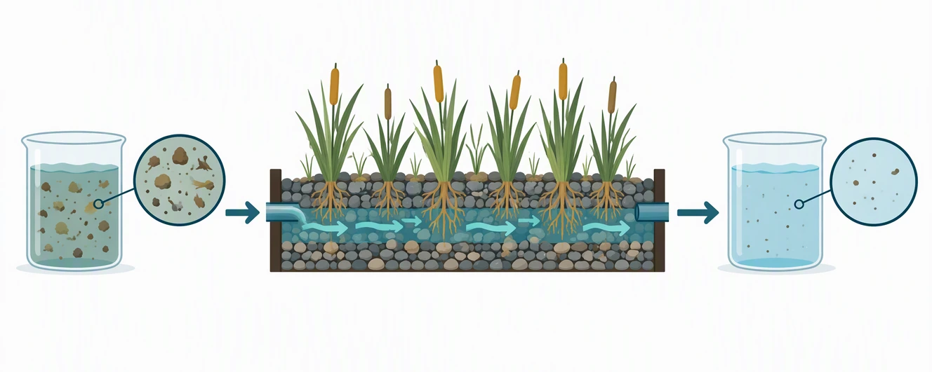
Example Category 11: Constructed Wetland Treatment
Environmental science layout, 1328 × 531 px at 300 dpi. This canvas follows the Elsevier minimum pixel specification and nominal 5:2 ratio. It is a WebP preview, not an accepted submission format: prepare TIFF, EPS, PDF, or MS Office according to the target journal. Official size and format source, checked 2026-10.
Visual story: input water → planted porous bed → output sample. The second sample still contains particles, so the image does not imply sterilization or drinking-water safety. Arrows describe flow through the treatment bed. The magnified circles explain what the samples represent without invented percentages or measurement axes.
How to adapt it: replace the generic particles with the actual material you measured, label sampling points, and check the flow direction against your apparatus. If your study measured dissolved nutrients rather than suspended solids, this picture needs different symbols; a visually cleaner beaker is not proof of chemical removal. Put only your verified finding in the caption.
Why the shape works: all content was generated in a wide central band on a 16:9 canvas, then cropped to the target dimensions without stretching objects. A square scene would require rearranging the panels rather than squeezing them horizontally. Follow the graphical abstract creation tutorial for the drafting sequence.
Example Category 12: Root-Microbe Inoculation Study
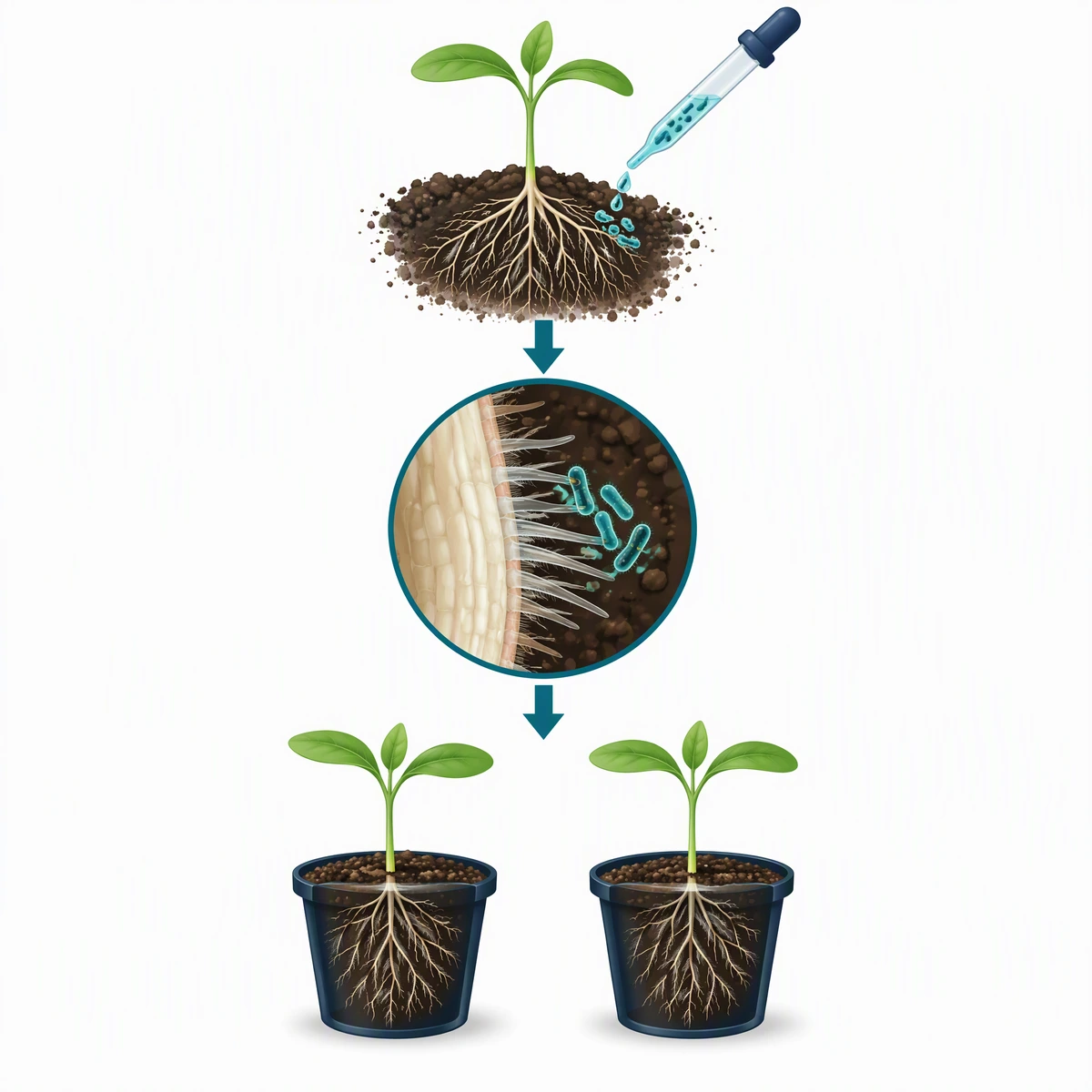
Plant science layout, exactly 1200 × 1200 px at 300 dpi. This matches the Cell Press square canvas; final files must be TIFF, PDF, or JPG, not this WebP preview. The controlling source is the Cell final-file checklist, checked 2026-10. Use your particular journal's rules if they differ.
Visual story: inoculation → root-surface view → planned control/treatment comparison. The plants are deliberately similar: the diagram illustrates an experimental design, not a demonstrated growth benefit. Microbes are schematic and enlarged, not a scale-accurate micrograph. The arrows connect workflow stages and do not prove a causal mechanism.
How to adapt it: add the organism and strain, identify the treatment and control, and replace the generic seedlings with your study species. If your paper claims nitrogen fixation, disease suppression, or yield improvement, show only the mechanism and outcome actually supported by its evidence. Do not infer any of those claims from the illustration.
Why the shape works: the vertical sequence uses the square canvas without cramming three landscape panels into it. The central magnification gives the reader one focal point. Cell Press's design guidance favors sparse text and no data in the graphical abstract; place statistical plots in the paper rather than adding a miniature bar chart here.
Match the example to the destination
| New example | Canvas checked | Best layout use | Before submission |
|---|---|---|---|
| Wetland workflow | 1328 × 531 px; nominal 5:2 | Left-to-right environmental process | Check journal AI policy; convert to its accepted format; replace hypothetical content |
| Root–microbe workflow | 1200 × 1200 px; 1:1 | Vertical plant or microbiology study | Check journal AI policy; label control/treatment; export TIFF, PDF, or JPG where required |
For ACS, RSC, Wiley, MDPI, and Nature Chemistry, consult the journal requirements table. There is no single Nature-wide graphical abstract preset. These two examples add environmental and plant workflows to the existing biology, chemistry, clinical, physics, engineering, and computational sections.
Templates by Journal Requirements
The layouts below match the two most common pixel specs. For ACS, RSC, Wiley, MDPI, and Nature Chemistry sizes, with official links for each, see our TOC graphic requirements by journal table.
Cell Press Template (1200 × 1200 px)
Cell Press requires square graphical abstracts. Here's an effective template structure:
┌─────────────────────────────────┐
│         [Title/Context]         │
│                                 │
│  ┌─────┐    ┌─────┐    ┌─────┐  │
│  │ A   │ →  │ B   │ →  │ C   │  │
│  └─────┘    └─────┘    └─────┘  │
│                                 │
│         [Key Finding]           │
│                                 │
│  [Take-home message in 1 line]  │
└─────────────────────────────────┘

Specifications:
- Dimensions: 1200 × 1200 pixels
- Resolution: 300 DPI
- Font: Arial or Avenir, 12-16pt minimum
- Format: TIFF, PDF, or JPG
Elsevier Template (1328 × 531 px)
Elsevier uses a wide aspect ratio, ideal for horizontal flow:
┌─────────────────────────────────────────────────────────────┐
│                                                             │
│  [Context]  →  [Method]  →  [Finding]  →  [Implication]    │
│                                                             │
│  Brief visual narrative from left to right                  │
│                                                             │
└─────────────────────────────────────────────────────────────┘

Specifications:
- Dimensions: 1328 × 531 pixels minimum (500:200 ratio)
- Resolution: 300 DPI
- Font: Times, Arial, Courier
- Format: TIFF, EPS, PDF, or MS Office
General Purpose Template
For journals without specific requirements:
┌───────────────────────────────────────┐
│                                       │
│  ┌─────────────────────────────────┐  │
│  │        MAIN VISUAL              │  │
│  │    (Central finding/process)    │  │
│  │                                 │  │
│  └─────────────────────────────────┘  │
│                                       │
│  [Supporting element 1] [Element 2]   │
│                                       │
│  Key message: One sentence summary    │
│                                       │
└───────────────────────────────────────┘

General guidelines:
- Maintain at least 300 DPI
- Use vector formats when possible
- Keep text minimal (60-80 words max)
Analysis: What Makes These Examples Work
Common Success Factors
The examples and layout sketches above use the following design principles:
1. Clear Entry Point
- Viewers immediately know where to start
- Usually top-left or clearly labeled "Start"
2. Logical Flow
- Arrows guide the eye through the narrative
- No ambiguous reading paths
3. Visual Hierarchy
- Main finding is largest/most prominent
- Supporting details are smaller/subdued
4. Consistent Style
- Same icon style throughout
- Unified color palette (3-5 colors)
- Consistent line weights
5. Minimal Text
- Labels only, not sentences
- 60-80 words maximum
- Large enough to read when scaled
6. White Space
- Not every pixel filled
- Elements have breathing room
- Improves readability
Common Failure Patterns
Avoid these frequent mistakes:
| Mistake | Why It Fails | Fix |
|---|---|---|
| Too much text | Defeats visual purpose | Cut 50% of words |
| Copying paper figure | Not designed as standalone | Create purpose-built design |
| No reading flow | Confuses viewers | Add arrows, numbers |
| Inconsistent icons | Looks unprofessional | Use one icon source |
| Wrong dimensions | Rejected by journal | Check guidelines first |
| Too much detail | Overwhelms viewers | Focus on one message |
Creating Your Own: Step-by-Step Adaptation
Step 1: Find Your Closest Example
From the categories above, identify which type best matches your research:
- Pathway/mechanism study → Biology molecular examples
- Treatment comparison → Clinical trial template
- New method development → Linear flow structure
- Discovery/finding → Central focus structure
Step 2: Sketch Your Adaptation
On paper, sketch how your content fits the chosen template:
- What's your starting point?
- What's your main finding (make it central/prominent)?
- What connects the elements?
- What's the take-home message?
Step 3: Gather Visual Elements
Collect the components you need:
- For scientific icons: Bioicons, Servier Medical Art
- For quick diagrams: ConceptViz graphical abstract maker generates scientific diagrams from text descriptions
- For general icons: Noun Project, Flaticon
Step 4: Build Digitally
Use your preferred tool:
- Quick option: PowerPoint/Keynote with correct dimensions
- Professional option: Adobe Illustrator, Inkscape
- Science-specific: BioRender, ConceptViz
Step 5: Review Against Examples
Compare your draft to successful examples in your field:
- Does it have similar visual weight?
- Is the complexity level appropriate?
- Does it follow field conventions?
Discipline-Specific Resources
Biology & Life Sciences
- Cell Press Gallery - Browse Cell journal graphical abstracts
- Bioicons - Free scientific icons
- Servier Medical Art - Medical illustrations
Chemistry
- ChemDraw Templates - Reaction scheme templates
- RSC Style Guide - Royal Society of Chemistry guidelines
Medicine
- JAMA Network Graphical Abstracts - Medical journal examples
- NEJM Visual Abstracts - Clinical research examples
General
- Author Services - Wiley's author resources
- Scientific Color Palette Guide - Color selection help
- Best Fonts for Scientific Figures - Typography guidance
Tools Comparison for Creating Graphical Abstracts
| Tool | Best For | Learning Curve | Cost |
|---|---|---|---|
| PowerPoint | Quick drafts, simple layouts | Low | Included with Office |
| Canva | Template-based designs | Low | Free tier available |
| ConceptViz | AI-generated scientific diagrams | Low | Free tier available |
| BioRender | Life science illustrations | Low-Medium | Paid plans; pricing details |
| Adobe Illustrator | Professional vector editing | High | Paid subscription; regional pricing |
| Inkscape | Free vector editing | Medium | Free |
| Figma | Collaborative design | Medium | Free tier available |
Recommended Workflow:
- Use ConceptViz or BioRender to generate initial scientific visuals
- Assemble and refine in PowerPoint, Canva, or Illustrator
- Export at journal-required specifications
Frequently Asked Questions
Where can I find graphical abstract examples for my field?
The best source is the journal you're targeting. Browse recent issues and look at graphical abstracts from similar studies. Cell Press maintains a gallery of visual abstracts, and most Elsevier journals display graphical abstracts prominently. PubMed Central also indexes graphical abstracts for open-access papers. Additionally, searching Google Images for 'graphical abstract [your field]' can provide inspiration.
Can I use a template from another paper?
You can use the layout structure as inspiration, but don't copy specific visual elements or icons without permission. The layout concept (e.g., left-to-right flow with three main elements) isn't copyrightable, but specific illustrations are. Create your own visual elements or use properly licensed icons from resources like Bioicons or Servier Medical Art.
How do I know if my graphical abstract is good enough?
Apply the '10-second test': show it to someone unfamiliar with your work for 10 seconds, then ask them to explain the main finding. If they can identify the key message, your graphical abstract is working. Also compare it to published examples in your target journal, it should match the quality and complexity level of accepted papers.
Should my graphical abstract match my paper's figures?
Your graphical abstract should be consistent in style with your paper figures (same color palette, similar icon style), but it should be a unique, purpose-built summary, not a copy of any existing figure. Journals explicitly prohibit reusing paper figures as graphical abstracts.
What if my research is too complex for one image?
Focus on the single most important finding or message. A graphical abstract isn't meant to summarize every aspect of your paper, it's a visual hook to attract readers. If you have multiple major findings, choose the one with broadest appeal or most significant impact. You can mention other findings in your text abstract.
Are there graphical abstract templates I can download?
Yes, many resources offer templates. BioRender provides discipline-specific templates for subscribers. PowerPoint templates sized for Cell (1200×1200px) and Elsevier (1328×531px) can be created by adjusting slide dimensions. Canva offers scientific presentation templates that can be adapted. The key is starting with correct dimensions for your target journal.
How do graphical abstract styles differ between disciplines?
Life sciences typically use more illustration-based approaches with cellular and molecular imagery. Chemistry relies heavily on molecular structures and reaction schemes. Physics often features experimental setups and mathematical relationships. Clinical medicine uses patient-flow diagrams and outcome comparisons. Data science incorporates simplified algorithm representations and performance metrics. Study examples from your specific field to understand conventions.
Can I hire someone to create my graphical abstract?
Yes, many scientific illustration services create graphical abstracts. Options include freelance scientific illustrators (found on platforms like Upwork or Fiverr), journal-affiliated services (Elsevier's Author Services offers this), and university graphics departments. Costs typically range from $50-500 depending on complexity. AI tools like ConceptViz can also help generate initial concepts that you refine.
Conclusion
Creating an effective graphical abstract becomes much easier when you have good examples to learn from. The key insights from analyzing successful graphical abstracts across disciplines:
- Choose the right structure for your research type (linear, central, comparison, or hierarchical)
- Follow field conventions while maintaining your unique finding's visibility
- Prioritize clarity over complexity, one message, clearly communicated
- Use consistent styling throughout your design
- Meet technical specifications for your target journal
Remember: your graphical abstract is often the first impression readers have of your research. Invest the time to make it clear, professional, and engaging.
Graphical Abstract Maker
Describe your study and draft a visual summary. Choose a starting ratio, review the science, then crop or resize to your journal's exact requirements.
Draft a graphical abstract →Related Guides:
Categories
More Posts
Free AI Graphical Abstract Makers for Research Papers (2026)
Compare the best free AI graphical abstract makers for researchers. Create journal-ready visual abstracts for Elsevier, Cell & Nature, no design skills needed.
What Is a Particulate Diagram? Particle Models Explained
A particulate diagram shows matter as individual particles. Learn how particle diagrams represent solids, liquids, gases, elements, and mixtures, with examples.
Heating Curve of Water Explained: The 5 Stages
Understand the heating curve of water step by step: what the axes mean, why the plateaus are flat, and how specific and latent heat shape each stage.