How to Make a Graphical Abstract: Free Maker & 7-Step Guide (2026)
Free graphical abstract maker and guide. Create Elsevier and Cell journal-ready abstracts in minutes, with size specs (1328x531px, 1200x1200px) and templates.
How to Make a Graphical Abstract: Free Maker & 7-Step Guide (2026)
A graphical abstract can double the visibility of your research.
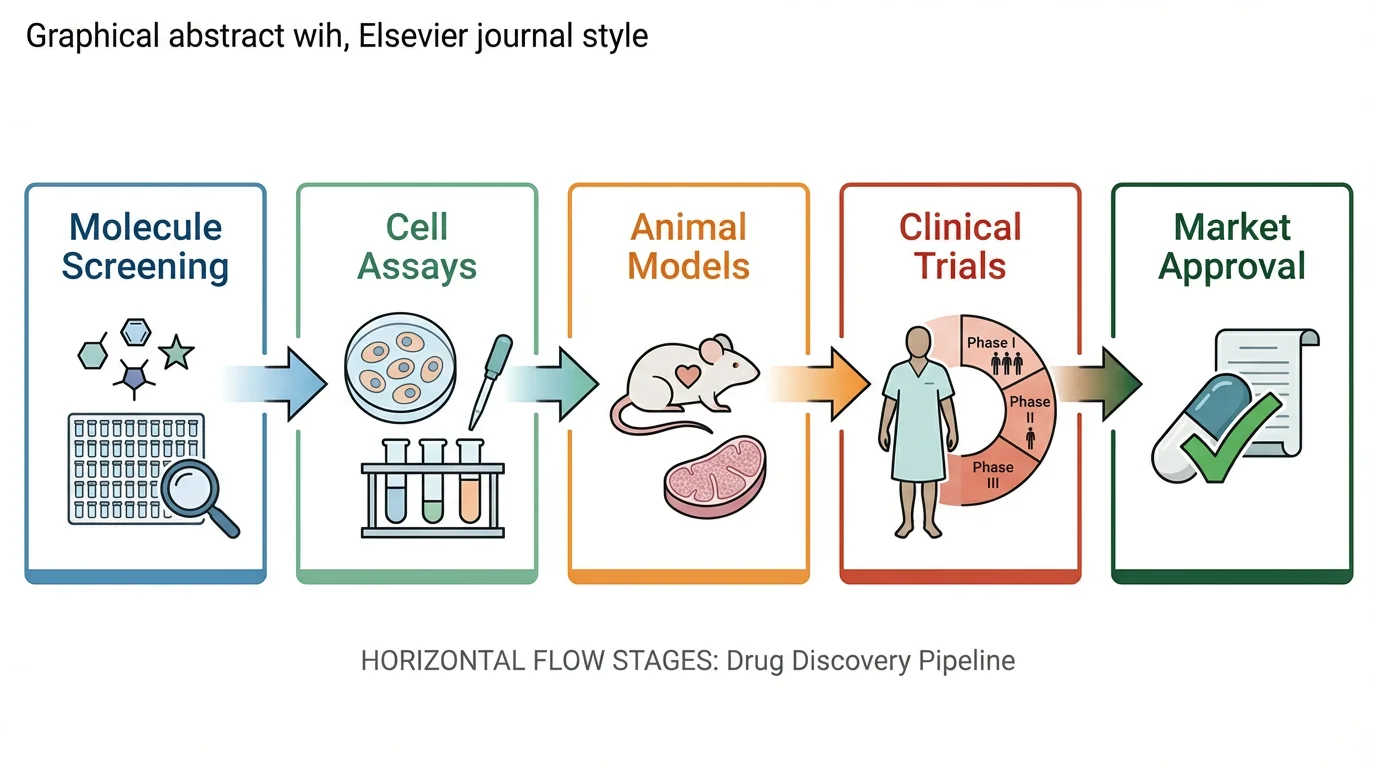
Free Graphical Abstract Maker
Create journal-ready graphical abstracts for Elsevier, Cell & Nature in minutes. AI-powered, no design skills needed.
Try it free →According to studies by Elsevier, articles with graphical abstracts see significantly increased views and social media engagement — with some research showing the average annual use of an article doubles when compared with those without a visual abstract.
Yet most scientists receive no formal training in visual communication. This guide covers everything you need to create an effective graphical abstract: from understanding journal requirements to design principles and the best tools for the job.
What Is a Graphical Abstract?
A graphical abstract is a single visual summary of your research paper's key findings. Unlike traditional text abstracts, it communicates your work through images, icons, and minimal text — designed to be understood in seconds.
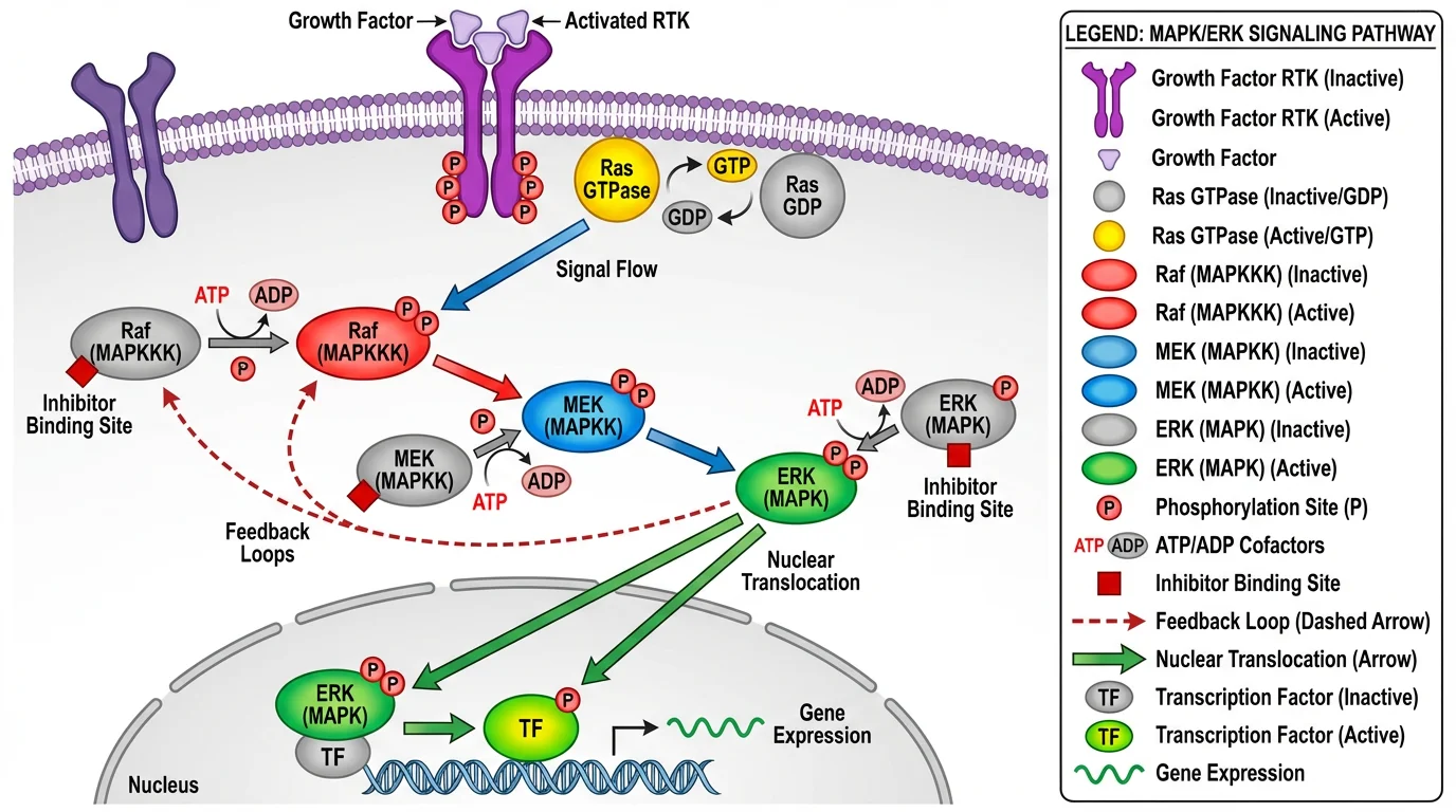 A well-designed visual summary that captures the essence of complex research in a single image.
Key characteristics:
- Single image — One panel, not multiple figures
- Visual-first — Images dominate, text supports
- Self-contained — Understandable without reading the paper
- Accessible — Designed for interdisciplinary readers
What a graphical abstract is NOT:
- A copy of a figure from your paper
- A detailed methodology diagram
- A text-heavy infographic
- A table of contents
Why Graphical Abstracts Matter
Impact on Visibility
Research consistently shows that graphical abstracts increase paper visibility:
| Metric | With Graphical Abstract | Without |
|---|---|---|
| Article views | ~2x higher | Baseline |
| Social media shares | Significantly higher | Lower |
| Time to first citation | Often faster | Slower |
| Interdisciplinary reach | Broader | Limited |
Journal Requirements
Many journals now require or strongly encourage graphical abstracts:
- Cell Press journals — Required for all research articles
- Elsevier journals — Encouraged/required for many titles
- FEBS journals — Encouraged, AI-generated abstracts permitted
- JCI — Required for research articles
Even when optional, including a graphical abstract gives your paper a competitive advantage in attracting readers.
Journal Requirements: Cell vs. Elsevier vs. Others
Different publishers have different specifications. Here's a comparison of the major requirements:
Technical Specifications
| Publisher | Dimensions | Resolution | Format |
|---|---|---|---|
| Cell Press | 1200 × 1200 px (square) | 300 DPI | TIFF, EPS, PDF |
| Elsevier | 1328 × 531 px (or 500:200 ratio) | 300 DPI | TIFF, EPS, PDF, MS Office |
| Nature Reviews | Varies by journal | 300 DPI | Check specific journal |
| JCI | Per journal guidelines | 300 DPI | — |
Cell Press Specific Guidelines
According to the Cell Press graphical abstract guidelines:
- Size: 1200 × 1200 pixels at 300 DPI
- Font: Avenir or Arial, 12-16 points minimum
- Colors: Avoid heavily saturated primary colors
- Content: Should convey the take-home message immediately
- Submission: Upload as a separate file
Pro tip: In PowerPoint, resize your slide to 1200 × 1200 pixels, then export at 300 DPI.
Elsevier Specific Guidelines
According to Elsevier's graphical abstract guide:
- Size: Minimum 1328 × 531 pixels (500:200 ratio)
- Font: Times, Arial, Courier, or Symbol
- Resolution: Minimum 300 DPI
- Format: TIFF, EPS, PDF, or MS Office files
- Content: No heading "graphical abstract" within the image
- White space: Minimize unnecessary blank areas
The 10 Principles of Effective Graphical Abstracts
Based on the influential paper "Ten Simple Rules for Designing Graphical Abstracts" by Jambor and Bornhäuser (PLOS Computational Biology, 2024), here are the key principles:
1. Start with Your Message
Before opening any software, answer: What is the one thing readers should remember?
Write it in 1-2 sentences. This is the foundation of your entire design. If you can't articulate it clearly in words, you won't be able to show it visually.
2. Choose a Clear Visual Metaphor
Your central image should immediately communicate your research concept:
| Research Type | Visual Approach |
|---|---|
| Process/mechanism | Flowchart with arrows |
| Comparison | Side-by-side or before/after |
| Discovery | Key finding highlighted |
| Method | Simplified workflow |
| Structure | Diagram or model |
3. Design a Clear Reading Flow
Viewers should know where to start and where to end:
- Left → Right (most common, follows Western reading)
- Top → Bottom (works for vertical processes)
- Center → Outward (for radial concepts)
Avoid designs that leave readers confused about the sequence.
4. Use Arrows Strategically
Arrows connect elements into a narrative. Use them to show:
- Sequence of events
- Cause and effect
- Transformation or change
- Direction of flow
Keep arrows consistent — same style, weight, and color throughout.
5. Limit Text Drastically
| Element | Guideline |
|---|---|
| Total words | 60-80 maximum |
| Font size | Large enough to read when scaled down |
| Labels | Short, no full sentences |
| Jargon | Avoid — design for interdisciplinary readers |
If you need more than 80 words, your design is too complex.
6. Control Your Colors
- Limit to 3-5 colors — more becomes chaotic
- Use color meaningfully — not decoratively
- Ensure accessibility — avoid red-green combinations
- Match your paper — consistent with other figures
For detailed color guidance, see our Scientific Color Palette Guide.
7. Simplify Ruthlessly
Every element should earn its place. Ask yourself:
- Does this help communicate the main message?
- Can I remove this without losing meaning?
- Is this detail necessary for understanding?
When in doubt, leave it out.
8. Use Professional Icons and Illustrations
Avoid clip art or inconsistent icon styles. Good sources:
- Bioicons — Free scientific icons
- Servier Medical Art — 3,000+ medical illustrations under CC BY 4.0 (how to use and credit them)
- BioRender — 40,000+ scientific icons (paid)
- ConceptViz — AI-generated scientific diagrams
9. Choose the Right Tool
Match your tool to your skill level and needs (see Tools section below).
10. Get Feedback Before Submitting
Show your graphical abstract to:
- A colleague in your field (for accuracy)
- A colleague outside your field (for clarity)
- A non-scientist (for accessibility)
If they can't explain your main finding back to you, revise.
Step-by-Step Creation Process
Here's a practical workflow for creating your graphical abstract:
Step 1: Define Your Message (10 minutes)
Answer these questions:
- What is the key finding of my paper?
- Why does it matter?
- What's new or surprising?
Write a 1-2 sentence summary. This is your North Star.
Step 2: Sketch on Paper (15 minutes)
Don't open software yet. Grab paper and sketch:
- Different layout options (horizontal, vertical, radial)
- Key visual elements you'll need
- How elements connect (arrows, flow)
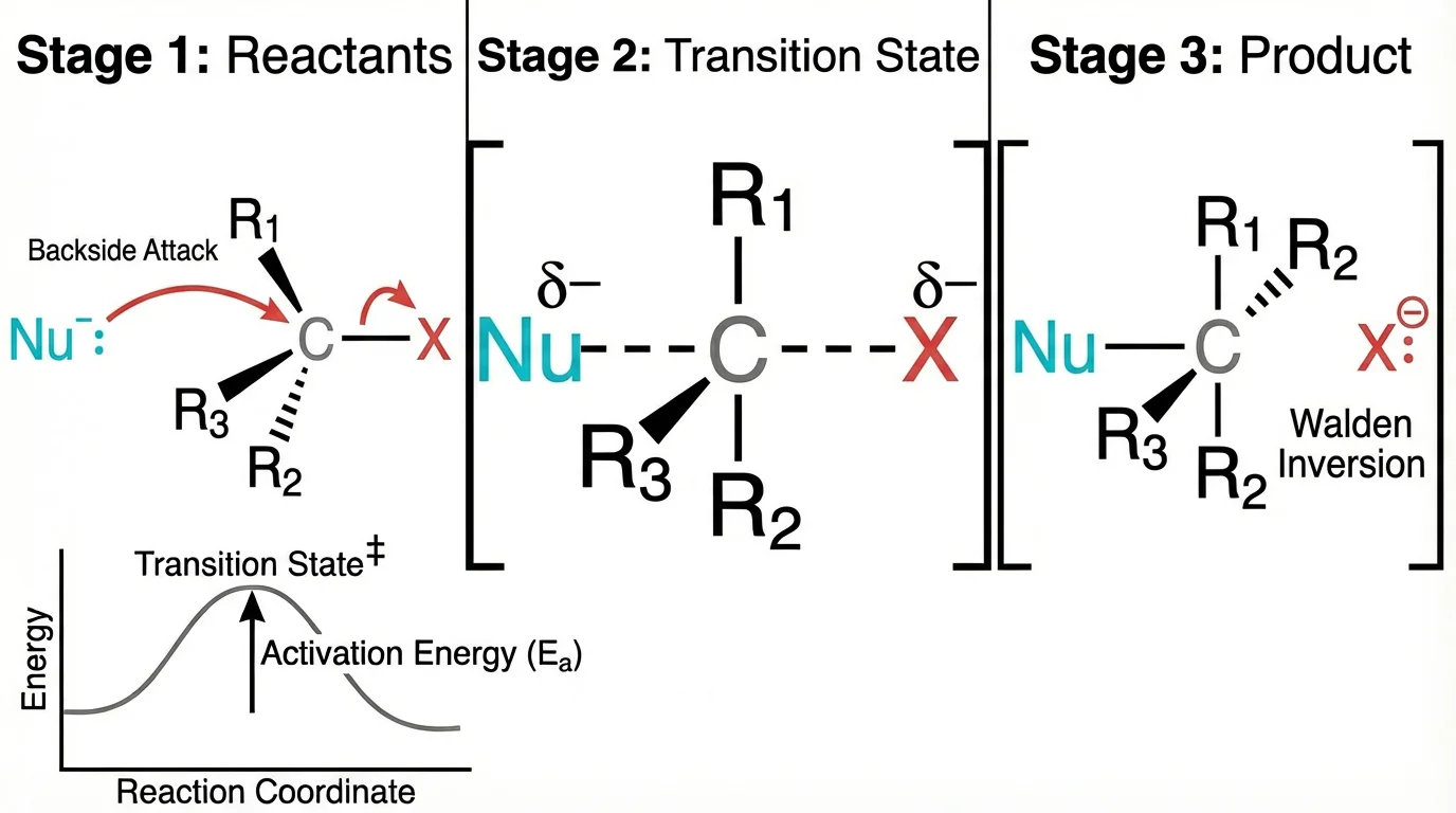 Even complex scientific concepts can be represented with clean, simple visuals.
Sketching is faster than digital iteration and helps you think visually.
Step 3: Gather Visual Elements (20 minutes)
Collect the components you'll need:
- Icons or illustrations for key concepts
- Any data visualizations (simplified versions)
- Color palette (3-5 colors)
Quick option: Use ConceptViz to rapidly generate concept diagrams for the visual elements you need. This can save significant time in the early stages, especially for biological or scientific concepts.
Step 4: Create Digital Draft (30-60 minutes)
Open your chosen software and:
- Set up canvas at correct dimensions (e.g., 1200 × 1200 px for Cell)
- Place main visual in the center or at the start
- Add supporting elements following your reading flow
- Connect with arrows to show relationships
- Add minimal text for essential labels only
Step 5: Refine and Simplify (20 minutes)
Review critically:
- Remove any non-essential elements
- Ensure consistent styling
- Check text is readable at reduced size
- Verify colors are accessible
Step 6: Get Feedback (Variable)
Share with colleagues and iterate based on their input.
Step 7: Export Correctly (5 minutes)
For Cell Press:
Export as TIFF or PDF
Dimensions: 1200 × 1200 pixels
Resolution: 300 DPI
Color mode: RGB
For Elsevier:
Export as TIFF, EPS, or PDF
Dimensions: 1328 × 531 pixels minimum
Resolution: 300 DPI
Color mode: RGB
Tools for Creating Graphical Abstracts
Professional Tools
| Tool | Price | Best For | Learning Curve |
|---|---|---|---|
| Adobe Illustrator | $23/month | Full customization, print-ready | High |
| Affinity Designer | $70 one-time | Professional alternative to AI | Medium |
| BioRender | $35/month | Scientific icons, templates | Low |
Free Tools
| Tool | Best For | Limitations |
|---|---|---|
| Inkscape | Full vector editing | Steeper learning curve |
| draw.io + Bioicons | Quick diagrams with scientific icons | Limited styling options |
| Canva | Template-based design | Less scientific-specific |
| PowerPoint/Keynote | Familiar interface | Limited precision |
AI-Assisted Tools
| Tool | Use Case |
|---|---|
| ConceptViz | Generate concept diagrams, pathway illustrations, cell diagrams quickly |
| Grabstract | Convert text abstracts to visual drafts |
| DALL-E/Midjourney | General visual concepts (check journal AI policies) |
Note on AI usage: Some journals now explicitly permit AI-generated graphical abstracts. FEBS Press, for example, allows AI-generated graphical abstracts provided you assume responsibility for accuracy and credit AI usage in the caption. Always check your target journal's policy.
Recommended Workflow by Budget
Free workflow:
- Sketch concept on paper
- Generate initial visuals with ConceptViz
- Assemble and refine in Inkscape or draw.io
- Export at required specifications
Professional workflow:
- Sketch concept on paper
- Source icons from BioRender or Bioicons
- Compose in Adobe Illustrator
- Export as vector PDF or high-res TIFF
Common Mistakes to Avoid
Mistake 1: Too Much Information
Problem: Trying to include every finding from your paper.
Solution: Focus on ONE main message. Your graphical abstract is an advertisement, not a summary of everything.
Mistake 2: Copying a Paper Figure
Problem: Using an existing figure from your manuscript.
Solution: Create a unique visual specifically designed as a standalone summary. Journals explicitly prohibit copying figures.
Mistake 3: Too Much Text
Problem: Including paragraphs of explanation.
Solution: Maximum 60-80 words. If you need more text, your visual design isn't working.
Mistake 4: Unclear Reading Order
Problem: Viewers don't know where to start or what sequence to follow.
Solution: Use clear arrows, numbering, or obvious spatial flow (left→right, top→bottom).
Mistake 5: Inconsistent Style
Problem: Mixing different icon styles, fonts, or color schemes.
Solution: Choose one visual style and apply it consistently throughout.
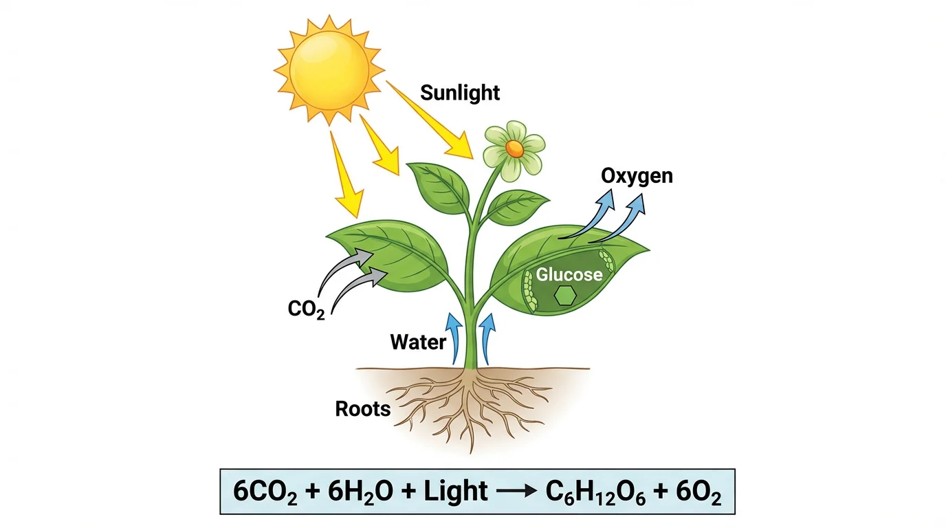 Consistent styling creates a professional, cohesive appearance.
Mistake 6: Wrong Dimensions
Problem: Creating at arbitrary dimensions, then having to awkwardly crop or stretch.
Solution: Set up your canvas at the exact required dimensions before you start designing.
Mistake 7: Using Jargon
Problem: Including technical abbreviations that only specialists understand.
Solution: Remember graphical abstracts target interdisciplinary readers. Spell out terms or use visual representations instead.
Mistake 8: Low Resolution
Problem: Exporting at screen resolution (72 DPI) instead of print resolution.
Solution: Always export at 300 DPI. Set this before you start, not as an afterthought.
Examples Analysis: What Works and Why
Effective Graphical Abstract Elements
Clear hierarchy:
- Main finding is visually dominant
- Supporting information is secondary
- Reading flow is obvious
Visual storytelling:
- Shows transformation or process
- Uses arrows to connect cause and effect
- Minimal text labels only essential elements
Professional appearance:
- Consistent icon style
- Limited, purposeful color palette
- Balanced composition with appropriate white space
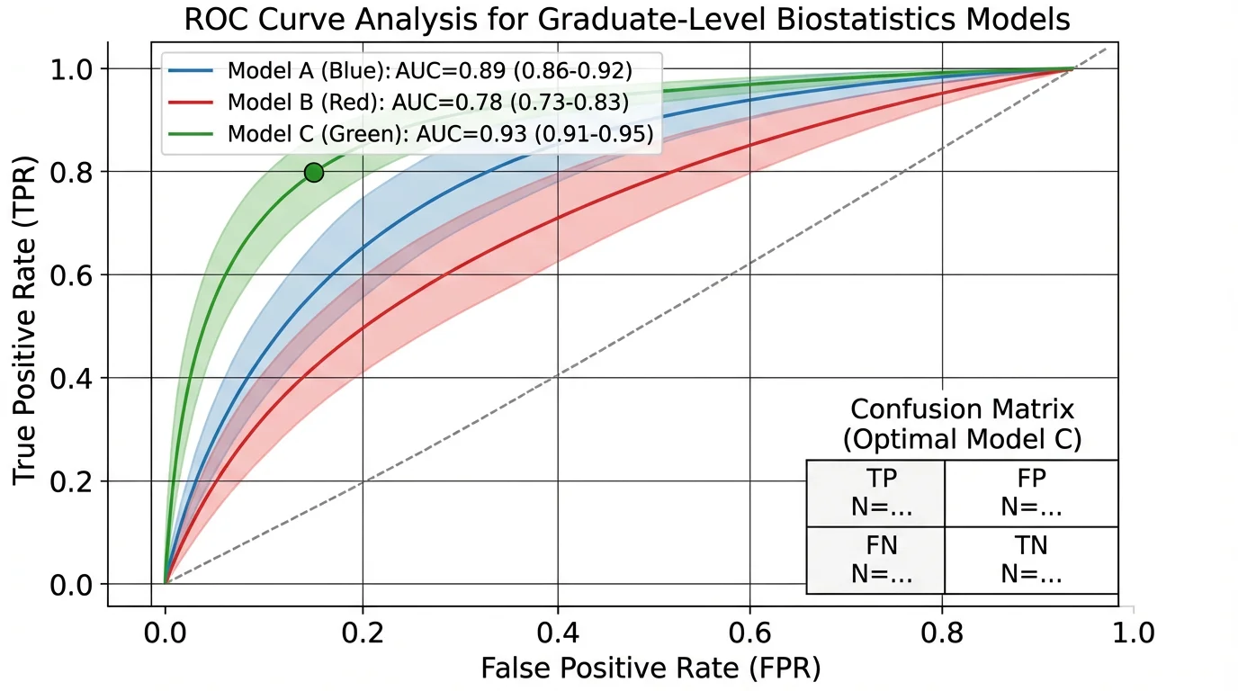 Clean design with clear visual hierarchy and professional appearance.
Applying These Principles
Creating an effective graphical abstract takes practice, but the investment pays off in increased visibility for your research.
For quick concept generation, especially for biological and scientific diagrams, tools like ConceptViz can help you rapidly explore visual approaches before committing to a final design. The AI-generated diagrams work well for initial concepts that you can then refine in professional software.
For more detailed guidance on creating publication-quality scientific figures, see our complete guide: How to Make Figures for Nature, Science, and Cell Journals.
Related Resources
- How to Make Figures for Nature, Science, and Cell Journals
- Scientific Color Palette Guide
- How to Make Scientific Diagrams for Research Papers
- Best Free BioRender Alternatives
- Science Diagram Tools
FAQ
Q: What is a graphical abstract? A: A graphical abstract is a single visual summary of your research paper's key findings. It uses images, icons, and minimal text to communicate your work in a format that can be understood in seconds. Unlike text abstracts, graphical abstracts are designed to be shared on social media and help readers quickly decide if your paper is relevant to their interests.
Q: What size should a graphical abstract be? A: This depends on your target journal. Cell Press requires 1200 × 1200 pixels (square) at 300 DPI. Elsevier requires minimum 1328 × 531 pixels (approximately 500:200 ratio) at 300 DPI. Always check your specific journal's guidelines before starting.
Q: Can I use AI to create a graphical abstract? A: Increasingly, yes. Some journals like FEBS Press explicitly allow AI-generated graphical abstracts, provided you take responsibility for accuracy and disclose AI usage in the caption. However, policies vary — always check your target journal's guidelines. AI tools like ConceptViz can be useful for generating initial concepts that you then refine.
Q: How long does it take to create a graphical abstract? A: For a first-timer, expect 2-4 hours. With practice and the right tools, you can create an effective graphical abstract in 1-2 hours. Using AI tools for initial concept generation can reduce this time significantly.
Q: What's the difference between a graphical abstract and a TOC image? A: A Table of Contents (TOC) image is typically smaller and simpler, designed to appear in journal tables of contents. A graphical abstract is more detailed and designed to stand alone as a summary of your research. Some journals use these terms interchangeably, so check your specific journal's requirements.
Q: Should I include data in my graphical abstract? A: Sparingly, if at all. A graphical abstract should focus on the concept and main finding rather than detailed data. If you include data, use highly simplified visualizations. Most effective graphical abstracts are primarily conceptual illustrations with minimal or no raw data.
Q: What if my research doesn't translate well to images? A: All research can be visualized with the right approach. For theoretical or computational work, consider visualizing: the problem you're solving, the approach/method conceptually, or the implications of your findings. Abstract concepts can be represented through metaphors, flowcharts, or symbolic illustrations.
Q: Can I use the same graphical abstract for different journals? A: You may need to resize for different specifications, but the core content can remain the same. However, ensure the dimensions and format match each journal's requirements before submission.
Categories
More Posts
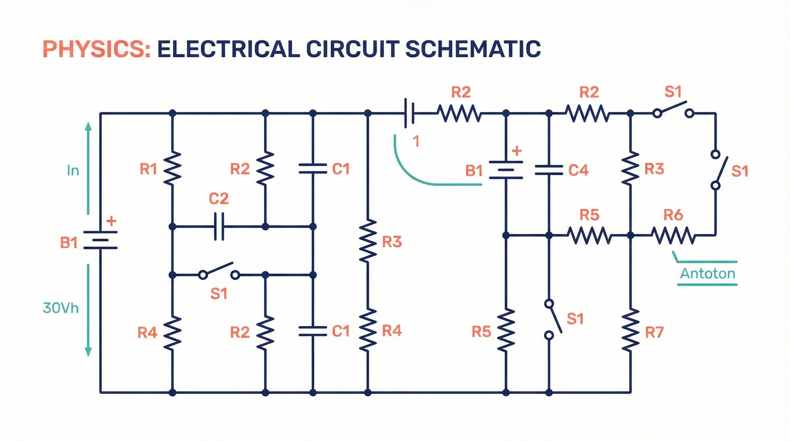
How to Create Circuit Diagrams Online: Free Tools & Step-by-Step Guide (2026)
Learn how to draw circuit diagrams online for free. Compare top circuit diagram makers and follow a step-by-step guide to professional electrical diagrams.
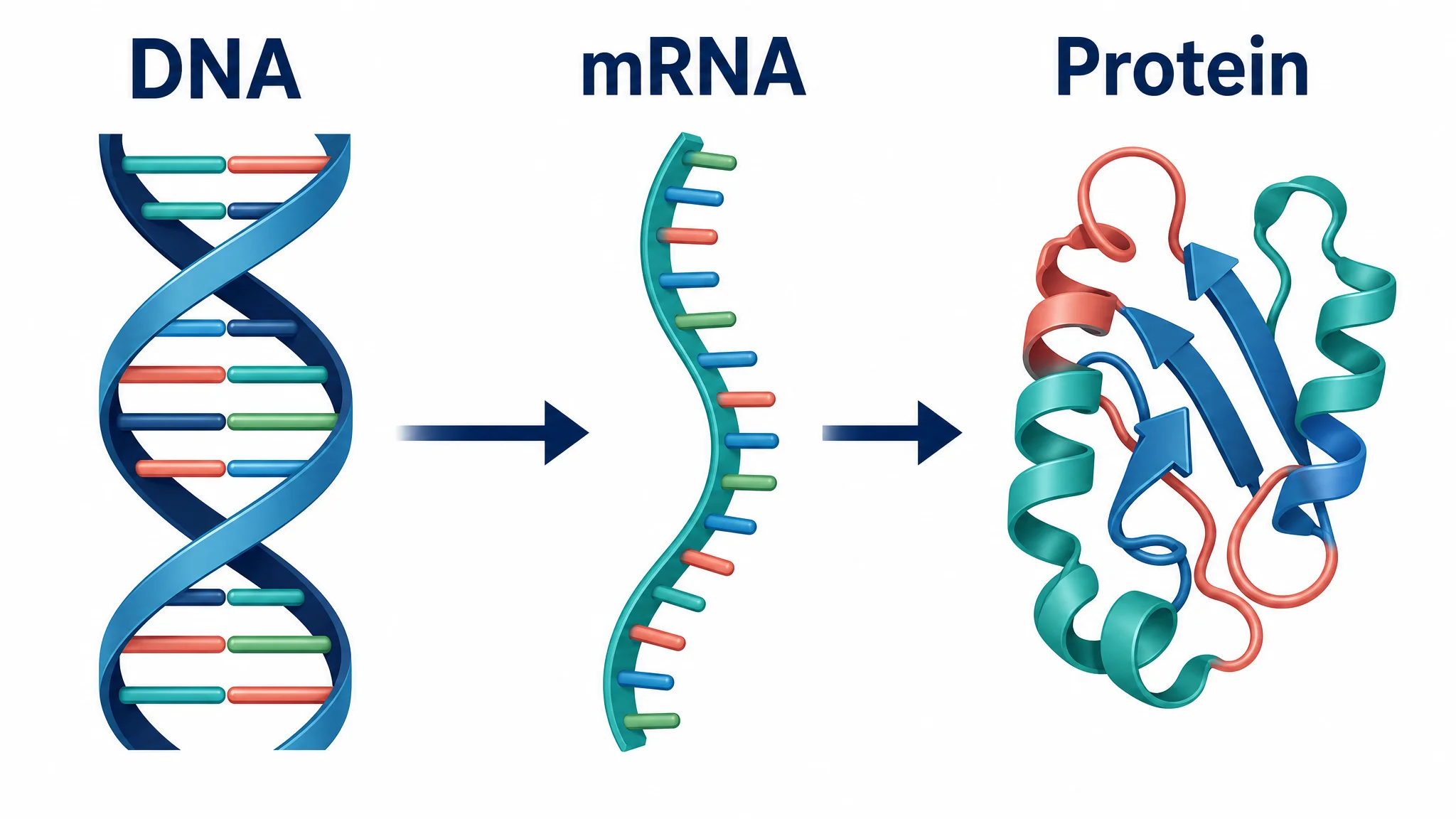
Central Dogma Diagram Guide: DNA to RNA to Protein
Learn how to read and draw a central dogma diagram, including DNA, mRNA, transcription, translation, ribosomes, codons, and common mistakes.

3 Minute Thesis (3MT): Tips, Slide Examples & Presentation Guide (2026)
3MT tips and winning slide examples. Learn how to design your 3 Minute Thesis slide, structure your presentation, and avoid common mistakes.