Volcano Plot Generator for RNA-seq
Free volcano plot generator for RNA-seq and proteomics. Paste a DESeq2, edgeR, or limma table to draw an exact publication-ready volcano plot and download SVG.
Paste a DESeq2 / edgeR / limma table — renders an exact volcano plot as SVG, free
Differential expression table
gene, log2 fold change, p-value or FDR. DESeq2 / edgeR / limma columns are auto-detected.
280 genes parsed
Up 8 · Down 7 · NS 265
Volcano Plot Generator
Free to try ·
Your AI volcano plot illustration will appear here
For a data-accurate plot from your table, use the Precise Plot tab instead
Volcano Plot Examples
The first four are exact engine renders from tables. The last two are AI illustrations of Illustration mode.
RNA-seq inflammatory response
Exact engine render — |log2FC| > 1, FDR < 0.05, cytokine genes labeled on the right.
Proteomics treatment vs vehicle
Exact engine render — tighter FDR, for TMT or label-free protein tables.
Knockdown, mostly down
Exact engine render — loss-of-function layout with the significant cloud on the left.
CRISPR screen, wide fold change
Exact engine render — wider x-axis, editable thresholds.
AI illustration — RNA-seq
AI illustration of Illustration mode — visual mockup, not plotted from a table.
AI illustration — proteomics
AI illustration of Illustration mode — visual mockup, not plotted from a table.
What is a volcano plot?
A volcano plot is the standard scatter plot for differential expression. Each gene (or protein, metabolite, or other feature) is one point: the x-axis is log2 fold change between two conditions, and the y-axis is −log10(p-value) so the smallest p-values sit highest. Non-significant features form a dense cloud at the bottom; significant up- and down-regulated features erupt to the upper right and upper left. This generator is for that statistical figure — not a geological volcano diagram. Paste a table from DESeq2, edgeR, limma, or a similar tool and it draws the plot as an exact SVG.
What table to paste
- You need at least three columns: a feature ID (gene symbol, Ensembl ID, protein name), a log2 fold change, and a p-value or adjusted p-value / FDR.
- DESeq2 tables work as-is (gene, log2FoldChange, pvalue, padj). The parser prefers padj/FDR when both raw p and adjusted p are present.
- edgeR and limma exports are fine too — logFC plus PValue or adj.P.Val is enough.
- Comma, tab, or semicolon separated text all work. Upload a CSV/TSV, or copy from Excel and paste.
How to read the plot
- Points on the right are higher in the second condition (positive log2 fold change); points on the left are lower.
- Height is statistical significance. The dashed horizontal line is your p / FDR cutoff; the dashed vertical lines are ± the log2 fold-change cutoff.
- Red = significant and up, blue = significant and down, grey = not significant under the current cutoffs.
- Labels are the top hits by significance, plus any extra gene names you type. This is a visualization tool: it plots the p-values you supply and does not re-run DESeq2.
RNA-seq, proteomics, and related figures
The same plot is used for RNA-seq, proteomics, metabolomics, and many CRISPR screens. Pair it with an MA plot of the same table when you want mean expression versus log2 fold change instead of p-value height, a heatmap of the significant genes, and a graphical abstract for the journal. For genome-wide association results you usually want a Manhattan plot, not a volcano plot. For a labeled cross-section of a geological volcano, use the volcano diagram generator instead.
Export
Download a scalable SVG with no watermark and no account required for the precise plot. Open it in Illustrator, Inkscape, PowerPoint, or a journal submission portal. The AI Illustration tab is only for slide mockups when you do not have a table yet — it will not match your p-values.
Frequently Asked Questions
Related Research Tools
 Research
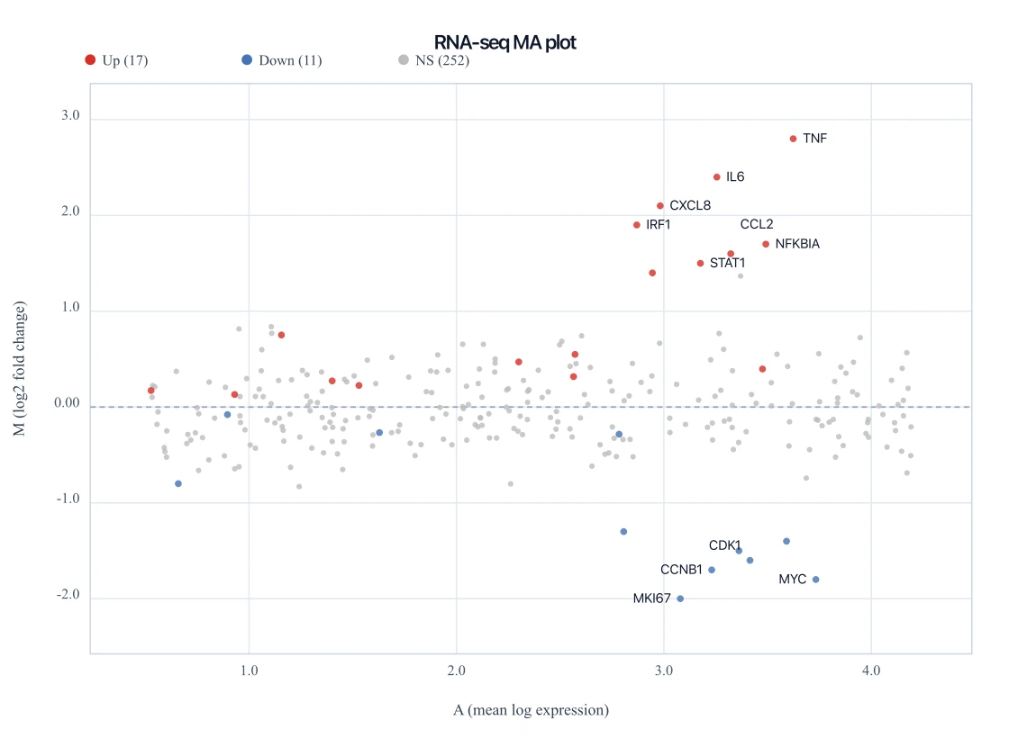
MA Plot Generator
Paste the same DESeq2 table to draw mean expression versus log2 fold change.
 Research
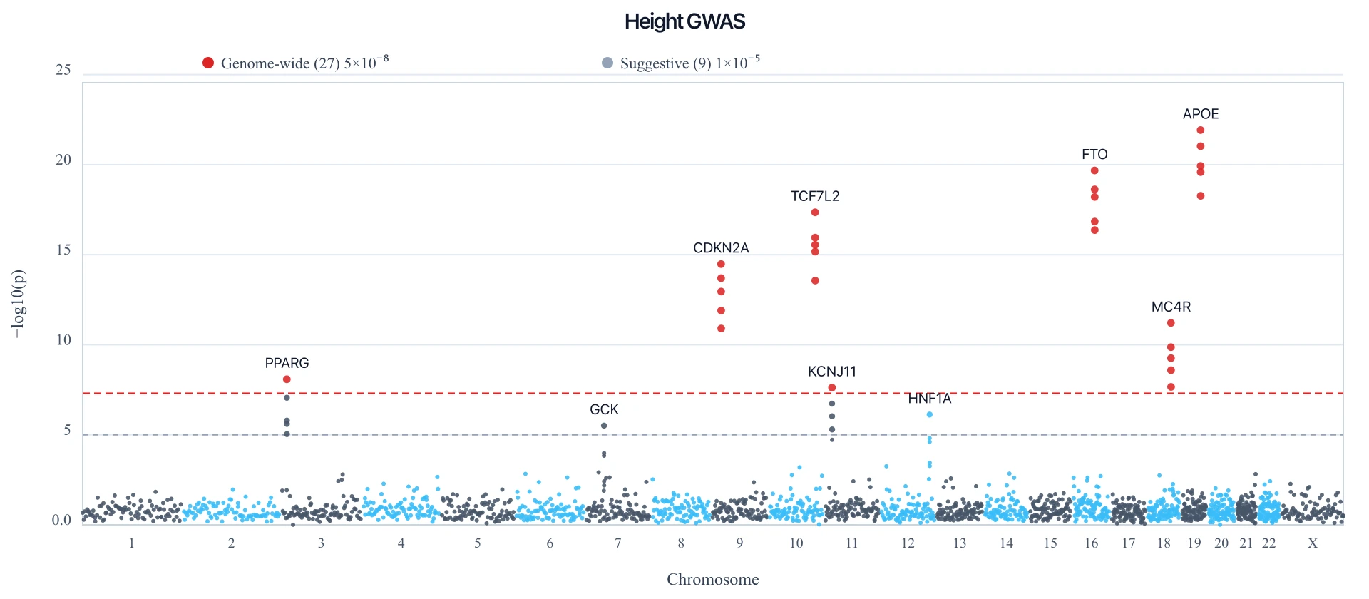
Manhattan Plot Generator
Paste a GWAS table to draw an exact Manhattan plot with a 5e-8 genome-wide line.
 Research
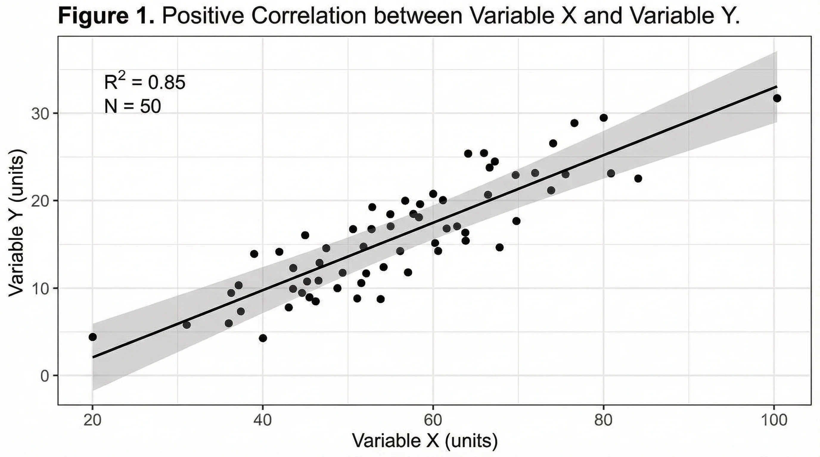
Heatmap Generator
Paste a matrix and render an exact clustered-style heatmap as SVG for the same experiment.
 Research
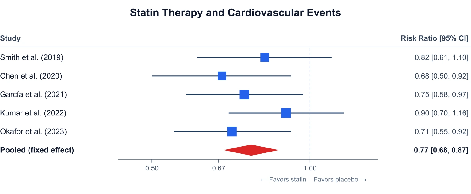
Forest Plot Generator
Build a meta-analysis forest plot from effect sizes and 95% confidence intervals.
 Research
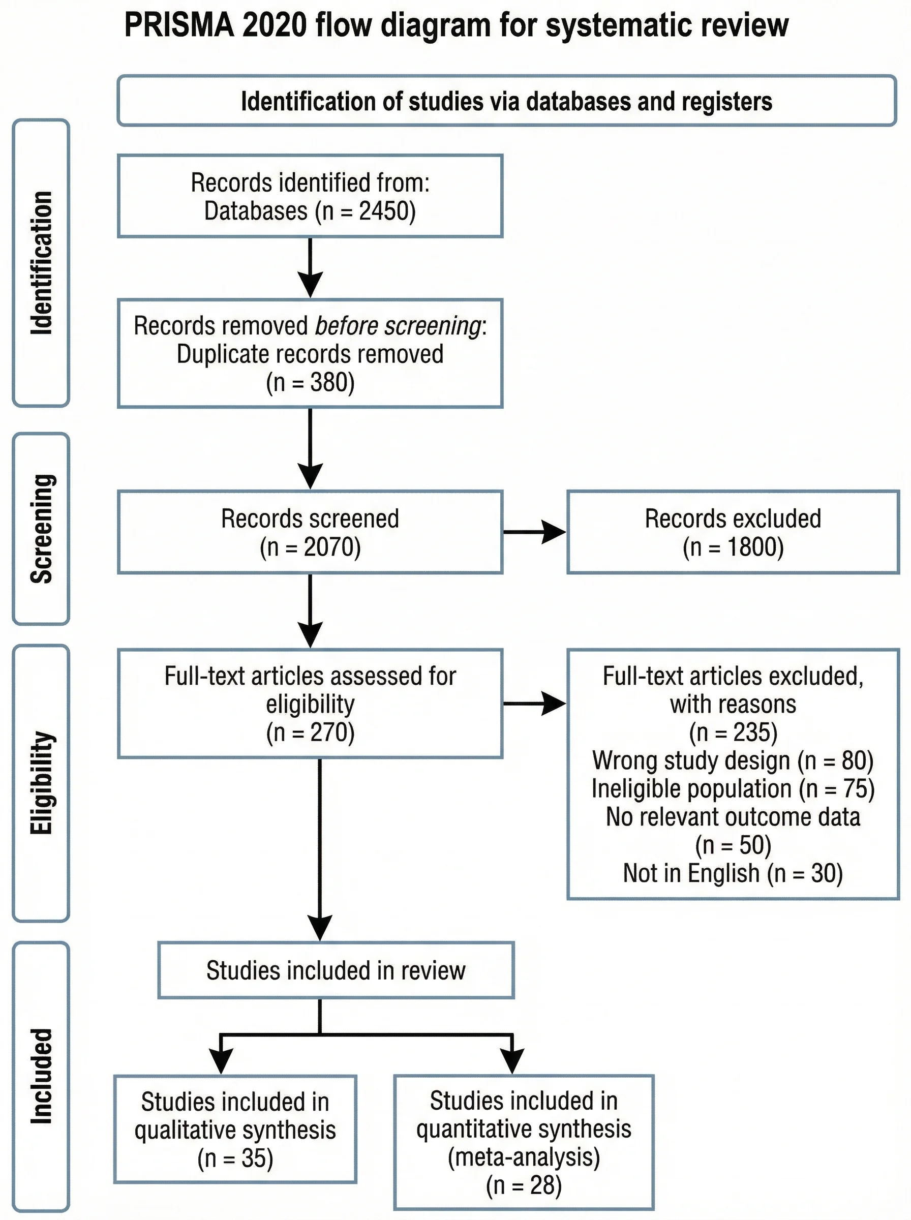
PRISMA Flow Diagram Generator
Document study screening for a systematic review alongside your omics figures.
 Research
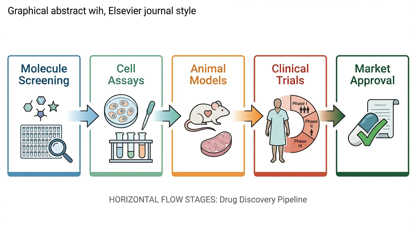
Graphical Abstract Maker
Turn the same experiment into a journal graphical abstract.
 Earth Science
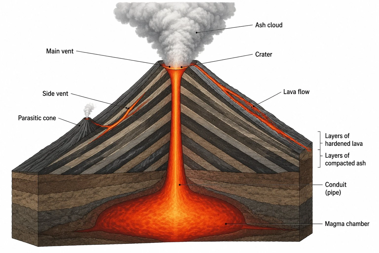
Volcano Diagram Generator
Need a labeled geological volcano for class? That is a different tool.