MA Plot Generator for RNA-seq
Free MA plot generator. Paste DESeq2 mean and log2 fold-change columns to draw an exact RNA-seq MA plot and download SVG.
Paste a DESeq2 / edgeR / limma table — renders an exact MA plot as SVG, free
Differential expression table
gene, baseMean (or AveExpr), log2 fold change, and padj. DESeq2 / edgeR / limma columns are auto-detected.
280 genes parsed
Up 17 · Down 11 · NS 252
MA Plot Generator
Free to try ·
Your AI MA plot illustration will appear here
For a data-accurate plot from your table, use the Precise Plot tab instead
Example MA plots
The first four are exact engine renders from tables. The last two are AI illustrations of Illustration mode.
RNA-seq inflammatory response
Exact engine render — DESeq2-style table, A = log10(baseMean), M = log2FC.
Well-calibrated cloud
Exact engine render — most genes sit on M = 0 after a balanced comparison.
Knockdown, hits below zero
Exact engine render — significant points fall below the dashed zero line.
Proteomics, padj coloring
Exact engine render — same A vs M geometry on a protein table.
AI illustration — RNA-seq
AI illustration of Illustration mode — visual mockup, not plotted from a table.
AI illustration — shrunk LFC
AI illustration of Illustration mode — visual mockup, not plotted from p-values.
What is an MA plot?
An MA plot (minus–average plot, also written M–A plot) is the RNA-seq and microarray scatter of mean expression against log2 fold change. A is the average log intensity — DESeq2 uses log10 of the mean of normalized counts (baseMean); limma uses AveExpr. M is log2(condition 1 / condition 2). Genes that do not change sit on the dashed M = 0 line; upregulated genes sit above it and downregulated genes below it. This page draws that statistical figure from a results table. It is not a movie plot, and it is not a Bland–Altman plot of clinical method agreement.
MA plot versus volcano plot
- A volcano plot puts log2 fold change on x and −log10(p) on y, so significance is height. An MA plot puts mean expression on x and log2 fold change on y, so you see whether large fold changes are only in low-count genes.
- Paste the same DESeq2 table into both. Use the volcano plot generator when you want p-value height; use this page when you want the mean-versus-fold-change cloud, including a quick check that the bulk sits on M = 0.
- This tool plots the numbers you paste. It does not run DESeq2, shrink LFCs, or fit a loess normalization curve.
What table to paste
A DESeq2 results table works as-is: gene, baseMean, log2FoldChange, and padj. limma AveExpr + logFC + adj.P.Val and edgeR logFC tables are fine too. Comma, tab, or semicolon separated text all work. Very large files are truncated to 12,000 rows while keeping significant points on screen. baseMean is plotted as log10; already-logged AveExpr / A columns are plotted as-is.
Export
Download a scalable SVG with no watermark and no account required for the precise plot. The AI Illustration tab is only for slides when you do not have a table yet — it will not match your quantiles.
Frequently Asked Questions
Related Research Tools
 Research
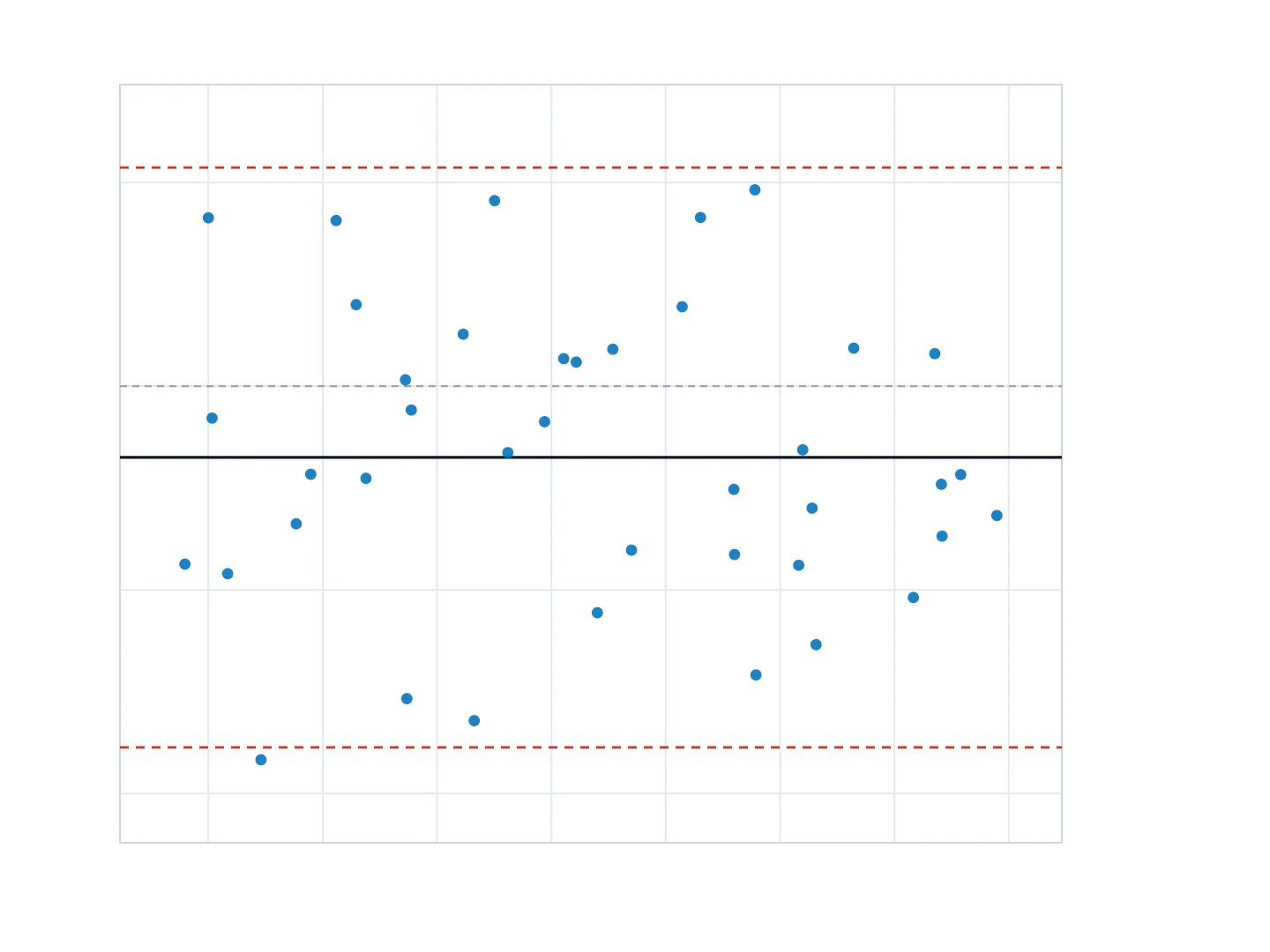
Bland-Altman Plot Generator
Need clinical method agreement with bias and 95% limits of agreement? That is Bland–Altman, not an MA plot.
 Research
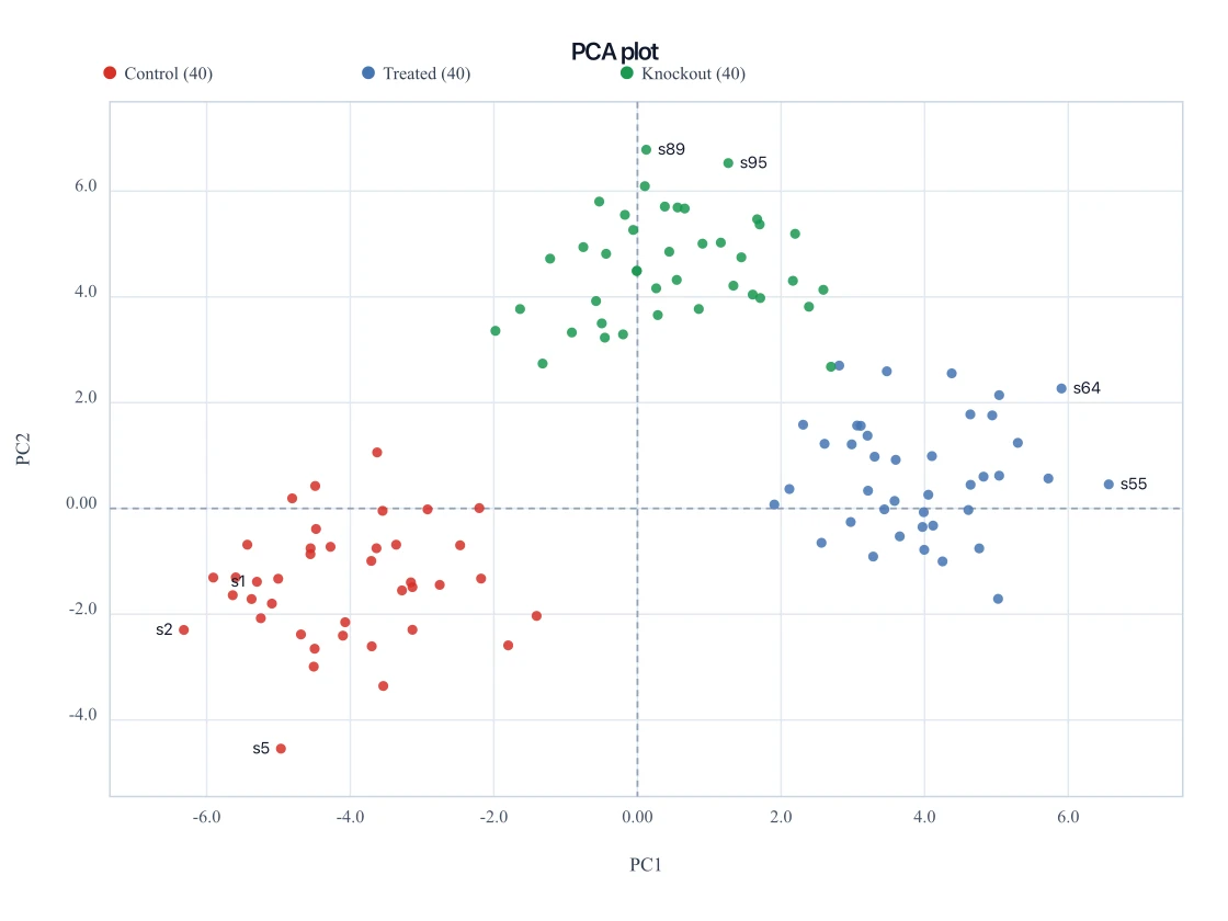
PCA Plot Generator
Paste sample PC1 and PC2 scores to draw the companion multivariate scatter.
 Research
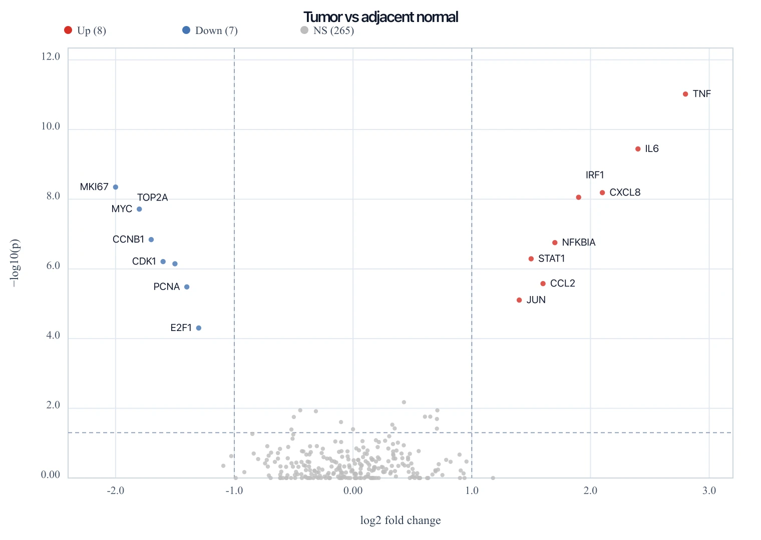
Volcano Plot Generator
Paste the same DESeq2 table to draw log2 fold change versus −log10(p).
 Research
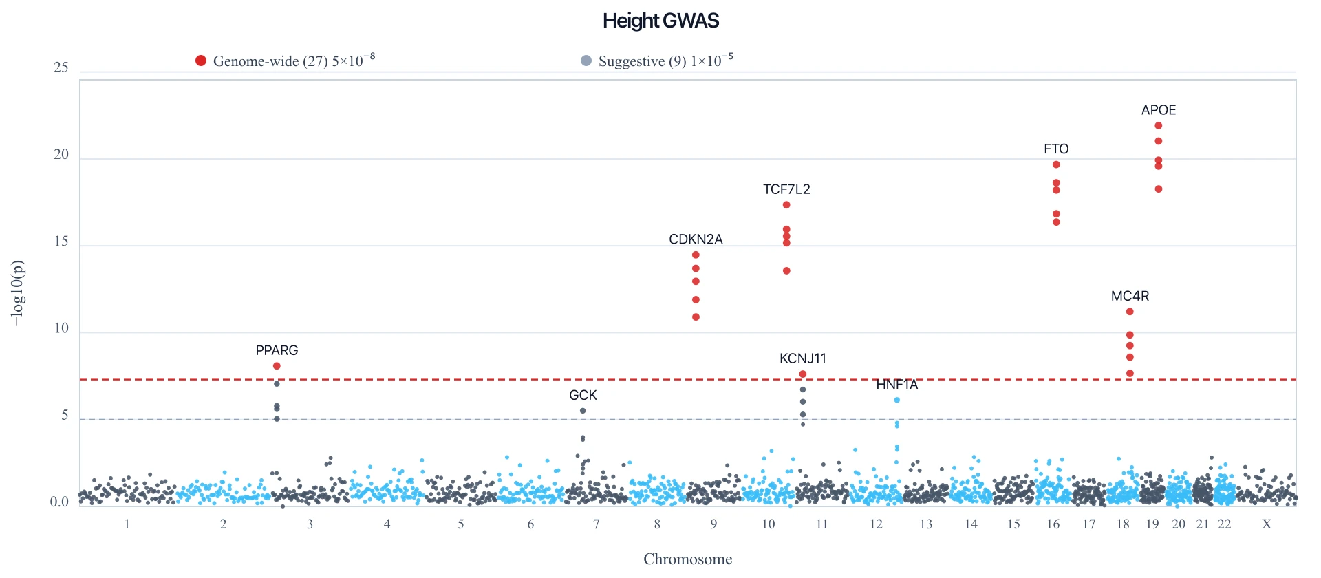
Manhattan Plot Generator
Paste a GWAS table to draw an exact Manhattan plot with a 5e-8 genome-wide line.
 Research
Heatmap Generator
Paste a matrix and render an exact clustered-style heatmap as SVG for the same experiment.
 Research
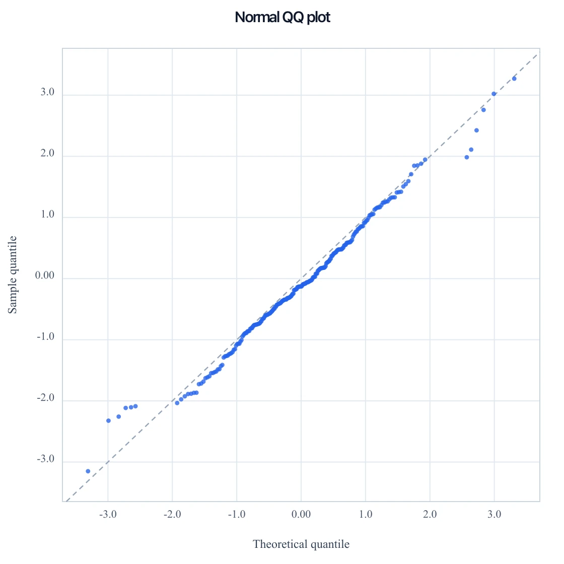
QQ Plot Generator
Paste numbers for a normal QQ, or p-values for a GWAS QQ, and download SVG.