Manhattan Plot Generator for GWAS
Free GWAS Manhattan plot generator. Paste SNP, chromosome, position, and p-value to draw an exact plot with a 5e-8 line and download SVG.
Paste a PLINK, REGENIE, or BOLT table — renders an exact Manhattan plot as SVG, free
GWAS summary table
SNP, chromosome, position, p-value. PLINK / REGENIE / BOLT columns are auto-detected.
2115 variants parsed
Genome-wide 27 · Suggestive 9 · NS 2079
Manhattan Plot Generator
Free to try ·
Your AI Manhattan plot illustration will appear here
For a data-accurate plot from your table, use the Precise Plot tab instead
Manhattan Plot Examples
The first four are exact engine renders from tables. The last two are AI illustrations of Illustration mode.
Height GWAS
Exact engine render — chromosomes 1–22, genome-wide 5×10⁻⁸, FTO and MC4R labeled.
Type 2 diabetes GWAS
Exact engine render — TCF7L2, PPARG, and KCNJ11 peaks from a pasted table.
Lipid GWAS, APOE peak
Exact engine render — APOE on 19 as the leading genome-wide hit.
Suggestive, few genome-wide hits
Exact engine render — tighter genome-wide cutoff still shown; most peaks stay suggestive.
AI illustration — height
AI illustration of Illustration mode — visual mockup, not plotted from a table.
AI illustration — T2D
AI illustration of Illustration mode — visual mockup, not plotted from a table.
What is a Manhattan plot?
A Manhattan plot is the standard genome-wide association (GWAS) figure. Each variant is one point: the x-axis is genomic position ordered by chromosome, and the y-axis is −log10(p-value) so the smallest p-values sit highest. Non-significant SNPs form a low skyline; true association peaks rise like buildings — the resemblance to the Manhattan skyline is the name. This generator is that statistical figure, not a map of New York. Paste a summary table from PLINK, REGENIE, BOLT-LMM, or a similar tool and it draws the plot as an exact SVG.
What table to paste
- You need at least a chromosome column and a p-value column. SNP/rsid and base-pair position are used when present; missing positions are filled in order within each chromosome.
- PLINK assoc files work as-is (SNP, CHR, BP, P). Chromosome 23 is treated as X, 24 as Y, 26 as MT.
- REGENIE (CHROM, GENPOS, ID, P) and BOLT-LMM (SNP, CHR, BP, P_BOLT_LMM) headers are auto-detected.
- Comma, tab, or semicolon separated text all work. Upload a CSV/TSV, or copy from Excel and paste. Full summary-stat files with millions of SNPs should be pruned first — the plot keeps at most 25,000 rows and always retains significant hits when downsampling the rest.
How to read the plot
- Points are ordered left to right across chromosomes 1–22, then X and Y if they are in the table. Alternating colors separate neighboring chromosomes.
- Height is statistical significance. The red dashed line is the genome-wide cutoff (default 5×10⁻⁸); the grey dashed line is the suggestive cutoff (default 1×10⁻⁵).
- Red points are genome-wide significant under the current cutoff. Labels are the top hits plus any SNP or gene names you type. This is a visualization tool: it plots the p-values you supply and does not run a GWAS.
- 5×10⁻⁸ is the conventional common-variant GWAS line, not a Bonferroni correction for every study. Change it if your paper uses a different threshold.
GWAS figures that usually sit together
A Manhattan plot is often paired with a QQ plot to check p-value inflation, a locus zoom of the lead SNP, and a forest plot if you meta-analyse cohorts. Use the QQ plot generator for the companion figure. For differential expression you usually want a volcano plot, not a Manhattan plot. The sample table on this page is synthetic for the demo — it is not a published GWAS.
Export
Download a scalable SVG with no watermark and no account required for the precise plot. Open it in Illustrator, Inkscape, PowerPoint, or a journal submission portal. The AI Illustration tab is only for slide mockups when you do not have a table yet — it will not match your p-values.
Frequently Asked Questions
Related Research Tools
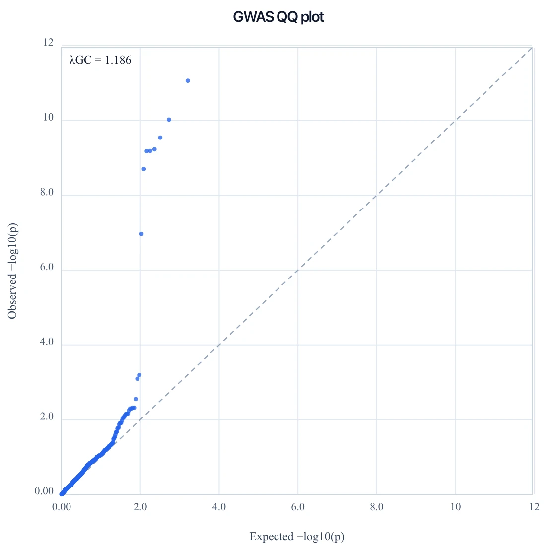 Research
QQ Plot Generator
Check p-value inflation with a GWAS QQ plot, or draw a normal QQ from residuals.
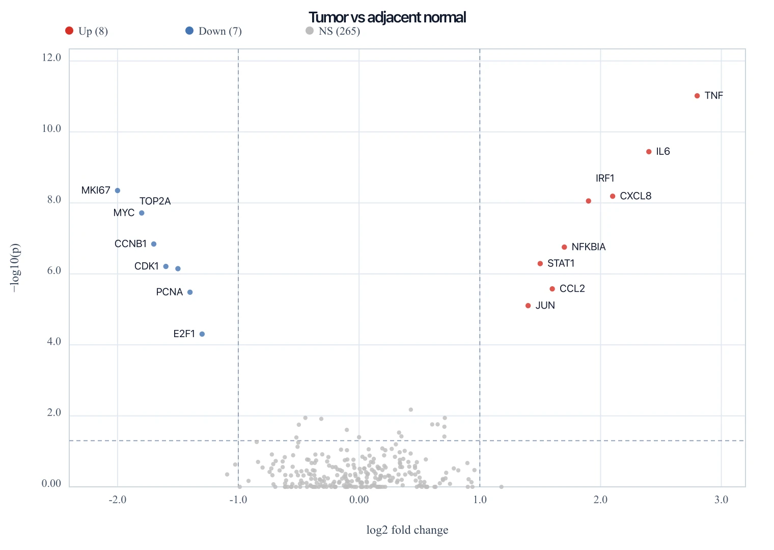 Research
Volcano Plot Generator
Paste a DESeq2 table to draw an exact RNA-seq volcano plot as SVG.
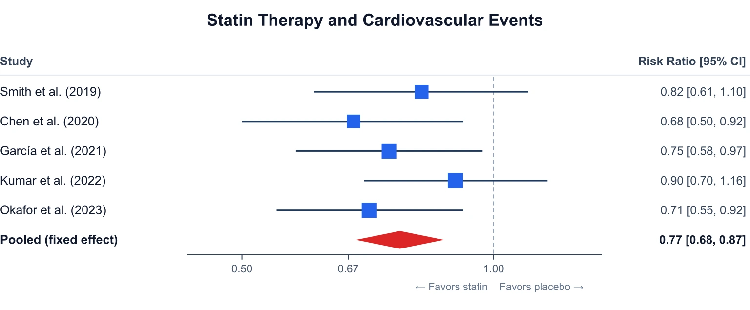 Research
Forest Plot Generator
Build a meta-analysis forest plot from effect sizes and 95% confidence intervals.
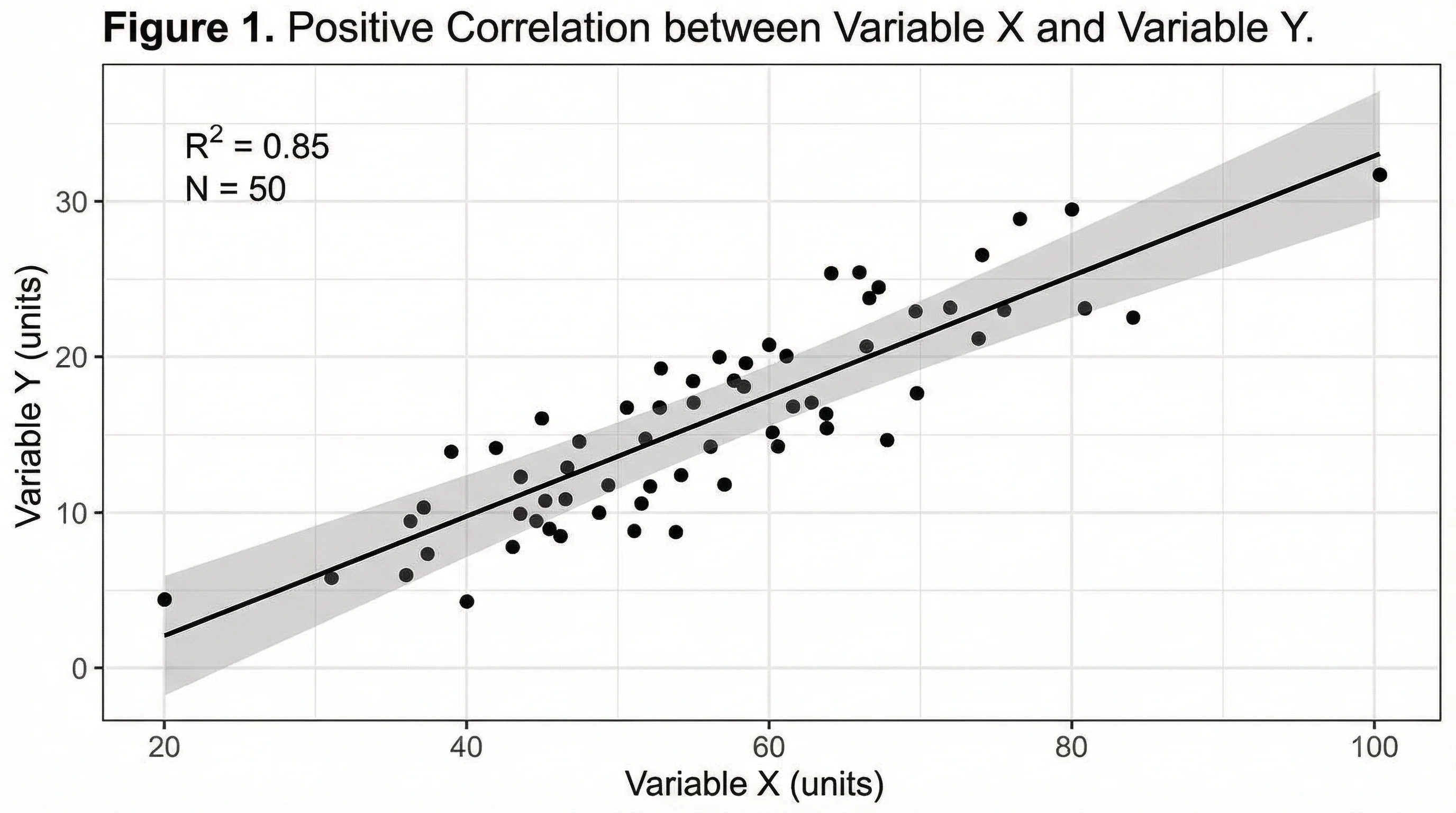 Research
Heatmap Generator
Paste a matrix and render an exact clustered-style heatmap as SVG.
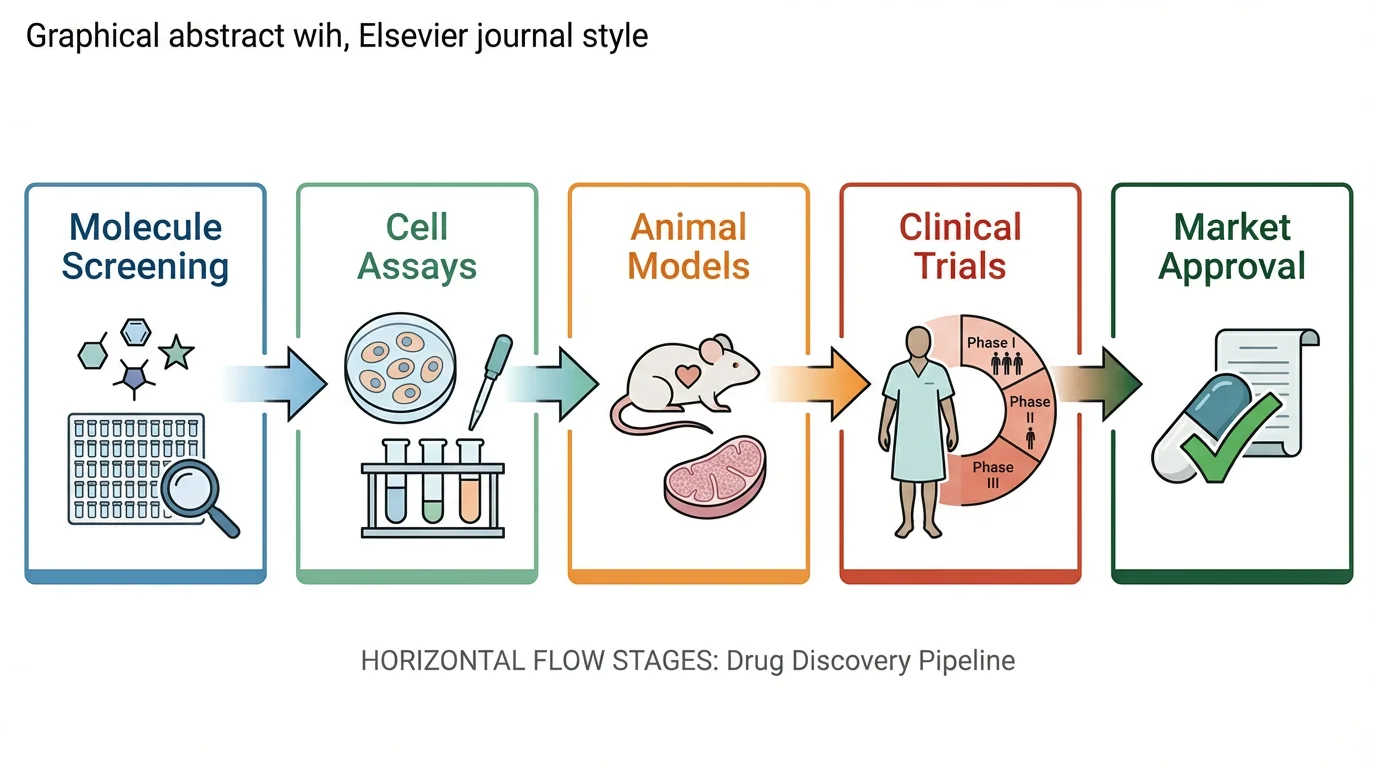 Research
Graphical Abstract Maker
Turn the same study into a journal graphical abstract.