Heatmap Generator from Your Data
Make a heatmap online from your own data. Paste a matrix to render a precise, color-mapped heatmap with cell values and a min-to-max legend, or describe one for an AI illustration — then download SVG, free.
Paste your data matrix — renders an exact color-mapped heatmap as SVG, free
Heatmap data
Matrix in, colored grid out — rendered as SVG.
First row is column headers. Each next row is RowLabel, v1, v2, .... Commas or tabs both work.
Each cell is colored by mapping its value onto a sequential scale from the data minimum (light) to the maximum (dark). Download an editable SVG for slides, reports, and worksheets.
Heatmap Generator
Free to try ·
Your heatmap will appear here
Describe the heatmap you want
Heatmap Examples
Correlation, confusion, and intensity grids across research and analytics
Correlation Matrix Heatmap
A correlation heatmap is the fastest way to spot which variables move together across a dataset.
Calendar / Activity Heatmap
Map intensity over time — days, weeks, or hours — to reveal patterns and busy periods at a glance.
Gene Expression Heatmap
A staple of bioinformatics: genes as rows, conditions as columns, color showing expression level.
Performance Heatmap
Turn a table of scores into a dashboard tile where strong and weak cells stand out instantly.
Confusion Matrix Heatmap
A confusion matrix is a heatmap of predicted versus actual labels — color makes the diagonal pop.
Traffic-by-Hour Heatmap
Hour-by-day heatmaps surface peak windows in web traffic, sales, or support volume.
What is a heatmap?
A heatmap is a grid where each cell is colored by its value, so a table of numbers becomes a picture you can read at a glance. High values get one end of a color scale and low values the other, which makes hot spots, cold spots, and patterns jump out far faster than they would from raw figures. Heatmaps are everywhere in data work — correlation matrices, confusion matrices, gene-expression panels, activity calendars, and any month-by-region or hour-by-day table. This heatmap generator takes your matrix and draws exactly that: a colored grid with the numbers kept in each cell, so nothing is lost in translation from data to color.
Two ways to make a heatmap here
- Precise data mode: paste your data matrix and the tool reads the column headers and row labels, finds the minimum and maximum across every cell, and colors each cell on a single shared scale. The mapping is computed, so the colors are accurate and comparable — ideal for reports, analysis, and homework.
- AI illustration mode: describe the heatmap you want in plain English and the tool generates a polished, presentation-ready graphic with themed colors and styling — great for slides, blog posts, and social.
- Use data mode when the values must be mapped correctly; use AI mode when you want a styled, on-brand picture of a heatmap rather than an exact plot of your numbers.
How the color scale works
The color is the whole point of a heatmap, so getting the scale right matters. This generator scans every numeric cell in your matrix, takes the overall minimum and maximum, and maps each value onto a single sequential color ramp — light at the minimum, dark at the maximum. Because every cell shares one scale, a dark cell in one row means the same thing as a dark cell in another, so the colors are directly comparable. A min-to-max legend is drawn beneath the grid so anyone reading it knows what the colors mean, and the exact number stays printed inside each cell with the text color flipped to dark or light automatically for contrast.
How to make a heatmap from your data
- Put your column headers on the first row, then one row per record as "RowLabel, value, value, value" — commas or tabs both work, so you can paste straight from a spreadsheet.
- The tool parses the matrix, ignores any malformed rows, and computes the minimum and maximum across all the values.
- Each cell is colored on the shared scale and labeled with its value; row labels sit on the left and column headers across the top.
- Download a clean SVG to drop into a doc, slide, or report — it stays crisp at any size and editable in vector software.
Heatmaps for correlation, confusion, and intensity
The same colored grid handles many of the most common analysis tasks. A correlation heatmap places variables on both axes and colors each cell by how strongly the pair moves together, so clusters of related variables become obvious. A confusion matrix is a heatmap of a classifier’s predictions versus the true labels, where a bright diagonal signals an accurate model. An intensity or activity heatmap maps a value over two categories — month by region, hour by day, product by store — to reveal where things peak. Whatever the matrix, this maker applies one consistent scale so the picture is honest and the comparisons hold up.
When to use the AI illustration mode
Reach for the AI illustration mode when you want a styled, eye-catching graphic rather than a strict plot of your numbers — a themed heatmap for a presentation, a concept image for a blog post, or a friendly visual for social. The AI graphic looks great but is not measured from your data, so for anything where the color mapping must be exact — an analysis, a report, or a graded assignment — use the precise data mode, where every cell is computed from a single shared minimum-to-maximum scale and the values stay printed in the grid.
Frequently Asked Questions
Related Visualization Tools
 Visualization
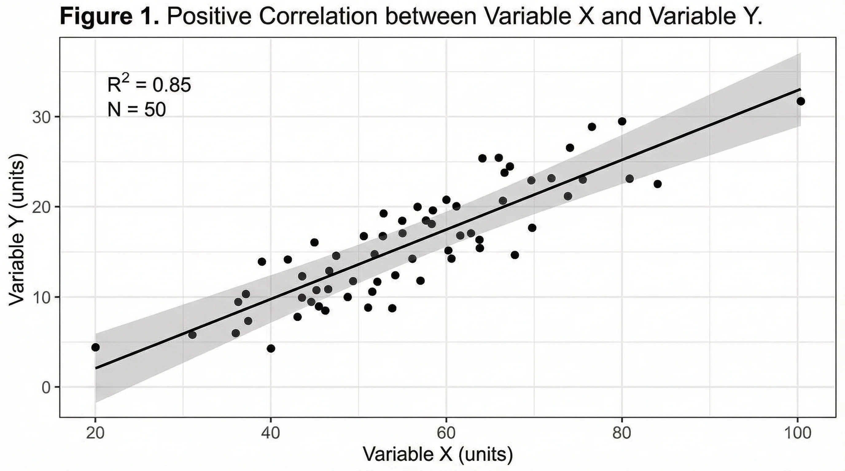
Scatter Plot Maker
Plot two variables to reveal correlation and trends, with an optional trend line.
 Visualization
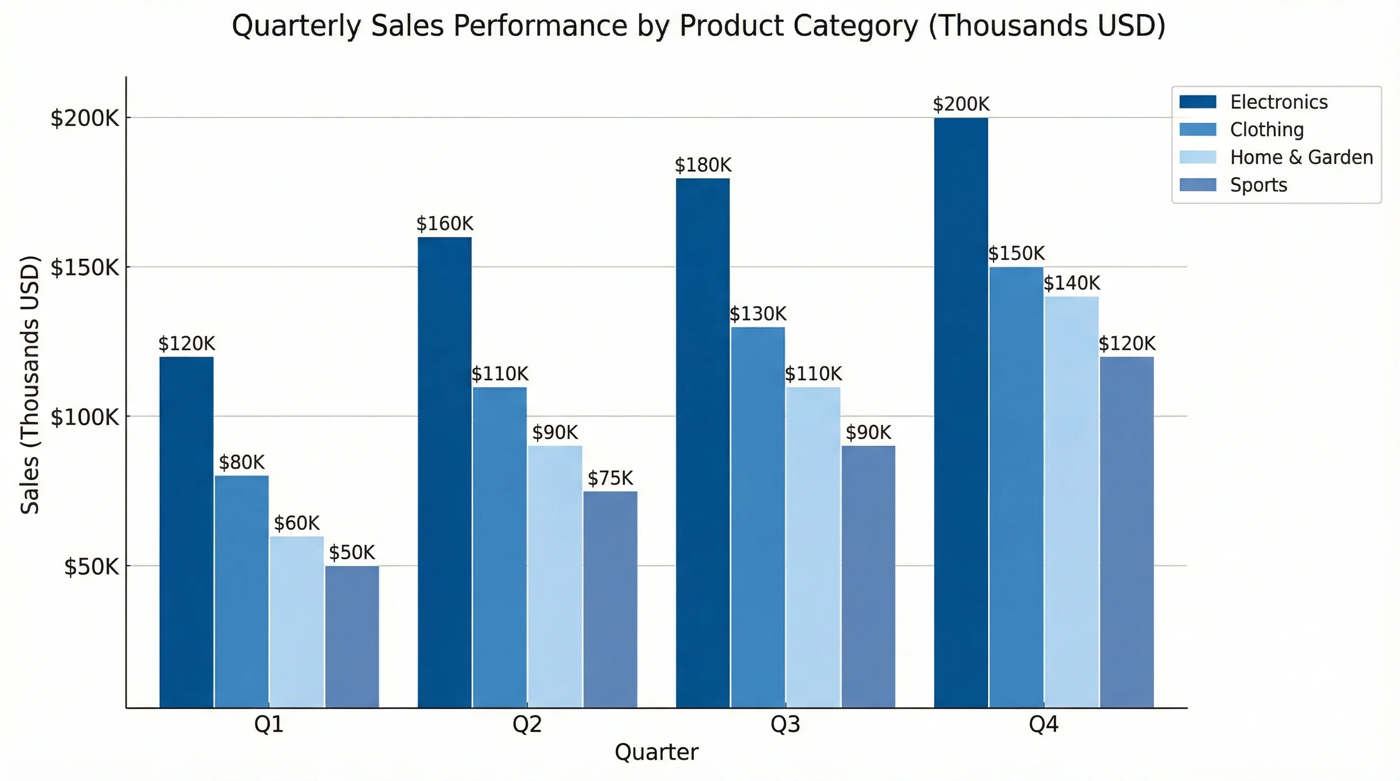
AI Chart Generator
Turn your data into clean bar, line, pie, and scatter charts in seconds.
 Visualization
Radar Chart Generator
Compare several items across multiple metrics on a single radar chart.