Forest Plot Generator for Meta-Analysis
Free forest plot generator for meta-analysis — enter each study’s effect size and 95% CI for a publication-ready plot with a pooled estimate. Export SVG.
Enter each study’s effect size and 95% CI — renders an exact forest plot as SVG, free
Studies — effect & 95% CI (null = 1)
Forest Plot Generator
Free to try ·
Your AI forest plot illustration will appear here
For an exact, data-driven plot, use the Precise Plot tab instead
Forest Plot Examples
Exact engine renders plus AI illustrations across effect measures
Risk Ratio Meta-Analysis
Exact engine render — five trials with weighted squares and a fixed-effect pooled diamond on a log axis.
Mean Difference (Linear Axis)
Exact engine render — a continuous-outcome mean difference on a linear axis with the null line at 0.
Odds Ratio Meta-Analysis
AI illustration — an odds-ratio meta-analysis of randomized controlled trials.
Hazard Ratio for Survival
AI illustration — hazard ratios for an overall-survival outcome from cohort studies.
Subgroup Analysis
AI illustration — studies split into subgroups, each with its own pooled diamond.
Standardized Mean Difference
AI illustration — standardized mean differences (Cohen’s d) for an education intervention.
What is a forest plot?
A forest plot is the standard way to visualize the results of a meta-analysis. Each study is shown as one row: a square marks its point estimate (an odds ratio, risk ratio, hazard ratio, or mean difference), and a horizontal line spans the 95% confidence interval. The square’s size reflects how much weight the study carries. A vertical dashed line marks the null value (1 for ratios, 0 for differences), and a diamond at the bottom summarizes the pooled estimate across all studies. This generator draws that plot for you — enter each study’s numbers on the left and the exact SVG updates instantly on the right.
How to read a forest plot
- Each row is one study; the square is its effect estimate and the line is its 95% confidence interval.
- Square size = the study’s weight in the analysis — bigger squares are more precise, higher-weight studies.
- The dashed vertical line is the line of no effect (ratio measures at 1, difference measures at 0).
- If a study’s confidence interval crosses the null line, its result is not statistically significant on its own.
- The diamond is the pooled estimate; its width is the pooled confidence interval. A diamond that does not touch the null line indicates a significant overall effect.
How to make your forest plot
- Choose your effect measure — Risk Ratio, Odds Ratio, and Hazard Ratio use a log axis with the null at 1; Mean Difference and SMD use a linear axis with the null at 0.
- Add a row for each study with its point estimate and the lower and upper bounds of the 95% confidence interval.
- The tool computes each study’s weight from its confidence interval and draws a fixed-effect, inverse-variance pooled diamond (toggle it on or off).
- Set the title and the "favors" labels on each side of the null line, then download a clean, scalable SVG for your paper, slides, or poster.
Effect measures and the null line
Ratio measures — the odds ratio, risk ratio, and hazard ratio — are plotted on a logarithmic axis so that, for example, a ratio of 0.5 and a ratio of 2 sit an equal distance from the null value of 1. A confidence interval that stays entirely below 1 favors the treatment for an adverse outcome, while one entirely above 1 favors the control. Difference measures — the mean difference and standardized mean difference (SMD) — are plotted on a linear axis with the null at 0, where negative values favor one group and positive values the other. Choosing the right measure sets the axis and the reference line automatically.
Forest plots in a systematic review
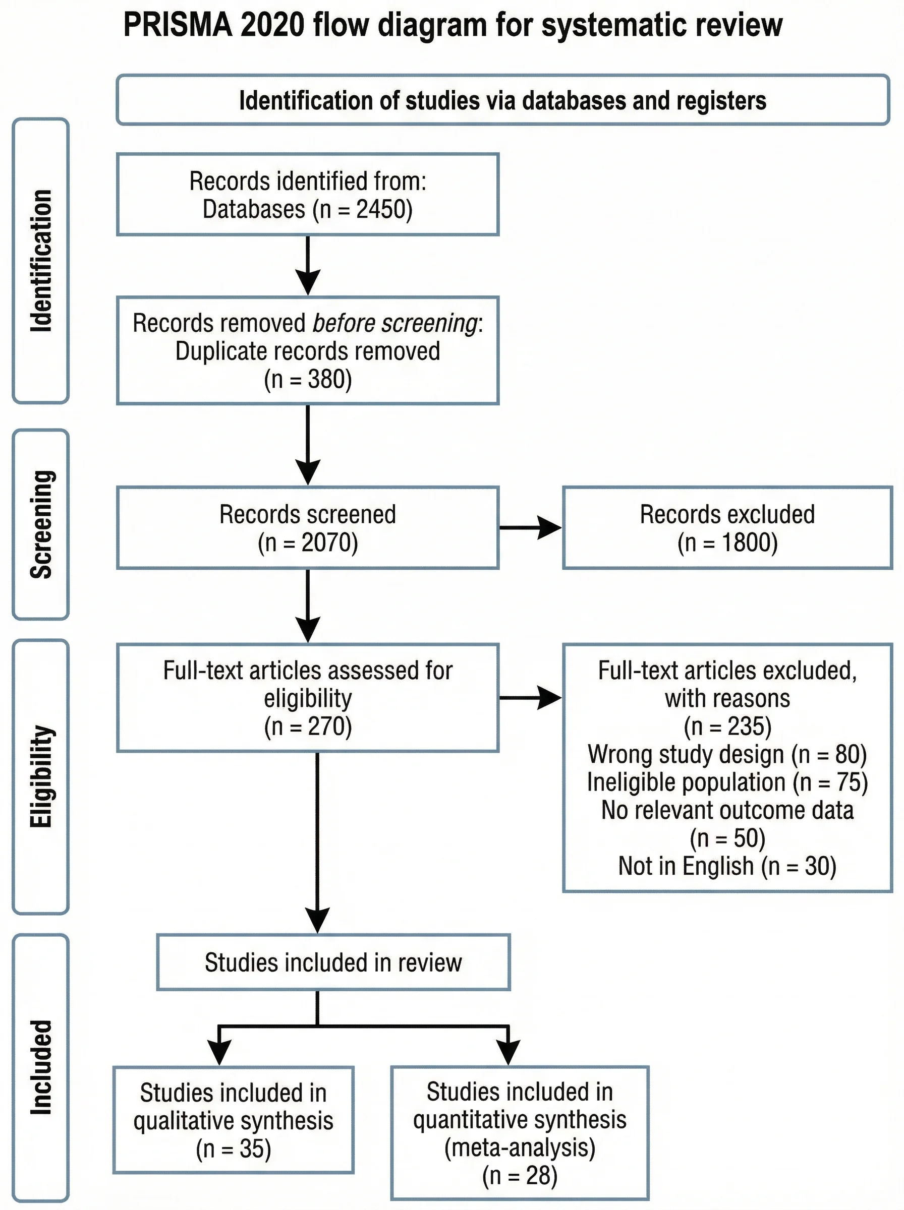
A forest plot is the centerpiece figure of most systematic reviews and meta-analyses. It usually appears alongside a PRISMA flow diagram that documents how studies were screened and selected, and it may be paired with a funnel plot to assess publication bias. Report the effect measure, the model (fixed or random effects), and a heterogeneity statistic such as I² alongside the plot. This tool renders the forest plot itself from the effect sizes you provide; if you also need to show your study-selection process, use the PRISMA flow diagram generator to build the matching flow chart.
Frequently Asked Questions
Related Research Tools
 Research
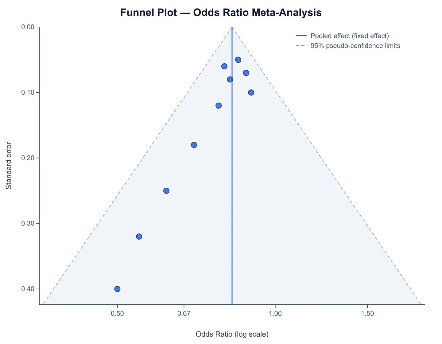
Funnel Plot Generator
Check your meta-analysis for publication bias with a funnel plot and Egger’s test.
 Research
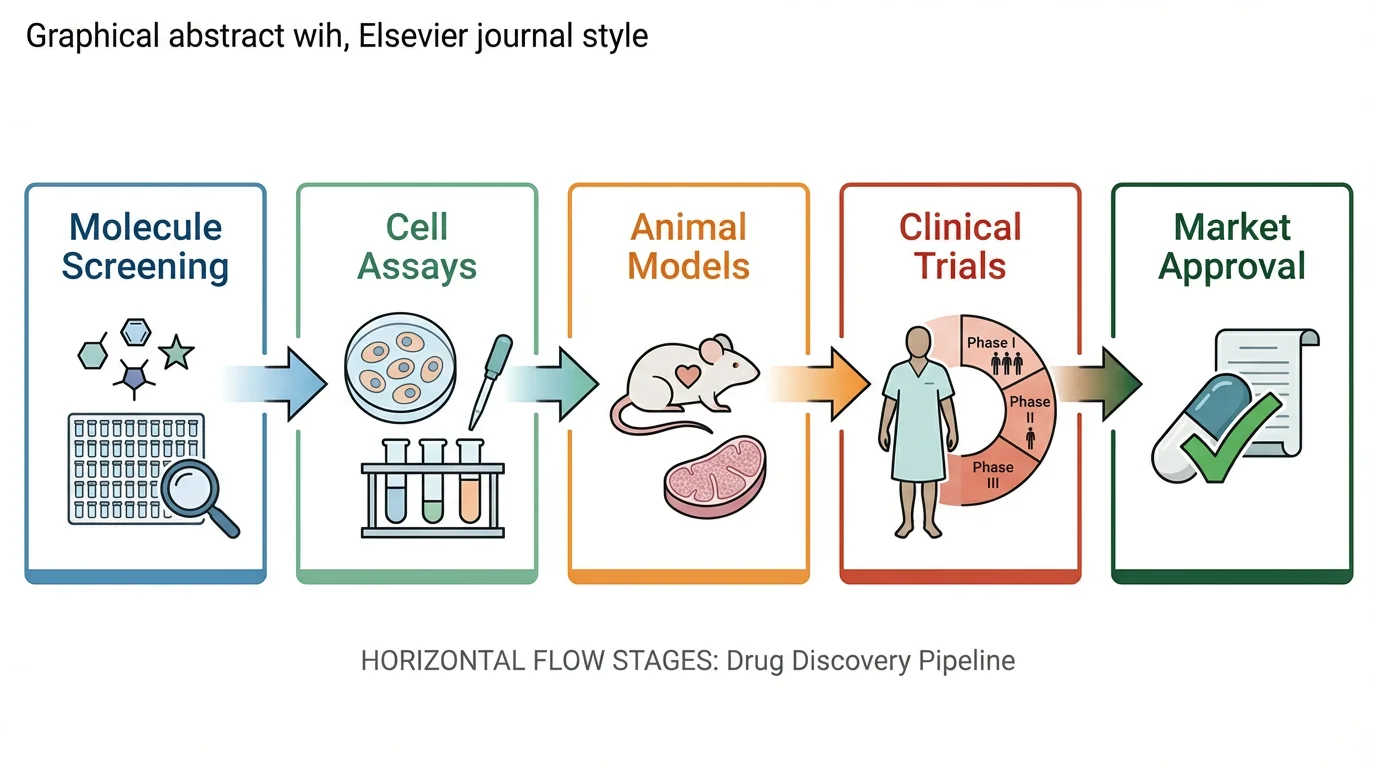
Graphical Abstract Maker
Create a publication-ready graphical abstract to summarize your paper in one figure.
 Research
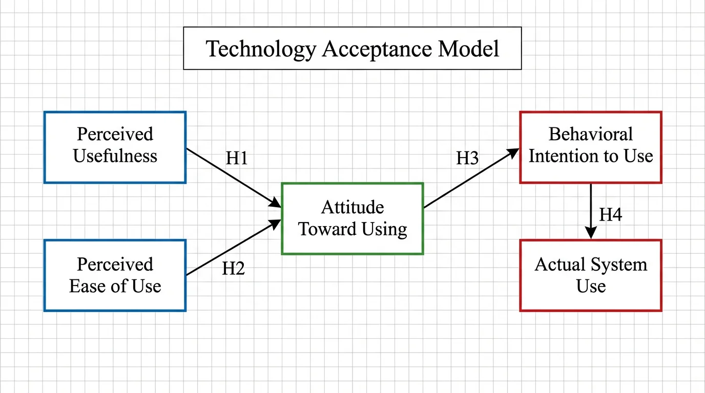
Conceptual Framework Generator
Diagram the variables and relationships behind your study or thesis.
 Research
Scientific Poster Generator
Lay out a conference research poster with your figures and sections.
 Research
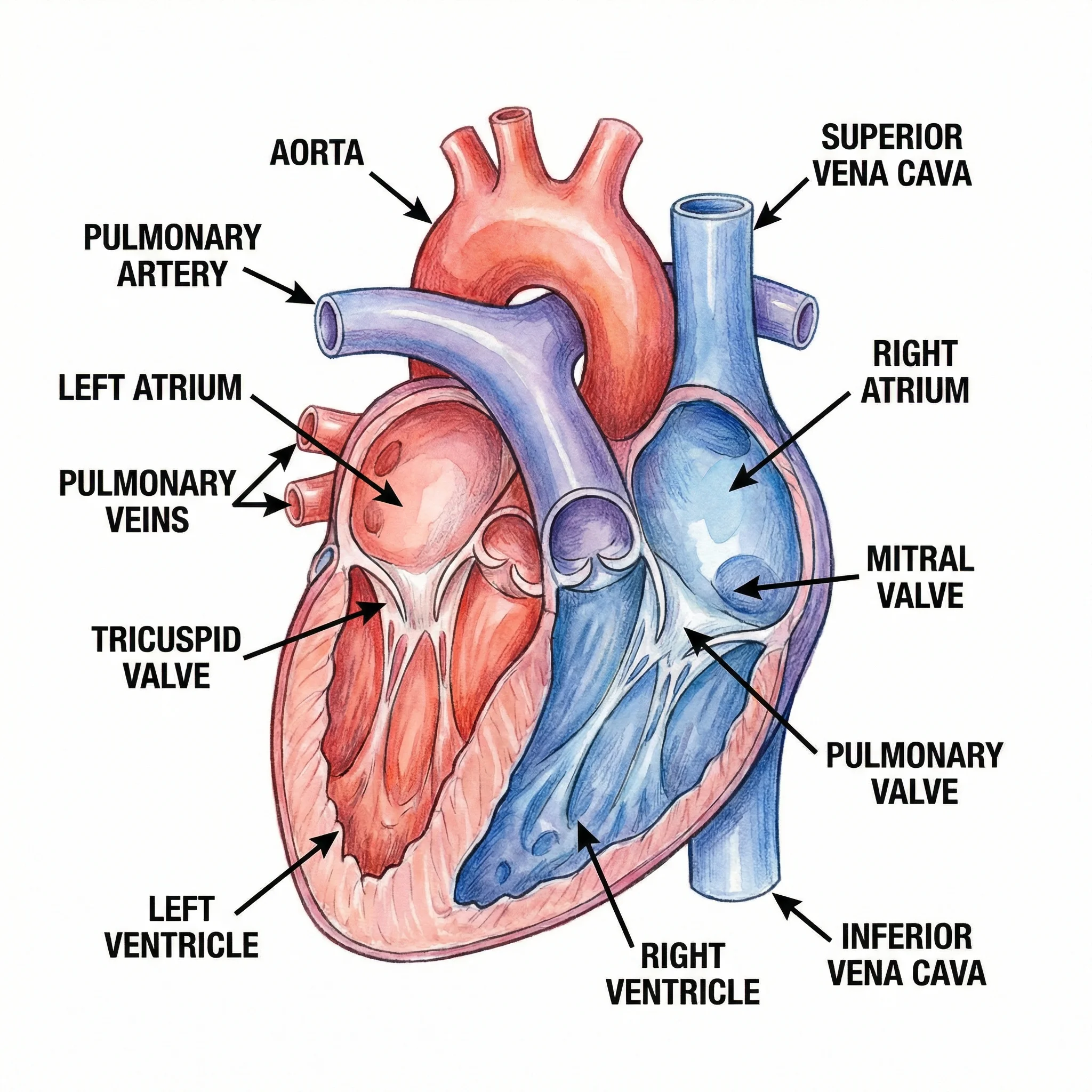
Medical Illustration Generator
Generate clean medical and anatomy illustrations for papers and posters.
 Research
PRISMA Flow Diagram Generator
Fill in your record counts and get a PRISMA 2020 flow diagram for your systematic review.