QQ Plot Generator for stats and GWAS
Free QQ plot generator. Paste numbers for a normal QQ, or p-values for a GWAS QQ, and download SVG.
Paste numbers or p-values — renders an exact QQ plot as SVG, free
Data table
One numeric column for a normal QQ, or a p-value column for a GWAS QQ.
240 values parsed
QQ Plot Generator
Free to try ·
Your AI QQ plot illustration will appear here
For a data-accurate plot from your numbers, use the Precise Plot tab instead
QQ Plot Examples
The first four are exact engine renders from tables. The last two are AI illustrations of Illustration mode.
Normal QQ, well behaved
Exact engine render — standard normal sample, theoretical quantiles on x.
Right-skewed sample
Exact engine render — upper tail lifts off the dashed line.
GWAS QQ, λGC ≈ 1
Exact engine render — observed versus expected −log10(p), inflation labeled.
GWAS QQ with tail hits
Exact engine render — bulk on the line, a handful of small p-values in the tail.
AI illustration — normal
AI illustration of Illustration mode — visual mockup, not plotted from data.
AI illustration — GWAS
AI illustration of Illustration mode — visual mockup, not plotted from p-values.
What is a QQ plot?
A QQ plot (quantile-quantile plot, also written Q–Q plot) compares the quantiles of your sample with the quantiles of a theoretical distribution. If the points hug the dashed y = x line, the sample matches that distribution. This page is the statistical figure — not a chat-app logo. The default is a normal QQ plot: paste a numeric column (residuals, measurements, z-scores). Switch to GWAS / p-value mode to plot observed versus expected −log10(p), the companion figure to a Manhattan plot.
Normal QQ versus GWAS QQ
- Normal QQ: x is the theoretical standard-normal quantile using plotting positions (i − 0.5) / n; y is the sorted sample. Curvature tells you skew; a steep slope tells you extra spread.
- GWAS QQ: x is expected −log10(p) under a uniform null; y is observed −log10(p). The genomic inflation factor λGC is the median χ²(1) statistic divided by 0.455. Values near 1 mean the bulk of tests is well calibrated.
- A few points peeling off in the GWAS tail are expected if you have true associations. A line that is high from the start usually means confounding, not biology.
- This tool plots the numbers you paste. It does not refit a GWAS, estimate λ from principal components, or draw a Manhattan plot — use the Manhattan plot generator for that.
What table to paste
A header plus one numeric column is enough. Residual or value columns draw a normal QQ. A p, pvalue, or padj column draws a GWAS QQ when you select that mode. Comma, tab, or semicolon separated text all work. Very large files are truncated to 25,000 rows while keeping the most extreme tail points on screen.
Export
Download a scalable SVG with no watermark and no account required for the precise plot. The AI Illustration tab is only for slides when you do not have data yet — it will not match your quantiles.
Frequently Asked Questions
Related Research Tools
 Research
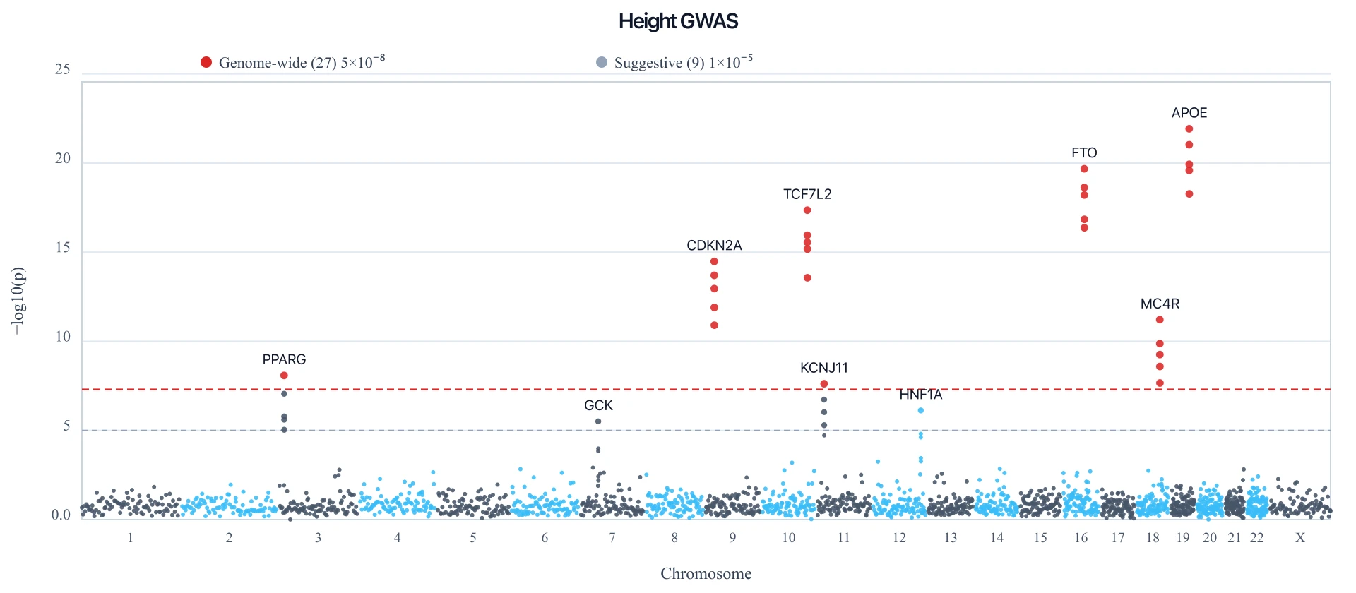
Manhattan Plot Generator
Paste a GWAS table to draw the companion Manhattan plot with a 5e-8 line.
 Research
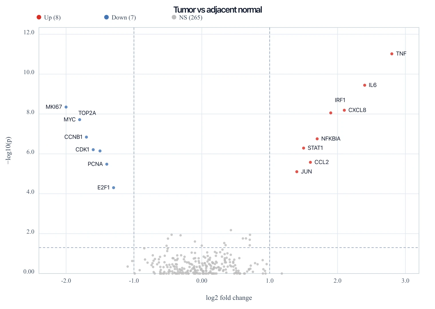
Volcano Plot Generator
Paste a DESeq2 table to draw an exact RNA-seq volcano plot as SVG.
 Research
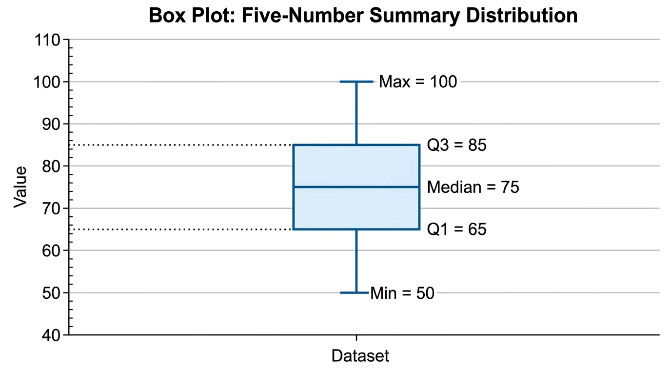
Box Plot Generator
Need quartiles and outliers instead of a QQ plot? Draw a box plot from the same column.
 Research
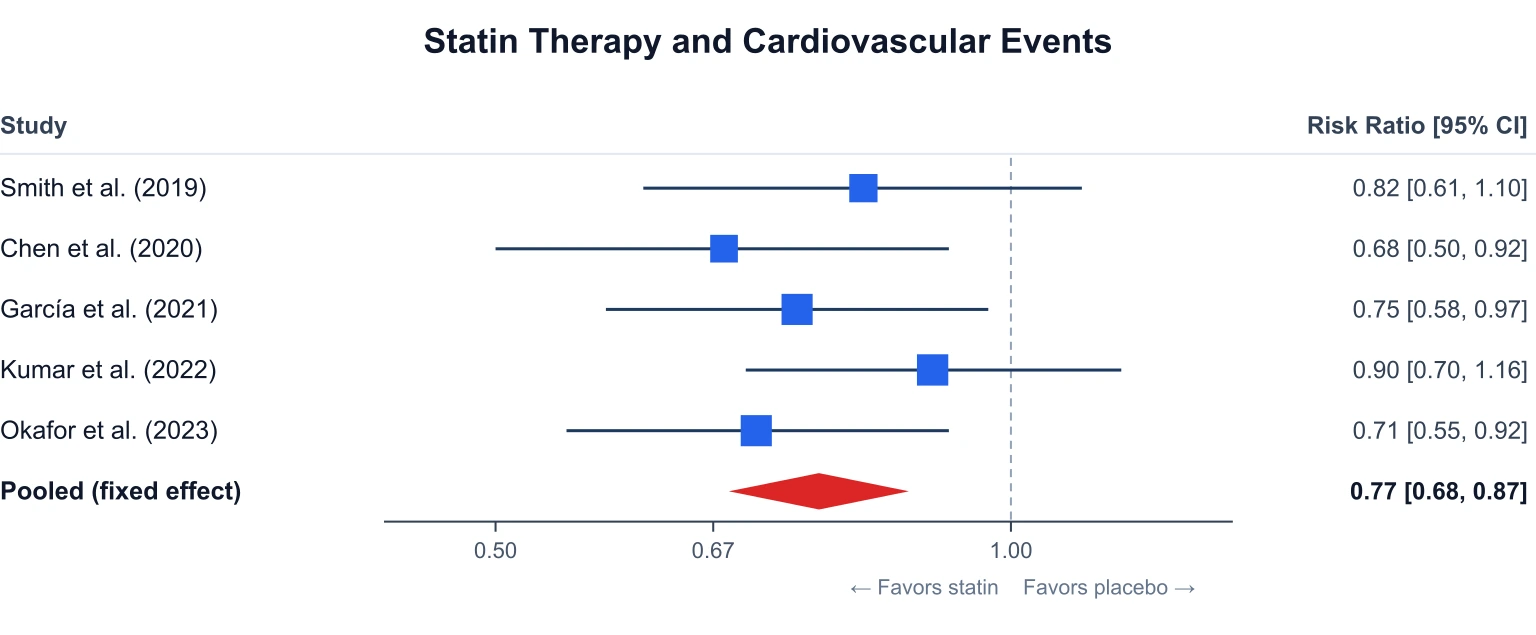
Forest Plot Generator
Build a meta-analysis forest plot from effect sizes and 95% confidence intervals.