Box Plot Generator for Box & Whisker Plots
Make a box and whisker plot online. Paste your numbers and the tool computes the 5-number summary (min, Q1, median, Q3, max), the IQR, and outliers, then draws an exact box plot you can export as SVG — free. Or describe one for an AI illustration.
Paste your numbers — renders an exact box-and-whisker plot with quartiles and outliers as SVG, free
Box plot data
Exact box-and-whisker plot, rendered as SVG.
Format: Label: v1, v2, v3, ... — one group per line. A bare line of numbers becomes a single group.
5-number summary
Group A
- Min
- 9
- Q1
- 11.75
- Median
- 14
- Q3
- 16.25
- Max
- 22
- IQR
- 4.5
Group B
- Min
- 18
- Q1
- 20.75
- Median
- 23.5
- Q3
- 26.25
- Max
- 35
- IQR
- 5.5
Outliers: 35
Quartiles use linear interpolation (type 7); whiskers reach the most extreme value within 1.5 × IQR of the hinges, and points beyond are drawn as outlier dots. Download an editable SVG for slides, reports, and worksheets.
Box Plot Generator
Free to try ·
Your box plot will appear here
Describe the box plot you want
Box Plot Examples
Box-and-whisker plots covering single datasets, group comparisons, and outliers
Single Box Plot
One dataset shown as a box from Q1 to Q3 with a median line and whiskers — the full 5-number summary at a glance.
Multi-Group Comparison
Compare several groups on one shared axis — medians and spread line up so differences are obvious.
Box Plot with Outliers
Points beyond 1.5 × IQR are flagged as outlier dots, so extreme values stand out instead of hiding.
Horizontal Box Plots
A horizontal layout keeps long group labels readable while still sharing one numeric scale.
Box Plot vs Violin Plot
A violin adds the distribution shape around the box — useful when the data is skewed or multimodal.
Publication-Ready Box Plots
Clean, labeled box plots styled for reports and papers, with sample sizes and significance brackets.
What is a box plot?
A box plot — also called a box-and-whisker plot — summarizes a dataset using its five-number summary: the minimum, first quartile (Q1), median, third quartile (Q3), and maximum. The box spans Q1 to Q3 (the middle 50% of the data), a line inside it marks the median, and the whiskers reach out toward the smallest and largest values that are not outliers. It is one of the fastest ways to see a distribution’s center, spread, and skew on a single line, which is exactly what this generator draws from your numbers.
Two ways to make a box plot here
- Precise mode: paste your numbers and the tool computes the 5-number summary, the IQR, the whiskers, and any outliers, then renders an exact box-and-whisker plot — accurate every time, with no charting software.
- AI illustration mode: describe the box plot you want in plain English and the tool generates a polished, presentation-ready illustration with themed colors and annotations.
- Use precise mode when correctness matters (homework, lab reports, analysis); use AI mode when you want a stylized graphic for slides or a poster.
The 5-number summary and the IQR
The five-number summary is min, Q1, median (Q2), Q3, and max. The interquartile range is IQR = Q3 − Q1, the width of the box, and it measures the spread of the middle half of the data. This tool computes quartiles by linear interpolation (the “type 7” method used by NumPy’s default percentile, R’s default quantile, and Excel’s PERCENTILE.INC), so your numbers match what those tools produce. Reading the box plot: a median sitting off-center, or one whisker much longer than the other, tells you the distribution is skewed.
How the whiskers and outliers are drawn
The whiskers do not simply run to the minimum and maximum. Following the standard Tukey rule, the tool builds a fence at 1.5 × IQR below Q1 and 1.5 × IQR above Q3. Each whisker then extends only to the most extreme data point that still falls inside that fence. Any value past the fence is plotted as a separate outlier dot rather than being swallowed by a whisker. This is the box-plot-with-outliers convention you see in statistics textbooks, and it makes genuinely extreme values easy to spot.
How to make a box and whisker plot from your data
- Open the precise mode and paste your numbers, separated by commas, spaces, or new lines.
- For a single dataset, one line of numbers is enough; for groups, put one group per line as “Label: v1, v2, v3, …”.
- The tool computes each group’s 5-number summary and outliers and draws every box on a shared, labeled numeric axis.
- Copy the summary values or download a clean SVG to drop into a doc, slide, or worksheet.
Box plot vs violin plot
A box plot summarizes a distribution with five numbers and is compact and easy to compare across many groups. A violin plot adds the full distribution shape (a kernel density estimate) around the box, which reveals features a box plot hides — such as a bimodal distribution that has two peaks but an ordinary-looking box. Use a box plot when you want a clean, quantitative comparison; reach for a violin (available in AI illustration mode) when the exact shape of the distribution matters.
Frequently Asked Questions
Related Statistics Tools
 Statistics
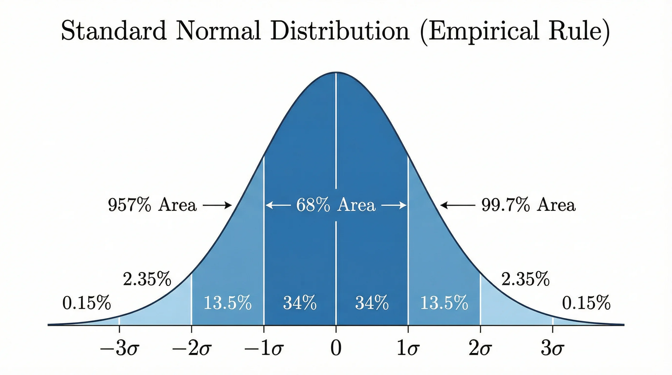
Bell Curve Generator
Render an exact normal distribution from a mean and standard deviation, with shaded regions.
 Research
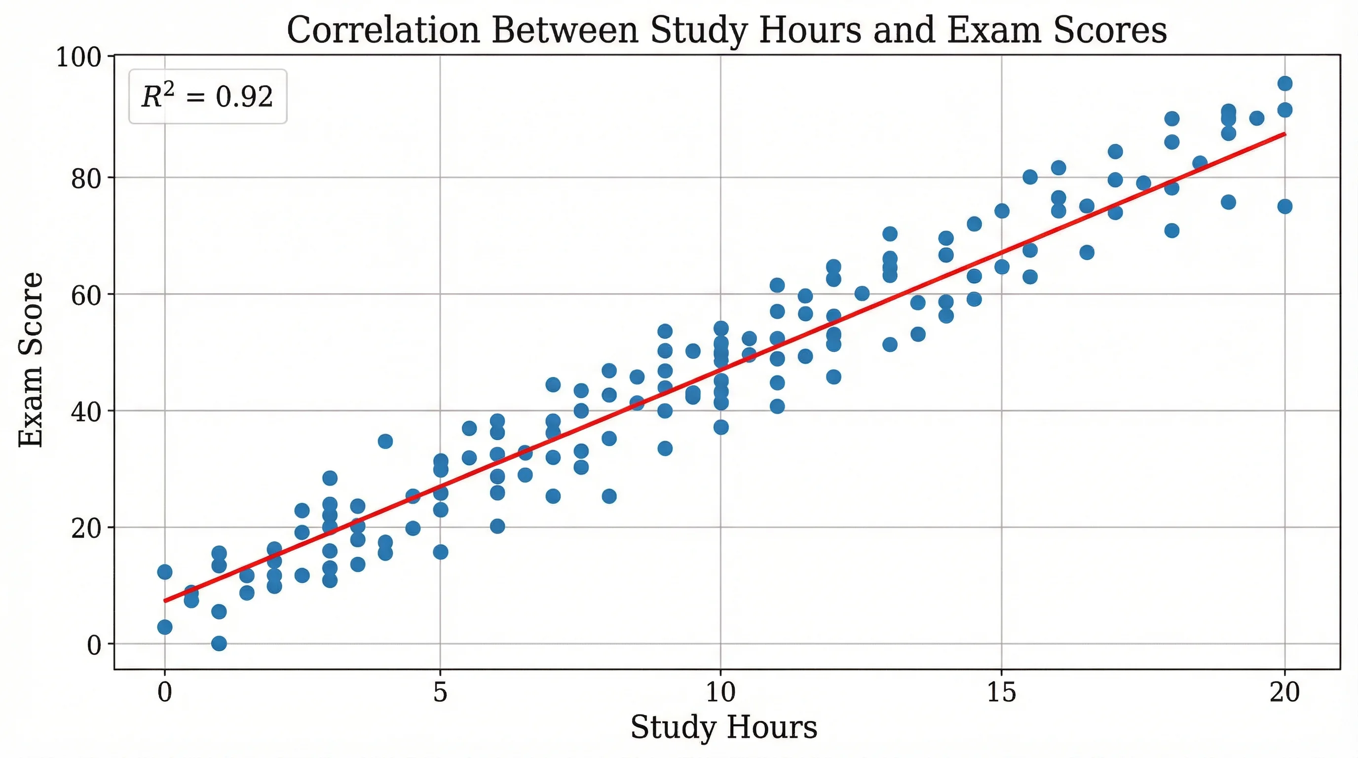
Scatter Plot Maker
Plot two variables to reveal correlation, clusters, and trends in your data.
 Statistics
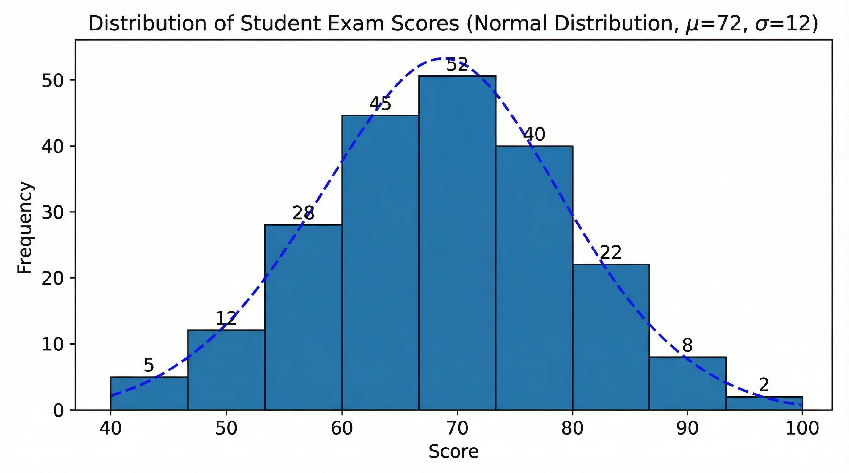
Histogram Maker
Turn your data into a histogram to see its frequency distribution and shape.