Pareto Chart Generator for 80/20 analysis
Free Pareto chart generator. Paste categories and counts to draw the 80/20 bar-and-line chart, then download SVG.
Paste categories and counts — renders an exact 80/20 bar-and-line chart as SVG, free
Categories and counts
Paste a category column plus a count. The chart sorts largest first. This tool does not run ABC inventory analysis.
6 categories parsed
n=6 · total=106 · first 3 categories reach 80%. The 80/20 split is a visual cutoff — this page does not rank root causes for you.
Pareto Chart Generator
Free to try ·
Your AI Pareto-chart illustration will appear here
For a data-accurate plot from counts, use the Precise Plot tab instead
Pareto Chart Examples
The first four are exact engine renders from tables. The last two are AI illustrations of Illustration mode.
Manufacturing defects
Exact engine render — pasted defect counts, sorted bars plus cumulative line.
Hospital incidents
Exact engine render — incident types sorted by count.
Software bugs
Exact engine render — bug categories ranked largest first.
Late shipments
Exact engine render — shipment reasons sorted by count.
AI illustration — 80/20
AI illustration of Illustration mode — visual mockup, not plotted from counts.
AI illustration — teaching
AI illustration of Illustration mode — visual mockup, not a fitted cutoff.
What is a Pareto chart?
A Pareto chart ranks categories by count and overlays the cumulative percent. The tall bars on the left are the vital few; the long tail is the useful many. The name comes from Pareto’s 80/20 observation, later turned into a quality tool by Juran. This page draws that figure from counts you already have. It does not run root-cause analysis, ABC inventory ranking, or a statistical test.
How to read the bars and the 80% line
- Paste a category column plus a count, or upload CSV/TSV. The engine sorts largest first. Blue bars are the categories that first reach 80% of the total; gray bars are the remainder. The orange line is cumulative percent on the right axis. The dashed red line is the 80% cutoff — a visual aid, not a decision this page makes for you.
- A generic bar chart keeps your original order. A histogram bins a continuous variable. A waterfall shows signed increments. None of those is a Pareto chart.
Pareto chart versus a bar chart or histogram
Use this page when you want ranked frequencies plus a cumulative percent. Use the bar chart maker for grouped or stacked comparisons that should not be re-sorted. Use the histogram maker for a distribution of one numeric variable. Use the fishbone diagram when you already know the vital few and need causes, not counts.
Export
Download a scalable SVG with no watermark and no account required for the precise plot. The AI Illustration tab is only for slides when you do not have counts yet — it will not match your table.
Frequently Asked Questions
Related Research Tools
 Research
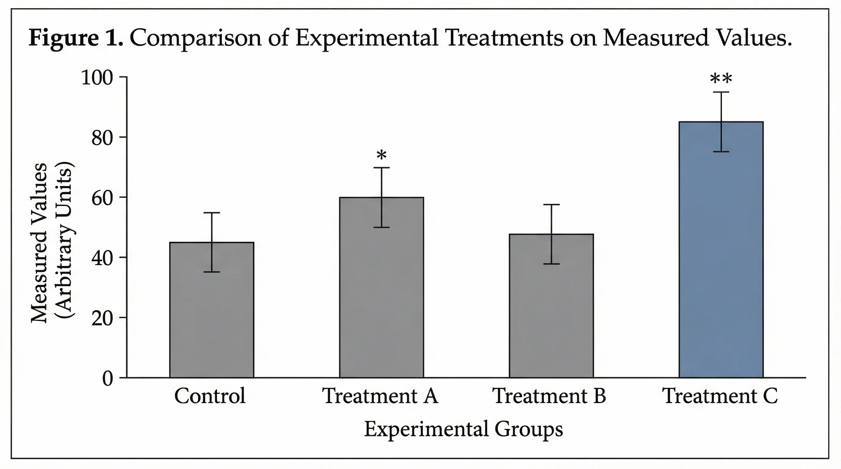
Bar Chart Maker
Need grouped or stacked bars that keep your order? That is a bar chart, not a Pareto chart.
 Research
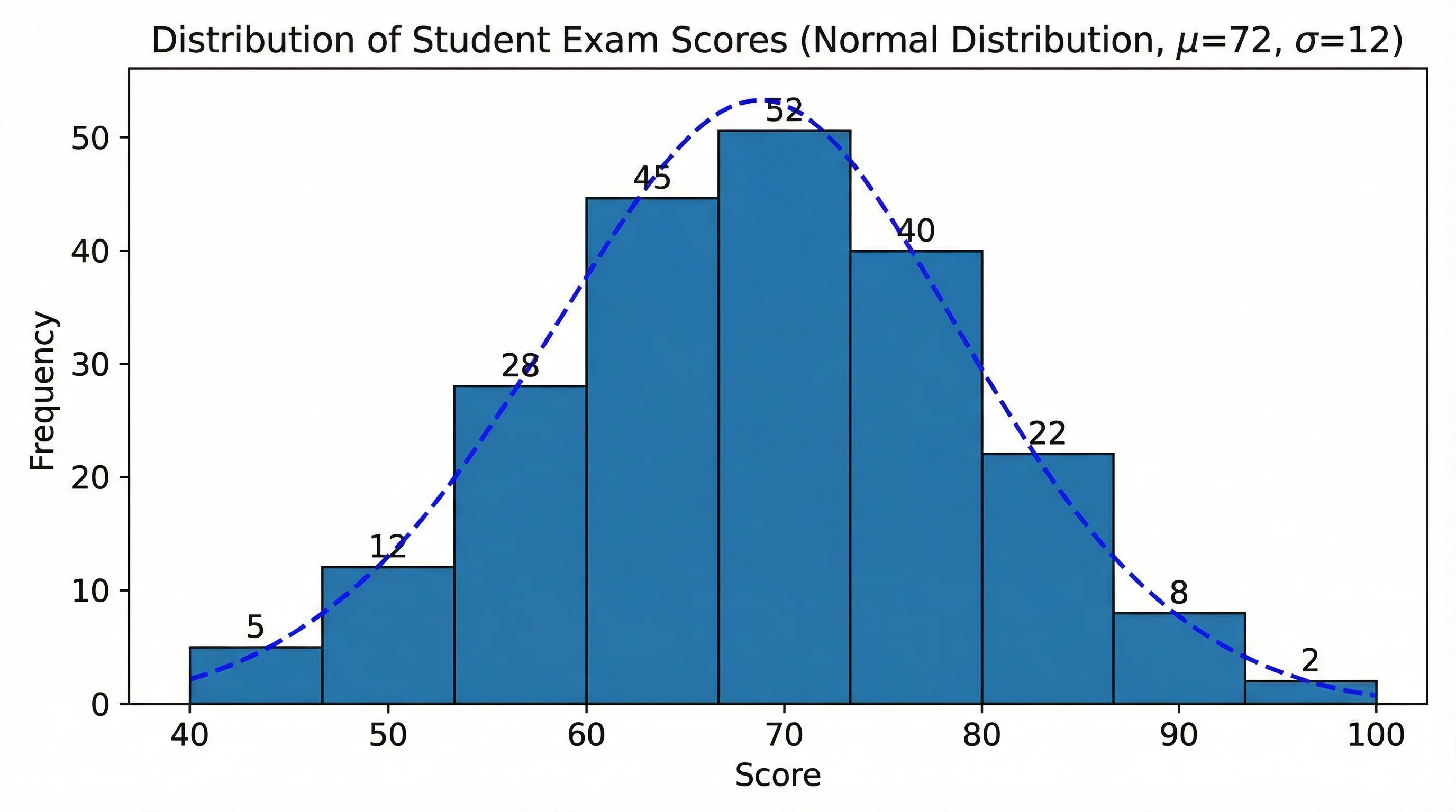
Histogram Maker
A histogram bins a continuous variable. Use it when you do not have named categories.
 Research
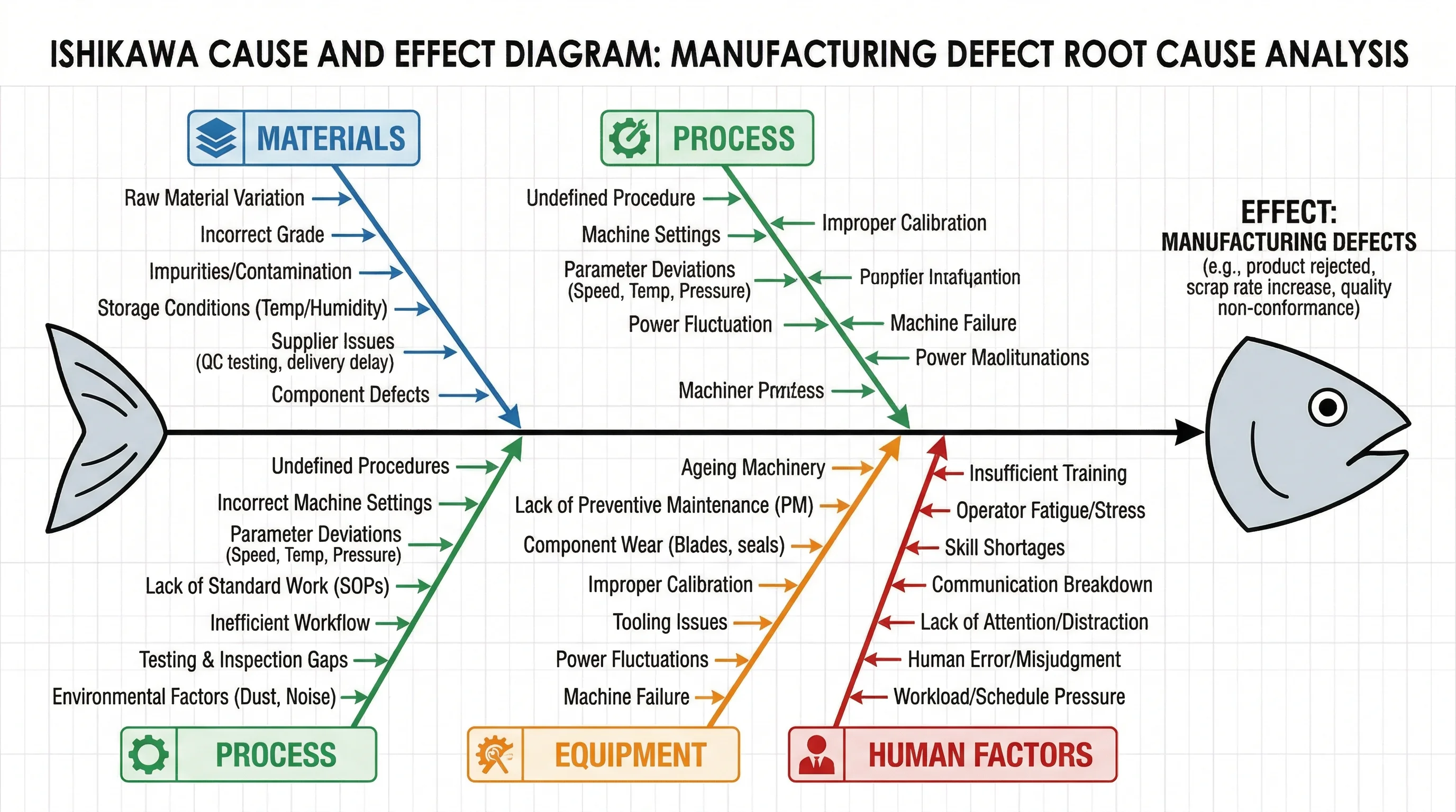
Fishbone Diagram Generator
After the vital few are visible, map causes on an Ishikawa diagram.
 Research
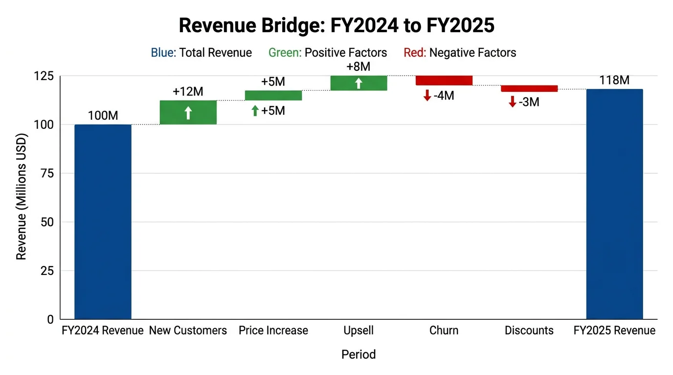
Waterfall Chart Generator
A waterfall is signed increments, not ranked frequencies. Use it for bridges, not 80/20.
 Business
SIPOC Diagram Maker
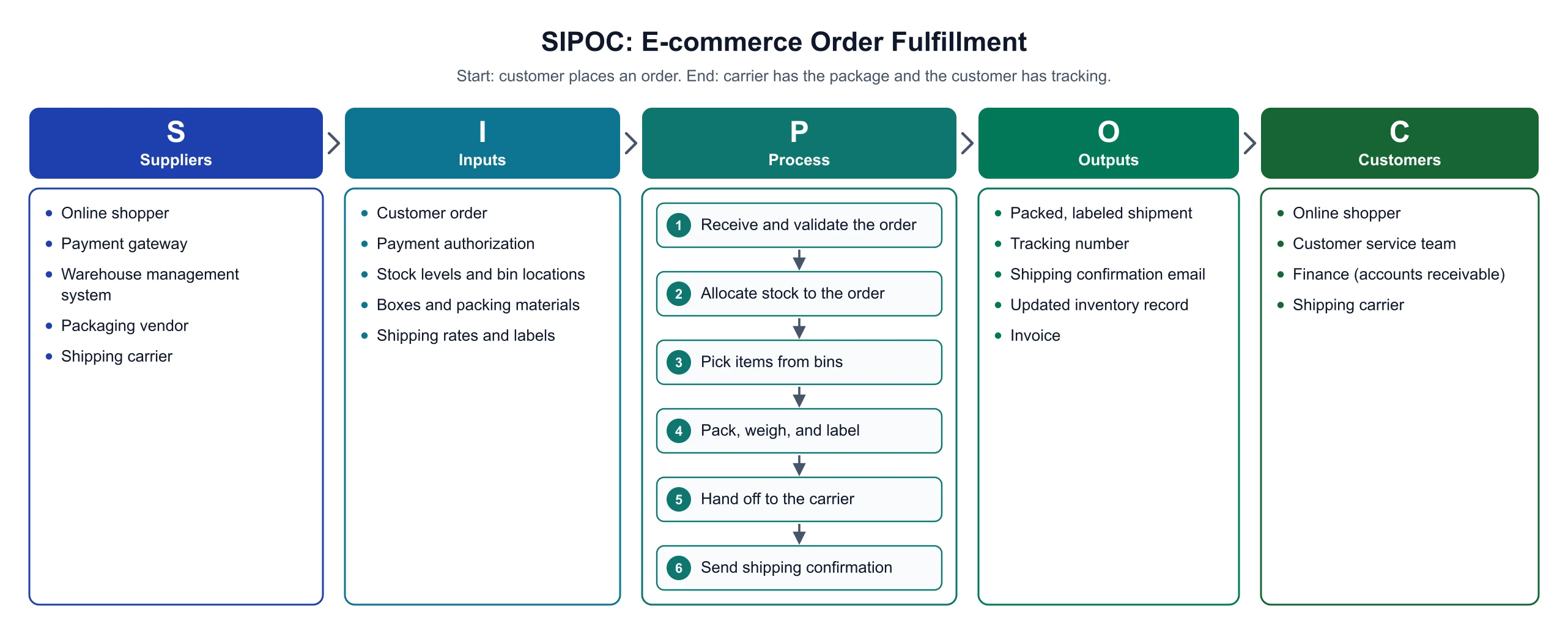
Map suppliers, inputs, process steps, outputs, and customers and download an exact SIPOC diagram.
 Research
Tornado Diagram Generator
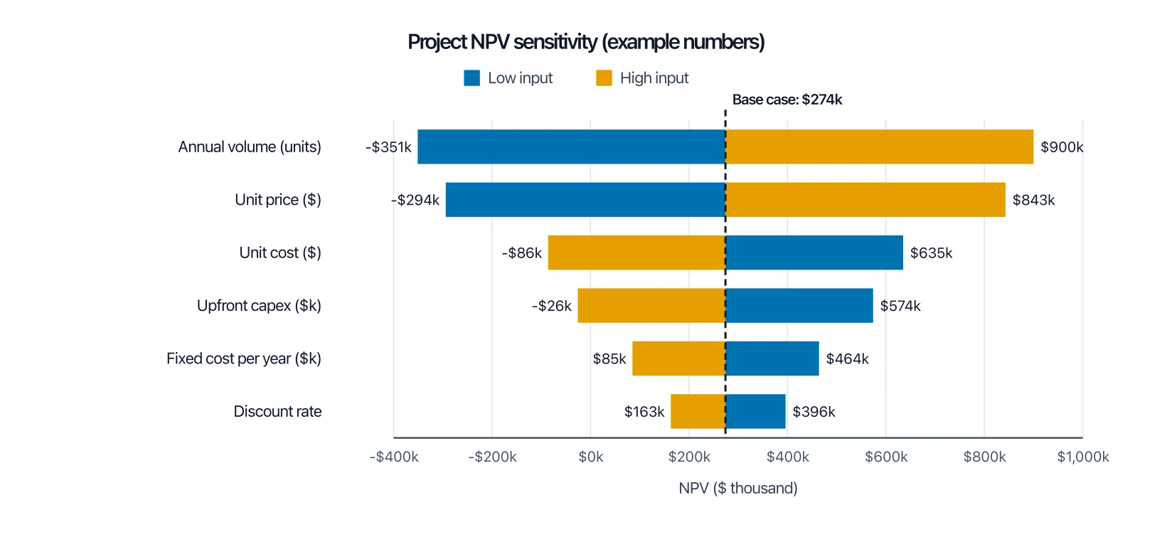
Rank model inputs by how much they swing a result, not by how often they occur.