Histogram Maker from Your Data
Make a histogram online from your data, free. Paste raw numbers and the tool bins them automatically, counts the frequency in each bin, and draws labeled frequency bars you can download as SVG — or describe one for an AI illustration.
Paste your raw numbers — bins them and renders exact frequency bars as SVG, free
Histogram settings
Binned frequencies, rendered as SVG.
32 numeric values detected
32 values across 6 bins, bin width 5.17. Bars touch because this is a histogram of binned continuous data. Download an editable SVG for slides, reports, and worksheets.
Histogram Generator
Free to try ·
Your histogram will appear here
Describe the histogram you want
Histogram Examples
Common distribution shapes — normal, skewed, bimodal, and more
Normal (Bell-Shaped) Histogram
A symmetric, single-peaked distribution — the classic bell shape where most values cluster near the mean.
Right-Skewed Histogram
A long tail to the right pulls the mean above the median — common for income and time data.
Bimodal Histogram
Two peaks signal two underlying groups in one dataset — something a bar chart would hide.
Comparative Histograms
Overlay several distributions to compare their spread, center, and shape at a glance.
Frequency Distribution
A frequency distribution with a cumulative ogive line layered on top of the binned bars.
Publication-Ready Histogram
Clean, labeled, and print-friendly — with bin width and sample size annotated for a report.
What is a histogram?
A histogram shows the shape of a dataset by grouping continuous numbers into equal-width intervals called bins and drawing a bar for each bin whose height is the frequency — how many values fall in that range. Because the data is continuous, the bars touch with no gaps, and the area of the bars represents how the values are distributed. It is the fastest way to see the center, spread, and shape of a set of measurements, and it is exactly what this maker draws: paste your numbers and it bins them, counts each bin, and labels the axes for you.
Two ways to make a histogram here
- Precise mode: paste your raw numbers and the tool bins them, counts the frequency in each bin, and renders accurate frequency bars as a downloadable SVG — no spreadsheet, no sign-up, and zero network calls.
- AI illustration mode: describe the histogram you want in plain English and the tool generates a polished, presentation-ready illustration with themed colors and styling.
- Use precise mode when the numbers must be right (homework, lab reports, real measurements); use AI mode when you want a stylized graphic for slides or a blog post.
How to make a histogram from your data
- Paste your raw values into the box — separated by spaces, commas, or new lines. Non-numeric entries are ignored automatically.
- Leave the bin count on Auto to let the tool pick a sensible number of bins, or set your own to make the bars wider or narrower.
- The tool finds the minimum and maximum, splits that range into equal-width bins, and counts how many values land in each one.
- Read off the frequency for each bin from the y-axis and the bin edges from the x-axis, then download a clean SVG to drop into a doc, slide, or worksheet.
Choosing the number of bins
The number of bins controls how the distribution looks: too few bins hide the shape, while too many leave gaps and noise. By default this tool uses Sturges’ rule, k = ⌈log₂(n) + 1⌉, a standard starting point that scales the bin count with how many values you have. The bin width is then simply (max − min) ÷ k, so every bin is the same width and the bars touch. You can override the count to try a coarser or finer view — there is no single “correct” number, so it is normal to test a few and keep the one that shows the shape most clearly.
Histogram vs bar chart: what is the difference?
A histogram and a bar chart look similar but answer different questions. A histogram displays the frequency distribution of one continuous, numeric variable that has been grouped into bins — so its bars touch and the x-axis is a number line. A bar chart compares values across separate categories (like countries or product names) — so its bars have gaps and the x-axis is categorical. In short: use a histogram to see how a set of measurements is distributed, and a bar chart to compare distinct groups. This tool always draws touching bars over a numeric axis, because it is a histogram, not a bar chart.
Reading the shape: center, spread, and skew
Once your histogram is drawn, its shape tells the story. A single, symmetric peak is roughly normal (bell-shaped). A long tail on one side means the data is skewed — a right tail (skewed right) is common for income and waiting times, while a left tail is skewed left. Two separate peaks (bimodal) often hint at two groups mixed into one dataset. The width of the bars shows the spread, and the tallest bin shows where values concentrate. Reading these features is the whole point of a histogram, and seeing them is far easier than scanning a column of raw numbers.
Frequently Asked Questions
Related Statistics Tools
 Statistics
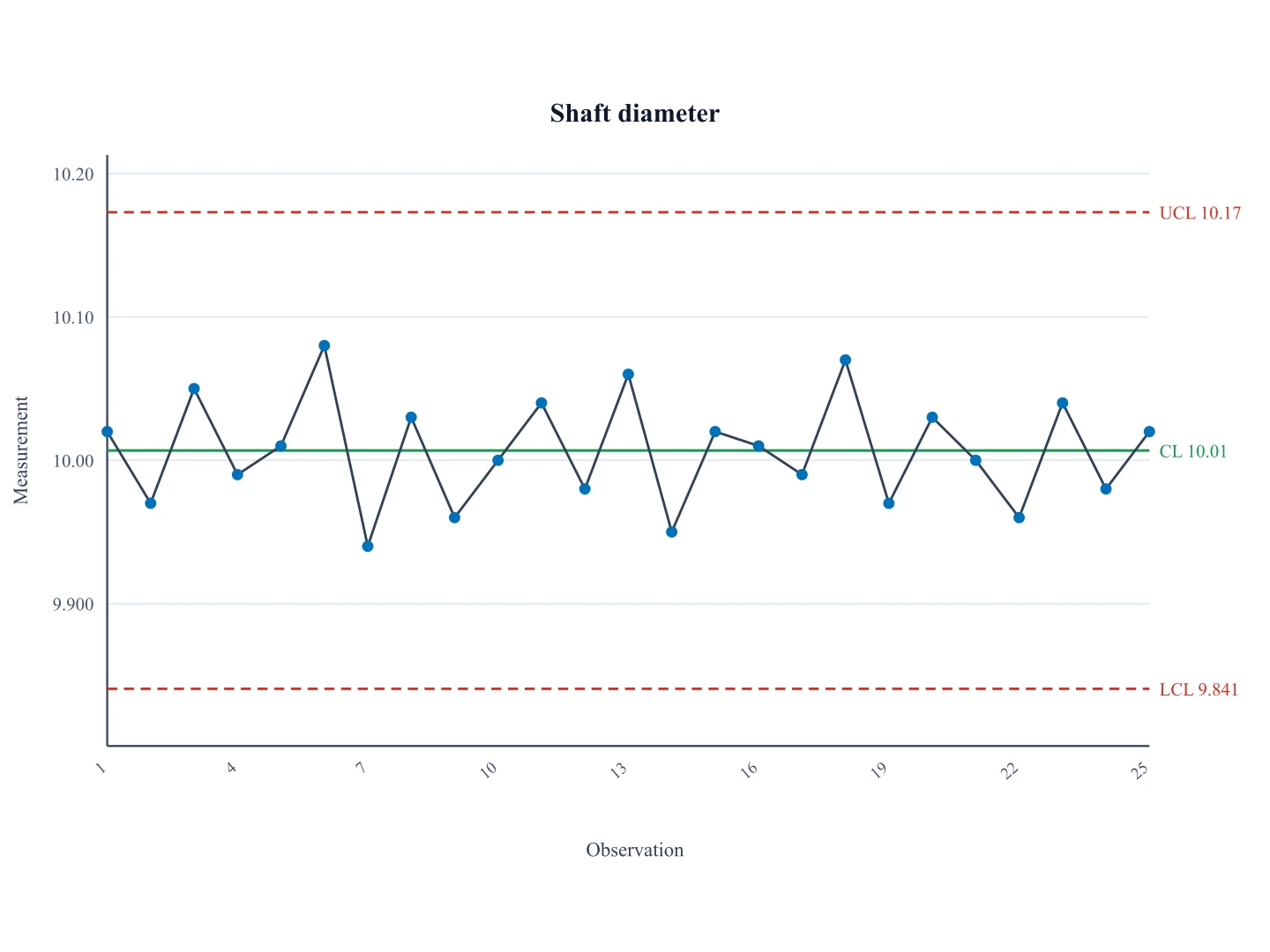
Control Chart Generator
Plot the same process in time order with Shewhart CL, UCL, and LCL.
 Statistics
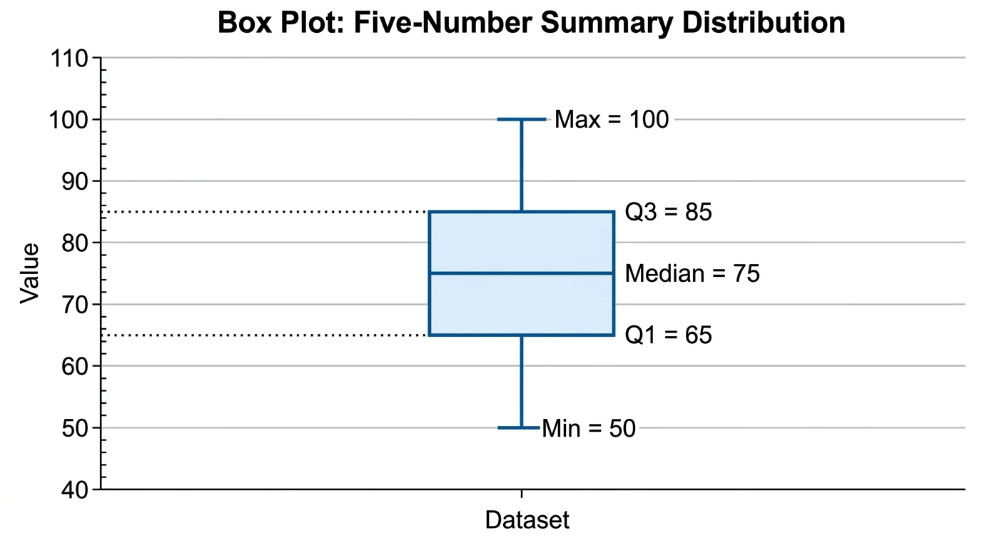
Box Plot Generator
Summarize a distribution with quartiles, the median, whiskers, and outliers.
 Statistics
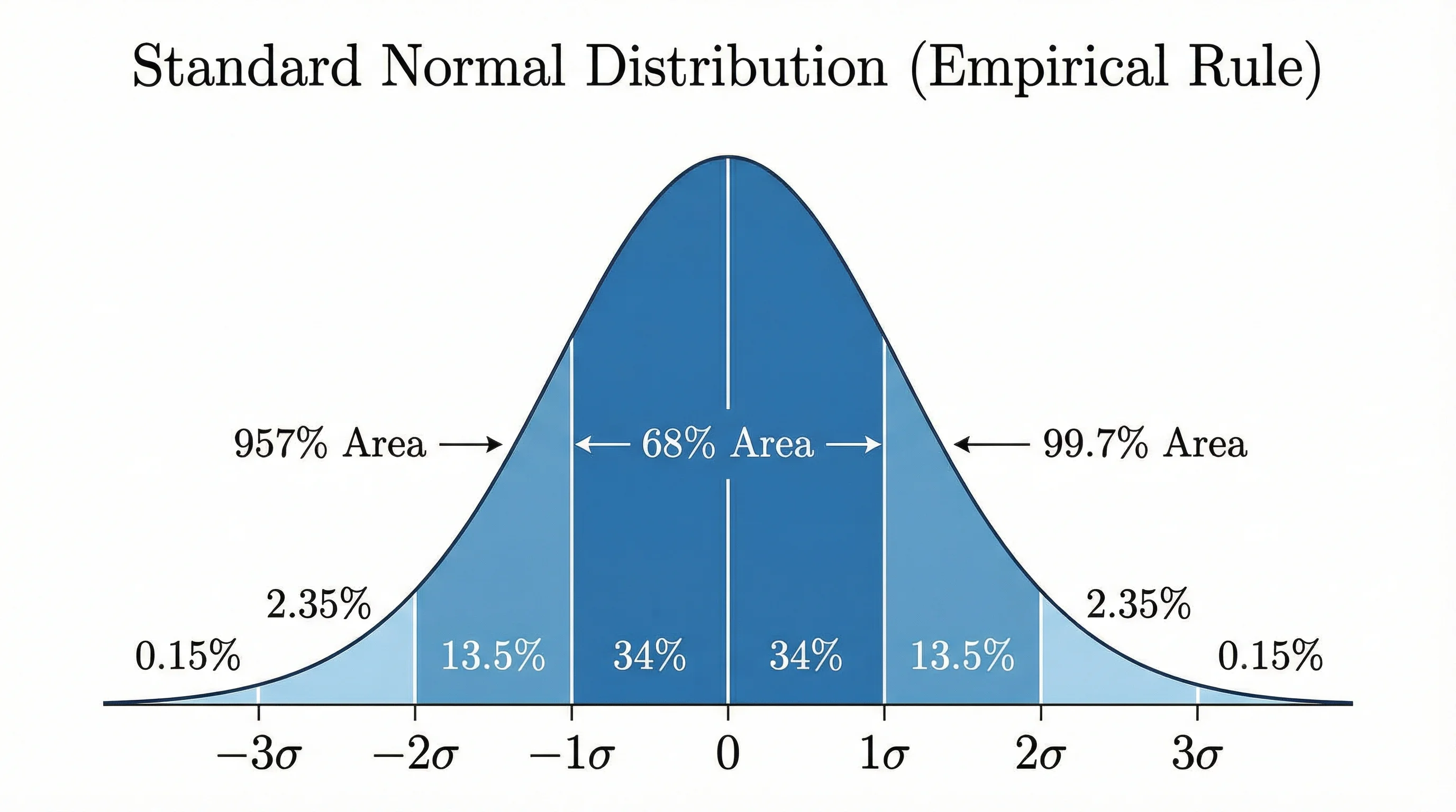
Bell Curve Generator
Draw an exact normal distribution from a mean and standard deviation or your data.
 Research
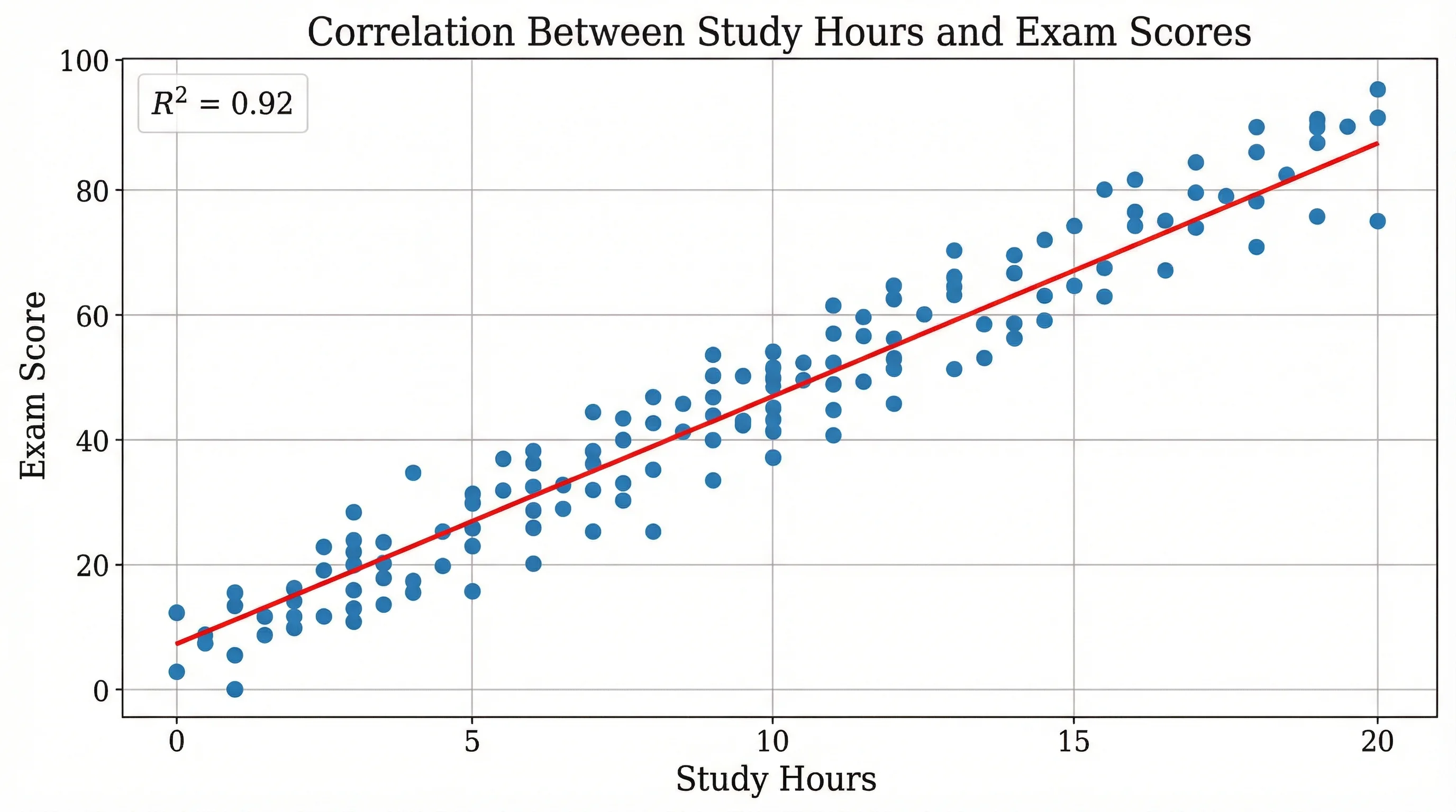
Scatter Plot Maker
Plot two variables to reveal correlation, clusters, and trends in your data.