Tornado Diagram Generator for sensitivity analysis
Free tornado diagram generator. Enter low and high outcomes for each input, get a sorted sensitivity chart around the base case, and download SVG or PNG.
Inputs and outcomes
One row per input. "Low outcome" is the model result when that input is at its low value; "high outcome" when it is high. The model itself stays in your own tool.
Paste from a spreadsheet or CSV. Columns: variable, low input, high input, low outcome, high outcome. Three columns (variable, low outcome, high outcome) also work.
5 rows read
Example model: ICER = incremental cost / QALY gain. Base case: cost $5,040, QALY gain 0.12 (0.024 per year over 5 years), ICER $42,000 per QALY. Lower ICER is better. Note that low input values give the higher ICER for the first two bars.
| Rank | Variable | At low input | At high input | Swing |
|---|---|---|---|---|
| 1 | Utility gain per year of effect | $56,000 | $33,600 | $22,400 |
| 2 | Duration of treatment effect (years) | $52,500 | $35,000 | $17,500 |
| 3 | Drug cost per course ($) | $36,000 | $48,000 | $12,000 |
| 4 | Adverse event cost ($) | $39,333 | $47,333 | $8,000 |
| 5 | Administration cost ($) | $39,500 | $44,500 | $5,000 |
Tornado Diagram Examples
Exact renders from the example presets. The numbers are invented for illustration, with the model stated beside each chart.
Health economics: one-way ICER
Exact render of the health economics preset (example numbers). The first two bars show a low input giving the higher ICER, so blue sits on the right.
Project NPV sensitivity
Exact render of the project NPV preset (example numbers). Outcome labels show NPV at each end of the bar.
Risk ranking by cost impact
Exact render of the risk ranking preset (example estimates). Each end shows the input and the resulting cost.
Top 3 bars with both labels
Same data limited to the top three bars, with input and outcome shown together for a slide.
What is a tornado diagram?
A tornado diagram shows the result of one-way sensitivity analysis. For each input you change only that input from a low value to a high value, keep everything else at the base case, and record the model result. Each input becomes a horizontal bar that starts at the base-case result and runs to the two results. The bars are sorted so the input with the widest swing is on top, which gives the funnel shape the name refers to. It is used in health economics (cost-effectiveness models), project and investment appraisal, and risk ranking.
How to make one from your own model
- Run your model at base-case values and note the result. This is the base-case outcome and the dashed vertical line.
- For each input, choose a low and a high value and say why (a confidence interval, a quoted range, or an expert estimate). Re-run the model with only that input changed and write down the two outcomes.
- Paste one row per input: variable, low input, high input, low outcome, high outcome. Here, "low outcome" means the result when the input is at its low value, so it can be the larger number. The generator sorts by the absolute difference between the two outcomes and draws each bar from the base-case line.
How to read the chart
- The vertical dashed line is the base case. Bars are not drawn from zero, so a bar to the right of the line means the outcome rises and a bar to the left means it falls. Colour follows the input side: blue is the low input value and orange is the high input value on every bar. When a bar shows orange on the left and blue on the right, a higher input lowers the outcome.
- Rank tells you where to spend effort on better data, not how likely each value is. A narrower bar that crosses a decision threshold (an NPV of zero, a willingness-to-pay limit) can matter more than a wider bar that never gets near it. The ranking also depends on the ranges you chose: a range of plus or minus 20% for every input is easy to defend as a screening step but says little about which values are plausible.
Tornado diagram versus spider diagram
- A spider diagram (also called a spider plot) draws one line per input, showing the outcome as that input moves through a range of percentage changes. All lines cross at the base case. It shows the shape of each relationship, including non-linear effects, but gets crowded as inputs are added.
- A tornado diagram keeps only two points per input, the low and the high, and ranks the inputs. It is easier to scan with many inputs and easier to read in a report, but it hides the shape between the two points. Many analysts use a tornado diagram to rank and a spider diagram for the few inputs that matter. This page draws the tornado diagram only.
What a tornado diagram cannot show
Each input is varied alone, so the chart shows no interaction between inputs and no correlation. It does not give the probability of any outcome. Cost-effectiveness submissions often add a probabilistic sensitivity analysis for that reason. This page draws the figure from outcomes you computed elsewhere. It does not run your model, fit distributions, or run Monte Carlo simulation.
Export
Download an SVG (vector, 860 pixels wide, white background) or a PNG at twice that width. There is no watermark and no account is needed. The example presets use made-up numbers with the model stated beside each chart, so replace them with your own results before you publish anything.
Frequently Asked Questions
Related Research Tools
 Business
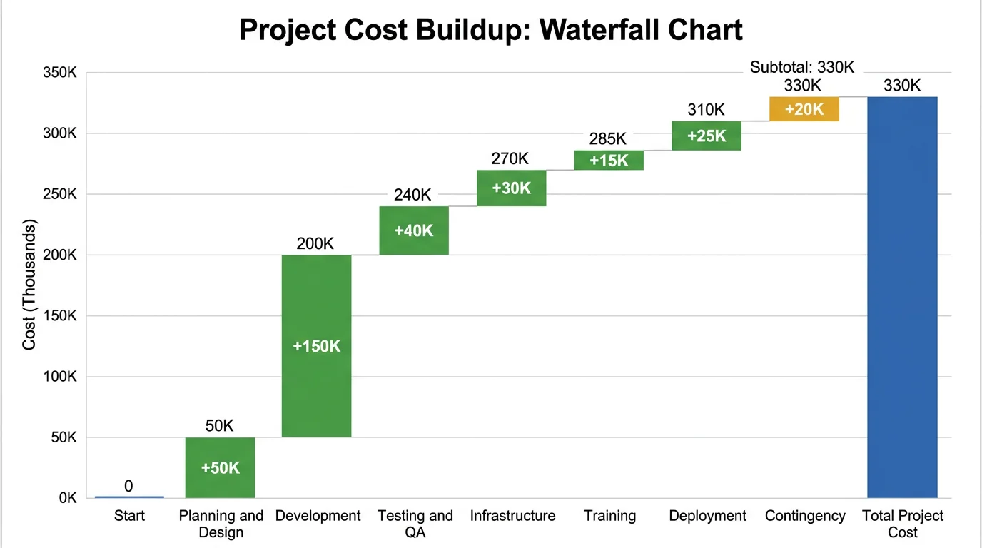
Waterfall Chart Generator
Show how signed steps add up from a start value to a total. A bridge chart, not a ranking of sensitivities.
 Research
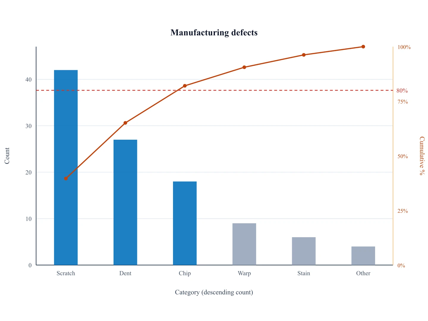
Pareto Chart Generator
Rank categories by count with a cumulative line. Use it for frequencies rather than model sensitivity.
 Business
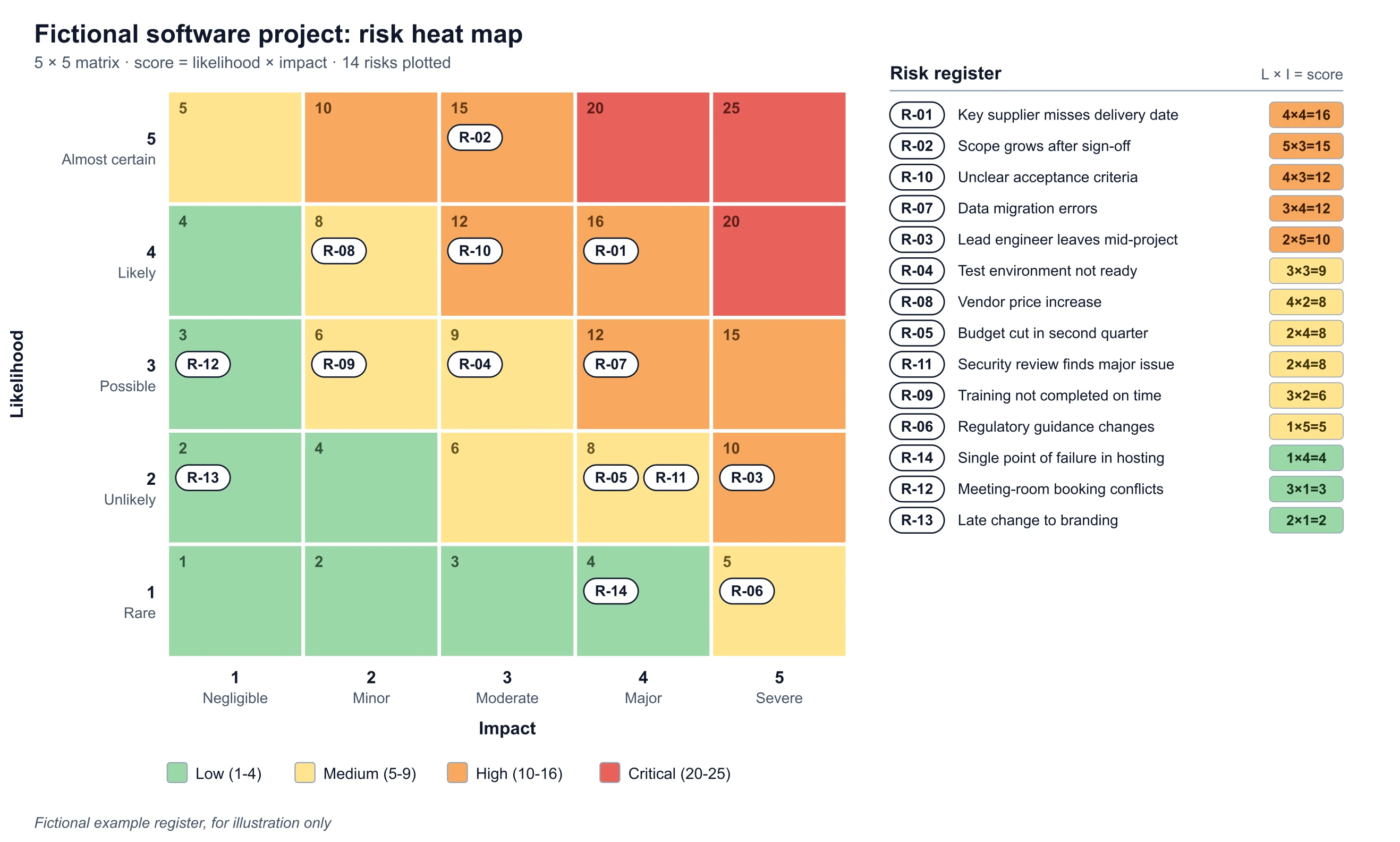
Risk Heat Map Maker
Place risks on a likelihood and impact matrix before you size them with a tornado diagram.
 Business
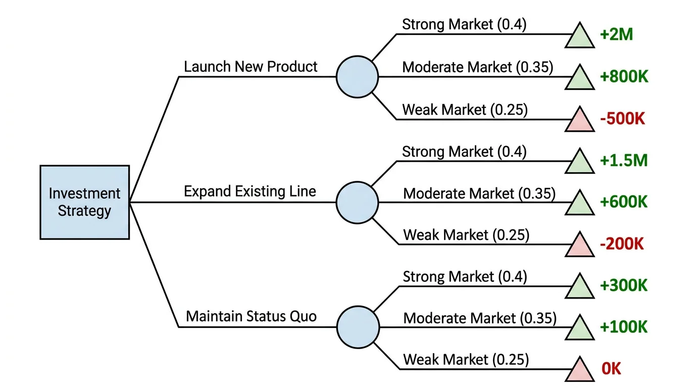
Decision Tree Generator
Lay out the decision and its branches that your sensitivity analysis is then run on.
 Research
Forest Plot Generator
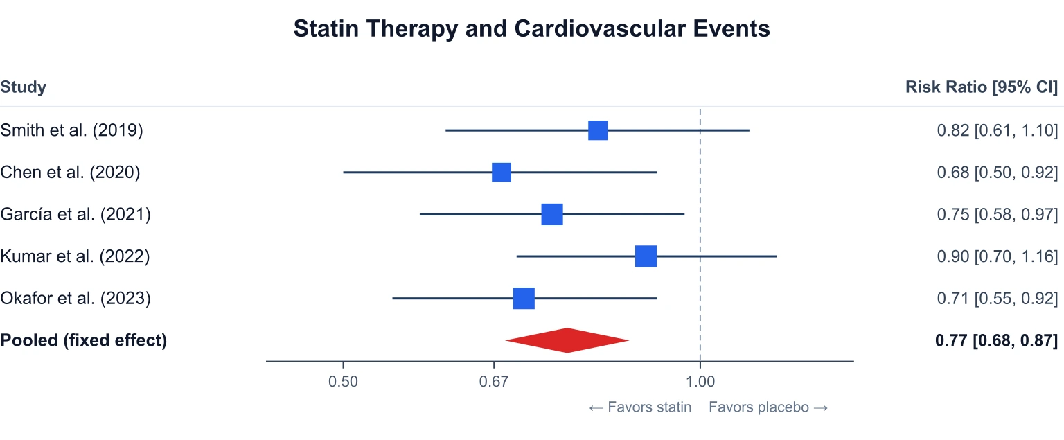
Another effect-size figure for health research: estimates with confidence intervals across studies.