Bar Chart Maker from Your Data
Make a bar chart online from your data, free. Type or paste "Label, value" rows for a precise, auto-scaled chart with labeled axes — switch to grouped or stacked bars, flip to horizontal, then download an editable SVG. Or describe one for an AI illustration.
Type or paste "Label, value" rows — renders an exact, labeled bar chart as SVG, free
Chart data
Exact bars, rendered as SVG.
One category per line as Label, value. Add more numbers (Label, v1, v2) for grouped or stacked series.
Bars are scaled to your values and the axis rescales automatically. Download an editable SVG for slides, reports, and worksheets.
Bar Chart Maker
Free to try ·
Your bar chart will appear here
Describe the bar chart you want
Bar Chart Examples
Vertical, horizontal, grouped, and stacked bars for every kind of comparison
Research Comparison Bars
A clean column chart for comparing values across a handful of categories — the everyday bar chart.
Sales Performance Bars
Categories sorted high to low with value labels — the standard format for a business report.
Quarterly Bars
One bar per time period is a simple, honest way to show change quarter over quarter.
Grouped Bar Chart
Multiple series side by side, with a legend — perfect for comparing two or three metrics per category.
Horizontal Bar Chart
Horizontal bars give long category labels room to breathe — ideal for rankings and survey results.
Stacked Bar Chart
Stacked bars show how parts add up to a whole — use them when the total matters as much as the parts.
What is a bar chart?
A bar chart compares a value across categories using rectangular bars, where the length of each bar is proportional to the value it represents. It is the clearest way to answer "which category is biggest?" — sales by product, votes by candidate, scores by group. Because the eye is good at judging length, a bar chart is more accurate to read than a pie chart and works for almost any categorical comparison. This maker turns a simple list of categories and values into a clean, auto-scaled bar chart with labeled axes, no design work required.
Two ways to make a bar chart here
- Precise mode (default): type or paste your data as one "Label, value" row per category, and the tool parses it, scales the axis automatically, and draws exact, labeled bars in your browser — no account, no waiting, and every bar is true to your numbers.
- AI illustration mode: describe the bar chart you want in plain English and the tool generates a polished, presentation-ready illustration with themed colors and styling.
- Use precise mode when the values must be correct (reports, homework, dashboards); use AI mode when you want a stylized graphic for a slide, blog post, or social image.
Bar chart vs column chart: orientation matters
Strictly, a "bar chart" has horizontal bars and a "column chart" has vertical bars, but in everyday use both are called bar charts. The orientation is a real choice, not just a style. Use vertical bars (columns) for time-ordered data and short labels — quarters, months, a few products. Use horizontal bars when category names are long or when you are ranking many items, because horizontal labels stay readable and the ranking reads top to bottom. This tool draws vertical bars by default and flips to horizontal with one toggle, so you can pick whichever fits your data.
Grouped vs stacked bars for multiple series
When each category has more than one value — say revenue and expenses per department — you have two ways to show it. Grouped bars place the series side by side within each category, which is best for comparing the individual values directly. Stacked bars stack the series on top of each other so each bar shows a total, which is best when the whole and the composition matter more than the individual parts. To use either here, add extra numbers to each row ("Label, value1, value2"); the tool draws grouped bars with a legend by default and switches to stacked when you turn on the Stacked toggle.
How to make a bar chart from your data
- Open the maker in precise mode and clear the sample, or edit it in place.
- Enter one category per line as "Label, value" — for example "North, 120". Paste straight from a spreadsheet column if you like.
- For multiple series, add more numbers per row ("Label, v1, v2"); a legend appears automatically.
- Toggle horizontal bars or stacked layout as needed — the axis rescales itself every time.
- Download a crisp, editable SVG to drop into a slide, document, or worksheet.
When to use a bar chart (and when not to)
Reach for a bar chart whenever you are comparing a numeric value across distinct categories, especially when you want readers to rank or compare exact amounts. It is the right default for survey results, group comparisons, and "top N" lists. Avoid it when your categories are continuous numeric ranges — that is a histogram, not a bar chart — or when you want to show the trend of a single quantity over many time points, where a line chart reads better. Choosing the right chart for the data is half of making it clear, and a bar chart is the safe, honest choice for categorical comparisons.
Frequently Asked Questions
Related Chart Tools
 Visualization
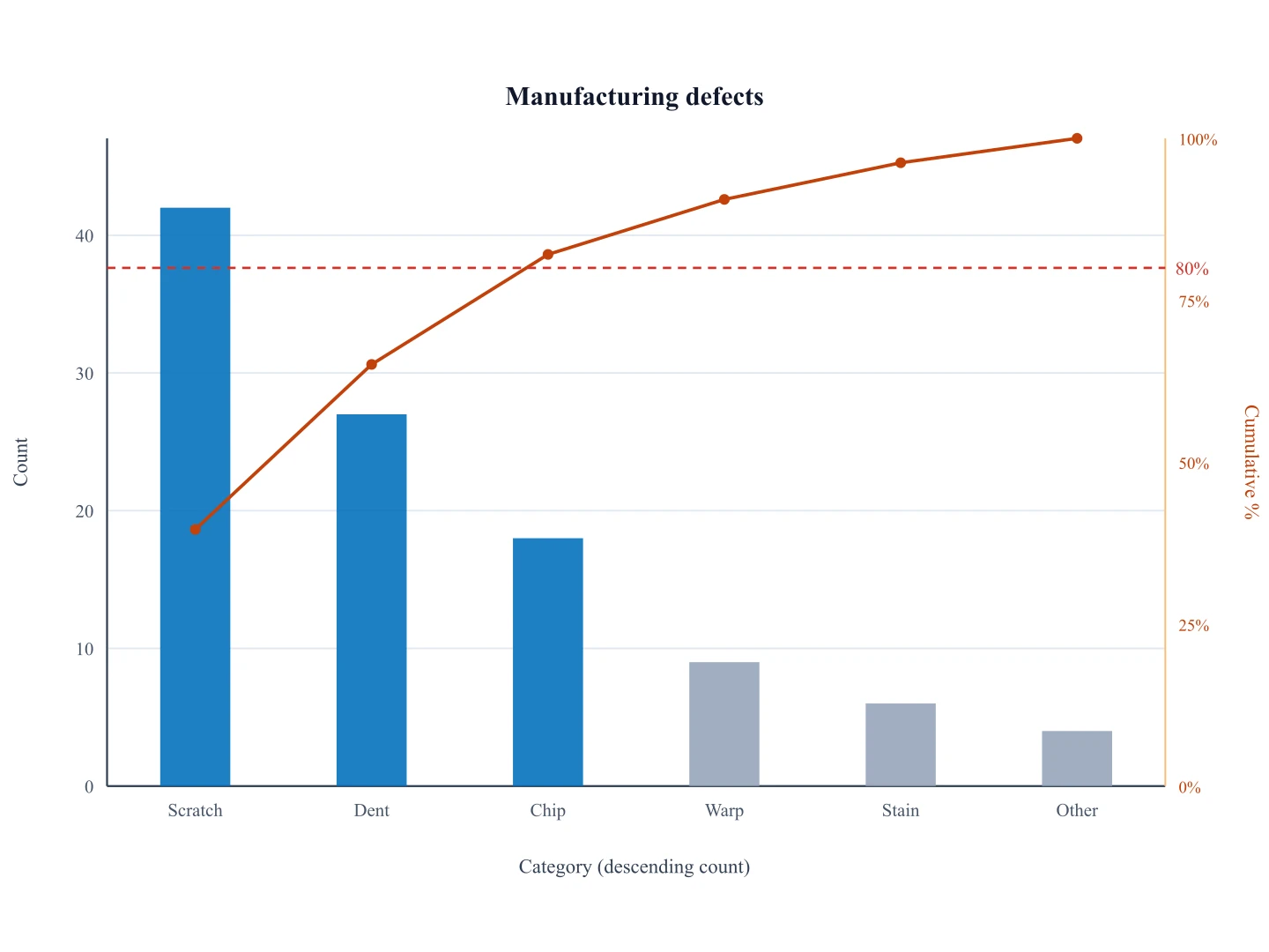
Pareto Chart Generator
Ranked counts plus a cumulative 80/20 line — not a generic bar chart.
 Visualization
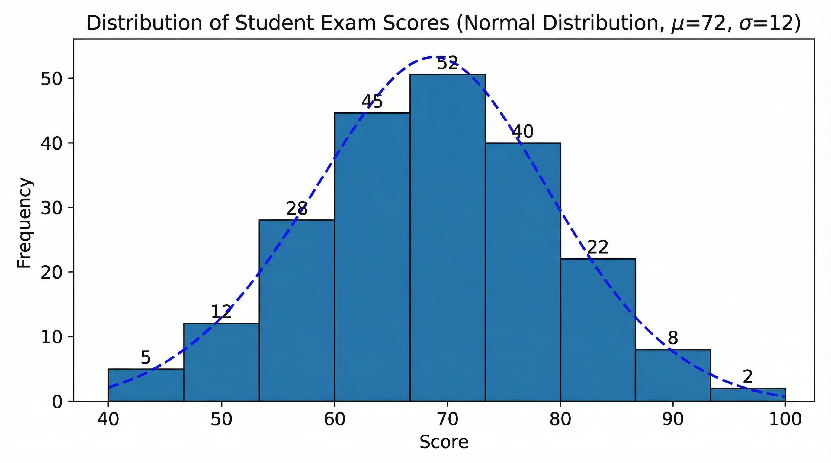
Histogram Maker
Turn continuous data into a histogram with auto-binned frequency bars.
 Visualization
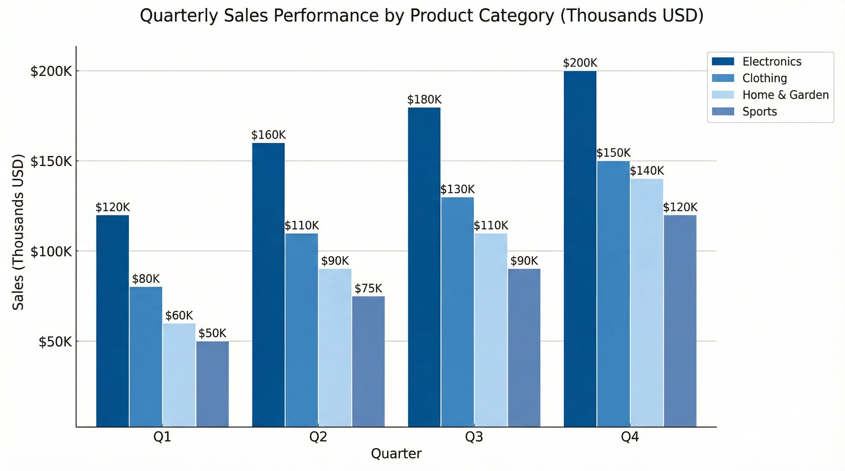
AI Chart Generator
Describe any chart in plain English and generate a polished visual instantly.
 Visualization
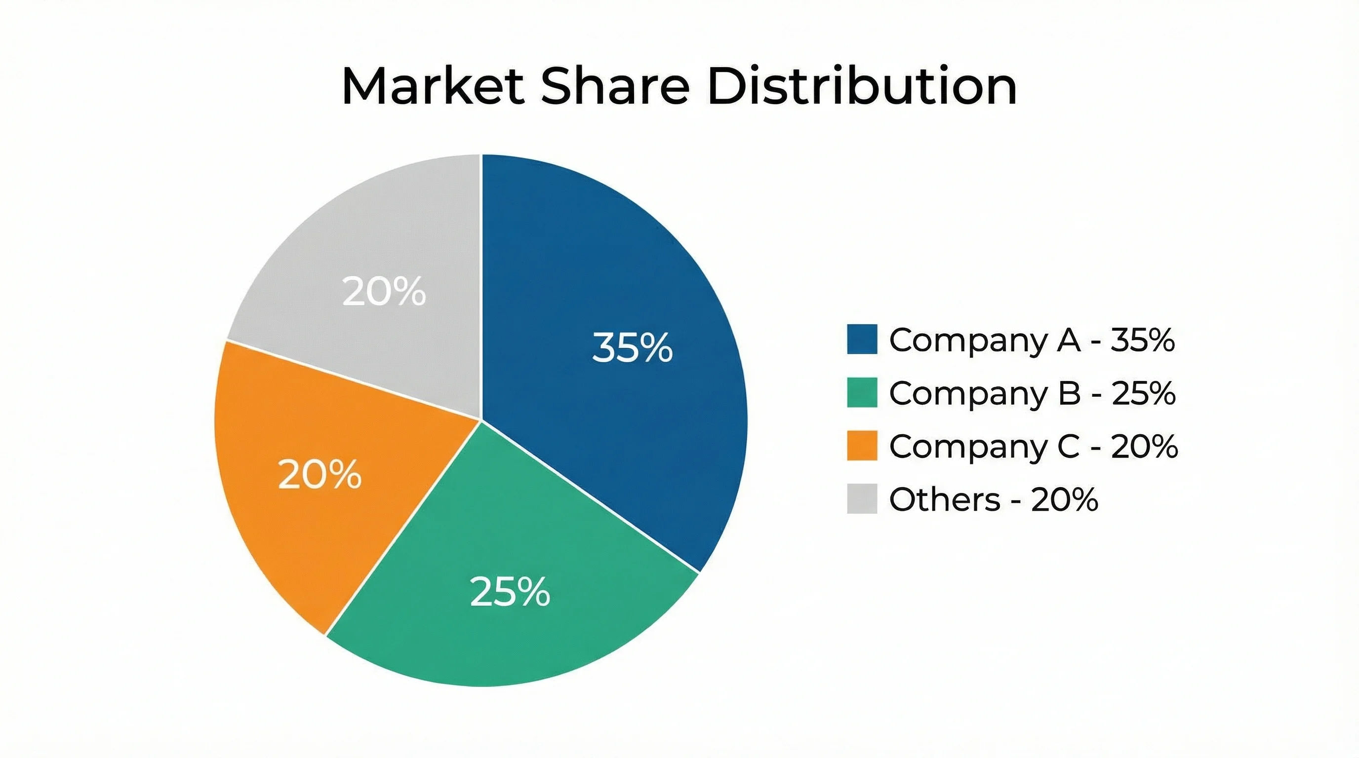
Pie Chart Maker
Show how parts make up a whole with a clean, labeled pie chart.