Waterfall Chart Generator & Bridge Chart Maker
Make a waterfall chart (also called a bridge chart) online for free. Type each step as a signed value and the tool computes the running total, draws floating green and red bars with connector lines, and marks subtotals — or describe one for an AI illustration, then export SVG.
Type each step as "Label, value" — renders an exact waterfall (bridge) chart as SVG, free
Chart data
Exact bridge chart, rendered as SVG.
Format: Label, value where value is a signed delta (e.g. Churn, -18). Mark a running total with Net, = or Subtotal, total — it draws a full bar from zero.
Green bars are increases, red bars are decreases, and blue bars are running totals drawn from zero. Download an editable SVG for slides, reports, and worksheets.
Waterfall Chart Generator
Free to try ·
Your waterfall chart will appear here
Describe the waterfall chart you want
Waterfall Chart Examples
Revenue bridges, P&L walks, and variance reports built from real cumulative totals
Revenue Bridge Chart
The classic revenue bridge: a starting total, signed gains and losses, and an ending total bar.
P&L Waterfall
Walk an income statement from gross revenue to net income, with subtotal bars for each stage.
Budget Variance Waterfall
A variance bridge that shows exactly which line items moved the plan to actuals.
Quarter-over-Quarter Bridge
Bridge one period to the next, attributing each driver of the change to its own bar.
Cost Build-up Waterfall
Stack costs phase by phase to show how a project budget builds up to a final total.
Cash Flow Waterfall
Track an opening balance through inflows and outflows to a closing balance.
What is a waterfall chart (bridge chart)?
A waterfall chart shows how a starting value becomes an ending value through a series of positive and negative steps. Each step is drawn as a floating bar that begins where the previous one ended, so the column appears to "step" up and down like a waterfall — which is why it is also called a bridge chart, since it bridges one number to another. Increases are colored green, decreases red, and totals or subtotals sit as full bars from the baseline. It is the clearest way to answer the question "what got us from here to there?" — which is exactly what this generator draws, computing every running total for you so the bars line up correctly.
Two ways to make a waterfall chart here
- Precise data mode: type each step as "Label, value" and the tool computes the running cumulative total, places every floating bar where the last one ended, colors gains green and losses red, and draws connector lines — accurate every time, no manual stacking.
- AI illustration mode: describe the waterfall or bridge chart you want in plain English and the tool generates a polished, presentation-ready graphic with themed colors and styling.
- Use data mode when the numbers have to add up (finance, variance, reporting); use AI mode when you want a styled, on-brand graphic for slides or social.
How the running total and floating bars are calculated
Every value you enter is a signed delta — a change relative to the running total, not an absolute height. The tool starts the cumulative at the first value, then adds each subsequent delta in order: a +20 step floats up from the previous level, and a −15 step floats down from it. Because each bar starts where the last one finished, the chart reads as a continuous bridge, and a thin connector line links consecutive bars so the eye follows the running balance. You never stack or align anything by hand — the cumulative math is done for you, which is the part people most often get wrong when building a waterfall chart in a spreadsheet.
Marking totals and subtotals
Most bars are floating deltas, but you will usually want one or more anchor bars that show the running total at a point — an opening balance, a subtotal partway through, or the final result. Mark any row as a total by ending it with "= " (for example "Net Revenue, =") or "total" (for example "Gross Profit, total"). A flagged row is drawn as a full-height bar from zero up to the current cumulative total and colored neutral blue, so it stands apart from the green and red change bars. A subtotal in the middle of the chart restates the running balance without resetting it: the next delta continues from the same total, so nothing is double-counted.
When to use a waterfall chart for variance and finance reporting
Waterfall and bridge charts are a staple of financial reporting because they explain a net change rather than just stating it. A revenue bridge breaks a year-over-year revenue move into new business, expansion, churn, and pricing. A P&L waterfall walks gross revenue down to net income through each cost line. A budget-versus-actual variance bridge shows which departments drove the gap, with favorable and unfavorable variances as separate bars. Cash-flow and headcount bridges work the same way. In every case the chart turns a single number — the change — into a story of the components behind it, which is why analysts reach for it in board decks and management reports.
When to use the AI illustration mode
Reach for AI illustration mode when you want a styled, eye-catching graphic rather than a strict data plot — a themed bridge for a presentation, a concept image for a blog post, or a friendly visual for a social post. The AI graphic looks great but is not measured from your numbers, so for anything where the bars and totals must be exact — a board deck, a variance report, or a real analysis — use the precise data mode, where the running total and every floating bar are computed from the values you enter.
Frequently Asked Questions
Related Chart Tools
 Visualization
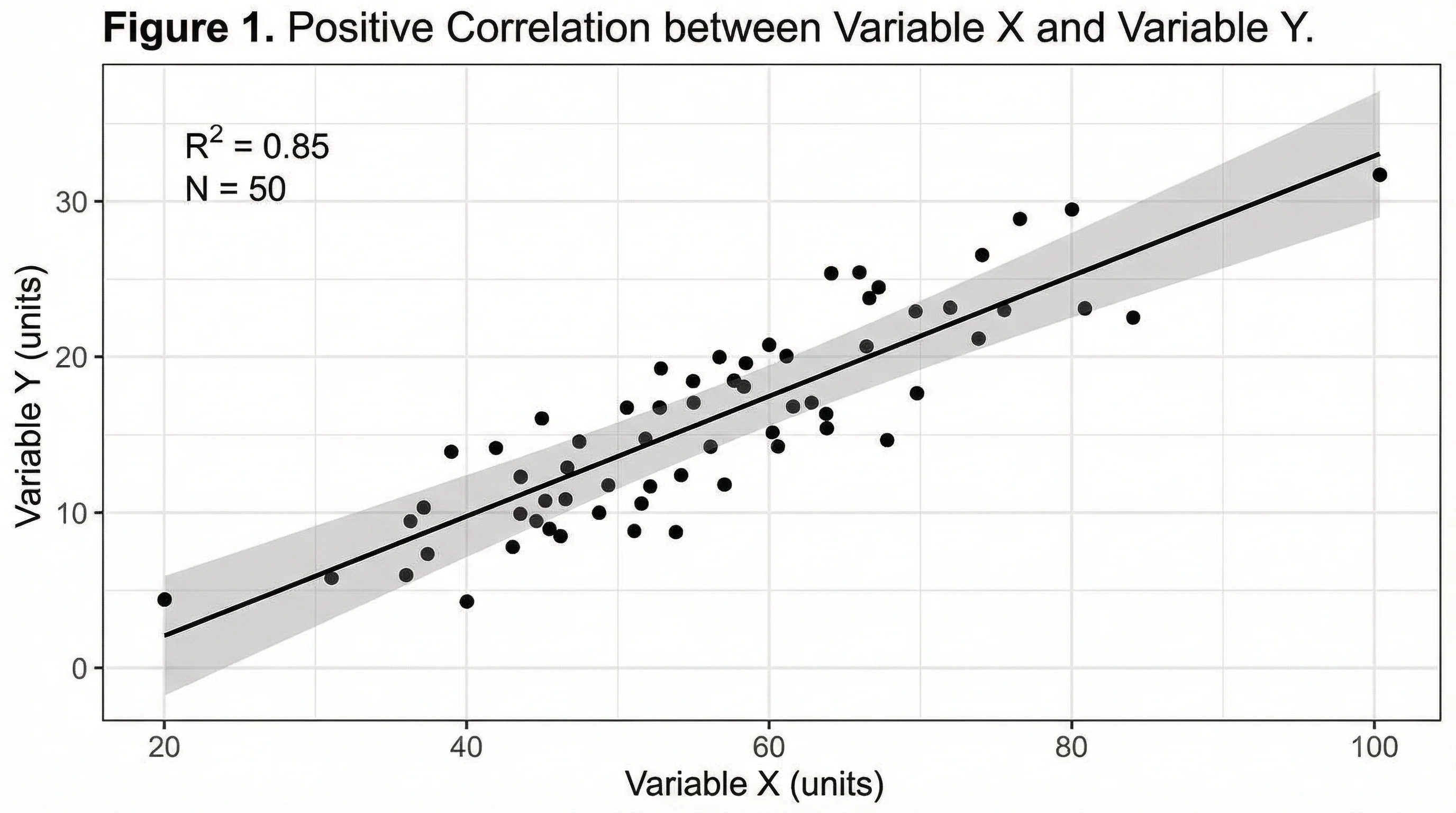
AI Chart Generator
Turn your data into clean bar, line, pie, and scatter charts in seconds.
 Statistics
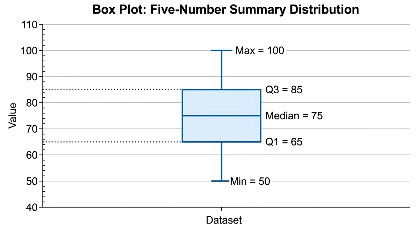
Box Plot Generator
Summarize a dataset with quartiles, median, and outliers in a clean box plot.
 Statistics
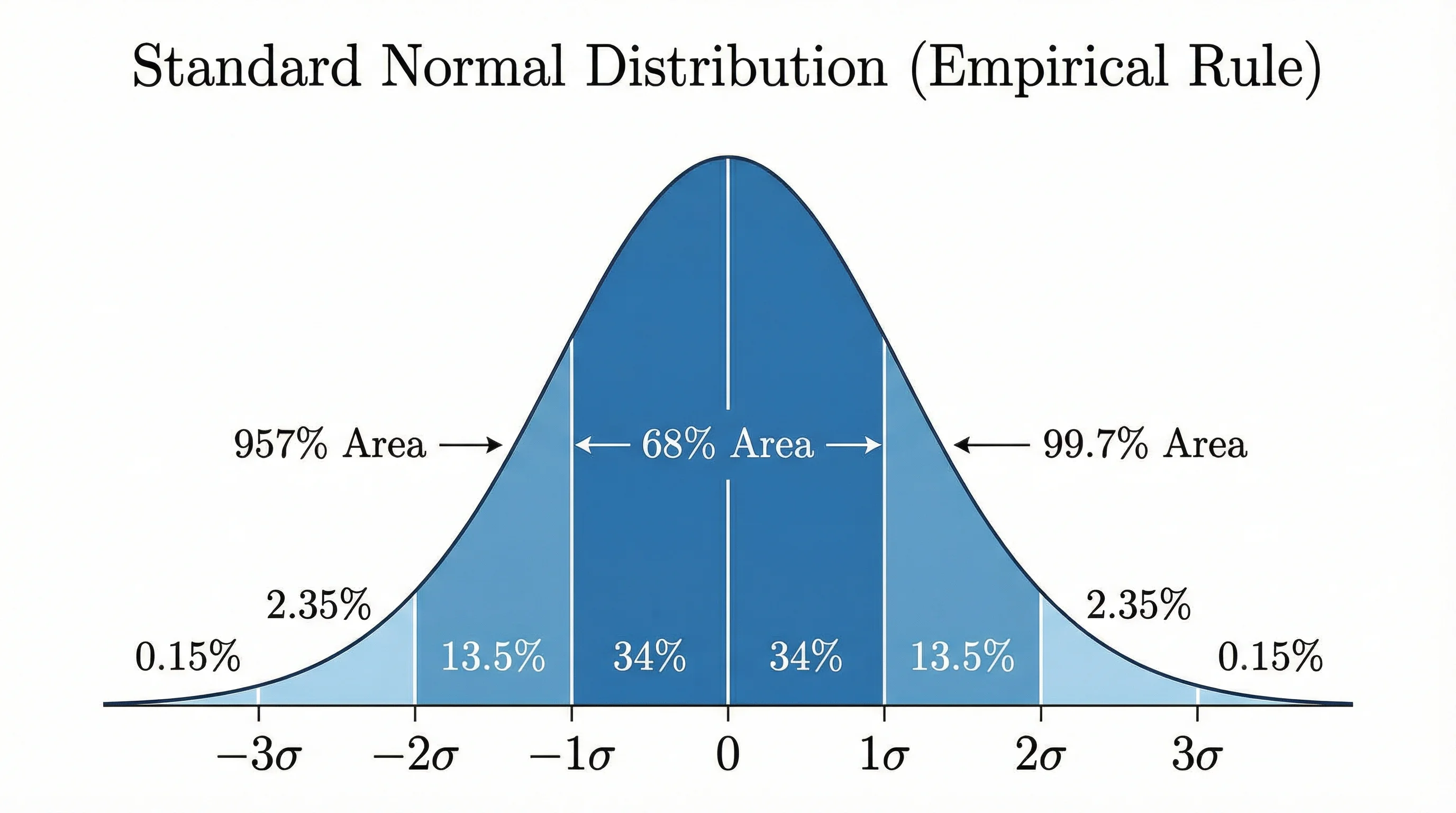
Bell Curve Generator
Plot a precise normal distribution from a mean and standard deviation.