Risk Heat Map Maker with Scores
Type your risks, set a likelihood and an impact for each, and watch them land on a color-coded matrix with scores. Pick 3x3, 4x4 or 5x5, then export SVG, PNG or CSV.
Risk register
Edit a row and the risk moves to its cell. Score = likelihood × impact. Up to 40 risks.
| ID | Risk | Likelihood | Impact | Score | Delete |
|---|---|---|---|---|---|
| 16 | |||||
| 15 | |||||
| 10 | |||||
| 9 | |||||
| 8 | |||||
| 5 | |||||
| 12 | |||||
| 8 | |||||
| 6 | |||||
| 12 | |||||
| 8 | |||||
| 3 | |||||
| 2 | |||||
| 4 |
CSV columns: id, name, likelihood and impact, whole numbers from 1 to 5.
14 plotted · 5 high · 6 medium · 3 low
What is a risk heat map?
A risk heat map plots risks on a grid. Likelihood (how probable the risk is) runs up one axis and impact (how bad it would be) runs along the other. Each cell is shaded by the product of the two, so risks that are both likely and costly sit in the hot corner and get attention first. It turns a long register into one picture that a project board or audit committee can read in seconds.
This maker draws the grid and the risks together. Every row you edit in the register moves its marker to the matching cell, the legend shows the score band ranges, and a sorted register is drawn beside the grid so each marker can be traced back to a name and a score.
How to make a risk heat map
- 1
Choose the grid size and colors
Start with 5 × 5 if your organization already has a 5-point scale. Use the blue scale if the chart will be printed in greyscale or read by people with color vision deficiency.
- 2
Add each risk once
Give it a short ID and a name that says what could go wrong ("Key supplier misses delivery date"), not a topic ("Suppliers"). One row is one risk.
- 3
Set likelihood and impact
Use the scale names on the chart as a guide: likelihood from Rare to Almost certain, impact from Negligible to Severe. Agree what each level means for your team before you score, for example a cost or schedule figure for each impact level.
- 4
Read the score and the band
Score is likelihood times impact. The row shows the score in its band color, the matrix puts the risk in its cell, and the register sorts every risk from highest score to lowest.
- 5
Export what you need
SVG for slides and design tools, PNG for documents, CSV for the register with score and rating so it can go back into a spreadsheet or be re-imported here.
3x3, 4x4 or 5x5: which grid size?
More cells means finer ranking but more arguing over whether a risk is a 3 or a 4. These are the three layouts this maker draws and the score bands it uses for each.
| Grid | Score bands | Good for |
|---|---|---|
| 3 × 3 | Low 1-2, Medium 3-4, High 6-9 | Quick workshops, small projects, and first-pass screening where a rough ranking is enough |
| 4 × 4 | Low 1-2, Medium 3-4, High 6-9, Critical 12-16 | Teams that want to avoid a middle "possible" option, so every risk has to lean one way |
| 5 × 5 | Low 1-4, Medium 5-9, High 10-16, Critical 20-25 | Formal risk registers, audits and board reporting, where finer steps and a critical band are expected |
The ranges list the scores that can actually occur on each grid. On a 5 × 5, for example, there is no score of 7, so Medium reads 5 to 9. Because bands are set per grid, the same risk can change band when you change grid size. Pick one size for a register and keep it.
Risk heat map vs a data heatmap
A data heatmap colors every cell of a numeric table, such as a correlation matrix or traffic by hour, on one continuous scale. A risk heat map is different: the cells are fixed combinations of likelihood and impact, the color comes from the score band rather than from a data value, and the content of the chart is the list of risks placed on it. If you have a table of numbers to color, use the heatmap generator. If you have risks to rank, use this maker.
Using it as a risk matrix template
Click Clear all to get an empty matrix with the scale names, cell scores and band legend, then export it as SVG or PNG for a workshop slide or a printed sheet. Once the group has agreed scores, type them in and export again. A blank 5 × 5 is below.
Common risk matrix mistakes
- Scoring alone. Individual scores drift. Agree the level definitions first, then score as a group, and note who disagreed.
- Treating the score as a measurement. 4 × 4 = 16 is a ranking aid on an ordinal scale, not a probability or a dollar figure.
- Packing many risks into one cell and calling it done. If six risks share a cell, the scale is too coarse for the decision, or the risks need splitting.
- Ignoring low-likelihood, high-impact risks. A 1 × 5 sits in a mild color but may still need a response plan or an owner.
- Plotting risks without owners or actions. A heat map shows where risks sit; the register is where someone takes responsibility for them.
- Using red and green only. Roughly 8% of men have some form of color vision deficiency, so keep the score printed in each cell and consider the blue scale.
Using it responsibly
The maker draws the scores you enter. It does not assess risks, check your likelihood and impact definitions, or replace the risk management process of your organization, regulator or client. For safety-critical, financial or regulated decisions, follow the method your framework requires and have it reviewed by the people accountable for the risk. To work out what could go wrong in the first place, a fishbone diagram or a SIPOC diagram of the process is a good start.
Risk Heat Map Examples
Exact exports from the maker above, using fictional example registers
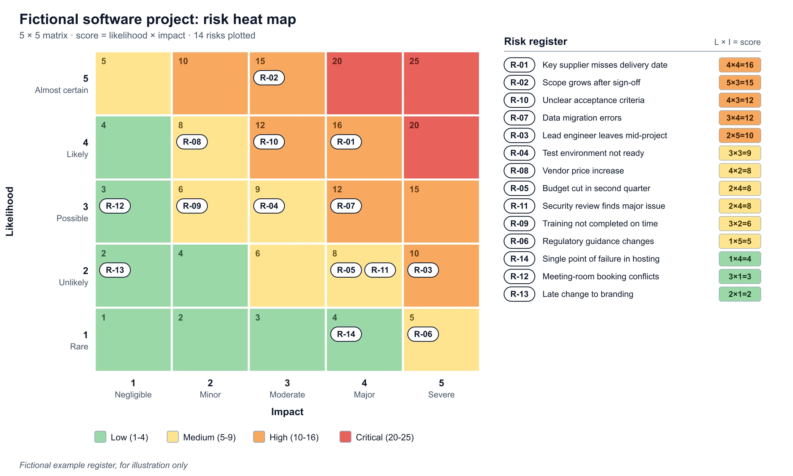
Project Risk Register, 5x5
Exact render from a fictional register: 14 risks on a 5x5 matrix, with the register sorted by score.
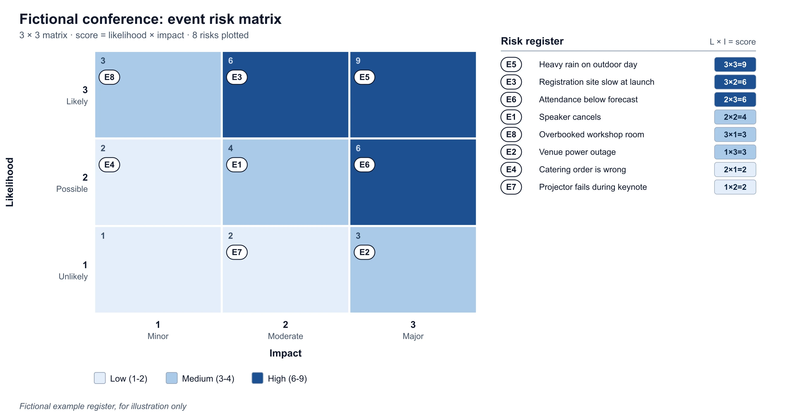
Event Risk Matrix, 3x3, Color-Blind Safe
Exact render from a fictional register: 8 risks on a 3x3 matrix in the color-blind safe blue scale.
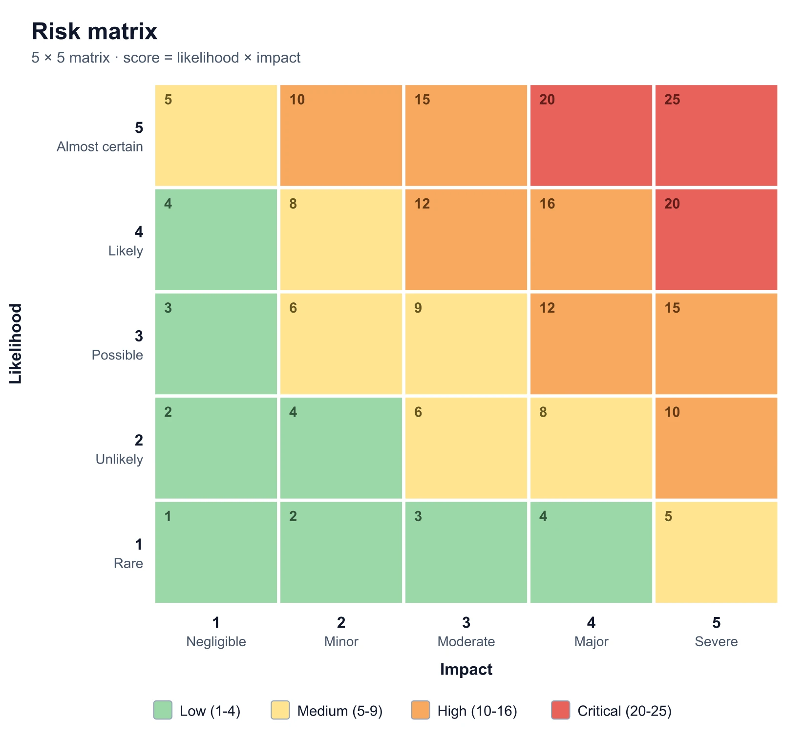
Blank 5x5 Risk Matrix
Exact render with no risks: the empty 5x5 grid you get after Clear all, ready for your own register.
Is a risk heat map the same as a risk matrix?
In everyday use, yes. Both terms describe a grid with likelihood on one axis and impact (or consequence, or severity) on the other, with cells shaded by how serious the combination is. "Risk matrix" is the more formal name, "risk heat map" the more common one in reports and slide decks, and some teams use the heat map only for the version with the individual risks plotted on it. This page makes that version: the matrix plus a register of the risks.
Where do the band thresholds come from?
They are a widely used convention, not a standard. Organizations set their own scales, scoring and color bands in their risk management framework, and the same 4 × 5 can be "High" at one company and "Medium" at another. The bands here (5 × 5: Low up to 4, Medium 5 to 9, High 10 to 16, Critical 20 and above) are a reasonable starting point. If your policy differs, use the chart for plotting and replace the band names and ranges in your own documentation.
Frequently Asked Questions
Related Planning & Quality Tools
 Research
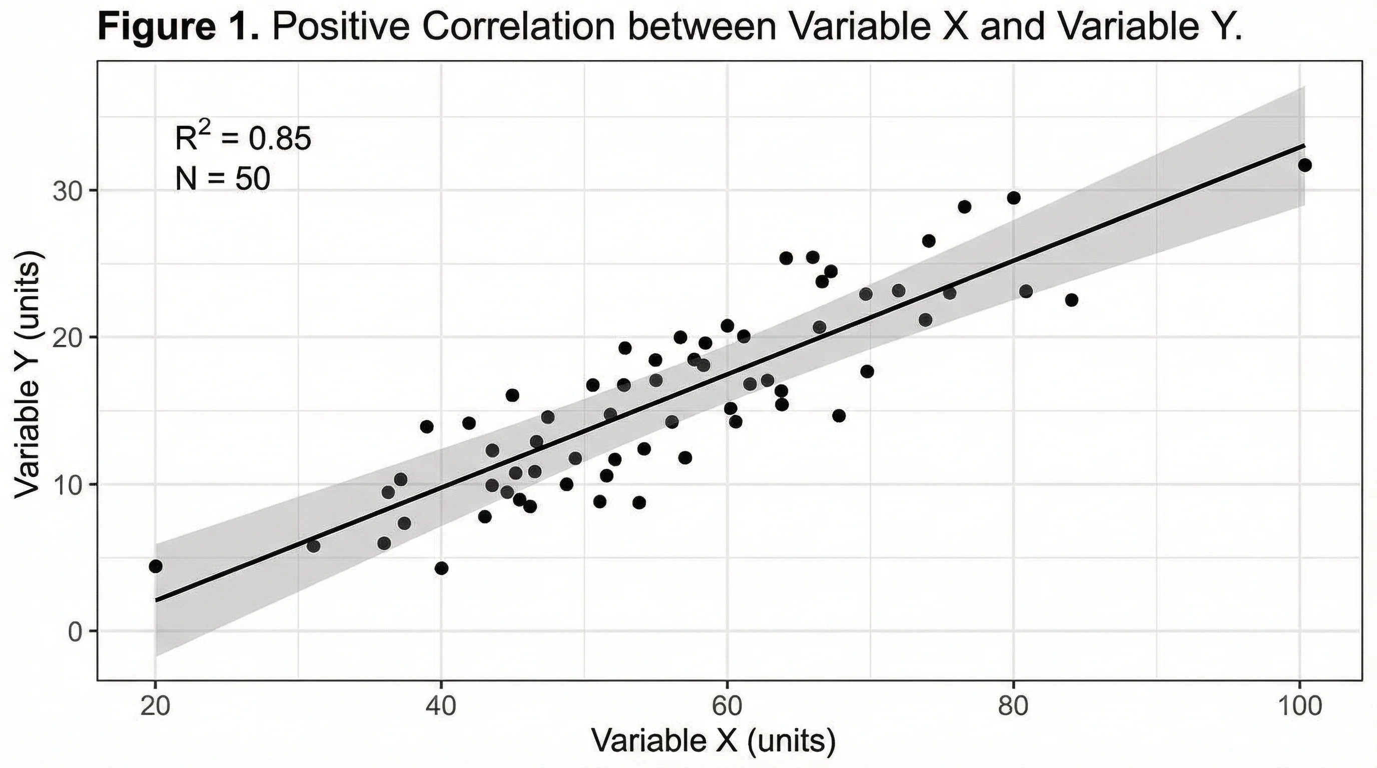
Heatmap Generator
Color a numeric data matrix such as correlations or hourly activity on one shared scale.
 Quality
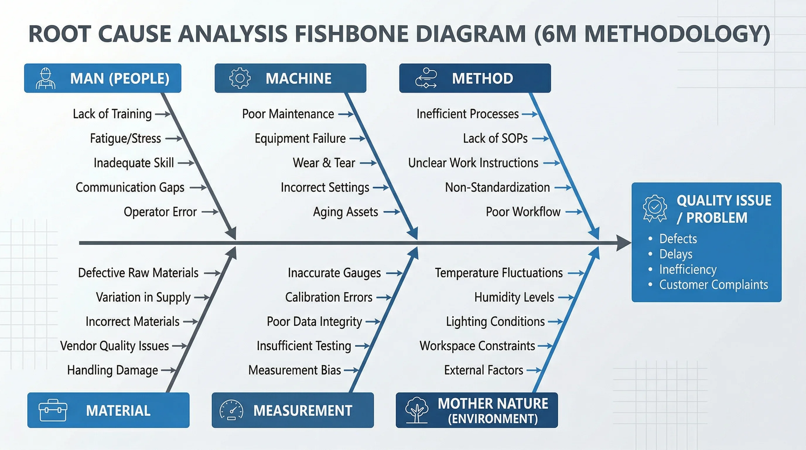
Fishbone Diagram Generator
Brainstorm the causes behind a risk before you score it.
 Quality
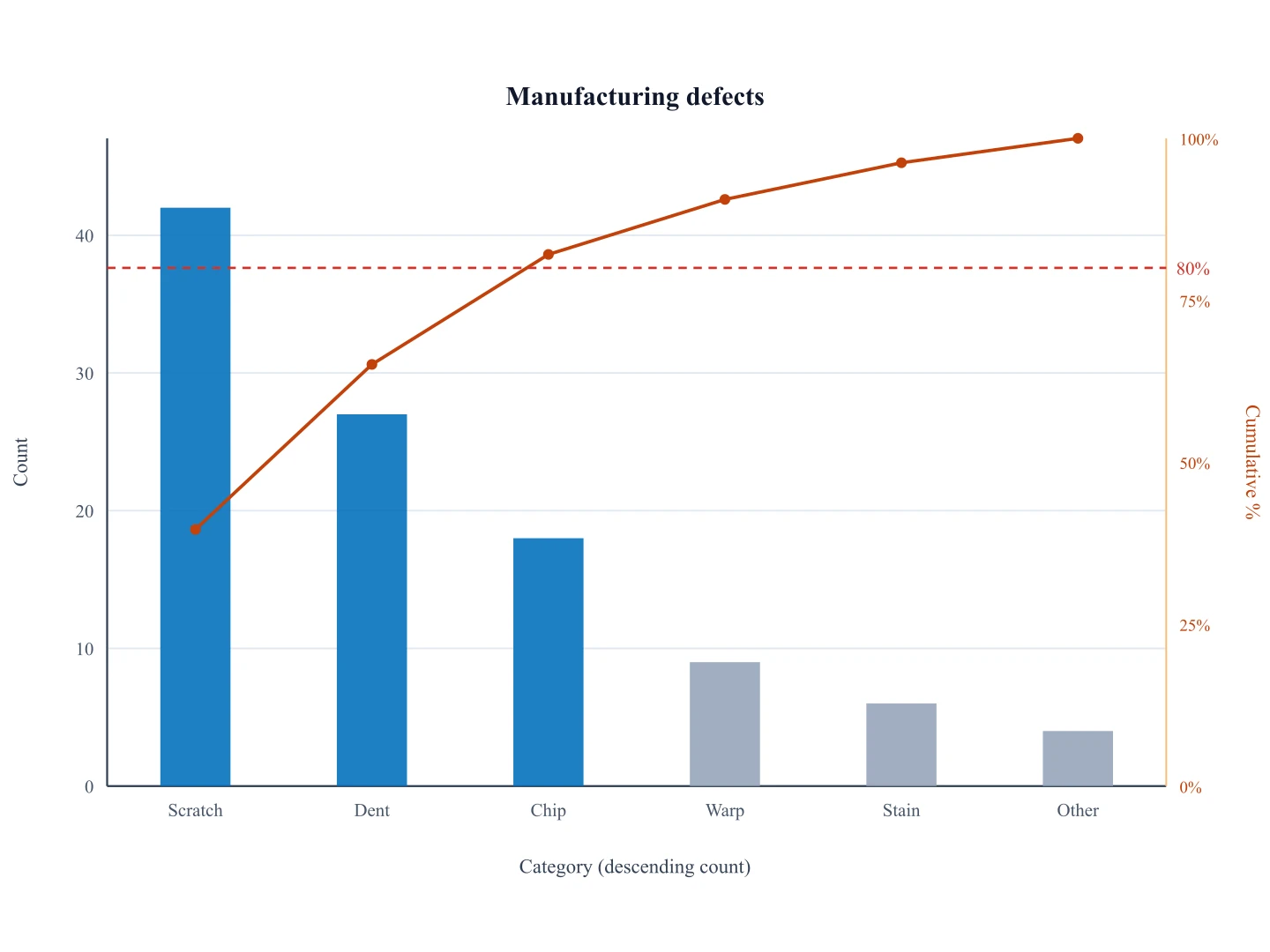
Pareto Chart Generator
Rank risks or defects by frequency to see where to focus.
 Business
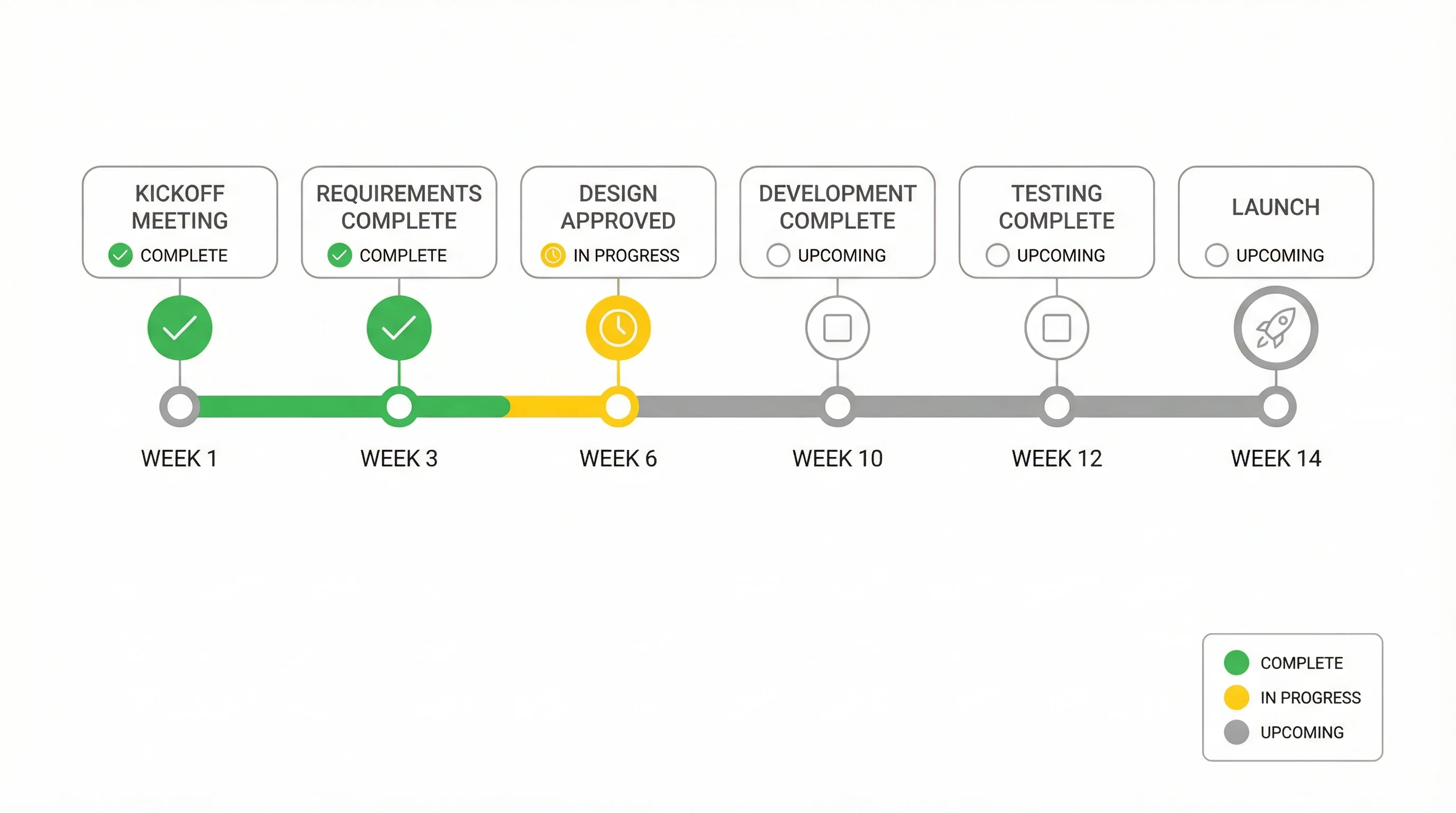
Gantt Chart Maker
Put mitigation actions on the project timeline.
 Business
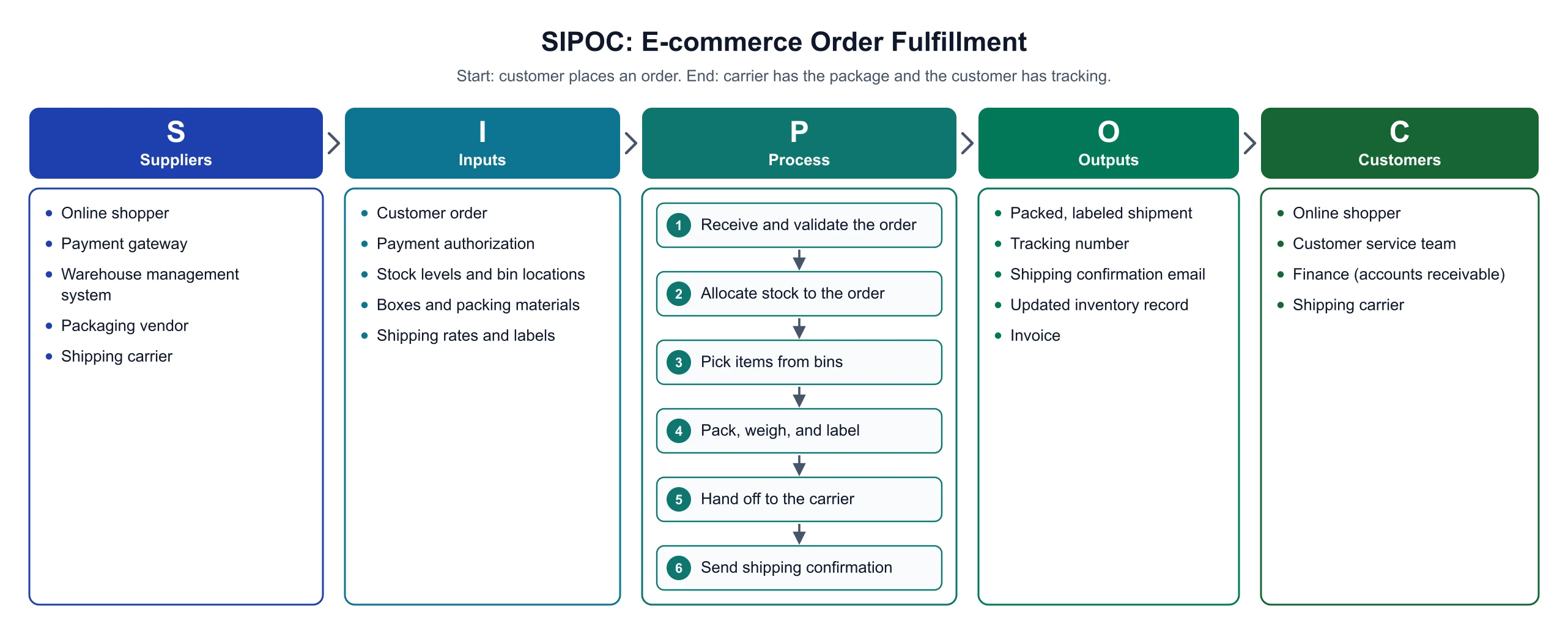
SIPOC Diagram Maker
Scope a process before you list its risks, with an exact SIPOC diagram.