")
How to Illustrate Science: Methods, Tools & Examples (2026)
Learn 8 proven ways to illustrate science for research papers, posters, and presentations. Covers diagrams, infographics, graphical abstracts, and more.
Science is inherently visual. From the double-helix structure of DNA to the orbital paths of planets, the most powerful scientific ideas become tangible only when we can see them. But illustrating science is not the same as scientific illustration — while the latter is a specialized art form with its own career path and techniques, "illustrating science" is about the broader practice of visually communicating scientific concepts to any audience.
Whether you are a graduate student preparing figures for your first publication, a professor designing lecture slides, or a science communicator translating complex research for the public, this guide covers the practical methods, tools, and real-world examples you need.
AI Scientific Image Generator
Create publication-quality scientific visuals with AI. Diagrams, posters, graphical abstracts, and more.
Try it free →What Does It Mean to Illustrate Science?
To illustrate science means to represent scientific information visually so that it becomes easier to understand, remember, and share. This goes beyond drawing pictures — it includes charts, diagrams, animations, interactive models, and any visual format that clarifies a concept.
Research consistently supports the value of visual communication in science:
- A study in PLOS ONE found that papers with high-quality figures receive significantly more citations.
- According to eLife, figures are often the first element readers evaluate when deciding whether to read a paper.
- The National Academies of Sciences reports that visuals improve comprehension of scientific topics across all education levels.
In short, illustrating science is not optional — it is a core skill for effective research communication.
Why Visual Communication Matters in Science
Before diving into methods, it helps to understand why visuals are so effective for science.
The Cognitive Case for Visuals
The dual coding theory, proposed by psychologist Allan Paivio, suggests that people process verbal and visual information through separate channels. When a concept is encoded both verbally (text) and visually (diagram), recall and comprehension improve dramatically.
For science specifically:
| Challenge | How Visuals Help |
|---|---|
| Abstract concepts (e.g., quantum states) | Diagrams make the invisible tangible |
| Complex processes (e.g., CRISPR gene editing) | Flowcharts break multi-step procedures into clear sequences |
| Large datasets (e.g., genomic data) | Charts and plots reveal patterns hidden in raw numbers |
| Spatial relationships (e.g., protein folding) | 3D models show structure that text cannot convey |
| Cross-disciplinary communication | Visuals transcend jargon and language barriers |
The Professional Case
Beyond cognition, there are practical reasons to invest in science illustration:
- Journal acceptance: Many journals now require graphical abstracts (Elsevier, Cell Press, ACS journals).
- Grant funding: Well-illustrated proposals are easier for reviewers to evaluate.
- Public engagement: Media outlets are far more likely to cover research that comes with compelling visuals.
- Teaching: Students retain visual explanations longer than text-only instruction.
8 Ways to Illustrate Science
Here are the eight most effective methods for visually communicating science, with tools and examples for each.
1. Scientific Diagrams
Diagrams are the most fundamental way to illustrate science. They show structures, relationships, and processes through labeled drawings.
Best for: Explaining anatomical structures, molecular pathways, experimental setups, and system architectures.
Examples: Cell cross-sections, circuit diagrams, phylogenetic trees, reaction mechanisms.
Tools:
- ConceptViz AI Scientific Image Generator — Generate labeled scientific diagrams from text descriptions in seconds
- BioRender — Drag-and-drop biology diagrams (paid, $33/month)
- Inkscape — Free, open-source vector editor for manual diagram creation
- draw.io — Free web-based diagramming
For a deep dive into diagram creation, see our guide on how to make scientific diagrams for research papers.
2. Infographics
Infographics combine data, text, and graphics into a single cohesive visual that tells a story. They are particularly effective for summarizing research findings for broader audiences.
Best for: Conference posters, social media, science outreach, funding summaries.
Examples: Climate change data summaries, vaccine efficacy comparisons, pandemic timelines.
Tools:
- ConceptViz AI Infographic Generator — AI-generated scientific infographics with accurate data representation
- Canva — Template-based design (free tier available)
- Piktochart — Infographic-focused design tool
- Visme — Data-driven infographic creation
We cover the full process in our scientific infographic design guide.
3. Graphical Abstracts
A graphical abstract is a single-panel visual summary of a research paper. Increasingly required by journals like Elsevier, Cell Press, and ACS publications, graphical abstracts have become a standard part of the publication workflow.
Best for: Journal submissions, paper promotion on social media, research portfolio pages.
Key specs:
- Elsevier: 1328 x 531 px
- Cell Press: 1200 x 1200 px
- ACS: 508 x 254 px (table of contents graphic)
Tools:
- ConceptViz Graphical Abstract Maker — AI-powered, journal-spec compliant
- BioRender — Popular among biologists
- Adobe Illustrator — Full creative control (steep learning curve)
- PowerPoint/Google Slides — Quick and accessible, though limited
See our complete tutorial: How to make a graphical abstract.
4. Data Visualizations
Data visualization transforms raw numbers into charts, plots, and graphs that reveal patterns, trends, and outliers. This is the most quantitative form of illustrating science.
Best for: Presenting experimental results, statistical analyses, survey data, computational outputs.
Examples: Scatter plots showing correlations, box plots comparing group distributions, heatmaps of gene expression, Sankey diagrams of energy flow.
Tools:
- ConceptViz Scatter Plot Maker — AI-assisted scatter plots and regression analysis
- ConceptViz Box Plot Generator — Statistical distribution visualization
- Python (Matplotlib/Seaborn) — Programmatic, fully customizable
- R (ggplot2) — The gold standard for statistical graphics
- Prism (GraphPad) — Designed for biomedical statistics
5. Scientific Posters
Conference posters are a unique format that combines diagrams, data visualizations, and text into a large-format presentation. Effective poster design requires balancing information density with visual clarity.

Best for: Academic conferences, departmental presentations, science fairs.
Design principles:
- Use a clear visual hierarchy (title > key findings > methods > details)
- Limit text to 800 words or fewer
- Choose accessible fonts at readable sizes
- Use a colorblind-friendly palette
Tools:
- ConceptViz Scientific Poster Generator — AI-generated poster layouts from your research summary
- PowerPoint — Most commonly used despite limitations
- Adobe InDesign — Professional layout control
- Canva — Template-based poster design
6. Animations and Video
When static images cannot convey a process that unfolds over time — protein folding, cell division, tectonic plate movement — animation fills the gap. Video is also the dominant format for science communication on platforms like YouTube and social media.
Best for: Dynamic processes, time-series data, educational content, public outreach.
Examples: Molecular dynamics simulations, ecological succession timelapses, surgical procedure walkthroughs.
Tools:
- Blender — Free, open-source 3D animation (steep learning curve)
- UCSF ChimeraX — Molecular visualization and animation
- After Effects — Motion graphics for science communication
- Manim — Python library for mathematical animations (used by 3Blue1Brown)
- BioRender Video — Animated biological illustrations
7. Conceptual Frameworks and Mind Maps
Conceptual frameworks visually organize the relationships between theories, variables, and outcomes in a research study. Mind maps serve a similar purpose for brainstorming and literature review.
Best for: Research proposals, literature reviews, theoretical papers, thesis planning.
Examples: Theoretical framework diagrams, literature review concept maps, variable relationship models.
Tools:
- ConceptViz Conceptual Framework Generator — AI-generated frameworks from your research description
- ConceptViz Mind Map Generator — Visual brainstorming and idea organization
- Miro — Collaborative online whiteboard
- XMind — Dedicated mind mapping software
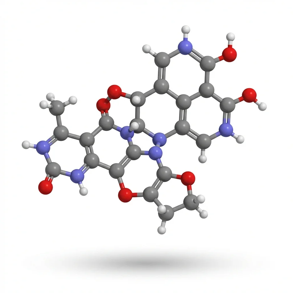
8. 3D Models and Molecular Visualizations
Three-dimensional models are essential when spatial structure is the point — molecular biology, crystallography, geology, and anatomy all rely on 3D visualization to communicate findings that 2D images cannot capture.
Best for: Protein structures, molecular docking, geological formations, anatomical models, engineering prototypes.
Examples: Protein crystal structures from PDB, geological cross-sections, organ system models.
Tools:
- PyMOL — Molecular visualization (free educational license)
- UCSF ChimeraX — Molecular visualization and analysis
- Blender — General-purpose 3D modeling
- BioDigital — Interactive 3D human anatomy
- Avogadro — Free molecular editor and visualization
Choosing the Right Method
Not sure which approach fits your needs? Use this decision guide:
| Your Goal | Recommended Method | Quick Tool |
|---|---|---|
| Explain a biological structure | Scientific diagram | AI Scientific Image Generator |
| Summarize a paper for social media | Graphical abstract | Graphical Abstract Maker |
| Present experimental results | Data visualization | Scatter Plot Maker |
| Communicate research to non-scientists | Infographic | AI Infographic Generator |
| Show a dynamic process over time | Animation | Blender or Manim |
| Organize literature or theories | Conceptual framework | Conceptual Framework Generator |
| Present at a conference | Scientific poster | Scientific Poster Generator |
| Show 3D molecular structure | 3D model | PyMOL or ChimeraX |
Best Practices for Illustrating Science
Regardless of the method you choose, follow these principles to create effective scientific visuals.
1. Accuracy First
Every element of your illustration must be scientifically correct. A visually stunning diagram that misrepresents a mechanism does more harm than no diagram at all. Always cross-reference your visuals against primary sources.
2. Simplify Without Distorting
The goal of illustration is to reduce complexity — but not at the cost of accuracy. Remove unnecessary details while preserving the essential relationships and proportions. As Einstein reportedly said, "Make everything as simple as possible, but not simpler."
3. Design for Accessibility
- Use colorblind-friendly palettes (blue-orange instead of red-green)
- Add text labels in addition to color coding
- Ensure sufficient contrast ratios
- Use patterns and line styles as secondary differentiators
4. Follow Publication Standards
If your visuals are destined for a journal, check the requirements early:
- Resolution: 300 DPI minimum for print
- File format: EPS, PDF, or TIFF for vector; PNG or TIFF for raster
- Dimensions: Fit within column width (typically 89 mm or 183 mm)
- Fonts: Sans-serif (Arial, Helvetica) at 6-8 pt minimum
For journal-specific guidance, see our guide on making figures for Nature and Science journals.
5. Tell a Visual Story
Arrange elements so the viewer's eye follows a logical path — typically left to right, top to bottom. Use arrows, numbering, and visual hierarchy to guide attention. Every figure should answer one clear question.
How AI Is Changing Science Illustration
The landscape of science illustration has shifted dramatically since 2024. AI tools can now generate publication-quality scientific visuals from text descriptions, reducing the time from hours of manual drawing to minutes.
Key advantages of AI-assisted illustration:
- Speed: Generate a first draft in seconds, then refine
- Accessibility: No drawing skills or design training required
- Consistency: Maintain a uniform style across all figures in a paper
- Iteration: Quickly explore multiple visual approaches to the same concept
ConceptViz combines AI generation with domain-specific scientific knowledge, producing diagrams that are not only visually clean but scientifically accurate. Unlike general-purpose AI image generators, it understands the conventions of scientific illustration — proper labeling, standard symbols, and publication-ready formatting.
AI Scientific Image Generator
Describe your scientific concept in plain text. Get a publication-ready illustration in seconds.
Create your first illustration →Frequently Asked Questions
What does it mean to illustrate science?
To illustrate science means to use visual methods — diagrams, charts, infographics, models, animations — to communicate scientific concepts, data, or processes. It is a core part of science communication, used in research papers, textbooks, presentations, and public outreach.
What are the most common ways to illustrate science?
The eight most common methods are: scientific diagrams, infographics, graphical abstracts, data visualizations (charts and plots), scientific posters, animations and video, conceptual frameworks, and 3D models. The best choice depends on your audience, content, and publication venue.
Do I need artistic skills to illustrate science?
Not anymore. While traditional scientific illustration requires drawing ability, modern tools — including AI generators like ConceptViz, template-based platforms like Canva, and programming libraries like Matplotlib — allow anyone to create professional visuals. What matters most is understanding the science and the audience.
What is the difference between scientific illustration and illustrating science?
Scientific illustration is a specialized discipline focused on creating accurate, detailed visual representations of scientific subjects — often as a career. "Illustrating science" is broader: it refers to any method of visually communicating science, from simple charts to complex 3D animations, used by researchers, teachers, and communicators.
What tools do researchers use most often?
The most commonly used tools vary by field: BioRender for biology, ChemDraw for chemistry, Python/R for data visualization, Adobe Illustrator for publication-quality vector graphics, and AI tools like ConceptViz for quick, versatile diagram generation across disciplines.
How do I make my scientific illustrations accessible?
Use colorblind-friendly palettes (avoid red-green combinations), add text labels alongside color coding, maintain sufficient contrast, and include descriptive alt text for digital publications. Our scientific color palette guide covers accessible color choices in detail.
Ready to illustrate your science? Try ConceptViz to generate professional scientific visuals in seconds — from diagrams and graphical abstracts to infographics and posters.
Категории
Ещё публикации
")
How to Make a Bohr Model: Step-by-Step Guide for Students (2026)
Learn how to draw a Bohr model for any element. Covers electron shell rules, common elements, mistakes to avoid, and when Bohr models break down for heavier atoms.
")
Free Printable Life Cycle Worksheets for Teachers (2026)
Download free printable life cycle worksheets for plants, butterflies, frogs, and chickens. Includes labeled diagrams, blank worksheets for quizzes, and hands-on activities aligned with NGSS standards.

Nature, Science & Cell Figure Guidelines: Size, DPI, Fonts
Quick reference for Nature, Science and Cell figure requirements: dimensions, DPI, accepted file formats, fonts, panel labels, color mode and submission checks.