Scatter Plot Maker with Line of Best Fit
Make a scatter plot online to show the correlation between two variables. Paste your X,Y data for an exact chart with a line of best fit, or describe one for an AI illustration — then export SVG or PNG, free.
Paste your x, y pairs — renders an exact scatter plot with a line of best fit as SVG, free
Plot settings
Exact scatter plot, rendered as SVG.
13 valid points · comma, space, or tab separated
Pearson r = 0.9963 · R² = 0.9927
Plotting 13 points. Line of best fit: y = 1.3 + 0.822x. Download an editable SVG for slides, reports, and worksheets.
Scatter Plot Maker
Free to try ·
Your scatter plot will appear here
Describe the scatter plot you want
Scatter Plot Examples
Correlation charts with trend lines, groups, and outliers
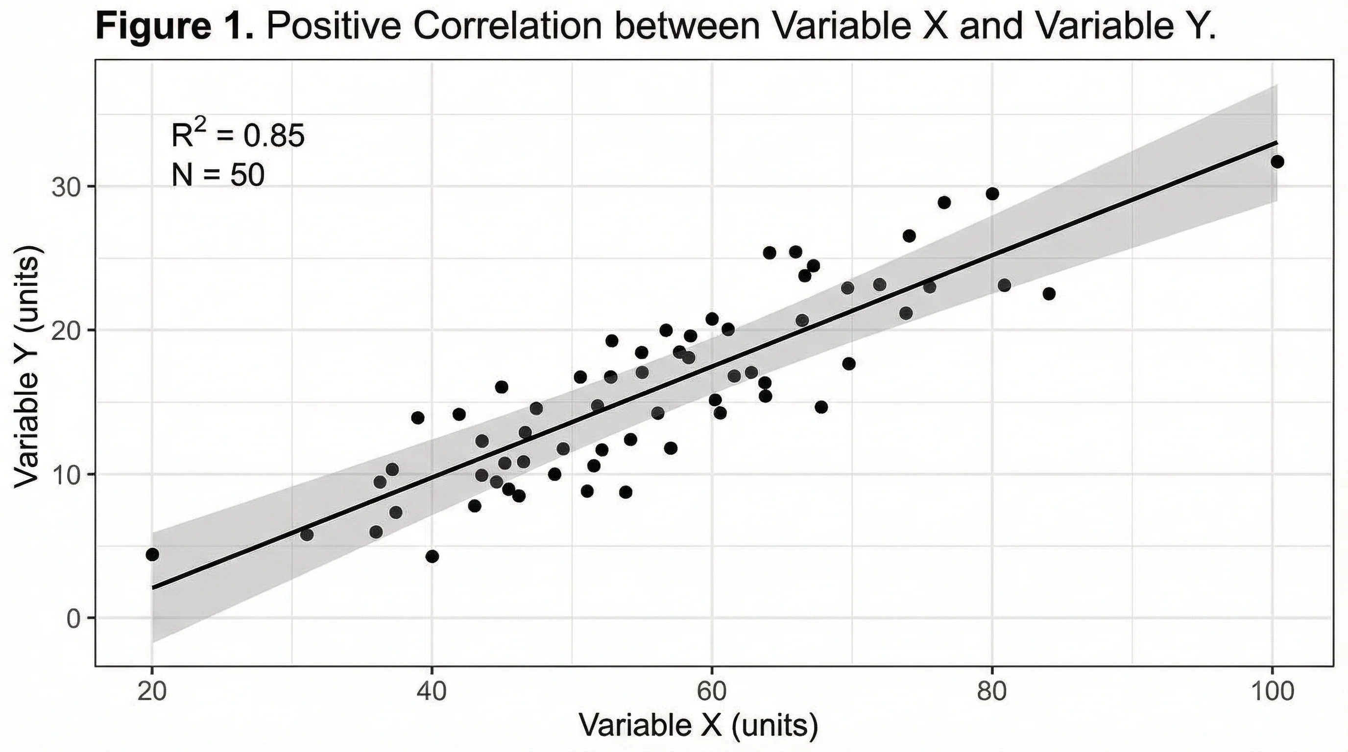
Positive Correlation + Trend Line
As one variable rises so does the other — the upward line of best fit shows positive correlation.
Multi-Group Scatter
Plot several groups in different colors to compare relationships side by side.
Line of Best Fit + R²
Add a linear regression line with the equation and R² to quantify the trend.
Outliers Highlighted
Points that sit far from the cloud are outliers — easy to spot and label on a scatter plot.
Two Variables Compared
One variable on the x-axis, the other on the y-axis — the shape reveals the relationship.
Scientific Scatter Plot
Lab and research data plotted with error bars and a fitted curve for publication.
What is a scatter plot?
A scatter plot (or scatter diagram) shows the relationship between two variables by plotting one on the x-axis and the other on the y-axis. Each point represents a single observation — its position is set by its X value and its Y value. The overall pattern of the cloud of points tells you whether and how the two variables move together. It is the standard chart for spotting correlation, clusters, and outliers, and it is exactly what this maker draws from your data.
Two ways to make a scatter plot here
- Data mode: paste your X,Y pairs (or upload them) and the tool plots every point exactly, scales the axes, and can add a line of best fit — accurate every time, no manual placing.
- AI illustration mode: describe the scatter plot you want in plain English and the tool generates a polished, presentation-ready graphic with themed colors and styling.
- Use data mode when the numbers must be right (homework, reports, analysis); use AI mode when you want an illustrative graphic for slides or a blog without real data.
Reading correlation: positive, negative, and none
The direction of the cloud of points is the correlation. In a positive correlation the points trend upward from left to right — as X increases, Y increases (study hours and exam scores). In a negative correlation the points trend downward — as X increases, Y decreases (price and units sold). When the points form no clear slope and are scattered randomly, there is little or no correlation. Tighter, more line-like clouds mean a stronger relationship; wide, fuzzy clouds mean a weaker one.
Adding a line of best fit (trend line)
A line of best fit, or trend line, is a straight line drawn through the points to summarize the overall trend. The tool fits it with linear regression so it sits as close as possible to all the points, and it can show the line equation (y = mx + b) and the R² value — how well the line explains the data, from 0 (no fit) to 1 (perfect fit). The line makes the direction and strength of the correlation obvious at a glance and lets you read off predicted values, which is why it is one of the most-requested scatter plot features.
How to make a scatter plot from your data
- Enter or paste your X,Y data — one pair per line, or paste two columns straight from a spreadsheet.
- Label the x-axis and y-axis so it is clear which variable is which.
- Turn on the line of best fit if you want the trend line, equation, and R² value shown.
- Adjust colors and labels, then export a clean SVG or PNG to drop into a doc, slide, or report.
When to use the AI illustration mode
Reach for AI illustration mode when you want a styled, eye-catching scatter graphic rather than a plot of exact numbers — a concept illustration for a presentation, a blog header, or a social post. For anything where the points and the line of best fit must reflect real values, such as an assignment, a lab report, or a data analysis, use data mode so the chart is computed from your X,Y pairs rather than drawn for looks.
Frequently Asked Questions
Related Chart Tools
 Visualization
AI Chart Generator
Turn your data into bar, line, pie, and other charts with clean labels and styling.
 Research
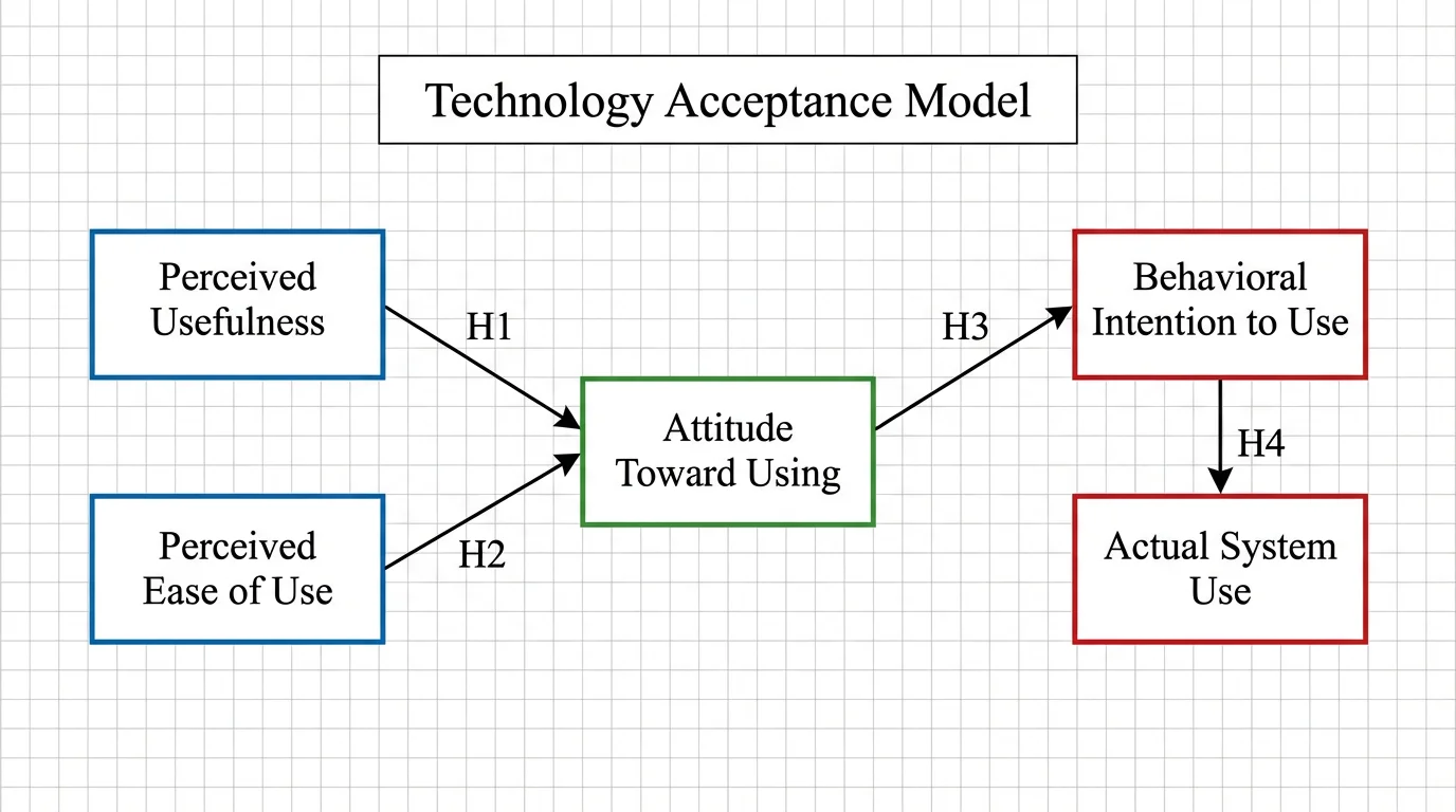
Conceptual Framework Generator
Map variables and relationships into a clear conceptual framework for research.
 Research
AI Scientific Image Generator
Create accurate, labeled scientific figures and illustrations for papers and slides.