Scree Plot Generator for PCA eigenvalues
Free scree plot generator. Paste eigenvalues or percent variance to draw the PCA elbow chart, then download SVG.
Paste eigenvalues or percent variance — renders an exact PCA elbow chart as SVG, free
Eigenvalues
Paste a single column, or component plus eigenvalue / percent variance. This tool does not run PCA.
8 components parsed
n=8 · Kaiser λ>1 keeps 3 · largest drop after PC1. Cattell’s scree test is visual — this page does not pick the number of components for you.
Scree Plot Generator
Free to try ·
Your AI scree-plot illustration will appear here
For a data-accurate plot from eigenvalues, use the Precise Plot tab instead
Scree Plot Examples
The first four are exact engine renders from tables. The last two are AI illustrations of Illustration mode.
Classic elbow
Exact engine render — pasted eigenvalues, bars plus line, Kaiser at 1.
Percent variance
Exact engine render — y is percent variance, no Kaiser line.
Kaiser criterion
Exact engine render — count of λ > 1 is a diagnostic, not a pick.
Gradual decay
Exact engine render — Cattell’s test is visual; a flat cliff is not required.
AI illustration — elbow
AI illustration of Illustration mode — visual mockup, not plotted from eigenvalues.
AI illustration — teaching
AI illustration of Illustration mode — visual mockup, not a fitted elbow.
What is a scree plot?
A scree plot is eigenvalue (or percent variance) versus component number, drawn in descending order. The name comes from the rubble — scree — that collects at the foot of a cliff: the steep drop is signal, the flat tail is noise. You look for the elbow and keep the components to the left of it. This page draws that chart from values you already have. It does not run principal component analysis, estimate loadings, or draw a score scatter or biplot.
How to read the elbow and Kaiser’s rule
- Paste a column of eigenvalues, or a component label plus a value. Bars plus a connecting line is the textbook figure. The dashed red line is Kaiser’s criterion at eigenvalue 1 — useful in PCA or exploratory factor analysis when the variables are standardized. It is a count, not a decision this page makes for you.
- Cattell’s scree test is visual. The caption prints the largest consecutive drop as a hint. It does not pick k. Parallel analysis and a pre-registered variance cutoff belong in your notebook, not in this SVG.
- Percent-variance mode plots the numbers you paste (or 0–1 proportions scaled to percent). Kaiser’s line is hidden because “1” is not a percent.
Scree plot versus a PCA score plot
A scree plot decides how many components to keep. A PCA plot on this site is the sample score scatter on PC1 versus PC2. They answer different questions and are not interchangeable. This page is also not a k-means elbow chart of within-cluster sum of squares — that is a different “elbow.”
Export
Download a scalable SVG with no watermark and no account required for the precise plot. The AI Illustration tab is only for slides when you do not have eigenvalues yet — it will not match your PCA.
Frequently Asked Questions
Related Research Tools
 Research
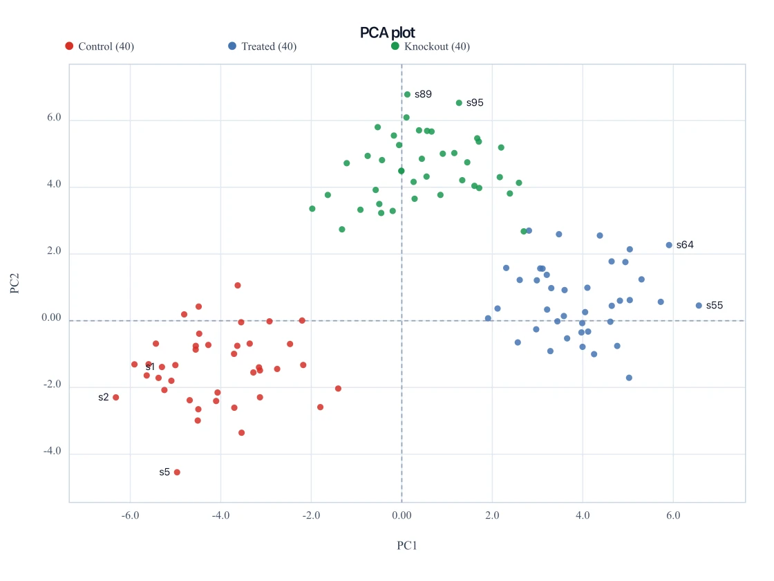
PCA Plot Generator
Need the sample score scatter on PC1 vs PC2? That is a PCA plot, not a scree plot.
 Research
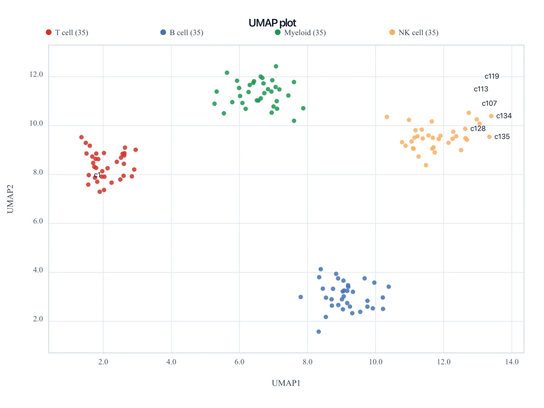
UMAP Plot Generator
Paste already-computed UMAP1 and UMAP2 coordinates for the nonlinear companion embedding.
 Research
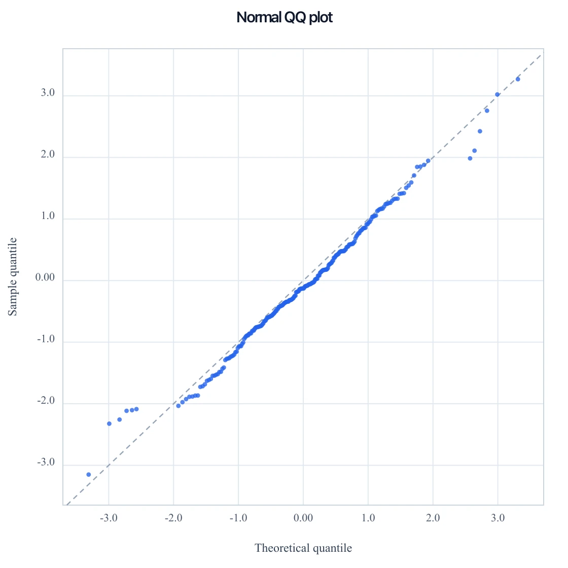
QQ Plot Generator
Paste numbers for a normal QQ, or p-values for a GWAS QQ, and download SVG.
 Research
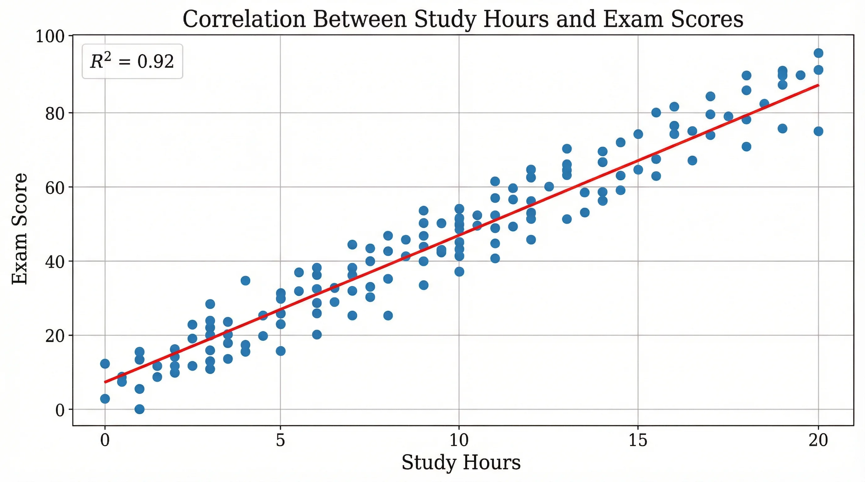
Scatter Plot Maker
A generic x–y scatter is not an eigenvalue chart — use it only when you just need two columns plotted.