PCA Plot Generator for sample scores
Free PCA plot generator. Paste sample scores for PC1 and PC2 to draw an exact scatter and download SVG.
Paste sample, PC1, PC2 scores — renders an exact PCA scatter as SVG, free
PCA score table
sample, PC1, PC2, and optional group. This plots scores you already computed — it does not run PCA.
120 samples parsed
Control 40 · Treated 40 · Knockout 40
PCA Plot Generator
Free to try ·
Your AI PCA plot illustration will appear here
For a data-accurate plot from your scores, use the Precise Plot tab instead
Example PCA plots
The first four are exact engine renders from score tables. The last two are AI illustrations of Illustration mode.
Three groups on PC1 vs PC2
Exact engine render — pasted PC scores, colored by group.
Tumor vs normal
Exact engine render — two-group separation on PC1.
Batch clouds
Exact engine render — QC view of batch structure.
Labeled outliers
Exact engine render — farthest samples labeled.
AI illustration — groups
AI illustration of Illustration mode — visual mockup, not plotted from scores.
AI illustration — RNA-seq
AI illustration of Illustration mode — visual mockup, not plotted from a matrix.
What is a PCA plot?
A PCA plot here means a score scatter: each sample is a point on PC1 versus PC2 (or any two components you paste). Points that sit together share similar multivariate profiles. This page draws that figure from a table of already-computed scores. It does not run principal component analysis, estimate loadings, or draw a biplot with arrows. It is also not a generic scatter-plot maker and not a “what is PCA” explainer.
Score plot versus biplot
- A score plot is samples in PC space. A PCA biplot overlays variable loadings as arrows on the same axes. This generator is the score plot — paste sample, PC1, PC2, and an optional group column.
- If you still need to compute PCs, do that in R, Python, or your RNA-seq pipeline, then paste the score matrix here for a clean SVG. Eigenvalues and a “how many components?” question belong on the scree plot generator, not here.
- For differential expression of the same experiment, pair this with the volcano plot generator or the MA plot generator.
What table to paste
A header plus sample, PC1, and PC2 is enough. A group, cluster, or condition column colors the points. Comma, tab, or semicolon separated text all work. Files are truncated to 8,000 rows. Axis titles default to PC1 and PC2; type variance percentages yourself if you want them on the figure.
Export
Download a scalable SVG with no watermark and no account required for the precise plot. The AI Illustration tab is only for slides when you do not have scores yet — it will not match your samples.
Frequently Asked Questions
Related Research Tools
 Research
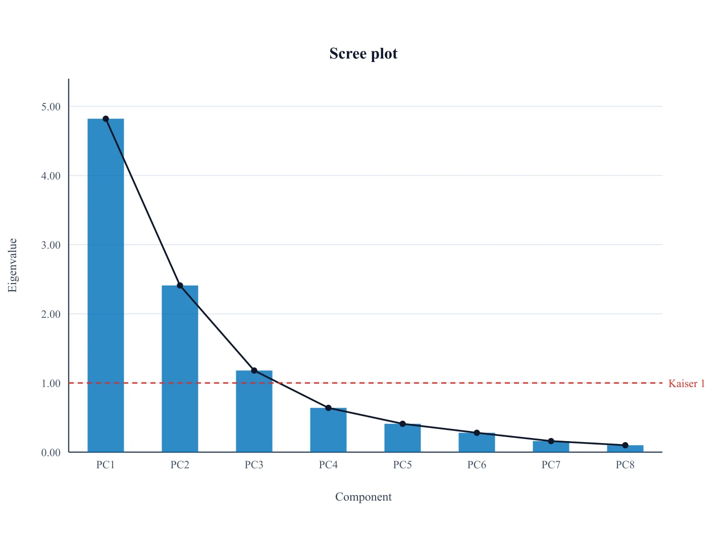
Scree Plot Generator
Need eigenvalue versus component number? That is a scree plot, not a score scatter.
 Research
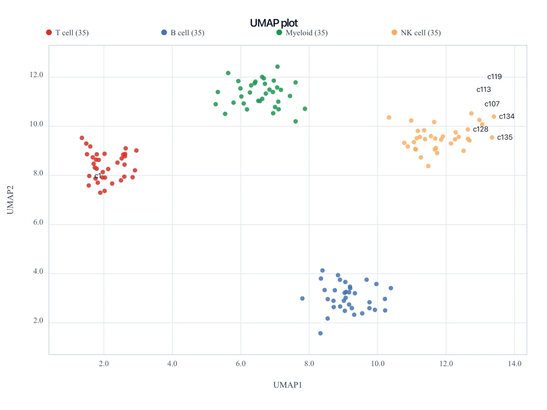
UMAP Plot Generator
Paste UMAP1 and UMAP2 coordinates for the nonlinear companion embedding.
 Research
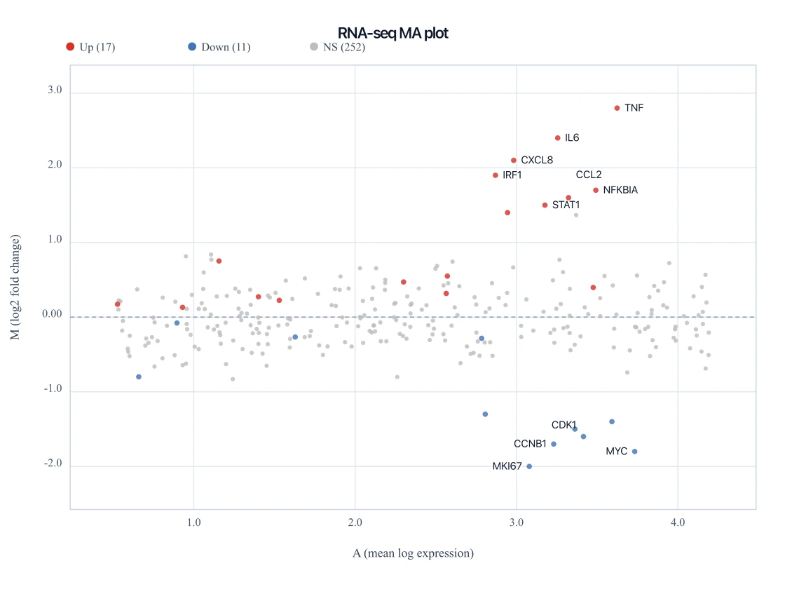
MA Plot Generator
Paste DESeq2 mean and log2 fold-change columns for the companion expression figure.
 Research
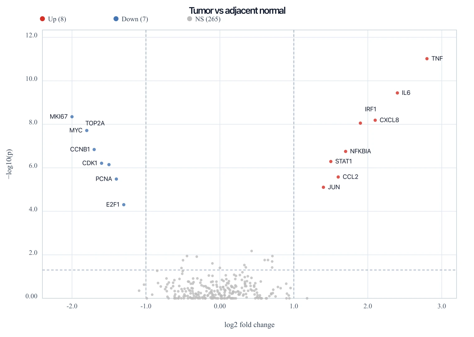
Volcano Plot Generator
Paste the same experiment’s DE table to draw log2 fold change versus −log10(p).
 Research
Scatter Plot Maker
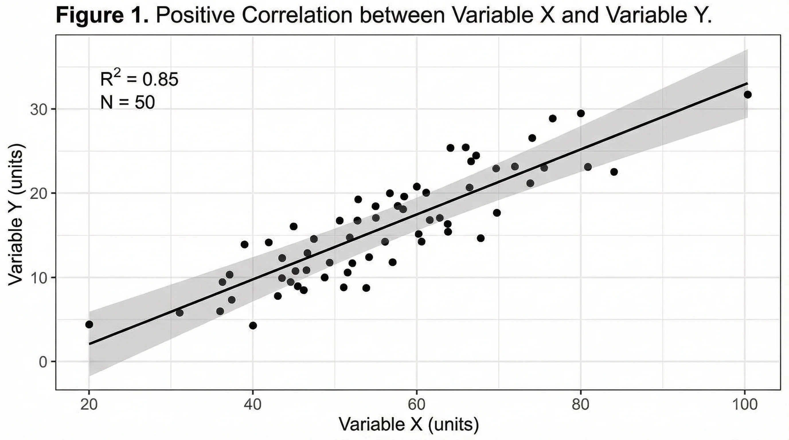
Need a generic x–y scatter that is not PCA scores? Use the scatter plot maker.
 Research
QQ Plot Generator
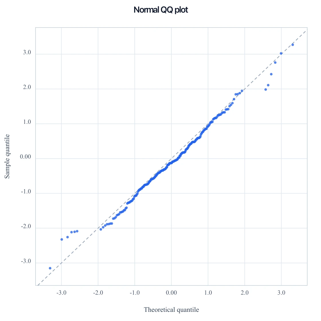
Paste numbers for a normal QQ, or p-values for a GWAS QQ, and download SVG.