Bland-Altman Plot Generator for method comparison
Free Bland-Altman plot generator. Paste paired measurements to draw bias and 95% limits of agreement, then download SVG.
Paste paired measurements — renders an exact mean-difference plot as SVG, free
Paired measurements
Paste two columns (method A / reference and method B / new). The tool does not run method-comparison software.
40 pairs parsed
n=40 · bias=-1.75 · SD=3.63 · LoA -8.87 to 5.37 · difference vs mean slope=-0.009 (R²=0.003). Limits of agreement are mean ± 1.96 SD of the paired differences, not a mixed-effects or Passing–Bablok analysis.
Bland-Altman Plot Generator
Free to try ·
Your AI Bland–Altman illustration will appear here
For a data-accurate plot from paired measurements, use the Precise Plot tab instead
Bland–Altman Plot Examples
The first four are exact engine renders from tables. The last two are AI illustrations of Illustration mode.
Cuff vs monitor
Exact engine render — difference versus mean, bias ± 1.96 SD.
Lab vs glucometer
Exact engine render — glucometer reads high, so A − B bias is negative.
Percent difference
Exact engine render — y = 100 × (A − B) / mean, still classic horizontal LoA.
Proportional bias
Exact engine render — slope of difference vs mean is a diagnostic; LoA stay horizontal.
AI illustration — agreement
AI illustration of Illustration mode — visual mockup, not plotted from pairs.
AI illustration — LoA schematic
AI illustration of Illustration mode — visual mockup, not a fitted LoA.
What is a Bland–Altman plot?
A Bland–Altman plot (also called a Tukey mean-difference plot) compares two methods that measure the same continuous quantity. For each pair it plots the difference (A − B) against the mean ((A + B) / 2), then draws the mean difference (bias) and the 95% limits of agreement at bias ± 1.96 SD. Correlation can look excellent while the methods still disagree by a clinically important amount — that is the point of this figure. This page draws that plot from the table you paste. It does not run MedCalc, Passing–Bablok, Deming regression, or mixed-effects limits for repeated measures, and it is not an RNA-seq MA plot.
How bias and limits of agreement are read
- Paste two paired columns. Method A is usually the reference (lab, cuff, gold standard); method B is the new device. Difference is A − B, so a negative bias means B reads higher.
- The solid line is the mean difference. The dashed lines are mean ± 1.96 times the sample standard deviation of the differences (n − 1). About 95% of future differences are expected to fall between them if the differences are roughly normal and independent.
- Whether those limits are acceptable is a clinical decision you make before looking at the plot, not a p-value this page computes.
- Percent difference mode uses 100 × (A − B) / mean. Rows whose mean is zero cannot be converted and are skipped. Classic horizontal LoA are still used; a large slope of difference versus mean is printed as a diagnostic, not as regression-based limits.
Bland–Altman versus an MA plot
Both plot a difference against a mean, but they are different figures. Bland–Altman is clinical method comparison with limits of agreement. An MA plot is the genomics figure of log-ratio versus average intensity for thousands of genes. Use this page for paired assays; use the MA plot generator for DESeq2 / limma results.
Export
Download a scalable SVG with no watermark and no account required for the precise plot. The AI Illustration tab is only for slides when you do not have pairs yet — it will not match your bias or LoA.
Frequently Asked Questions
Related Research Tools
 Research
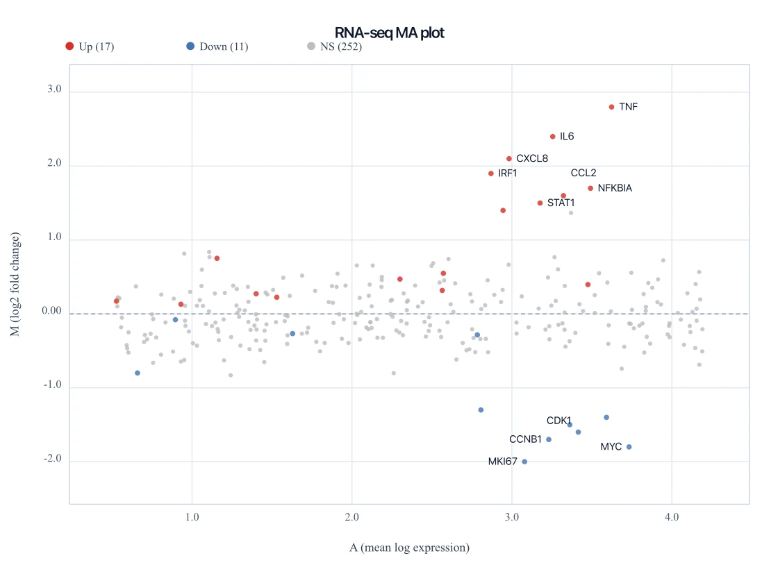
MA Plot Generator
Need the genomics mean-versus-fold-change figure instead? That is an MA plot, not Bland–Altman.
 Research
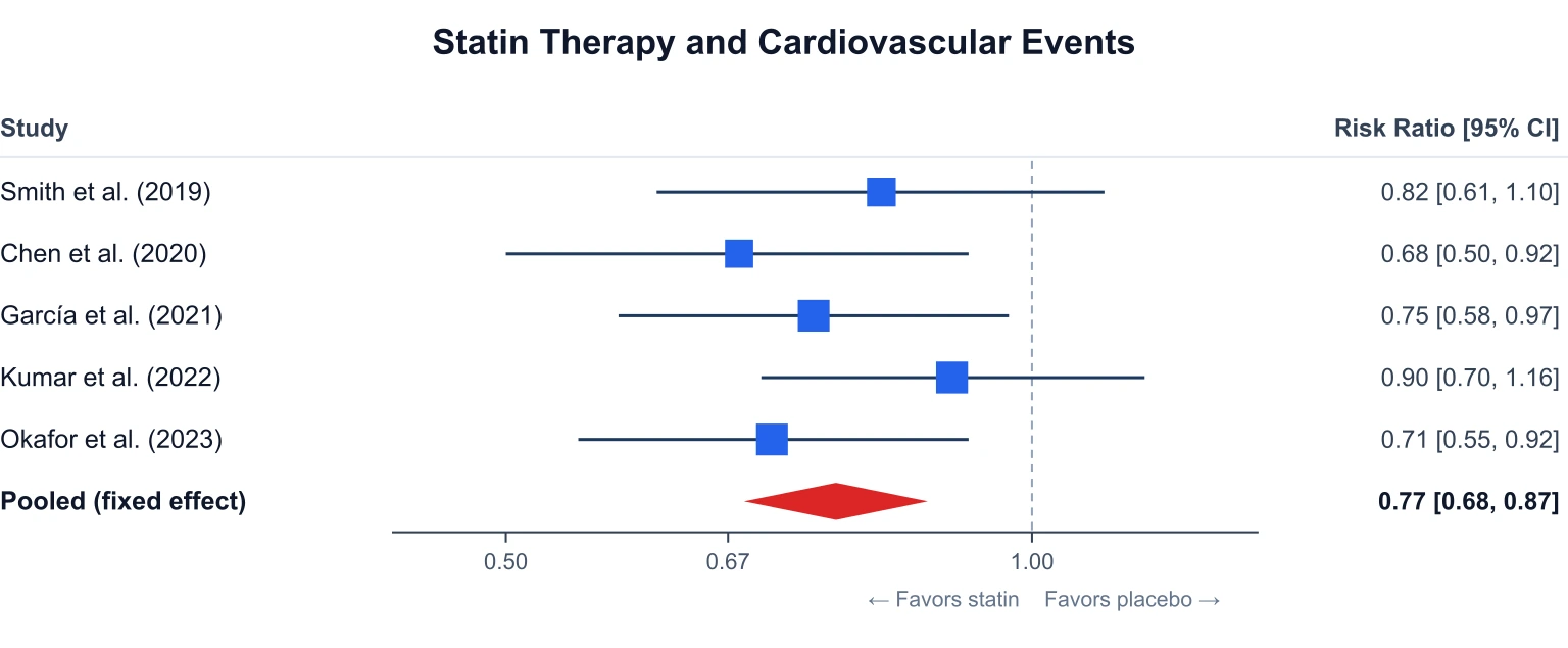
Forest Plot Generator
Draw a meta-analysis forest plot from effect sizes and confidence intervals.
 Research
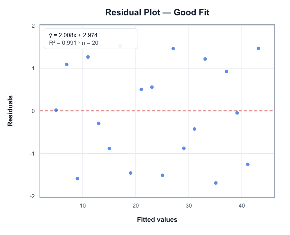
Residual Plot Generator
Check a linear fit with residuals versus fitted values after a method comparison.
 Research
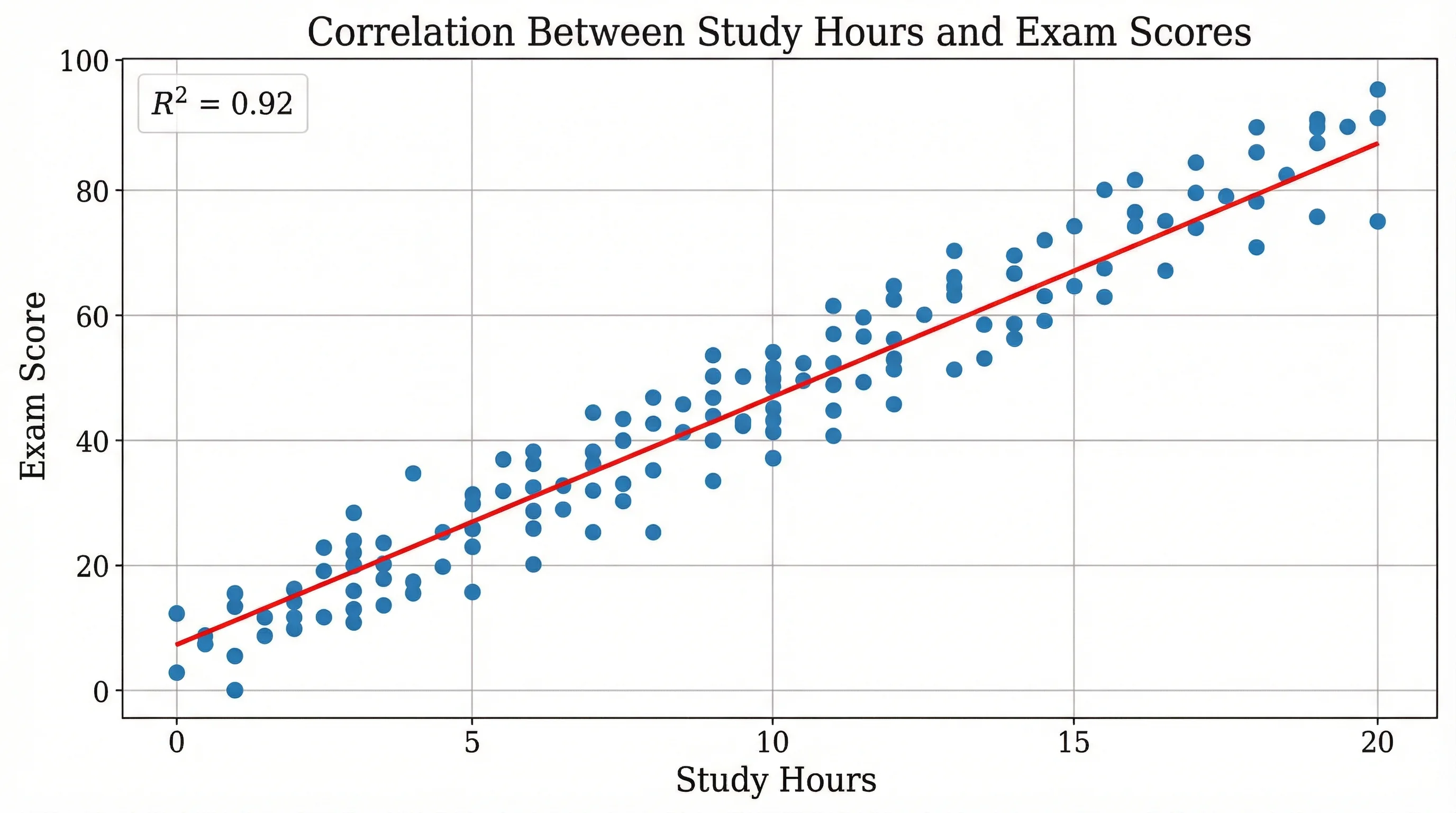
Scatter Plot Maker
A generic X–Y scatter is not limits of agreement — use it only when you just need two columns plotted.