Residual Plot Generator with R²
Free residual plot generator — paste your x, y data to fit a line and plot residuals against fitted values with R², to check your regression. Export SVG.
Paste your x, y data — fits a line and renders an exact residual plot with R², free
Residual Plot Generator
Free to try ·
Your AI residual plot will appear here
For an exact plot fitted from your data, use the Precise Plot tab instead
Residual Plot Examples
Exact engine renders — good fits, funnels, curves, and outliers
Random Scatter (Good Fit)
Exact engine render — random scatter around zero, the sign of a good linear fit.
Funnel (Heteroscedasticity)
Exact engine render — a funnel shape, revealing non-constant variance.
Curved (Non-Linear)
Exact engine render — a U-shaped curve, revealing a non-linear relationship.
Strong Linear Fit
Exact engine render — a tight, high-R² fit with small residuals.
Outlier Present
Exact engine render — a clear outlier standing far from the zero line.
Lab Calibration
Exact engine render — a calibration curve check with residuals around zero.
What is a residual plot?
A residual plot is the main diagnostic for checking a regression. A residual is the gap between an observed value and the value the model predicts (y − ŷ), and the plot scatters those residuals on the y-axis against the fitted values on the x-axis, with a horizontal line at zero. If the regression captures the relationship well, the residuals should scatter randomly and evenly around zero with no pattern. Any structure — a curve, a funnel, or a drift — is a sign that an assumption has been violated. This generator fits an ordinary-least-squares line to the x, y data you paste in, then plots the residuals against the fitted values and reports the slope, intercept, and R².
Reading the pattern
- Random scatter around zero: the linear model fits well and the assumptions hold.
- A curve or U-shape: the relationship is non-linear — a straight line is the wrong model.
- A funnel (spread grows or shrinks across the x-axis): non-constant variance (heteroscedasticity).
- A few points far from zero: potential outliers or influential points worth investigating.
Why residuals matter more than R²
A high R² tells you the model explains a lot of the variance, but it does not tell you whether the model is appropriate — a curved relationship can still produce a high R² while systematically mispredicting. The residual plot catches exactly that: it magnifies the part of the data the model failed to capture, so a clear pattern in the residuals is a warning even when R² looks good. That is why statisticians look at the residual plot before trusting a regression. This tool shows both so you can judge them together, but the shape of the residuals is the deciding evidence about whether a linear fit is honest.
How to make your residual plot
- Paste your data as one x, y pair per line — the tool fits the least-squares line for you.
- The residuals are plotted against the fitted values with a dashed zero line, and the equation and R² are shown.
- Look for a random cloud around zero (good) versus a curve or funnel (a violated assumption).
- Download a clean, scalable SVG for your paper, report, or slides — free, with no sign-up.
Residual plots and regression assumptions
Linear regression assumes the relationship is linear, the residuals have constant variance, and they are independent and roughly normal. The residuals-versus-fitted plot checks the first two directly, and it is usually read alongside a scatter plot of the raw data with the fitted line, and sometimes a Q–Q plot for normality. If the residual plot shows a curve, try transforming a variable or adding a term; if it shows a funnel, consider a transformation or weighted regression. This tool renders the residuals-versus-fitted view from a simple linear fit; pair it with a scatter plot to see the fit itself.
Frequently Asked Questions
Related Data & Stats Tools
 Research
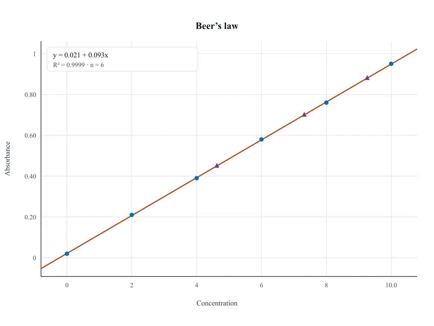
Calibration Curve Generator
The working curve of standards plus a fitted line. Use residuals here to check that fit.
 Research
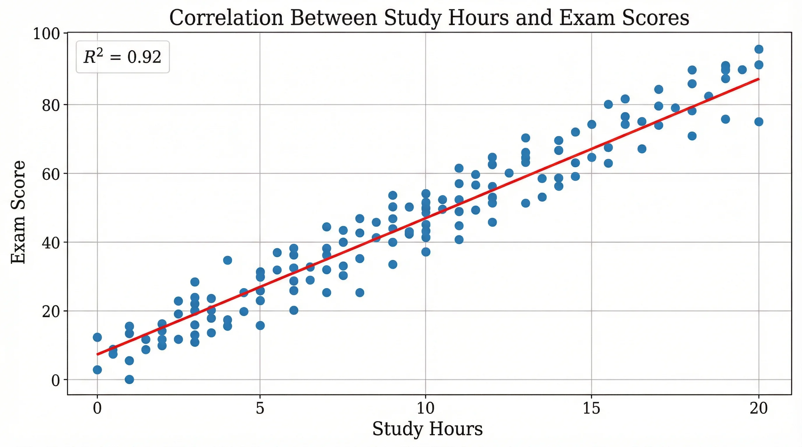
Scatter Plot Maker
Plot paired data points to reveal correlation and trends between variables.
 Research
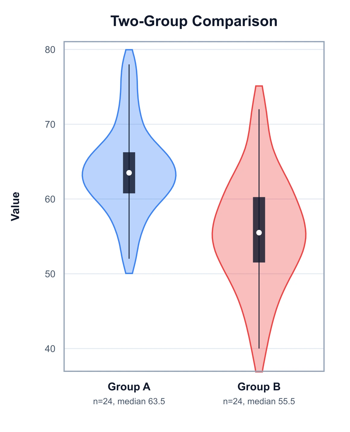
Violin Plot Generator
Draw kernel-density violins with quartile boxes to compare distributions.
 Research
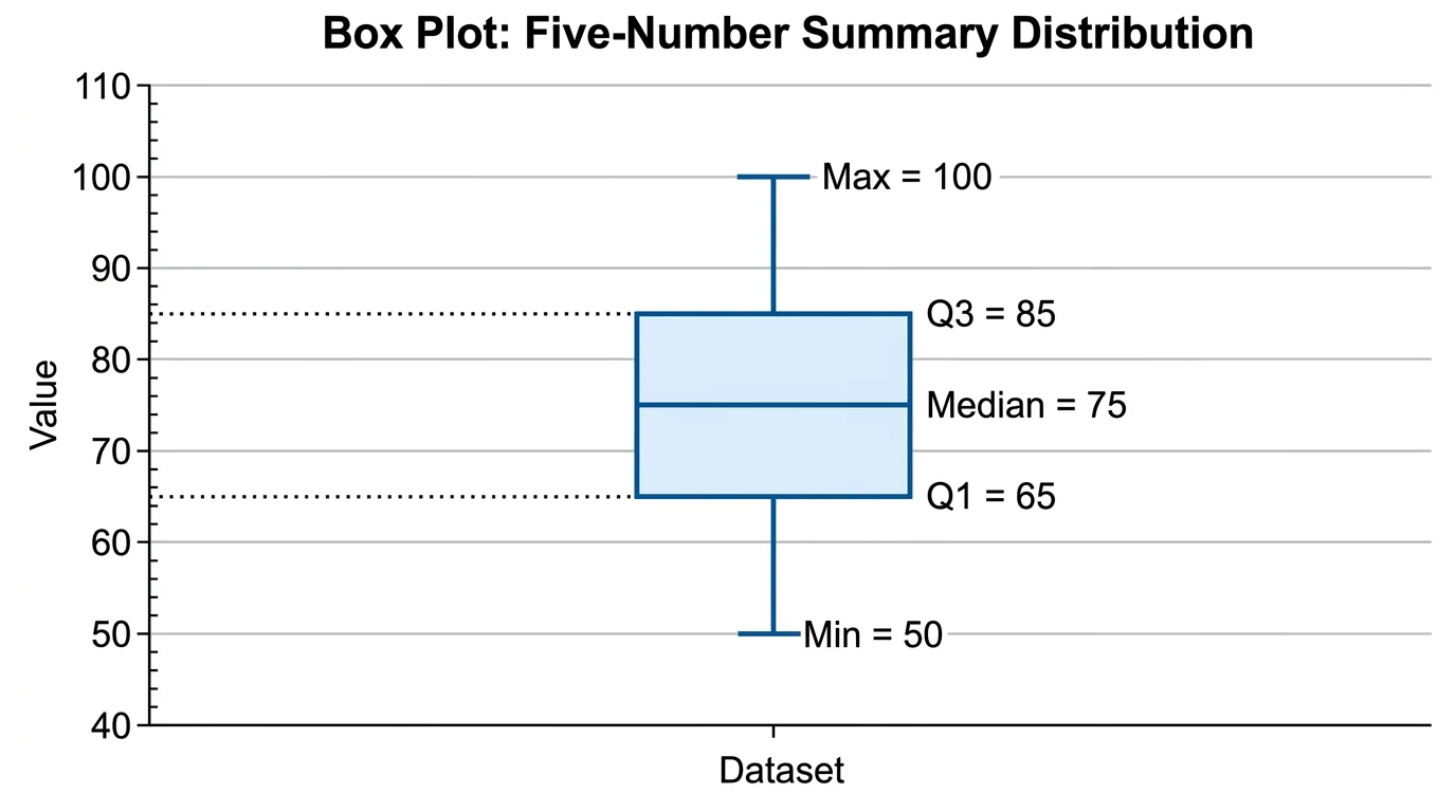
Box Plot Generator
Draw box-and-whisker plots showing quartiles, medians, and outliers.
 Research
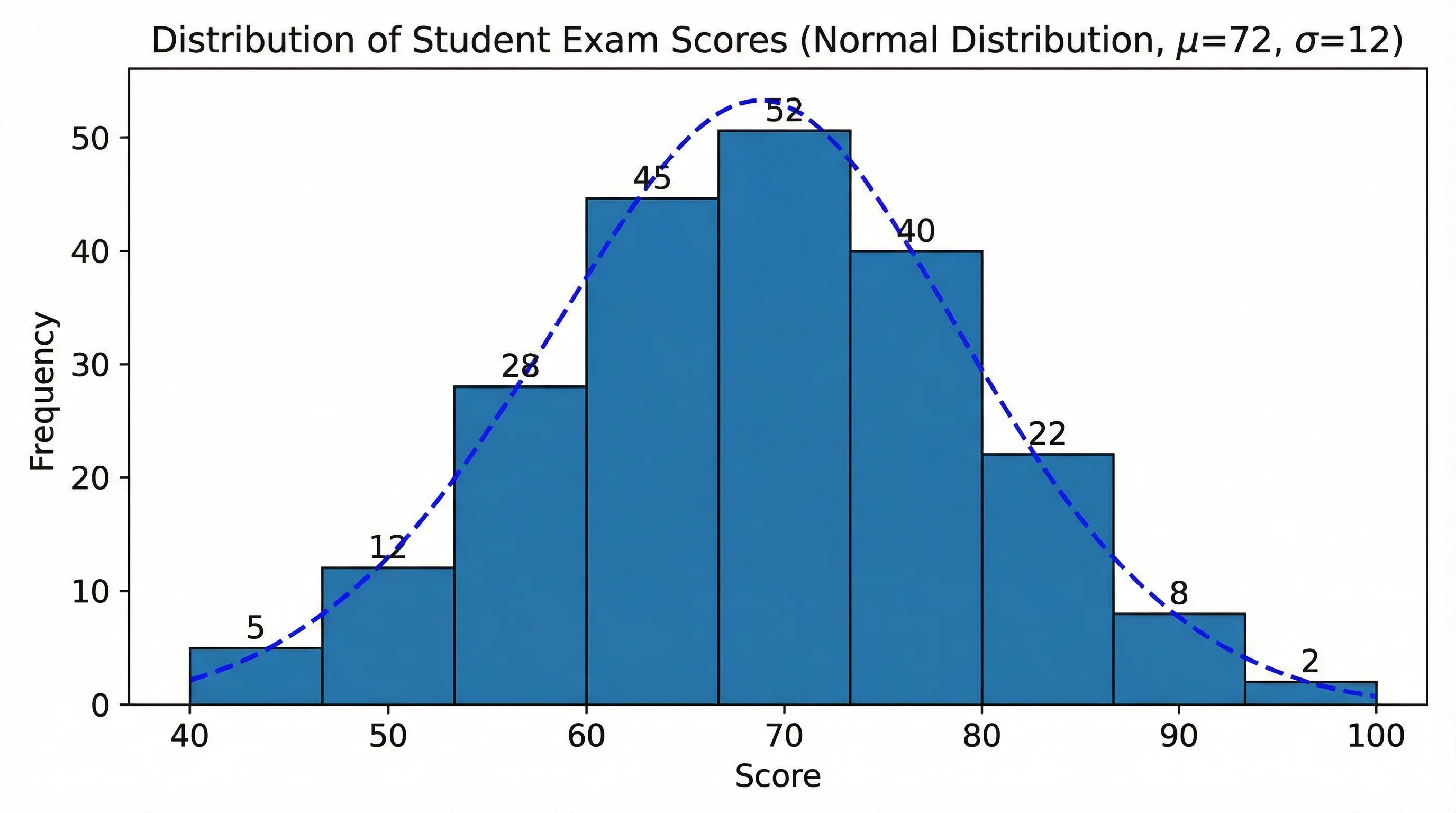
Histogram Maker
Turn a data set into a histogram showing the shape of its distribution.
 Research
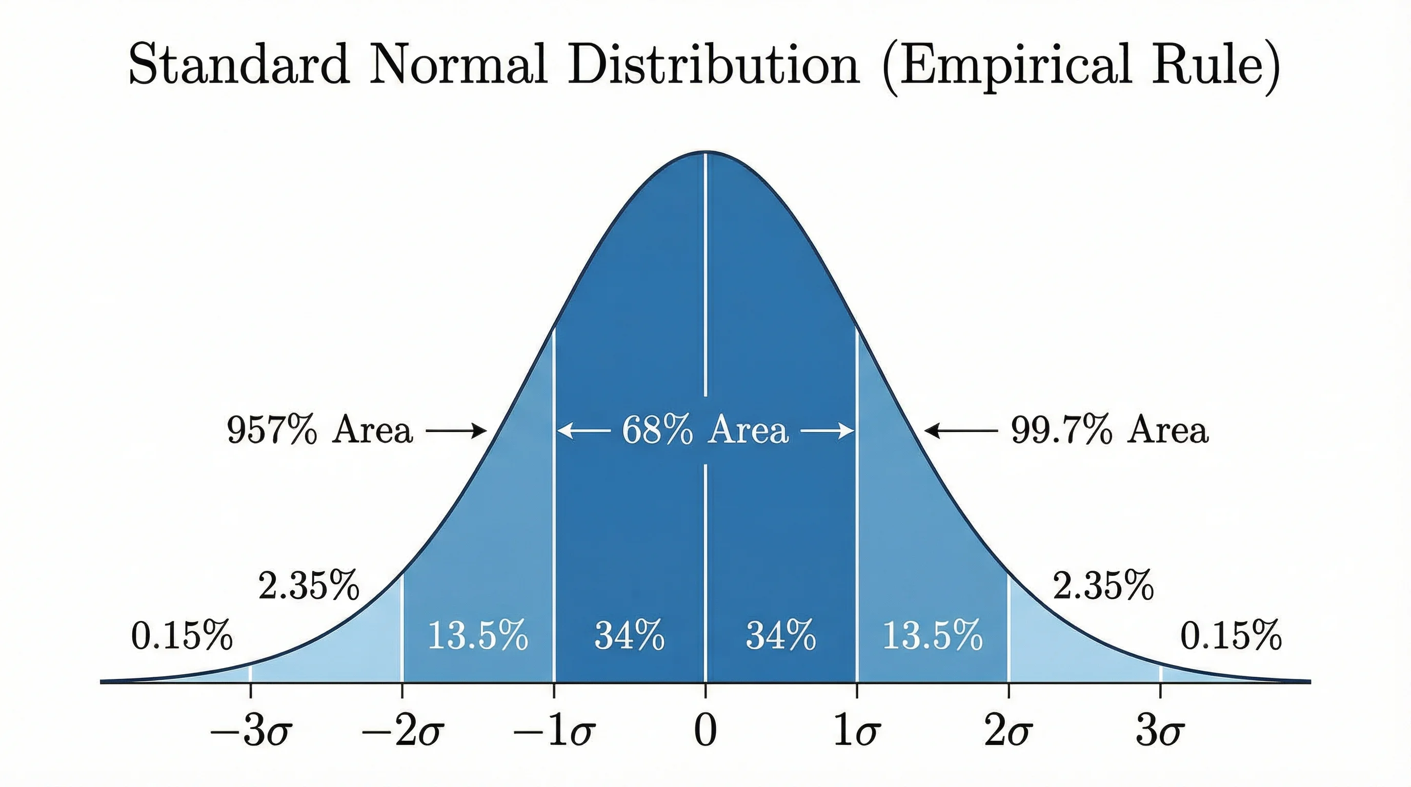
Bell Curve Generator
Plot a normal distribution with shaded areas, z-scores, and standard deviations.