Funnel Plot Generator for Meta-Analysis
Free funnel plot generator for meta-analysis — plot effect vs. standard error with a 95% pseudo-CI funnel and Egger’s test for publication bias. Export SVG.
Enter each study’s effect size and SE (or 95% CI) — renders an exact funnel plot as SVG, free
Studies — effect & SE (log axis)
Egger’s regression test
Intercept = -1.356 (SE 0.378), t(8) = -3.58, p = 0.007
Evidence of funnel asymmetry — possible publication bias or small-study effects.
Funnel Plot Generator
Free to try ·
Your AI funnel plot illustration will appear here
For an exact, data-driven plot, use the Precise Plot tab instead
Funnel Plot Examples
Exact engine renders plus AI illustrations of publication-bias checks
Asymmetric Funnel (Egger Positive)
Exact engine render — ten trials with mild asymmetry; Egger’s test flags possible publication bias.
Symmetric Funnel (No Bias)
Exact engine render — a symmetric scatter consistent with no publication bias.
Publication Bias Explained
AI illustration — how missing small studies create funnel asymmetry.
Risk Ratio on a Log Axis
AI illustration — a risk-ratio funnel plot on a log-scaled x-axis.
The Meta-Analysis Figure Set
AI illustration — the funnel plot alongside its companion PRISMA and forest plot figures.
SMD Funnel with an Outlier
AI illustration — an SMD funnel plot with one study outside the pseudo-confidence limits.
What is a funnel plot?
A funnel plot is a scatter plot used in meta-analysis to detect publication bias and other small-study effects. Each study is one point: its effect size (an odds ratio, risk ratio, or mean difference) sits on the horizontal axis, and its standard error sits on the vertical axis — inverted, so large, precise studies appear at the top and small studies at the bottom. A vertical line marks the pooled effect, and two dashed lines form the 95% pseudo-confidence-interval funnel: the region where studies would be expected to fall if they differ only by chance. This generator draws that plot from your numbers and runs Egger’s regression test to quantify asymmetry.
How to read funnel plot asymmetry
- With no bias, points scatter symmetrically inside the funnel — tightly at the top, widely at the bottom, like an inverted funnel.
- A gap in one bottom corner — typically missing small studies with null or unfavorable results — suggests publication bias.
- Asymmetry can also come from genuine small-study effects: lower methodological quality, different populations, or selective outcome reporting in small trials.
- Check the Egger’s test result under the plot: an intercept significantly different from zero (p < 0.10) indicates statistically significant asymmetry.
- A funnel plot needs enough studies to be meaningful — with fewer than about 10, the power to detect asymmetry is low.
How to make your funnel plot
- Choose your effect measure — Odds Ratio, Risk Ratio, and Hazard Ratio use a log x-axis; Mean Difference and SMD use a linear x-axis.
- Add a row for each study with its effect size and standard error — or switch to "95% CI → SE" and enter the confidence interval; the tool converts it with SE = (upper − lower) / (2 × 1.96), on the log scale for ratios.
- The tool computes the fixed-effect inverse-variance pooled effect, draws the vertical line and 95% pseudo-confidence funnel, and runs Egger’s regression test automatically.
- Set the title, then download a clean, scalable SVG for your paper, slides, or poster.
Publication bias and why it matters
Publication bias arises when the likelihood of a study being published depends on its results — trials with statistically significant, favorable findings are published faster and more often, while null or unfavorable small studies stay in file drawers. A meta-analysis that only sees the published subset overestimates the true effect. The funnel plot is the classic first-line check: if small studies cluster on the favorable side of the pooled effect with a corresponding gap on the other side, suspect missing studies. Egger’s regression test puts a p-value on that visual impression by regressing each study’s standardized effect (effect / SE) against its precision (1 / SE); a non-zero intercept signals asymmetry. For ratio measures, performing the test on the log scale — as this tool does — is the recommended approach.
Funnel plots alongside forest plots and PRISMA
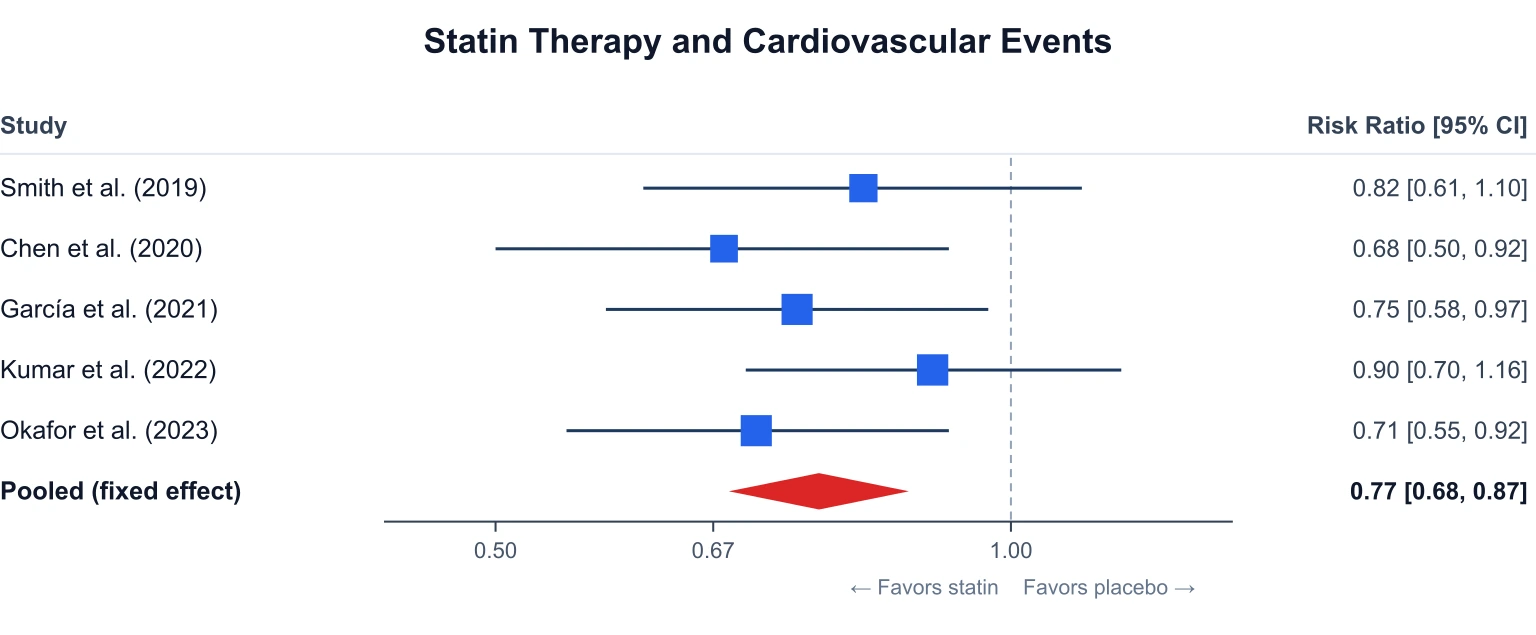
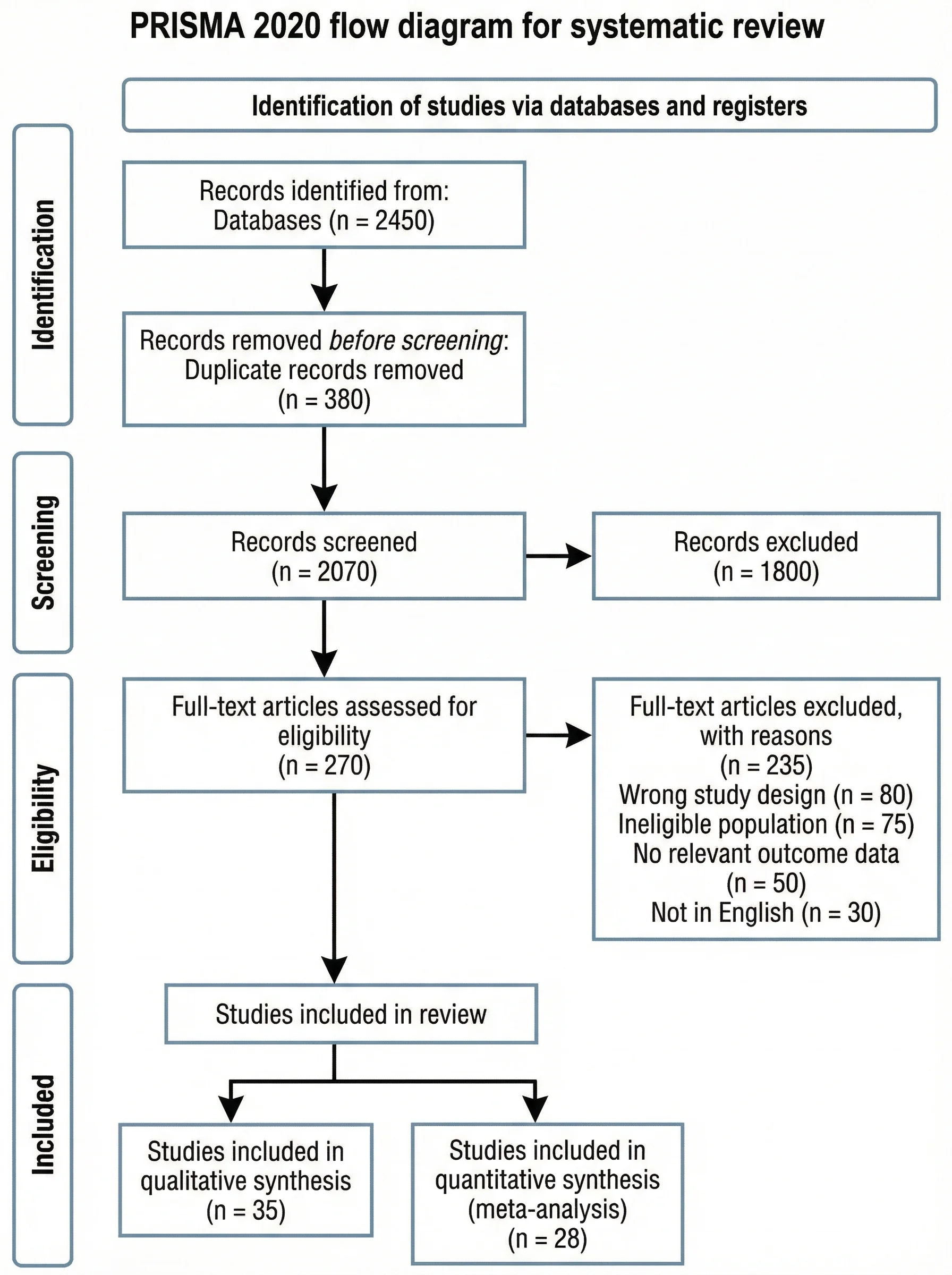
A complete meta-analysis report pairs several figures. The PRISMA flow diagram documents how studies were identified, screened, and included. The forest plot presents each study’s effect size with its confidence interval and the pooled estimate. The funnel plot complements both by interrogating whether the included studies are an unbiased sample of all the evidence. Report the funnel plot whenever you have roughly ten or more studies, and state which asymmetry test you used. Build the matching figures with our forest plot generator and PRISMA flow diagram generator — all three export publication-ready SVGs.
Frequently Asked Questions
Related Research Tools
 Research
Forest Plot Generator
Plot pooled effect sizes with confidence intervals for a meta-analysis.
 Research
PRISMA Flow Diagram Generator
Draw the PRISMA 2020 study-selection flow for a systematic review or meta-analysis.
 Research
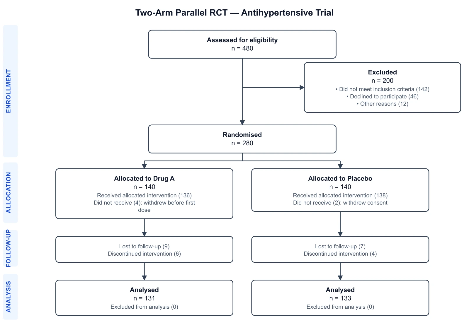
CONSORT Diagram Generator
Build a CONSORT 2010 participant flow diagram for your randomized trial.