Control Chart Generator for Shewhart SPC
Free control chart generator. Paste sequential measurements to draw a Shewhart I-chart with CL, UCL, and LCL, then download SVG.
Paste sequential measurements — renders a Shewhart I-chart with CL, UCL, and LCL as SVG, free
Measurements
Paste a time order plus a measurement, or a single column. This is a Shewhart I-chart. It does not run X-bar/R, Nelson rules, or Bode plots.
25 observations parsed
n=25 · CL=10.007 · σ̂=0.055 · MR̄=0.062 · no points beyond ±3σ. This page does not run Nelson / Western Electric rules.
Control Chart Generator
Free to try ·
Your AI control-chart illustration will appear here
For a data-accurate plot from measurements, use the Precise Plot tab instead
Control Chart Examples
The first four are exact engine renders from tables. The last two are AI illustrations of Illustration mode.
In control
Exact engine render — pasted measurements, I-chart with 3-sigma limits from moving range.
Mean shift
Exact engine render — later points sit above UCL.
Wait time
Exact engine render — weekday/weekend wait times in order.
Bath temperature
Exact engine render — temperature runs in time order.
AI illustration — Shewhart
AI illustration of Illustration mode — visual mockup, not plotted from measurements.
AI illustration — teaching
AI illustration of Illustration mode — visual mockup, not a fitted process.
What is a control chart?
A Shewhart control chart plots a process in time order against its own natural variation. The center line (CL) is the mean. The upper and lower control limits (UCL, LCL) are conventionally mean ± 3 sigma. Points inside the limits are consistent with common-cause variation; a point outside is a special-cause signal worth investigating. This page draws an individuals (I) chart from measurements you already have. It does not run X-bar and R charts, CUSUM, EWMA, or Nelson / Western Electric run rules, and it is not a Bode or Nyquist plot from control theory.
How the limits are calculated
- Paste a time-order column plus a measurement, or a single column. The default sigma uses the average moving range divided by d2 = 1.128 (n = 2), which is the textbook individuals-chart estimator. Sample standard deviation is an optional second method. Limits are 3-sigma around the mean of the series you pasted.
- A run chart is the same series without limits. A histogram ignores time order. A Pareto chart ranks categories, not sequential measurements.
Control chart versus a run chart or Bode plot
Use this page when you want Shewhart limits on a process you already measured. Use a histogram to see the distribution without time. Use the fishbone diagram after a special-cause point to list candidate causes. Do not use this page for Bode / Nyquist / root-locus plots of a transfer function — those live on the control-theory tools.
Export
Download a scalable SVG with no watermark and no account required for the precise plot. The AI Illustration tab is only for slides when you do not have measurements yet — it will not match your process.
Frequently Asked Questions
Related Research Tools
 Research
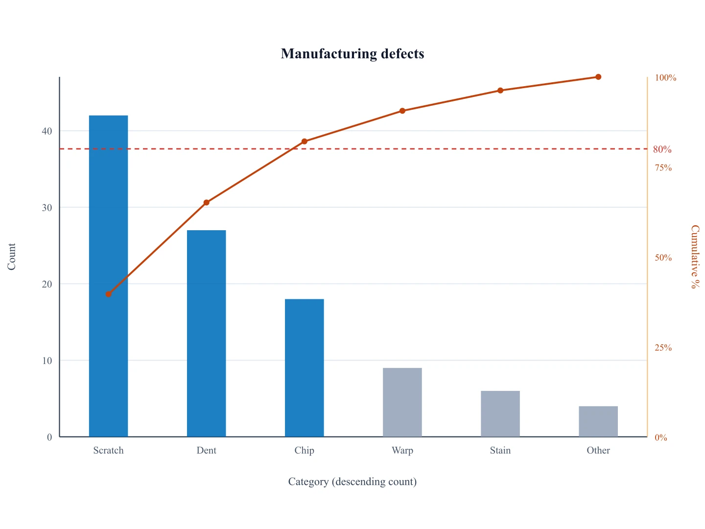
Pareto Chart Generator
Ranked counts plus an 80/20 cumulative line — a different quality chart from a time-ordered I-chart.
 Research
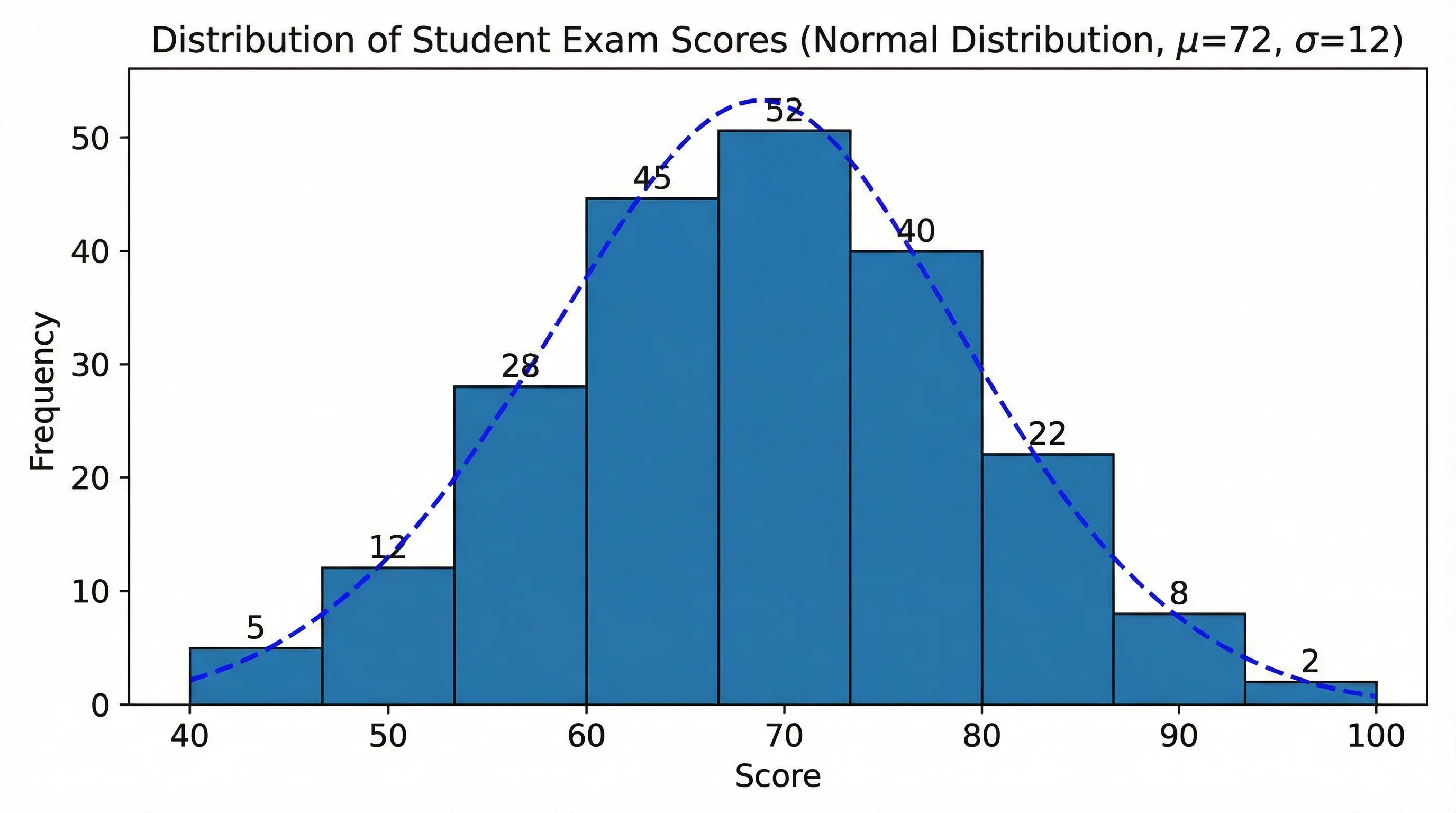
Histogram Maker
See the distribution of the same measurements without time order.
 Research
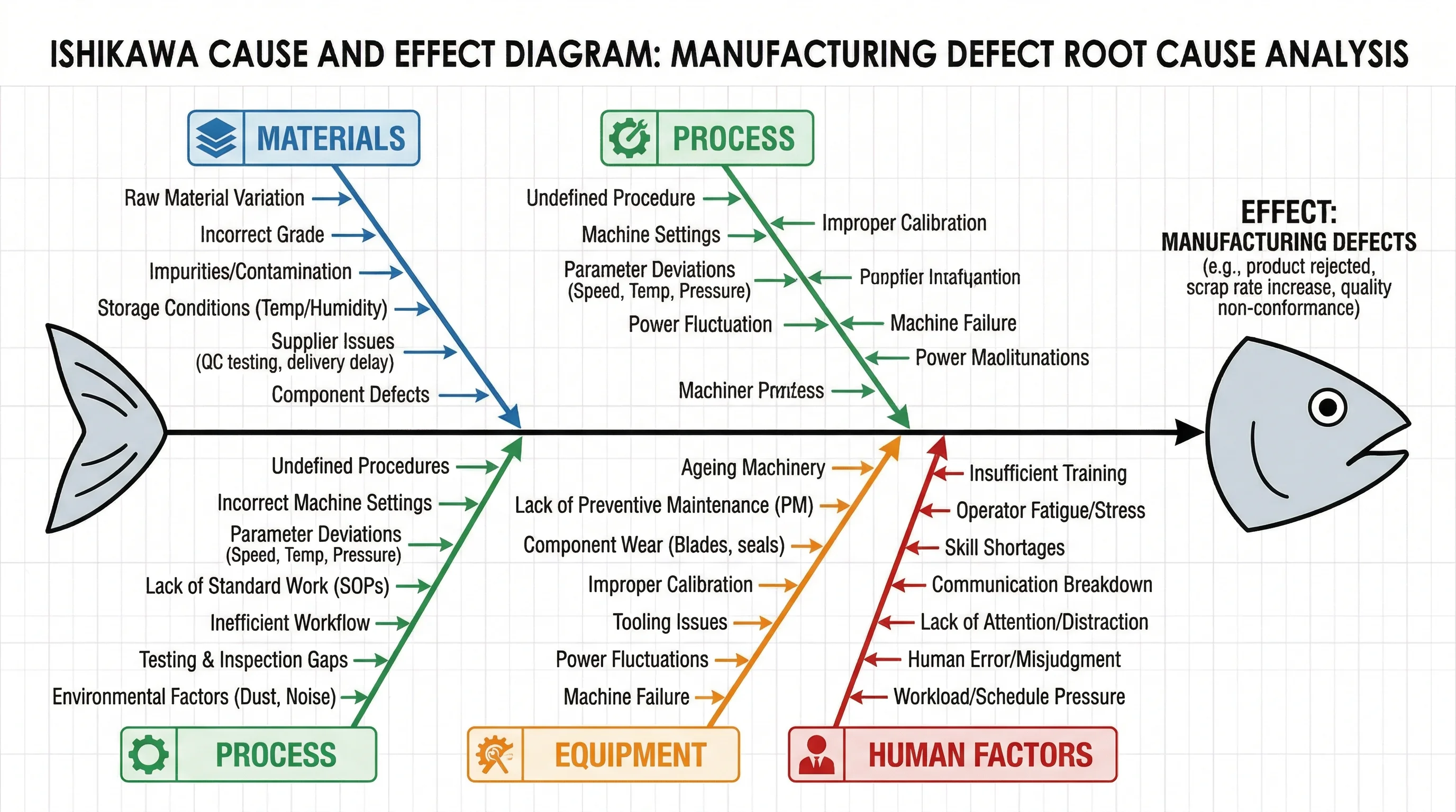
Fishbone Diagram Generator
After a point sits outside the limits, map candidate causes on an Ishikawa diagram.
 Research
Bode Plot Generator
Need magnitude and phase of G(jω)? That is a Bode plot, not a Shewhart chart.