Confounding
A common cause L of exposure A and outcome Y opens the non-causal path A <- L -> Y; adjusting for L blocks it.
Free causal diagram maker. Type one arrow per line, get a clean DAG with exposure, outcome, confounder, mediator and collider styling. Download SVG or PNG.
Write A -> B, chains like A -> B -> C, roles like smoking [exposure], and quotes for names with spaces. Lines starting with # are comments.
Roles: exposure, outcome, confounder, mediator, collider, unobserved.
Each figure below is drawn live by the tool from the text behind it. Load one into the editor to change it. Sources: Hernan and Robins, Causal Inference: What If (chapters 6 to 8), and Greenland, Pearl and Robins (1999), Epidemiology 10(1):37-48.
A common cause L of exposure A and outcome Y opens the non-causal path A <- L -> Y; adjusting for L blocks it.
M lies on the causal path from A to Y; adjusting for M blocks that indirect path, so the result is no longer the total effect of A.
The path A <- U1 -> C <- U2 -> Y is blocked at the collider C; adjusting for C opens it and creates a non-causal association between A and Y.
A and Y both affect selection S; analysing only the selected people (conditioning on S) can make A and Y associated even when neither causes the other.
Writing a thesis rather than drawing a causal model? The conceptual framework generator lays out variables and relationships without the causal assumptions of a DAG. For adjustment sets, use DAGitty.
A causal diagram is a drawing of your assumptions about what causes what. Each variable is a node and each arrow means "may have a direct causal effect on". In epidemiology and the social sciences the usual form is the causal directed acyclic graph, or DAG: arrows have one direction and there are no loops. Drawing the DAG before the analysis makes the assumptions visible to co-authors and reviewers, and it is the starting point for deciding which variables to adjust for. The standard references are Greenland, Pearl and Robins (1999), "Causal diagrams for epidemiologic research", Epidemiology 10(1):37-48, and Hernan and Robins, "Causal Inference: What If".
Almost every DAG is built from a few patterns. A confounder is a common cause, so it creates a non-causal association between exposure and outcome that adjustment removes. A mediator sits on the causal path, so adjusting for it removes the indirect part of the effect. A collider is a variable where two arrowheads meet on a path, so that path is closed until you condition on the collider or a descendant of it, and conditioning opens the path (M-bias is the best-known example). Selection bias is the same collider logic applied to who ends up in your study: if exposure and outcome both influence selection, analysing only the selected people can create an association. The examples above are drawn live by this tool, and Hernan and Robins explain each in detail in chapters 6 to 8 (graphs, confounding, selection bias) and chapter 23 (mediation).
DAGitty (dagitty.net, checked October 2026) describes itself as a browser-based environment for creating, editing and analyzing causal diagrams, and it is free and open source. It computes minimal sufficient adjustment sets, testable implications and d-separation, and there is an R package. This page does none of that. It does not tell you what to adjust for. Use DAGitty when you need adjustment sets or implied conditional independencies. Use this page when you already have the structure and want a clean, consistent figure for a paper, thesis, slide or protocol, with shapes and colors for the roles and an export that opens in any editor.
It does not compute adjustment sets, check d-separation, test your DAG against data or tell you whether your assumptions are right. A DAG is only as good as the subject-matter knowledge behind it. The tool also draws a DAG, not a graph with feedback: if two variables affect each other over time, give each time point its own node. The same layout works for any acyclic graph, such as task dependencies, but it does not read pipeline code. Everything runs in your browser and the text you type is not uploaded.
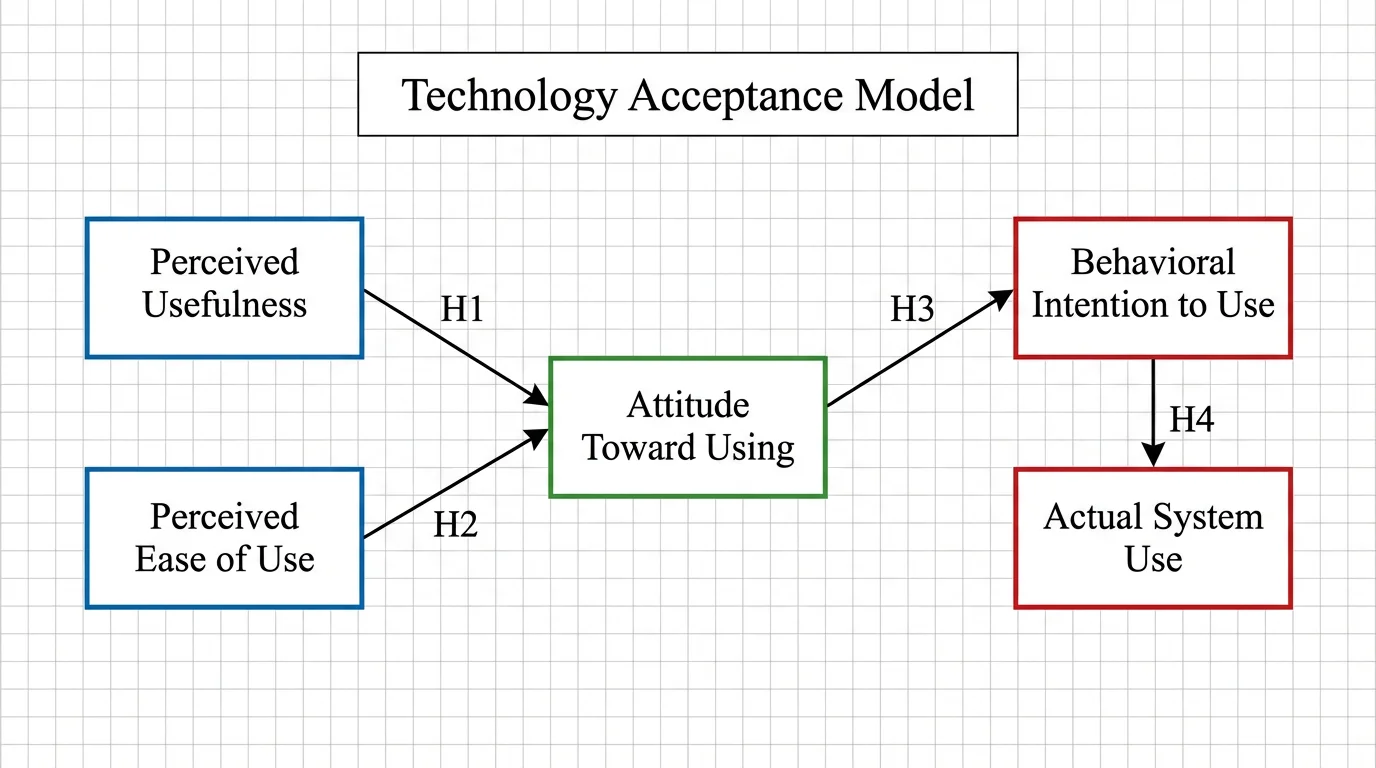 Research
Map the variables and relationships of a thesis or research study when you need a conceptual framework rather than a causal DAG.
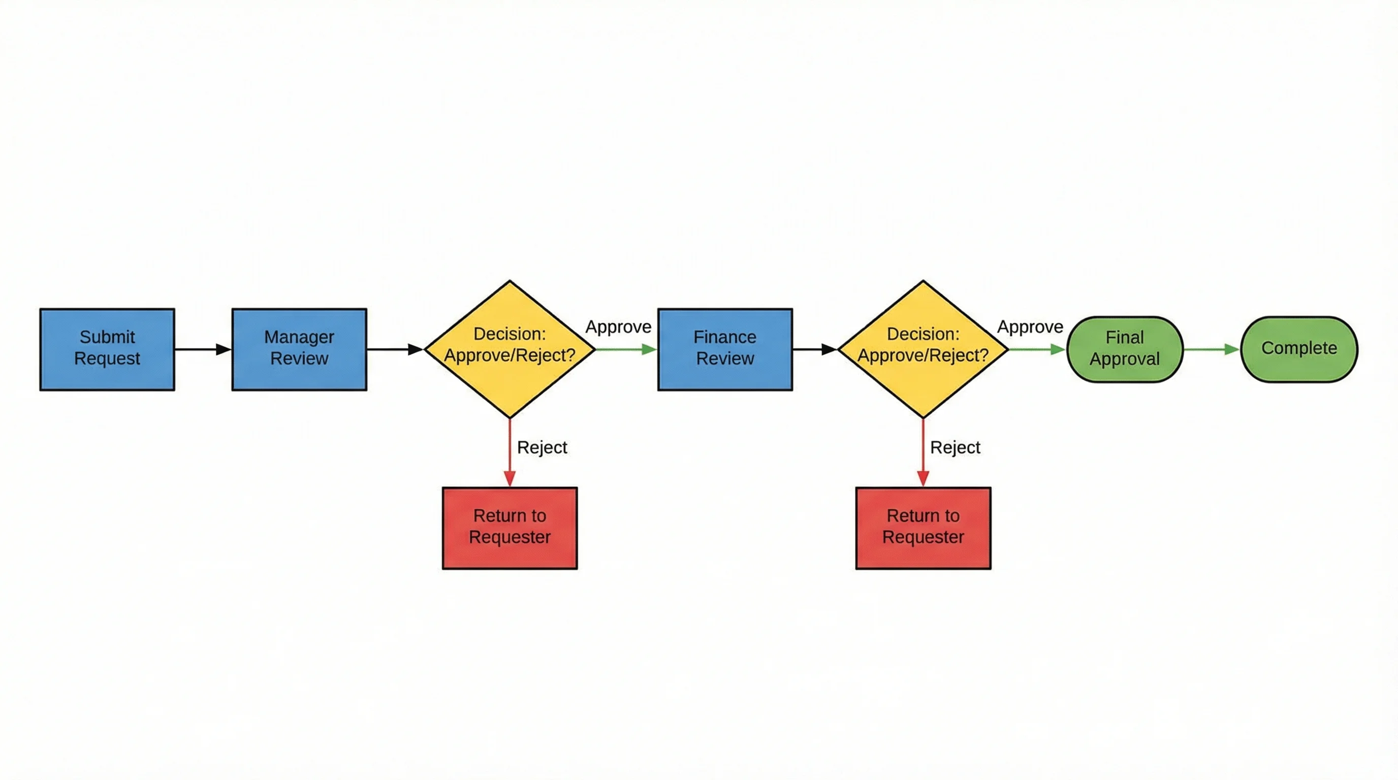 Diagrams
Draw process steps and decisions. A flowchart shows a procedure, while a DAG states causal assumptions.
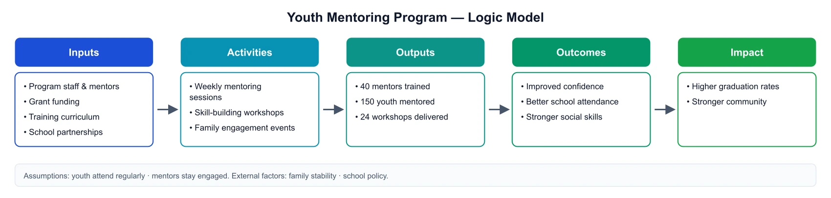 Research
Lay out inputs, activities, outputs and outcomes for a program, a close relative of a causal pathway figure.