Scientific Infographic Design: A Complete Guide for Researchers & Educators
Learn how to create compelling scientific infographics for research, teaching, and social media. Covers layouts, data visualization, design principles, tools.
In an era of information overload, scientific infographics have become essential tools for researchers, educators, and science communicators. They transform complex data and concepts into visually engaging, easily digestible content that reaches broader audiences.
Whether you're creating an infographic for a conference poster, social media, classroom teaching, or public science communication, this guide will help you design effective scientific infographics that inform and inspire.
What is a Scientific Infographic?
A scientific infographic is a visual representation of scientific information, data, or concepts designed to communicate complex ideas quickly and clearly. Unlike general infographics used in marketing, scientific infographics prioritize:
- Accuracy: Every data point, statistic, and claim must be verifiable
- Clarity: Complex concepts must remain scientifically accurate while being accessible
- Credibility: Sources must be cited; claims must be supported
- Objectivity: Visual representations must not mislead or exaggerate
Scientific Infographics vs. General Infographics
| Aspect | Scientific Infographic | General Infographic |
|---|---|---|
| Primary Goal | Accurate communication | Engagement/marketing |
| Data Standards | Must cite sources | Often simplified |
| Audience | Researchers, students, educated public | General consumers |
| Design Approach | Clarity over flash | Visual impact first |
| Fact-checking | Essential | Variable |
| Complexity | Can include technical details | Usually simplified |
Common Uses for Scientific Infographics
1. Academic Posters
Conference posters are perhaps the most traditional use of scientific infographics. They condense months or years of research into a single visual narrative.
For detailed poster guidance, see our Scientific Poster Examples guide.
2. Social Media Science Communication
Platforms like Twitter/X, Instagram, and LinkedIn have become vital channels for sharing research. Infographics designed for social media must:
- Work at small sizes (mobile-first design)
- Grab attention in crowded feeds
- Communicate one key message quickly
- Include handles/links for attribution
3. Educational Materials
Teachers and professors use infographics to:
- Explain complex processes (photosynthesis, cellular division)
- Compare concepts (mitosis vs. meiosis)
- Summarize large topics for review
- Create engaging study materials
4. Public Science Communication
Science journalists, museums, and public health organizations use infographics to:
- Make research findings accessible to non-experts
- Communicate health guidelines
- Explain environmental issues
- Build scientific literacy
5. Graphical Abstracts
Many journals now require or encourage graphical abstracts—single-image summaries of papers. These are essentially infographics distilled to their essence.
Learn more in our Graphical Abstract Guide.
The Six Types of Scientific Infographic Layouts
Choosing the right layout is crucial. Match your layout to your content type:
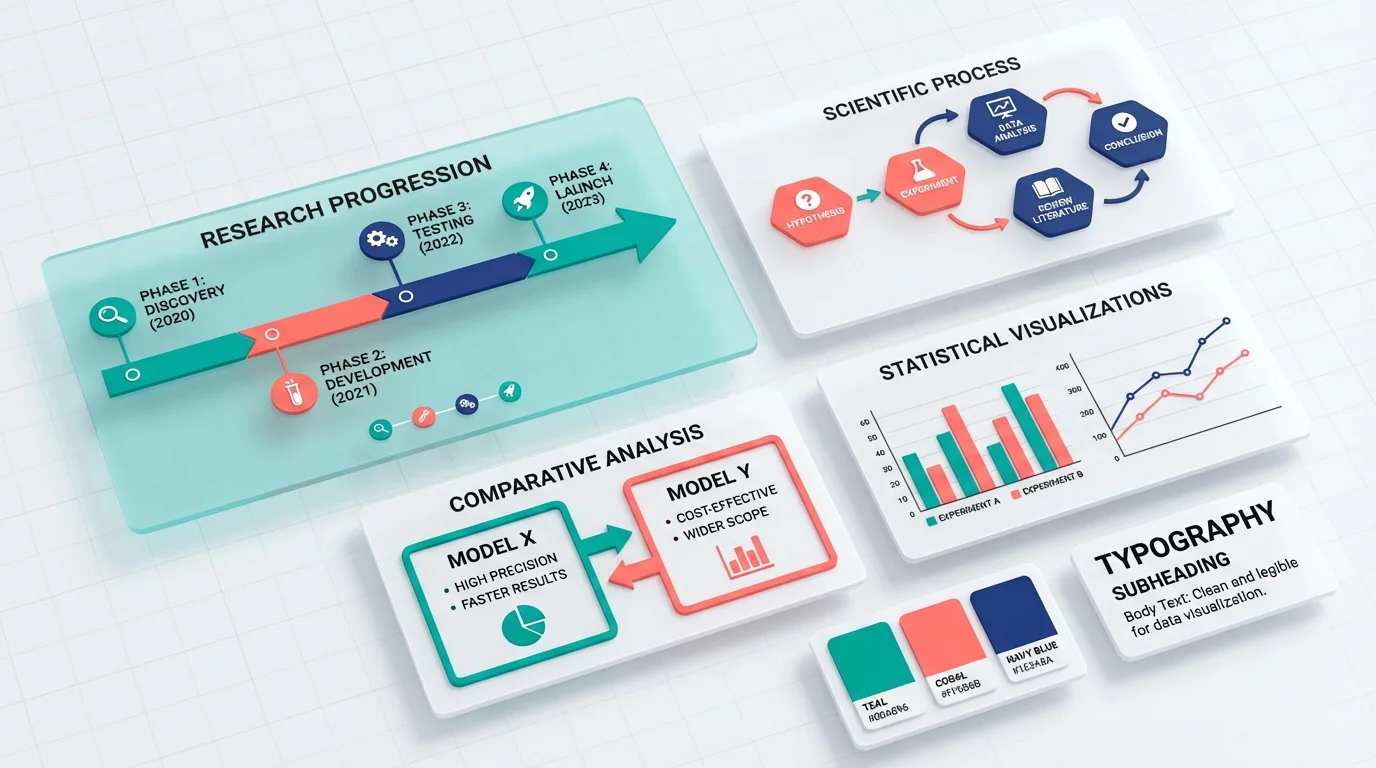
1. Timeline Layout
Best for: Historical developments, research progression, evolutionary changes
Structure: Linear arrangement showing chronological sequence
Use when:
- Showing how a field/technology evolved
- Presenting research phases
- Comparing changes over time
Example topics:
- History of vaccine development
- Evolution of a species
- Phases of a clinical trial
2. Process/Flowchart Layout
Best for: Methodologies, procedures, cause-and-effect relationships
Structure: Connected nodes showing sequential steps or decision points
Use when:
- Explaining experimental methods
- Showing how systems work
- Illustrating decision frameworks
Example topics:
- CRISPR gene editing process
- Water cycle
- Machine learning pipeline
3. Comparison Layout
Best for: Contrasting methods, species, treatments, or concepts
Structure: Side-by-side or split design highlighting differences
Use when:
- Comparing two approaches
- Showing before/after states
- Presenting pros and cons
Example topics:
- Plant cell vs. animal cell
- Treatment A vs. Treatment B outcomes
- Traditional vs. modern techniques
4. Statistical/Data Layout
Best for: Research findings, survey results, quantitative data
Structure: Charts, graphs, and numbers as primary elements
Use when:
- Presenting research results
- Showing trends and patterns
- Communicating statistics
Example topics:
- Climate change data
- Public health statistics
- Survey findings
5. Geographic/Map Layout
Best for: Spatial distributions, regional comparisons, global phenomena
Structure: Map-based visualization with data overlays
Use when:
- Showing where something occurs
- Comparing regions
- Illustrating spread or migration
Example topics:
- Disease outbreak mapping
- Species distribution
- Climate patterns by region
6. Hierarchical Layout
Best for: Classifications, organizational structures, taxonomies
Structure: Tree diagrams, pyramids, or nested structures
Use when:
- Showing category relationships
- Explaining taxonomies
- Presenting organizational concepts
Example topics:
- Biological classification
- Protein structure levels
- Theoretical frameworks
Design Principles for Scientific Infographics
1. Accuracy First
Never sacrifice accuracy for visual appeal. Every element must be:
- Factually correct: Verify all data and claims
- Properly sourced: Include citations or references
- Proportionally accurate: Bar charts and pie charts must reflect real ratios
- Up-to-date: Use the most current data available
2. Clear Visual Hierarchy
Guide viewers through your content with intentional design:
- Primary information: Largest, most prominent
- Secondary information: Supporting details, smaller
- Tertiary information: Sources, credits, fine print
Use size, color, and position to establish hierarchy.
3. Strategic Color Use
Colors in scientific infographics should:
- Aid comprehension: Use color to group related items
- Ensure accessibility: Consider colorblind viewers
- Maintain professionalism: Avoid garish or distracting palettes
- Be consistent: Same colors should mean the same things throughout
For science-appropriate palettes, see our Scientific Color Palette Guide.
4. Readable Typography
Text in infographics must be legible at the intended viewing size:
- Sans-serif fonts for most text (Arial, Helvetica, Open Sans)
- Adequate size: Minimum 12pt for print, 16px for digital
- High contrast: Dark text on light backgrounds (or vice versa)
- Limited font families: 2-3 maximum
For detailed font guidance, check our Best Fonts for Scientific Posters.
5. Effective White Space
Resist the urge to fill every pixel:
- White space improves readability
- Groups related elements together
- Creates visual breathing room
- Makes key elements stand out
Rule of thumb: If it feels crowded, remove something.
Data Visualization Best Practices
Data visualization is often the heart of scientific infographics. Get it right:
Choose the Right Chart Type
| Data Type | Best Chart Options |
|---|---|
| Comparison | Bar chart, grouped bar chart |
| Trend over time | Line chart, area chart |
| Part-to-whole | Pie chart (limited), stacked bar |
| Distribution | Histogram, box plot |
| Correlation | Scatter plot |
| Geographic | Map, choropleth |
Common Data Visualization Mistakes
1. Misleading axes
- Always start bar charts at zero
- Label axes clearly with units
- Don't truncate scales to exaggerate differences
2. Poor color choices
- Don't use red and green together (colorblind accessibility)
- Avoid rainbow color scales for sequential data
- Use consistent color meanings
3. Overcrowding
- Don't include every data point if it obscures the message
- Simplify where possible while maintaining accuracy
- Use annotations to highlight key findings
4. Missing context
- Include sample sizes
- Show error bars or confidence intervals when relevant
- Provide time frames and data sources
Annotation Strategies
Good annotations transform charts from confusing to clear:
- Call out key findings with arrows or highlighting
- Explain anomalies directly on the chart
- Provide context for unusual patterns
- Include "so what?" interpretation
Creating Scientific Infographics: Step-by-Step
Step 1: Define Your Goal
Before designing, answer:
- Who is your audience?
- What one thing should they learn?
- Where will this be displayed?
- What action (if any) should they take?
Step 2: Gather and Verify Content
- Collect all data and facts
- Verify accuracy with primary sources
- Note all citations needed
- Identify the key message
Step 3: Choose Your Layout
Based on your content type, select from:
- Timeline (chronological)
- Process (steps/methodology)
- Comparison (contrasting)
- Statistical (data-focused)
- Geographic (location-based)
- Hierarchical (classification)
Step 4: Sketch a Rough Layout
Before going digital:
- Draw a rough wireframe
- Establish visual hierarchy
- Plan the reading flow
- Identify where visuals go
Step 5: Create Visual Elements
This is where tools matter:
- For diagrams: ConceptViz, Adobe Illustrator, Figma
- For charts: Excel, Python/R, Datawrapper
- For icons: Noun Project, Flaticon
- For assembly: Canva, PowerPoint, InDesign
Step 6: Refine and Review
- Check all data for accuracy
- Ensure text is readable at intended size
- Test with someone unfamiliar with the topic
- Verify color accessibility
- Add proper citations
Step 7: Export Appropriately
| Use Case | Format | Resolution |
|---|---|---|
| Print (poster) | PDF, PNG | 300 DPI |
| Web/social | PNG, SVG | 72-150 DPI |
| Presentation | PNG | 150 DPI |
| Journal submission | TIFF, EPS | Per journal guidelines |
Common Mistakes in Scientific Infographics
Mistake #1: Information Overload
Problem: Trying to include everything results in a cluttered, unreadable mess.
Fix: Focus on one main message. Create multiple infographics rather than one overcrowded one.
Mistake #2: Misleading Visualizations
Problem: Charts that distort data through improper scaling, 3D effects, or cherry-picked data.
Fix: Always use accurate proportions. Start bar charts at zero. Avoid 3D effects that distort perception.
Mistake #3: Missing Citations
Problem: Claims without sources undermine credibility.
Fix: Include a references section or footnotes. Use DOI links in digital versions.
Mistake #4: Poor Accessibility
Problem: Relying only on color to convey meaning excludes colorblind viewers.
Fix: Use patterns, labels, and shapes in addition to color. Test with colorblind simulators.
Mistake #5: Outdated Information
Problem: Using old data when newer data is available.
Fix: Always use the most recent reliable data. Include dates on data sources.
Mistake #6: Inconsistent Style
Problem: Mixing fonts, colors, and styles creates visual chaos.
Fix: Establish a style guide before starting. Use the same colors, fonts, and icon styles throughout.
Mistake #7: Ignoring the Audience
Problem: Using jargon with general audiences or oversimplifying for experts.
Fix: Know your audience and adjust complexity accordingly.
Tools for Creating Scientific Infographics
For Diagram Creation
- ConceptViz: AI-powered scientific diagram generation from text descriptions
- Adobe Illustrator: Professional vector graphics (steep learning curve)
- Figma: Free, collaborative design tool
- BioRender: Specialized for life sciences
For Data Visualization
- Python (Matplotlib, Seaborn): Programmable, reproducible charts
- R (ggplot2): Statistical graphics
- Datawrapper: Web-based, easy charts
- Tableau: Interactive dashboards
For Layout and Assembly
- Canva: Template-based, beginner-friendly
- Adobe InDesign: Professional page layout
- PowerPoint: Familiar interface, good for basic infographics
- Piktochart: Infographic-specific tool
For more tool options, see our guides on Canva Alternatives and Adobe Illustrator Alternatives.
Frequently Asked Questions
What size should a scientific infographic be?
It depends on the use case. For social media, use platform-specific sizes (Instagram: 1080×1080px or 1080×1350px; Twitter: 1200×675px). For print posters, A0 (841×1189mm) or A1 (594×841mm) at 300 DPI. For web articles, aim for 800-1200px wide. Always design at the largest size you'll need and scale down.
How do I cite sources in an infographic?
Include a 'Sources' or 'References' section at the bottom of your infographic. For digital versions, use shortened URLs or DOI links. For print, list author, year, and publication. In data visualizations, add small superscript numbers linking to your reference list. Always include the date data was accessed for web sources.
How many colors should I use in a scientific infographic?
Limit your palette to 3-5 colors maximum. Use 1-2 primary colors for main elements, 1-2 secondary colors for supporting elements, and neutral colors (black, white, gray) for text and backgrounds. Ensure sufficient contrast for readability and consider colorblind accessibility.
How do I make my infographic accessible to colorblind viewers?
Never use color alone to convey meaning. Pair colors with patterns, labels, or shapes. Avoid red-green combinations. Use high contrast between elements. Test your design with colorblind simulation tools like Coblis or the Colorblinding Chrome extension. Consider using colorblind-friendly palettes like Okabe-Ito or viridis.
What's the difference between an infographic and a graphical abstract?
A graphical abstract is a specific type of infographic summarizing a single research paper, typically required by journals. It's usually a single image (often square) that captures the key finding and methodology of one study. General scientific infographics can cover broader topics, multiple studies, or educational concepts without being tied to a specific paper.
How long does it take to create a scientific infographic?
A simple infographic might take 2-4 hours for someone experienced. Complex infographics with custom illustrations and data visualizations can take 1-2 days or more. Factor in time for research, fact-checking, design iteration, and review. Using AI tools like ConceptViz can significantly speed up diagram creation.
Can I use icons and illustrations I find online?
Only if they're properly licensed. Use resources like The Noun Project, Flaticon, or Freepik that offer icons with clear licensing. Always check whether attribution is required. For scientific accuracy, be cautious of generic icons that might not accurately represent scientific concepts. When possible, create custom illustrations or use specialized scientific icon libraries.
Should I include my institution's logo?
It depends on the context. For conference posters and official institutional communications, yes—typically in a corner without dominating the design. For social media science communication or educational materials, it's optional. Check your institution's branding guidelines for logo usage requirements. Never distort the logo's proportions.
Conclusion
Scientific infographics are powerful tools for communicating research and educating audiences. The best scientific infographics share these qualities:
- Accuracy above all: Every element is verified and properly sourced
- Clear visual hierarchy: Viewers know where to look and in what order
- Appropriate complexity: Matched to the target audience
- Effective data visualization: Charts that clarify rather than confuse
- Consistent, professional design: Cohesive colors, fonts, and style
- Accessible to all: Designed with colorblind and other accessibility needs in mind
Whether you're creating a conference poster, a social media graphic, or educational materials, these principles will help you communicate science effectively through visual design.
Need to create scientific diagrams for your infographic? Try ConceptViz to generate professional, accurate scientific visuals from simple text descriptions. Perfect for researchers and educators who want publication-quality diagrams without extensive design skills.
Categories
More Posts

3 Minute Thesis (3MT): Tips, Slide Examples & Presentation Guide (2026)
3MT tips and winning slide examples. Learn how to design your 3 Minute Thesis slide, structure your presentation, and avoid common mistakes.
AI Worksheet Generator Guide: Create Printable Worksheets and Answer Keys
Learn how to use an AI worksheet generator for printable classroom worksheets, answer keys, differentiation, diagrams, and teacher review workflows.
12 Best Wiring Diagram Software & Apps (2026)
Compare 12 wiring diagram programs and apps for electrical, panel, and automotive work, with prices checked in October 2026, free options, and car lookup apps.