Swimmer Plot Generator from a CSV
Make a swimmer plot online: paste a CSV of subjects, durations, response events and ongoing flags, then export SVG, PNG or CSV. Runs in your browser.
Subject table
One subject per line: id,group,duration,ongoing,events. Events use CODE@time separated by semicolons, for example PR@8;PD@30.
Columns: id and duration are required. group sets the bar colour (an arm, dose level, or best response). ongoing (yes/no) draws an arrow at the end of the bar. Event codes CR, PR, SD, PD, Death and AE get built-in markers; any other code gets its own marker.
16 subjects · 6 ongoing · median duration 29.5 weeks
Swimmer Plot Examples
Exact renders from this generator, using fictional example data
Two-Arm Response Timeline
Exact engine render from fictional example data: two arms, response markers and ongoing arrows.
Dose-Escalation Cohort
Exact engine render from fictional example data: bars coloured by dose level with adverse events.
What is a swimmer plot?
A swimmer plot shows the course of each subject in a study as one horizontal bar. The bar runs from the start of treatment to the end of follow-up, markers on the bar show when events happened, and an arrow at the end of a bar means that subject was still on treatment (or still responding) at the data cut-off. It is most common in oncology and early-phase trials, where a Kaplan–Meier curve hides individual stories: who responded early, who progressed, who is still being treated. Plotting every subject on one time axis makes patterns visible that a summary statistic cannot show.
How to read one
- Each row is one subject, labelled with the subject ID on the left.
- Bar length is time on treatment or time on study, on the x-axis in weeks, months, days or years.
- Bar colour shows a grouping such as treatment arm, dose level, or best overall response.
- Markers show events at the time they occurred, for example a complete response, partial response, progression, adverse event or death.
- An arrow at the end of a bar marks treatment that is ongoing at the cut-off, so the true end of that bar is still unknown.
- Subjects are usually sorted by duration so the longest bars sit at the top and the plot reads like a staircase.
Data format for this generator
- Header row with id and duration (required), then optional group, ongoing and events columns.
- id: any text label for the subject, for example P-01. Use unique IDs.
- duration: a positive number in the unit you select. Time on treatment or time on study, whichever your figure shows.
- group: any text. Each distinct value gets its own bar colour.
- ongoing: yes or no (1 or 0 also work). Yes draws the end-of-bar arrow.
- events: a semicolon-separated list of CODE@time, for example PR@8;CR@24;PD@38. CR, PR, SD, PD, Death and AE use built-in markers. Any other code is drawn with its own shape and listed in the legend.
Swimmer plot vs Kaplan–Meier and forest plots
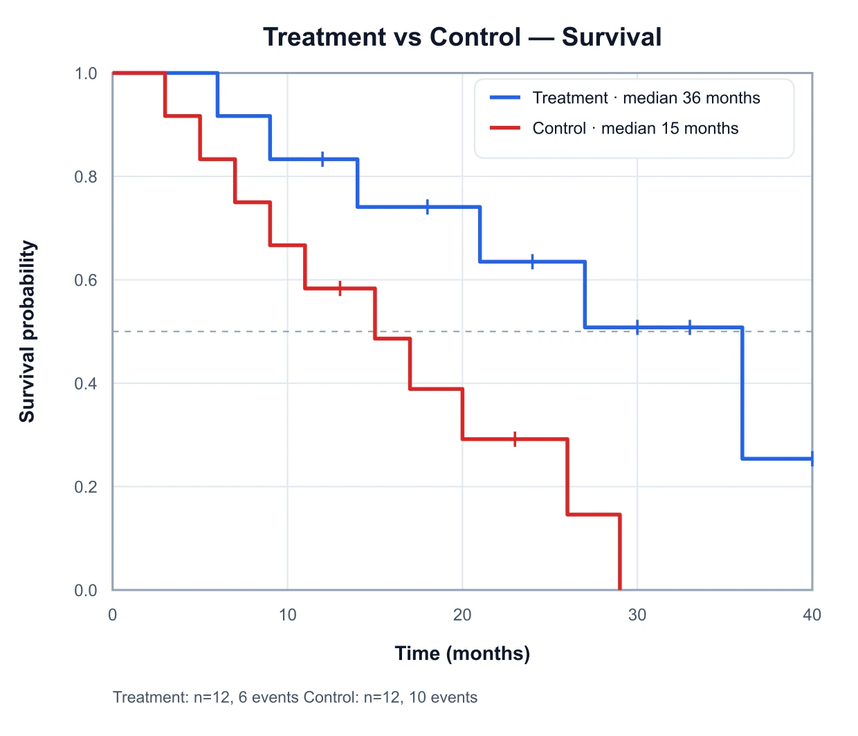
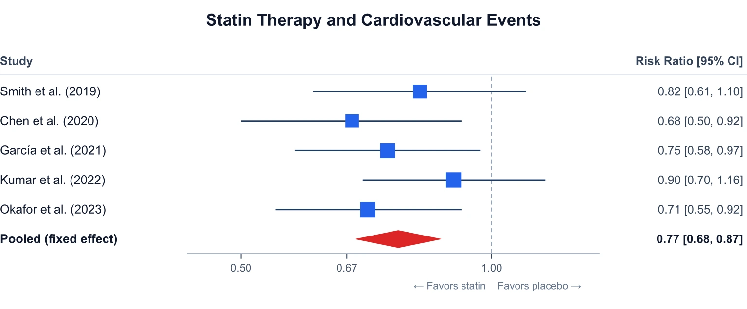
A Kaplan–Meier curve summarises a whole group: the probability of staying event-free over time, with censoring ticks. A swimmer plot keeps every subject separate, so you can see the response timing and the ongoing cases behind that curve. A forest plot sits one level higher still, pooling effect sizes across studies. Many clinical papers and slide decks use all three: swimmer plot for individual courses, Kaplan–Meier for the group-level time-to-event, and forest plot for the pooled estimate.
Using it responsibly
This tool draws the data you give it. It does not check response criteria, derive best overall response, or compute any statistic, and it is not a validated clinical-programming environment. Check durations, event times and ongoing status against your source data before you use the figure, and follow your sponsor, journal or regulator rules for any figure that goes into a submission. The data stay in your browser; nothing in the table is uploaded to draw the plot.
Frequently Asked Questions
Related Clinical & Stats Tools
 Research
Kaplan–Meier Generator
Plot a survival curve with censoring and median survival from event times.
 Research
Forest Plot Generator
Plot effect sizes and confidence intervals with a pooled diamond.
 Research
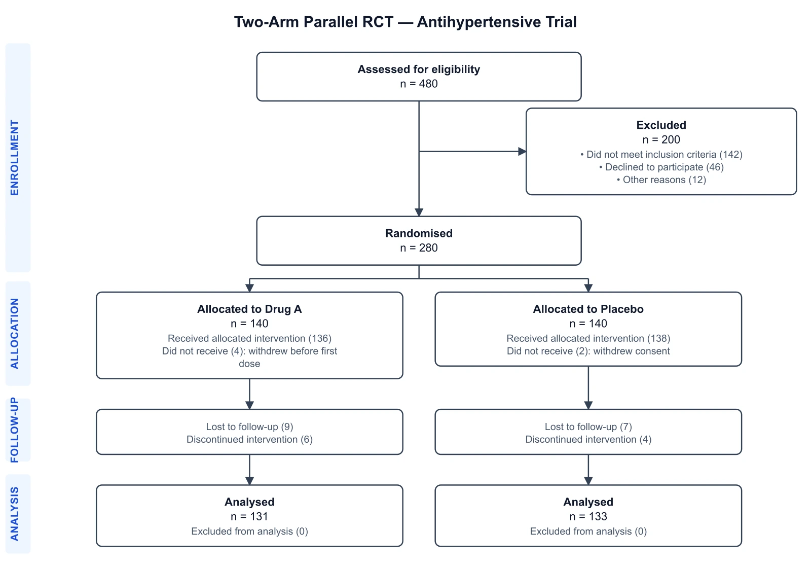
CONSORT Diagram Generator
Draw the participant flow diagram for a randomized trial.
 Research
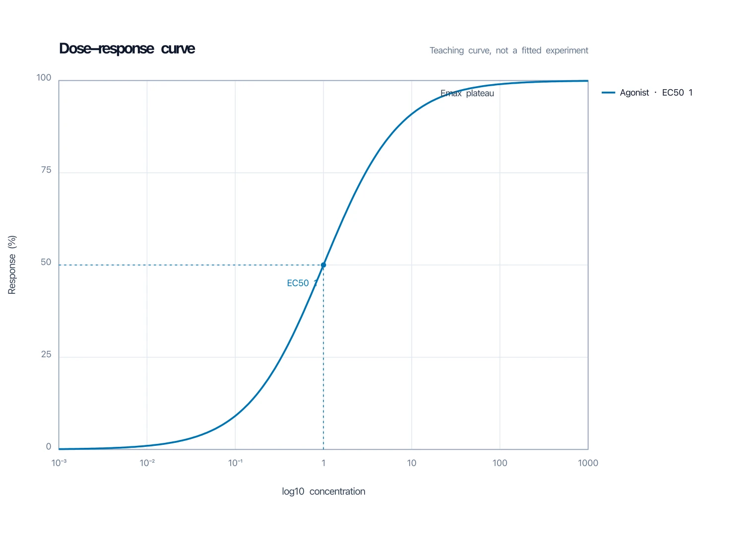
Dose-Response Curve Generator
Fit and plot a dose-response curve with EC50.
 Research
ROC Curve Generator
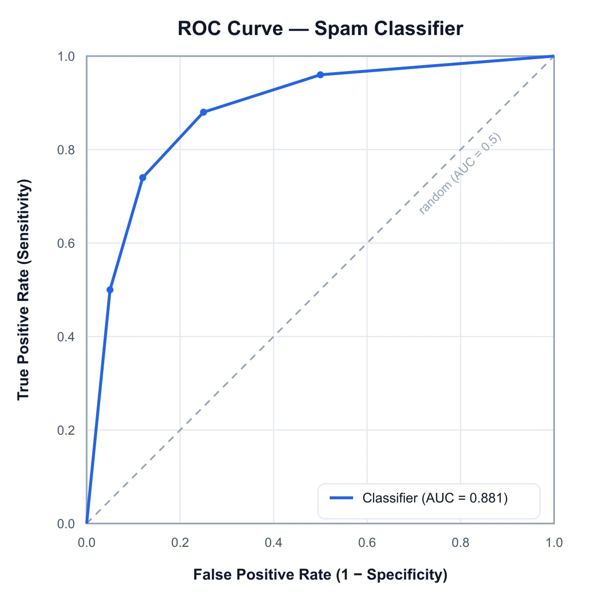
Plot true positive rate against false positive rate and compute the AUC.