Kaplan–Meier Generator for Survival Analysis
Free Kaplan–Meier generator — paste your survival times and censoring to plot a step survival curve with median survival, and compare groups. Export SVG.
Paste your survival times — renders an exact Kaplan–Meier curve with median survival, free
One subject per line: time,status — status 1 for an event (e.g. death) or 0 for a censored observation. Median survival and censoring marks are computed for you.
Kaplan–Meier Generator
Free to try ·
Your AI survival curve will appear here
For an exact curve computed from your data, use the Precise Curve tab instead
Kaplan–Meier Examples
Exact engine renders — single cohorts, group comparisons, and censoring
Treatment vs Control
Exact engine render — two groups with censoring marks and median survival.
Single Cohort
Exact engine render — one cohort as a product-limit step function.
Three-Arm Trial
Exact engine render — three trial arms compared, each with its median.
Oncology Overall Survival
Exact engine render — overall survival for an oncology cohort.
Progression-Free Survival
Exact engine render — progression-free survival for two treatment groups.
Heavy Censoring
Exact engine render — heavy censoring where the median is not reached.
What is a Kaplan–Meier curve?
A Kaplan–Meier curve is the standard way to show survival data — how the probability of "surviving" (not yet having an event such as death, relapse, or failure) changes over time. It is drawn as a step function starting at 100%: each time an event happens, the curve drops, and the size of the drop depends on how many subjects are still at risk. Subjects who leave the study before having an event are censored and marked with a small tick, contributing to the at-risk count up to that point without causing a step. The Kaplan–Meier (product-limit) estimator is the workhorse of survival analysis in medicine, reliability engineering, and the social sciences. This generator computes the estimate and the median survival from the times you paste in, and can overlay several groups to compare them.
Events, censoring, and the at-risk set
- Event: the outcome you are tracking (death, relapse, failure) actually occurred at that time — the curve steps down.
- Censored: the subject was lost to follow-up or the study ended before the event; marked with a tick, no step.
- At risk: the number of subjects still being followed and event-free just before a given time.
- Product-limit estimate: at each event time, survival is multiplied by (1 − events / at-risk), building the step curve.
Median survival and comparing groups
The median survival time is where the curve crosses 50% — the time by which half the subjects have had the event. It is often more meaningful than a mean because survival data are skewed and censored, and it is defined even when many subjects are still alive at the end of follow-up (in which case the median is "not reached"). Comparing two Kaplan–Meier curves shows which group does better over time; a formal comparison uses the log-rank test, and the hazard ratio from a Cox model quantifies the difference. This tool draws the curves and reports the median for each group so you can see the separation; compute the log-rank p-value and hazard ratio in your statistics package and report them alongside.
How to make your Kaplan–Meier curve
- Paste one subject per line as "time,status" — status 1 for an event, 0 for a censored observation.
- Set the time unit (months, days, years) and a title; the curve, censoring marks, and median survival update as you type.
- Add a second or third group to compare survival on the same axes — each gets its own color and median in the legend.
- Download a clean, scalable SVG for your paper, thesis, or slides — free, with no sign-up.
Kaplan–Meier in a survival analysis
The Kaplan–Meier curve is usually the first figure in a survival analysis, giving a model-free picture of the data before any modelling. It pairs naturally with a numbers-at-risk table beneath the x-axis, a log-rank test for the difference between groups, and a Cox proportional-hazards model for adjusted hazard ratios — which are often summarized across studies in a forest plot. This tool focuses on the curve itself, computed exactly from your data with censoring handled correctly; for the pooled hazard ratio across trials, use the forest plot generator.
Frequently Asked Questions
Related Data & Stats Tools
 Research
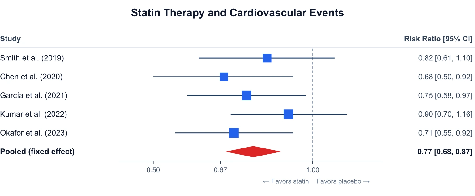
Forest Plot Generator
Plot pooled hazard ratios and confidence intervals for a meta-analysis.
 Research
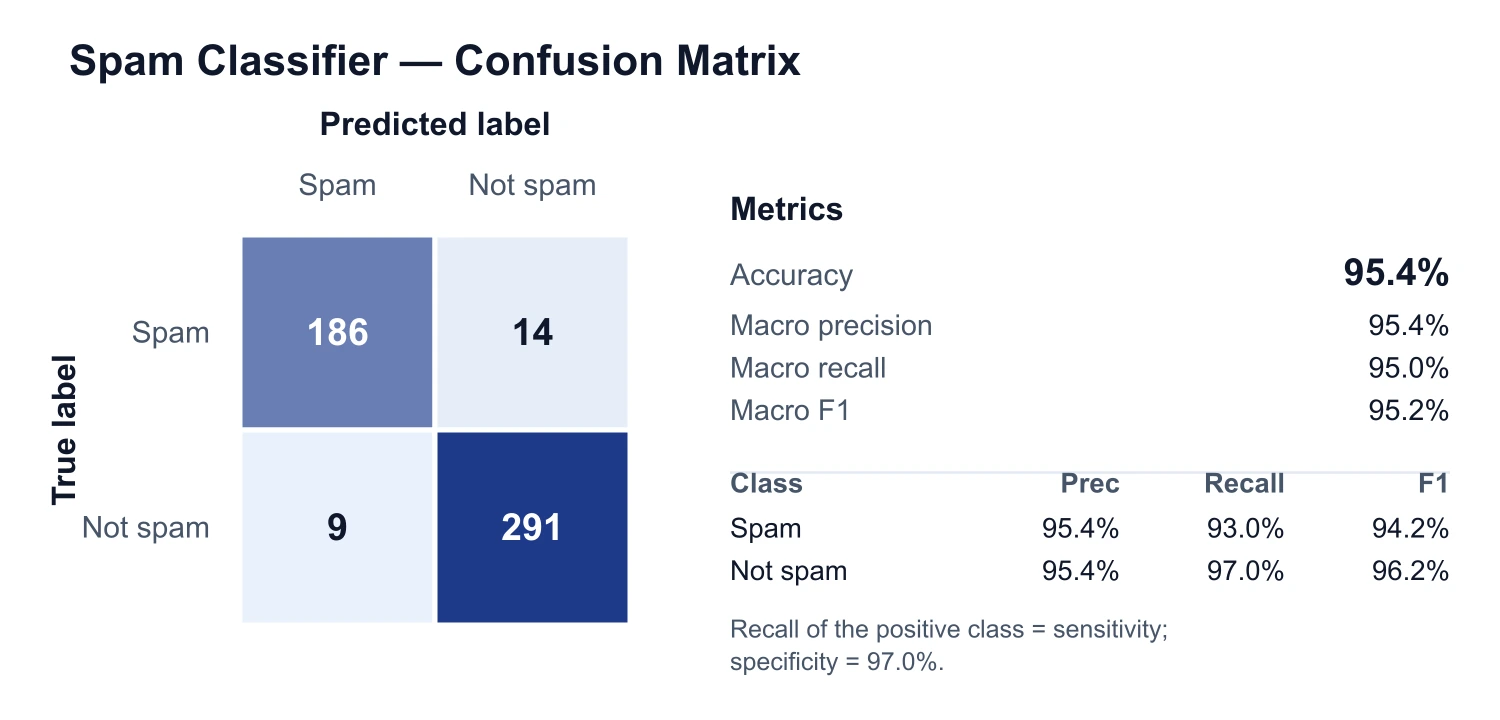
Confusion Matrix Generator
Build a confusion matrix with accuracy, precision, recall, and F1 for a classifier.
 Research
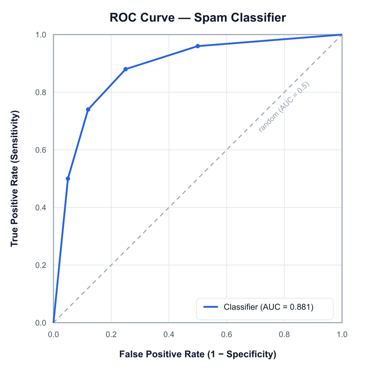
ROC Curve Generator
Plot true positive rate against false positive rate and compute the AUC.
 Research
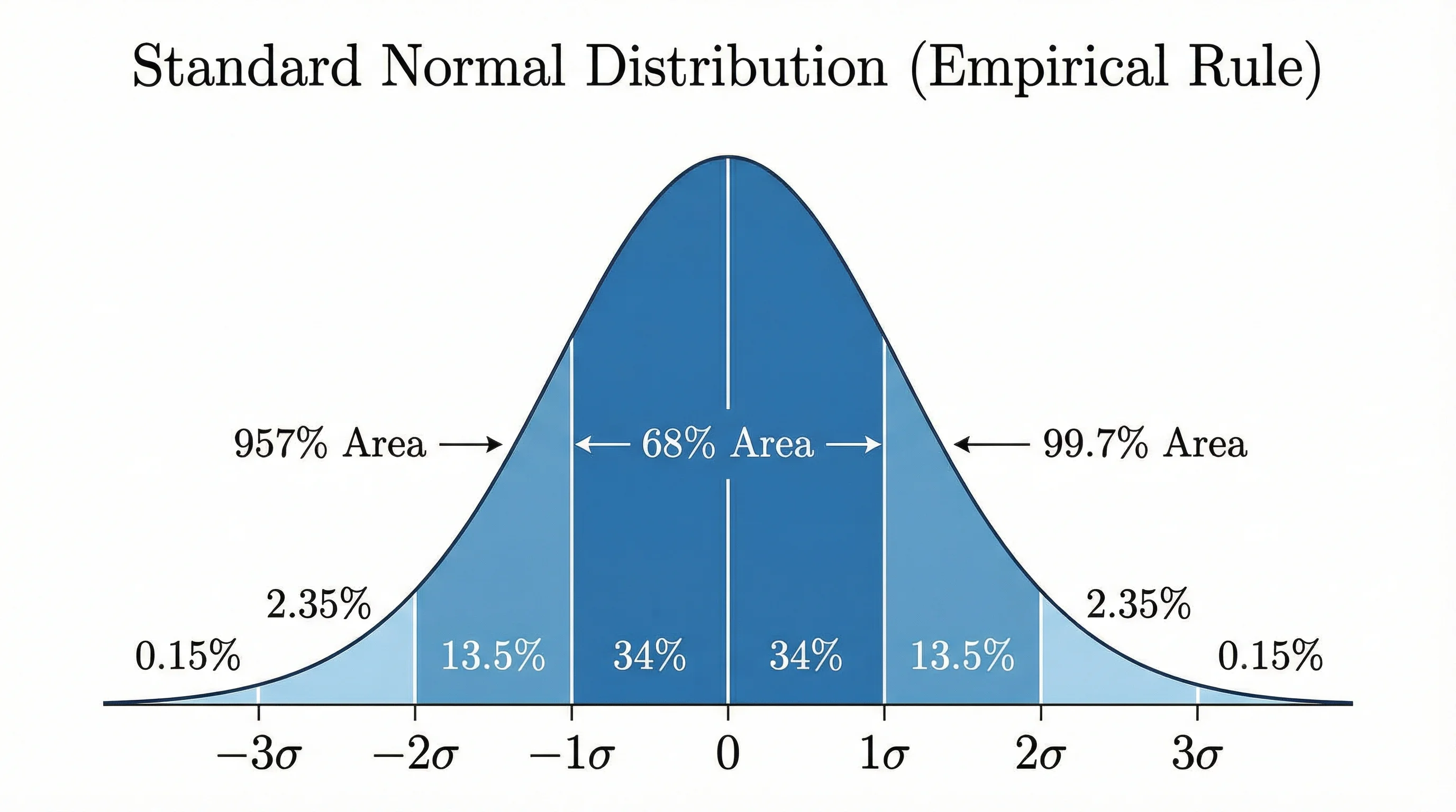
Bell Curve Generator
Plot a normal distribution with shaded areas, z-scores, and standard deviations.
 Research
Box Plot Generator
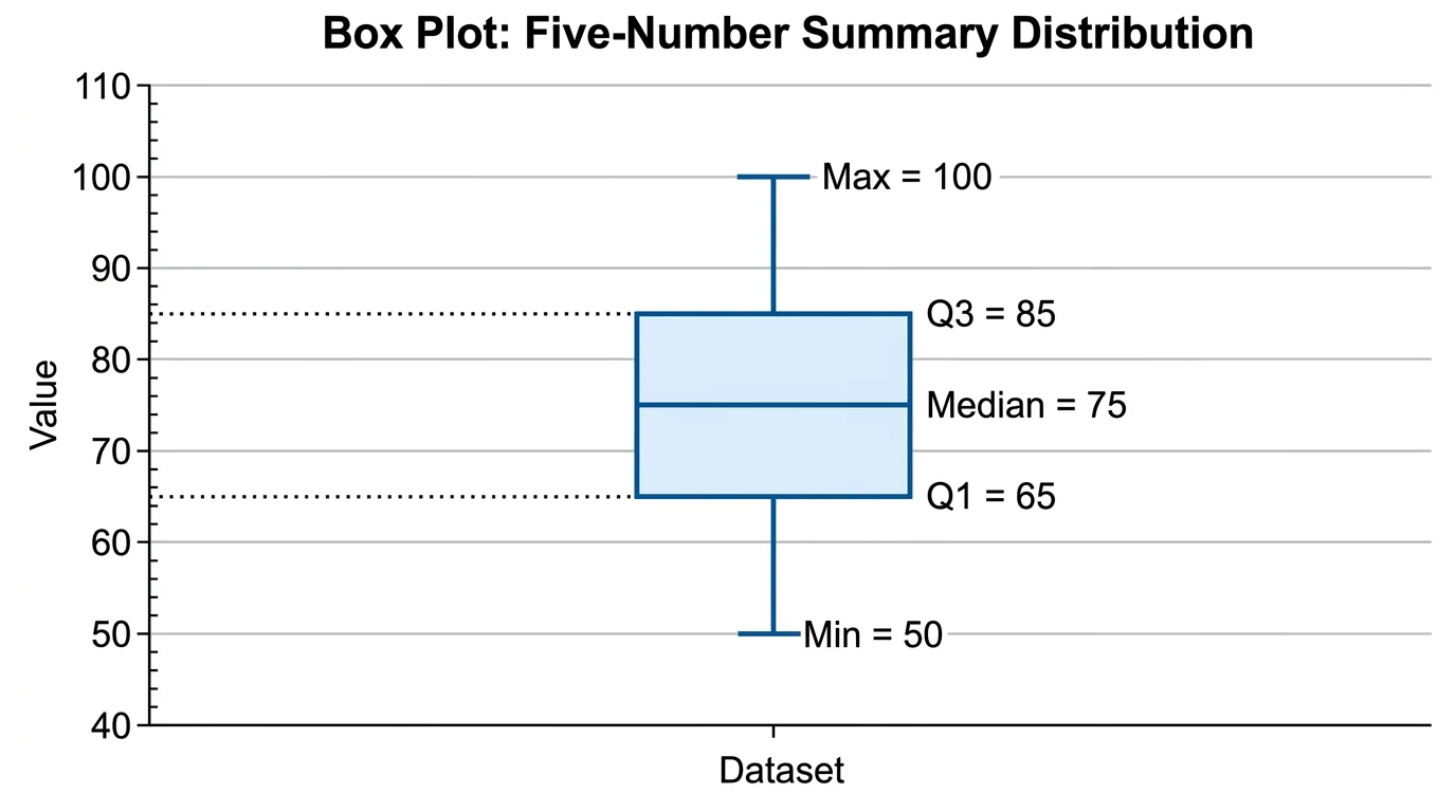
Draw box-and-whisker plots showing quartiles, medians, and outliers.