ROC Curve Generator with AUC
Free ROC curve generator — plot true positive rate against false positive rate, compare models on one chart, and compute AUC. Enter your points, export SVG.
Enter your TPR / FPR operating points — renders an exact ROC curve with AUC, free
Enter operating points as false positive rate (x) and true positive rate (y), each between 0 and 1. The (0,0) and (1,1) corners and the AUC are added automatically.
ROC Curve Generator
Free to try ·
Your AI ROC curve figure will appear here
For an exact curve with a computed AUC, use the Precise Curve tab instead
ROC Curve Examples
Exact engine renders — single models, comparisons, and diagnostic tests
Single Classifier
Exact engine render — one classifier with its AUC and the random baseline.
Model Comparison
Exact engine render — several models overlaid, each with its AUC in the legend.
Excellent Classifier
Exact engine render — a strong model whose curve hugs the top-left corner.
Weak Classifier
Exact engine render — a weak model whose curve sits near the random diagonal.
Medical Diagnostic Test
Exact engine render — a diagnostic test framed as sensitivity vs 1 − specificity.
Three-Model Comparison
Exact engine render — three models with different AUCs on one chart.
What is a ROC curve?
A ROC (Receiver Operating Characteristic) curve shows how well a binary classifier separates two classes as you vary its decision threshold. It plots the true positive rate (sensitivity, or recall) on the y-axis against the false positive rate (1 − specificity) on the x-axis. Each point is the model at one threshold: lowering the threshold catches more true positives but also more false positives, tracing a curve from the bottom-left (0, 0) to the top-right (1, 1). A perfect classifier hugs the top-left corner; a useless one follows the diagonal. This generator draws the curve and computes the area under it (AUC) from the operating points you enter, and it can overlay several models on one chart to compare them.
True positive rate, false positive rate, and thresholds
- True Positive Rate (TPR) = TP / (TP + FN) — also called sensitivity or recall; the share of real positives the model catches.
- False Positive Rate (FPR) = FP / (FP + TN) — equal to 1 − specificity; the share of real negatives wrongly flagged.
- Each threshold gives one (FPR, TPR) point; sweeping the threshold from strict to lenient traces the ROC curve.
- The dashed diagonal is the random classifier (AUC = 0.5); a good model bows toward the top-left corner.
What the AUC means
AUC is the Area Under the ROC Curve, a single number between 0 and 1 that summarizes performance across all thresholds. It equals the probability that the model ranks a random positive case above a random negative one. AUC = 0.5 is no better than chance, 0.7–0.8 is generally considered acceptable, 0.8–0.9 is good, and above 0.9 is excellent; below 0.5 means the predictions are inverted. Because AUC is threshold-independent, it is useful for comparing models, and this tool computes it with the trapezoidal rule from the points you provide. AUC does not tell you the best threshold to deploy — for that, look at the curve itself and the cost of false positives versus false negatives.
How to make your ROC curve
- Enter each operating point as a false positive rate (x) and a true positive rate (y), both between 0 and 1.
- The (0, 0) and (1, 1) corners and the AUC are added and computed for you as you type.
- Add a second or third curve to compare models on the same axes — each gets its own color and AUC in the legend.
- Download a clean, scalable SVG for your paper, notebook, or slides — free, with no sign-up.
ROC curve vs precision-recall curve
ROC curves are the standard way to report classifier performance, but on heavily imbalanced data they can look overly optimistic because the false positive rate stays low when negatives vastly outnumber positives. In that situation a precision-recall curve is often more informative, since precision reacts directly to false positives among the predicted positives. A good workflow is to read the ROC curve and AUC alongside the raw counts in a confusion matrix so you can see the trade-off in absolute terms, then pick the threshold that matches the cost of each error for your problem.
Frequently Asked Questions
Related Data & Stats Tools
 Research
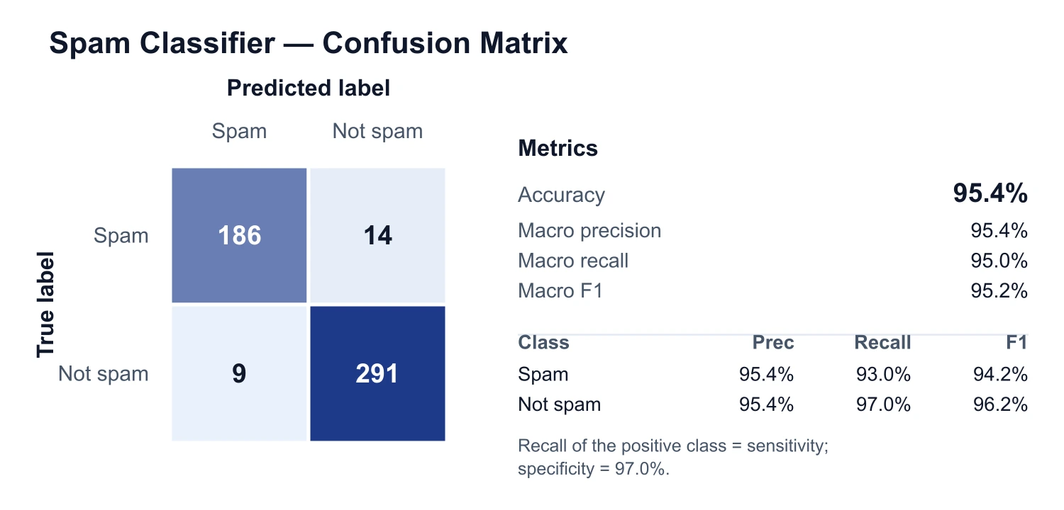
Confusion Matrix Generator
Build a confusion matrix with accuracy, precision, recall, and F1 for your classifier.
 Research
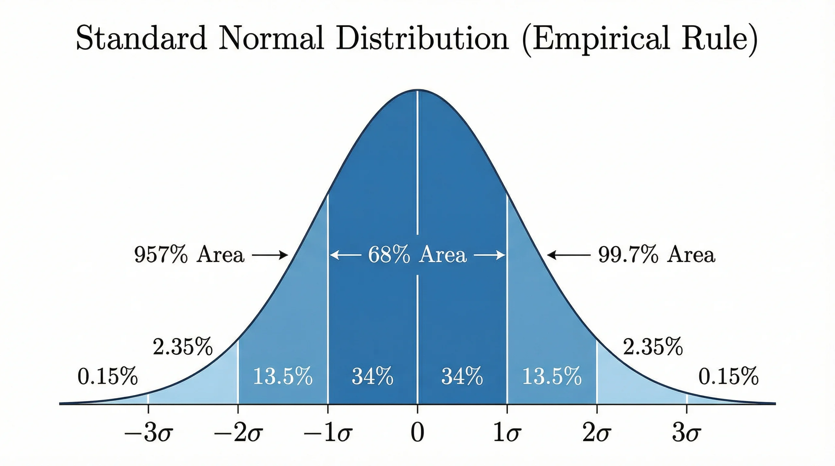
Bell Curve Generator
Plot a normal distribution with shaded areas, z-scores, and standard deviations.
 Research
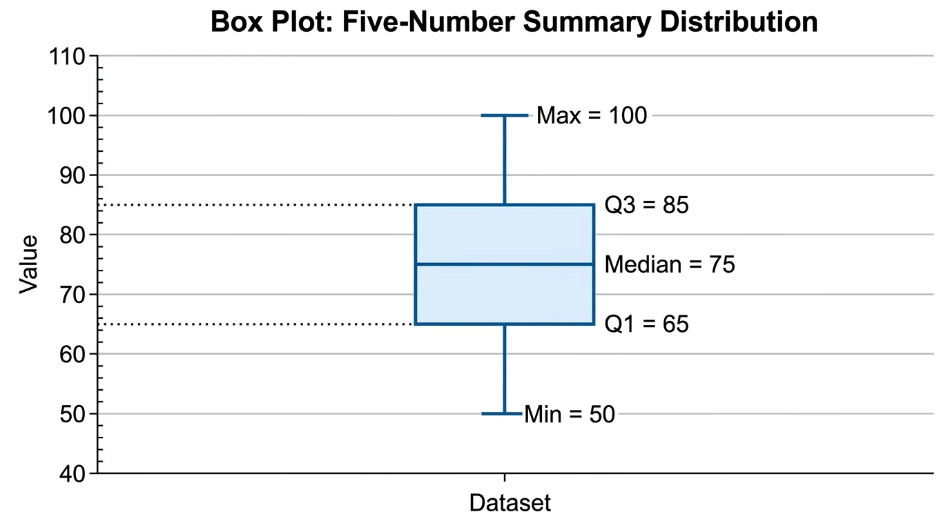
Box Plot Generator
Draw box-and-whisker plots showing quartiles, medians, and outliers.
 Research
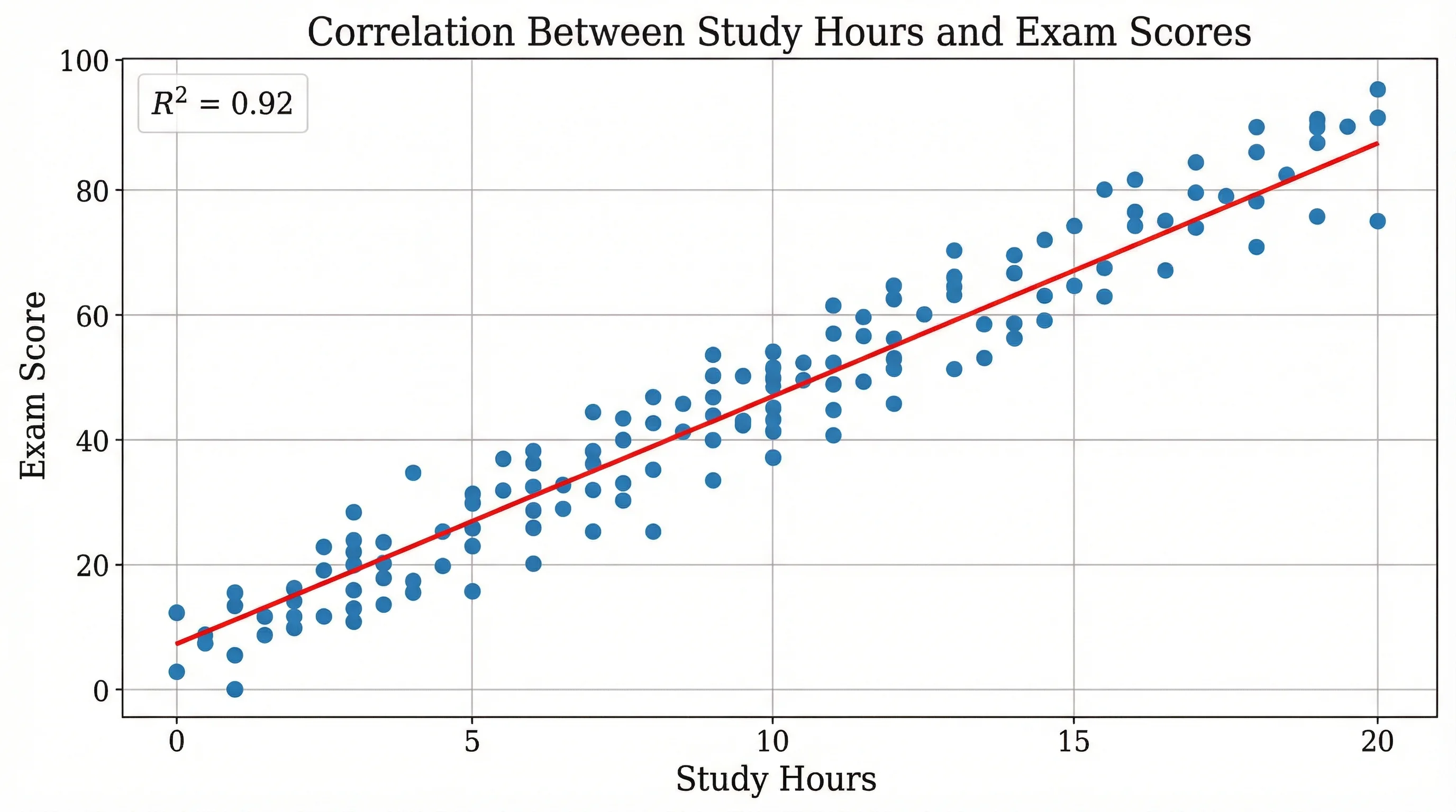
Scatter Plot Maker
Plot paired data points to reveal correlation and trends between variables.
 Research
Histogram Maker
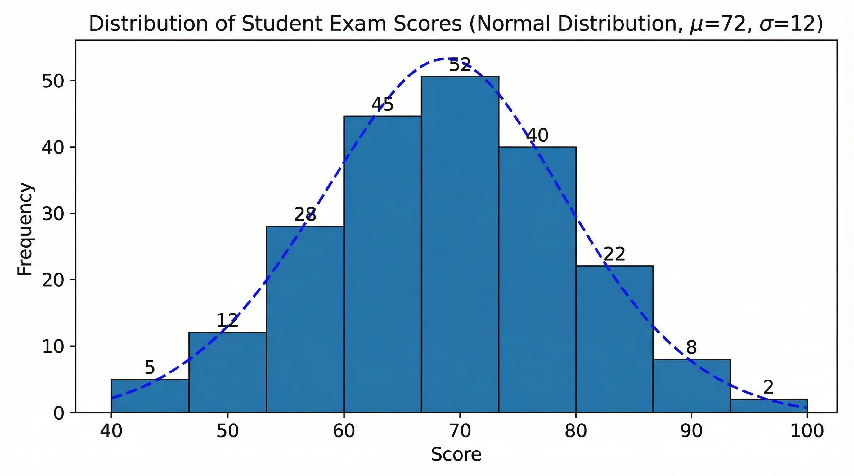
Turn a data set into a histogram showing the shape of its distribution.