Gantt Chart Maker for Free, Online
Make a Gantt chart online, free. Enter your tasks with start and end dates for a precise project timeline, or describe a project for an AI illustration — then export SVG or PNG, no sign-up needed.
Type one task per line (name, start, end) — renders an exact Gantt chart as SVG, free
Tasks
Exact Gantt chart, rendered as SVG.
One task per line: name, start, end. Use ISO dates (2026-01-05) or plain day numbers (0, 5, 12). When start equals end, the task renders as a milestone diamond.
6 tasks · spanning 91 days
6 tasks · spanning 91 days. Download an editable SVG for slides, reports, and project plans.
Gantt Chart Maker
Free to try ·
Your Gantt chart will appear here
Describe the project timeline you want
Gantt Chart Examples
Project plans, roadmaps, and schedules built from a task list
Product Launch Plan
Tasks grouped into phases with milestone markers for the key approvals along the way.
Product Roadmap
Parallel feature tracks across several months, with sprint boundaries and release dates.
Research Project Timeline
A dissertation-style plan: review, data collection, analysis, writing, and revision, with deadlines.
Migration with Dependencies
Parallel workstreams linked by dependencies, with the critical path and cutover window highlighted.
Event Planning Schedule
Every workstream of an event — booking, outreach, marketing, logistics — on one timeline.
Content Calendar
Separate tracks for blog, video, and social, with publication and promotion windows.
What is a Gantt chart?
A Gantt chart is a horizontal bar chart that shows a project schedule over time. Each task gets its own row, and a bar spans from the task’s start date to its end date along a timeline that runs left to right. The longer the bar, the longer the task; bars that overlap vertically are happening at the same time. Add milestones for key dates and dependencies to show which tasks must finish before others can start, and you can see the whole plan — what happens when, what runs in parallel, and where the deadlines fall — in a single picture. That is exactly what this maker draws from your task list.
Two ways to make a Gantt chart here
- Data mode: enter your tasks with their start and end dates (or durations) and the tool plots each one as a bar on an accurate, to-scale timeline — no dragging, aligning, or spreadsheet formulas.
- AI illustration mode: describe your project in plain English and the tool generates a polished, presentation-ready Gantt-style graphic with themed colors and styling.
- Use data mode when the dates have to be exact (a real project plan, a thesis schedule, a client deliverable); use AI mode when you want a clean visual for a slide, proposal, or pitch.
Tasks, durations, dependencies, and milestones
- Tasks: the individual pieces of work, each on its own row with a start and end date.
- Durations: how long a task takes — set it directly, or let it follow from the start and end dates.
- Dependencies: links that say one task can only start after another finishes, so the schedule stays realistic.
- Milestones: zero-duration markers for key dates such as a kickoff, an approval, or a launch.
- Phases: group related tasks (for example Research, Build, Launch) to keep a longer plan readable.
How to make a Gantt chart online from a task list
- List your tasks — one per line — and give each a start date and an end date (or a duration).
- Add any dependencies so tasks that rely on each other line up in the right order.
- Mark milestones for the dates that matter, like approvals, deadlines, or the launch.
- The tool plots every task as a bar on a to-scale timeline and labels the schedule for you.
- Adjust colors and labels, then export a clean SVG or PNG to drop into a doc, slide, or report.
How to read a Gantt chart timeline
Read a Gantt chart from left to right: the horizontal axis is time (days, weeks, or months) and each row is a task. A bar’s left edge is the start date and its right edge is the end date, so its length is the duration. Tasks whose bars overlap vertically run at the same time, while a task that begins only after another ends shows a dependency. Diamonds or flags mark milestones. Following the chain of dependent tasks reveals the critical path — the sequence that determines the project’s finish date — which is why a Gantt chart is the standard way to plan and track schedules in project management.
When to use the AI illustration mode
Reach for AI illustration mode when you want a styled, eye-catching schedule graphic rather than a strict, date-accurate plan — a roadmap slide for a pitch, a high-level timeline for a proposal, or a visual for a blog post. For anything where the dates and dependencies must be exactly right, such as a project plan you will actually track against or a deliverable schedule, use data mode so every bar is placed to scale from your real dates.
Frequently Asked Questions
Related Project Management Tools
 Project Management
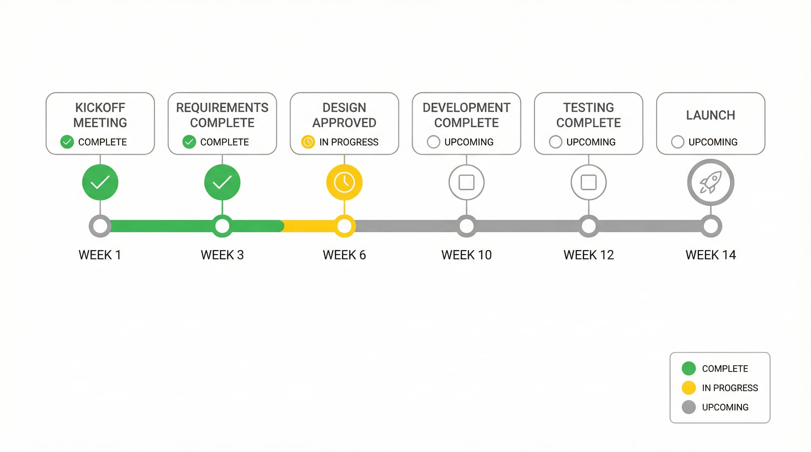
Timeline Generator
Turn a list of dates and events into a clean, presentation-ready timeline.
 Visualization
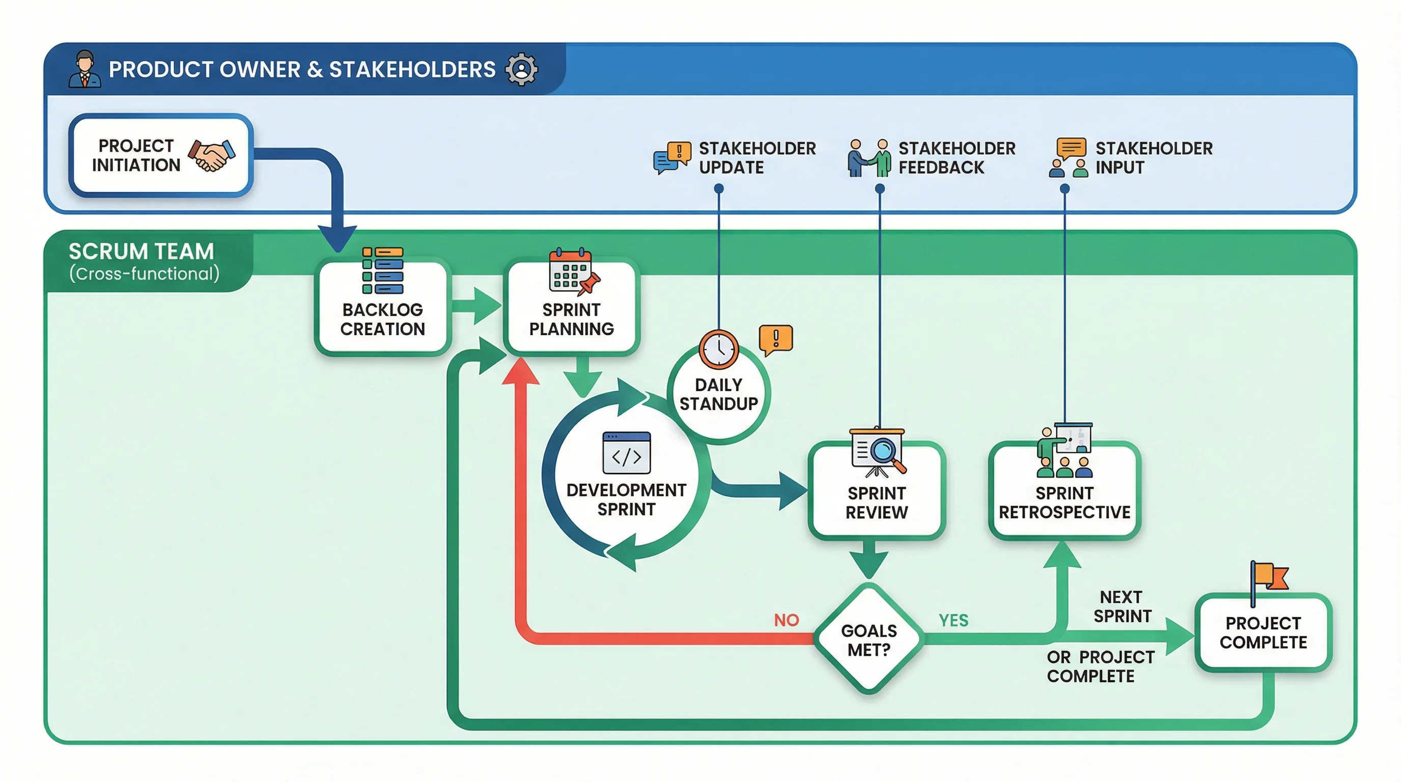
AI Flowchart Generator
Map a process or workflow into a clear flowchart with steps and decisions.
 Visualization
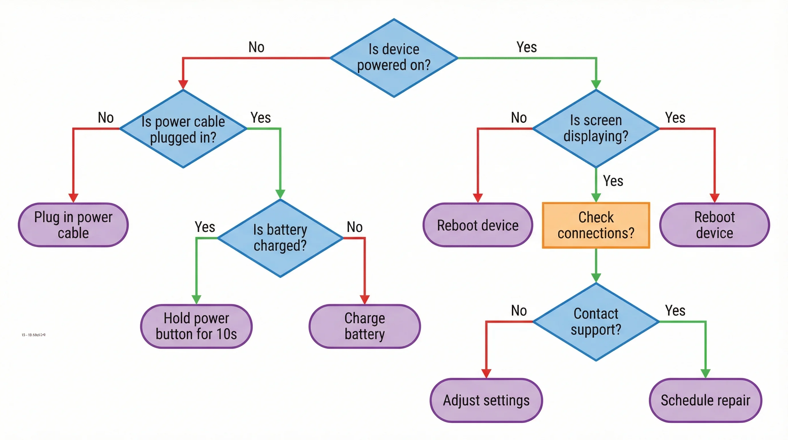
Decision Tree Generator
Build a decision tree that branches choices into clear outcomes and paths.