")
How to Draw a Box and Whisker Diagram: Complete Step-by-Step Guide (2026)
Learn how to draw a box and whisker diagram from scratch. Step-by-step tutorial covering hand-drawn, Excel, Python, and R methods with examples and common mistakes.
How to Draw a Box and Whisker Diagram: The Complete Guide for Students and Researchers
If you have ever stared at a dataset wondering how to summarize its spread, center, and outliers in a single chart, the box and whisker diagram is your answer.
Invented by statistician John Tukey in 1969, the box plot (also called a box and whisker plot or box and whisker diagram) is one of the most widely used statistical visualizations in research, education, and data science. It compresses five key summary statistics into one compact graphic, making it easy to compare groups, spot outliers, and understand distributions at a glance.
This guide walks you through everything you need to know about how to draw a box and whisker diagram, from calculating the five-number summary by hand to generating publication-quality plots in Excel, Python, and R.
AI Chart Generator
Generate professional box plots and statistical charts from your data using AI. Export in high resolution for research papers and presentations.
Create box plots free →What Is a Box and Whisker Diagram?
A box and whisker diagram is a standardized way of displaying the distribution of a dataset based on five summary statistics: the minimum, first quartile (Q1), median (Q2), third quartile (Q3), and maximum. It provides a visual snapshot of where most data points fall, how spread out they are, and whether any unusual values (outliers) exist.
Unlike bar charts that only show means, or histograms that require binning choices, box plots present the full distributional picture in a compact format. This makes them especially valuable when you need to compare multiple groups side by side.
Why Researchers Rely on Box Plots
Box and whisker diagrams have become essential in academic research for several reasons:
| Advantage | Description |
|---|---|
| Compact summary | Displays five statistics in one small graphic |
| Outlier detection | Unusual values are immediately visible as individual points |
| Group comparison | Easy to place multiple box plots side by side |
| Distribution shape | Skewness is apparent from median position within the box |
| No assumptions | Works for any continuous data, regardless of distribution |
As our research data visualization guide explains, choosing the right chart type is the foundation of effective scientific communication, and box plots are often the best choice for comparing distributions.
Anatomy of a Box and Whisker Plot
Before learning how to draw a box and whisker diagram, you need to understand its five core components.
The Five-Number Summary
Every box plot is built from these five values:
- Minimum -- The smallest data point (excluding outliers)
- First Quartile (Q1) -- The value below which 25% of data falls (also called the 25th percentile)
- Median (Q2) -- The middle value that divides the dataset in half (50th percentile)
- Third Quartile (Q3) -- The value below which 75% of data falls (75th percentile)
- Maximum -- The largest data point (excluding outliers)
Visual Components
| Component | What It Represents | Visual Element |
|---|---|---|
| Box | The interquartile range (IQR = Q3 - Q1), where the middle 50% of data lies | Rectangle |
| Median line | The center of the distribution | Line inside the box |
| Whiskers | Range of data within 1.5 x IQR from the box edges | Lines extending from the box |
| Outliers | Data points beyond 1.5 x IQR from Q1 or Q3 | Individual dots or circles |
| Fences | Boundaries at Q1 - 1.5 x IQR and Q3 + 1.5 x IQR | Not drawn, but define whisker limits |
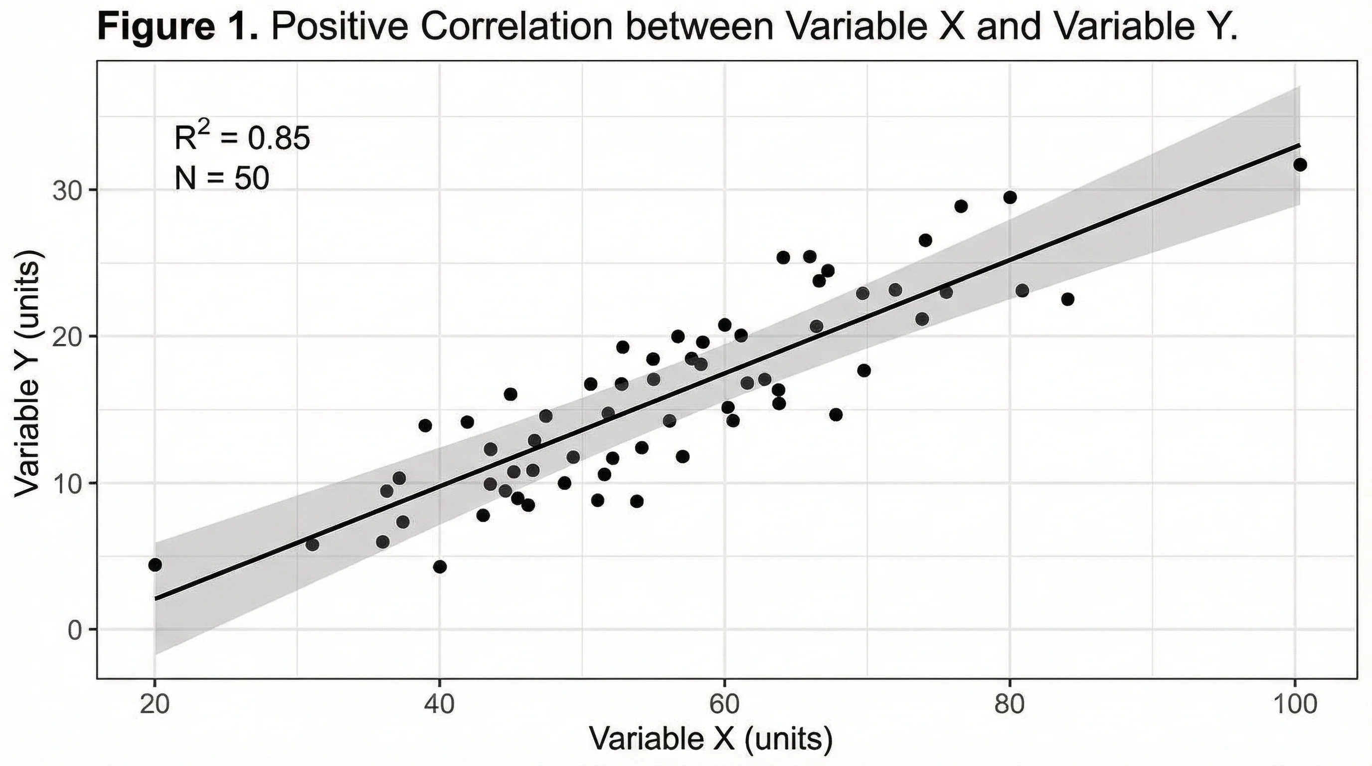
Understanding data distribution is essential for creating accurate box plots. Scatter plots like this one reveal the raw data points that box plots summarize.
How to Draw a Box and Whisker Diagram by Hand
Let us work through a complete example. Suppose you have test scores from 15 students:
Dataset: 23, 25, 28, 33, 35, 38, 42, 45, 48, 52, 55, 60, 65, 72, 91
Step 1: Order the Data
Arrange values from smallest to largest. Our data is already sorted:
23, 25, 28, 33, 35, 38, 42, 45, 48, 52, 55, 60, 65, 72, 91
Step 2: Find the Median (Q2)
With 15 values, the median is the 8th value:
Q2 (Median) = 45
Step 3: Find Q1 (First Quartile)
Q1 is the median of the lower half (values below Q2):
23, 25, 28, 33, 35, 38, 42
Q1 = 33
Step 4: Find Q3 (Third Quartile)
Q3 is the median of the upper half (values above Q2):
48, 52, 55, 60, 65, 72, 91
Q3 = 60
Step 5: Calculate the IQR and Fences
IQR = Q3 - Q1 = 60 - 33 = 27
- Lower fence: Q1 - 1.5 x IQR = 33 - 40.5 = -7.5
- Upper fence: Q3 + 1.5 x IQR = 60 + 40.5 = 100.5
Since all values fall within -7.5 and 100.5, there are no outliers in this dataset.
Step 6: Identify the Whisker Endpoints
- Lower whisker: The smallest value at or above the lower fence = 23
- Upper whisker: The largest value at or below the upper fence = 91
Step 7: Draw the Box Plot
- Draw a horizontal number line covering the data range
- Draw a rectangle (box) from Q1 (33) to Q3 (60)
- Draw a vertical line inside the box at the median (45)
- Draw a line (whisker) from the left side of the box to the minimum (23)
- Draw a line (whisker) from the right side of the box to the maximum (91)
- Plot any outliers as individual dots beyond the whiskers
Your five-number summary:
| Statistic | Value |
|---|---|
| Minimum | 23 |
| Q1 | 33 |
| Median (Q2) | 45 |
| Q3 | 60 |
| Maximum | 91 |
How to Create Box Plots in Excel
Microsoft Excel has included a built-in box and whisker chart type since Excel 2016. Here is how to use it:
Method: Built-in Box and Whisker Chart
- Enter your data in a single column with a header
- Select the data range including the header
- Go to Insert > Charts > Statistical > Box and Whisker
- Excel automatically calculates quartiles and creates the plot
Customizing Your Excel Box Plot
After inserting the chart, right-click on the box to access formatting options:
- Show inner points -- Display all data points within the whiskers
- Show outlier points -- Mark values beyond the whiskers
- Show mean markers -- Add an "X" at the mean position
- Show mean line -- Connect means across multiple groups
- Inclusive/Exclusive quartile calculation -- Choose how quartiles are computed
Tips for Publication-Quality Excel Box Plots
| Setting | Recommendation |
|---|---|
| Colors | Use a scientific color palette |
| Fonts | Choose readable fonts (see our font guide) |
| Gridlines | Remove or lighten for cleaner appearance |
| Legend | Include only if comparing multiple groups |
| Export | Save as high-resolution PNG or SVG |
How to Create Box Plots in Python
Python, combined with libraries like Matplotlib and Seaborn, gives you complete control over box plot appearance.
Basic Box Plot with Matplotlib
import matplotlib.pyplot as plt

data = [23, 25, 28, 33, 35, 38, 42, 45, 48, 52, 55, 60, 65, 72, 91]

fig, ax = plt.subplots(figsize=(8, 5))
ax.boxplot(data, vert=False, patch_artist=True,
           boxprops=dict(facecolor='#4C72B0', alpha=0.7),
           medianprops=dict(color='white', linewidth=2))

ax.set_xlabel('Test Scores')
ax.set_title('Distribution of Student Test Scores')
plt.tight_layout()
plt.savefig('boxplot.png', dpi=300)
plt.show()
Comparing Multiple Groups with Seaborn
import seaborn as sns
import pandas as pd

# Sample data for three treatment groups
data = pd.DataFrame({
    'Group': ['Control']*20 + ['Treatment A']*20 + ['Treatment B']*20,
    'Value': [45, 48, 42, 50, 47, 44, 49, 51, 46, 43,
              53, 48, 55, 50, 52, 47, 54, 51, 49, 56,
              60, 62, 58, 65, 61, 59, 63, 57, 64, 66,
              55, 52, 58, 53, 57, 54, 56, 59, 51, 60]
})

fig, ax = plt.subplots(figsize=(8, 6))
sns.boxplot(x='Group', y='Value', data=data, palette='Set2', ax=ax)
ax.set_ylabel('Measurement Value')
ax.set_title('Treatment Comparison')
plt.tight_layout()
plt.savefig('comparison_boxplot.png', dpi=300)
plt.show()
Adding Individual Data Points
For research publications, showing raw data points alongside the box plot is increasingly expected:
fig, ax = plt.subplots(figsize=(8, 6))
sns.boxplot(x='Group', y='Value', data=data, palette='Set2', ax=ax)
sns.stripplot(x='Group', y='Value', data=data,
              color='black', alpha=0.4, size=4, ax=ax)
plt.tight_layout()
plt.savefig('boxplot_with_points.png', dpi=300)
plt.show()
How to Create Box Plots in R
R, particularly with ggplot2, is the standard tool for statistical visualization in many research fields.
Basic Box Plot with ggplot2
library(ggplot2)

scores <- data.frame(value = c(23, 25, 28, 33, 35, 38, 42,
                                45, 48, 52, 55, 60, 65, 72, 91))

ggplot(scores, aes(y = value)) +
  geom_boxplot(fill = "#4C72B0", alpha = 0.7, width = 0.4) +
  labs(title = "Distribution of Student Test Scores",
       y = "Test Scores") +
  theme_minimal()
Comparing Groups in R
# Sample grouped data
treatment_data <- data.frame(
  Group = rep(c("Control", "Treatment A", "Treatment B"), each = 20),
  Value = c(rnorm(20, mean = 47, sd = 3),
            rnorm(20, mean = 52, sd = 4),
            rnorm(20, mean = 60, sd = 3))
)

ggplot(treatment_data, aes(x = Group, y = Value, fill = Group)) +
  geom_boxplot(alpha = 0.7) +
  geom_jitter(width = 0.15, alpha = 0.4, size = 2) +
  scale_fill_brewer(palette = "Set2") +
  labs(title = "Treatment Group Comparison",
       y = "Measurement Value") +
  theme_minimal() +
  theme(legend.position = "none")
Notched Box Plots for Statistical Comparison
Notched box plots add confidence intervals around the median. If notches of two groups do not overlap, the medians are likely significantly different:
ggplot(treatment_data, aes(x = Group, y = Value, fill = Group)) +
  geom_boxplot(notch = TRUE, alpha = 0.7) +
  scale_fill_brewer(palette = "Set2") +
  theme_minimal()
When to Use Box and Whisker Diagrams
Box plots are not always the right choice. Here is a decision framework:
Use Box Plots When You Want To:
- Compare distributions across 2 or more groups
- Identify outliers in your data
- Show data spread including median, quartiles, and range
- Present summary statistics compactly in limited space
- Compare medians across experimental conditions
Consider Alternatives When:
| Situation | Better Alternative | Why |
|---|---|---|
| Small sample size (n < 10) | Strip/dot plot | Box plots can be misleading with few points |
| Showing exact distribution shape | Violin plot or histogram | Box plots hide multimodal distributions |
| Presenting to general audiences | Bar chart with error bars | Box plots require statistical literacy |
| Single group description | Histogram or density plot | More detail about distribution shape |
| Showing individual data values | Beeswarm or strip plot | Every observation is visible |
As noted in our guide to making scientific diagrams, matching the visualization to both your data type and audience is critical for effective communication.
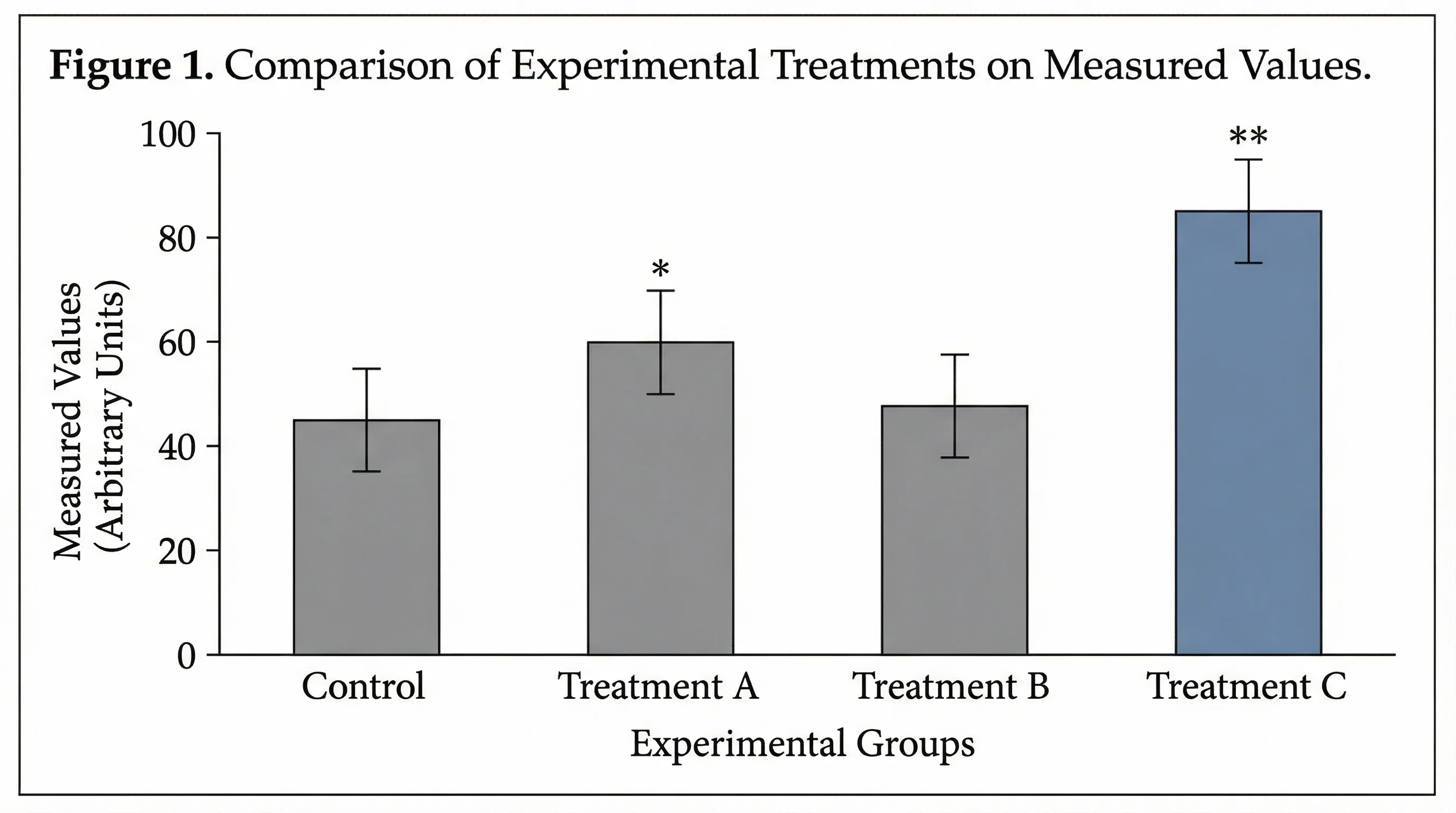
Bar charts show means but hide distribution details. Box plots reveal the full story behind your data, including spread, skewness, and outliers.
Comparing Multiple Groups with Box Plots
One of the greatest strengths of box and whisker diagrams is comparing distributions across groups. Here are best practices:
Side-by-Side Comparison
Place box plots for each group on the same axis with a shared scale. This allows direct visual comparison of:
- Center -- Are medians at different levels?
- Spread -- Does one group have more variability?
- Skewness -- Are distributions symmetric or skewed?
- Outliers -- Which groups have extreme values?
Grouped Box Plots
When you have two categorical variables (e.g., treatment and time point), use grouped or faceted box plots:
# Grouped box plot in Seaborn
sns.boxplot(x='Timepoint', y='Value', hue='Treatment', data=df)
# Faceted box plot in ggplot2
ggplot(df, aes(x = Treatment, y = Value)) +
geom_boxplot() +
facet_wrap(~Timepoint)Reading the Comparison
| Observation | Interpretation |
|---|---|
| Boxes at different heights | Groups have different central tendencies |
| One box much wider than another | That group has more variability |
| Median line near box top/bottom | Distribution is skewed |
| Many outlier dots | Data may not follow normal distribution |
| Non-overlapping boxes | Groups likely differ significantly |
Common Mistakes When Drawing Box Plots
Avoid these frequent errors that can mislead your audience or undermine your research.
Mistake 1: Using Box Plots for Very Small Samples
Problem: A box plot with only 5 data points shows a box and whiskers, but each component is based on just 1-2 values. The visualization implies more statistical stability than actually exists.
Fix: For datasets with fewer than 10 observations, use a strip plot or dot plot that shows every individual value.
Mistake 2: Ignoring Bimodal Distributions
Problem: A dataset with two distinct clusters (e.g., two subpopulations) will produce a box plot that looks perfectly normal but completely hides the bimodal pattern.
Fix: Pair box plots with strip plots (geom_jitter in R, sns.stripplot in Python) or use violin plots that show distribution shape.
Mistake 3: Inconsistent Whisker Definitions
Problem: Different software tools calculate whiskers differently. Some use min/max, others use 1.5 x IQR, and some use percentiles (5th and 95th).
Fix: Always state your whisker definition in the figure caption. The most common convention is 1.5 x IQR (Tukey's method).
Mistake 4: Missing or Misleading Axes
Problem: Box plots without clear axis labels, units, or scale markers leave readers guessing what the values represent.
Fix: Always include descriptive axis labels with units. Use consistent scales when comparing groups.
Mistake 5: Overloading with Too Many Groups
Problem: Placing 15 or more box plots on a single chart makes comparison impossible.
Fix: If you have many groups, consider reordering by median, using faceted plots, or grouping related categories. Generally, keep to 7 or fewer groups per panel.
Mistake 6: Poor Color Choices
Problem: Colors that are too similar, inaccessible to colorblind viewers, or purely decorative add noise rather than meaning.
Fix: Use a scientific color palette designed for accessibility. Ensure colors encode meaningful differences.
Advanced Box Plot Variations
Beyond the standard box and whisker diagram, several variations offer additional insights:
Violin Plots
Combine a box plot with a kernel density estimation, showing the full distribution shape. Best for revealing multimodal data.
Notched Box Plots
Add notches around the median to show an approximate 95% confidence interval. Useful for quick visual significance testing.
Letter-Value Plots (LV Plots)
Extend the box plot concept with additional quantiles, providing more detail for large datasets. Developed by Heike Hofmann and colleagues as an improvement for big data scenarios.
Raincloud Plots
Combine a half-violin plot, box plot, and strip plot in one visualization. This "best of all worlds" approach is increasingly popular in psychology and neuroscience publications.
Box Plots with Individual Points
Overlay raw data points on the box plot using jittered strip plots. Many journals now recommend or require showing individual observations alongside summary statistics.
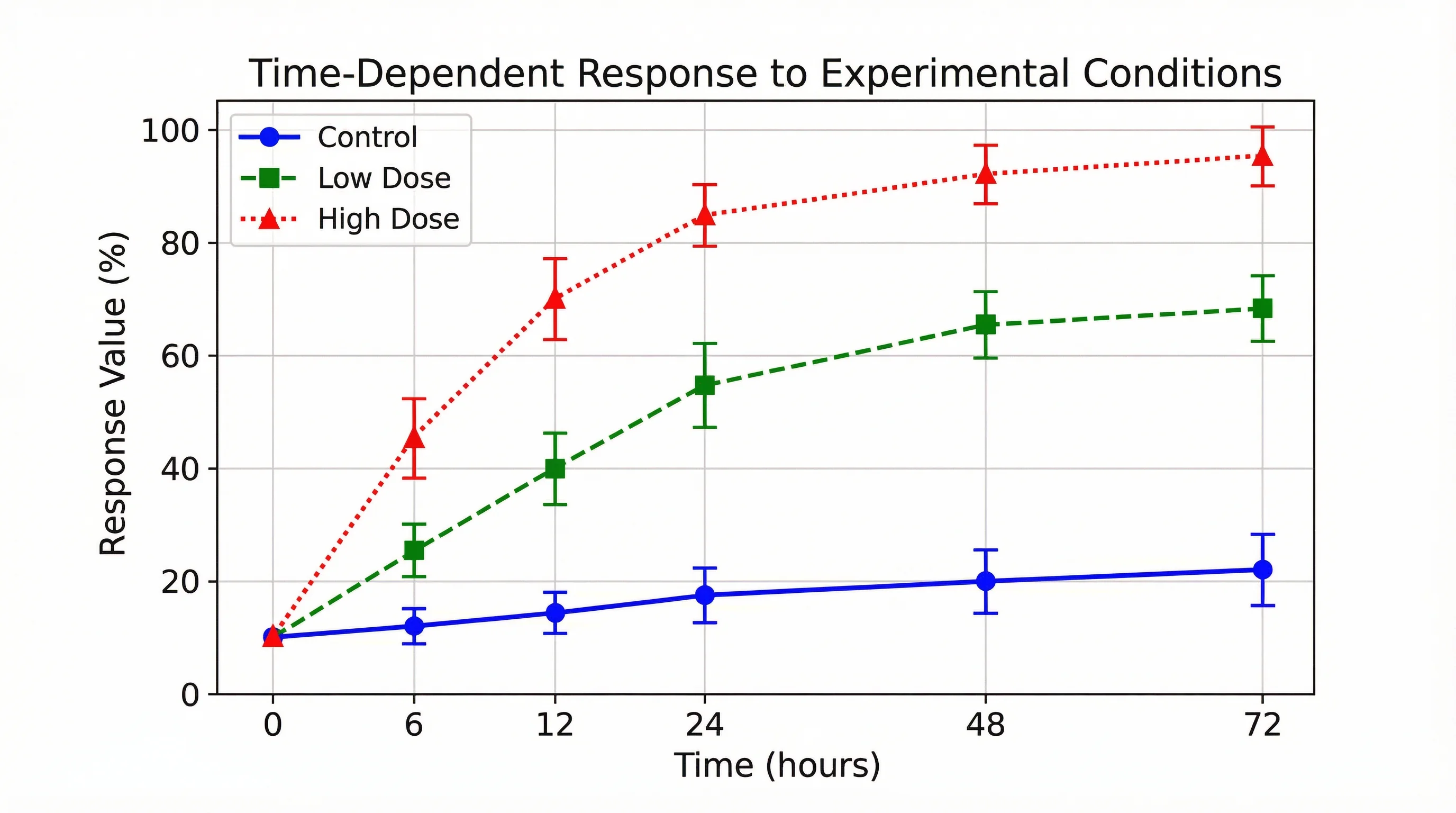
Modern statistical visualizations often combine multiple plot types. Time series data can be paired with box plots to show distribution at each time point.
Box Plot Interpretation Cheat Sheet
Use this quick reference when reading box and whisker diagrams:
| Feature | What to Look For | Interpretation |
|---|---|---|
| Median position | Where the line sits within the box | Close to center = symmetric; near edge = skewed |
| Box height/width | Size of the IQR | Larger = more variability in the middle 50% |
| Whisker length | Distance from box to whisker ends | Longer whiskers = data has a wider range |
| Asymmetric whiskers | One whisker longer than the other | Data is skewed toward the longer whisker side |
| Number of outliers | Dots beyond whiskers | Many outliers may suggest non-normal distribution |
| Box overlap | Whether boxes of different groups overlap | Non-overlapping = likely significant difference |
Frequently Asked Questions
What is the difference between a box plot and a box and whisker diagram?
They are the same thing. 'Box plot' and 'box and whisker diagram' (or 'box and whisker plot') are interchangeable terms for the same statistical visualization. The chart displays five summary statistics (minimum, Q1, median, Q3, maximum) along with any outliers. The name 'box and whisker' simply describes the visual appearance of the chart.
How do you calculate quartiles for a box and whisker diagram?
First, sort your data from smallest to largest. The median (Q2) is the middle value. Q1 is the median of the lower half of the data (values below Q2), and Q3 is the median of the upper half (values above Q2). For even-numbered datasets, the median is the average of the two middle values. Note that different software may use slightly different methods for quartile calculation, so always check which method your tool uses.
How do you identify outliers in a box and whisker plot?
Outliers are identified using the interquartile range (IQR = Q3 - Q1). Any data point below Q1 - 1.5 x IQR or above Q3 + 1.5 x IQR is considered an outlier. These values are plotted as individual dots beyond the whiskers. Some definitions also use 3 x IQR to identify 'extreme' outliers.
Can you make a box plot in Google Sheets?
Google Sheets does not have a built-in box plot chart type as of 2026. However, you can create one using a candlestick chart workaround or by using a Google Sheets add-on. For a simpler approach, you can calculate the five-number summary in Google Sheets and then use a dedicated tool like Python, R, or ConceptViz's AI Chart Generator to create the actual visualization.
When should I use a box plot instead of a bar chart?
Use a box plot when you want to show the distribution, variability, and outliers in your data, not just the mean. Box plots are better for comparing groups when spread matters, for detecting skewness, and for identifying outliers. Bar charts are better for showing simple counts or categorical comparisons where distribution details are not important.
How do I draw a box and whisker diagram for grouped data?
For grouped data, create a separate box plot for each group and place them side by side on the same axis. Most software (Excel, Python, R) handles this automatically when you specify a grouping variable. Ensure all groups share the same y-axis scale for fair comparison, and use distinct colors or labels to differentiate groups.
What does a skewed box plot look like?
In a right-skewed (positively skewed) box plot, the median line sits closer to Q1 (the bottom of the box), the upper whisker is longer than the lower whisker, and outliers tend to appear on the upper end. A left-skewed box plot is the mirror image: the median sits near Q3, the lower whisker is longer, and outliers appear on the lower end.
How many data points do I need for a meaningful box plot?
While you can technically create a box plot with as few as 5 data points, it is generally recommended to have at least 15-20 observations for the plot to be statistically meaningful. With fewer points, consider using a strip plot or dot plot that shows every individual value, as box plots can be misleading with small samples.
Conclusion
The box and whisker diagram remains one of the most versatile and informative tools in statistical visualization. Whether you are a student learning statistics, a researcher comparing experimental conditions, or a data scientist exploring distributions, mastering box plots will strengthen your ability to communicate findings clearly.
To recap the key steps for how to draw a box and whisker diagram:
- Sort your data from smallest to largest
- Calculate the five-number summary -- minimum, Q1, median, Q3, maximum
- Compute the IQR and determine fence values for outlier detection
- Draw the box from Q1 to Q3 with a median line
- Extend whiskers to the most extreme non-outlier values
- Plot outliers as individual points beyond the whiskers
- Add labels, title, and context for clear communication
For more on creating effective research visualizations, explore our guides on data visualization best practices, designing scientific diagrams, and creating publication-quality figures.
Additional Resources
- Box Plot - Wikipedia
- A Complete Guide to Box Plots - Atlassian
- Box Plot Explained with Examples - Statistics By Jim
- Reading a Box and Whisker Plot - Simply Psychology
- Research Data Visualization Best Practices
- Scientific Color Palette Guide
- Best Fonts for Scientific Figures
Ready to create professional box plots and statistical charts? Try ConceptViz to generate publication-ready visualizations from your data descriptions.
Categories
More Posts

How to Create a Workflow Diagram: Step-by-Step Guide with Examples
Learn how to create a workflow diagram for research, business processes, and team projects. Step-by-step guide with symbols, types, best practices, and free tools.
")
How to Create a Tree Diagram: 5 Types, Examples & Free AI Generator (2026)
Learn how to create tree diagrams for probability, decisions, org charts, and more. Step-by-step guide with real examples — plus a free AI tree diagram maker.
")
How to Make Scientific Diagrams for Research Papers (2025 Guide)
Learn how to create professional scientific diagrams for research papers, theses, and publications. Includes best practices, tools comparison, and step-by-step tutorials for biology, chemistry, and physics diagrams.