AI Chart Generator from Text & Data
Turn text into a chart with AI. Paste your data or describe the chart you want in plain English, and the AI picks the right chart type — bar, line, pie, scatter, and more — and generates it for you. Free, no spreadsheet skills needed.
Upload your CSV/Excel data — AI automatically picks the best chart type and generates precise visualizations
AI Chart Generator
Free to try ·
Your chart will appear here
Describe any chart type you want
AI Chart Generator
Paste data, upload a file, or use sample data to continue.
Free to try ·
Your chart will appear here
Upload data — AI picks the best chart type automatically
AI Chart Examples
Charts generated from pasted data and plain-text descriptions
Bar Chart from Sales Data
Paste rows of numbers and the AI builds a clean bar chart for comparing categories.
Pie Chart from Percentages
Describe a few parts of a whole and the AI picks a pie chart with labeled slices.
Line Chart for a Trend
Give the AI values over time and it draws a line chart to show the trend.
Scientific Bar Chart
Ask for error bars and significance markers and the AI styles it for a paper.
Scatter Plot with Trend Line
Describe a relationship between two variables and the AI returns a scatter plot.
Time-Series Chart
Measurements taken over time become a labeled time-series chart in one prompt.
Turn text into a chart with AI
This is an AI chart generator: instead of fiddling with a spreadsheet, you describe what you want in plain English — or paste your raw data — and the AI builds the chart for you. Write something like "bar chart of monthly revenue: Jan 12k, Feb 18k, Mar 15k" or "show how these survey answers break down by age group," and the tool returns a finished, labeled chart you can download. It is the fastest way to go from a few numbers or a sentence to a clear visual, with no chart-building skills required.
The AI picks the right chart type for you
Not sure whether your data wants a bar, line, or pie chart? You do not have to decide. The AI reads your text and chooses a chart type that fits the data: bar charts for comparing categories, line charts for trends over time, pie or donut charts for parts of a whole, and scatter plots for relationships between two variables. If you already know what you want, just say so — "make it a line chart" — and it follows your lead. Either way, the goal is the same: the clearest possible picture of your data without you guessing at the format.
Two ways to give the AI your data
- Paste your data: drop in numbers from a table, a list, or a spreadsheet column, and the AI reads the structure and builds the matching chart with axes, labels, and a legend.
- Describe it in words: explain the chart you want in plain English — the values, the categories, the comparison — and the AI fills in the rest, even if your data is messy or incomplete.
- Mix both: paste a rough list and add a sentence about how you want it shown ("highlight the top three" or "group by region"), and the AI combines the data with your intent.
Chart types this generator can make
Because the engine is AI rather than a single fixed template, one tool covers a wide range of charts. Use it for bar and column charts to compare categories, line charts for trends and time series, pie and donut charts for proportions, scatter plots for correlations, and combinations such as grouped or stacked bars. You can also ask for presentation touches — a color theme, a legend, axis units, error bars, or a title — and the AI applies them. If a description fits a chart, this tool will usually attempt it, which is what makes a generic "any chart from any text" generator different from a tool locked to one chart type.
Write a prompt that gets a great chart
- State the chart goal: are you comparing categories, showing a trend, or splitting a total? Naming the goal helps the AI pick the right type.
- Include the actual numbers and labels you have — even a short list like "A: 40, B: 25, C: 35" is enough to anchor the chart in real values.
- Add the styling you care about: a color scheme, a chart title, axis labels with units, or "clean business style" versus "academic publication style."
- Regenerate to refine — if the first result is close but not perfect, tweak the wording and run it again until the chart matches what you pictured.
When an AI chart generator is the right tool
Reach for this when you want speed and flexibility: a quick chart for a slide, a visual for a blog post or report, or a graphic built from a description rather than a clean dataset. Because the chart is AI-generated, it is ideal for turning messy data or a plain-text idea into a polished image fast. For work where every value, axis, and tick must be exactly measured — a graded assignment, a precise statistical plot, or a chart you will keep editing later — a dedicated data tool such as a scatter plot maker or bell curve generator gives you exact, computed output. Use this AI generator to explore and produce great-looking charts quickly, and a precise tool when the numbers have to be perfect.
Frequently Asked Questions
Related Visualization Tools
 Visualization
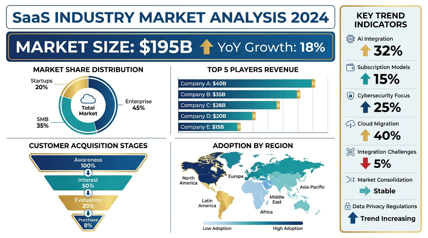
AI Infographic Generator
Turn your data and key points into a clean, shareable infographic in one prompt.
 Visualization
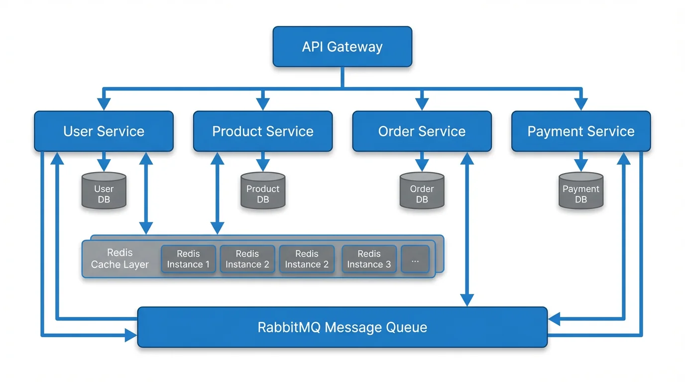
Text to Diagram Generator
Describe a process or system in plain text and get a clear diagram back.
 Research
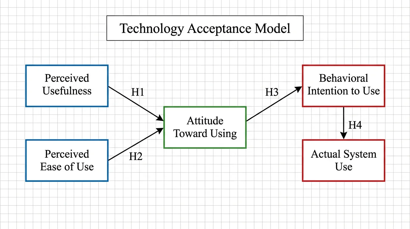
Conceptual Framework Generator
Map variables and relationships into a clear conceptual framework for research.