Value Stream Map Maker for Lean & Process Improvement
Describe your process, cycle times, and inventory and get a value stream map with process boxes, data boxes, inventory triangles, push or pull arrows, and a lead-time timeline. Review the numbers, then download a PNG.
AI Value Stream Map Maker
Free to try ·
Your value stream map will appear here
Include the numbers you want shown, then check them in the result
What is a value stream map?
A value stream map (VSM) is a lean tool that draws every step material and information take from supplier to customer, then adds the time data: how long each step works on the product and how long the product waits between steps. The result is one page that shows where the lead time actually goes. In most factories, waiting is the overwhelming share, and the map makes that visible.
Use it for lean projects, kaizen events, and Six Sigma analysis, and for office and healthcare processes through the service variant. If you only need to agree on scope, start with a SIPOC diagram.
Check the numbers. The generator draws the symbols and layout from your description. AI images can misplace a value or mix up a symbol, so verify every data box, inventory count, and timeline total against your own measurements before sharing the map.
Value stream map symbols and what they mean
These are the symbols most VSMs use, following the conventions from Learning to See. The icons below are exact drawings; the generator follows the same set.
| Symbol | Name | What it means | Drawing tip |
|---|---|---|---|
| Process box with data box | One area of continuous flow. The box under it holds the data: C/T (cycle time), C/O (changeover time), uptime, number of operators, available time, and yield. | Draw one box per area of flow, not one per task. | |
| Customer / supplier | The outside source of material (left) and destination of product (right). Customer demand per day goes in or under it. | Put the customer on the right and the supplier on the left. | |
| Inventory triangle | Stock waiting between steps, with the quantity and the time it covers underneath. | Write quantity and days of demand, for example 1,200 pcs (2 days). | |
| Push arrow | Material moved to the next step on a schedule, not because the next step asked for it. | Each striped arrow is a place to ask if a pull system could replace it. | |
| Supermarket | A controlled stock that a downstream step pulls from. The upstream step refills only what was taken. | Add the maximum quantity and the pull signal next to it. | |
| Withdrawal kanban | The card or signal that tells the upstream step what to replace. A dashed line shows the loop. | Show production kanban separately if the upstream step also uses one. | |
| FIFO lane | A first-in, first-out lane with a maximum quantity that links two processes without a full supermarket. | Write the maximum, for example "FIFO max 100". | |
| Information flow | A straight arrow is manual information such as a schedule or report. A zigzag arrow is electronic information such as EDI or MRP. | Label every arrow: weekly forecast, daily orders, daily schedule. | |
| Kaizen burst | A starburst marking an improvement to make at that point. Draw it on the current state, then carry the changes into the future-state map. | Name the improvement, for example "Reduce changeover". | |
| Operator | A person at a process. It shows how many people the step needs and where workload can be balanced. | Match it to the "operators" line in the data box. | |
| Timeline ladder | Upper steps are waiting time (inventory days) and lower steps are processing time. The two sums give lead time and value-added time. | Keep the units consistent: days on the top, seconds on the bottom. |
How to make a value stream map, step by step
- 1
Choose one product family and the customer demand
Pick the products that share most of their processing steps. Write the customer demand per day and compute takt time: available working seconds divided by daily demand. With 25,200 working seconds and 420 units a day, takt time is 60 seconds.
- 2
Walk the flow from shipping back to the first step
Start at the customer and walk upstream. Every step you see on the floor becomes a process box. Collect the numbers yourself instead of copying them from the routing sheet.
- 3
Fill in a data box for each process
Record cycle time (C/T), changeover time (C/O), uptime, operators, and available time. These five lines are enough for a first map.
- 4
Count the inventory between steps
Count what is physically waiting and convert it to days of demand: quantity divided by daily demand. 1,200 pieces at 600 a day is 2 days.
- 5
Add information flow and production control
Show how the customer order reaches the plant, how the schedule reaches each step, and what is pulled and what is pushed. Label every arrow with its frequency.
- 6
Draw the timeline and calculate
Add up the inventory days for lead time and the cycle times for value-added time. The ratio of the two, often well under 5 percent, shows how much of the lead time is waiting.
- 7
Mark improvements and draw the future state
Use kaizen bursts on the current state where the data points to waste, then redraw the map with flow, supermarkets, and a single pacemaker process.
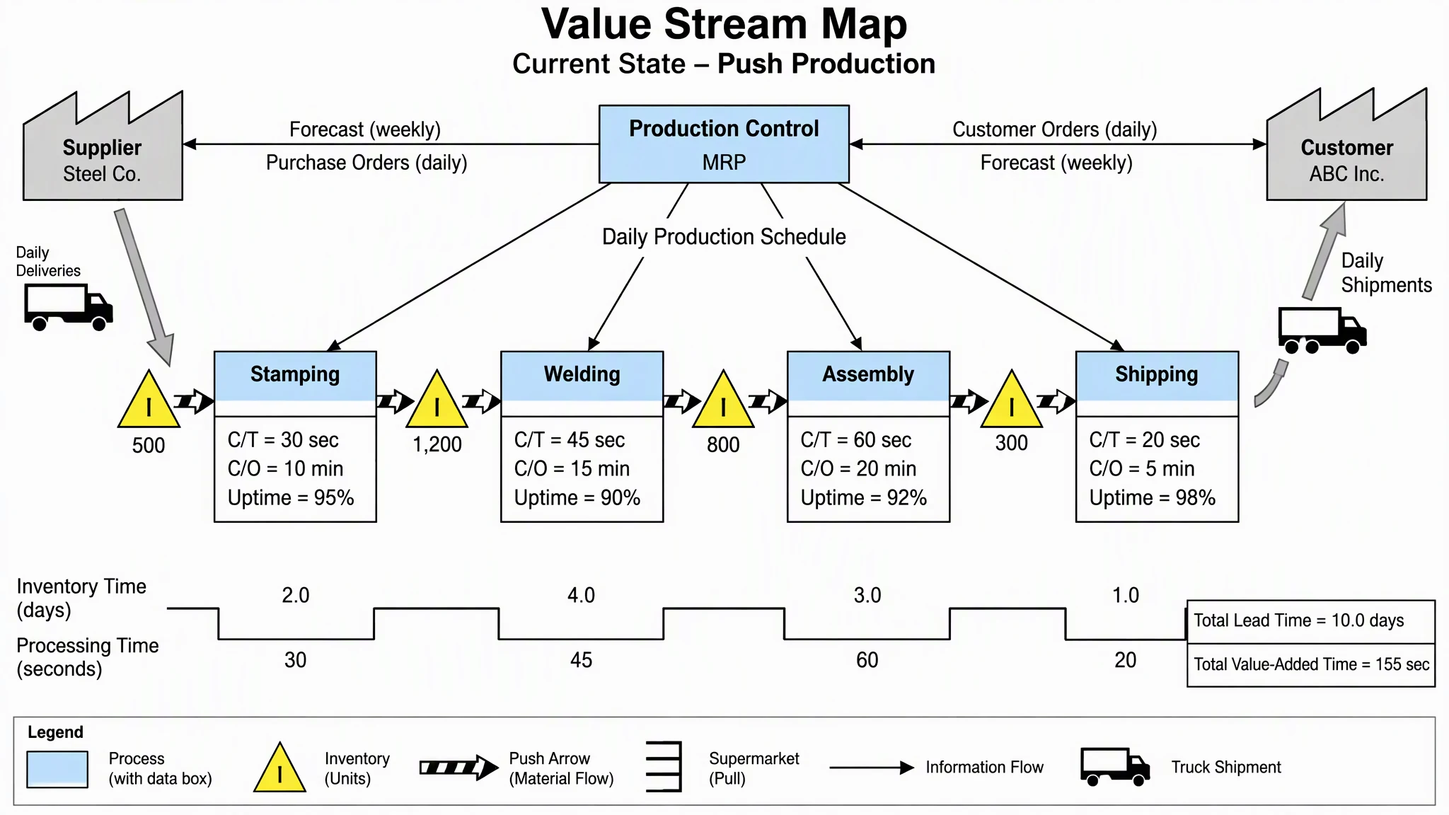
Value stream map calculations
Five formulas cover most of the numbers on a current-state map. The examples use the push-production map above.
| Metric | Formula | Example |
|---|---|---|
| Takt time | Available working time per day / customer demand per day | 25,200 s / 420 units = 60 s per unit |
| Inventory days | Inventory quantity / customer demand per day | 1,200 pcs / 600 pcs per day = 2.0 days |
| Production lead time | Sum of inventory days (and any wait time) plus processing time | 2.0 + 4.0 + 3.0 + 1.0 days, plus 155 s of processing = about 10 days |
| Value-added time | Sum of the cycle times of the value-adding steps | 30 + 45 + 60 + 20 = 155 s |
| Process cycle efficiency | Value-added time / lead time | 155 s / (10 days x 25,200 s of working time) = about 0.06 percent |
Example values are illustrative, for a 7-hour working day. Use the working time and demand from your own plant.
Common value stream mapping mistakes
- Mapping every task instead of every area of flow. A VSM is not a flowchart; one process box covers a group of steps that run together.
- Using standard times from the routing instead of measured ones. Walk the floor and time it.
- Mapping several product families on one page. Pick one family and map the others later.
- Skipping information flow. The scheduling system is often the biggest source of inventory.
- Counting inventory in pieces only. Convert it to days of demand so the timeline adds up.
- Drawing the future state before the current state has real numbers.
VSM vs SIPOC vs process flow diagram vs swimlane
| Diagram | What it shows | Best for |
|---|---|---|
| Value stream map | Material and information flow with cycle times, inventory, and wait times | Lean waste analysis and lead-time reduction |
| SIPOC diagram | Suppliers, inputs, 4 to 7 steps, outputs, and customers on one page | Scoping a project before detailed mapping |
| Process flow diagram | Major equipment and material streams, often with a stream table | Chemical and process plant design |
| Swimlane diagram | Steps and decisions split by role or department | Finding handoff delays and ownership gaps |
For a chemical or plant process with equipment and streams, use the process flow diagram generator. To split the same steps by role, use the swimlane diagram generator. After the map shows where the delay is, a fishbone diagram and a Pareto chart help you find and rank the causes.
Value Stream Map Examples
Generated with this tool from the prompts shown. Always check the numbers before you reuse a map.
Current State: Push Production
Four steps pushed through inventory. The timeline separates 10 days of waiting from 155 seconds of processing.
Current State with Supermarket and Kanban
Production control, forecasts, a finished-goods supermarket, and a withdrawal kanban in one current-state map.
Future State: Pull and FIFO
A future state with a supermarket pull loop, a FIFO lane, and a kaizen burst on the changeover.
Continuous Flow Cell
Three steps grouped as one cell with a single data box, so there is no inventory between them.
Service Process: Order to Cash
An office process: queues of orders and invoices, %C&A in the data boxes, and 6.5 days of wait against 28 minutes of work.
What is a value stream map template?
A value stream map template is a starting layout with the standard symbols already placed: customer and supplier at the top corners, production control in the middle, a row of process boxes with data boxes, inventory triangles between them, and a timeline ladder at the bottom. In this tool, the sample prompts above work as templates: pick one, replace the step names and numbers with yours, and generate. If you work from a printed or slide template instead, the symbol table on this page is the checklist for filling it in.
Current state vs future state map
The current-state map shows how material and information flow today, with the real inventory, cycle times, and push arrows. The future-state map redraws it with improvements applied: connected flow, supermarkets and pull signals, and a single scheduling point. Teams usually draw the current state first, mark kaizen bursts on it, then generate a future state to agree on the target and the order of improvements.
Manufacturing vs service VSM
Manufacturing maps count pieces and use cycle time and changeover time. Service and office maps count requests, orders, or patients, and usually replace the data box with process time (P/T), wait time (WT), percent complete and accurate (%C&A), and number of people. The timeline works the same way: waiting time on top, processing time below, and a ratio of value-added time to lead time at the end.
Where the maps come from
Value stream mapping grew out of the Toyota "material and information flow" diagrams and was popularized by the 1998 workbook Learning to See by Mike Rother and John Shook (Lean Enterprise Institute), which is the usual source of the symbols used here. Some companies add their own symbols or use slightly different data boxes, so follow your own standard where one exists.
Frequently Asked Questions
Related Process & Quality Tools
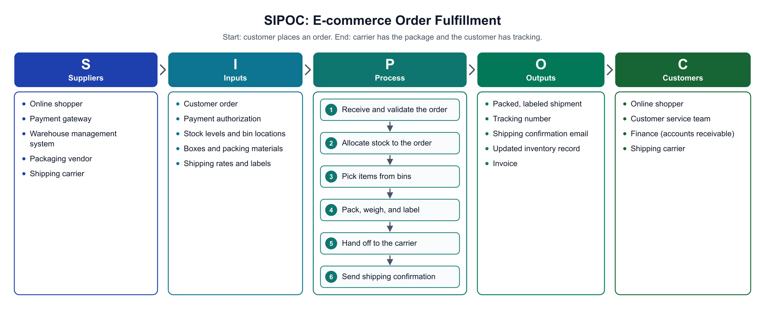 Process
SIPOC Diagram Maker
Scope the process with a one-page SIPOC before you map the value stream.
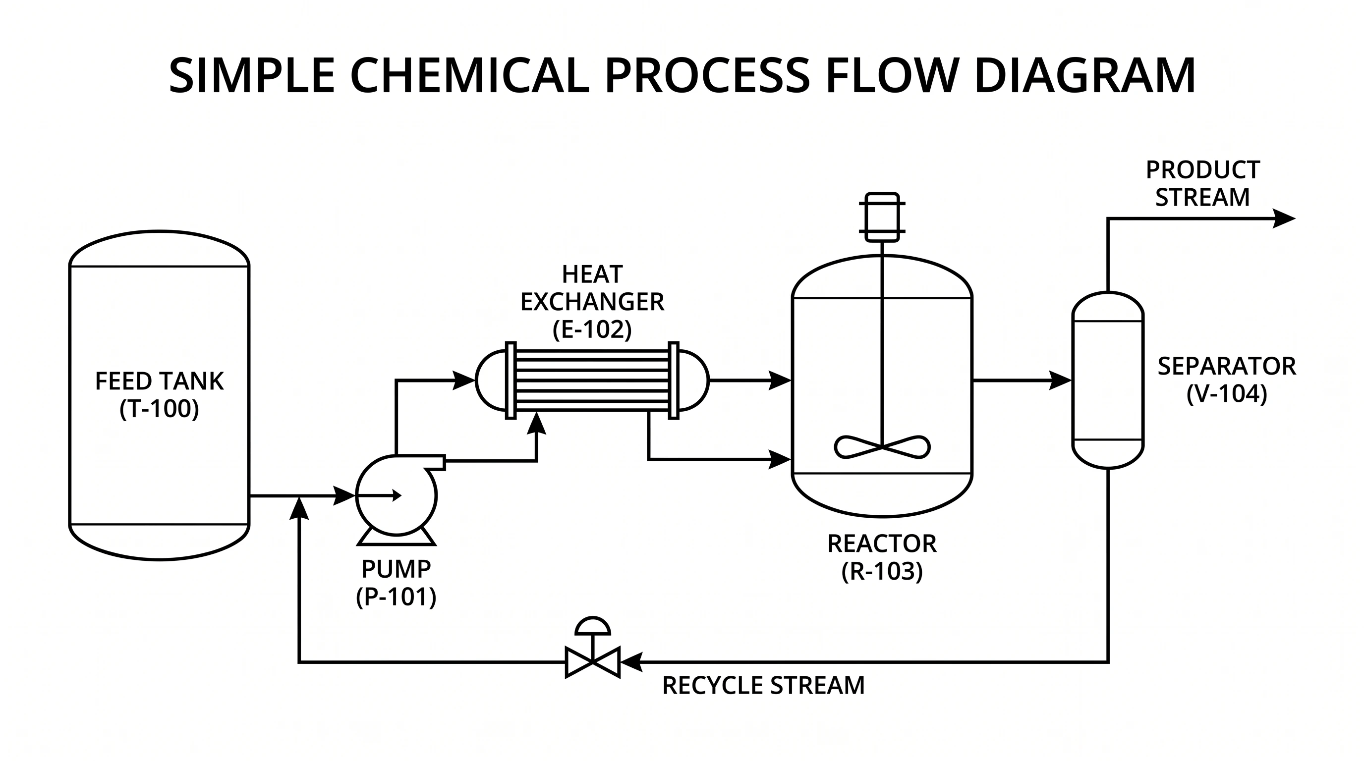 Engineering
Process Flow Diagram Generator
Draw equipment and material streams for chemical and process plants.
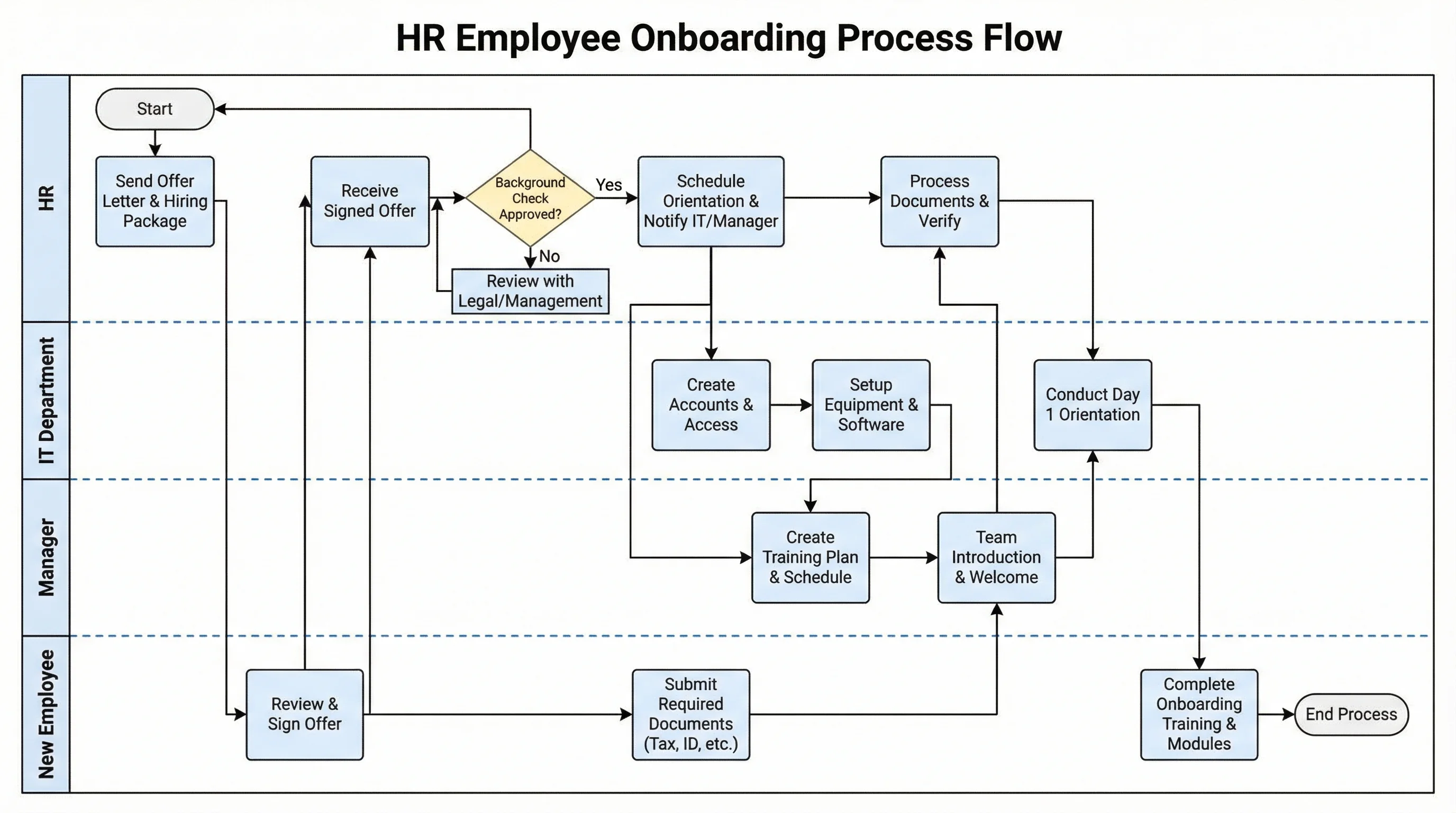 Process
Swimlane Diagram Generator
Split the process by role or department to find handoff delays.
 Quality
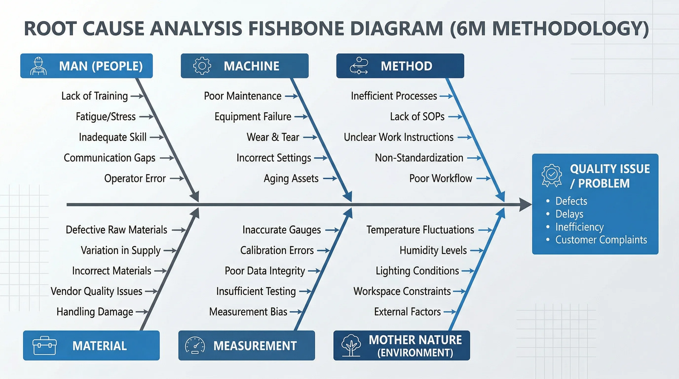
Fishbone Diagram Generator
Find root causes of the delay a value stream map points to.
 Quality
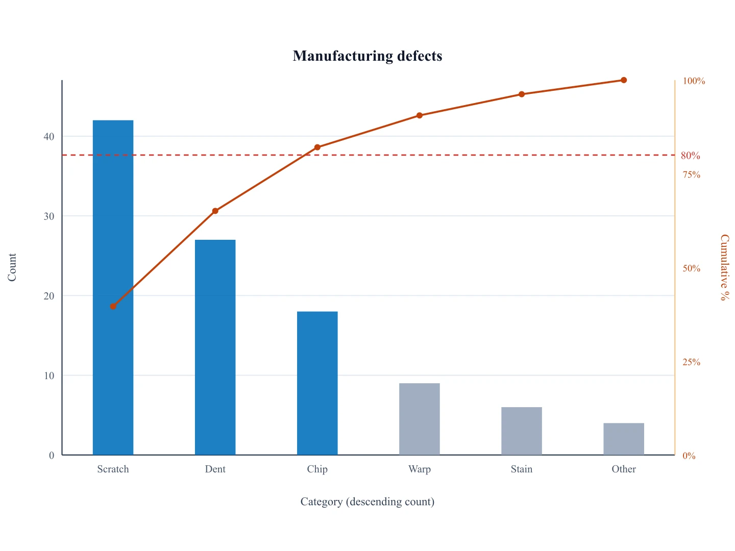
Pareto Chart Generator
Rank the causes of waste to decide where to improve first.