Bell Curve Generator for the Normal Distribution
Make a normal distribution graph from your data or a custom mean and SD. Shade z-scores and the 68-95-99.7 regions, then export SVG or PNG free.
Enter a mean and standard deviation (or paste data) — renders an exact normal curve as SVG, free
Curve settings
Exact normal curve, rendered as SVG.
Shaded area ≈ 68.27% (μ ± 1σ)
Shaded area ≈ 68.27% (μ ± 1σ). Download an editable SVG for slides, reports, and worksheets.
Bell Curve Generator
Free to try ·
Your bell curve will appear here
Describe the bell curve you want
Bell Curve Examples
Normal distribution graphs for grading, testing, and quality control
Standard Normal Distribution
The standard normal curve (μ = 0, σ = 1) with the 68-95-99.7 regions shaded and labeled.
Exam Score Distribution
A custom curve built from a mean and standard deviation — here, grading on a curve.
Comparing Two Curves
Plot two normal curves on the same axes to compare a control and treatment group.
Shaded Region & Critical Values
Shade a region to show a 95% interval, with critical values at z = ±1.96.
IQ Score Distribution
IQ scores are a classic bell curve with μ = 100 and σ = 15 — change μ and σ to fit any scale.
Process Capability Curve
A normal curve with specification limits — the bell curve behind Six Sigma quality control.
What is a bell curve (normal distribution)?
A bell curve is the graph of a normal distribution — the smooth, symmetric, bell-shaped curve that describes how many natural measurements cluster around an average. Most values fall near the middle, and they thin out evenly toward both tails. The peak sits at the mean, the curve is symmetric about it, and the total area underneath always equals 1 (or 100% of the data). Heights, test scores, measurement errors, and IQ all follow this shape closely, which is why the bell curve is the single most-used graph in statistics. This bell curve generator draws that curve for you — precisely, from your own numbers — so you do not have to plot points by hand.
Two ways to make a bell curve here
- Precise data mode: enter a mean and standard deviation, or paste a dataset, and the tool draws the exact normal curve, scales the axes, and can shade any region you choose. The math is computed, so the graph is accurate every time — ideal for homework, lab reports, and statistics class.
- AI illustration mode: describe the bell curve you want in plain English and the tool generates a polished, presentation-ready graphic with themed colors and labels — great for slides, blog posts, and explainer visuals.
- Use data mode when the numbers have to be right; use AI mode when you want a styled, on-brand picture of a distribution rather than an exact plot.
How the mean (μ) and standard deviation (σ) shape the curve
Every normal distribution is defined by just two numbers. The mean (μ) sets the location — it is the center of the curve, where the peak sits, so changing μ slides the whole bell left or right without changing its shape. The standard deviation (σ) sets the spread. A small σ makes the curve tall and narrow, because the data is tightly packed around the mean; a large σ makes it short and wide, because the data is more spread out. In every case the area under the curve stays equal to 1, so a wider curve is also flatter. In this normal distribution graph generator you simply type μ and σ, and the curve redraws instantly — set μ = 0 and σ = 1 for the standard normal curve, or any values that match your real data.
The 68-95-99.7 rule, z-scores, and shading a region
For a normal distribution the empirical rule (the 68-95-99.7 rule) describes how the data spreads: about 68% of values fall within one standard deviation of the mean (±1σ), about 95% within two (±2σ), and about 99.7% within three (±3σ). A z-score restates any value as the number of standard deviations it sits from the mean — z = (x − μ) / σ — and the area to the left of that z-score is its percentile. The generator can shade a region under the curve so you can see and label these areas directly: shade ±1σ to show the 68% band, shade a tail to mark a probability, or shade the central 95% (which lands at z = ±1.96, the precise figure behind a 95% confidence interval). Shading turns the curve into a tool for reading percentiles and probabilities, not just a picture.
How to make a bell curve from your own data
- Choose your input: either enter a mean and standard deviation directly, or paste a column of raw numbers and let the tool compute the mean and standard deviation for you.
- The generator builds the matching normal curve and scales the x-axis to cover roughly μ ± 3σ, so the whole bell is visible.
- Optionally shade a region — a ±1σ band, a tail, or a custom interval — to highlight a percentage, percentile, or z-score.
- Adjust labels and colors, then export a clean SVG or PNG to drop into a report, slide, or worksheet.
When to use the AI illustration mode
Reach for the AI illustration mode when you want a styled, eye-catching graphic rather than a strict plot — a themed distribution for a presentation, a concept image for a blog post, or a friendly visual for a social post. The AI graphic looks great but is not measured from your numbers, so for anything where the curve, areas, or z-scores must be exact — a graded assignment, a lab report, or a real analysis — use the precise data mode, where the normal curve is computed from your mean and standard deviation.
Frequently Asked Questions
Related Statistics Tools
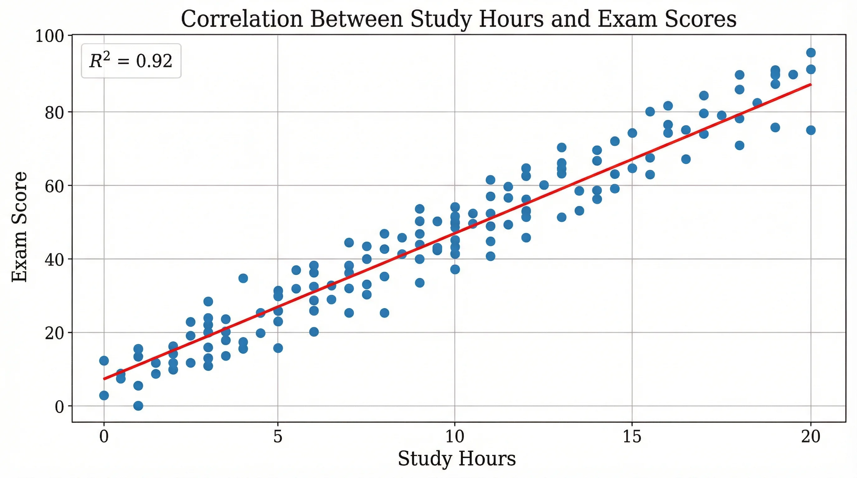 Research
Scatter Plot Maker
Plot two variables to reveal correlation and trends, with an optional trend line.
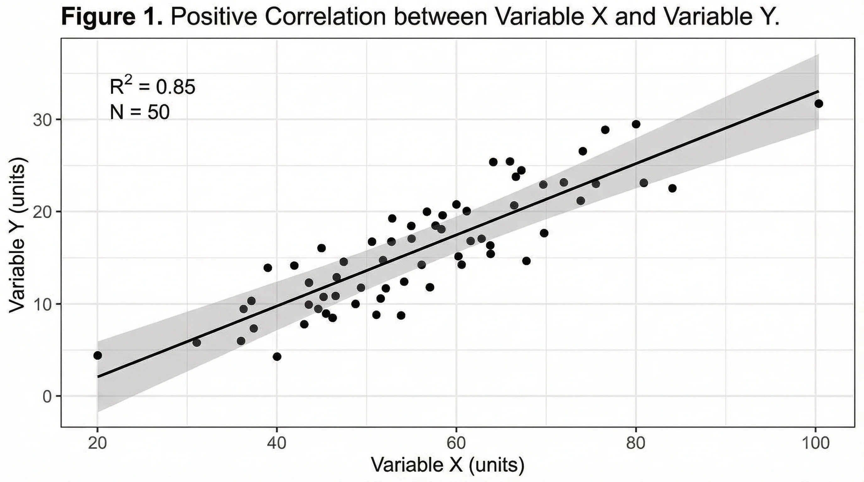 Research
AI Chart Generator
Turn your data into clean bar, line, pie, and scatter charts in seconds.
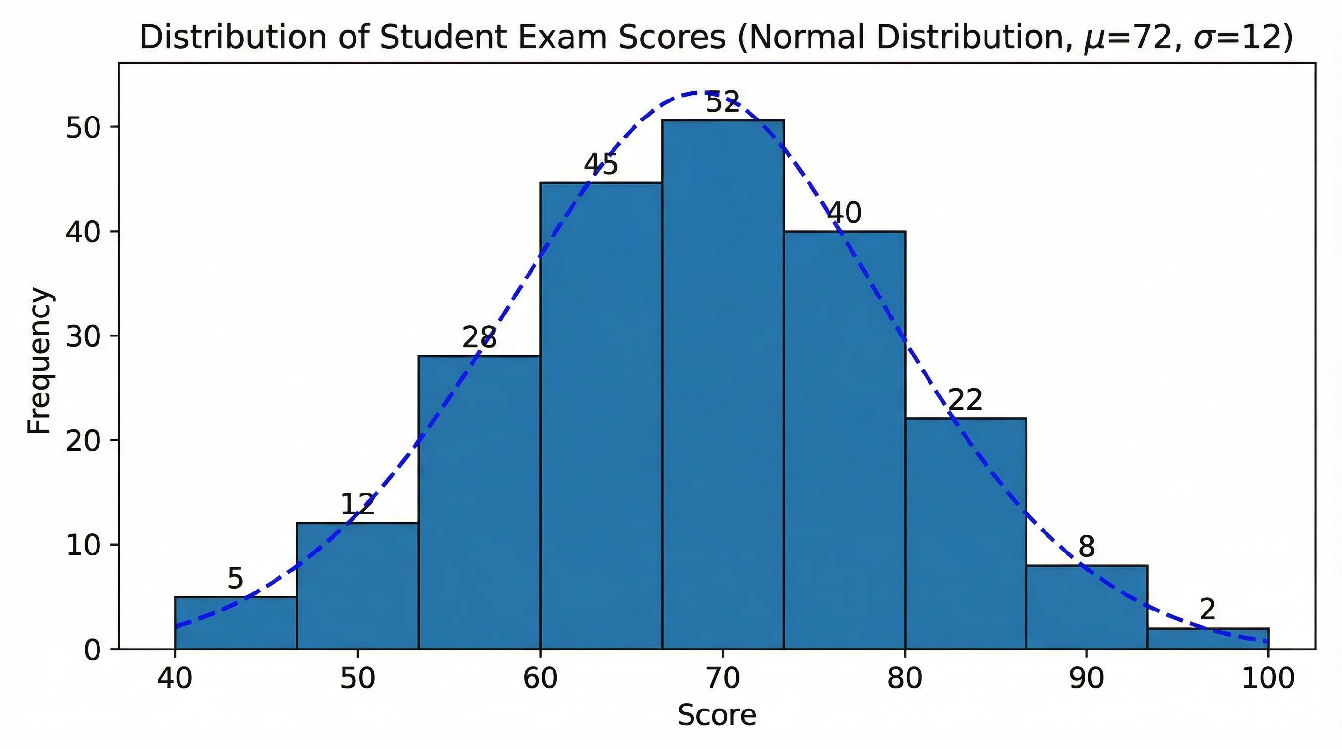 Statistics
Histogram Maker
Turn raw scores into a histogram, then compare the shape with a normal curve.