Violin Plot Generator with Density & Quartiles
Free violin plot generator — paste your numbers to draw a kernel-density violin with quartile box and median, and compare groups. Export SVG.
Paste your numbers — renders an exact violin plot with density, quartiles & median, free
Paste raw values for each group — the kernel-density shape, quartile box, and median are computed for you.
Violin Plot Generator
Free to try ·
Your AI violin plot will appear here
For an exact plot computed from your data, use the Precise Plot tab instead
Violin Plot Examples
Exact engine renders — single distributions, group comparisons, and skew
Two-Group Comparison
Exact engine render — two groups with density shapes and inner quartile boxes.
Single Distribution
Exact engine render — one distribution as a kernel-density violin.
Four-Group Comparison
Exact engine render — four groups compared on one value axis.
Skewed Distribution
Exact engine render — a right-skewed distribution with a long tail.
Test Scores by Class
Exact engine render — test-score distributions across two classes.
Gene Expression
Exact engine render — gene expression across three conditions.
What is a violin plot?
A violin plot shows the full distribution of a numeric variable. It looks like a box plot with a mirrored density curve wrapped around it: the width at any height is the estimated density of the data at that value, so wide sections mean many observations and narrow sections mean few. Inside each violin, a small box marks the interquartile range (Q1 to Q3) and a dot or line marks the median, combining the summary statistics of a box plot with the shape information of a histogram. Violin plots are the standard way to compare distributions across groups — they reveal skew, multiple peaks (bimodality), and spread that a box plot alone would hide. This generator computes the kernel density estimate and the quartiles from the numbers you paste in and draws one violin per group.
How to read a violin plot
- Width at a given height = density — the wider the violin there, the more data points fall near that value.
- The inner box spans the interquartile range (Q1 to Q3); half the data lies inside it.
- The dot marks the median; the thin line is the full min-to-max range.
- A long tail or a second bulge reveals skew or bimodality that a box plot would flatten out.
Violin plot vs box plot vs histogram
All three show distribution, but at different resolutions. A histogram shows the shape of one distribution in detail but is awkward for comparing many groups side by side. A box plot summarizes each group compactly with quartiles and outliers but hides the shape — two very different distributions can share the same box. A violin plot is the middle ground: it keeps the box plot's compact per-group summary while adding the density shape, so it is ideal when you want to compare several groups and still see whether each is skewed or bimodal. Use a histogram to study one distribution closely, a box plot for a quick five-number comparison, and a violin plot when shape and comparison both matter.
How to make your violin plot
- Paste the raw numbers for each group into its box — separated by commas, spaces, or new lines.
- Set the title and value-axis label; the density shape, quartile box, and median update as you type.
- Add a second or third group to compare distributions on the same axis, each with its own color.
- Download a clean, scalable SVG for your paper, report, or slides — free, with no sign-up.
Kernel density estimation behind the shape
The smooth outline of each violin is a kernel density estimate (KDE): every data point contributes a small Gaussian bump, and the bumps are summed to form a continuous curve, with the bandwidth chosen by Silverman's rule of thumb. That is why a violin looks smooth even from a handful of points, and why very small samples produce wide, uninformative shapes — with only a few observations, prefer a box plot or a dot plot. This tool normalizes each violin to the same maximum width so groups are easy to compare; the quartile box and median inside are computed directly from your data, not from the smoothed curve.
Frequently Asked Questions
Related Data & Stats Tools
 Research
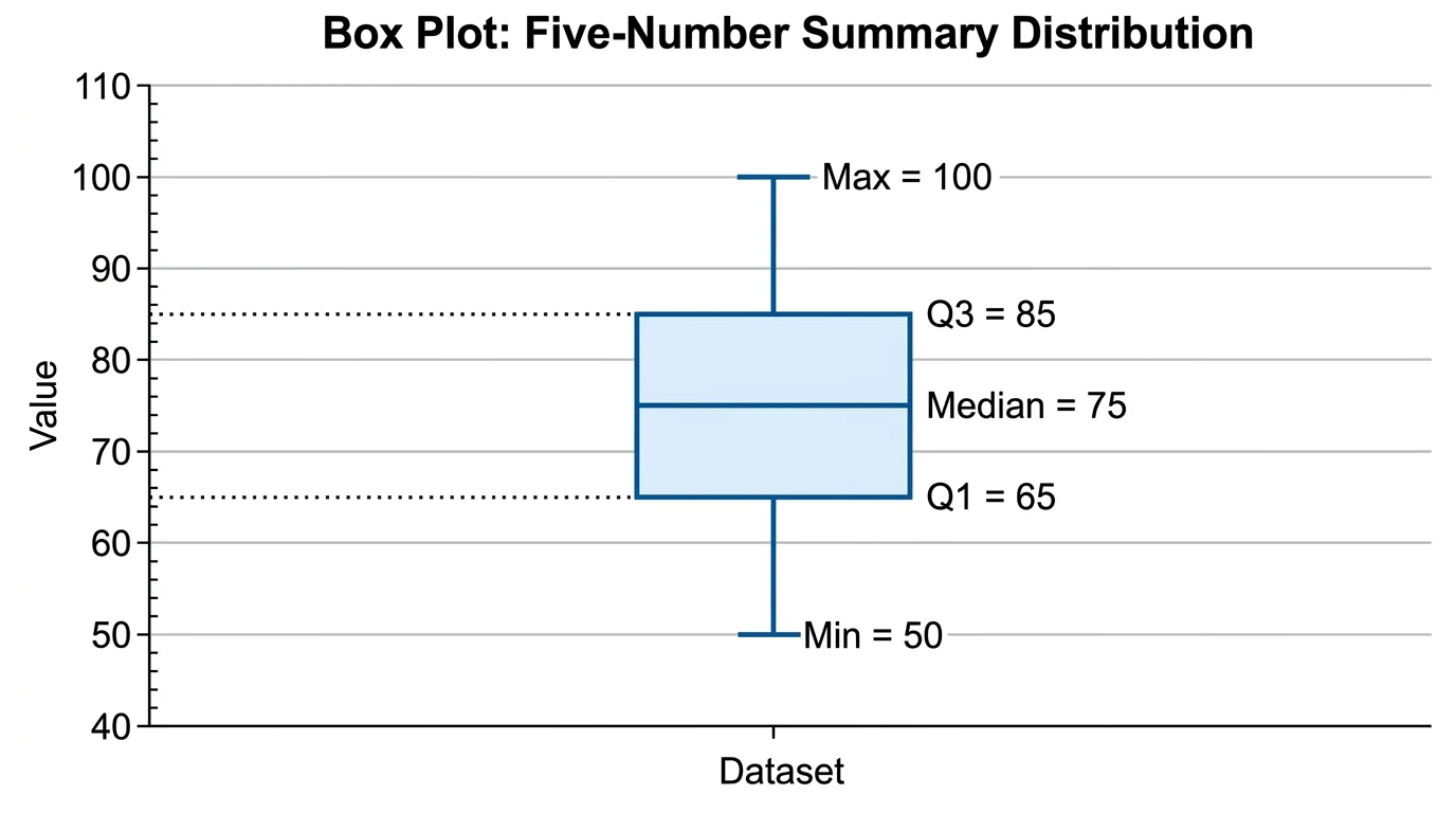
Box Plot Generator
Draw box-and-whisker plots showing quartiles, medians, and outliers.
 Research
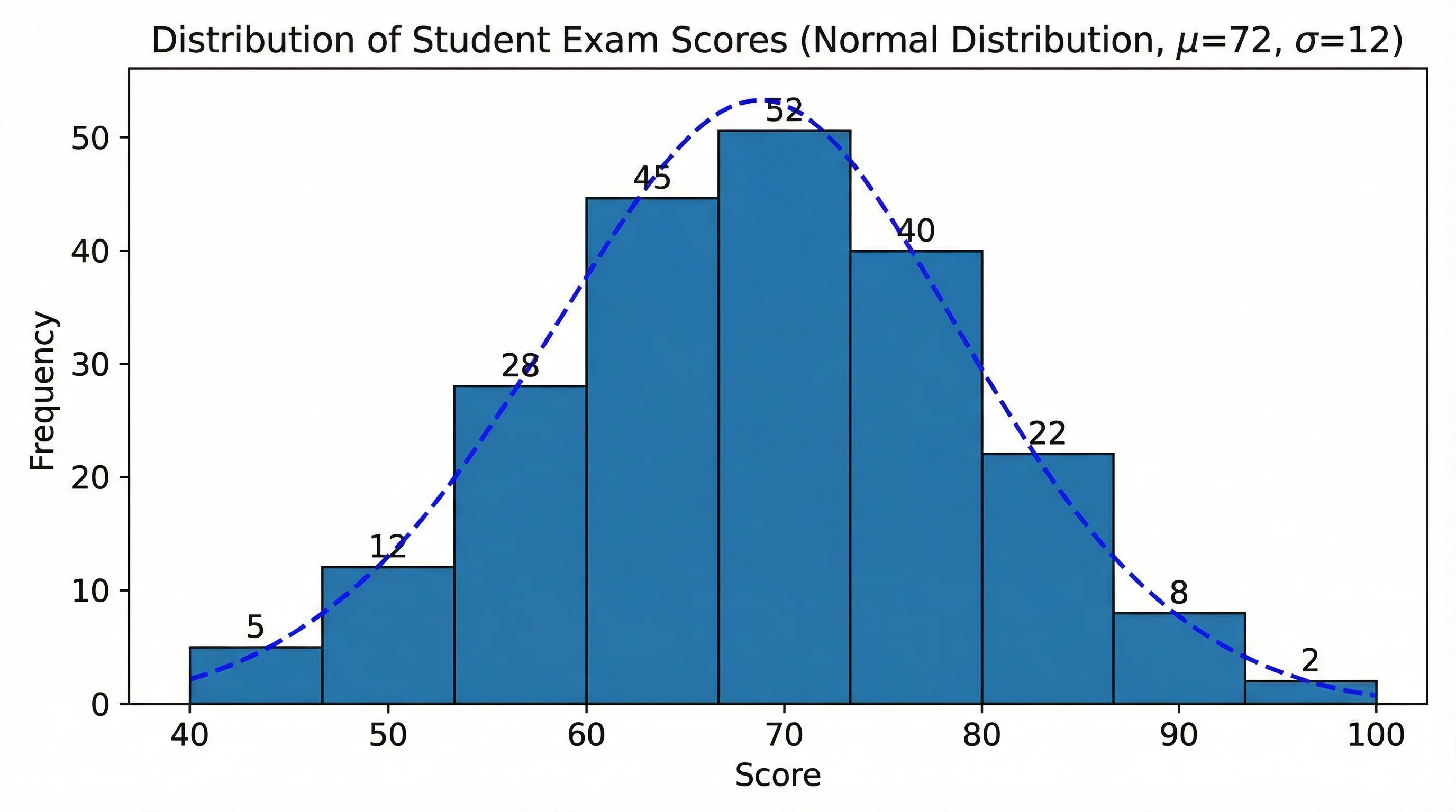
Histogram Maker
Turn a data set into a histogram showing the shape of its distribution.
 Research
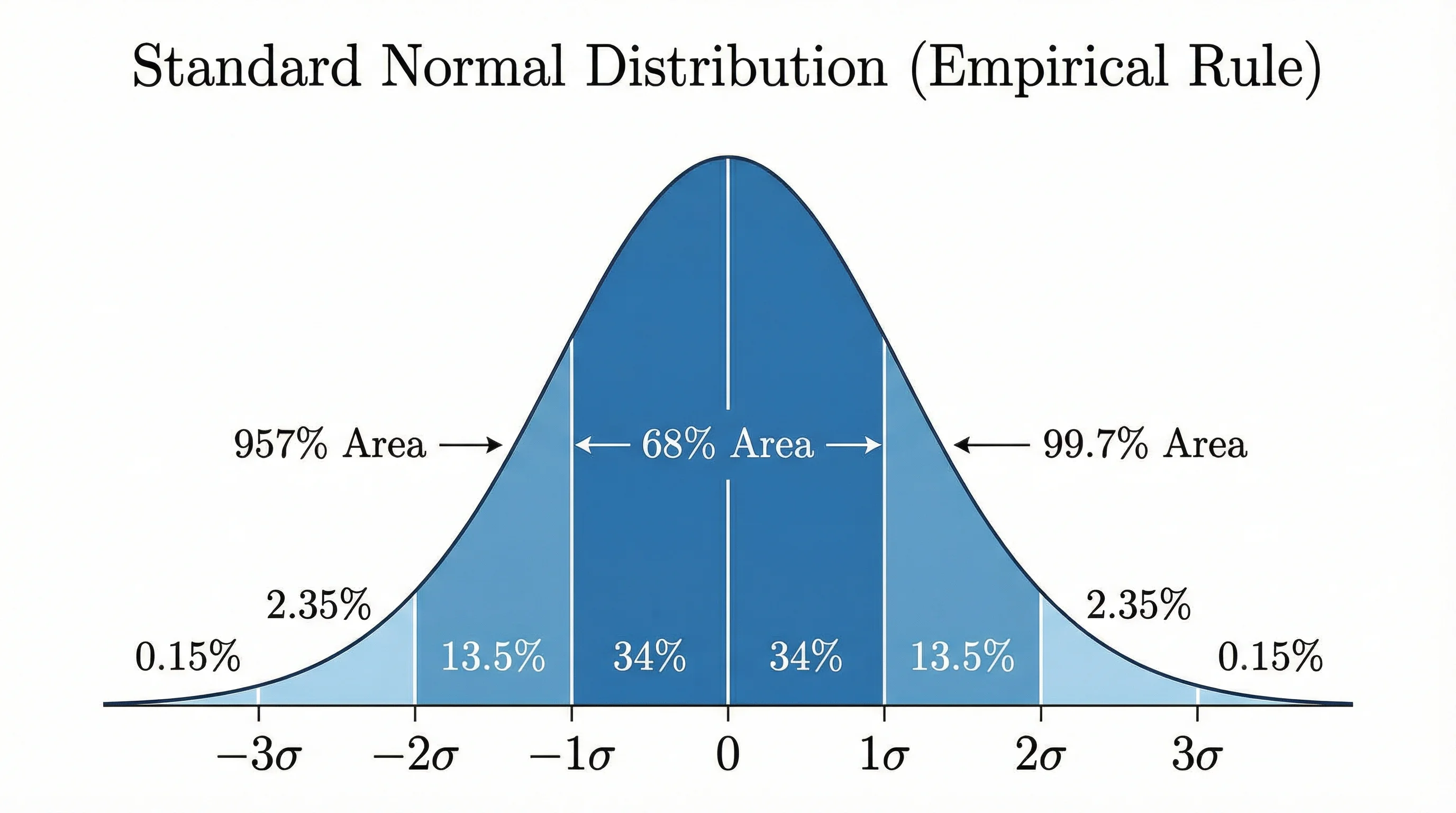
Bell Curve Generator
Plot a normal distribution with shaded areas, z-scores, and standard deviations.
 Research
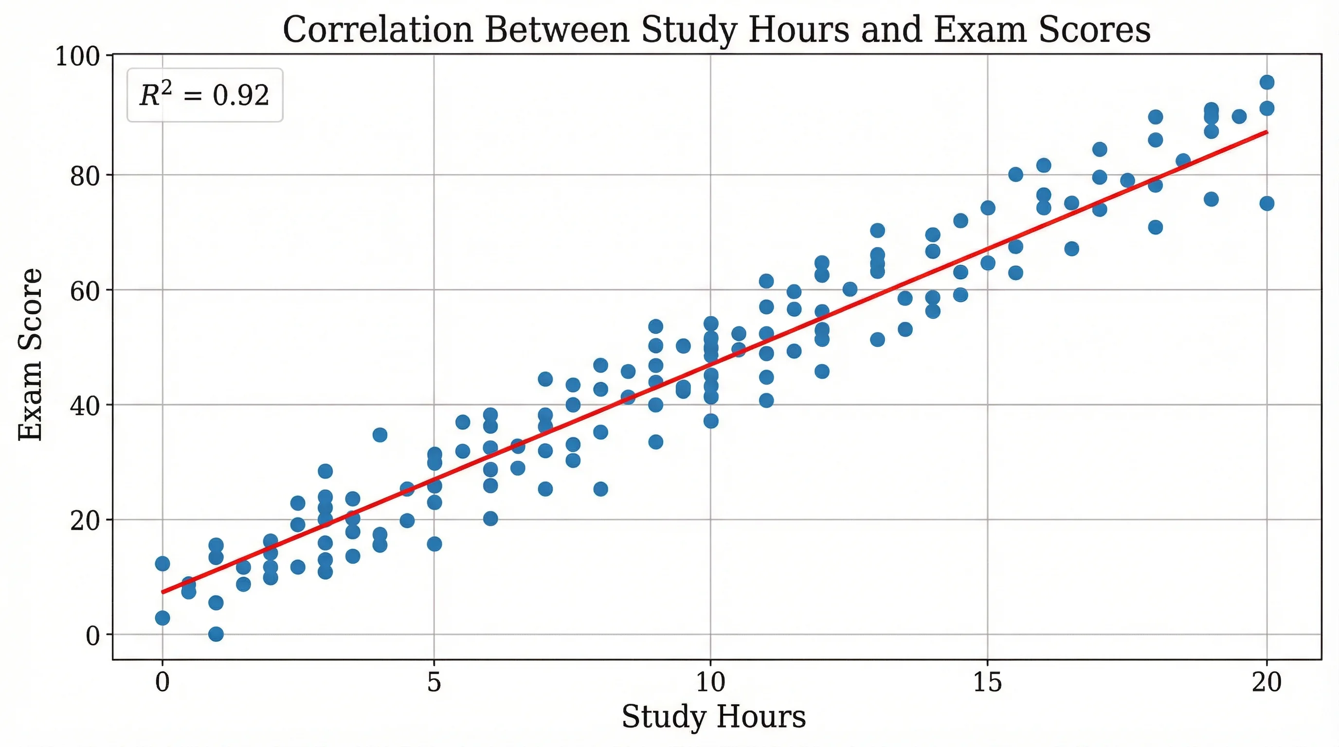
Scatter Plot Maker
Plot paired data points to reveal correlation and trends between variables.
 Research
Dot Plot Generator
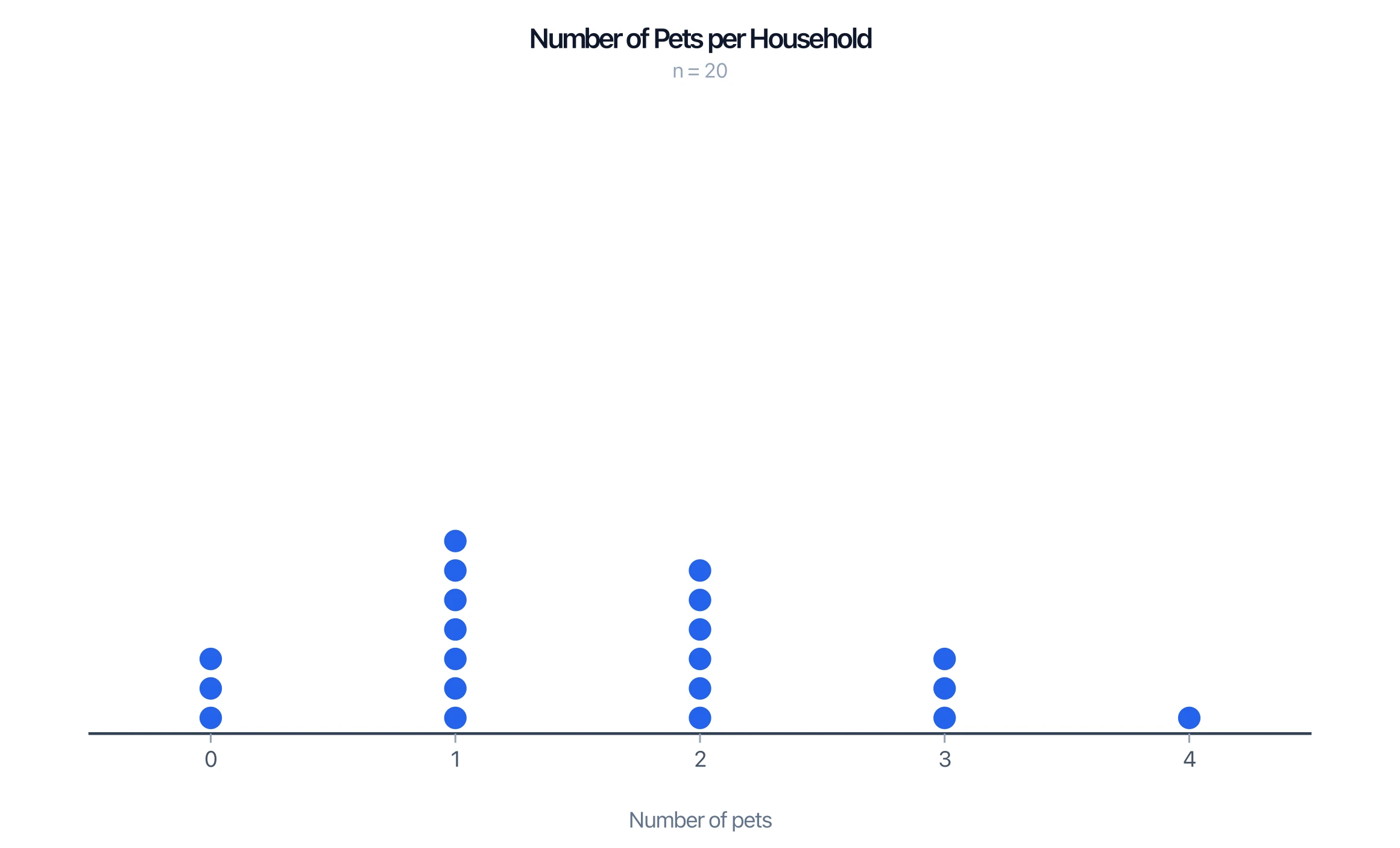
Show a small data set as stacked dots along a number line.