Precision-Recall Curve Generator with Average Precision
Free precision-recall curve generator — plot precision against recall, compare models, and compute average precision (AP). Enter your points, export SVG.
Enter your precision / recall points — renders an exact PR curve with average precision, free
Enter points as recall (x) and precision (y), each between 0 and 1. The baseline is the positive-class prevalence (no-skill line), and the average precision (AP) is computed for you.
Precision-Recall Curve Generator
Free to try ·
Your AI precision-recall curve will appear here
For an exact curve with a computed AP, use the Precise Curve tab instead
Precision-Recall Curve Examples
Exact engine renders — single models, comparisons, and imbalanced data
Single Classifier
Exact engine render — one classifier with its AP and the no-skill baseline.
Model Comparison
Exact engine render — several models overlaid, each with its AP in the legend.
Imbalanced Data
Exact engine render — rare positives, where the baseline sits low.
Excellent Classifier
Exact engine render — a strong model that holds precision across recall.
Fraud Detection
Exact engine render — a fraud detector where positives are rare.
Three-Model Comparison
Exact engine render — three models with different AP on one chart.
What is a precision-recall curve?
A precision-recall (PR) curve shows the trade-off between precision and recall for a binary classifier as its decision threshold changes. Precision (y-axis) is the share of predicted positives that are correct; recall (x-axis, also called sensitivity) is the share of real positives the model finds. As you lower the threshold you catch more positives (recall rises) but usually let in more false positives (precision falls), tracing a curve that starts high-left and decays toward the right. The PR curve is the standard companion to the ROC curve and is especially informative on imbalanced data, where a high false-positive count is hidden by the ROC curve but shows up directly as low precision. This generator draws the curve and computes the average precision (AP) from the points you enter, and can overlay several models to compare them.
Precision, recall, and the no-skill baseline
- Precision = TP / (TP + FP) — of everything predicted positive, how much really was positive.
- Recall = TP / (TP + FN) — of all the real positives, how many the model found (same as sensitivity).
- No-skill baseline: a horizontal line at the positive-class prevalence — a random classifier scores that precision at every recall.
- A good model stays well above the baseline; the further toward the top-right corner, the better.
Average precision (AP) and when to prefer PR over ROC
Average precision (AP) summarizes the PR curve as a single number — the area under it, computed here with the trapezoidal rule. Higher is better, and the no-skill value equals the positive prevalence, so on imbalanced data a "good" AUC on the ROC curve can hide a poor AP. That is exactly when the PR curve earns its keep: if positives are rare (fraud, disease, rare events), a classifier can achieve a high ROC AUC while still flooding you with false positives, and only the PR curve and AP make that visible. Report both when you can, and read them alongside the raw counts in a confusion matrix to choose a threshold that fits the cost of each error.
How to make your precision-recall curve
- Enter each point as a recall (x) and a precision (y), both between 0 and 1.
- Set the baseline to your positive-class prevalence to draw the no-skill line; the AP is computed as you type.
- Add a second or third curve to compare models on the same axes — each gets its own color and AP in the legend.
- Download a clean, scalable SVG for your paper, notebook, or slides — free, with no sign-up.
Precision-recall curve vs ROC curve
The ROC curve plots the true positive rate against the false positive rate and is threshold-independent and prevalence-independent, which makes it great for comparing models in general. The precision-recall curve, by contrast, reflects the class balance directly through precision, so it is the better lens when the positive class is rare and false positives are costly. A common workflow is to look at both curves plus a confusion matrix: the ROC and its AUC for an overall sense of ranking quality, the PR curve and AP for performance on the positive class, and the confusion matrix for the raw counts at your chosen threshold.
Frequently Asked Questions
Related Data & Stats Tools
 Research
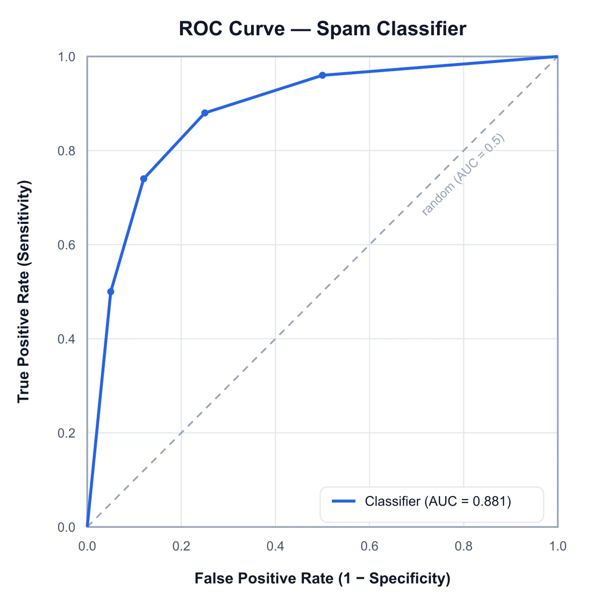
ROC Curve Generator
Plot true positive rate against false positive rate and compute the AUC.
 Research
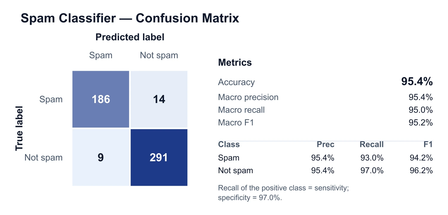
Confusion Matrix Generator
Build a confusion matrix with accuracy, precision, recall, and F1 for a classifier.
 Research
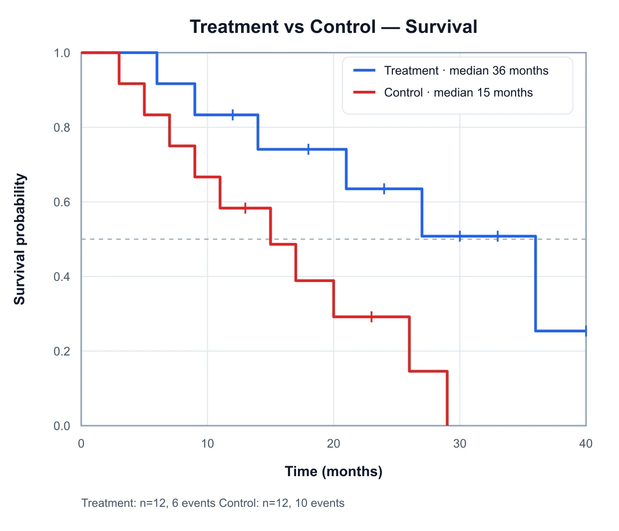
Kaplan–Meier Generator
Plot survival curves with censoring marks and median survival.
 Research
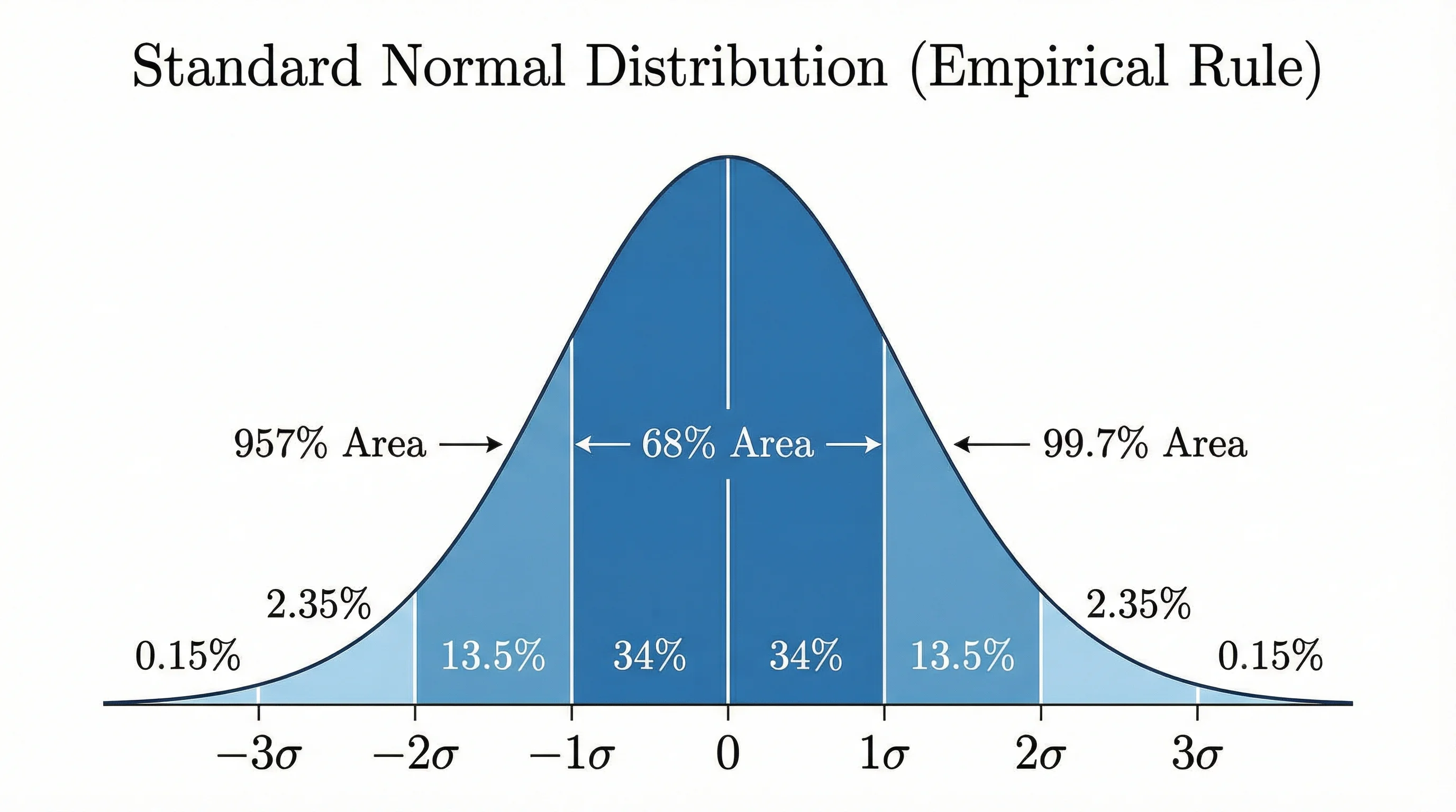
Bell Curve Generator
Plot a normal distribution with shaded areas, z-scores, and standard deviations.
 Research
Box Plot Generator
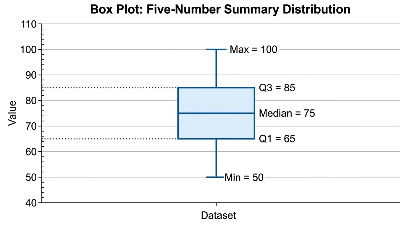
Draw box-and-whisker plots showing quartiles, medians, and outliers.