")
How to Design Scientific Infographics: 8-Step Guide for Researchers (2026)
Create credible, publication-ready infographics that scientists trust. Step-by-step process covering data accuracy, visual hierarchy, and source citations - with free templates.
Designing infographics for scientists is fundamentally different from creating them for general audiences. Scientists are trained to scrutinize data, question methodology, and demand evidence. An infographic that works for social media marketing will likely fall flat—or worse, damage your credibility—when presented to researchers.
This 8-step guide shows you exactly how to create infographics that meet the rigorous standards of scientific audiences while still leveraging the power of visual communication.
AI Infographic Generator
Create professional scientific infographics with AI. No design skills needed.
Try it free →Understanding the Scientific Audience
Before designing anything, understand what makes scientists different as an audience:
What Scientists Value
| Priority | What It Means | Design Implication |
|---|---|---|
| Accuracy | Data must be precise and verifiable | Include sources, avoid rounding errors |
| Methodology | How was this information obtained? | Show sample sizes, confidence intervals |
| Nuance | Reality is complex | Avoid oversimplification that distorts meaning |
| Skepticism | Claims require evidence | Cite peer-reviewed sources |
| Efficiency | Time is valuable | Get to the point quickly |
According to research published in PMC, effective scientific infographics must balance visual appeal with intellectual rigor—a challenge that requires understanding both design principles and scientific communication norms.
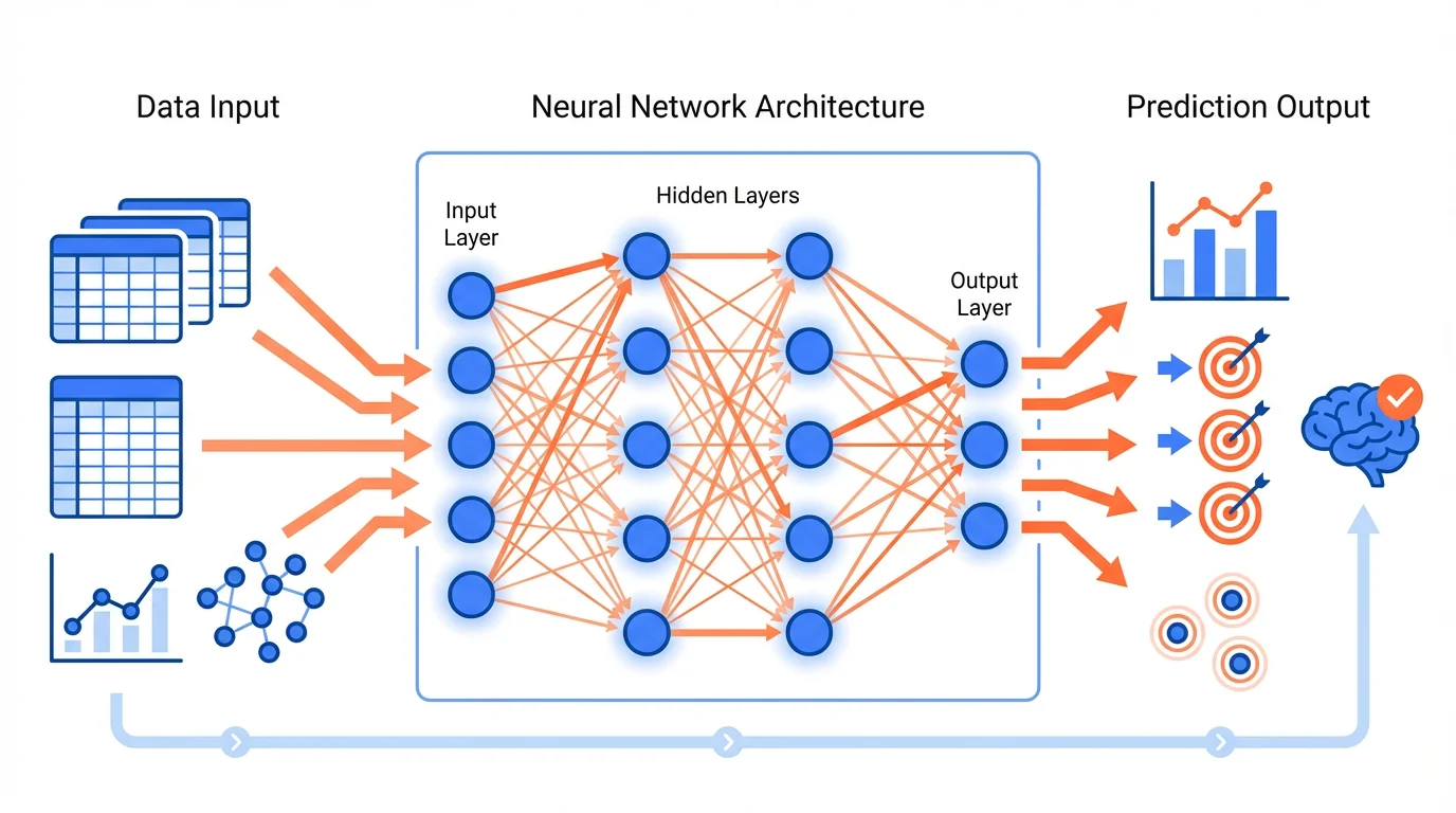
A machine learning workflow infographic demonstrating clear data flow and methodology
The Credibility Framework
For scientific audiences, credibility is everything. The Open University identifies key factors that determine infographic credibility:
1. Source Authority
Scientists will immediately look for:
- Who created this infographic?
- What institution are they affiliated with?
- Are the underlying sources peer-reviewed?
Best Practice: Include institutional logos, author credentials, and DOIs or citations for all data points.
2. Data Accuracy
Every number, percentage, and statistic must be:
- Verifiable from the original source
- Presented with appropriate precision
- Contextualized with sample sizes or confidence intervals
Best Practice: When showing "70% of researchers," also show "n=1,234" and the study citation.
3. Visual Honesty
Scientists are trained to spot misleading visualizations:
- Truncated axes that exaggerate differences
- Cherry-picked time ranges
- Misleading scales or proportions
Best Practice: Start bar charts at zero, use consistent scales, and show full data ranges.
Design Principles for Scientific Infographics
1. Prioritize Clarity Over Creativity
While creative infographics work for general audiences, scientists prefer clarity. As Animate Your Science notes, scientific infographics should explain complex topics without overwhelming the reader.
Do:
- Use standard chart types (bar, line, scatter)
- Label everything clearly
- Maintain consistent visual language
Don't:
- Use decorative elements that obscure data
- Employ unusual chart types without justification
- Sacrifice accuracy for aesthetics
2. Establish Visual Hierarchy
Guide the viewer through your information logically:
┌─────────────────────────────────────────┐
│           MAIN FINDING (Largest)        │
├─────────────────────────────────────────┤
│     Supporting Data    │   Context      │
│     (Medium)           │   (Medium)     │
├─────────────────────────────────────────┤
│  Methods  │  Limitations  │  Sources    │
│  (Small)  │   (Small)     │  (Small)    │
└─────────────────────────────────────────┘
The most important information should be immediately visible; supporting details can be smaller but must still be present.
3. Use Appropriate Data Visualization
Different data types require different visualizations:
| Data Type | Best Visualization | Example Use |
|---|---|---|
| Comparison | Bar chart | Comparing treatment groups |
| Trend over time | Line chart | Showing disease progression |
| Correlation | Scatter plot | Relationship between variables |
| Proportion | Pie/donut chart | Budget allocation |
| Process | Flowchart | Experimental methodology |
| Hierarchy | Tree diagram | Taxonomic classification |
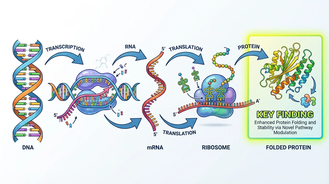
Gene expression study using appropriate visualization for biological data
4. Include Statistical Context
Scientists expect statistical rigor. Always include:
- Sample sizes (n=X)
- Error bars or confidence intervals
- P-values or significance indicators
- Effect sizes when relevant
Example annotation:
Treatment group showed 45% improvement (n=234, p<0.001, 95% CI: 38-52%)5. Maintain Color Accessibility
Scientific audiences include colorblind researchers. Follow these guidelines:
- Use colorblind-safe palettes (avoid red-green combinations)
- Don't rely solely on color to convey information
- Include patterns or labels as secondary indicators
- Test with colorblind simulation tools
For detailed color guidance, see our scientific color palette guide.
Content Strategy for Scientists
Writing for Experts
Unlike general audiences, scientists don't need basic concepts explained. Adjust your content accordingly:
| General Audience | Scientific Audience |
|---|---|
| "DNA is the blueprint of life" | "CRISPR-Cas9 editing efficiency" |
| "Climate change is real" | "1.5°C warming threshold implications" |
| "Exercise is good for you" | "Dose-response relationship in cardiovascular outcomes" |
Assume prior knowledge appropriate to your target field.
Balancing Simplification and Accuracy
The challenge is simplifying without distorting. According to Mind the Graph, clarity, correctness, and simplicity are critical factors for effective scientific graphics.
Acceptable simplification:
- Omitting tangential details
- Using representative examples
- Summarizing methodology
Unacceptable simplification:
- Removing caveats that change interpretation
- Hiding contradictory data
- Overstating certainty
Including Limitations
Scientists respect honesty about limitations. Consider including:
- Study limitations
- Data gaps
- Alternative interpretations
- Areas of ongoing debate
This builds credibility rather than undermining it.
Types of Scientific Infographics
1. Research Summary Infographics
Condense a paper's findings into a visual format:
- Key finding prominently displayed
- Methodology overview
- Main data visualization
- Implications and next steps
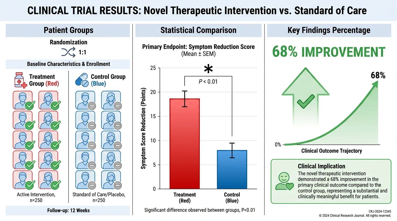
Clinical trial results presented in an accessible visual format
2. Process/Methodology Infographics
Explain experimental procedures or workflows:
- Step-by-step visual flow
- Decision points clearly marked
- Time/resource requirements
- Quality control checkpoints
3. Comparison Infographics
Compare treatments, methods, or findings:
- Side-by-side visual comparison
- Consistent metrics across items
- Clear criteria for comparison
- Statistical significance indicators
4. Timeline Infographics
Show progression or historical development:
- Chronological flow
- Key milestones highlighted
- Scale appropriate to content
- Context for each time point
5. Conceptual Framework Infographics
Illustrate theoretical relationships:
- Clear relationship indicators
- Hierarchical structure
- Feedback loops if applicable
- Variable definitions
For more on conceptual frameworks, see our guide to creating conceptual frameworks.
Common Mistakes When Designing for Scientists
1. Oversimplification
Removing nuance that scientists consider essential. If your infographic makes a complex topic seem simple, scientists will question what you've left out.
2. Missing Sources
Every data point should be traceable. Scientists will dismiss unsourced claims regardless of how well-designed the infographic is.
3. Decorative Data Visualization
Using pictographs, 3D effects, or unusual chart types that obscure rather than clarify data. Stick to standard visualizations unless you have a compelling reason not to.
4. Ignoring Uncertainty
Presenting findings as more certain than they are. Include confidence intervals, acknowledge limitations, and avoid definitive language for preliminary findings.
5. Poor Resolution
Scientists often need to examine details closely. Low-resolution graphics that become pixelated when zoomed are unacceptable.
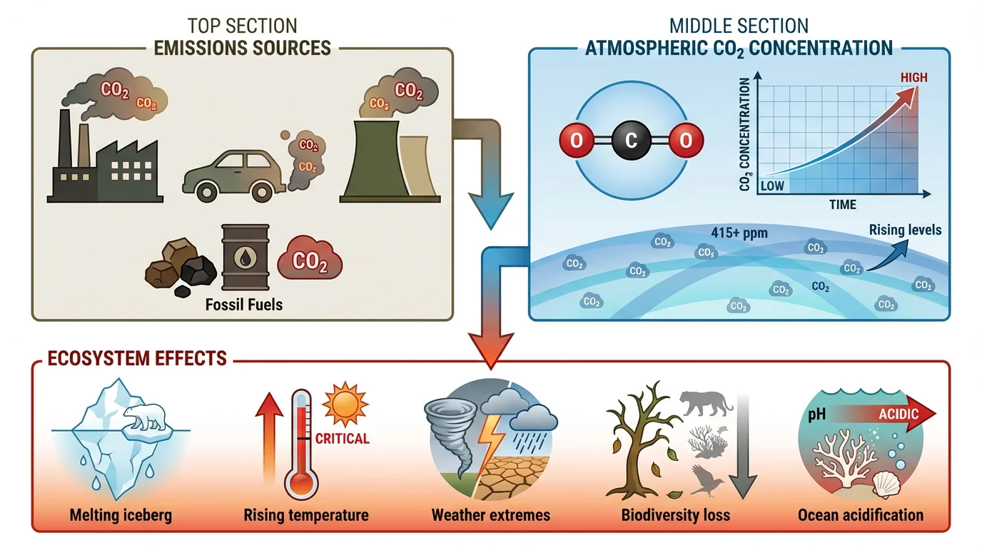
Environmental impact infographic maintaining scientific rigor
Tools and Resources
Design Software
- Adobe Illustrator: Professional-grade, steep learning curve
- BioRender: Specialized for life sciences
- Mind the Graph: Scientific illustration focus
- Canva: User-friendly, limited scientific templates
AI-Powered Solutions
ConceptViz offers AI-powered infographic generation specifically designed for scientific content, helping researchers create professional visualizations while maintaining accuracy.
Data Visualization Libraries
For custom visualizations:
- Python: Matplotlib, Seaborn, Plotly
- R: ggplot2, plotly
- JavaScript: D3.js, Chart.js
Quality Checklist for Scientific Infographics
Before sharing your infographic with a scientific audience:
Data Integrity:
- All data points have citations
- Numbers are accurate and appropriately precise
- Statistical context is included (n, p-values, CI)
- Visualizations don't distort data
Design Quality:
- Visual hierarchy guides the eye logically
- Colors are accessible (colorblind-safe)
- Text is readable at intended display size
- Resolution is sufficient for detailed examination
Scientific Standards:
- Limitations are acknowledged
- Methodology is clear
- Sources are peer-reviewed where possible
- Claims match the evidence strength
Audience Appropriateness:
- Technical level matches target audience
- Jargon is appropriate for the field
- Prior knowledge assumptions are reasonable
- Format suits the distribution channel
Distribution Considerations
Where you share your infographic affects design choices:
| Platform | Considerations |
|---|---|
| Journal submission | High resolution, print-ready, follows journal guidelines |
| Conference poster | Large format, readable from distance |
| Social media | Optimized dimensions, key message visible in thumbnail |
| Presentation slides | Simplified version, builds progressively |
| Website/blog | Interactive elements possible, responsive design |
Conclusion
Designing infographics for scientists requires a different mindset than general audience design. The core principles are:
- Prioritize accuracy over visual appeal
- Include sources for every data point
- Maintain statistical rigor with appropriate context
- Acknowledge limitations honestly
- Use standard visualizations unless alternatives are justified
When done well, scientific infographics can communicate complex research efficiently while maintaining the credibility that scientific audiences demand. The goal isn't to make science "pretty"—it's to make it clearer without sacrificing accuracy.
For more guidance on scientific visualization, explore our data visualization best practices guide and scientific infographic design guide.
Frequently Asked Questions
How should an infographic look for an audience of scientists?
Infographics for scientists should prioritize accuracy and credibility over decorative elements. Include citations for all data, show statistical context (sample sizes, confidence intervals), use standard chart types, acknowledge limitations, and maintain visual honesty. Scientists value clarity and verifiability over creative design.
What makes scientific infographics different from general infographics?
Scientific infographics require higher data accuracy, source citations, statistical context, and acknowledgment of limitations. They assume prior knowledge, use field-appropriate terminology, and prioritize clarity over creativity. Scientists will scrutinize methodology and dismiss unsourced claims.
Should I include citations in my scientific infographic?
Yes, absolutely. Every data point, statistic, and claim should be traceable to a source, preferably peer-reviewed. Scientists will dismiss infographics without proper citations regardless of design quality. Include DOIs or abbreviated references that viewers can verify.
How do I balance simplification with scientific accuracy?
Simplify by omitting tangential details and using representative examples, but never remove caveats that change interpretation, hide contradictory data, or overstate certainty. The goal is clarity without distortion. When in doubt, include more context rather than less.
What chart types work best for scientific audiences?
Standard chart types are preferred: bar charts for comparisons, line charts for trends, scatter plots for correlations, and flowcharts for processes. Avoid decorative visualizations like pictographs or 3D effects that can obscure data. Scientists trust familiar formats.
How important is color accessibility in scientific infographics?
Very important. Scientific audiences include colorblind researchers, so use colorblind-safe palettes, avoid red-green combinations, and don't rely solely on color to convey information. Include patterns, labels, or other secondary indicators alongside color coding.
Should I include limitations in my infographic?
Yes. Scientists respect honesty about limitations, and including them builds credibility rather than undermining it. Acknowledge study limitations, data gaps, alternative interpretations, and areas of ongoing debate. This demonstrates scientific rigor.
What resolution should scientific infographics be?
Use high resolution (at least 300 DPI for print) so scientists can examine details closely. Low-resolution graphics that pixelate when zoomed are unacceptable for scientific audiences who may need to scrutinize specific data points or labels.
Can AI tools help create scientific infographics?
Yes, AI infographic generators like ConceptViz can help researchers create professional scientific infographics quickly. These tools understand scientific visualization requirements, maintain data accuracy, and generate publication-ready graphics while saving hours of design time.
What are the 8 steps to design a scientific infographic?
The 8 steps are: 1) Understand your scientific audience, 2) Establish the credibility framework with sources, 3) Prioritize clarity over creativity, 4) Establish visual hierarchy, 5) Use appropriate data visualization, 6) Include statistical context, 7) Maintain color accessibility, and 8) Review with the quality checklist before distribution.
カテゴリー
もっと読む
")
How to Create Circuit Diagrams Online: Free Tools & Step-by-Step Guide (2026)
Learn how to draw circuit diagrams online for free. Compare top circuit diagram makers and follow our step-by-step guide to create professional electrical diagrams.

Canva for Diagrams: Honest Review & Alternatives
An honest review of Canva's diagramming features in 2026. See where Canva excels, where it falls short, and which specialized alternatives work better.

Framework vs Model in Research: Complete Guide to Understanding the Difference
Learn the key differences between frameworks and models in academic research. Includes practical examples, when to use each, and how to apply them in your research methodology.