用 AI智能
即时生成专业蜘蛛图和蜘蛛网图。对比多个维度变量、可视化绩效指标、分析数据规律,AI驱动的蜘蛛图制作工具,一键生成。
Upload your data — generates precise spider charts with real values
Spider Chart Maker
By using ConceptViz, you agree not to generate or edit adult, sexual, explicit, unsafe, or policy-violating content. See Content Policy.
免费试用 ·
Your spider chart will appear here
Describe the spider chart you want
Spider Chart Maker
Paste data, upload a file, or use sample data to continue.
By using ConceptViz, you agree not to generate or edit adult, sexual, explicit, unsafe, or policy-violating content. See Content Policy.
免费试用 ·
Your spider chart will appear here
Upload data to generate a precise spider chart
蜘蛛图示例
浏览AI生成的各类应用场景蜘蛛图
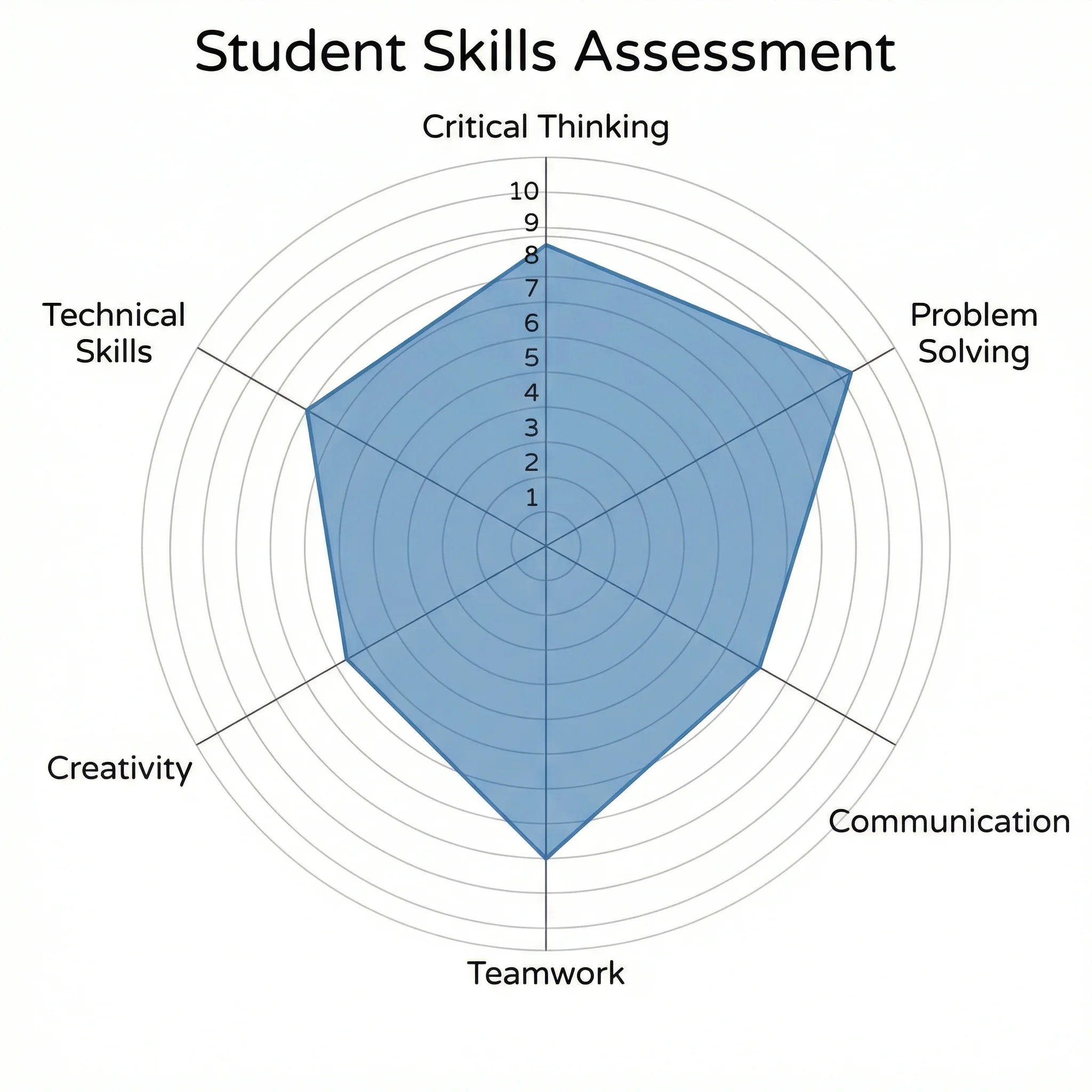
运动员表现蜘蛛图
多维度运动表现综合对比
产品功能对比图
产品能力多维度横向分析
员工技能评估图
技能差距全面可视化
市场分析蜘蛛图
战略市场定位全景概览
项目健康度看板
项目管理KPI可视化
学业成绩画像
学生综合能力画像图
什么是蜘蛛图?
蜘蛛图(又称雷达图、蜘蛛网图或星形图)是一种二维图表,用于在从中心点辐射的轴上展示多变量数据。每条轴代表一个不同的变量,数据点相连形成类似蜘蛛网的多边形。蜘蛛图擅长同时展示多个维度上的相对优势与劣势,非常适合绩效分析、技能评估和竞品对比。
蜘蛛图的适用场景
- 在相同标准下对比多个对象
- 可视化员工绩效考核与技能评估
- 跨竞争对手的产品或服务功能对比
- 运动员多项指标表现画像
- 制造业质量控制与过程监控
- 跨科目的学业成绩跟踪
如何解读蜘蛛图
蜘蛛图中每条轴代表一个变量,数值通常从中心向外增大。中心代表最小值(通常为零),外边缘代表最大值。数据点沿各轴绘制,连线形成封闭多边形。多边形越大、越对称,表示各维度表现均衡且优秀;不对称的形状则突显优势与劣势领域。对比多组数据时,不同颜色的重叠多边形可一目了然地揭示规律。
蜘蛛图使用最佳实践
- 轴数限制在5至10个以保证可读性——轴太多会让图表难以辨认
- 确保所有轴使用相同刻度,或在绘图前对数据进行归一化处理
- 叠加多组数据时使用一致的颜色编码
- 为每条轴清晰标注变量名称和计量单位
- 以固定间隔添加网格线,帮助读者估算数值
- 同一图表对比多个对象时需添加图例
- 仔细规划轴的顺序——相邻轴尽量选择相关变量
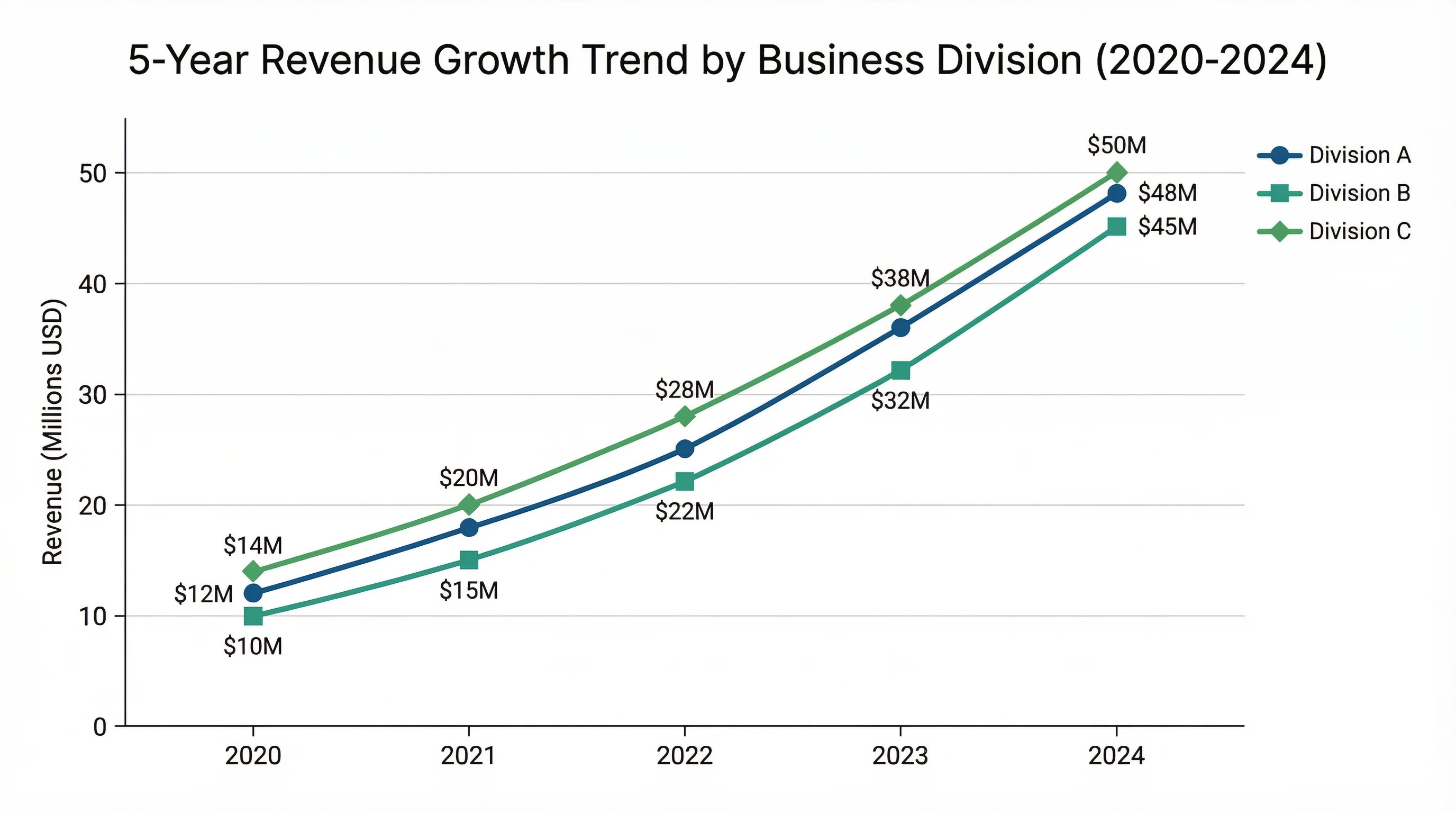
蜘蛛图与条形图的区别
蜘蛛图和条形图都能对比多个类别,但各有侧重。蜘蛛图擅长展示各维度的整体规律和相对平衡,便于发现异常值和不均衡之处;条形图更适合精确数值对比和排名。当变量数量在5至10个之间、视觉形状与具体数值同等重要时,蜘蛛图是更好的选择。对于需要快速把握对象整体画像的演示场景,蜘蛛图往往更具优势。