Radar Chart Generator for Profiles & Comparisons
Make a radar chart online to compare items across several axes or plot a star profile. Type your values for a precise, auto-scaled chart, or describe one for an AI illustration — then export SVG or PNG, free.
Enter axis labels and values — renders an exact radar chart as SVG, free
Chart settings
Exact radar chart, rendered as SVG.
One axis per line: Label, value. Add a third column for a second series: Label, value1, value2. Uses 3–8 axes.
6 axes across 2 series, scaled to a max of 9. Download an editable SVG for slides, reports, and worksheets.
Radar Chart Generator
Free to try ·
Your radar chart will appear here
Describe the radar chart you want
Radar Chart Examples
Star profiles, multi-item comparisons, and metrics across several axes
Skill & Ability Radar
The classic star profile: one shape per person, with each axis a skill or ability score.
Multi-Item Comparison
Overlay several items on the same axes to see at a glance which one leads where.
Before / After Radar
Two series on one chart make a quarter-over-quarter or before/after shift easy to read.
Evaluation Radar
Score competing options against the same criteria to support a decision or write-up.
Profile Radar
A profile shows the balance across categories — strong, weak, and evenly matched axes.
Metrics Radar
Track several quality or performance metrics at once and compare versions side by side.
What is a radar chart?
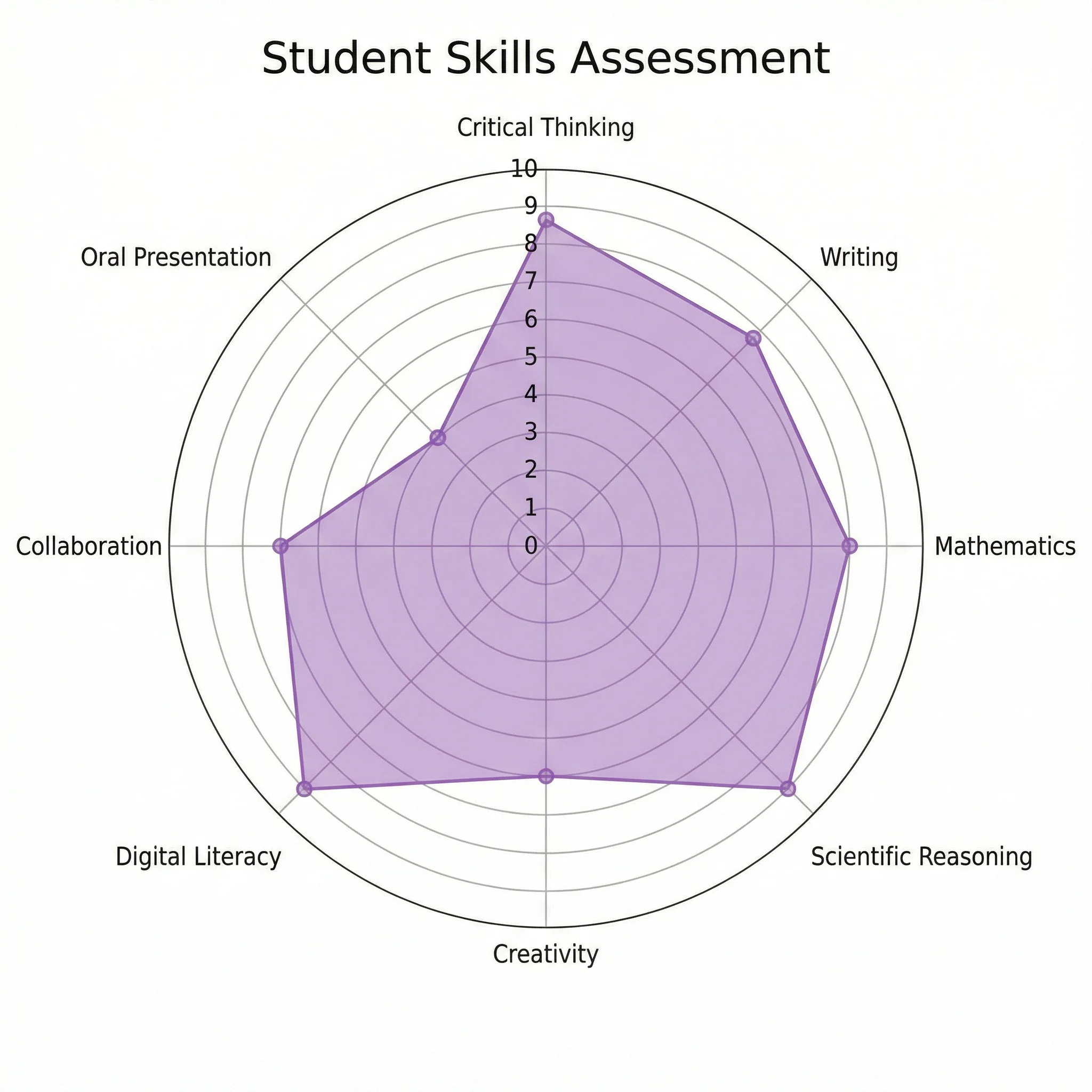
A radar chart plots several variables on axes that radiate out from a single center point, then connects the values into a shape. Each axis is one variable, distance from the center is the value, and the resulting polygon — its "star" shape — shows the overall profile at a glance. It is the best chart type when you want to compare items across many dimensions at once, or capture one item's strengths and weaknesses in a single picture. This generator draws that chart for you, scaling and labeling every axis automatically. (You may also see it called a spider chart or web chart — same chart, different name.)
Star profiles and ability radar charts
The radar chart is the go-to format for a "star profile": a single shape that summarizes one subject across many traits. Game designers use it for character stats — strength, speed, defense, magic, stamina — so a balanced fighter reads as a near-circle and a glass cannon reads as a spike. Teachers and coaches use the same idea as an ability or skill radar, scoring a learner across competencies so growth areas are obvious. Because the shape is instantly recognizable, an ability radar chart communicates a profile far faster than a table of numbers.
Compare multiple items across several axes
The radar chart really earns its place when you overlay more than one series on the same axes. Plot two or three products, candidates, teams, or versions together and each becomes its own translucent shape, so you can see exactly which one leads on which dimension and where they are evenly matched. This many-variables, multiple-items job is where bar and line charts fall apart — a radar chart keeps every axis visible at once. Keep the comparison to two or three series for the cleanest read; more than that and the overlapping shapes get hard to separate.
Two ways to make a radar chart here
- Data mode: type or paste a value for each axis and the tool builds a precise, auto-scaled radar chart — add a second or third series for an exact, labeled comparison, no manual plotting.
- AI illustration mode: describe the radar chart you want in plain English and the tool generates a polished, styled graphic — handy for a presentation, a thumbnail, or a stylized look.
- Use data mode whenever the numbers must be exact (reports, assessments, comparisons); use AI mode when you want an on-brand visual for slides or social.
How to make a radar chart from your data
- List your axes — the variables or skills you are measuring — and give each a short, clear label.
- Enter a value for every axis; to compare items, add another series with its own set of values.
- The tool scales the axes to a common range, plots each series, and adds a legend automatically.
- Adjust labels and colors, then export a clean SVG or PNG to drop into a doc, slide, or worksheet.
When to use the AI illustration mode
Reach for AI illustration mode when you want a styled, eye-catching graphic rather than a strict data plot — a themed character sheet, a presentation visual, or a stylized 3D-look radar for a thumbnail. A radar chart is inherently a flat, 2D plot, so a true data chart stays 2D; the AI mode is what gives you a decorative three-dimensional feel. For anything where the values must be precise, such as an assessment or a graded comparison, use data mode so the chart is plotted from your numbers rather than illustrated by hand.
Frequently Asked Questions
Related Chart Tools
 Visualization
Spider Chart Maker
The same chart under its other name — make a spider or web chart from your values.
 Visualization
AI Chart Generator
Turn your numbers into bar, line, and pie charts with a clean, presentation-ready look.
 Visualization
AI Infographic Generator
Create clean, shareable infographics from your data and key points.