科学配色方案 生成器
为科研图表和数据可视化生成色盲友好配色方案,获取Okabe-Ito、Viridis和Nature期刊推荐颜色的十六进制代码。
Pick A Palette Family, Then Copy What You Need
This page now behaves like a real palette utility, not a generic image prompt box. Choose a family, inspect a figure preview, and copy ready-to-use hex, Python, R, or CSS snippets immediately.
Okabe-Ito
Widely recommended in academic publishing because every category stays distinct, even under common forms of color blindness.
#E69F00, #56B4E9, #009E73, #F0E442, #0072B2, #D55E00, #CC79A7, #000000
You need distinct colors for separate groups or treatments.
Your figure will be read on slides, in print, and by mixed audiences.
You can pair color with direct labels or line styles for extra clarity.
This sends you into the main creation flow with a prefilled prompt based on Okabe-Ito.
配色方案示例
浏览科研配色方案和图表示例,复制可直接使用的十六进制颜色代码
Okabe-Ito 分类配色
分类数据的黄金标准色盲友好配色,包含8种独特颜色。
Viridis 连续色阶
感知均匀的颜色映射,适合连续数据和热图。
Nature期刊风格
顶级科学期刊风格启发的专业配色方案。
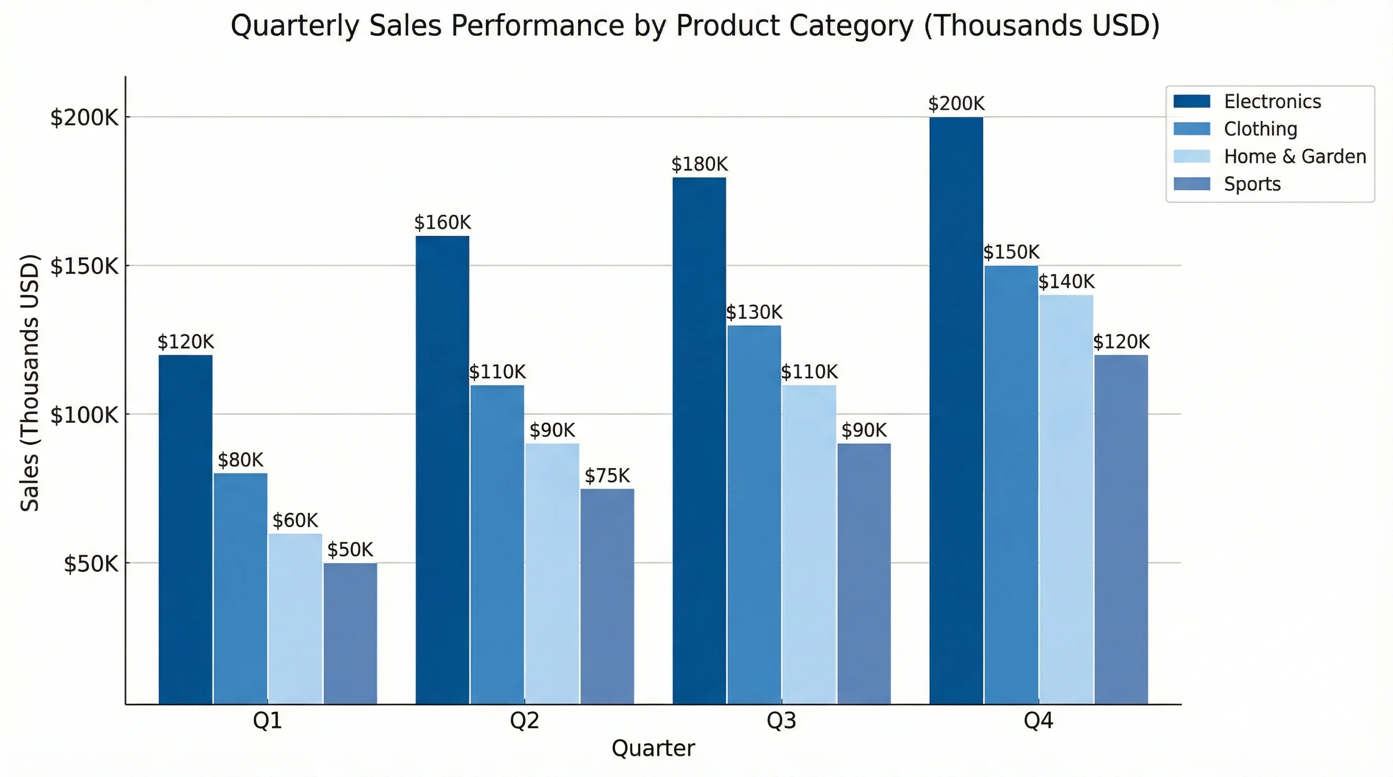
柱状图配色方案
展示如何将无障碍颜色应用于柱状图的示例。
折线图配色
使用无障碍颜色和线型的时间序列可视化。
热图色阶
带感知均匀色阶和注释的热图示例。
什么是科学配色方案?
科学配色方案是专为研究论文数据可视化优化的精心挑选颜色集合。与装饰性配色不同,科学配色注重无障碍性(色盲友好)、感知均匀性(视觉权重均等)以及在不同显示器和打印媒介上的可重现性。最广泛使用的配色包括:分类数据用Okabe-Ito、连续数据用Viridis,以及Nature、Science、Cell等期刊的专用配色方案。
为什么要使用色盲友好配色?
- 约8%的男性和0.5%的女性有某种程度的色觉缺陷
- 许多期刊现在要求或推荐使用无障碍配色方案
- 色盲友好配色对所有读者都更美观,不只是有色觉问题的读者
- 使用Okabe-Ito等标准配色,让你的工作立刻显示出专业水准
- 无障碍图表获得更多引用,因为更多人能理解它们
- 你的图表在灰度打印时也能正确呈现
主流科学配色方案
- Okabe-Ito:8色方案,针对所有类型色盲优化,适合柱状图和分类数据
- Viridis:感知均匀的紫色到黄色渐变,适合热图和连续数据
- Plasma:与Viridis类似,但为品红-橙-黄范围
- Cividis:专门针对绿色弱和红色弱色盲优化
- ColorBrewer:提供定性、连续和发散数据的多套配色
- Nature/Science风格:与顶级期刊审美匹配的精致配色
如何使用这些十六进制颜色代码
直接从我们的配色示例中复制十六进制代码,粘贴到你常用的软件中。在Excel中:格式 > 形状填充 > 更多颜色 > 自定义 > 输入十六进制代码。在PowerPoint中:设置形状格式 > 填充 > 颜色 > 更多颜色 > 自定义。在R中:直接在ggplot2中使用十六进制代码配合scale_color_manual()。在Python matplotlib中:将十六进制代码传入color参数。