折线图 制作工具
描述您的数据,AI将即时生成专业折线图。完美适用于科研论文、商业报告和数据演示。
Upload your CSV/Excel data — generates precise line charts with real trend analysis
Line Chart Maker
By using ConceptViz, you agree not to generate or edit adult, sexual, explicit, unsafe, or policy-violating content. See Content Policy.
免费试用 ·
Your line chart will appear here
Describe the line chart you want
Line Chart Maker
Paste data, upload a file, or use sample data to continue.
By using ConceptViz, you agree not to generate or edit adult, sexual, explicit, unsafe, or policy-violating content. See Content Policy.
免费试用 ·
Your line chart will appear here
Upload data to generate a precise line chart
折线图示例
浏览折线图示例,或在上方生成您自己的图表
单系列趋势折线图
简单单系列折线图,显示12个月内清晰的上升趋势,含数据点标记和标注坐标轴。
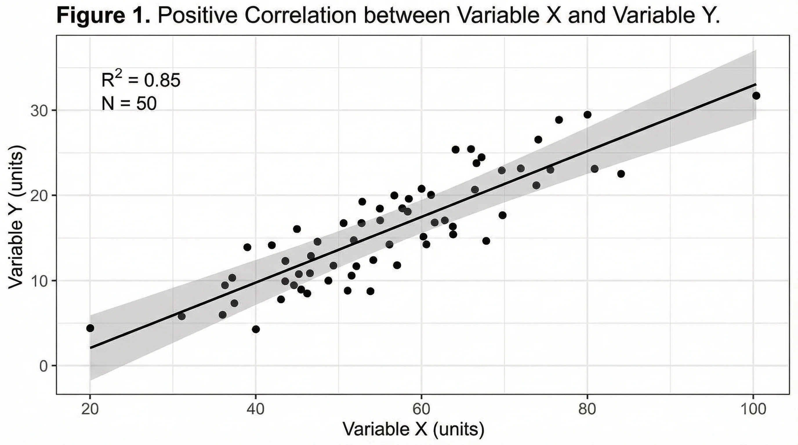
多系列对比折线图
多系列折线图,按季度对比三条产品线,带颜色编码系列和清晰图例。
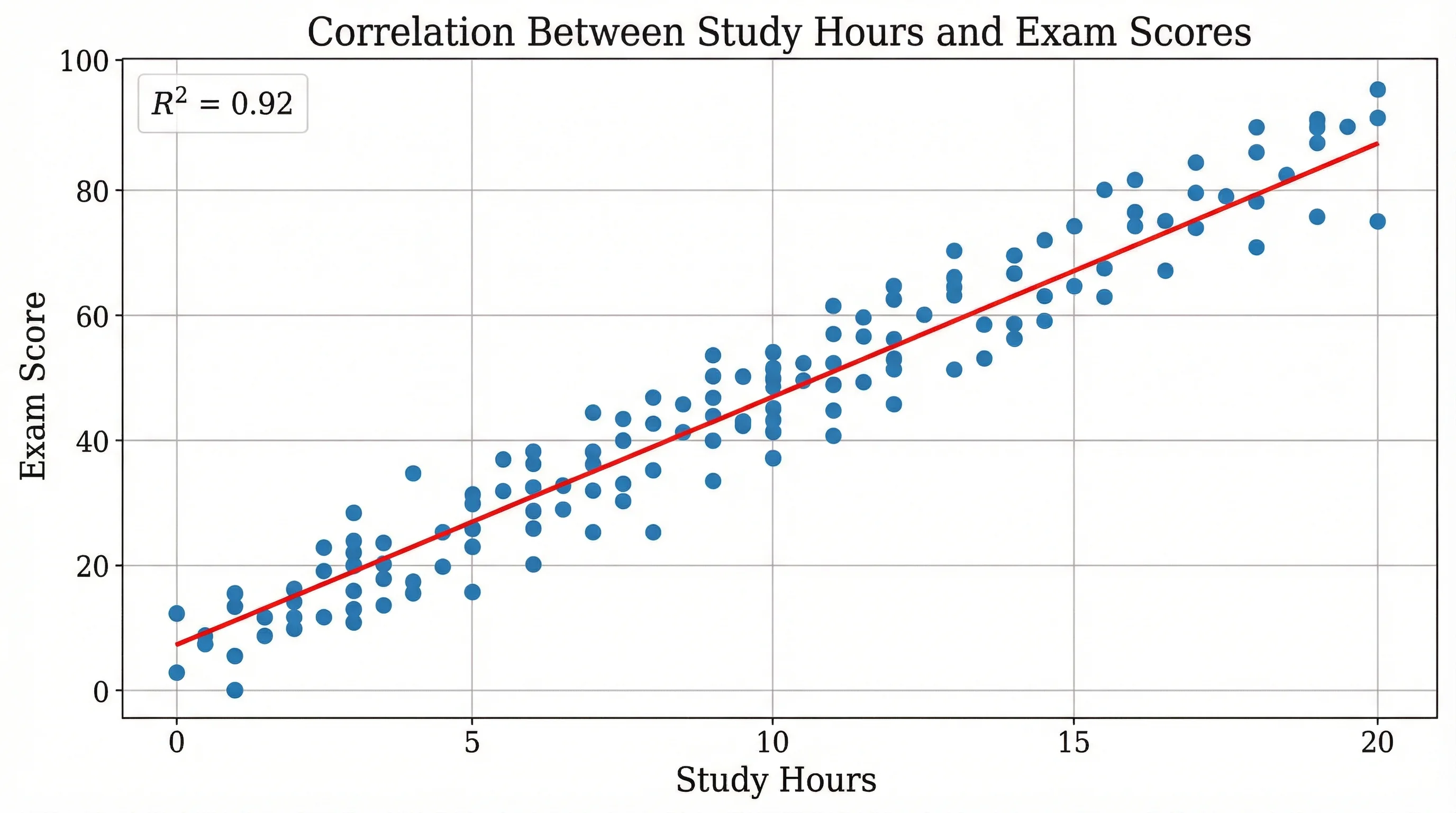
股价折线图
股价折线图,叠加50日均线和成交量指标,用于金融分析。
温度时序图
全年气温时序图,带季节分区底纹和月均气温数据点。
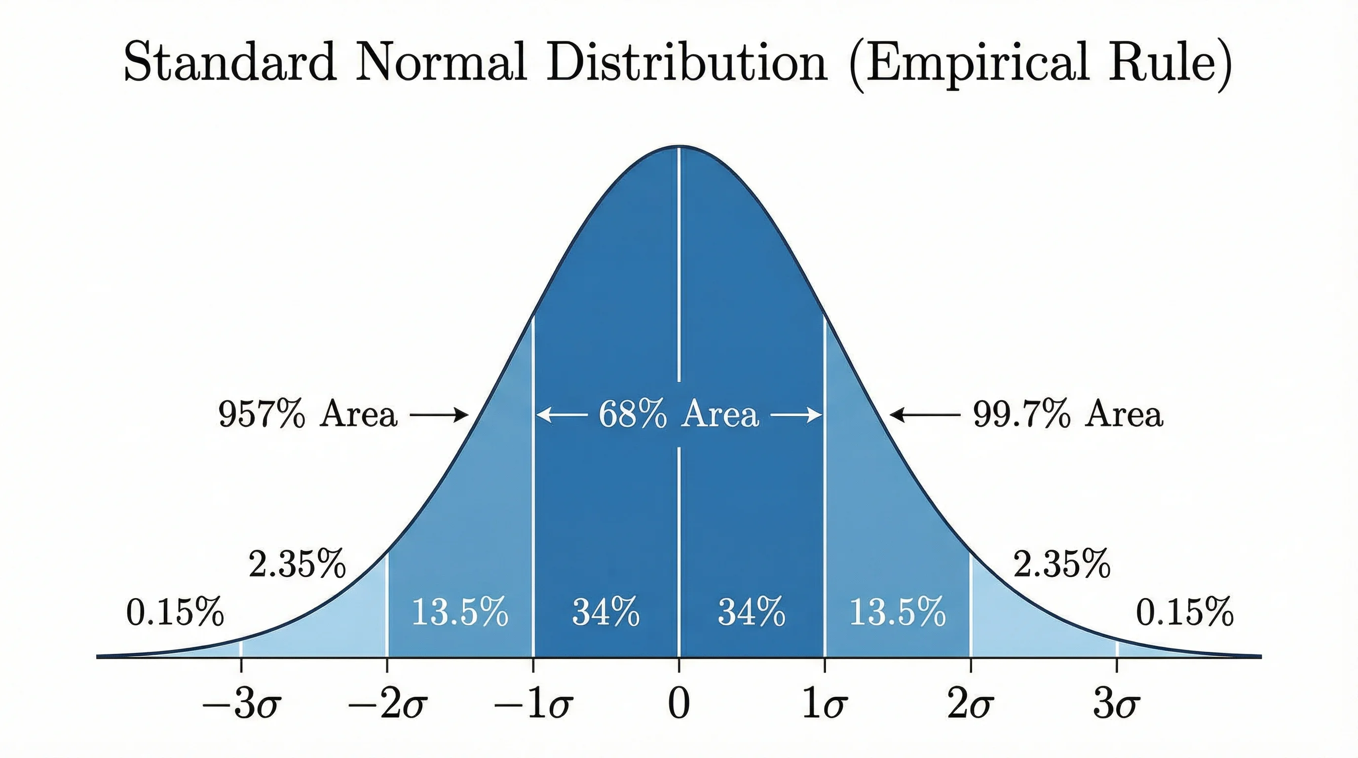
带误差线的科研数据图
达到科研发表水准的折线图,误差线表示各实验条件下的均值标准误差。
堆积面积图
堆积面积图变体,展示三个类别随时间对总量的贡献,带半透明色填充。
什么是折线图?
折线图(又称折线图表)是一种将数据信息以一系列数据点连线形式展示的数据可视化图表。折线图非常擅长展示数据随时间的趋势、规律和变化。横轴(X轴)通常表示时间或顺序类别,纵轴(Y轴)表示测量值。折线图是统计学、商业分析、科学研究和金融分析中的重要工具。
何时使用折线图
- 时序数据——展示数值在小时、天、月或年中的变化
- 趋势分析——识别数据中的上升、下降或周期性规律
- 多系列对比——在同一坐标轴上叠加两个或更多数据集
- 连续数据——当数据表示连续测量值而非离散类别时
- 预测——延伸趋势线以预测未来数值
- 科学实验——绘制各实验条件或时间点的测量值,含误差线
单线图与多线图的比较
单线图显示一个数据系列,非常适合清晰展示趋势或规律而不造成视觉混乱。多线图在同一坐标轴上叠加两个或更多数据系列,非常适合直接比较,例如对比各地区销售数据或实验组与对照组。使用多线图时,应采用明显不同的颜色并附上清晰图例,同时将线条数量限制在4-5条以内,以免过于杂乱。
折线图与柱状图的区别
折线图和柱状图服务于不同的目的。折线图强调随时间的趋势和连续性——连接线意味着数据在各点之间流动。柱状图强调各离散类别之间的单个值比较。当X轴表示时间或连续数据且您希望突出趋势时,使用折线图;当比较各类别顺序不代表连续性的离散类别时,使用柱状图。
折线图最佳实践
- Y轴尽量从零开始,以避免夸大趋势或误导读者
- 使用清晰、带计量单位的描述性坐标轴标签
- 数据点少于20个时,添加数据点标记以突出实际数值
- 多线图最多保留4-5个系列以确保可读性
- 使用一致的配色方案,并为多系列图表附上图例
- 考虑为数据中的重要事件、异常值或里程碑添加注释