How to Make a Venn Diagram: Free Guide with Examples & AI Generator (2026)
Learn how to make a Venn diagram step by step. Explore 10+ real examples for science, business, and education — or use our free AI Venn diagram maker to create one instantly.
Venn diagrams are one of the most universally recognized tools for visualizing relationships between groups of items. Whether you are a student comparing literary themes, a scientist mapping overlapping gene sets, a business analyst evaluating competing strategies, or a teacher designing a lesson plan, Venn diagrams make abstract comparisons tangible by showing what is shared and what is unique. They appear in elementary classrooms, peer-reviewed journals, boardroom presentations, and data science notebooks alike — and for good reason. No other diagram type communicates the concept of overlap and exclusion as intuitively as a Venn diagram.
Venn Diagram Generator
Create beautiful, publication-ready Venn diagrams instantly with AI. Just describe what you want to compare.
Try it free →In this comprehensive guide, you will learn everything about Venn diagrams — from their mathematical origins and set-theory foundations to a practical step-by-step tutorial for creating your own. We include over six real-world examples with images spanning biology, research methodology, ecology, and data science. You will also discover when a Venn diagram is the right choice versus other comparison tools, best practices for clean design, and answers to the most common questions.
What Is a Venn Diagram?
A Venn diagram is a visual representation that uses overlapping circles (or other closed curves) to show the logical relationships between two or more sets of items. Each circle represents a set, and the area where circles overlap represents elements that the sets have in common. The non-overlapping portions represent elements unique to each set.
A Brief History: John Venn and Set Theory
The diagram is named after John Venn (1834--1923), a British logician and philosopher who introduced the concept in his 1880 paper "On the Diagrammatic and Mechanical Representation of Propositions and Reasonings." Venn was building on earlier work by Leonhard Euler, who used similar diagrams (now called Euler diagrams) in the 18th century to illustrate syllogistic logic.
While Euler's diagrams only showed relationships that actually existed between sets, Venn's contribution was to require that all possible intersections be represented, even if some regions are empty. This seemingly small difference is what makes Venn diagrams a complete and systematic visualization of set relationships.
Venn Diagrams vs. Euler Diagrams
Many people use the terms interchangeably, but there is an important distinction:
| Feature | Venn Diagram | Euler Diagram |
|---|---|---|
| All intersections shown | Yes — every possible overlap region is drawn, even if empty | No — only existing relationships are drawn |
| Empty regions | Allowed (shaded or marked empty) | Not shown at all |
| Complexity | Can become complex with 4+ sets | Stays simpler because irrelevant overlaps are omitted |
| Use case | Formal logic, set theory, complete comparisons | Quick, informal illustrations of relationships |
| Named after | John Venn (1880) | Leonhard Euler (1768) |
For most practical purposes — classroom exercises, blog graphics, business comparisons — the distinction does not matter, and people simply call them "Venn diagrams" regardless of whether every possible overlap is represented.
Set Theory Basics in Plain Language
Venn diagrams are rooted in set theory, but you do not need a math degree to understand them. Here are the core concepts:
- Set: A collection of distinct items (e.g., "fruits," "red objects," "mammals")
- Union (A ∪ B): Everything that belongs to set A, set B, or both. Think of it as "A or B or both."
- Intersection (A ∩ B): Only the items that belong to both A and B. This is the overlapping region in a Venn diagram.
- Complement (A'): Everything that is not in set A. In a Venn diagram, this is the area outside circle A but still inside the bounding rectangle.
- Difference (A - B): Items in A that are not in B. This is the part of circle A that does not overlap with circle B.
These operations map directly to the visual regions of a Venn diagram, which is why the diagram is such an effective teaching tool for set theory concepts.
Types of Venn Diagrams
Venn diagrams come in several configurations depending on how many sets you need to compare. Each type has different strengths and limitations.
2-Circle Venn Diagram
The most common and simplest form. Two overlapping circles create three distinct regions: items unique to set A, items unique to set B, and items shared by both (the intersection).
Best for:
- Simple A-vs-B comparisons (e.g., plant cell vs. animal cell)
- Introducing the Venn diagram concept to beginners
- Quick decision-making between two options
3-Circle Venn Diagram
Three overlapping circles create seven distinct regions. This is the most popular variant for educational and professional use, as it allows comparison of three categories while remaining visually clear.
Best for:
- Comparing three related concepts (e.g., qualitative vs. quantitative vs. mixed methods)
- Identifying skills or traits shared across three domains
- Literature review overlap analysis
4-Circle Venn Diagram
Four overlapping circles (usually drawn as ellipses rather than perfect circles to show all intersections properly) create 15 distinct regions. The layout becomes significantly more complex.
Best for:
- Advanced academic comparisons
- Multi-criteria decision analysis
- Complex taxonomy overlaps
5+ Circle Venn Diagrams
With five or more sets, traditional circles cannot represent all possible intersections. Mathematicians use alternative shapes — such as ellipses, rectangles, or exotic curves — to draw valid Venn diagrams for five sets. The most famous five-set Venn diagram uses five congruent ellipses arranged in a rotationally symmetric pattern.
Best for:
- Bioinformatics (e.g., comparing gene expression across five conditions)
- Multi-dataset overlap analysis
- Specialized research applications
Comparison Table: Venn Diagram Types
| Type | Regions Created | Readability | Primary Use Cases |
|---|---|---|---|
| 2-circle | 3 (+ exterior) | Excellent | Simple comparisons, education, decision-making |
| 3-circle | 7 (+ exterior) | Very good | Multi-category analysis, research, presentations |
| 4-circle | 15 (+ exterior) | Moderate | Advanced research, multi-criteria analysis |
| 5-circle | 31 (+ exterior) | Low | Bioinformatics, specialized academic research |
| 6+ circles | 63+ (+ exterior) | Very low | Rarely used outside computational contexts |
Rule of thumb: If your audience needs to read and understand the diagram at a glance, stick to two or three circles. For four or more sets, consider whether a comparison table or matrix might communicate the information more effectively.
How to Make a Venn Diagram: Step-by-Step
Follow these six steps to create a clear, informative Venn diagram — whether you are drawing on paper, using a design tool, or generating one with AI.
Step 1: Identify the Items You Want to Compare
Start by defining the two or three categories (sets) you want to compare. Be specific about what each set represents. Vague labels lead to vague diagrams.
Examples of good set definitions:
- "Features of plant cells" and "Features of animal cells"
- "Skills for data science," "Skills for software engineering," and "Skills for data engineering"
- "Qualitative research methods" and "Quantitative research methods"
Tip: Write down each set's label before you start drawing. If you cannot define the set in a short, clear phrase, the comparison may be too broad.
Step 2: Determine Similarities and Differences
Before drawing anything, brainstorm the content for each region of the diagram:
- List all characteristics, traits, or items that belong to each set individually
- Identify which items appear in more than one set — these go in the overlapping region(s)
- Separate remaining items that are unique to each set
This research phase is the most important step. A Venn diagram is only as good as the content inside it.
Step 3: Draw the Circles
Draw two or three overlapping circles. Each circle should be the same size (unless you are creating a proportional Venn diagram where size encodes data). The circles should overlap enough to create a clearly visible intersection area — typically about 30-40% of each circle's diameter.
- For a 2-circle diagram, place circles side by side with moderate overlap
- For a 3-circle diagram, arrange circles in a triangular layout with each pair overlapping and all three meeting in the center
Step 4: Label Each Circle
Add a clear, concise label to each circle — either inside the circle (near the top edge) or outside the circle with an arrow or line pointing to it. Labels should be:
- Short (1-4 words)
- Descriptive of the entire set
- Consistently formatted (same font size, weight, and style)
Step 5: Fill In Unique Traits and Overlapping Traits
Place items in the correct regions:
- Unique items go in the non-overlapping portion of their respective circle
- Shared items go in the overlapping area between the relevant circles
- For a 3-circle diagram, items shared by all three sets go in the center where all three circles meet
Keep text concise. Use bullet points or short phrases rather than full sentences.
Step 6: Review and Refine
Review your completed diagram for accuracy, clarity, and visual balance:
- Accuracy: Is every item in the correct region? Are shared items truly shared?
- Clarity: Can someone unfamiliar with the topic understand the diagram?
- Balance: Are the circles evenly sized? Is text legible? Is there enough white space?
- Color: Use distinct, accessible colors for each circle (avoid red-green combinations for color-blind accessibility)
If an item does not fit neatly into any region, consider whether it belongs in the diagram at all. A Venn diagram should simplify, not complicate.
Venn Diagram Examples
Here are six real-world Venn diagram examples spanning multiple disciplines. Each demonstrates how the diagram format can clarify complex comparisons.
1. Plant Cell vs. Animal Cell
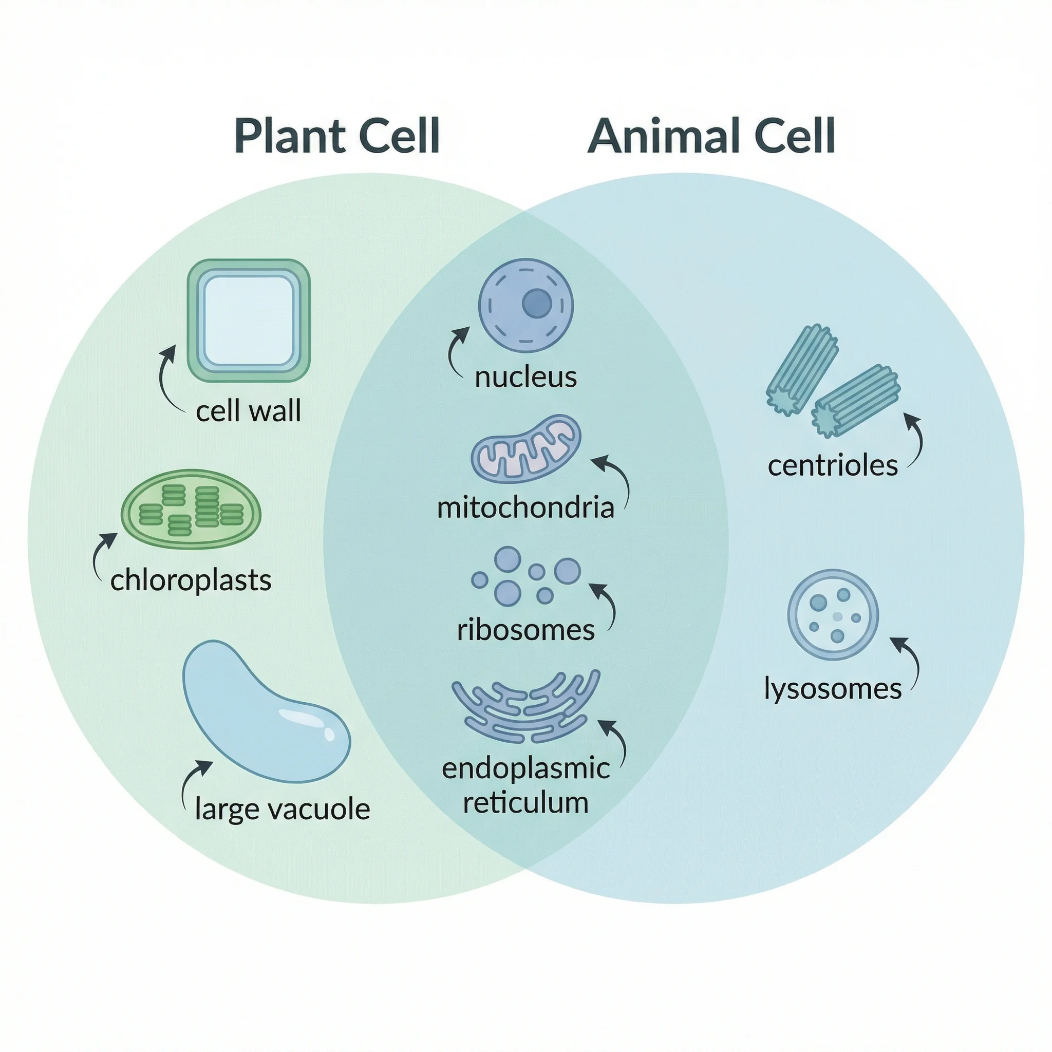
One of the most classic Venn diagram topics in biology education. Plant cells and animal cells share many organelles (nucleus, mitochondria, ribosomes, endoplasmic reticulum) but differ in key structures like cell walls, chloroplasts, and centrioles.
A Venn diagram comparing the unique and shared features of plant cells and animal cells, highlighting organelles like chloroplasts, cell walls, and centrioles.
Left circle (Plant Cell Only): Cell wall, chloroplasts, large central vacuole, plasmodesmata, starch storage
Overlap (Both): Nucleus, mitochondria, cell membrane, ribosomes, endoplasmic reticulum, Golgi apparatus, cytoplasm
Right circle (Animal Cell Only): Centrioles, lysosomes, small vacuoles, glycogen storage, flexible shape
For a deeper comparison with labeled diagrams, see our complete plant cell vs. animal cell guide.
2. Prokaryote vs. Eukaryote
This comparison is fundamental to understanding cellular biology. Prokaryotes (bacteria and archaea) lack a true nucleus and membrane-bound organelles, while eukaryotes (plants, animals, fungi, protists) have both.
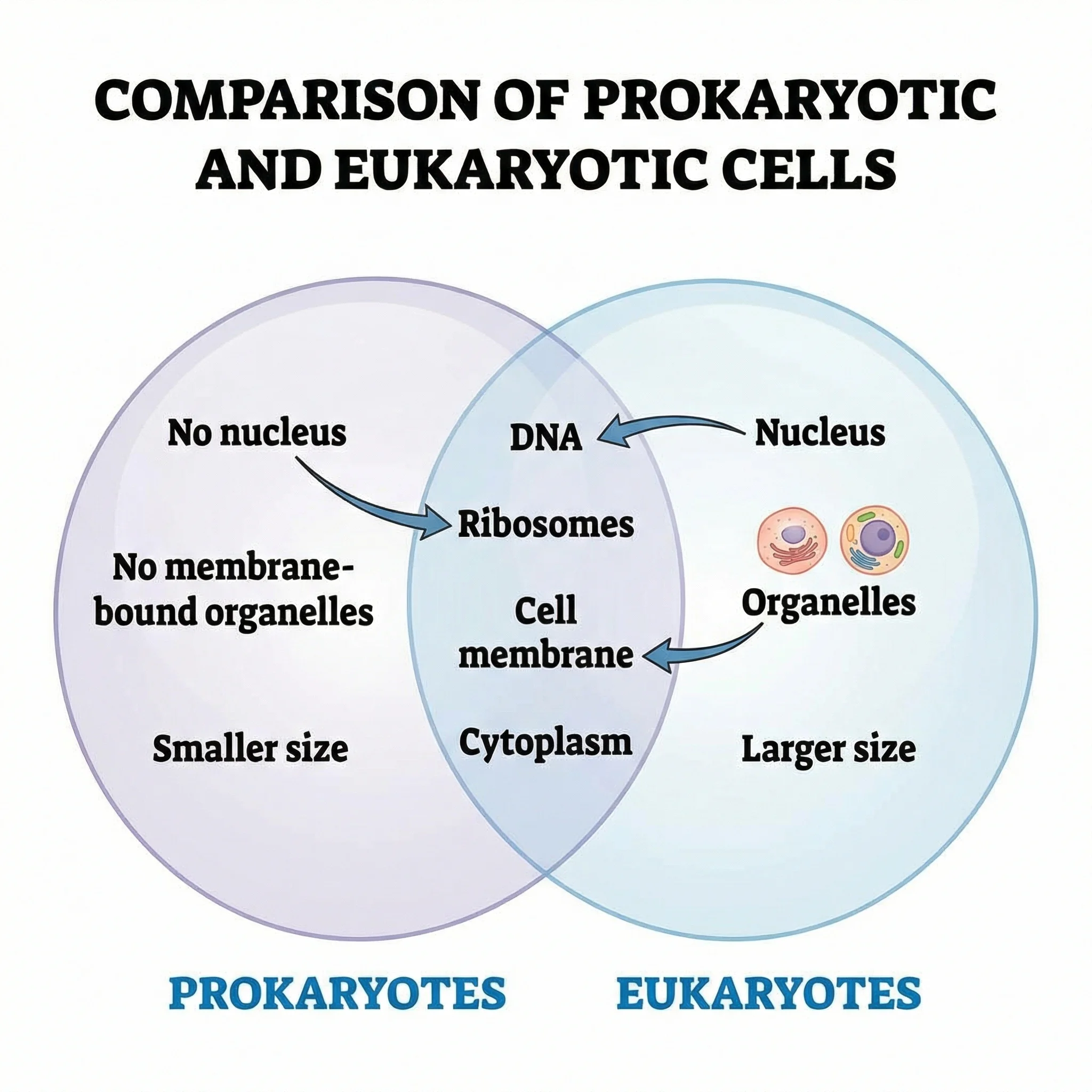 A Venn diagram showing the structural differences and similarities between prokaryotic and eukaryotic cells.
Left circle (Prokaryote Only): No nucleus, no membrane-bound organelles, circular DNA, smaller ribosomes (70S), binary fission, often have pili and flagella
Overlap (Both): DNA, ribosomes, cell membrane, cytoplasm, RNA, perform transcription and translation
Right circle (Eukaryote Only): True nucleus, membrane-bound organelles, linear chromosomes, larger ribosomes (80S), mitosis/meiosis, endoplasmic reticulum, Golgi apparatus
3. Literature Review Overlap
In academic research, a Venn diagram can visualize how different research areas or databases overlap. This is especially useful during systematic reviews and meta-analyses where researchers need to show how many studies were found in each database and how many appeared in multiple databases.
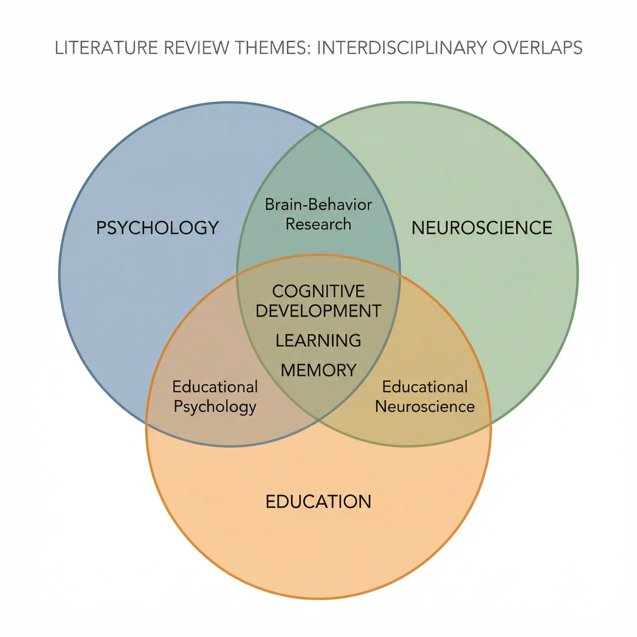 A Venn diagram illustrating the overlap between studies found in different academic databases during a literature review.
This type of diagram helps researchers communicate their search strategy and demonstrate thoroughness in their review process. It is also useful for visualizing interdisciplinary overlap — showing how a research topic spans multiple fields like psychology, neuroscience, and education.
4. Data Science Skills Overlap
Data science sits at the intersection of multiple disciplines. A Venn diagram is one of the most popular ways to visualize this — famously depicted as the overlap of mathematics/statistics, computer science/programming, and domain expertise.
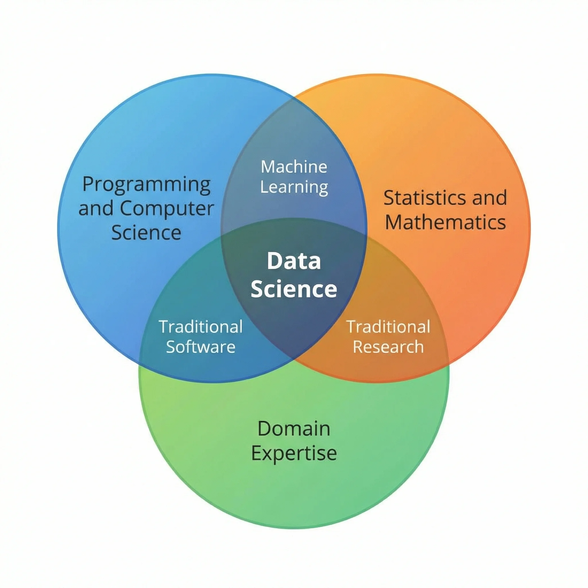 A three-circle Venn diagram showing how data science emerges at the intersection of statistics, programming, and domain knowledge.
Statistics/Math: Probability theory, hypothesis testing, regression, Bayesian inference
Programming/CS: Python, R, SQL, data structures, algorithms, machine learning engineering
Domain Expertise: Industry knowledge, business context, problem framing, stakeholder communication
Data Science (center overlap): The ability to combine all three — using statistical methods implemented in code to solve real-world domain problems.
5. Terrestrial vs. Aquatic Ecosystems
Ecology students frequently compare terrestrial (land-based) and aquatic (water-based) ecosystems. A Venn diagram highlights that while these ecosystems differ in physical medium, light availability, and organism adaptations, they share fundamental ecological principles.
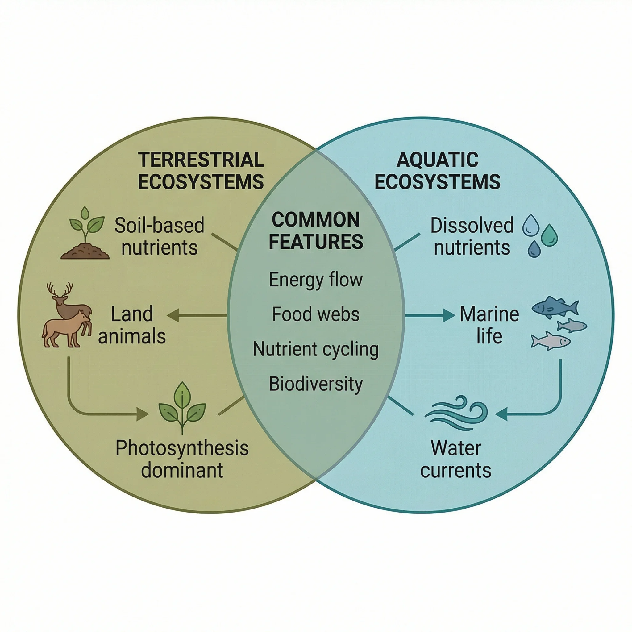 A Venn diagram comparing terrestrial and aquatic ecosystems, showing shared ecological principles and unique environmental characteristics.
Terrestrial Only: Soil as substrate, gravity as primary challenge, wind-based seed dispersal, roots for water absorption
Overlap (Both): Food chains/webs, producers-consumers-decomposers, nutrient cycling, energy flow from sun, biodiversity, affected by climate change
Aquatic Only: Water as medium, buoyancy reduces gravity effects, dissolved oxygen limitations, current-based dispersal, pressure increases with depth
6. Research Methodology Overlap
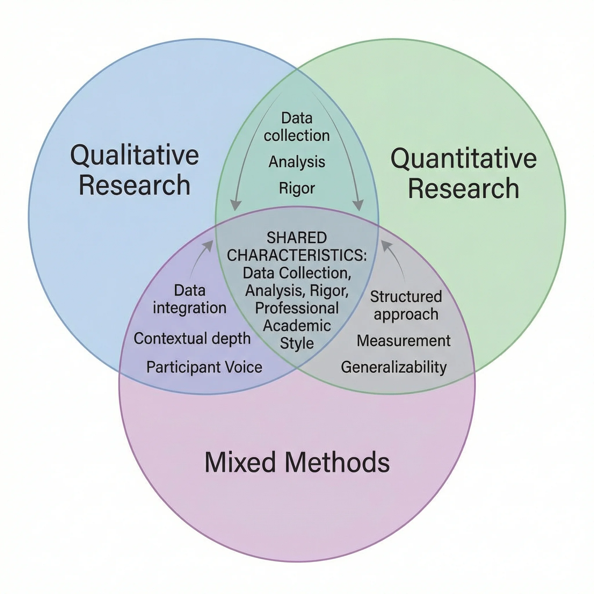
When planning a research study, understanding the relationship between qualitative, quantitative, and mixed methods is essential. A three-circle Venn diagram effectively shows how these methodologies relate.
A Venn diagram showing the overlap between qualitative, quantitative, and mixed research methods, with shared techniques in the intersection zones.
Qualitative Only: Interviews, focus groups, ethnography, thematic analysis, grounded theory
Quantitative Only: Surveys with closed questions, experiments, statistical analysis, hypothesis testing, large sample sizes
Mixed Methods (center): Combines both approaches — e.g., sequential explanatory design (quantitative data collection followed by qualitative exploration of results)
For more on research methodology, see our guide on how to make scientific diagrams for research papers.
When to Use a Venn Diagram (vs. Other Diagrams)
A Venn diagram is not always the best tool for every comparison. Here is when to use a Venn diagram and when an alternative visualization might serve you better.
Venn Diagram vs. Other Comparison Tools
| Diagram Type | Best For | Limitations | Choose When... |
|---|---|---|---|
| Venn Diagram | Showing overlap and unique traits between 2-3 sets | Becomes unreadable with 4+ sets; does not show quantities well | You need to visualize what items share and what is unique |
| Flowchart | Showing sequential processes and decision points | Does not show set relationships or overlap | Your comparison involves a process or decision tree |
| Mind Map | Brainstorming and exploring hierarchical relationships | No concept of overlap or shared elements | You want to explore ideas radiating from a central concept |
| Comparison Matrix | Detailed feature-by-feature comparisons across many items | Not as visually engaging; harder to see patterns | You have 4+ items to compare across many criteria |
| T-Chart | Simple two-column pros/cons or two-category comparisons | No overlap concept; only two categories | You want a quick, linear list of differences without overlap |
When a Venn Diagram Is the Right Choice
Use a Venn diagram when:
- You are comparing 2-3 categories and want to show both shared and unique elements
- The overlap is meaningful — if items only belong to one category, a simple list or table is better
- Your audience is familiar with the format — Venn diagrams are widely understood
- You want visual impact — a well-designed Venn diagram is more engaging than a bulleted list
- You are teaching set theory concepts — the diagram is the standard pedagogical tool
When to Choose an Alternative
Consider an alternative when:
- You have 4+ categories to compare — use a comparison matrix or table instead
- The comparison is purely sequential — use a flowchart
- There is no meaningful overlap between categories — use a T-chart or simple table
- You need to show quantitative data — use a bar chart, pie chart, or proportional Venn diagram
- You want to show hierarchy — use a mind map or org chart
For a broader overview of diagram tools, see our best free diagram software comparison guide.
Venn Diagram Best Practices
Follow these six best practices to create Venn diagrams that are clear, accurate, and visually effective.
1. Keep It to 2-3 Circles
Resist the temptation to add more circles. Every additional circle exponentially increases the number of regions, making the diagram harder to read. If you need to compare four or more items, consider splitting into multiple 2-circle diagrams or using a comparison table.
2. Use Distinct, Accessible Colors
Assign a unique color to each circle and set the opacity to 50-60% so overlap areas are visible. Avoid red-green combinations (approximately 8% of men have red-green color blindness). Good color pairings include:
- Blue and orange
- Purple and yellow-green
- Teal and coral
3. Write Concise Labels
Use short phrases or keywords inside the diagram, not full sentences. If you need to provide more detail, add a legend or footnotes outside the diagram. Each region should contain no more than 5-7 items to maintain readability.
4. Make the Overlap Region the Focal Point
The intersection is the most valuable part of a Venn diagram — it shows what the sets have in common. Make sure this region is large enough to read, has clear text, and is visually prominent. Use a slightly different background shade for the overlap area to draw the eye.
5. Add a Title and Context
Every Venn diagram should have a descriptive title that tells the reader what is being compared. Add a brief caption or subtitle if the context is not immediately obvious. For academic use, include a figure number and reference it in the surrounding text.
6. Ensure Accuracy Over Aesthetics
A beautiful diagram with incorrect information is worse than an ugly one with correct information. Double-check that every item is in the right region. Common mistakes include:
- Placing shared items in only one circle
- Forgetting the center region in a 3-circle diagram (where all three sets overlap)
- Including items that do not truly belong to the set
Tools for Creating Venn Diagrams
There are many ways to create Venn diagrams, ranging from manual drawing to AI-powered generation. Here is a quick overview of the most popular options:
AI-powered tools like ConceptViz's Venn Diagram Generator let you describe what you want to compare in plain text, and the AI generates a complete, publication-ready diagram in seconds. This is the fastest approach if you want to skip the manual design process entirely.
General design tools like Canva offer drag-and-drop Venn diagram templates. For a detailed walkthrough, see our Canva Venn diagram maker guide with alternatives.
Diagramming platforms like Lucidchart, Draw.io, and Creately provide more precise control over shapes, alignment, and collaboration features. These are ideal for professional or team-based work.
Presentation software like PowerPoint, Google Slides, and Keynote include SmartArt or shape tools that can create basic Venn diagrams, though they offer less flexibility than dedicated diagramming tools.
Programming libraries like matplotlib-venn (Python), VennDiagram (R), and D3.js (JavaScript) allow you to create data-driven, proportional Venn diagrams where circle sizes and overlaps reflect actual data values. These are preferred for academic publications and data analysis.
For a comprehensive comparison of all these tools, check our best free diagram software comparison guide.
Frequently Asked Questions
How many circles can a Venn diagram have?
Theoretically, a Venn diagram can have any number of circles (sets). However, with standard circles, you can only accurately represent all possible intersections for up to 3 sets. For 4 sets, ellipses are needed. For 5 sets, specialized shapes or symmetric ellipse arrangements are required. In practice, most Venn diagrams use 2 or 3 circles because diagrams with more sets become difficult to read and interpret.
What is the difference between a Venn diagram and an Euler diagram?
A Venn diagram shows ALL possible intersection regions between sets, even if some regions are empty. An Euler diagram only shows the relationships that actually exist — if two sets have no overlap, their circles do not touch. Euler diagrams are simpler but less systematic. In everyday usage, most people call both types 'Venn diagrams' without distinguishing between them.
Can I make a Venn diagram in PowerPoint?
Yes. In PowerPoint, go to Insert > SmartArt > Relationship, and select one of the Venn diagram layouts. You can add text to each circle and the overlapping regions, change colors, and resize the diagram. However, PowerPoint's SmartArt Venn diagrams are limited in customization compared to dedicated tools like Lucidchart or AI-powered generators like ConceptViz.
What is the middle of a Venn diagram called?
The overlapping area in the middle of a Venn diagram is called the 'intersection.' In set theory notation, the intersection of sets A and B is written as A ∩ B. This region contains all elements that belong to both sets simultaneously. In a 3-circle Venn diagram, the very center where all three circles overlap represents the intersection of all three sets (A ∩ B ∩ C).
How do I make a Venn diagram for free?
There are several free options: Google Drawings (completely free, browser-based), Canva (free tier with templates), Draw.io/Diagrams.net (free, open-source), and ConceptViz's Venn Diagram Generator (free AI-powered tool that creates diagrams from text descriptions). For simple diagrams, even Google Slides or Microsoft PowerPoint's built-in SmartArt feature works.
When should I use a Venn diagram instead of a table?
Use a Venn diagram when you want to visually emphasize what two or three groups share (the overlap) and what makes each unique. Use a comparison table when you have more than three items to compare, need to compare across many specific criteria, or when the precise details matter more than the visual pattern. Venn diagrams excel at showing the big picture; tables excel at showing granular detail.
Conclusion
Venn diagrams remain one of the most effective and universally understood tools for visualizing how different categories relate to one another. From elementary school classrooms to advanced bioinformatics research, the simple concept of overlapping circles communicates overlap, uniqueness, and shared ground in a way that no table or bulleted list can replicate.
Whether you are comparing plant and animal cells for a biology exam, mapping the overlap between research methodologies for a thesis, or visualizing data science skill sets for a career presentation, the six-step process outlined in this guide will help you create clear, accurate, and visually compelling Venn diagrams every time.
If you want to skip the manual design process entirely, try our AI-powered Venn Diagram Generator — describe what you want to compare in plain text, and get a publication-ready diagram in seconds.
Venn Diagram Generator
Describe what you want to compare and get a publication-ready Venn diagram in seconds.
Looking for more diagram guides? Explore our articles on scientific diagrams for research papers, Canva Venn diagram alternatives, and the best free diagram software.
分类
更多文章
Central Dogma Diagram Guide: DNA to RNA to Protein
Learn how to read and draw a central dogma diagram, including DNA, mRNA, transcription, translation, ribosomes, codons, and common mistakes.
How to Make a Bohr Model: Step-by-Step Guide for Students (2026)
Learn how to draw a Bohr model for any element. Covers electron shell rules, common elements, mistakes to avoid, and when Bohr models break down for heavier atoms.

How to Make Scientific Diagrams for Research Papers (2025 Guide)
Learn how to create professional scientific diagrams for research papers, theses, and publications. Includes best practices, tools comparison, and step-by-step tutorials for biology, chemistry, and physics diagrams.