Clinical Pathway Diagram Generator
Draw clinical pathway diagrams and care flowcharts with decision points and exit paths. Illustrative only, not a clinical guideline. Review before use.
Create Your Pathway Diagram
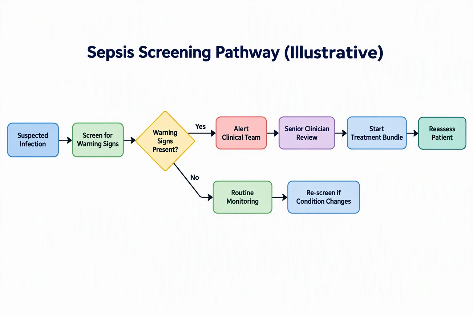 Example: Sepsis screening pathwayView full size
Preview is free on this page ·
Your pathway diagram will appear here
AI diagrams are drafts. Read every label and follow every arrow against your own pathway, and have a clinician review before use. Illustrative only, not a clinical guideline. No real patient data.
Clinical Pathway Diagram Examples
Four AI pathway flowcharts, each with its prompt and the flaws we found. Illustrative only, not clinical guidelines. No real patients.
Sepsis screening pathway (AI flowchart)
AI-generated from the prompt shown. Every label came out spelled as written on both tries; we kept the second, because the first had boxes pressed against the left and right edges; the kept one still has tight margins. The shape is a screen, one decision, an escalation branch and a routine branch, which is the general structure of recognition-and-early-management guidance such as NICE NG51 (checked October 2026). We did not draw any thresholds, scores, timings or drugs. Known flaws: "Start Treatment Bundle" does not say what is in the bundle, which is local and must be written in by the clinical team; "Re-screen if Condition Changes" has no arrow back to the screening step, so the loop the words describe is not drawn; the No arrow is a diagonal line with a kink; the Yes branch is drawn as one long row of four boxes with no owner or role lanes, and that serial order is only for illustration: in a real pathway a high-risk patient should not wait for senior review before treatment starts, and a single Yes or No is a simplification of risk stratification; the colors suggest severity (red for escalation) that a real pathway may not use; the background carries a very faint generated texture. Illustrative only, not a clinical guideline.
Hip fracture care pathway (AI flowchart)
AI-generated from the prompt shown, and all eleven labels came out as written. This is the third try. The first had boxes close to the image edges, and the kept one still has tight margins. The second, laid out in two rows, routed the Yes arrow out of the diamond in an awkward way, so we dropped it. The step order follows the general scope of NICE CG124, Hip fracture: management (checked October 2026), but we wrote the order ourselves and did not copy its text. Known flaws: no timing is shown, although real hip fracture pathways set time targets for surgery, and we left them out on purpose; "Optimize Medical Condition" loops back into the decision with an unlabeled arrow that meets the diamond at its lower right, and that loop can be misread as permission to delay surgery: NICE CG124 asks for prompt treatment of correctable comorbidities without postponing surgery; real pathways also involve anesthesia and orthogeriatric review, which are not drawn; pain relief before imaging is one common order, and local protocols differ; the background carries a very faint generated texture. Illustrative only, not a clinical guideline.
Type 2 diabetes: new diagnosis pathway (AI flowchart)
AI-generated from the prompt shown, and every label came out as written on the first try. The flow is a diagnosis, an education and lifestyle plan, baseline checks, individual targets, and a review loop, which matches the general idea of individualized targets and regular review in NICE NG28, Type 2 diabetes in adults: management (checked October 2026). No drug names, doses or target numbers appear on purpose. Known flaws: "Baseline Checks" is vague and the page reader must add what their service checks; the "No" loop goes back to "Scheduled Review" with no step for a different review interval or referral; "Continue Routine Follow-up" is drawn as the end, with no arrow back to review; the diamond is blue like the steps, so the decision does not stand out as much as in the other examples; the background carries a very faint generated texture. Illustrative only, not a clinical guideline.
Acute stroke pathway (AI flowchart)
AI-generated from the prompt shown. Every label is correct, but this took five tries. The first run drew a third arrow out of the diamond that was not on the Yes or No branch, which breaks the decision logic. A two-row retry spelled "Urgent" as "Urspnt". Our prompt then asked for exactly two arrows leaving each diamond, and we generated three more; all three were correct, and we kept the one with the cleanest layout. The structure, from recognition to brain imaging to an eligibility decision to stroke unit care, follows the general scope of NICE NG128, Stroke and transient ischaemic attack in over 16s: diagnosis and initial management (checked October 2026). Known flaws: no time window or eligibility criteria are drawn, on purpose, and "Clot Treatment" is a plain-language label, not a protocol; the imaging step does not show the split between bleeding and clot strokes, which is what drives the real decision; no TIA branch; the diagram uses only the right half of the image and the left is empty; the Yes branch re-enters "Stroke Unit Care" from the right through a long bent arrow; "Time-Critical Treatment" sits close to the right edge, so margins are tight; secondary prevention is drawn last only for sequence, because in practice it starts during the acute phase; the red diamond color has no meaning about severity; the background carries a very faint generated texture. Illustrative only, not a clinical guideline.
For a general flowchart try the AI Flowchart Generator, for business processes the Workflow Diagram Generator, for plant and manufacturing flows the Process Flow Diagram Generator, and for care plan maps the Nursing Concept Map Generator. Public guidance we used for the general scope, checked October 2026: NICE NG51 Suspected sepsis, NICE CG124 Hip fracture, NICE NG28 Type 2 diabetes in adults, and NICE NG128 Stroke and TIA.
What this page is for
This page is for hospital quality and improvement teams, clinical nurse specialists, nurse educators, care coordinators, medical and nursing students, and health service researchers who need a clean care pathway flowchart for a slide, a training handout, a committee paper, or a first draft before a formal modeling tool. You write the steps, the decision points and the exact wording, and the generator draws them. It is a drafting tool. It does not know your local protocol, it does not check a pathway against any guideline, and it is not a clinical decision aid. A clinician who owns the pathway must review every picture before it is used.
What a clinical pathway diagram shows
- A clinical pathway, also called a care pathway or integrated care pathway, lays out the expected sequence of care for one kind of patient or condition. The diagram is how a team agrees on that sequence and explains it to others.
- Most useful pathway diagrams have four parts. Milestones are the steps every patient goes through, such as admission, assessment or discharge planning. Decision points are the questions that split the flow, drawn as diamonds, such as "Fit for Surgery?". Handoffs show who or which service takes over, which is where lanes or role labels help. Variance and exit paths show what happens when the patient does not follow the expected course, for example a loop back to optimize before surgery, or a route to a different service.
- The prompts in the gallery use the first two and a simple loop for the third. If your pathway needs lanes by role, say so in the prompt and list which steps belong to which role.
How this differs from our flowchart and nursing pages
- The Process Flow Diagram Generator is for industrial and engineering process flow diagrams. The AI Flowchart Generator and the Workflow Diagram Generator are general-purpose and know nothing about clinical conventions. This page is written for care pathways: decision points, escalation, reassessment loops and discharge, with a clear statement that the picture is illustrative.
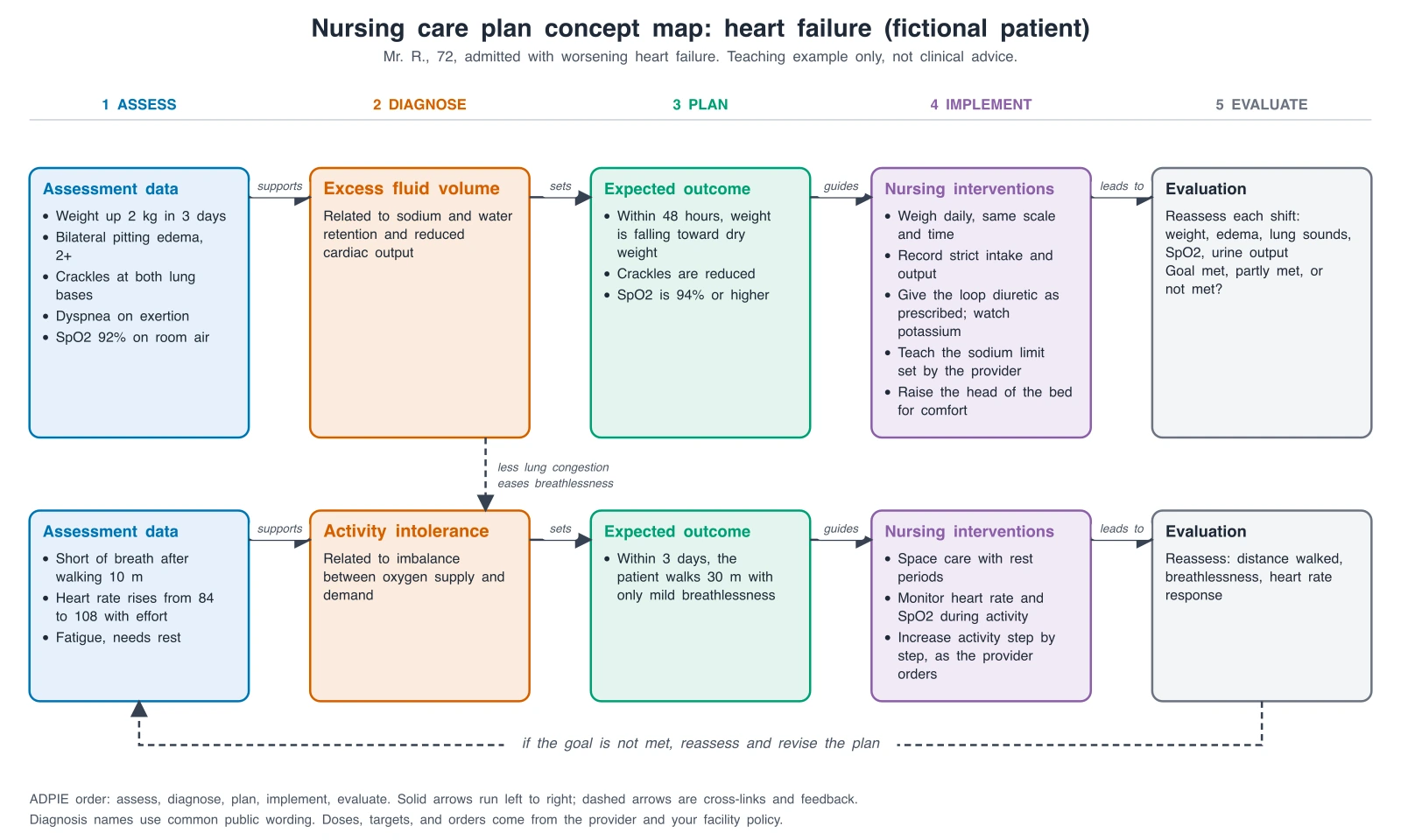
- The Nursing Concept Map Generator draws care plan maps that connect a diagnosis to assessments and interventions. A pathway is a sequence over time with decisions; a concept map is a web of relationships. Pick the one that matches what you need to show.
How to write a pathway prompt that draws correctly
- Name the condition and the setting, such as "hospital sepsis screening" or "newly diagnosed type 2 diabetes in primary care".
- List every step as an exact label in order. Spell the words you want to see, because the generator draws exactly the text you give it.
- Mark decision points as questions in diamonds and say where the Yes and No arrows go. Add "exactly two arrows leave each decision diamond, one Yes and one No" to avoid a stray third arrow.
- Say which steps loop back, and to which step.
- Leave out doses, scores, thresholds and time targets unless your service owns them and a clinician will check them. The AI can misplace or alter numbers.
- Ask for margins so boxes stay inside the frame, and use a wide landscape ratio for long pathways.
- Generate, then read every label and follow every arrow against your own pathway. If one thing is wrong, generate again.
The four example pathways and where they come from
- We wrote the step lists ourselves from the general scope of four public NICE guidance documents: Suspected sepsis (NG51), Hip fracture: management (CG124), Type 2 diabetes in adults: management (NG28), and Stroke and transient ischaemic attack in over 16s (NG128). Checked October 2026. We did not copy the text of these documents, and the diagrams are not drawn from their recommendations.
- Each example leaves out all doses, scores, thresholds and time targets. Real pathways have them, and they differ between guidelines, countries and hospitals. Use your own service protocol for any of these.
Accuracy and what AI gets wrong
The four pictures on this page were generated from the prompts shown, and each caption lists the flaws we found. The words came out right on almost every try, but the arrows were not always right: one stroke try added a third arrow out of the decision diamond, one try misspelled a word, and one hip fracture try routed an arrow in a confusing way. Other common problems are a loop that is described in the label but not drawn, a box crowding the edge, a decision with a missing branch, and colors that suggest a severity you did not intend. Treat each picture as a draft. It is an illustrative diagram, not a clinical guideline, it does not diagnose, and it does not give medical advice.
Privacy and use in a service
Do not enter patient names, record numbers, results or any real patient data. Describe the pathway in general terms. Check your organization's policy on AI tools and on what may go into controlled clinical documents, and follow its review and sign-off rules. A picture from this page is not an approved pathway until your clinical governance process says it is.
Free trial and downloads
Start free with 2 image credits, valid for 7 days, no card required. Free accounts download PNG or JPG.
Frequently Asked Questions
Related Flowchart and Medical Tools
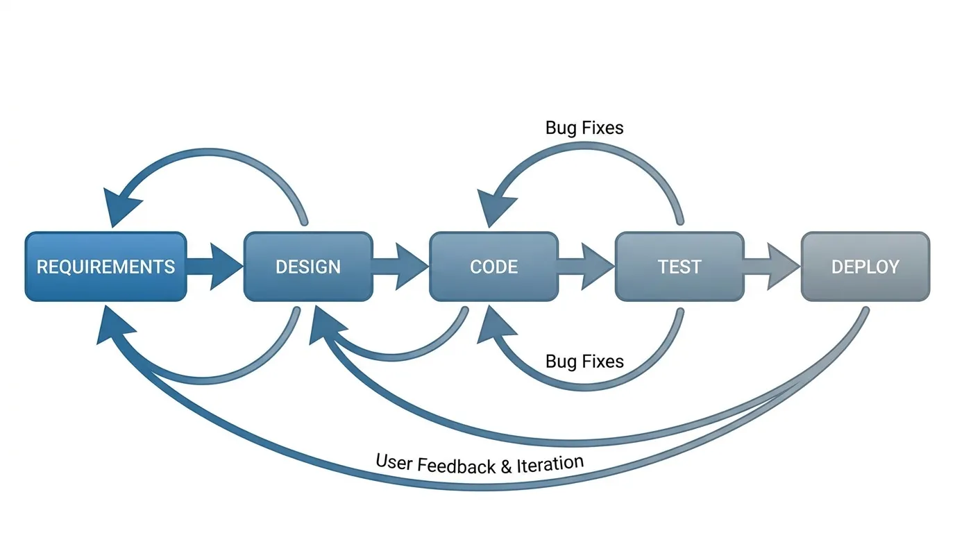
 Process
AI Flowchart Generator
Turn a description into a general-purpose flowchart with decisions and loops.
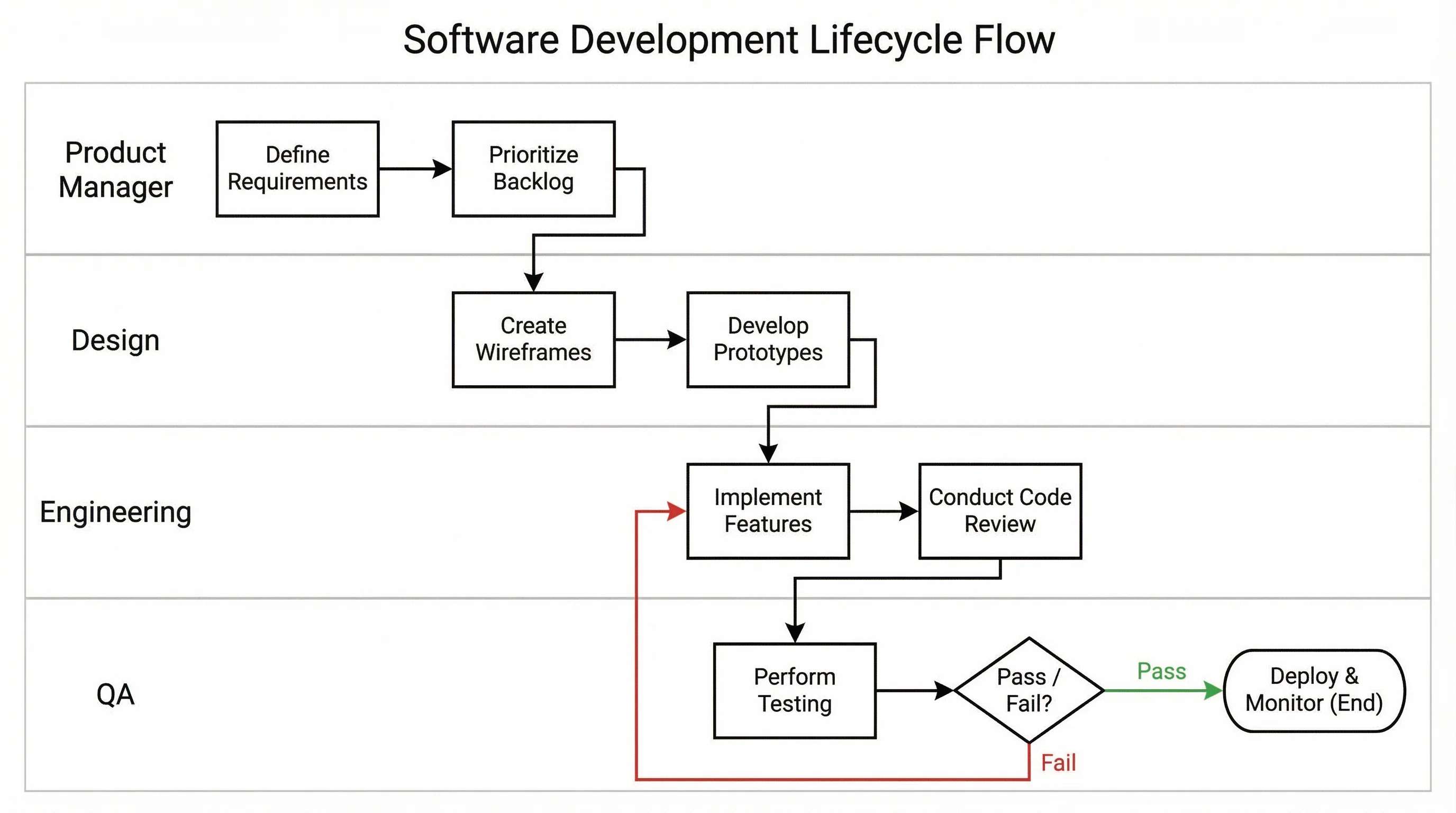
 Process
Workflow Diagram Generator
Draw business and project workflows with steps, owners and handoffs.
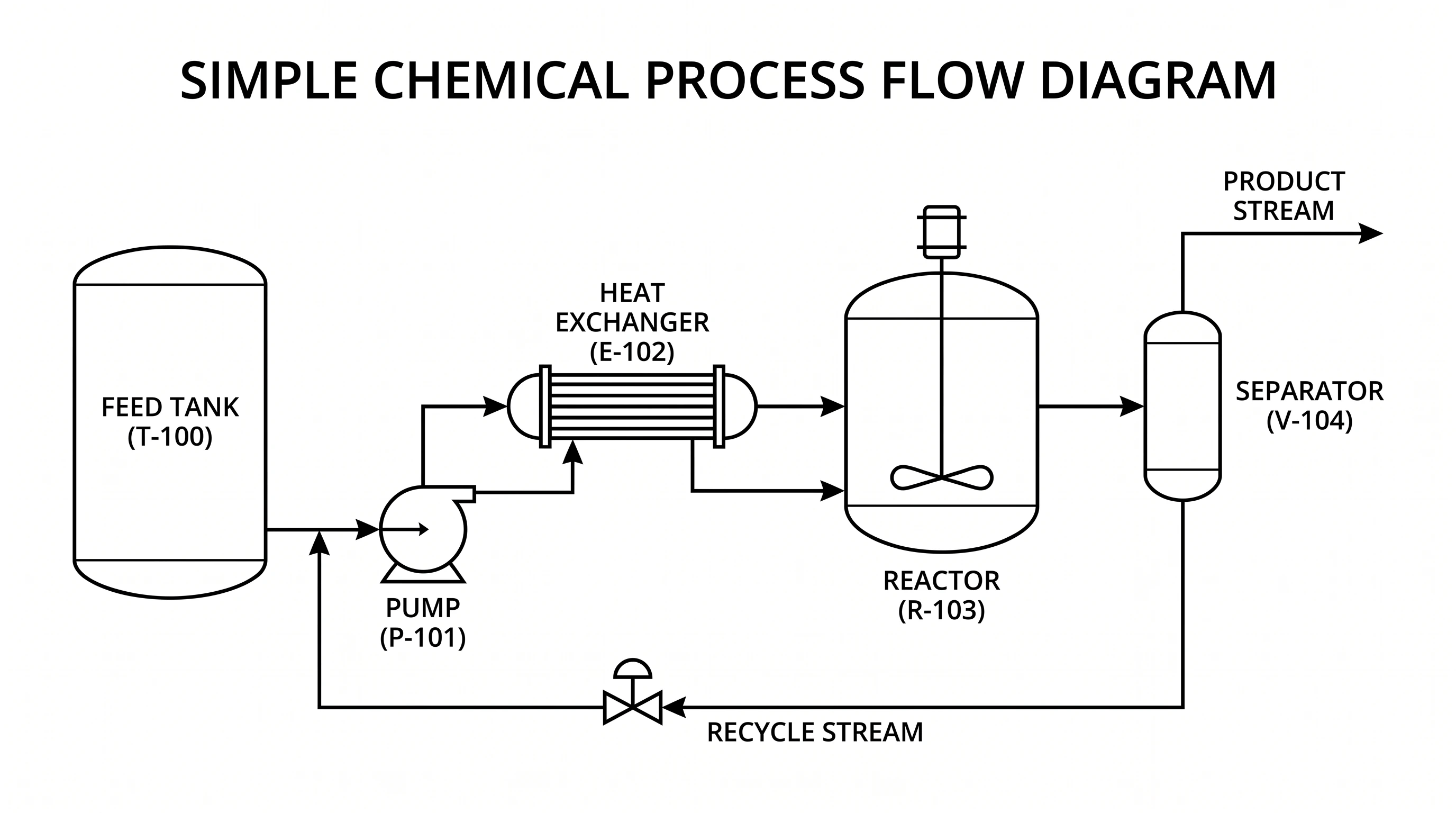 Process
Process Flow Diagram Generator
Create process flow diagrams for plants and manufacturing steps.
 Medical
Nursing Concept Map Generator
Make nursing care plan concept maps that connect diagnoses, assessments and interventions.