
How to Design an Award-Winning Scientific Poster: Complete Guide
Master the art of scientific poster design with proven strategies used by award winners. Learn layout principles, visual hierarchy, and presentation tips.
Standing in front of hundreds of posters at a research conference, judges have mere seconds to decide which ones deserve a closer look. What makes some posters magnetic while others fade into the background?
Award-winning scientific posters share common design principles that balance visual appeal with scientific rigor. This guide reveals the strategies that transform ordinary posters into award contenders.
The 3-30-300 Rule: Understanding Poster Psychology
Before diving into design specifics, understand how people interact with posters at conferences. The 3-30-300 rule captures this perfectly:
| Time | Distance | What Viewers Assess |
|---|---|---|
| 3 seconds | 10+ feet | Title, overall visual appeal, color scheme |
| 30 seconds | 3-5 feet | Main figures, key findings, structure |
| 3 minutes | 1-3 feet | Detailed content, methodology, conclusions |
Your poster must succeed at all three levels. Most posters fail at the 3-second test—they simply don't attract attention from across the room.

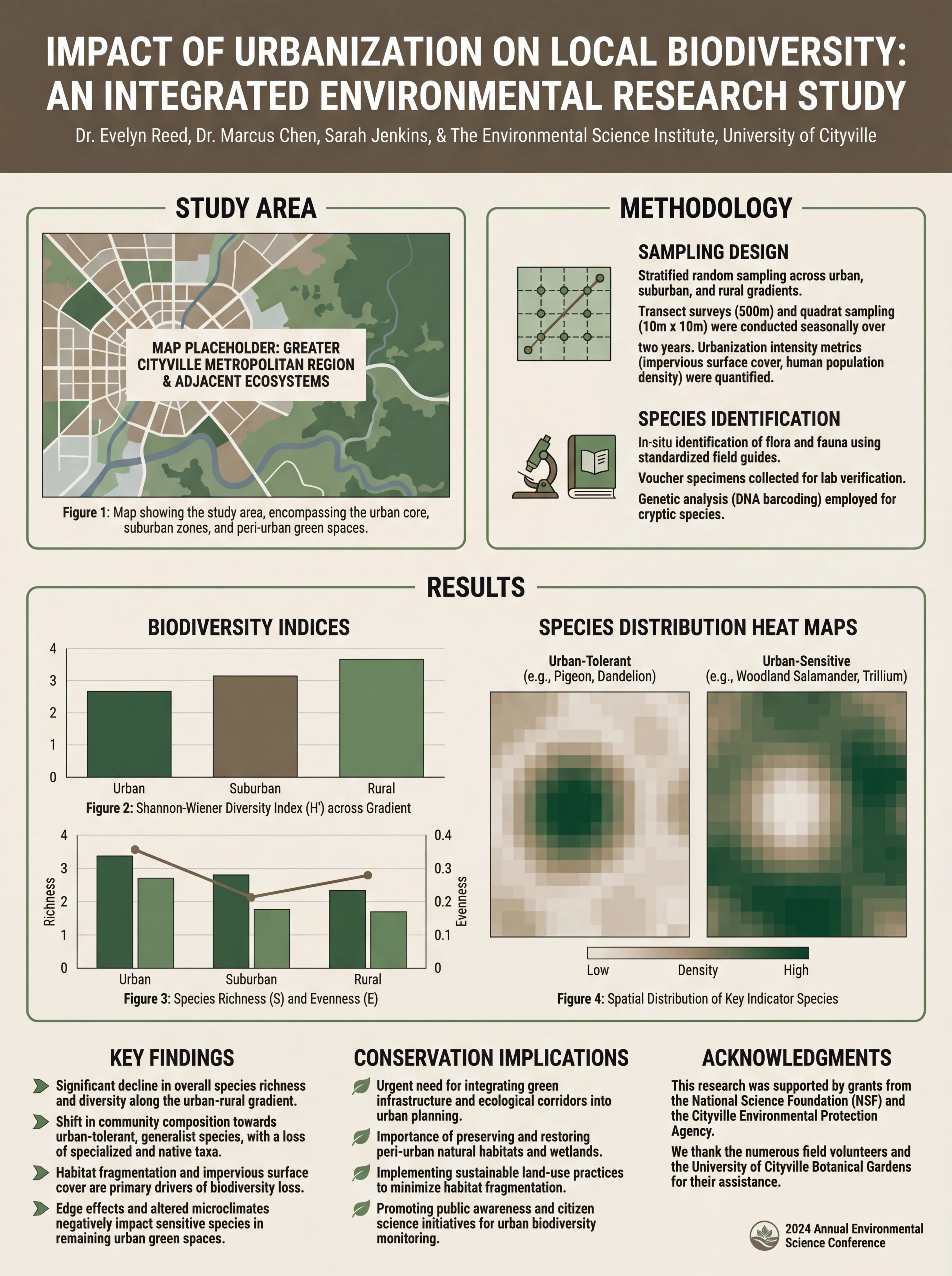
A biomedical research poster demonstrating clear visual hierarchy and professional design
What Judges Actually Look For
According to discussions on ResearchGate, poster competitions typically evaluate:
- Scientific merit (40-50%): Quality of research, methodology, significance
- Visual presentation (30-40%): Layout, graphics, readability
- Communication clarity (20-30%): How well the story is told
- Presenter engagement (varies): Your ability to discuss the work
The key insight: an unattractive poster with high scientific merit risks being overlooked on first impression. Visual design isn't superficial—it's your gateway to being evaluated at all.
Essential Design Principles
1. Embrace White Space
The most common mistake is cramming too much content onto the poster. As Animate Your Science puts it: "A poster is not a bottomless pit where you dump all of your data and technical lingo."
The 60/40 Rule:
- 60% of your poster should be visuals (figures, diagrams, images)
- 40% should be text (aim for under 1,000 words total)
White space isn't wasted space—it guides the eye and prevents cognitive overload.
2. Create a Clear Visual Path
Readers should intuitively know where to look next. According to PosterNerd, effective layouts follow predictable patterns:
Column Layout (Most Common):
┌─────────────────────────────────────────┐
│              TITLE & AUTHORS             │
├─────────────┬─────────────┬─────────────┤
│ Introduction│   Results   │ Discussion  │
│             │             │             │
│  Methods    │   Figures   │ Conclusions │
│             │             │             │
│             │             │ References  │
└─────────────┴─────────────┴─────────────┘
Z-Pattern Layout:
┌─────────────────────────────────────────┐
│              TITLE & AUTHORS             │
├─────────────────────────────────────────┤
│  Introduction ──────────► Key Finding   │
│                                         │
│  Methods ◄────────────── Results        │
│                                         │
│  Discussion ──────────► Conclusions     │
└─────────────────────────────────────────┘
Use numbered sections or subtle arrows if the flow isn't immediately obvious.
Environmental science poster showing logical information flow
3. Design for Distance
Your poster must be readable from different distances:
| Element | Font Size | Readable From |
|---|---|---|
| Title | 72-120 pt | 15+ feet |
| Section headers | 36-48 pt | 6-10 feet |
| Body text | 24-32 pt | 3-5 feet |
| Captions | 18-24 pt | 2-3 feet |
| References | 16-20 pt | 1-2 feet |
Test your poster by printing a scaled version and viewing it from across the room. If you can't read the title easily, it's too small.
4. Choose Colors Strategically
Color affects both aesthetics and accessibility:
Do:
- Use 2-3 main colors plus neutrals
- Ensure high contrast between text and background
- Consider colorblind viewers (avoid red-green combinations)
- Use color to highlight key findings
Don't:
- Use busy patterns or photo backgrounds
- Make the background compete with content
- Use low-contrast color combinations
- Rely solely on color to convey information
For detailed guidance on scientific color palettes, see our complete color guide for research papers and posters.
5. Typography Matters
Font choices affect readability and professionalism:
Recommended Font Pairings:
| Headers | Body Text | Style |
|---|---|---|
| Helvetica Bold | Helvetica | Clean, modern |
| Arial Black | Arial | Universal, safe |
| Futura Bold | Futura | Contemporary |
| Georgia Bold | Georgia | Traditional, readable |
Limit yourself to two font families maximum. Using more creates visual chaos.
For comprehensive typography guidance, check our best fonts for scientific posters guide.
Content Strategy: Less Is More
Crafting a Compelling Title
Your title is your 3-second hook. Make it:
- Specific: State your main finding, not just the topic
- Concise: 10-15 words maximum
- Engaging: Hint at why this matters
Weak: "A Study of Climate Change Effects on Coral Reefs"
Strong: "Rising Ocean Temperatures Reduce Coral Reef Recovery by 40%"
Writing Effective Sections
Each section should be ruthlessly edited:
Introduction (100-150 words):
- What problem are you addressing?
- Why does it matter?
- What's your approach?
Methods (100-150 words):
- Key methodology only
- Use bullet points or flowcharts
- Skip routine details
Results (200-300 words):
- Lead with your main finding
- Let figures do the heavy lifting
- Highlight statistical significance
Discussion/Conclusions (100-150 words):
- What do your results mean?
- What are the implications?
- What's next?
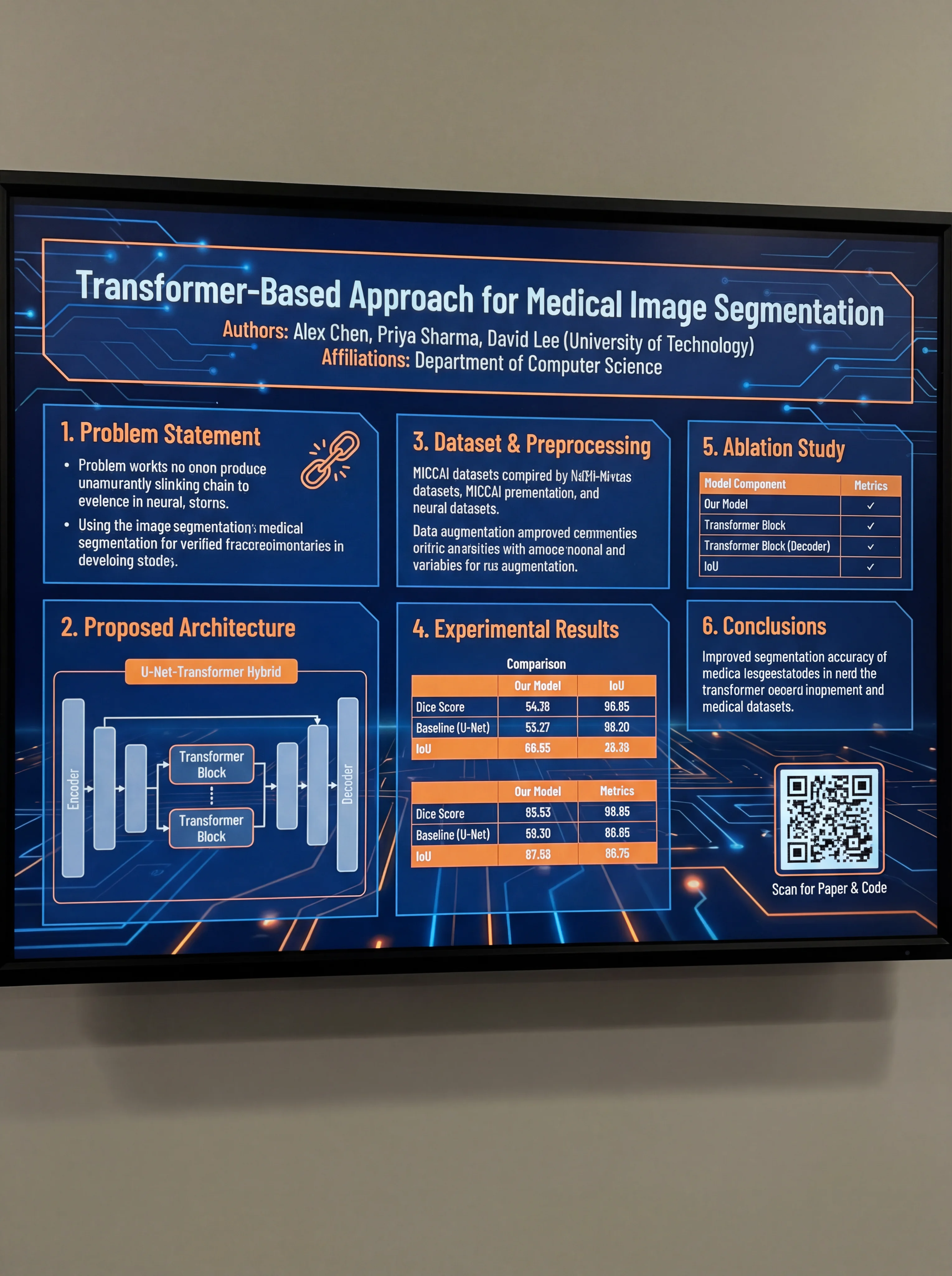
Computer science poster demonstrating concise, well-organized content
Creating Impactful Figures
Figures are the heart of an award-winning poster. According to BioRender's guide, your main figures should:
- Stand alone: Viewers should understand them without reading all the text
- Be high resolution: At least 300 DPI for print
- Use consistent styling: Same colors, fonts, and line weights throughout
- Include clear labels: Axis labels, legends, and brief captions
Figure Hierarchy
Not all figures are equal. Prioritize:
- Hero figure: Your main finding, largest and most prominent
- Supporting figures: Additional data that strengthens your story
- Method diagrams: Visual explanation of your approach
- Supplementary: Nice to have but not essential
Common Mistakes That Cost Awards
1. The Wall of Text
Research published in Frontiers in Communication found that most academic posters suffer from excessive text. If your poster looks like a journal article, you've failed.
2. Poor Figure Quality
Low-resolution images, pixelated graphs, or figures copied directly from papers look unprofessional. Recreate figures specifically for your poster.
3. Inconsistent Design
Mixing fonts, colors, and styles creates visual noise. Establish a design system and stick to it.
4. Ignoring the Audience
A poster for a specialized conference differs from one for a general audience. Adjust your technical depth accordingly.
5. Forgetting the Conversation
As Sage Research Methods emphasizes: "A poster is a conversation starter." Design it to invite questions, not answer everything.
The Presentation Factor
Even the best-designed poster won't win if you can't present it effectively:
Before the Session
- Practice a 2-minute overview
- Prepare for common questions
- Know your data inside and out
- Bring business cards or QR codes to your paper
During the Session
- Stand beside your poster, not in front of it
- Make eye contact with passersby
- Offer a brief introduction: "Would you like me to walk you through my research?"
- Adapt your explanation to the listener's background
Engaging Judges
- Be enthusiastic but not overwhelming
- Acknowledge limitations honestly
- Connect your work to broader implications
- Thank them for their time and interest
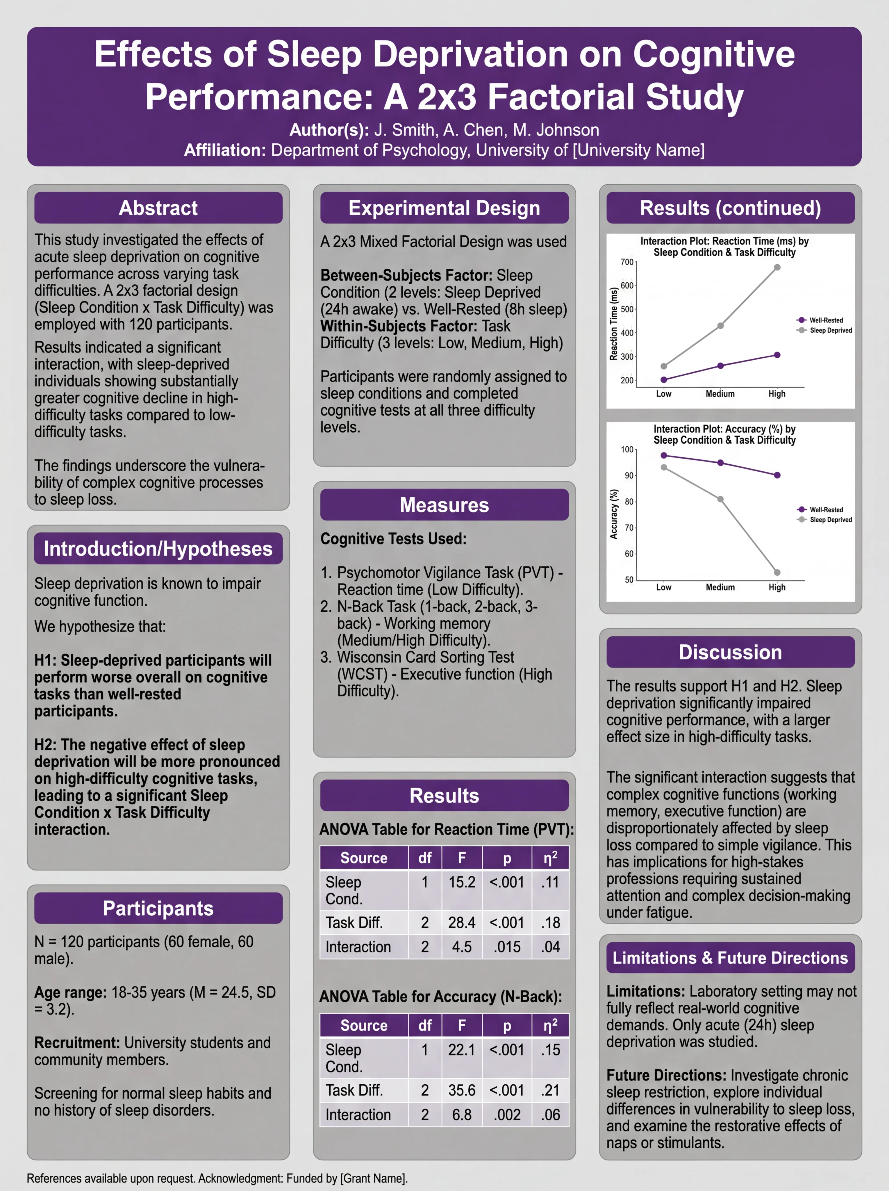
Psychology poster designed for effective presentation and discussion
Tools for Creating Award-Winning Posters
Traditional Software
- PowerPoint/Keynote: Familiar, widely available
- Adobe Illustrator: Professional-grade, steep learning curve
- Canva: User-friendly, limited customization
AI-Powered Solutions
Modern AI tools can accelerate poster creation significantly. ConceptViz offers AI-powered scientific poster generation that helps researchers create professional designs quickly while maintaining scientific accuracy.
Templates vs. Custom Design
Templates provide a starting point but can look generic. The best approach:
- Start with a template for structure
- Customize colors, fonts, and layout
- Create original figures
- Add your unique visual elements
Pre-Submission Checklist
Before printing or submitting your poster:
- Title is readable from 15+ feet
- Total word count is under 1,000
- Figures are high resolution (300+ DPI)
- Color scheme is consistent and accessible
- Visual flow is logical and clear
- All text is proofread
- Contact information is included
- File format meets conference requirements
- Poster dimensions match specifications
- You've gotten feedback from colleagues
Learning from Award Winners
Study posters that have won awards in your field. Notice:
- How do they balance text and visuals?
- What makes their titles compelling?
- How do they present complex data simply?
- What design elements make them stand out?
For inspiration, browse our collection of scientific poster examples and award-winning designs.
Conclusion
Designing an award-winning scientific poster requires balancing visual appeal with scientific substance. Remember:
- Attract attention in 3 seconds with a strong title and clean design
- Communicate clearly with logical flow and minimal text
- Let figures shine as the centerpiece of your poster
- Present confidently to complete the package
Your research deserves to be seen. With these principles, you'll create posters that not only win awards but effectively communicate your science to the world.
Frequently Asked Questions
What makes a scientific poster award-winning?
Award-winning posters combine strong scientific content with excellent visual design. Key factors include a compelling title, clear visual hierarchy, high-quality figures, minimal text (under 1,000 words), logical flow, and effective use of white space. The presenter's ability to engage with judges also plays a significant role.
How much text should be on a scientific poster?
Aim for under 1,000 words total, with approximately 60% of your poster dedicated to visuals and 40% to text. This includes figure captions and references. If your poster looks like a journal article, it has too much text.
What is the 3-30-300 rule for posters?
The 3-30-300 rule describes how viewers interact with posters: 3 seconds to attract attention from across the room, 30 seconds to convey your main message, and 3 minutes for interested viewers to read the details. Your poster must succeed at all three levels.
What font size should I use for a scientific poster?
For a standard 48×36 inch poster: title should be 72-120pt (readable from 15+ feet), section headers 36-48pt, body text 24-32pt, captions 18-24pt, and references 16-20pt. Always test readability from appropriate distances.
How many colors should I use on my poster?
Stick to 2-3 main colors plus neutrals (black, white, gray). Use color strategically to highlight key findings and create visual hierarchy. Ensure sufficient contrast for readability and consider colorblind accessibility by avoiding red-green combinations.
Should I use a template for my scientific poster?
Templates are a good starting point for structure, but customize them to avoid looking generic. Modify colors, fonts, and layout to match your content and field conventions. Create original figures rather than using template placeholders.
How do I present my poster effectively to judges?
Prepare a 2-minute overview of your research. Stand beside (not in front of) your poster, make eye contact with passersby, and offer brief introductions. Adapt your explanation to each listener's background, acknowledge limitations honestly, and be enthusiastic but not overwhelming.
What are the most common poster design mistakes?
The most common mistakes include: too much text (wall of text syndrome), low-resolution figures, inconsistent design elements, poor color choices, cluttered layout with insufficient white space, and designing for yourself rather than your audience.
カテゴリー
もっと読む

DNA Structure: The Double Helix and Base Pairs Explained
A clear guide to DNA structure: the double helix, nucleotides, the sugar-phosphate backbone, A-T and G-C base pairing, antiparallel strands, and grooves.

Motion Diagram Physics Guide: How to Draw and Read Motion Diagrams
Learn how to draw motion diagrams in physics, read dot spacing, velocity arrows, acceleration direction, and connect diagrams to graphs.
")
8 Best Free Visme Alternatives in 2026 (No Watermark)
Best free Visme alternatives: Canva, ConceptViz, Piktochart, Google Slides, Design.com & more. Create infographics and presentations without watermarks or subscriptions.